Posts: 1,342
Threads: 17
Joined: Jul 2013
Reputation:
45
Mylqin- Thank you
Kurt- do still lives an master studies, try to nail colors and values. Learn what colors work(for example what complimentary colors are). Try to paint the shadows in a complimentary color to the lit side, look for reflected lights. Get painterswheel application for photoshop. Experiment, for example I sometimes add high saturation paintstrokes on shadows.
As for characters its hard, determine the problems you run into, then find the material you need to solve them. For example if you want to design an adventurer with light armor, that looks appealing and interesting, then firt off you just go for it, try to do the best you can from imagination, after that your gonna run into all kinds of problems, maybe the pose is stiff, or the apparel looks bland, colors look wonky. Thats where you determine the exact problems you have and find your answers, search for some reference for poses, look at master drawings/paintings to see what they did, to make it dynamic. Look how various artists handle color, look for interesting clothing/leather armor on internet, also watching Game of Thrones helps, theres tons of interesting apparel there.
Another approach is to set criteriums for yourself, for example do a character that has fairly high contrast apparel(value wise), or a character that has many different materials and patterns, perhaps you can add a theme to characte, go so far where you can define the entire set of your character by a single word.
Last but not least, have purpose behind everything you do, if you decide that you want to study certain culture, then you should also create a character that is influenced by that.
Day 7 - 5h passed
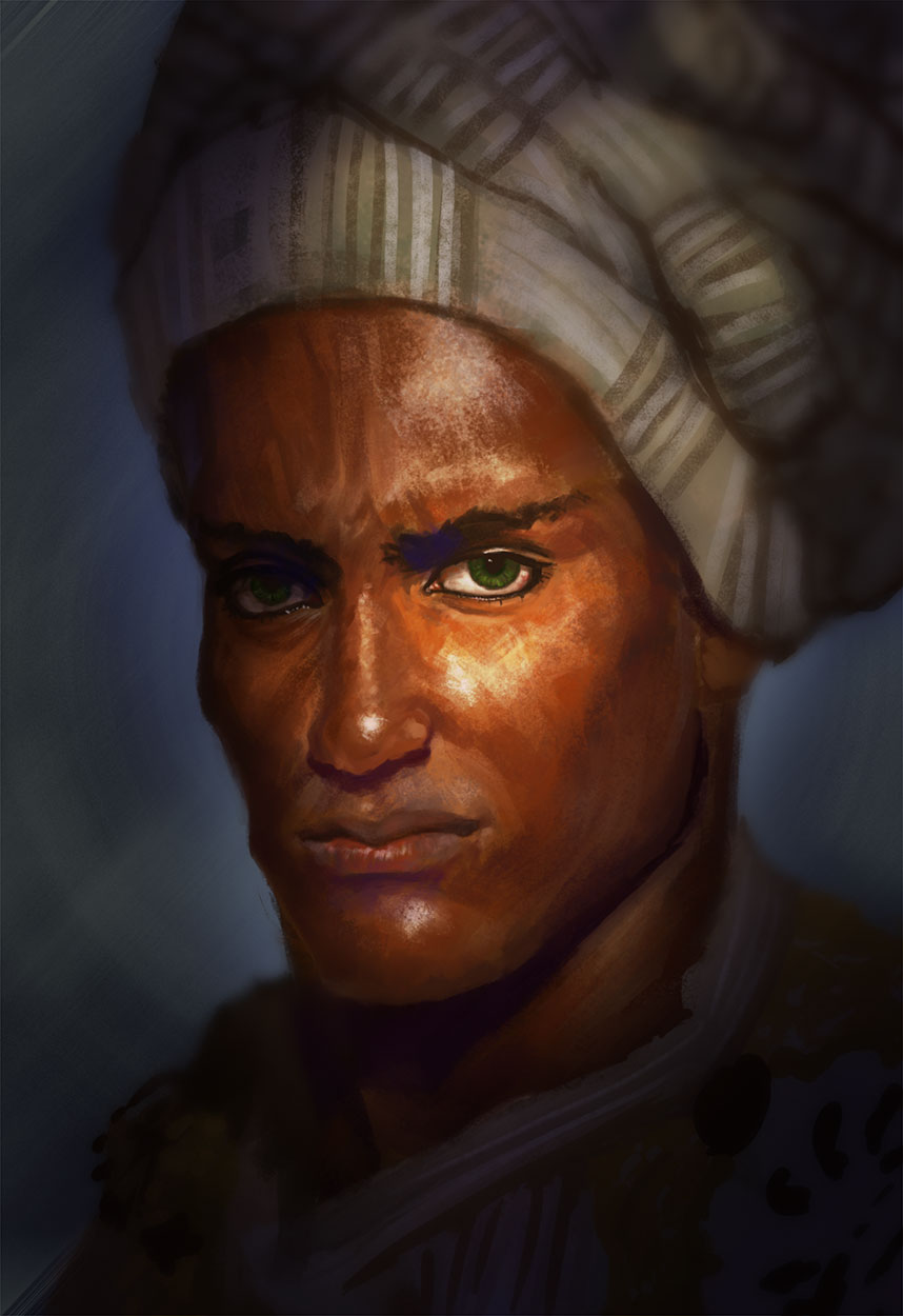
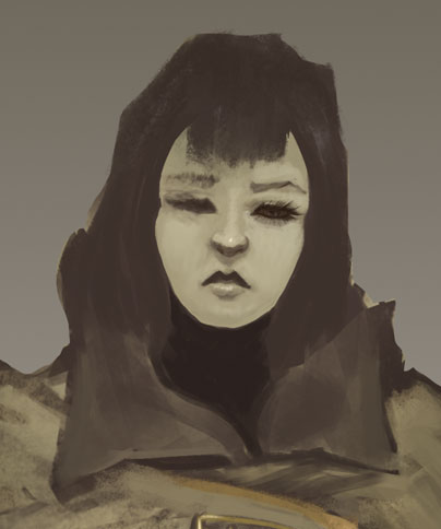
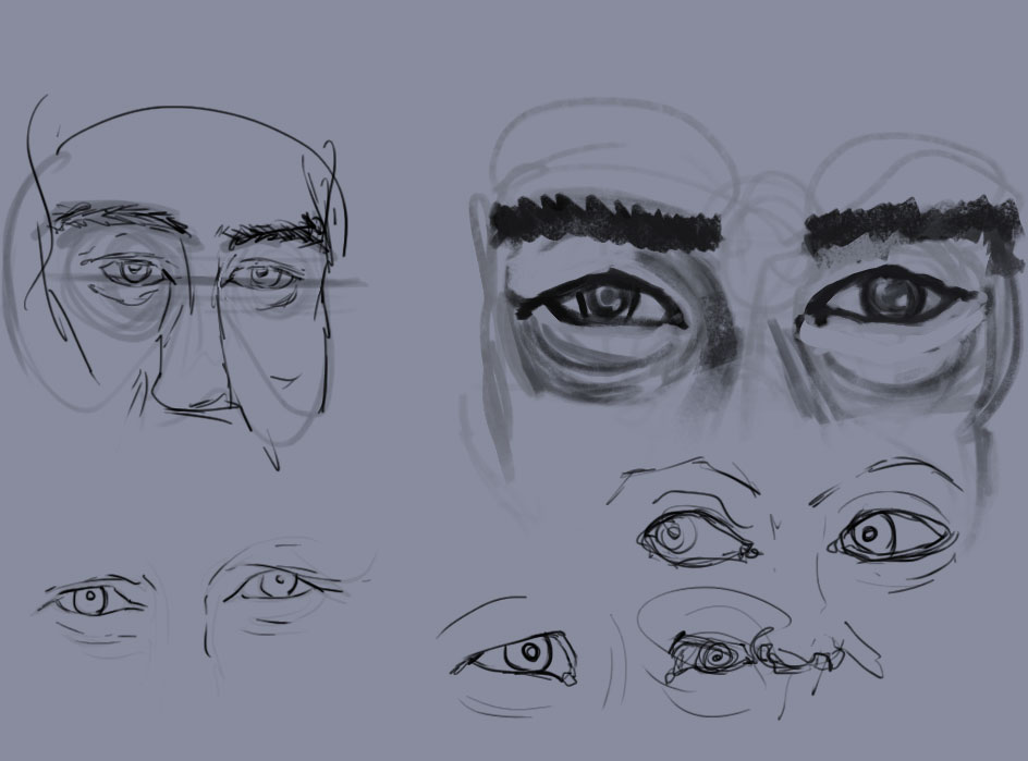
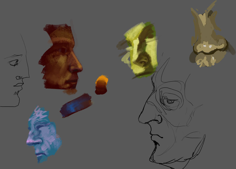
Had a silly idea to paint some faces as fast as possible, in the future I will try to instead paint faces with as few strokes as possible instead.
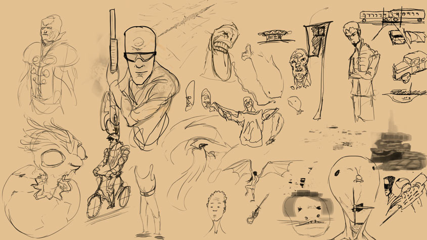
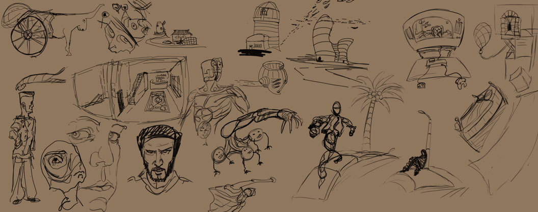
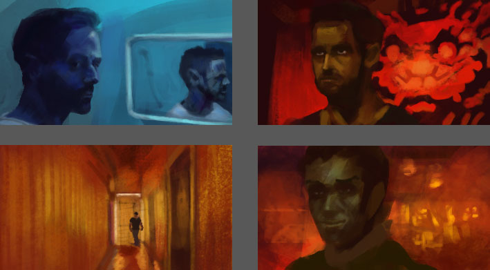
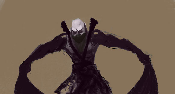
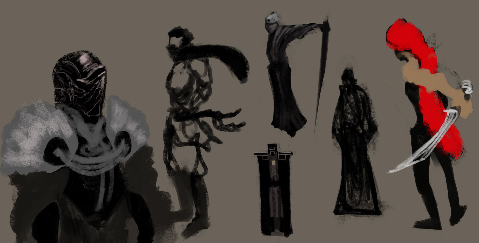
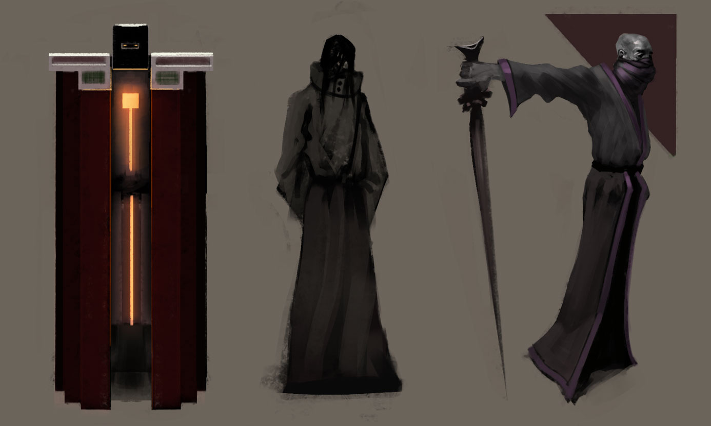
Then I did some character sketches, facestudy and worked on the 2 portfolio pieces


Posts: 172
Threads: 5
Joined: Feb 2012
Reputation:
3
So much improvement from 2013 to now. Keep up the great work.
Posts: 1,342
Threads: 17
Joined: Jul 2013
Reputation:
45
Thanks Cricketts
5h done completed day 8
So I was reading JoJo manga and I still had 3h left to go, at some point I knew It was getting too late so I got to work and managed to finish, fighting off tiredness. If I had spent 1h more reading the manga, I wouldnt have finished the goal today.
Stuff


Posts: 202
Threads: 1
Joined: Jun 2015
Reputation:
12
hey man!
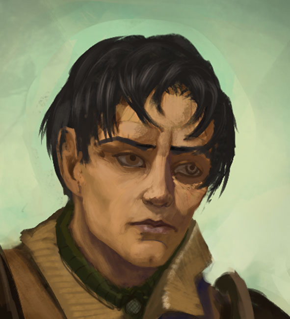
Great face study on post #583.
Nice brushwork and lighting,
keep pushing!
Posts: 1,527
Threads: 24
Joined: Dec 2012
Reputation:
70
Yo cracked!
That face study isn't bad at all, it's actually pulling my gaze, so you know that's a good thing!
I s'pose it just needed a little more love around the bottom of the nose. But yeah, real cool brush work meng.
Digging the PS sketchin' as well.
Can't wait to see where you take things with the CD Grand Manor ;)
sketchbook | pg 52
"Not a single thing in this world isn't in the process of becoming something else."
I'll be back - it's an odyssey, after all
Posts: 1,342
Threads: 17
Joined: Jul 2013
Reputation:
45
Appreciate it Voodoo
Yo Smrr, good to know the face is pulling your gaze, gonna slowly build up the Manor :)
Day 9- 5h done
Some stuff here http://crimsondaggers.com/forum/showthre...6#pid84066
Struggled with features and redrew them, but im getting there.


Posts: 848
Threads: 20
Joined: Jan 2012
Reputation:
29
Hey, nice update. You have improved heaps since I was last here. Nice watercolour stuff too.
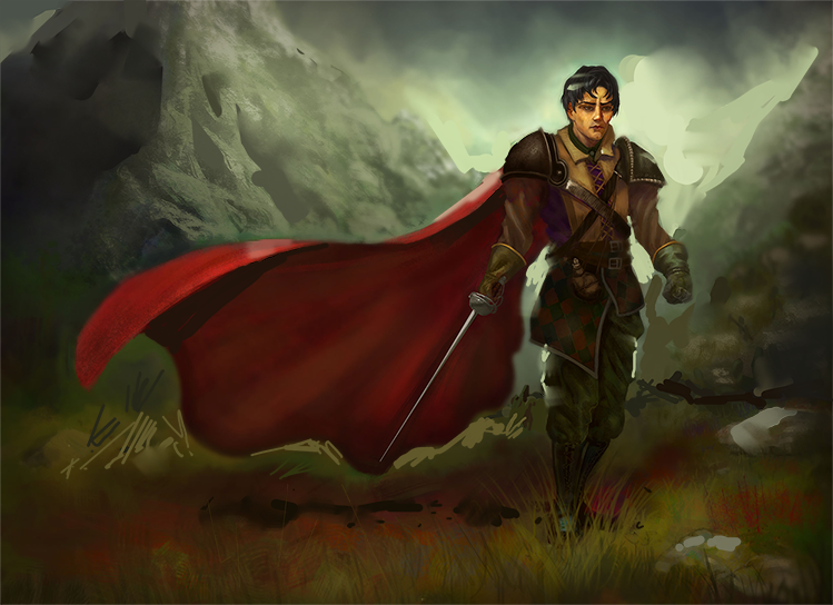
The composition in that musketeer pic is nice. Though dont forget to add some nice colour variation in there as well :) Always helps!
Keep up the good work :)
Posts: 1,527
Threads: 24
Joined: Dec 2012
Reputation:
70
Craaaaaaaaackedd! Hell yeah man we're gonna build the Manor like it's nobody's business!
Hey, you will get there with faces! Because damn, have you seen your improvement from day dot?!
Hmm, ever work with clipping masks? I know it doesn't really feel like "painting", but they sure help a lot with getting things done one step at a time, y'know?
Keep rocking, summonist!
sketchbook | pg 52
"Not a single thing in this world isn't in the process of becoming something else."
I'll be back - it's an odyssey, after all
Posts: 1,342
Threads: 17
Joined: Jul 2013
Reputation:
45
Thanks Jaik, Ill blast more colors on it
Hey Smrr, yes I do, but rarely, I should utilize it more. My main gripe with it is that the underlying layer shape is often incorrect, so I gotta switch layers everytime I wanna change something.
Day 10- 5h passed. Goal is complete.
New goal: Do 5-6h everyday for 10 days, by 10th july a total of 50-60h should be accumulated.
Made a comic for this new thing crimsondaggers.com/forum/showthread.php?tid=6523&pid=84066#pid84066
Worked on dude.

Posts: 1,342
Threads: 17
Joined: Jul 2013
Reputation:
45
Day 1:5h 30min done.
Finished my dude.


Posts: 1,527
Threads: 24
Joined: Dec 2012
Reputation:
70
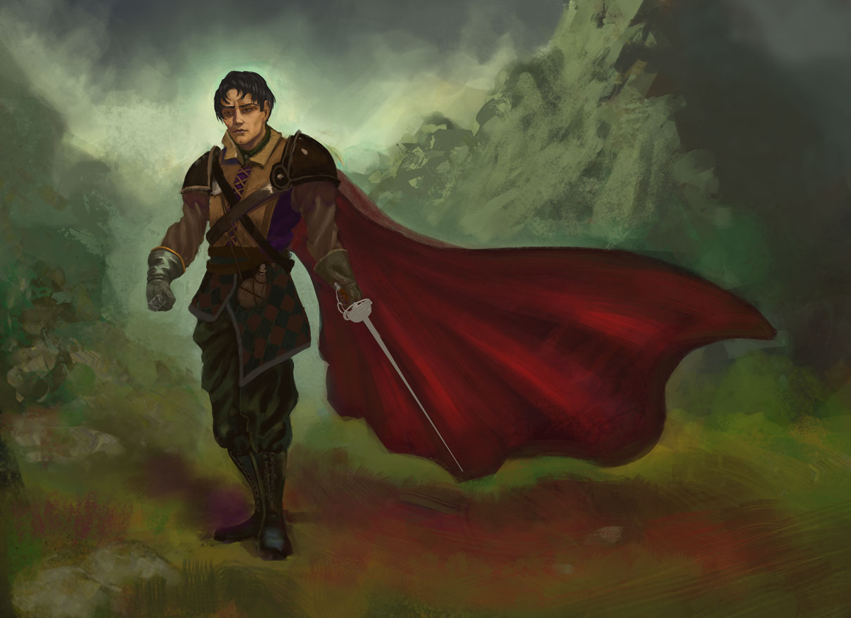
Ayyyyyyyyyyyyyyyyyyyye! The dude turned out great!! I love his glove/gauntlet (call me weird, idc haha)
Probably being nit-picky here, but I feel if you separated the ground and mountains a bit more, the figure would look more grounded in the world. Too many soft edges can give a floaty effect.
I did a thing (a very shitty thing, my tablet drivers clonked out on me = no pen pressure) to show what I mean

Take what you will from dese 2cents, only want the best for ya.
Seriously though cracked, you've been taking your blending and painting in general up a notch and it's awesome to see. Also, always respected this day-by-day goals you set for yourself... something I should be doing.
Keep it uuuupp!
sketchbook | pg 52
"Not a single thing in this world isn't in the process of becoming something else."
I'll be back - it's an odyssey, after all
Posts: 1,342
Threads: 17
Joined: Jul 2013
Reputation:
45
Posts: 429
Threads: 0
Joined: May 2012
Reputation:
7
You've been improving so much recently, I think the recent character and studies shows that. I don't think you had to soften the background so much in the last character image though, at least in the light. Keep it up man, looking forward to those portfolio pieces.
Posts: 1,342
Threads: 17
Joined: Jul 2013
Reputation:
45
Hey Ben, only one way to go I suppose, forvard.
Tried out a new way of working, It consists of listening to documentaries, so far it was a good controlled distraction, everytime I got the feeling to browse internet I looked a bit at the video. Also made working easier.
Day 3. 5h done


Posts: 37
Threads: 1
Joined: Jun 2015
Reputation:
3
Thanks for commenting on my sketchbook. It amazing to see how much you have improved. Your painting and studies are looking good. I love the last painting on post 561. I did have one question. I notice you post the day and amount of hours you have spent. Do you aim to spend 5hrs a day for a certain amount of time or do you have a 5-hour schedule where you break down 5 hours for what you want to work on and study? or are you trying to reach a certain amount of hours?
Posts: 172
Threads: 1
Joined: Sep 2014
Reputation:
10
Hey man, great improvement here! I feel like your edges could still use some work - some of them feel over-soft? Possibly because you're painting with a soft chalk brush, makes things feel a little muddy. It's generally cleared up in your longer pieces though. Great work ethic, keep it up!
Posts: 39
Threads: 2
Joined: Feb 2015
Reputation:
2
How has art school benefited you and your artistic development, so far?
Posts: 176
Threads: 2
Joined: Mar 2013
Reputation:
2
Thanks for coming by! ;)
Soooo let me take a look on your sketchbook! :D
First: I love theportrait on the top of that page! Also nice on the most recent sketches, expecially the hammer guy on the left, feels like a symbol of the hammerites (Thief games) :D
Yet I still want to give you a longer crit on your last longer piece, the red cape dude in the mountains
First off, there is no way to distinguish foreground from background, jsut the dude and scenery. You should at least border out the middleground where the dude is standing.
Then to the background, why is the mountain is so detailed? It only steals the point of interest from the guy. If you want to emphazise how huge it is then do it by contrast to the sky. That way you also create depth of the scenery.
Now to the guy himself. Nice job on the silhouette! The contrast to the background is quite good. Then I would also add detail to his right shoulderpad. His left one is there to support the silhouette and doesn't need to be as detailed but as his right one is inside the silhouette you better show that it is there. Add more detail and brighten it up a bit. The same goes for the whole arm. At the moment it is quite dark and the only thing "glowing out" is the sword, the arm itself is kinda merging to the darker red cape. If you brighten it up you create emphasis that he is actually wielding a sword.
My last point is for his feet. They kinda look like he is standing on one point on the ground. Yet his silhouette suggests that he is walking forward. Try adding some distance between his legs. You don't necessarily need to move them apart but try try to play with different colors or atmosphere, maybe brighten the front leg up so that one can see that it is in front of the other.
Hope that it helps, keep improving! :D
Posts: 903
Threads: 54
Joined: Feb 2012
Reputation:
18
Sweet updates! is there a particular company you are aiming for with your characters? I know what you mean about documentaries, they are a very good way to get through the rendering phases.
Posts: 1,342
Threads: 17
Joined: Jul 2013
Reputation:
45
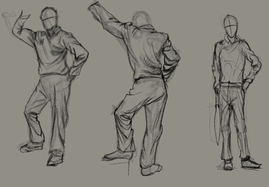
Zandra - Thanks for the kind words. I set my phone to 1h or 30min and I work. I dont have a fixed schedule, but usually I tend to start with some figuredrawing to warm up.
Eristhe - Youre right, love the chalk brushes :D
Jaktraytr - Well Ive learned to paint with color temperature more, and generally gotten better. The artschool here is free.
Nowio - You make good points in your critique, many thanks to you :)
Pnate - Im aiming for fantasy character companies. Ive heard of Fantasy Flight games, but dont know any other entry level ones. I do plan to check out the Artpact reviews once Im finished with starting portfolio.
Was too tired yesterday to post.
Day 4-failed 4.5h done
Day 5-completed 5h done
Also, since my sleep schedule is moving forvard, I gotta compensate with doing 2 days work someday.
One of these is a Peleng study.
Ps- dynamic cloth folds are hard.


|


