08-13-2013, 01:56 PM
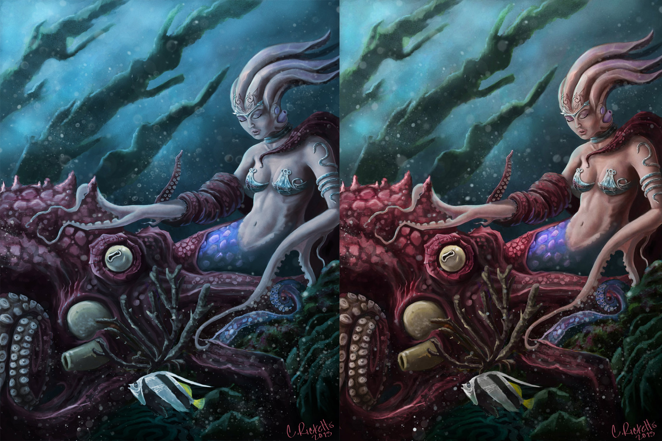
I like both of them. But there can only be one. Im looking for critique as well. Thanks.


|
seeking critique and opinions
|
|
08-13-2013, 01:56 PM
I like both of them. But there can only be one. Im looking for critique as well. Thanks.

08-14-2013, 04:56 AM
Light Loss
Water is approximately 800 times denser than air, and this density absorbs light - quickly. Not only does this result in dull, monotone colors, but it also decreases contrast and image sharpness. This is why under water photo are oftenb blue / gray- a direct result of the properties of water and the affect of light absorption. Specific frequencies of ambient light get absorbed at different depths, from the longest wavelength to shortest (basically the colors of the rainbow, remember ROYGBIV?). Red nearly disappears at around 5 meters, followed by orange at 10 meters, yellow at 20 meters, green at 30 meters and eventually even blue at 60 meters. http://www.divephotoguide.com/getting-st...nderwater/ so in my opinion it depend on the approch you want to give to the image blue and gray for realistic or clean and more cartoon
08-14-2013, 11:30 AM
Character should avoid touching the edge of a image it a basic of image composition
08-14-2013, 12:00 PM
@Darktiste, Thank you this is very helpful. I think ill shoot for the realism after reading this. Thanks.
08-14-2013, 06:19 PM
Darktiste is right about the composition stuff! I personally would go with a mixture of the color schemes: leave the octopus a cooler color (suggesting that it's a "truly" sea creature) And your creature the warmer and more saturated color. She's the main character after all, and a bit of color contrast would make her stand out more. Just and idea... :)
08-14-2013, 08:49 PM
Some nice design stuff going on with the mermopusquid lady. Realistic is all well and good, but you want to be careful to control your image so it is still exciting and has saturation value and contrast where needed, so definitely use higher saturation at focal points like her face/torso as well as the octopus face. Agree about cutting off the figure in the comp.
I think in general the value scheme of this is too compressed. All the action happens in the midground, and the fish and coral are adding a lot of clutter to the image where they are because they are so similar in value to the figures. Maybe bring them more into the foreground and off to the side or remove them completely and have some more negative space surrounding the octo face which is another focal point. Similarly the values of the background kelp could probably be a lot lighter and pushed into the distance to add more depth. In general some slight hue variation overall would help the colours be a bit more vibrant even though you are going for that underwater desaturated thing in the left image.
08-16-2013, 10:51 AM
Thanks all so much for the crits! I Truly appreciate it
08-19-2013, 09:30 AM
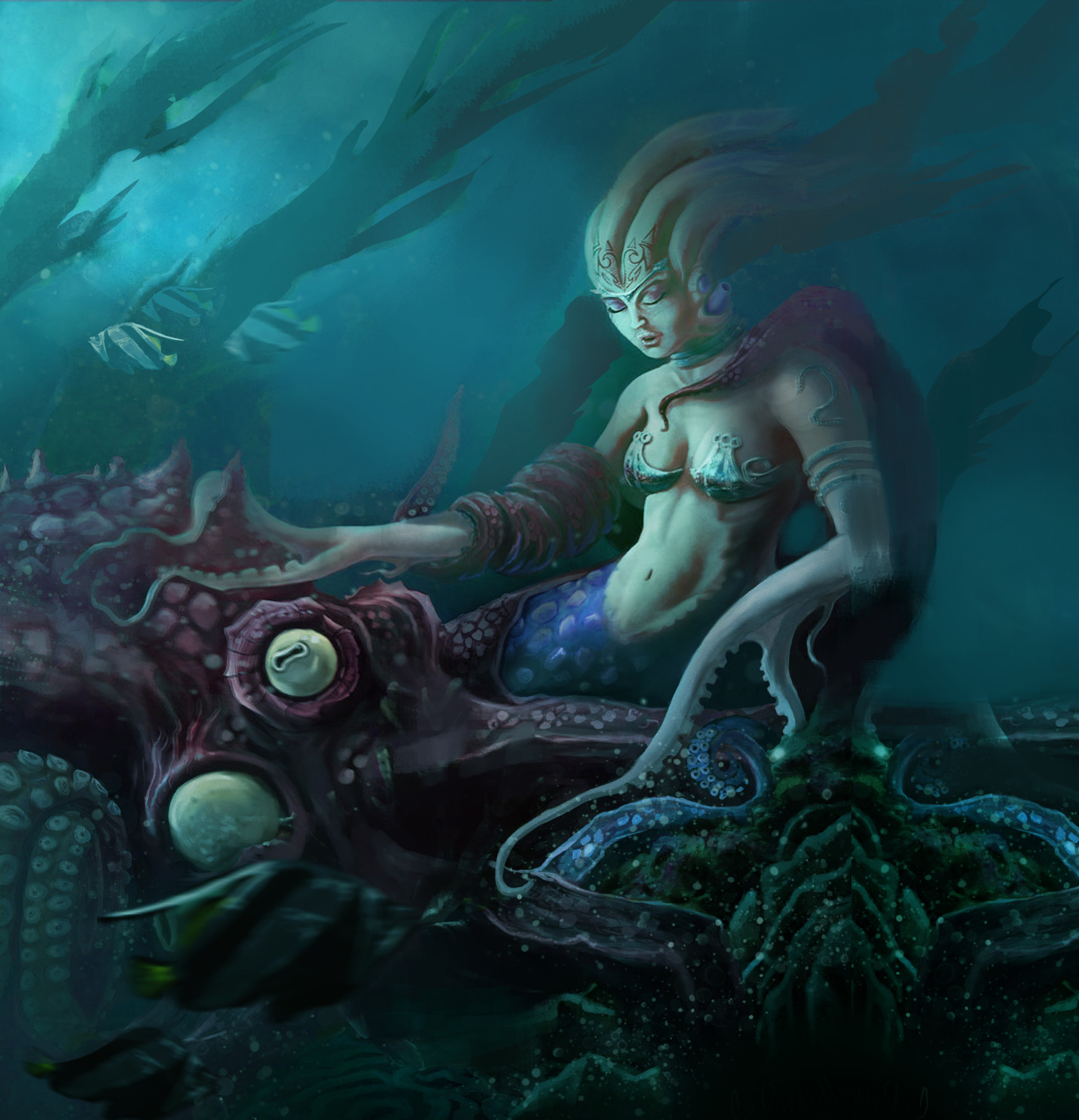
Damn I totally did a paintover and forgot to upload it lol.
It may be too late but here it is anyway haha, hope it's useful I think I addressed a few things, but in the process removed a lot of the floaty lit particles that would add to the atmosphere of this being underwater.  |
|
« Next Oldest | Next Newest »
|