08-23-2013, 03:59 AM
Hi!
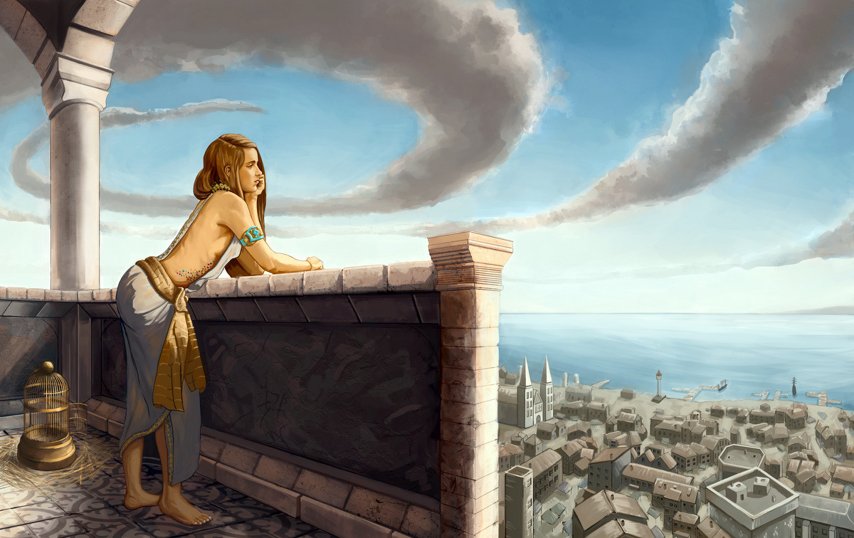
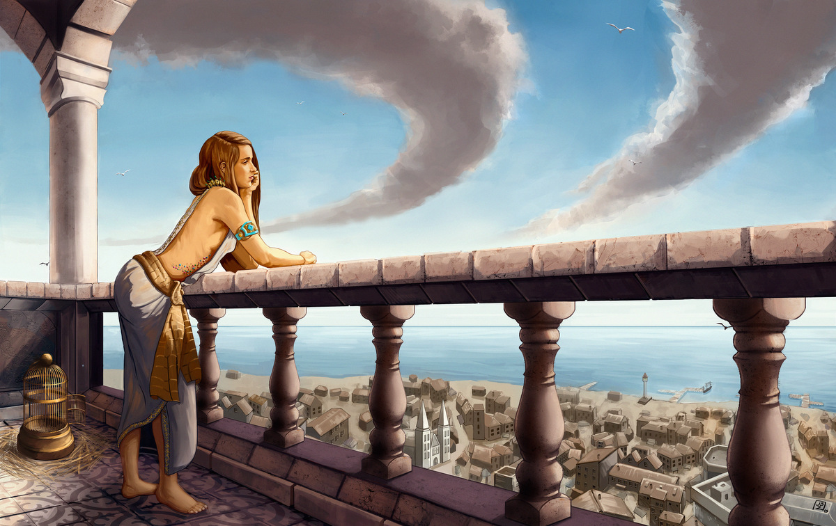
I'd like to know what you guys think of this piece, in which I've been working at for several days now. I am kinda partial about it myself: it's basically what I first envisioned, but as of now, it seems to me that it is lacking something. The story is this: a princess girl is looking out from her beach castle/fortress, longing for something, perhaps going on adventures, or waiting for an answer. I tried to reinforce the latter idea by placing an empty bird cage by her. All that is already conveyed, I think.. and yet.. the image seems a bit boring to me. :/
It could also be that I've grown too used of seeing it; I just don't know. That's why I'd be very thankful if someone could tell me what they think about it.
Having a fresh look at your work is immensely helpful, I believe. Thanks in advance!


