Posts: 656
Threads: 6
Joined: May 2013
Reputation:
12
Wow, that arab fighter is flipping awesome! The swords have such a killer design, the environment suits him, the light adds some drama.
The eyes of the next guy are really striking somehow, even though the actual color is similar to the rest of the painting.
The guy with the white crow is also really striking. Really love that set of fabric textures.
Monk riding a ginormous tiger looks calm but powerful.
Really great set of work!
_________________________________________________________________________
The best time to plant a tree was 20 years ago. The second best time is now.
-Chinese proverb
Sketchbook
Posts: 9
Threads: 1
Joined: Dec 2013
Reputation:
0
your art is amazing.. !
and so is design
Posts: 140
Threads: 2
Joined: Oct 2013
Reputation:
2
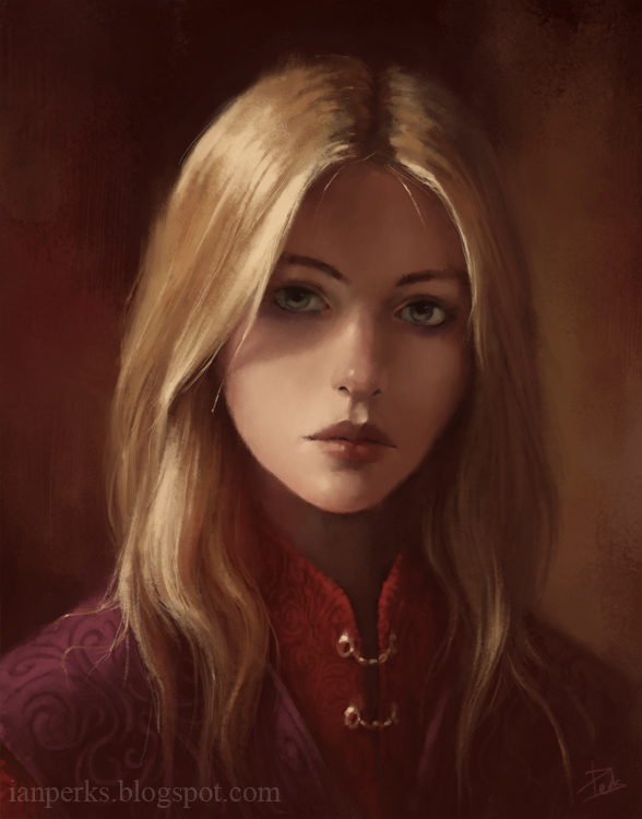
Past two portraits are pretty impressive! :)
Posts: 288
Threads: 8
Joined: Nov 2012
Reputation:
9
Awesome portraits and that knight on horse back is insanely bad ass. Love it.
Posts: 237
Threads: 3
Joined: Jan 2013
Reputation:
1
Wow! Is there any sketches in your sketchbook? :p Cool characters on first and second pages... ... and illustrations are impressive too) What can i advice is to put more variety of colors in your illustrations to make them more interesting, it will help to catch the viewer's eye. BUT you drawing better than me, so you can send me to hell or sth like that)
Posts: 429
Threads: 0
Joined: May 2012
Reputation:
7
seriously amazing work. your designing and sense of colors are solid
Posts: 19
Threads: 2
Joined: Feb 2014
Reputation:
0
Hey, just looking around the forum, and dropping comments, so i have a easier time stalking people, hope you don't mind :) btw your stuff is awesome, i wish i was on that level with my rendering, design sense etc, but i quess next step for you would be letting your idiosyncrasies speak through even more, maybe try taking a more expressionistic approach, because even though your designs are good and it's hard for me to point anything specificly wrong about them, they seem a bit dull, i hope you get what i mean :)
Posts: 656
Threads: 6
Joined: May 2013
Reputation:
12
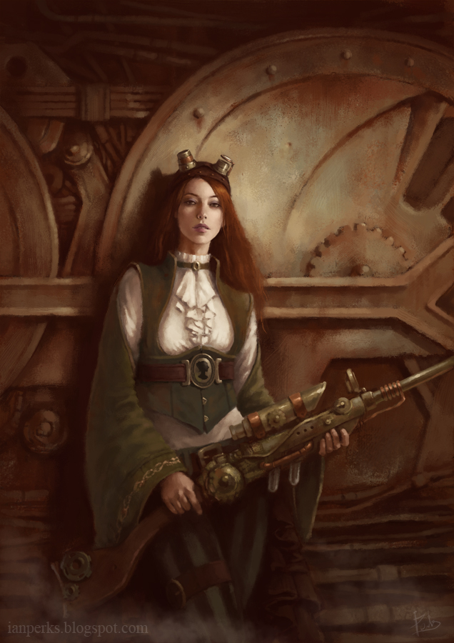
The steampunk lady is gorgeous! You could name her Lady Greensleeves--love the costume. The sepia gears make a good background, and the gun looks archaically functional.
_________________________________________________________________________
The best time to plant a tree was 20 years ago. The second best time is now.
-Chinese proverb
Sketchbook
Posts: 387
Threads: 2
Joined: Jul 2012
Reputation:
6
Keep them coming, this has so much taste and soul in it, glad I stumbled upon your work <3 Also, with these character designs you can get aaa work easily.
Posts: 140
Threads: 2
Joined: Oct 2013
Reputation:
2
Even if it took awhile, you have to notice the effort that went into it!
I would honestly say to not really worry at this point about how long a piece takes and just make sure that you're enjoying it the whole way through.
I could rant and rant about how this digital age makes everyone want to rush into everything, but I'll leave that alone hahha.
Regardless, this last piece has a very impressionistic quality to it!
I really like the loose brushwork and refined focal points.
I would suggest to either push the pasha's guard slightly back or darken him slightly to give the attention even more to the pasha guy, because at the moment it looks slightly like the assassin is looking toward the guard rather than the royal.
Either that or sharpen the lord up even more.
Think about how lens effects are in movies, they tend to blur out all the non-focused and really really sharpen the focus object.
That's really the only critique I have for this piece, it's very lovely!
Posts: 241
Threads: 0
Joined: Jun 2012
Reputation:
18
I dont even know what to say when I look at this sketchbook... I love the rendering... and the lighting in the last piece is really nice and warm. Great stuff, I love it.
Posts: 905
Threads: 39
Joined: Sep 2013
Reputation:
51
Wow, man, your range is just impressive. I don't know about the "ungodly amount of time". The birth of an unique, beautiful painting is worth that. Is that digital or traditional media?


