11-30-2013, 03:02 AM
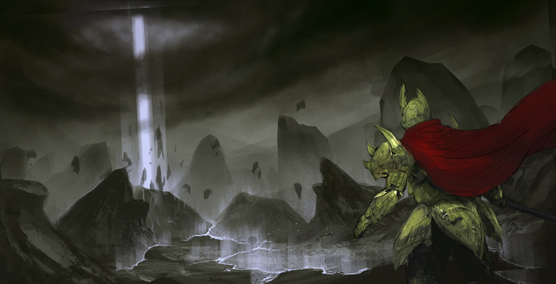
This is a WIP of a scene from my memory playing final fantasy games lol
Please feel free to paint over or critique. Thanks

Please feel free to paint over or critique. Thanks


|
Need feedback - epic scene WIP
|
|
11-30-2013, 03:02 AM
This is a WIP of a scene from my memory playing final fantasy games lol
Please feel free to paint over or critique. Thanks  
11-30-2013, 05:12 AM
The red cape seems to be drawing too much attention to the right side of the composition. Maybe bump down its saturation or throw some red in the beam of light to balance it? Its a WIP so if you were already planning to do something about it disregard what I say :D
11-30-2013, 01:16 PM
(11-30-2013, 05:12 AM)Hypnagogic_Haze Wrote: The red cape seems to be drawing too much attention to the right side of the composition. Maybe bump down its saturation or throw some red in the beam of light to balance it? Its a WIP so if you were already planning to do something about it disregard what I say :D Thanks man! okay I will take that red down
11-30-2013, 02:41 PM
Take the cape and make it blow toward the focal point.
Livestream Crits/Paintovers: www.twitch.tv/mike086
Loomis Study videos: http://www.youtube.com/user/mike086 My Facebook page: MCIII
12-01-2013, 12:11 AM
12-04-2013, 08:18 AM
the lighting of the armour seems to be a bit too strong and saturated- think about the light source and how it will interact with the metallic surface. There will be speculars and a lot darker values, as well as the primary hue being blue (the glowy pillar of light is the primary light source).
The ambient bounce light will be a lot softer and less noticeable :) That said, its looking really good keep working on it!
12-04-2013, 08:32 PM
(12-04-2013, 08:18 AM)Ward217 Wrote: the lighting of the armour seems to be a bit too strong and saturated- think about the light source and how it will interact with the metallic surface. There will be speculars and a lot darker values, as well as the primary hue being blue (the glowy pillar of light is the primary light source). Thanks man! |
|
« Next Oldest | Next Newest »
|