Posts: 33
Threads: 2
Joined: Jan 2024
Reputation:
2
Rather than post a lot of my past works, I'd like to keep moving forward and post more current works and studies. (Edit: If you're curious, here is a sample of my old works over time https://i.imgur.com/eQMMSKe.jpg)
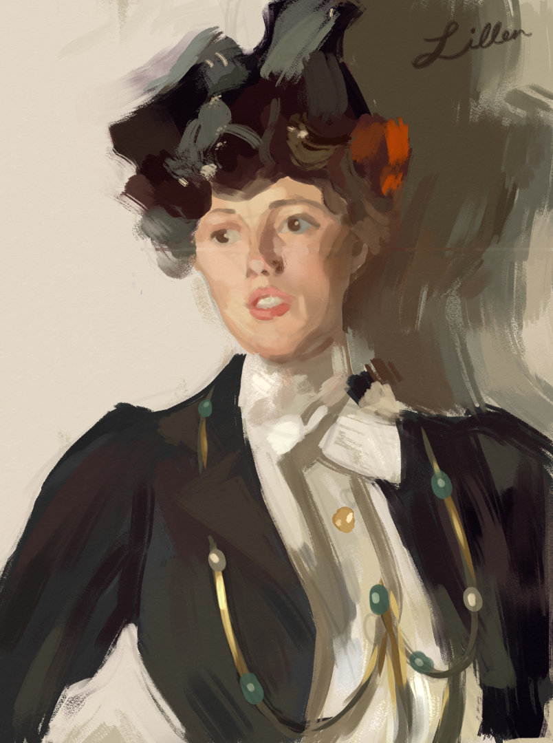
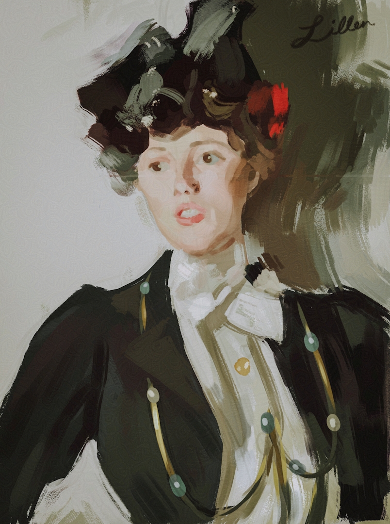
Recently, I re-visited a master study I've painted before 5 years ago. Martha Dana Mercer 1899 by Anders Zorn. I really love this portrait, which is a bit ironic because it feels rather simple compared to Zorn's other works.

Editing / Styling

I really love moody looks, and over time I've slowly come to prefer flatter, more stylized value control.

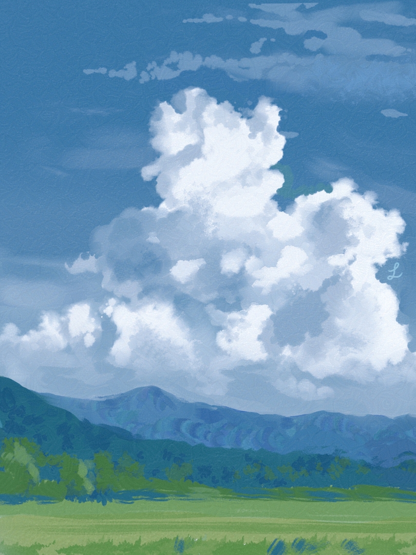
Cloud Study from Reference (Edited)
Reference Photo: Link
Photographer: photo_okina
One of my favorite artists released a cloud brush pack, so I'm taking the opportunity to do a few cloud studies. I don't feel particularly confident with this one. I plan to do a few more, following along with the tutorial.
Critique and comments welcome.
Posts: 3,357
Threads: 37
Joined: Aug 2013
Reputation:
234
Posting old stuff is somewhat about destroying old habit i don't advise on skipping it.You save yourself time if you do.There is no shame to it. But obviously those work are also not really representative of your current skill it just generally help to post them anyways to clarify your interest and where thing are perhaps stagnating.
Cloud study in my mind should be about brush control not letting the brush carry from end to finish.Cloud are the perfect excuse to practice edge control and doing them by hand create a strong visual signature.But there plenty of cool stuff out there also to use and just get the job done.
Anyways using brush texture is not a crime some people have made it there signature.You just might want to ask yourself the pro and con of you decision making but before anything have fun.
Posts: 33
Threads: 2
Joined: Jan 2024
Reputation:
2
(05-11-2024, 06:25 AM)darktiste Wrote: Posting old stuff is somewhat about destroying old habit i don't advise on skipping it.You save yourself time if you do.There is no shame to it. But obviously those work are also not really representative of your current skill it just generally help to post them anyways to clarify your interest and where thing are perhaps stagnating.
Cloud study in my mind should be about brush control not letting the brush carry from end to finish.Cloud are the perfect excuse to practice edge control and doing them by hand create a strong visual signature.But there plenty of cool stuff out there also to use and just get the job done.
Anyways using brush texture is not a crime some people have made it there signature.You just might want to ask yourself the pro and con of you decision making but before anything have fun.
Alright, you make a good point. I will add a timeline of my old works. Link here: https://i.imgur.com/eQMMSKe.jpg and i'll add it to the top.
Posts: 106
Threads: 5
Joined: Nov 2023
Reputation:
31
Yay! Finally another member who likes portraits as much as I do! And into the same type of artists/painting styles. Zorn, Sargent, Sorolla, Schmid, etc., are some of my biggest influences in painting, along with digital painters who are also heavily influenced by them.
Regarding the clouds. I have used cloud brush packs in the past, I find they're generally more suited to commercial works where deadlines are always looming, as they're a bit like shortcuts. But when doing personal works, I much prefer to just use general painting brushes I like and let the inherent texture/bristle marks of the brush show, as the results always looked more like the kind of organic and expressive painting I prefer.
Posts: 33
Threads: 2
Joined: Jan 2024
Reputation:
2
 Clouds II (1.5-2 hrs)
Initially, I thought this study was about the same as my previous one in terms of quality. I felt very neutral about it, but after receiving some feedback from my trusted partner, I started to feel much more positive and hopeful.
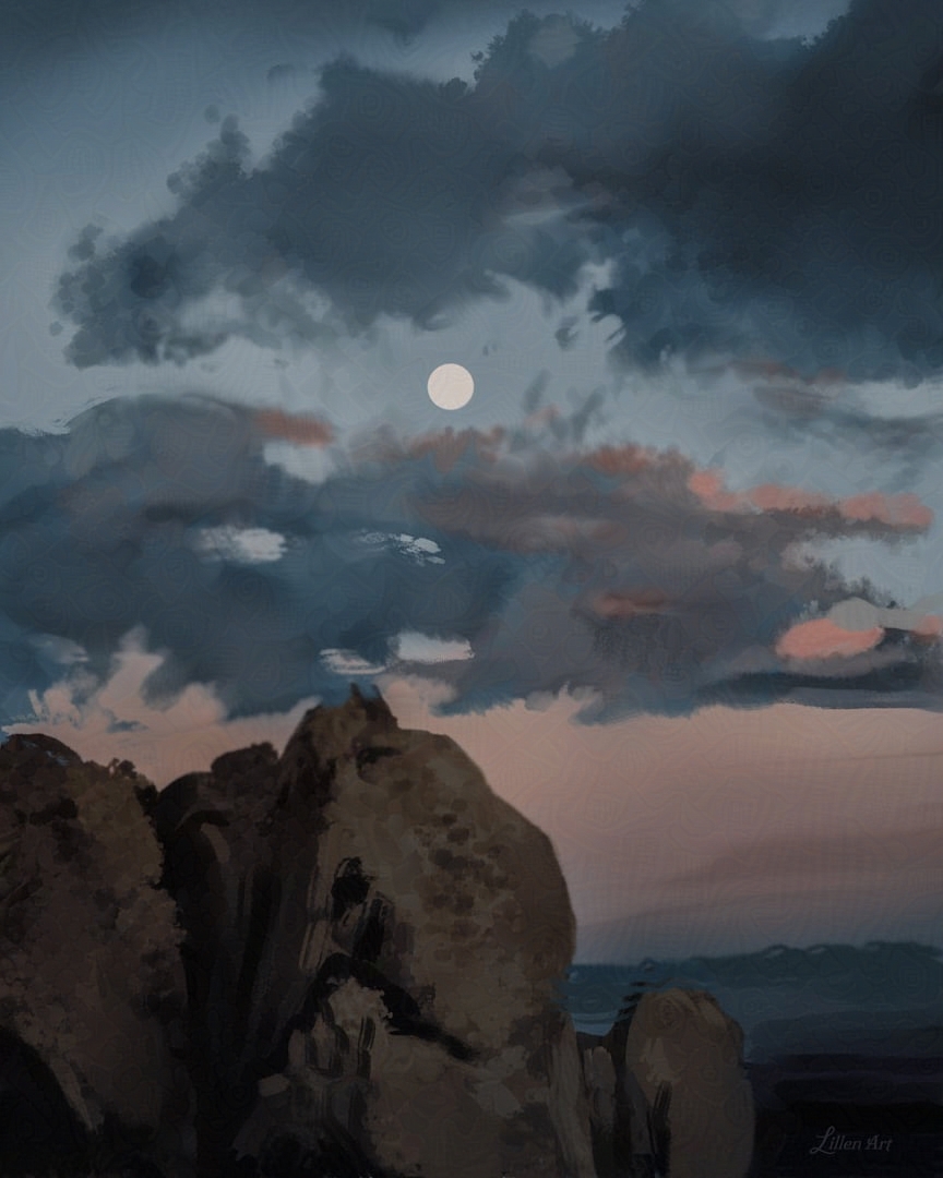
 Clouds III (2-3 hrs)
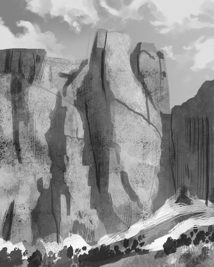
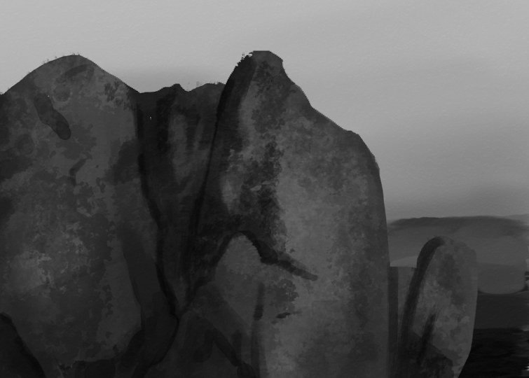
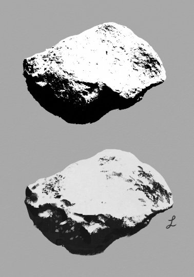
Now, it was time to move on to more interesting lighting scenarios. In comparison to my earlier studies, everything about this study went much smoother. I’m feeling good about it. The most difficult part was the rocks, which I’m considering adding to my never ending ‘things to study’ list. The method that I use is painting grayscale and then applying several gradient maps (and masks). I did this in 1 sitting, in about 2–3 hrs with mild sleep deprivation setting in. A friend pointed out to me later, I did make a careless mistake where the clouds form a tangent with the rocks. (Reminding me I should wait a day or two before I post.) They also said that my shapes initially were much stronger, but I had changed them to be more accurate like my reference. I had forgotten the lesson of my previous study, where I had focused more on editing the reference / designing my shapes. I still struggle in my mind between exaggerating shapes and pulling back to reality. I asked myself why I might be having this problem, and I came to a realization. Typically, I am a portrait artist, and my ‘bad habit’ for a while was overexaggerating to the point where it broke anatomy. Mentally, I hold myself back a bit on what I wanted to exaggerate to compensate this tendency. However, this does not serve well for landscapes. There is much more freedom to change the shapes. The past few weeks I serendipitously keep running into things that talk about being bold, free, and fearless with art. I shall take this as a sign.
Please Note: Nearly all the artworks I will be posting in this thread will be compressed jpgs / webp and Glazed due to AI scrapping my work. As a result, you may see some weird artifacts.
(05-16-2024, 06:24 AM)Lunatique Wrote: Yay! Finally another member who likes portraits as much as I do! And into the same type of artists/painting styles. Zorn, Sargent, Sorolla, Schmid, etc., are some of my biggest influences in painting, along with digital painters who are also heavily influenced by them.
Regarding the clouds. I have used cloud brush packs in the past, I find they're generally more suited to commercial works where deadlines are always looming, as they're a bit like shortcuts. But when doing personal works, I much prefer to just use general painting brushes I like and let the inherent texture/bristle marks of the brush show, as the results always looked more like the kind of organic and expressive painting I prefer.
I'm happy to meet another artist I have something in common with, and can learn from. Thank you very much for the kind advice! I will be practicing with my general painterly brushes.
Posts: 1,076
Threads: 4
Joined: Jan 2016
Reputation:
43
Great work here, really enjoy the master study especially. I like your brushwork as well, it's very interesting and helps make your paintings pop. Good stuff!
Posts: 316
Threads: 3
Joined: Sep 2019
Reputation:
23
Yeah — beautiful work that you've shared so far — please keep posting
Posts: 33
Threads: 2
Joined: Jan 2024
Reputation:
2
(05-26-2024, 05:19 PM)cgmythology Wrote: Great work here, really enjoy the master study especially. I like your brushwork as well, it's very interesting and helps make your paintings pop. Good stuff!
Thank you. I appreciate that. I'm trying to be more conscious of my brushstrokes. It's something I love about Zorn and Sargent's work.
(05-30-2024, 10:38 AM)Jephyr Wrote: Yeah — beautiful work that you've shared so far — please keep posting
Thanks! I am working on my portfolio, so I'll have more to share.
Posts: 33
Threads: 2
Joined: Jan 2024
Reputation:
2
I've taken somewhat of a break from my studies in favor of working on career related things. I'm currently an independent art student (self-educated). My goal is to become part junior freelance illustrator, part independent artist. My strength is character art, specifically semi-realistic stylized femme humanoids. (Despite my recent studies, I have no plans to specialize in landscapes / environment art. It is an area I'm weaker in, hence the practice.) I want to work on a mix of projects; creating art prints, developing my own characters and stories, drawing other people's characters, working with companies to illustrate book covers, card games, RPGs, etc. and maybe even branch out to the fine art world.
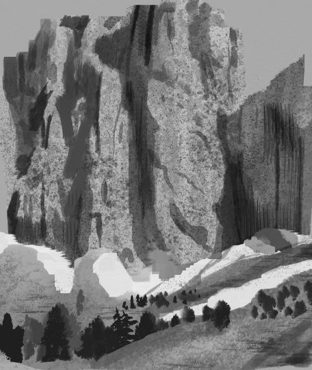
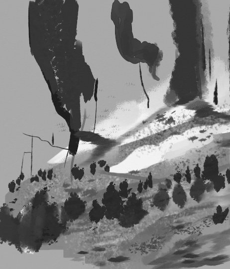
Working on improving my method / workflow / efficiency for painting rocks. Still a bit rough, but figuring things out slowly. Came to the conclusion I need to take a step back and work on my shapes more. Please share if you know any tips or brushes to get nice easy textures without photo-bashing.


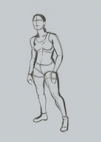
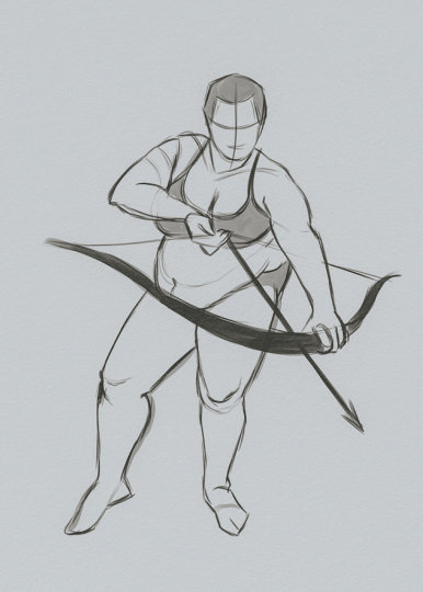
Bonus figure sketches from photo reference


Posts: 43
Threads: 2
Joined: May 2024
Reputation:
1
I don't know if it'll work for you but I found out that using the lasso tool to create texture is a good time saver trick. I recommand giving it a try. Unfortunately I don't have acess to my pad and I can't draw an example for you, but take a look of the way Forrest Imel is using and explaining the tool in this video, from 8:08 to 10:50.
I'm still experimenting with it but I think that it works in a lot of landscape, nature scenarios.
Let me know if it worked out once you tried it out!
Posts: 1,076
Threads: 4
Joined: Jan 2016
Reputation:
43
Excellent updates, nice to see you doing some environment studies as well. Your figure work is aces as always, great stuff!
Posts: 42
Threads: 1
Joined: Jul 2021
Reputation:
3
Really nice work! I like your painterly style and the figures look great. Regarding shapes, I would try combining them more. In other words linking them together more; shapes in general but maybe shadows in particular.
Here's a video (long but very informative) on the topic based on Frank Frazettas work. https://www.youtube.com/watch?v=cqs7ye6KJ5Y
Looking forward to more!
Posts: 40
Threads: 2
Joined: Jul 2024
Reputation:
2
I can't offer much feedback because I'm not very adept at art, but I really like your painting of the cliffs with the moon. Too bad about the artifacts due to AI taking your stuff. Interesting seeing your improvement through the years too. You're already good in my eyes but keep on painting and you'll become even better.
Posts: 33
Threads: 2
Joined: Jan 2024
Reputation:
2
Obligatory update post.
In 2025, I started learning a new digital art program called Rebelle.

"Falling" Study from Photo Reference (Rebelle)

2 Value Notan (Rebelle)

4 Value Notan (Rebelle)

Low Key Painting Exercise (Rebelle)

High Key Painting Exercise (Rebelle)

Low / High Key Painting Exercise 1 (Rebelle)

Low / High Key Painting Exercise 2 (Rebelle)

Anders Zorn Master Study (Rebelle)

Sketch from Photo Ref (Clip Studio)

Sketch from Photo Ref (Clip Studio)

Quick Sketch from Photo Ref (Clip Studio)
July 2025 I suffered an injury to my tendon and was unable to draw for a while...
I'm looking forward to a fresh start in 2026. ♥
Posts: 29
Threads: 3
Joined: Jan 2026
Reputation:
0
Rebelle is an excellent program! It's great at simulating traditional brushstrokes. Lovely studies you have here, very nice brushwork / control of value on the painting exercises, I'm very fond of the piece of the lady holding the cup, especially how the hair is rendered and the overall control of detail in the piecel. :D
Posts: 38
Threads: 2
Joined: Apr 2025
Reputation:
1
That first study looks very stylish. I love the contrast that desaturated leaves bring.
If I were you, I would've taken that shit and turned it into original work for a portfolio somehow :D
Posts: 106
Threads: 5
Joined: Nov 2023
Reputation:
31
Nice update. Love seeing master studies, and Zorn is always a great choice. I went to see his show several years ago in San Francisco and it was great. I've flown to see two Sargent shows too and loved those as well. I'd love to see Sorolla and Waterhouse in-person but haven't had a chance yet. Same with Richard Schmid.
I've been using Rebelle since version 5 and have been on their beta team ever since, and a number of the prominent features that exist were the result of my hounding them tirelessly about adding those features or making those changes for years. In its current version, it's very close to the perfect art app for me, as they have implemented almost all of my suggestions by now. But in terms of brushes, they are still behind Photoshop in some areas--particularly dry media and expressive brush dynamics such as dynamic bristles that clump together or splay out depending on which side you tilt the stylus.
|
