Posts: 116
Threads: 5
Joined: Jun 2013
Reputation:
6
Hey guys I'm setting up a pixel art sketchbook because I felt it didn't really have a place in my other sketchbook and I do so much pixel art I'd like it to be separate for feedback :)
So I'm working on a game project and I want to really establishing some great scenes so all feedback is welcome!! - I want this to be amazing.
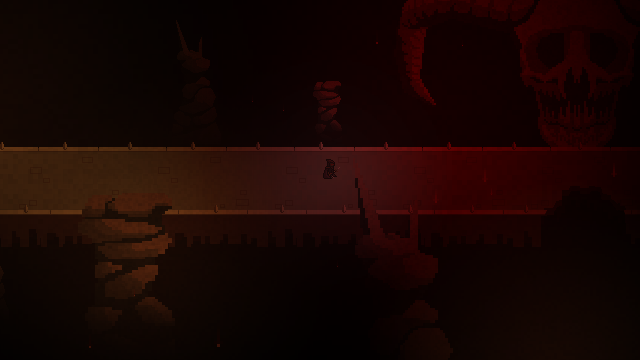
I'll start off with the first scene I'm working on. It takes place in a dream/vision, it's supposed to create a sense of fear/uneasiness. It's a vision of the world at an end:
Posts: 116
Threads: 5
Joined: Jun 2013
Reputation:
6
So I'm still playing around with the scene adding a few more elements. Does it feel too monotonous with the red? I'm trying to go for like a destroyed world vibe:
![[Image: M5Cd5UJ.png]](http://i.imgur.com/M5Cd5UJ.png)
Not sure what other elements I could include :/ My visual library definitely needs work!
Posts: 184
Threads: 4
Joined: May 2013
Reputation:
11
thats awesome!
VERY cool creepy dark vibe.
my first crit would be to make sure to get a good value separation between foreground, midground (where the player is) and background. the pillars in the foreground look too similar in value to the bridge, imo. they kind of merge together.
same problem with the shadow on the bridge and the blackness in the back, its a bit too similar and it looks like the bridge is part of the background in some parts, which takes away some of the impact. i think i get what youre going for but be careful with making it mix in too much (i'm referring especially to the area with the 3rd spike on the border of the bridge from the left of the image)
skull design and the things that look like raining dots are very cool.
keep it up :)
"If you want liberation in this life, there is no area that you do not watch. Watch the breathing, watch the posture, watch the flow of energy, watch the texture of the mind, watch the response to objects." - Namgyal Rinpoche
Posts: 116
Threads: 5
Joined: Jun 2013
Reputation:
6
Thanks so much aks9! You're exactly right about the values, I've been playing around with the piece trying to separate the elements like you said:
![[Image: S2OwrEm.png]](http://i.imgur.com/S2OwrEm.png)
I definitely think it's a step in the right direction! :)
Posts: 116
Threads: 5
Joined: Jun 2013
Reputation:
6
Designed the main character, and started working on his side run animation:
![[Image: 43RfwOO.gif]](http://i.imgur.com/43RfwOO.gif)
Does anyone know any good references for cape animations?
Posts: 116
Threads: 5
Joined: Jun 2013
Reputation:
6
Okay so here's part of the town I've been working on:
![[Image: LhnA4vV.png]](http://i.imgur.com/LhnA4vV.png)
I'm trying to make it as lively as possible (before adding the NPCs) I need some items or objects that can animate, hmm!
Posts: 116
Threads: 5
Joined: Jun 2013
Reputation:
6
Still working on filling out the town, here's the updated marketplace:
![[Image: E0kRmSl.png]](http://i.imgur.com/E0kRmSl.png)
Open to any ideas and suggestions for things to add to a medieval town :)
Posts: 1,118
Threads: 12
Joined: Nov 2013
Reputation:
63
You need a peasant carrying a big bundle of sticks on their back like on the cover of that Led Zeppelin album :)
Posts: 465
Threads: 2
Joined: Mar 2013
Reputation:
18
Oh wow, super cool to see some pixel art work! The way you have to design everything within the low-graphic limitations is really interesting, I can't wait to see more of this! I never really thought about it when playing games, but getting the values reading right is just as important is when making an illustration. In that last screenshot I guess I'm a little distracted by how bright the tent flaps over the market stands are.
I'm not sure why, but the paintings of Pieter Bruegel the Elder came to mind when I think about stuff to put in a medieval town, might be cool to look at some of the stuff he put in his scenes. Good luck!
Posts: 116
Threads: 5
Joined: Jun 2013
Reputation:
6
Small update, didn't have much time to work on it today:
![[Image: jlYZ2Bo.png]](http://i.imgur.com/jlYZ2Bo.png)
@Hypnagoic_Haze, haha I definitely need to fill out the town with NPCs, some stick carrying peasants doesn't sounds too bad :P
@Samszym, Thanks for the crit, I lowered the value of the tent flaps a bit to make it less glaring. I'll check out those paintings for some ideas, cheers!
I've started messing around with the forest level too. I'll put up some screenshots when there's more to show.
Posts: 812
Threads: 4
Joined: May 2012
Reputation:
35
woah! lovin' what your posting in here :D Really awesome to see something different.
Posts: 184
Threads: 4
Joined: May 2013
Reputation:
11
v nice warm evening sun colour palette, nice improvement on the previous one :)
suggestions for tihings to animate would be little flocks of butterflies, or flowers swaying gently in a common-direction wind.
the buffalo animal has nice character :)
how about doing a whole bunch of various grassy/shrubby sprites? the grass looks very monotone, like a lawn, perhaps a more varied and rougher grassy plain would suit the medieval vibe more.
as always, try going to hang out in some small rural areas if there are any that you can access that might give you some ideas
"If you want liberation in this life, there is no area that you do not watch. Watch the breathing, watch the posture, watch the flow of energy, watch the texture of the mind, watch the response to objects." - Namgyal Rinpoche
Posts: 116
Threads: 5
Joined: Jun 2013
Reputation:
6
Hey guys, so it's been a while since I've updated anything but I haven't been completely idle.
As you may or may not know a couple years ago I started developing a co-op rpg dungeon crawler; Dungeon Core. However I eventually put the project on hold as I felt I didn't have enough networked programming knowledge to really reach my vision of the game and do it justice. This is now no longer a problem.
I've teamed up with an RL mate of mine. We went to uni together, he did a BA in Games Programming and I did a BA in Games Animation. Together we've made an iOS/Android game for a client, and even designed and made a couple of our own HTML5 Mobile/web games to sell to publishers & Game Portals.
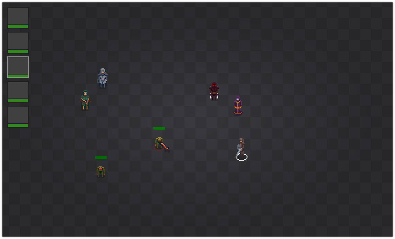
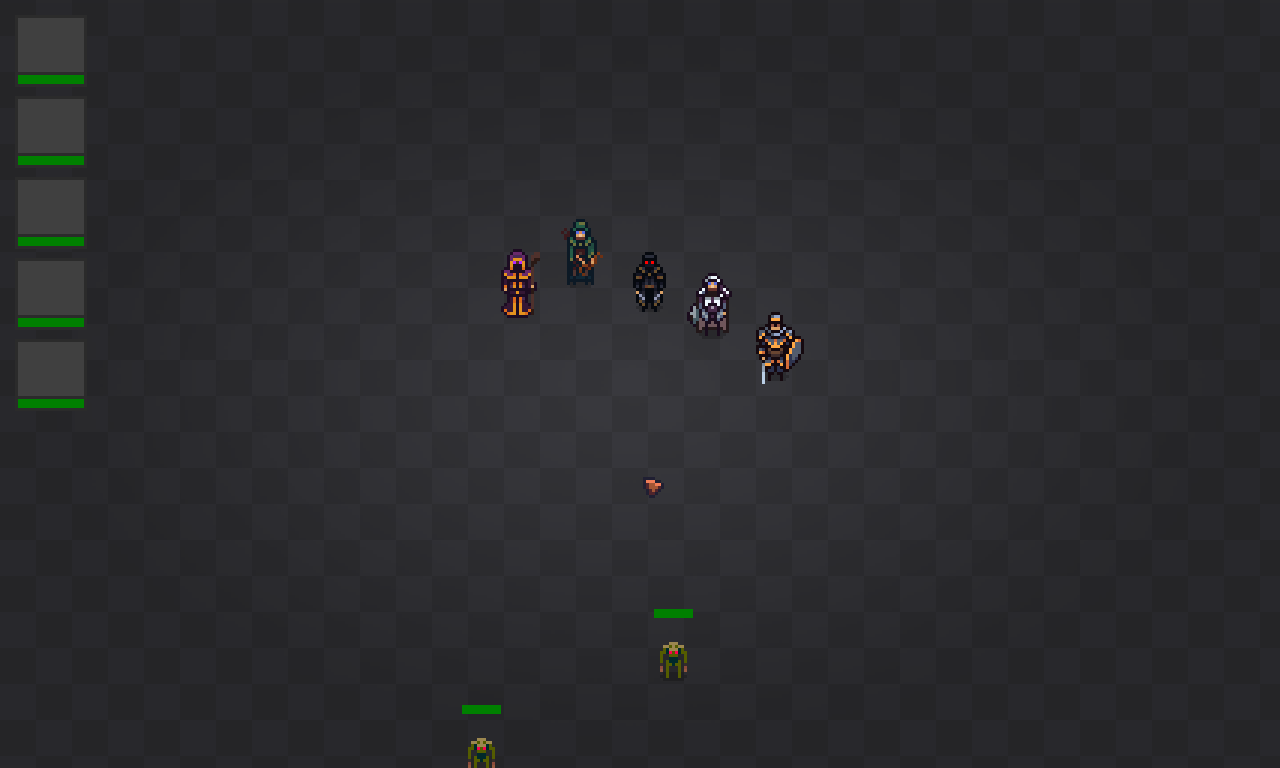
After working together for a few months now we've decided to kick it up a notch with a full-feature game. We've decided to start fresh on the design, but we'll be making a co-op RPG similar to what I wanted for Dungeon Core. I've been working on the hero designs so far; I had done up a few concepts for a prototype but we felt they were bland and a little bit lacking. So I stepped back, looked at my sprites from Dungeon Core and have merged the two to what will be the near-final design.
Prototype First Draft:
.png)
Dungeon Cores Hero Designs:

Redesign, 2nd pass:
Posts: 47
Threads: 3
Joined: Nov 2013
Reputation:
1
cool to see some pixelart in the forum :D The desings look really nice, keep it up! :)
Posts: 116
Threads: 5
Joined: Jun 2013
Reputation:
6
@Sir-lex - Thanks man :)
Alright so I've been working away on the pixel art side of things.
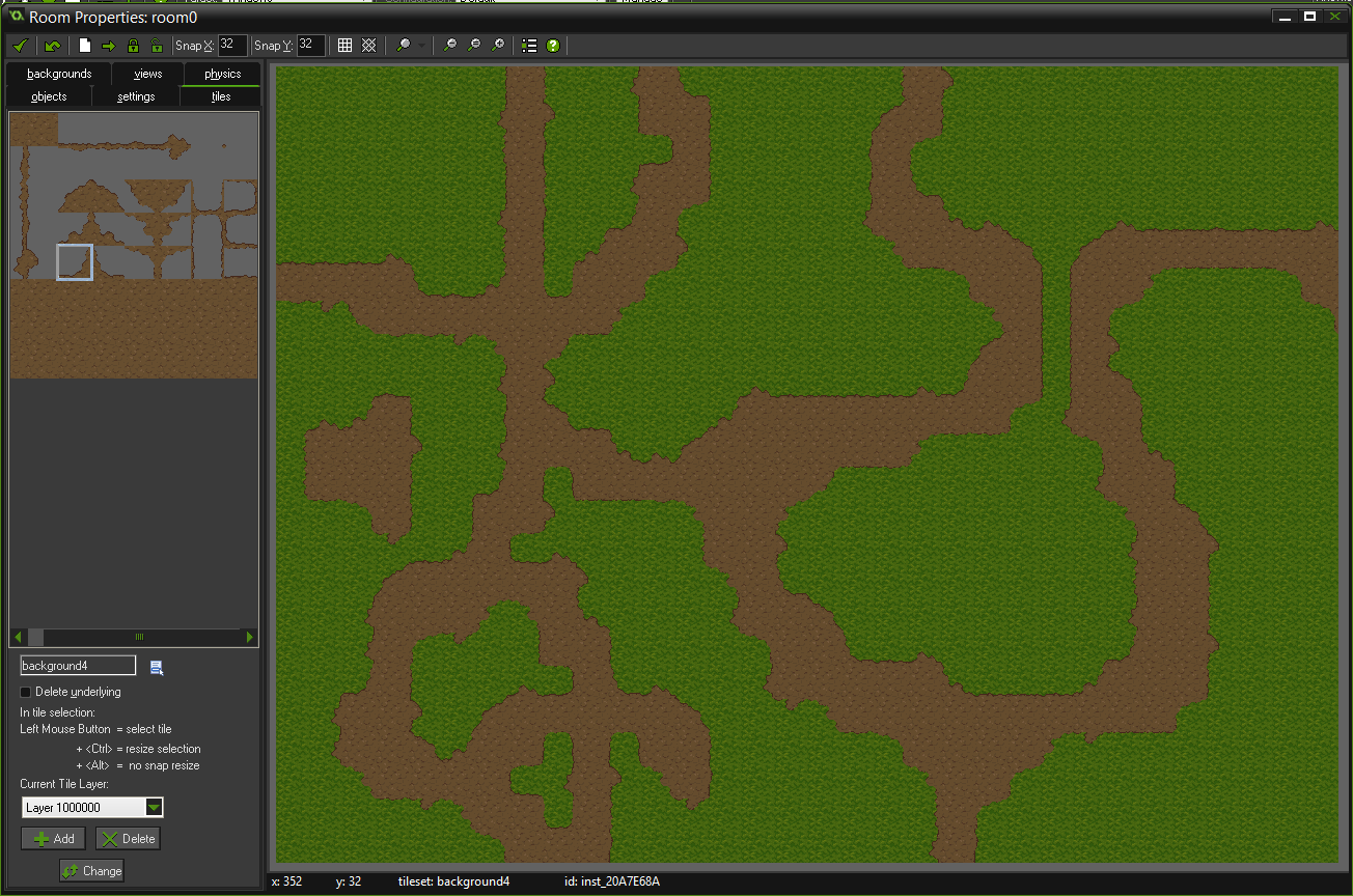
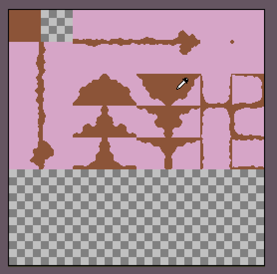
I designed a template for the road tileset. I wanted to keep it very flexible, allowing for a variety of paths and options, while trying to hide hide the fact that they're tiles:
I also did all the current hero designs for each direction:
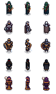
I'm also going to be adding the opposite side, instead of just mirroring the sprite in-game.
I also got the knight run animations done, again I'll be adding the opposite side-run eventually:
![[Image: 9MzwV3l.gif]](http://i.imgur.com/9MzwV3l.gif)
Posts: 1,118
Threads: 12
Joined: Nov 2013
Reputation:
63
The new stuff looks really cool, man. I tried messing around with game maker studio awhile back but gave up after a couple weeks of frustration in learning to write code. I have so many ideas for rpgs but I want to get good at this art thing too. I really like what you've got so far. I love all the old SNES-esque graphics. Is this going to be a turn based rpg or more of an action rpg like diablo?
|


![[Image: M5Cd5UJ.png]](http://i.imgur.com/M5Cd5UJ.png)
![[Image: S2OwrEm.png]](http://i.imgur.com/S2OwrEm.png)
![[Image: 43RfwOO.gif]](http://i.imgur.com/43RfwOO.gif)
![[Image: LhnA4vV.png]](http://i.imgur.com/LhnA4vV.png)
![[Image: E0kRmSl.png]](http://i.imgur.com/E0kRmSl.png)

![[Image: jlYZ2Bo.png]](http://i.imgur.com/jlYZ2Bo.png)

.png)


![[Image: 9MzwV3l.gif]](http://i.imgur.com/9MzwV3l.gif)