02-06-2014, 05:52 PM
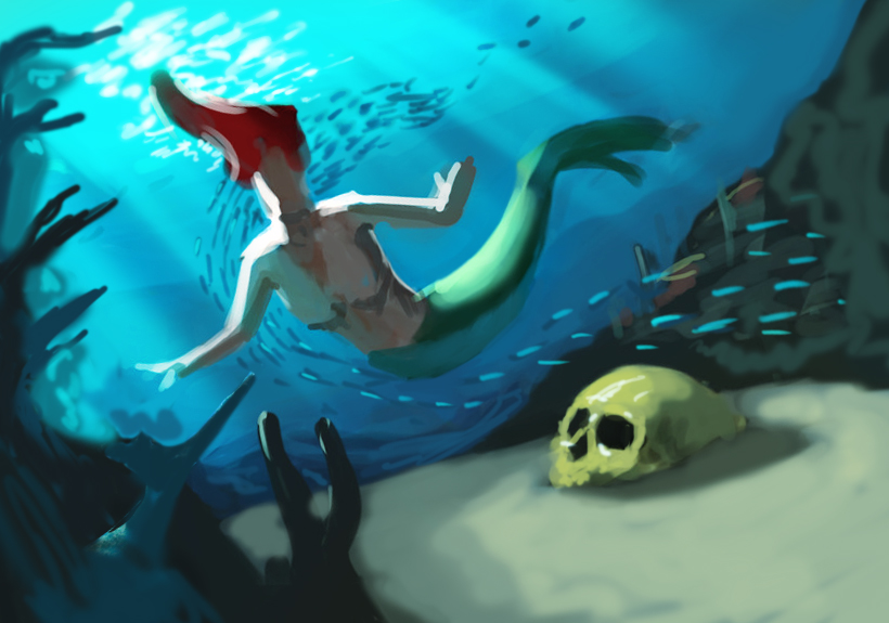
I started this trying to finish a complete illustration, but there´s something that bothers me a lot and i can´t figure it out, it´s 2hrs of work maybe, i rather see others opinion before i keep ruining it.
![[Image: Captura_de_pantalla_2014_02_06_00_06_51.png]](http://s28.postimg.org/42tdbwrd9/Captura_de_pantalla_2014_02_06_00_06_51.png)
![[Image: Captura_de_pantalla_2014_02_06_00_06_51.png]](http://s28.postimg.org/42tdbwrd9/Captura_de_pantalla_2014_02_06_00_06_51.png)
|
Mermaid
|
|
02-06-2014, 05:52 PM
I started this trying to finish a complete illustration, but there´s something that bothers me a lot and i can´t figure it out, it´s 2hrs of work maybe, i rather see others opinion before i keep ruining it.
![[Image: Captura_de_pantalla_2014_02_06_00_06_51.png]](http://s28.postimg.org/42tdbwrd9/Captura_de_pantalla_2014_02_06_00_06_51.png)
02-06-2014, 07:09 PM
looking really nice, love the clear water colour scheme.
all i would say is that you may want to have some foreground elements like little dark bits of coral or seeweed on say, the bottom right. just to place the camera. apart from that nice work! i dont know how far you've rendered, but you want to do some studies of hair in water before you do her hair i think, but i dont know if thats just a placeholder atm. Anyway keep going great stuff!
02-07-2014, 06:30 AM
What the story?What going on there is a mermaid for sure.The skull is a bit to yellow i would say.Can you show what kind of composition you want for.
02-08-2014, 02:14 AM
Really nice references, well, the story i want to to capture is the moment when she finds a golden magical skull, she is surprised and full of curiosity and atractted to the object.
i made a couple more sketches, not sure if it´s getting better. ![[Image: sirena3.jpg]](http://s7.postimg.org/b3wjjyygr/sirena3.jpg) ![[Image: sirena4.jpg]](http://s21.postimg.org/ugk1096br/sirena4.jpg)
02-09-2014, 05:48 AM
For the moment the skull in the number 2 is not the center of focus on number 3 it good
i prefer the composition of number 2 if i can tell you what i would do i would change the posture of the number 2 so that the left arm aim at the skull and also make sure the eye of the character also point on it.
02-09-2014, 05:58 AM
I think the third composition does the best job so far in leading the eye to the skull in the foreground. Maybe position the mermaid's limbs so that they lead the eye a little more? And I think that if you move the placement of her to the left of the image slightly, it'll make the fin point more towards it, too, which will also help.
02-10-2014, 04:09 AM
I agree that in the first image it is very hard to tell that the skull is meant to be the center of attention. i was actually surprised upon reading that its discovery was the story... so yes, the third image shows that much more clearly. i would, however, try to improve it more. for example as mentioned above by including elements to lead the eye towards the skull. you can of course make it stand out much more as well when you get to the rendering stage, but it's important to make these adjustments first. the rendering stage is just to intensify that focus if you want to.
02-17-2014, 07:54 AM
Hey we did a livestream critique and paint over for you!
You can check out the paintover below and watch for more detailed info.  Video here: http://youtu.be/ik0vhmEsDn8
Livestream Crits/Paintovers: www.twitch.tv/mike086
Loomis Study videos: http://www.youtube.com/user/mike086 My Facebook page: MCIII |
|
« Next Oldest | Next Newest »
|