paintover my study please?
#1
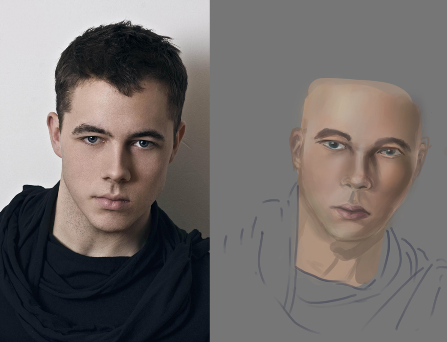
so I have been doing many skin studies, my ability to see the colors in skin has improved from when I first started but I still can't get it completely right.

someone who is good at painting skin, can you tell me what is the color on the left side of his face? (light color)

is it more pink? more yellow? I honestly can't tell. I laid down the base color based on the colors I saw on the shadow side.

also for lips, sometimes I have trouble painting them on men so that they look like lips and not like lipstick, any tips for this? more specifically, should I keep them less saturated, be careful about the shape, etc. ? (I mean when I am drawing from imagination)


Attached Files Image(s)


Reply
#2
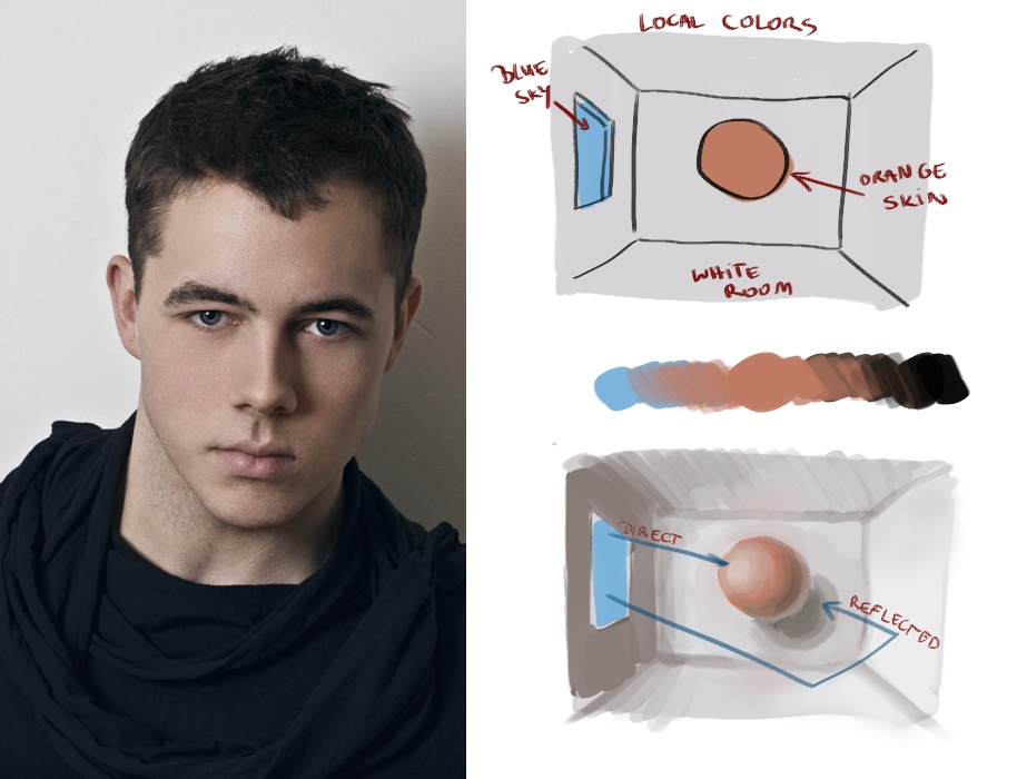
hey poyo. Try to figure out what is the environment and what is the color of light.
here's super simplified example based on the your photo


The source of light is more likely window with cool color temperature. The room is white, white is also cool color so reflected light will be cool too.
Now you have local color of skin - orange. We determined light is cool so highlight on skin will be cooler than local color.
For the shadow there's no other color to influence it besides white walls so in shadows the darker version of orange with reduced intensity will do.
If you check color wheel oranges and blues are complementary colors, what means mixing them will give as grays. Pick colors from few places on photo, you will see it's true. Lights and shadows are mostly desturated version of orange.
But, how I said it's simplified version and reality is a little more complicated. Skin don't have only one hue on whole surface and it's probably Photoshoped photo with unrealistic lights :D Try autoportraits to observe nature in purest way :)

Reply
#3
General rule of thumbs are, more greener shifted hues towards the jaw area of males, warmest reddest tones at cheeks, more yellow shifted on forehead. Notice shifted, means there is more than in the base colour but doesn't mean it's obviously so. Part of what gives skin its vibrancy is sub surface scattering and the fact that it is built up of layer upon layer of different material that light penetrates through to different degrees and varying absorption of wavelengths. Understanding this will help you build a model in your mind of how colours shift in skin. Read this to get an overview. http://douglasflynt.blogspot.co.nz/2012/...-part.html
Unfortunately he didn't finish the other posts...sound like they would have been equally awesome.

Also check out this on dA and also part two in the description for the different skin tones. http://navate.deviantart.com/art/SKIN-a-...-144294636

I slightly disagree with Madzia that simply a darker version of your base colour is a good enough approximation for the shadow areas. Colour variation is key to getting skin to look natural, so there should be hue shifting as she mentioned as well as value shifting, so make sure you do try and reflect this in your study. Nothing makes things look flat and dull like only using colours from a simple gradation from dark to light of one hue.
Also what madzia said., if you want to learn to paint a photograph along with all of its inherant biases and inability to capture light like the eyes does then simply duplicate the photograph. If you want to know how to do better skin, paint from life or the most "natural" looking images only.

I think with lips you have to pay special attention to the edges. The hardest edges are where the lips meet and the top lip shadows the bottom. Almost everything else is relatively soft, even the top lip with that classic bow shape, and in the pretty boy pout the dude has in your photo. Also pay attention the the actual shapes, forms and values you are looking at, and duplicate those, don't draw what you imagine a lip should look like. Pay close attention to the planes of the forms....these are key to getting the volume to them without outlining.
Lastly less saturation is necessary for unmade up lips. The key is correct form implied by your values and proper use of highlighting to show difference in texture and material

 YouTube free learnin! | DeviantArt | Old Folio | Insta
Reply
#4
thanks! this is some great advice, esp the part about cool light, and I agree about the photoshop lighting. I didn't really think about that before I chose my photos, I just took a bunch off google that were more high def than the others.

I fixed it a little:

Reply


Forum Jump:


Users browsing this thread: 4 Guest(s)