03-31-2014, 03:33 PM
Hey guys!
Jaik and I decided to resurrect the old Bloodsport challenges for fun & practice (and a little bit of nostalgia) - once a month, running for two weeks each. We would be happy to see some of you join the fun! We are going to post a new thread in the community challenge sub-forum for every topic, so everybody who wants to participate can post there and exchange feedback. There will be no judging in the end, and no enforcement of deadlines etc - it's all about the process and practice.
This month:
Action Figure Packaging!
Created by: Dave Rapoza
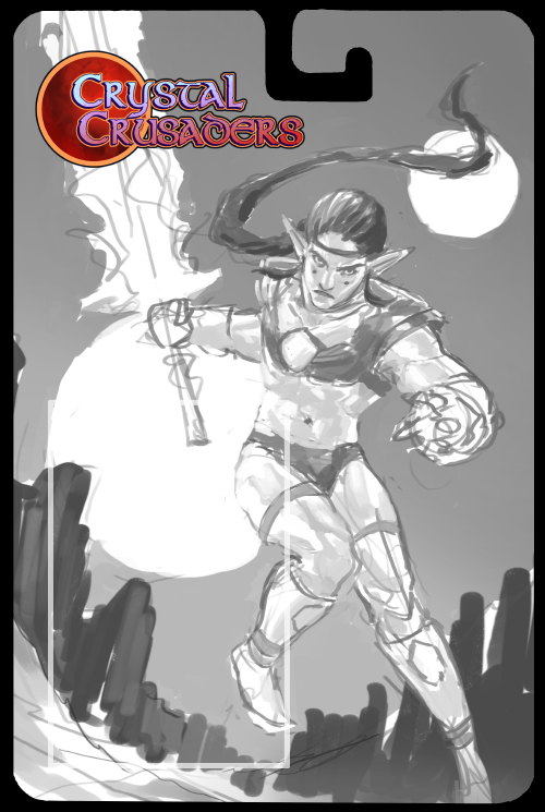
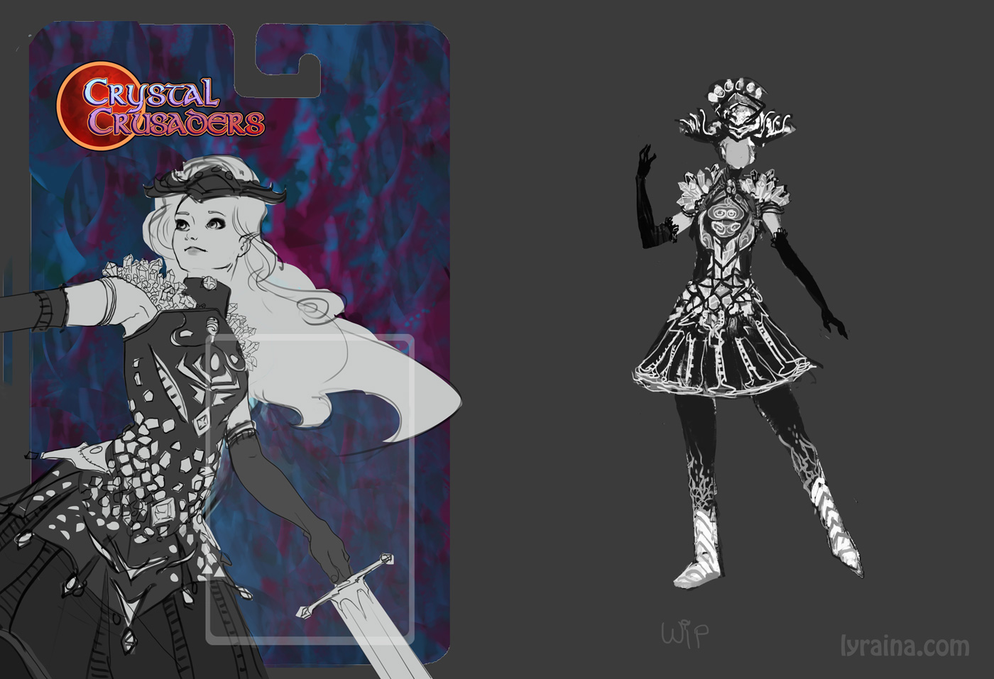
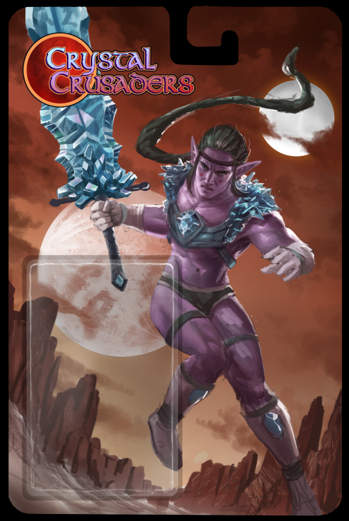
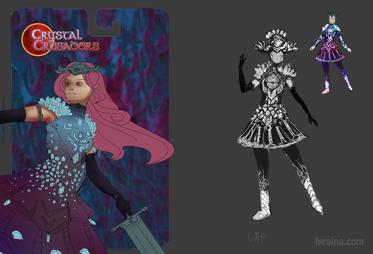
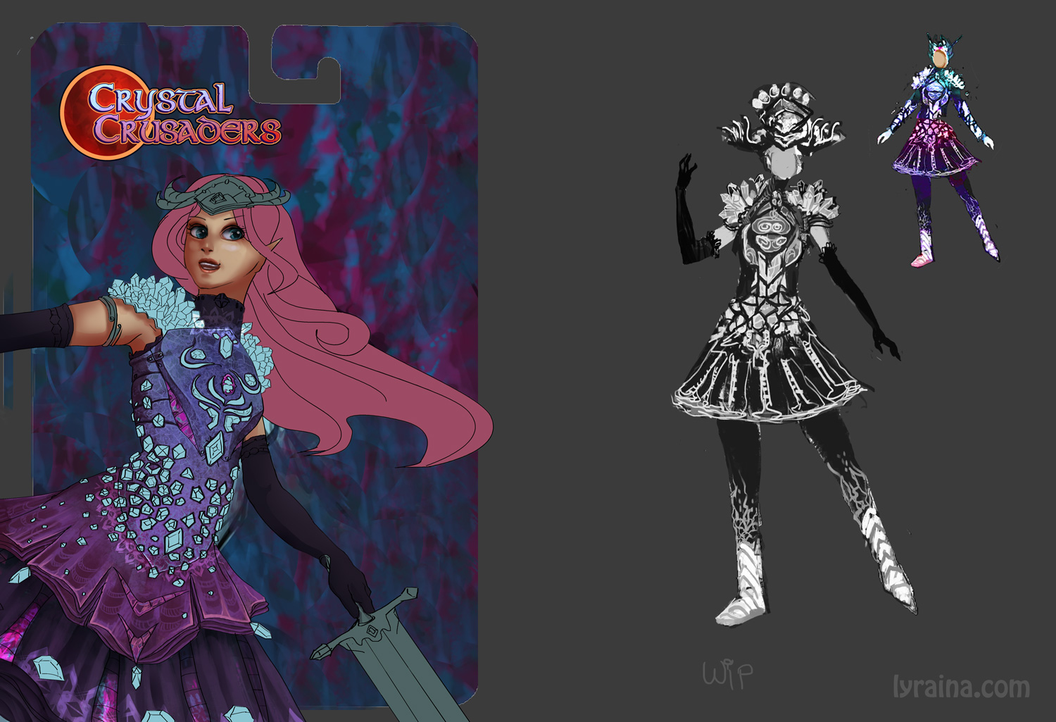
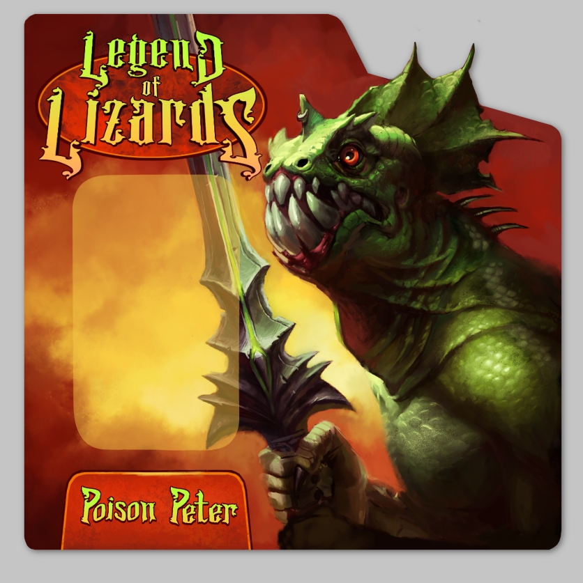
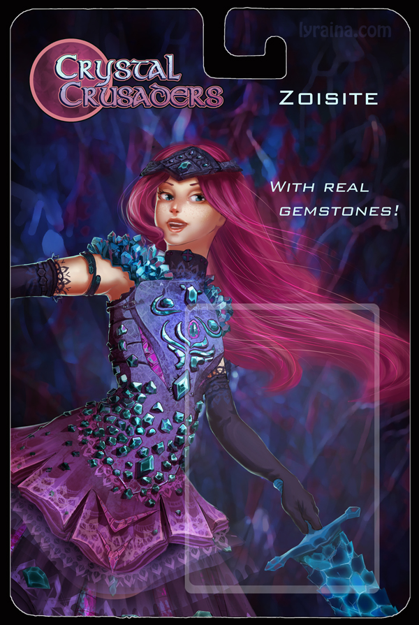
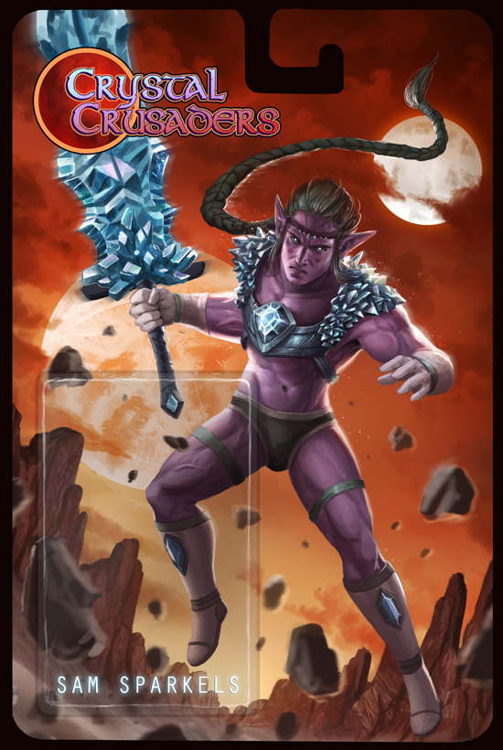
This challenge is to design a Action figure package using the provided template and logos. The character must represent your chosen property, feel free to interpret them any way you like, we want you to have fun with this! If you want to include little additional text about what it can do all action packed like feel free.
Use these logos on your packaging! Feel free to modify them if you need to regarding final products design. (OPEN IN NEW TAB, SAVE AS .PNG!)
Provided Properties! You must choose from one of these, its up to you to make them cool(thats the challenge)!
![[Image: CrystalCrusaders_logo.png]](http://img.photobucket.com/albums/v403/MrDelicious/CrystalCrusaders_logo.png)
![[Image: GorillaGuardians.png]](http://img.photobucket.com/albums/v403/MrDelicious/GorillaGuardians.png)
![[Image: LegendofLizards.png]](http://img.photobucket.com/albums/v403/MrDelicious/LegendofLizards.png)
Click here for package template:
http://smg.photobucket.com/user/MrDelici...e.png.html
Requirements:
- Must create a composition that includes space for the actual TOY!(you do not need to draw the figure itself, just the illustration of the figure on the package)
- Must use one of our THREE PROPERTIES! Character must represent the property in some way!
- Must use provided template although you can feel free to modify it with your own designs(cut into the package, etc.) IF you're doing something more like a 2 pack character feel free to do so.
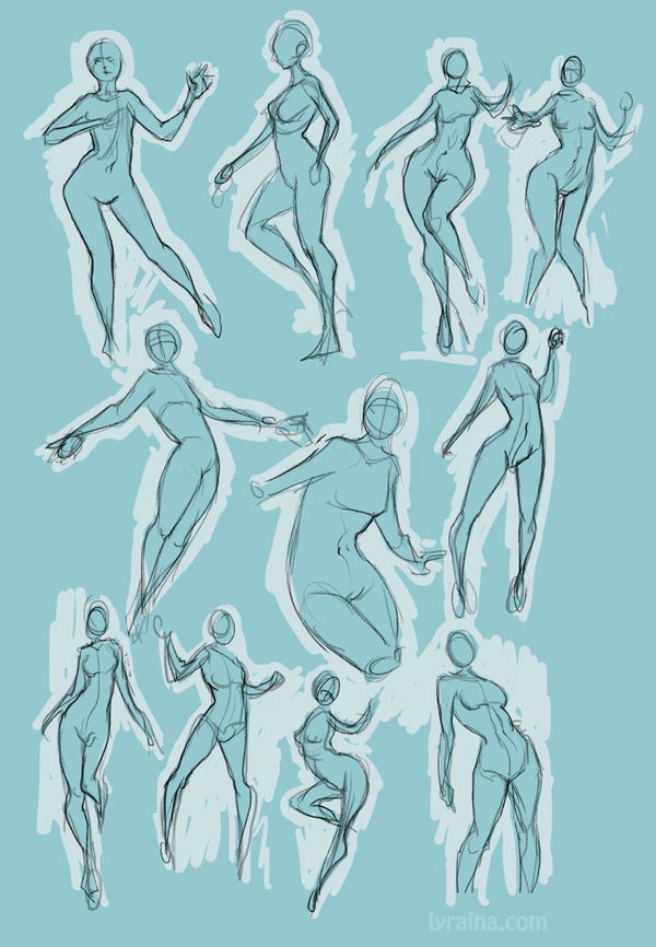
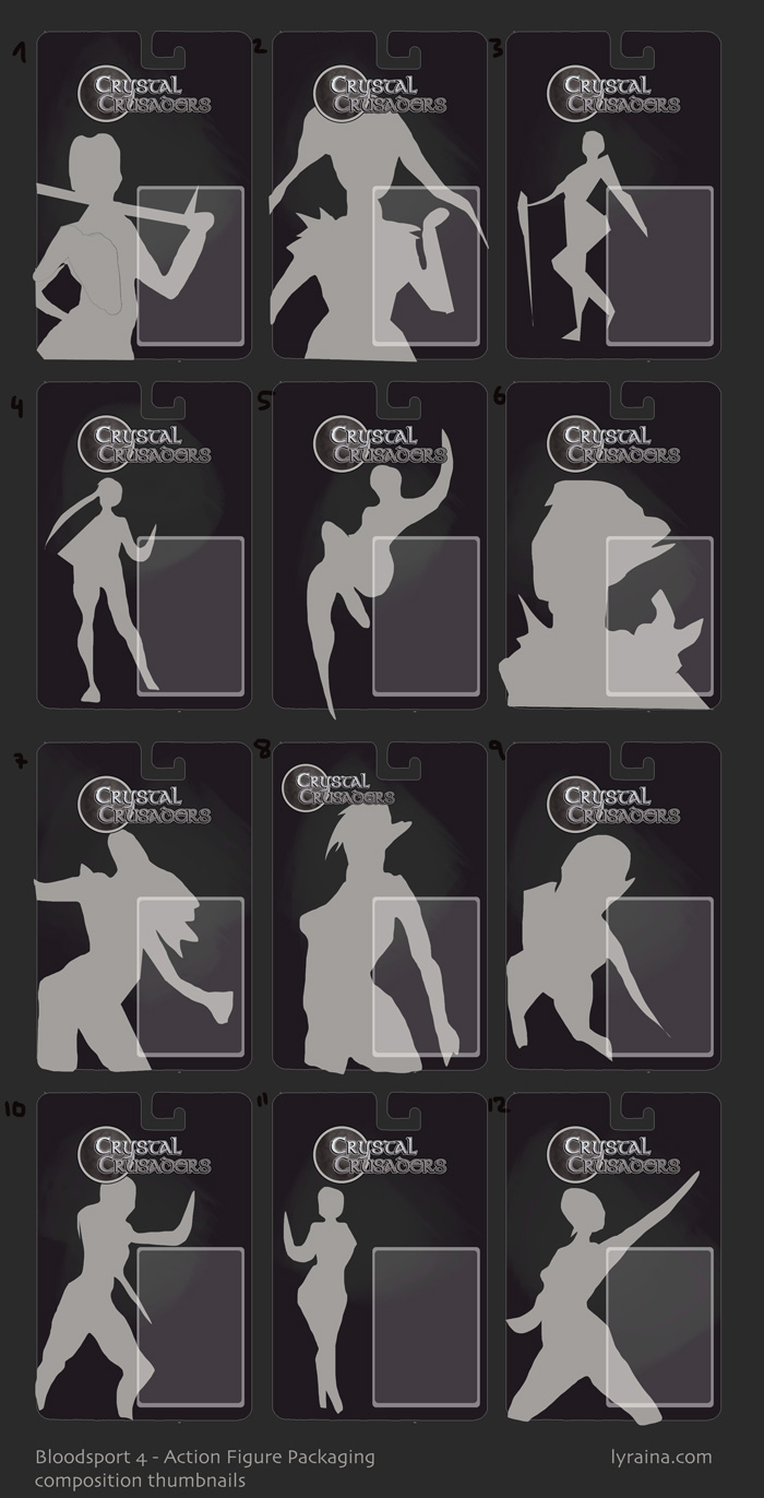
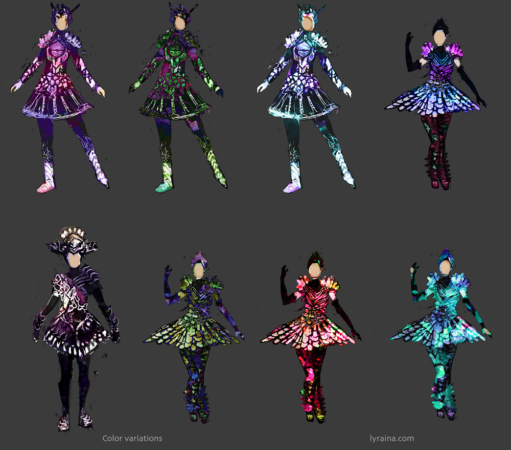
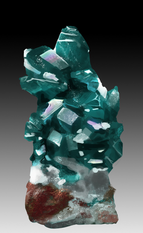
- Studies pertaining to finished illustration MUST be shown with the piece in order to be eligible to win. Studies MUST include compositional comps and thumbnails
- Studies must be relevant to the character design and elements used in the illustration.
Deadline: Friday, April 14th
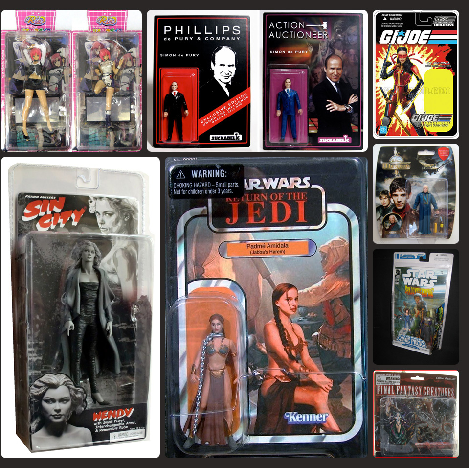
Examples! (You cant use these properties! just examples of other packaging!)
![[Image: ActionFigures.jpg]](http://img.photobucket.com/albums/v403/MrDelicious/ActionFigures.jpg)


