Posts: 1,970
Threads: 22
Joined: Apr 2012
Reputation:
243
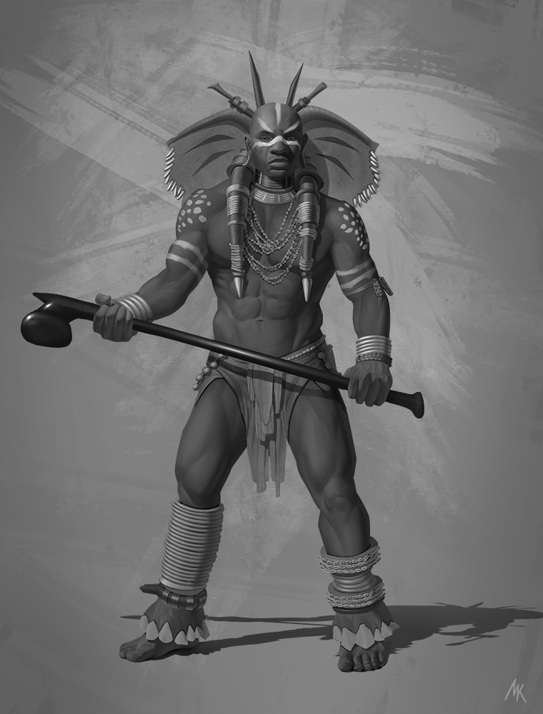
Sweet elephant design elements! I like the ears and tusks and the feet too. The rendering is simple and clean too. I do have a slight issue with his pose and some general anatomy things. I think it is the way his right leg is twisted in relation to the torso and general stance. It is slight, but something seems off with the connection there. Looking at his hip and torso angle you are implying more weight on his left leg (our right) and a slightly raised right leg. Instead both feet are flat on the ground with more or less equal weight distribution. Cover up his legs at the waist with your hand or a piece of paper, then remove it. You will see the disjointedness more clearly.
I find his right bicep a bit exaggerated or maybe not foreshortened well. His right trapezius also looks way too big if you consider where it would join up with the base of his head, compared to the other side. In general it seems you have an issue with some slight inconsistencies with twisting anatomy in general though your individual musculature seems pretty good overall.
In terms of design, I kinda want to see more of it. It's a great start, but seems a little empty. Perhaps more bodypaint with elephanty motifs, or something to connect his torso to the theme? Not sure there.
Posts: 1,970
Threads: 22
Joined: Apr 2012
Reputation:
243
No worries! I guess your foreshortening on that forearm is off given the hand angle, so perhaps that will solve things. I guess the best way to solve all that anatomical stuff is to shoot the pose yourself of a friend or yourself. Musculature may not be the same, but at least you could nail the balance of weight and foreshortening without having to guesstimate it.
I like the design additions on the club, works well. If you nail the pose and things it will be a nice piece overall. :)


