OK, since you are in such an early stage, I'm going to mainly look at the composition and shapes.
Starting off, I am finding it pretty hard to get my eye to settle on a clear focal point in the picture - in your comment you talk about the key element of the scene being the hermit's dugout, but that area is pretty misted out, so it is hard to tell what is going on. There are a number of ways you can make it more attention-grabbing though, so here are a few (of many potential!) methods:
1. When you colour it, use contrasting colours compared to the surroundings - perhaps he has painting or some artefacts that could do this. Colour contrast could stem from a difference in saturation or complementary hues.
2. Make it considerably darker compared to the background, pushing the drop shadow of the rocks more. Alternatively, if you do this is a certain way, you could have the shadow line bisecting the area so you have a light-dark contrast.
3. Put in some kind of light source and darken the surroundings a bit - maybe he has a fire going, or lamps, or magic, or fireflies or anything that will glow a bit.
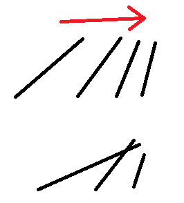
The spikes at the front have a nice interesting shape - they are all slightly different but with a consistent similarity that works well. However, the angle they point up with is so close to vertical, it is directing the eye off the top of the page, and the darkness they have relative to the background makes this read very strong indeed. So it may help to close the angle they have so they frame the focal point better. One possible solution to this could be to really tilt the outer most ones inwards, in order to create a gradient of angles that lead the eye in like a stack of falling dominoes. You might be able to introduce some overlap with them this way too (which would increase depth).

(Sorry for the MS Paint, but it is a simple point to illustrate.)
The broken top of the rock formation is working quite well as a frame. I like the way it creates a clear triangle, and the asymmetry adds a bit of a more dynamic feel. It may help to extend the canvas or shrink this in though, as it gets rather close to the edge of the image and is a bit distracting. Alternatively, increasing the size of the formation
may work, so that it is very much extending out of the frame. It depends on the feel you would prefer - maybe experiment in some thumbs. (For this it might be quickest to shrink a copy down and paste several onto a new canvas so you can paint over them and experiment.)
Definitely push attention to the fact that the back as collapsed though, it adds an interesting narrative and sense of time to the piece. Hope this helps!


