09-11-2014, 07:33 AM
i really appreciate the help :)
thanks
![[Image: ship_c_by_archamza-d7y0ust.jpg]](http://th02.deviantart.net/fs71/PRE/i/2014/248/7/6/ship_c_by_archamza-d7y0ust.jpg)
thanks
![[Image: ship_c_by_archamza-d7y0ust.jpg]](http://th02.deviantart.net/fs71/PRE/i/2014/248/7/6/ship_c_by_archamza-d7y0ust.jpg)
|
some pointers would be great
|
|
09-11-2014, 07:33 AM
i really appreciate the help :)
thanks ![[Image: ship_c_by_archamza-d7y0ust.jpg]](http://th02.deviantart.net/fs71/PRE/i/2014/248/7/6/ship_c_by_archamza-d7y0ust.jpg)
09-12-2014, 03:27 AM
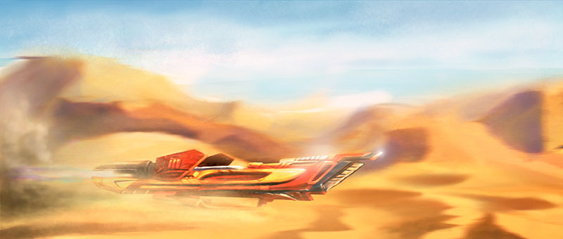
It would be interesting to add contrast between the background and the subject .A color thumnail for the vehicle could have save you some time if you didnt do it.The perspective make the vehicle read flat.
09-12-2014, 12:21 PM
As darkiste said, the car is blending rather well with the bright orange yellow sand dunes all around it, so it gets lost easily. I did a quick paint over in attempt to bring the car out by lowering saturation of the background, adding some cheesy bling to the car, and slightly brighten the colors of the car as well as adding some color to the jet flame behind it (although it's mostly covered up now by the smoke). I also tried to push some of the distant dune back a bit by adding magenta and blue shading over them. Here's the paint over, see if it's similar to what you're going for:

09-12-2014, 04:28 PM
thanks guys thats very helpful
yea you are right , i see it now , there isnt much depth in he image, the magenta touch was very good and it helped a abit but yea it needed more to it. i like the smoke behind there, it expressed the speed even more and split the background abit more. the blings are abit too strong in a sandy enviroment i feel but i see where you are going with it. i think one on the wind shield would have made it even better. thanks guys ill work on those more especially making a difference between the hero object and the rest of the scene
09-12-2014, 11:08 PM
(09-12-2014, 04:28 PM)archamza Wrote: thanks guys thats very helpful Here are all the reference image I looked at for the paint over, in case you find them useful. I would be careful about especially landscape reference image, because a lot of those are not true color, but with color and light altered by the camera's HDR or some other function. http://www.namibian.org/travel/lodging/p...nes_fs.jpg http://www.itourbeijing.com/admin/letter...875000.jpg http://i.telegraph.co.uk/multimedia/arch...98005i.jpg https://www.google.com/search?q=desert+r...CAcQ_AUoAg https://www.google.com/search?q=jet+engi...CAYQ_AUoAQ
09-20-2014, 02:20 AM
these are quite useful thanks man
ill work on my drafting skill more :) |
|
« Next Oldest | Next Newest »
|