Posts: 2,817
Threads: 15
Joined: Jun 2013
Reputation:
109
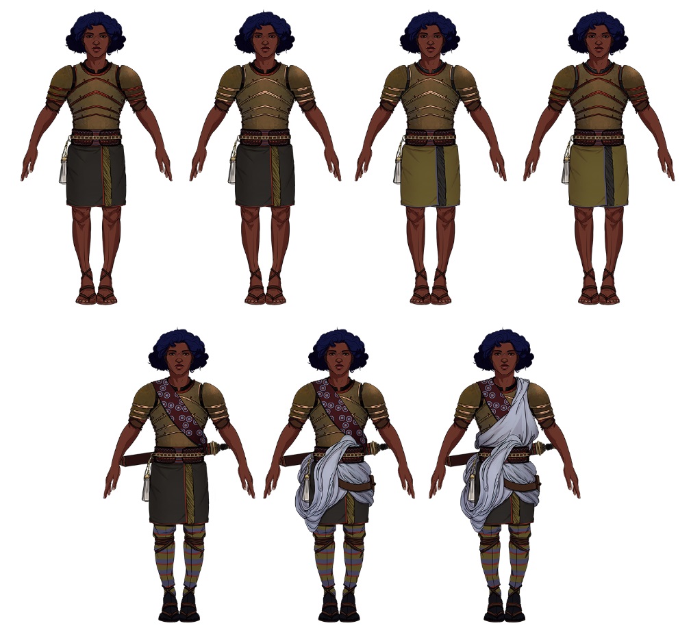
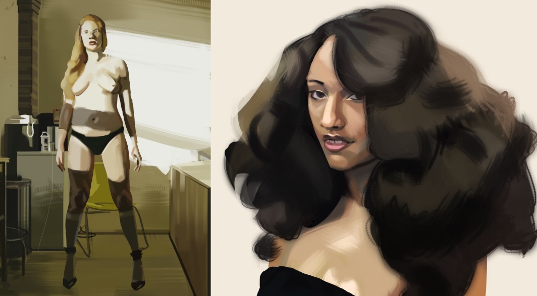
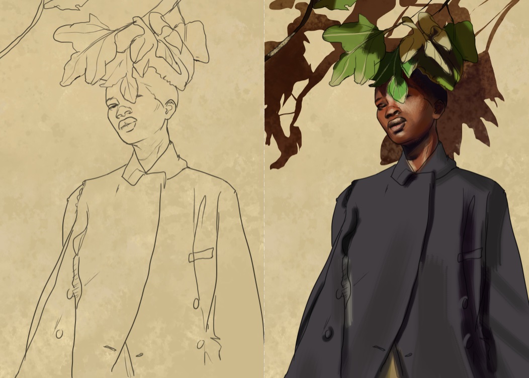
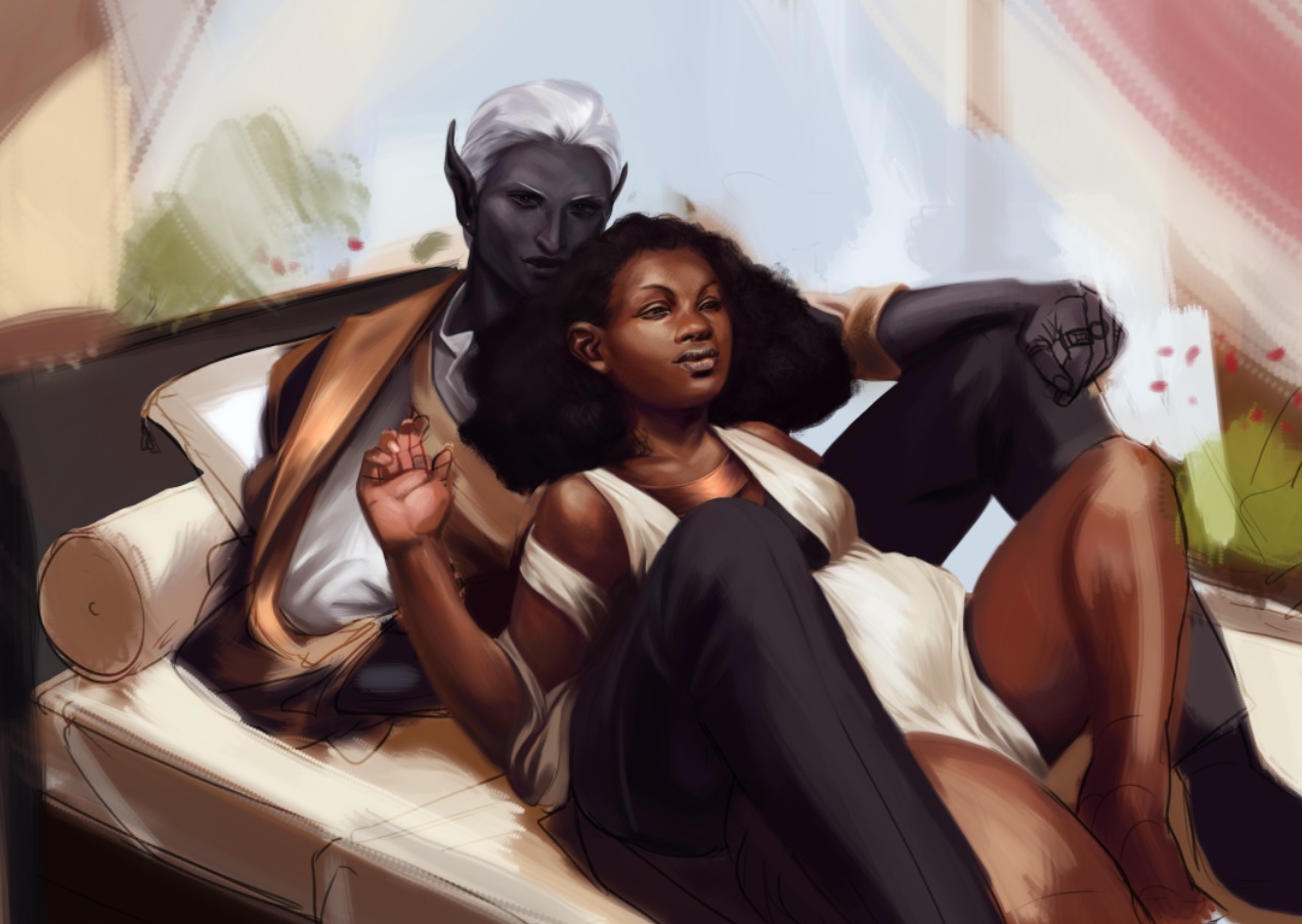
you got a solid schmexy style <3 I think you could push your anatomy and form lovin a bit more. For instance the black woman in the last one i look at her leg and i see your indicating the tibea and the gastrocnemius, but you could always indicate more patella near the knee cap. Sure the default construction of a thigh is a tube shape, but you can do so much more with the contours, and still make it effeminate, just add a new level of realism.
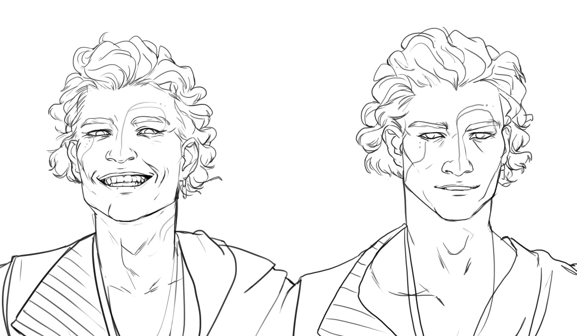
And expressions, smiles and pouts arent the only expressions in the world!
Posts: 3,361
Threads: 37
Joined: Aug 2013
Reputation:
234
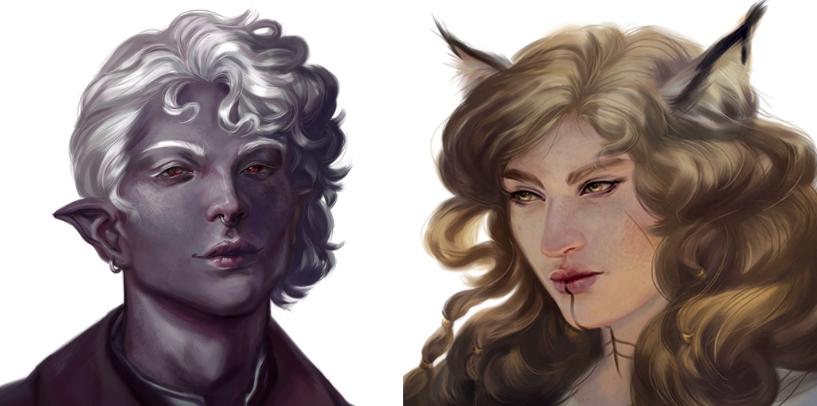
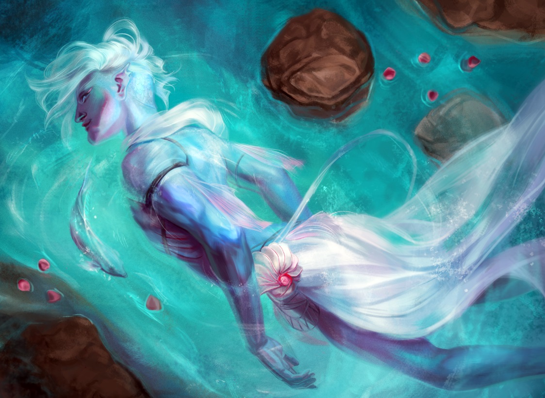
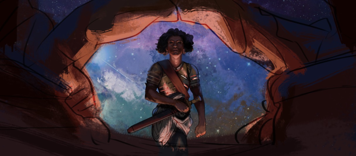
I see fantasy but i don't see a great depth of creativity.A few dark elve and that pretty much it.Would be fun to see you also draw ugly people you seem to really love drawing only good looking people... Idk if you have fallen into a comfort zone or what just try to stay creative.Idk if you aim to do character design,illustration, or portrait but it seem to fit you.If you choose to work more toward illustration i think you need to work on stronger storytelling and stronger composition(you alway put the focus at the center of the image as far as i have observe).
Posts: 3,361
Threads: 37
Joined: Aug 2013
Reputation:
234
I wish you would put more energy in those drawing atleast in the earlier stage just push those pose play with stiffness or fluidity you want those figure to tell a story just by the way they move.Try to think of gesture as emotion or as trait of personality.A noble doesn't stand the same way a peasant does.
Not sure if you mean critic on that but also play on facial expression.Not just serious face, smile face and model face.Laughing face sad face evil face etc.
There more you give them attitude and imperfection the more original they become.
Posts: 3,361
Threads: 37
Joined: Aug 2013
Reputation:
234
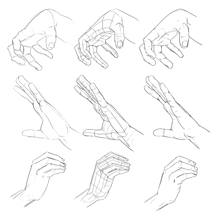
Can you upload the reference along your work you will get better critic.I think you might need to work on foreshorting.If you plan on doing illustration.
Posts: 2,817
Threads: 15
Joined: Jun 2013
Reputation:
109
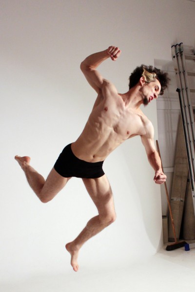
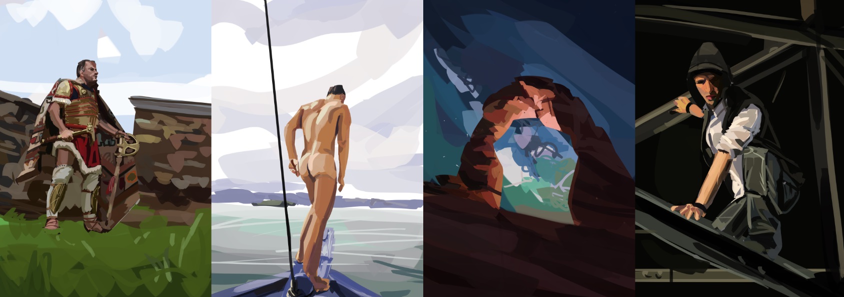
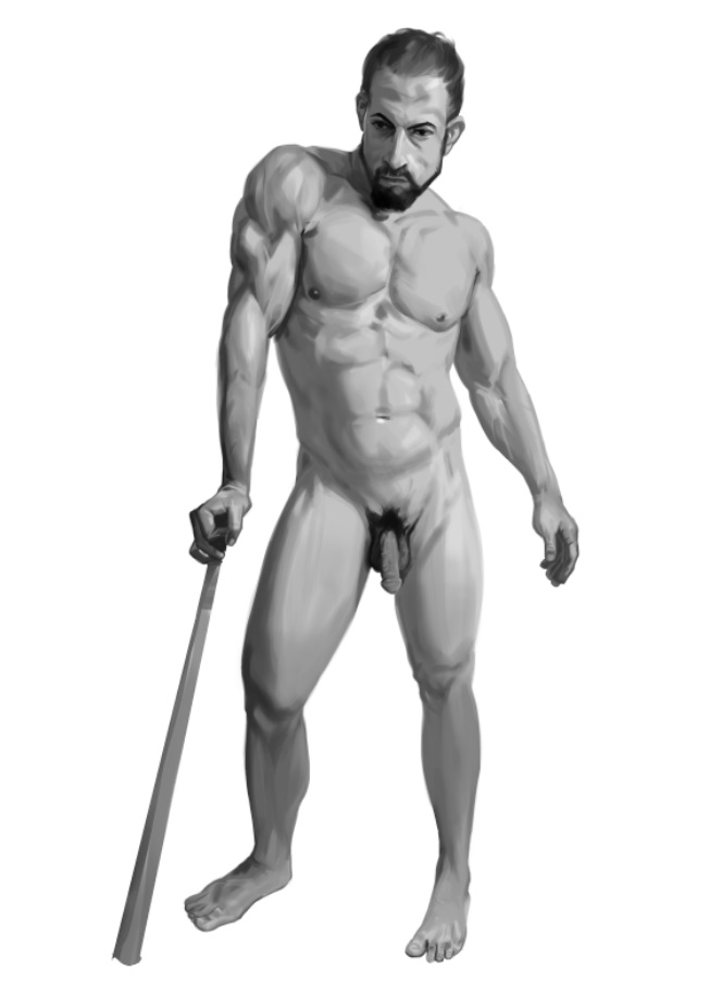
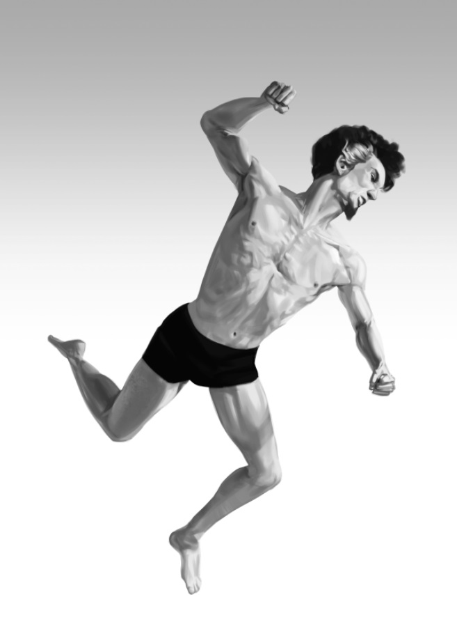
for the leaping guy, id take another look at his forearm behind his head, make sure those contours line up because the ulna bone i believe doesnt curve that deep behind the wrist insertion. He also has really high cheek bones, and his arms feel tiny, mainly because you made his chest wider than in the reference.
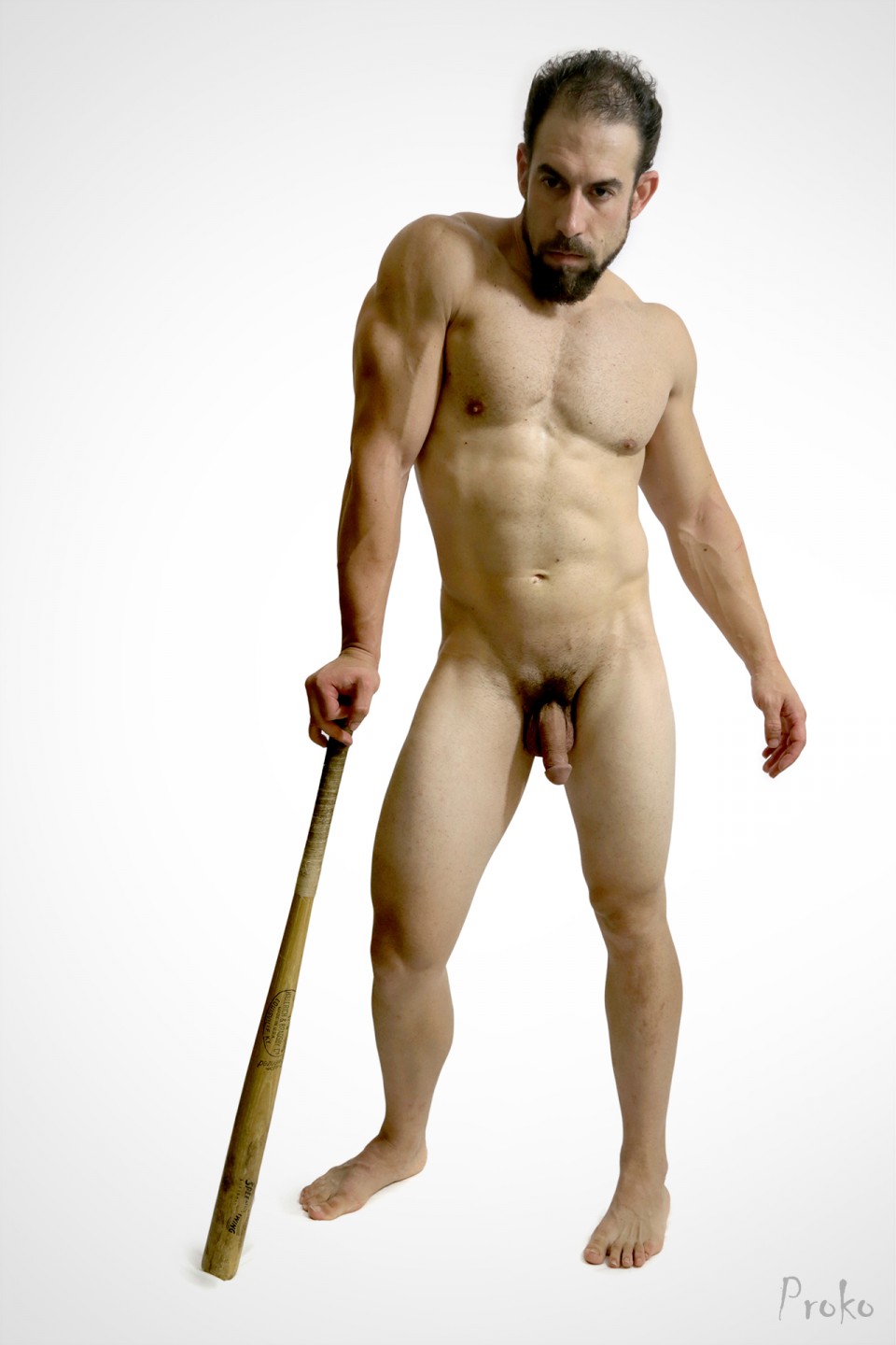
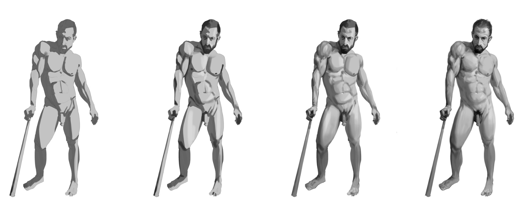
youre pretty close with the other one, again just the forearm that isnt holding the cane, see how the contour of yours ends under the bicep, but in the photo its over the bicep on the top muscle, i believe its called extensor digitorum, its not a concave muscle. Also his naval is slightly off center, same with the abdominals, make sure they follow from a symetrical line from the sternum :)
.jpg)
.jpg)
.jpg)
.jpg)
.jpg)
.jpg)
.jpg)
.jpg)
.jpg)
.jpg)
.jpg)
.jpg)
.jpg)
.jpg)
.jpg)
.jpg)
.jpg)
.jpg)
.jpg)
.jpg)
.jpg)
.jpg)
.jpg)
.jpg)
.jpg)
.jpg)


.jpg)
.jpg)
.jpg)
.jpg)
.jpg)
.jpg)
.jpg)
.jpg)
.jpg)
.jpg)
.jpg)
.jpg)
.jpg)
