10-29-2014, 01:06 PM
This might be going too far from the necromancer theme, but I'm enjoying it.
![[Image: GR4LYkM.png]](http://i.imgur.com/GR4LYkM.png)
![[Image: GR4LYkM.png]](http://i.imgur.com/GR4LYkM.png)
|
CRIMSON CHOW #5 - Necromancer WIP
|
|
10-29-2014, 01:06 PM
This might be going too far from the necromancer theme, but I'm enjoying it.
![[Image: GR4LYkM.png]](http://i.imgur.com/GR4LYkM.png)
10-29-2014, 07:22 PM
These WIPs are looking amazing, this is going to be interesting :)
Brainstorming. Summoning the Cthulhu with the power of music, maybe. ![[Image: ary5WJv.jpg]](http://i.imgur.com/ary5WJv.jpg)
Sketchbook ~ Blog ~ Deviantart ~ Livestream
10-30-2014, 01:19 AM
Great stuff so far everyone
I've missed the last few challenges so I decided to push myself further this time around trying things I don't necessarily like visually just to see what happens. Went with a more cartoony style at first but then quickly lost interest and went with something voodoo inspired. Also trying different themes within that (burn victim, mechano-mancer etc). Concepted some books and staffs as well. Trying to avoid the cliche designs but man is it hard :( ![[Image: 2m60k61.jpg]](http://i57.tinypic.com/2m60k61.jpg) ![[Image: vpfdpy.jpg]](http://i62.tinypic.com/vpfdpy.jpg) ![[Image: x6abh1.jpg]](http://i58.tinypic.com/x6abh1.jpg) ![[Image: 1060v9k.jpg]](http://i57.tinypic.com/1060v9k.jpg) Now time to pick one and go through some detailing concepts!
10-30-2014, 04:30 AM
You guys (and gals?) rock! I noodled a little yesterday. Who knows if I'll finish it, but I am having lots of fun so far. I'm going for a more organic design process hence nothing looks like anything yet. I dunno but I personally find doing iterative designs really really freaking tiresome haha at least I know what I like. (+1 for illustration, -5 for concept design) :P
Kudos to Terran for the crits! :) @JJAaron : Just a quick one. I know you are in transition stages to paint, but already I sense some loss of vitality from the original sketch. I think your linework was really good and added to the feel of the piece, and you are losing this in your blockout. Unless you are changing the comp, maybe keeping the sketch on multiply or checking every so often back during the process will help? I also prefered the original more creature-y face..makes the character more interesting...though might be taking away from the necromancer feel? Oh also my screen isn't calibrated properly yet, so if you could let me know if it is too dark/light etc for you and you are on a calibrated screen that would be really useful. Cheers! 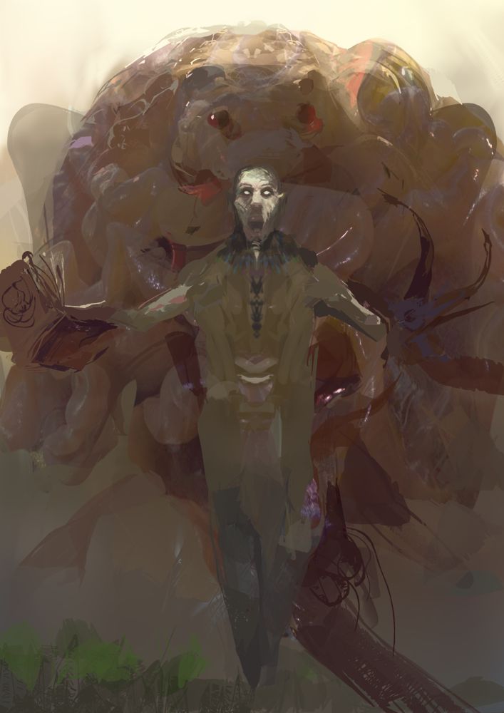
10-30-2014, 09:50 AM
Those colours are awesome; very ruan Jia like atm. I'm not on a calibrated monitor but it winds up being relative in the end if the values are laid out ok, and right now they seem very washed out to me.
I think the monster could stay that way, but definitely punch out the necromancer a bit!
10-30-2014, 10:40 AM
(10-30-2014, 09:50 AM)Beardley Wrote: Those colours are awesome; very ruan Jia like atm. I'm not on a calibrated monitor but it winds up being relative in the end if the values are laid out ok, and right now they seem very washed out to me. Dude that's an awesome compliment! :) I'm looking at it again from work and the colours and values are a lot more washed out than on my home screen. My screen must be way too contrasty / bright. Thanks that helps a lot.
10-30-2014, 01:29 PM
the colors on the top monster are really nice amit! more progress on mine.. and i don't mind rendering the whole thing Rafa it's a gooder learning experience :)
70+Page Koala Sketchbook: http://crimsondaggers.com/forum/thread-3465.html SB
Paintover thread, submit for crits! http://crimsondaggers.com/forum/thread-7879.html [color=rgba(255, 255, 255, 0.882)]e owl sat on an oak. The more he saw, the less he spoke.[/color]
10-30-2014, 01:31 PM
So I dropped the ball on silhouette, but I sort of worked myself into a corner with the standard cult cloak thing. I wanted this atmosphere more than I wanted to force wind to try and break it up. Just gotta keep fighting the values and saturation until they are where I want 'em. decisions decisions decisions
Keep pushing yourselves guys and crits are welcome ofc!
10-30-2014, 07:09 PM
Man, this is so exciting. Great job guys :D @pnate That's very original approach. I love guitars so you know, you got me here :D I can't wait to see the final versions :) Thanks @atenr. I know it's ton of shit there but I think it fits with the necromancer idea ;) Because he's old he's hunched a little that's why the neck seems weird. I moved his right arm back a little. He'll be holding a stuff in his left hand also so I'll rearrange that. I'm going with something like this but with greenish instead of red. Red does not work too well.
![[Image: wip_by_afternoon63-d84najx.jpg]](http://fc06.deviantart.net/fs70/f/2014/303/e/a/wip_by_afternoon63-d84najx.jpg)
10-30-2014, 07:37 PM
Beardley, woah, that's some serious design exploration! Great to see!!
atrenr, I like how your design is coming along. Has a good feel to me. Not sure about the framing - looks a bit like juuuust the feet got cut up (like those photographs where people forget to check if the feet are in frame) - maybe extend that to include it, or crop a bit higher so that it is closer to a medium long shot? Sorry for the nitpick :p Really like it though! Mike, great design, love it. I like the color scheme. Right now, the green and yellow really stands out to me, more than I would think appropriate for just some random bottles on his belt. Unless they are super important for some reason, maybe consider toning them down a bit, or mix some of those colors in other parts of the design too? To make it a bit more unified? I'm so late to the party again! Ugh. I had this idea of painting a little necromancer kid going through parent's study for the ChoW, but scrapped that idea. So I started with some pose exploration while thinking about how to not make the design too cliché. Nobody must ever find those ref videos I made of myself performing spellcasting motions! I find it hard to find appealing poses with subject matters like this. Either too weird/nondescriptive, or been done a million times. Also trying to push anatomy/pose to support the character/story. Design wise, I keep drifting too much towards goth, or tribal/witchdoctor stuff, which both doesn't feel quite right ... it lacks the creepy, ugly weirdness. But I'd also like to refrain from too many skulls or tentacles... tough one. 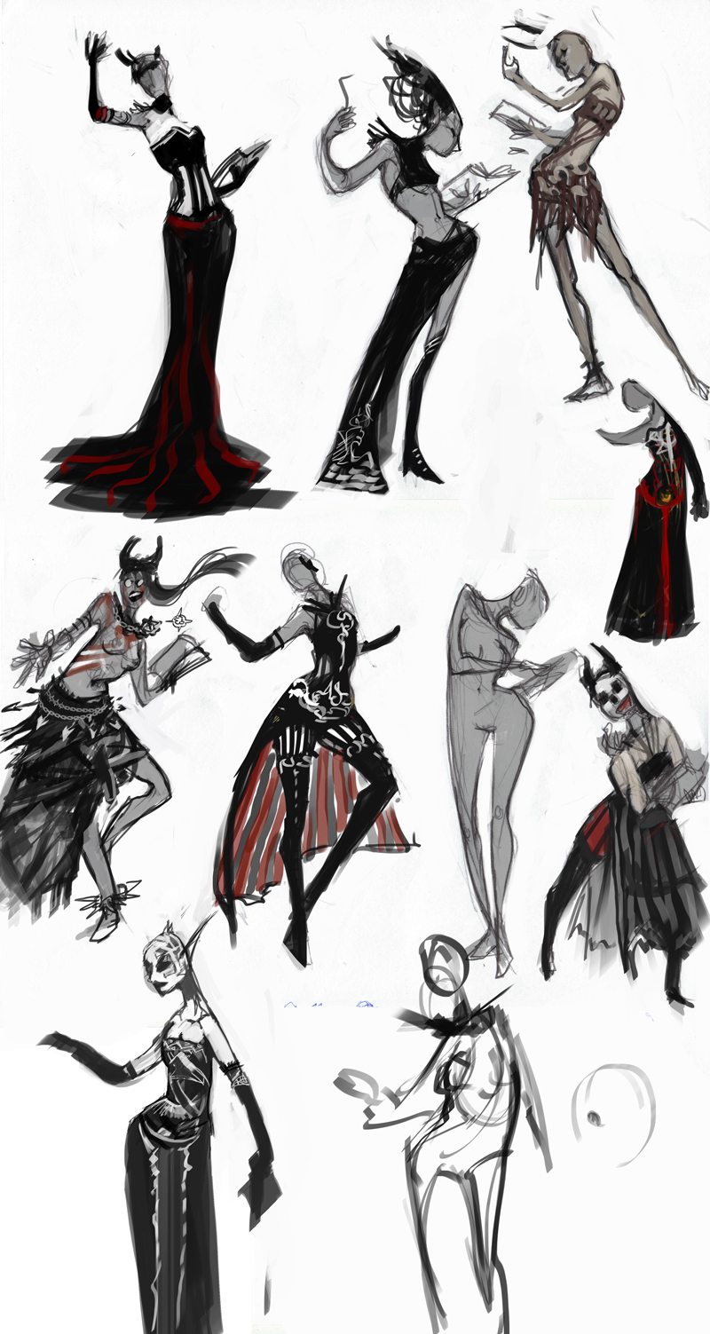 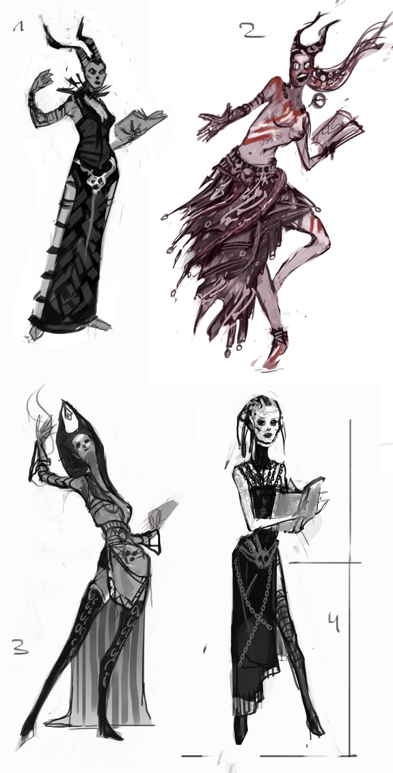 (sorry, totally forgot to clean up that sketch sheet from unneccessary poses, lol)
10-31-2014, 01:11 PM
more work on mine, just some more cleaning up to do tomorrow! probably add some more bells and whistles to the girl. and little doohickeys and symbols and stuff maybe a pentagram OF SATAN!!!
Dang lyraina those are some dynamic poses! No such thing as too many tentacles and skulls NONE!!!! Mike i like that guy hehe he has a lemon and a lime on his belt i wanna get one :) beardley those sigils and staffs are AWESOMME!! The little tank robot guy is so cool, i would be his friend even though he looks kinda upset about something >.>. Maybe if i had trees growing out my back i'd be pissed too could get itchy! Pnate: the girl has a really sexy leg, like jessica rabbit but all fun voodoo heheheh! dang that guitar guy looks like a dude i used to be in a metal band with just less cooler costume same smile. He smelled like a fucking dumpster, one time he sat on my couch and my mom said when he left, "which one of your friends shit their pants?" JJArrrroooon: You have some good shape language skills; that dude looks real srs! Rasta: dang i wished i could draw swirly thangs like that, reminds me of like the emperors new groove they have that shape alot. You really nailed the face, its GOOD proportionally hell everything you do is pretty solid I'm glad we are all doing this we need MORE PPL DOIN IT!!!!!! GET CRAZYY HEHEHEHEOASDIOFIOAIOAOIFOIASOIFOSAFAOISFASIOFASOFIHASFOIASFOIHASF!!!!!!!
70+Page Koala Sketchbook: http://crimsondaggers.com/forum/thread-3465.html SB
Paintover thread, submit for crits! http://crimsondaggers.com/forum/thread-7879.html [color=rgba(255, 255, 255, 0.882)]e owl sat on an oak. The more he saw, the less he spoke.[/color]
11-01-2014, 06:52 AM
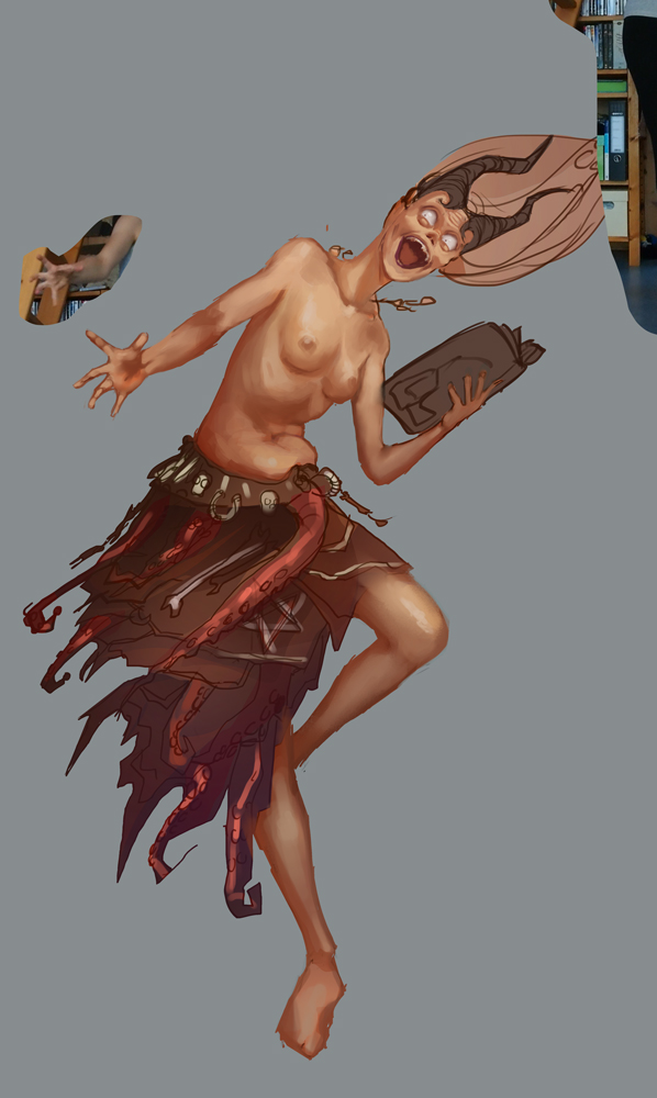
WIP, don't know if I can finish this time...
11-01-2014, 06:19 PM
MAAAAAAN diggin the crits yall are giving eachother. Gonna try and give some on finals :)
11-02-2014, 07:34 PM
Crap just seen this. going to see if I can wip something up fast, such a cool topic
(wip 1 + 2) 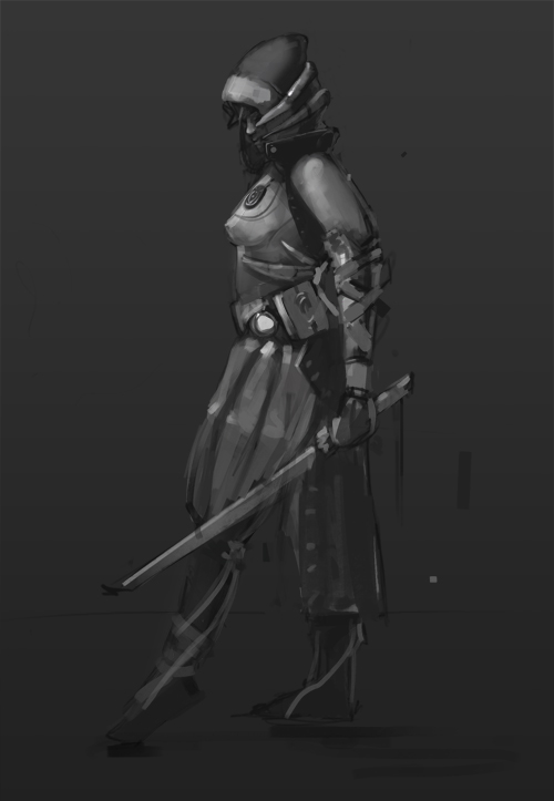 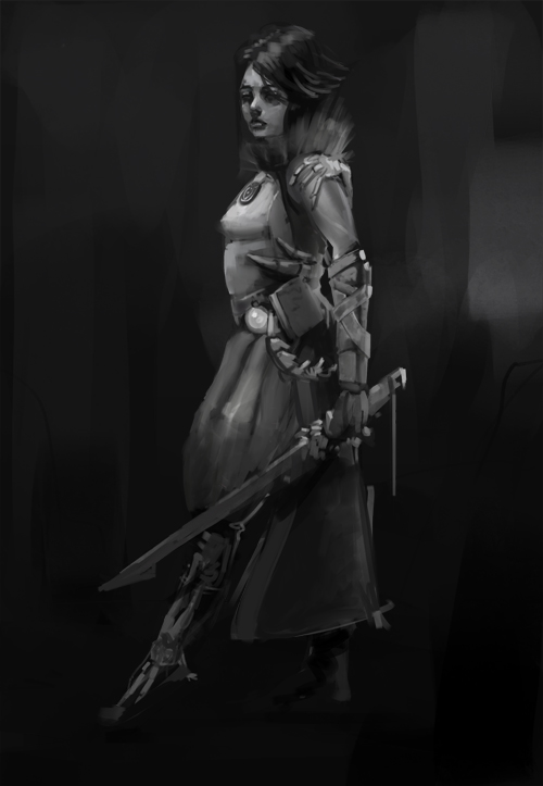
11-02-2014, 07:55 PM
Won't end up finishing this one on time, but super excited to see all the amazing entries from everyone!
![[Image: bWCToTE.jpg]](http://i.imgur.com/bWCToTE.jpg)
Sketchbook ~ Blog ~ Deviantart ~ Livestream
|
|
« Next Oldest | Next Newest »
|