This Sketchbook Sucks by Audie
#1
Aka Working Title Sketchbook by Audie


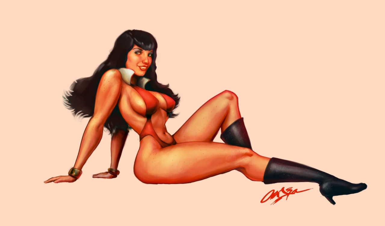
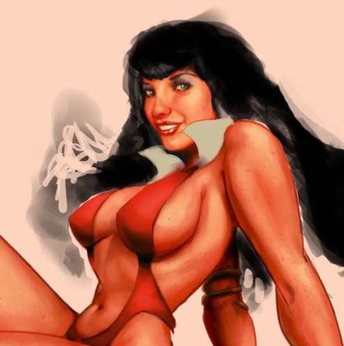
For Trinqutte's Powergirl & Wonder Woman weekly challenge - didn't make the cut



Regular Show x Army of Darkness. Something for Halloween.


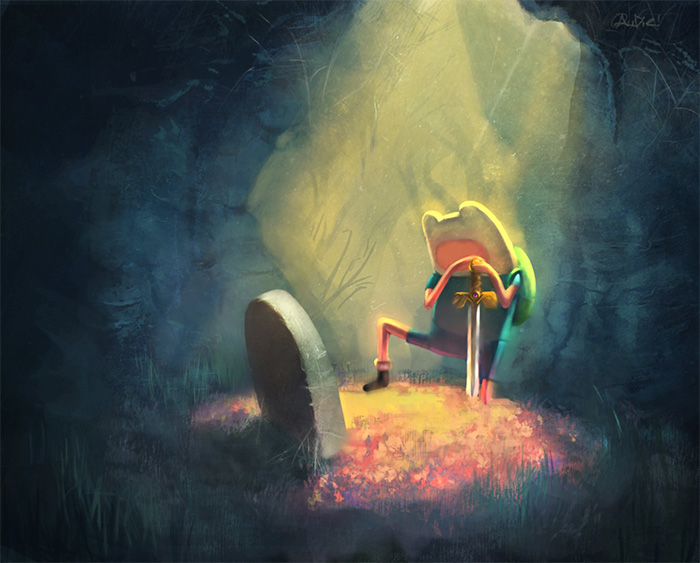
Color study and messing with some environmental brushes. I want to get into it. Need to incorporate some received critiques sometime.


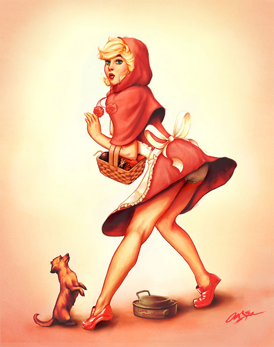
For Trinquette's weekly challenge, which, again, did not make the cut. Eh, I like it.


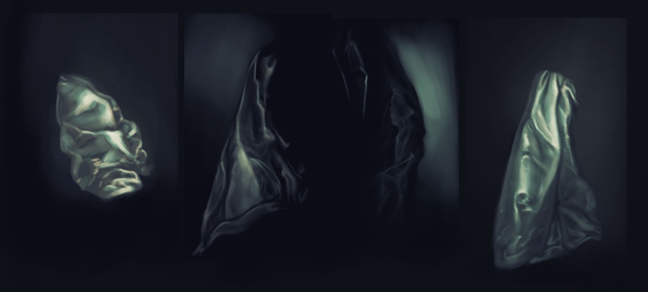
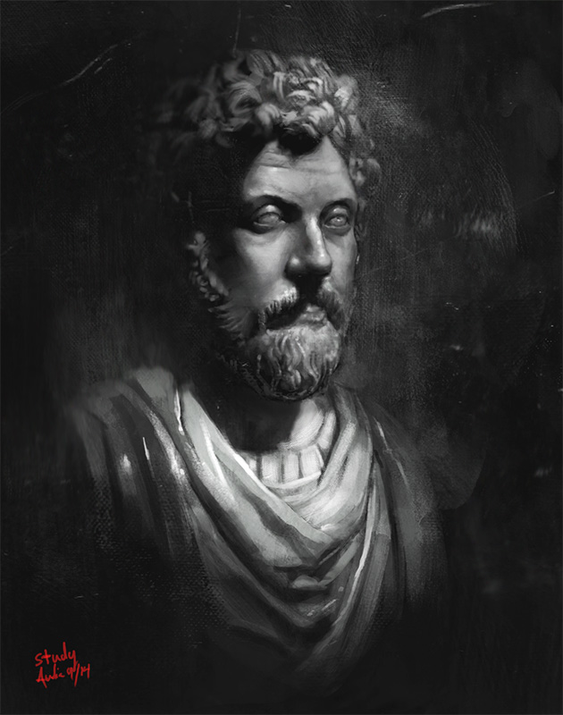
Studying light and shadow. Fuckin' rendered the shit out of it.
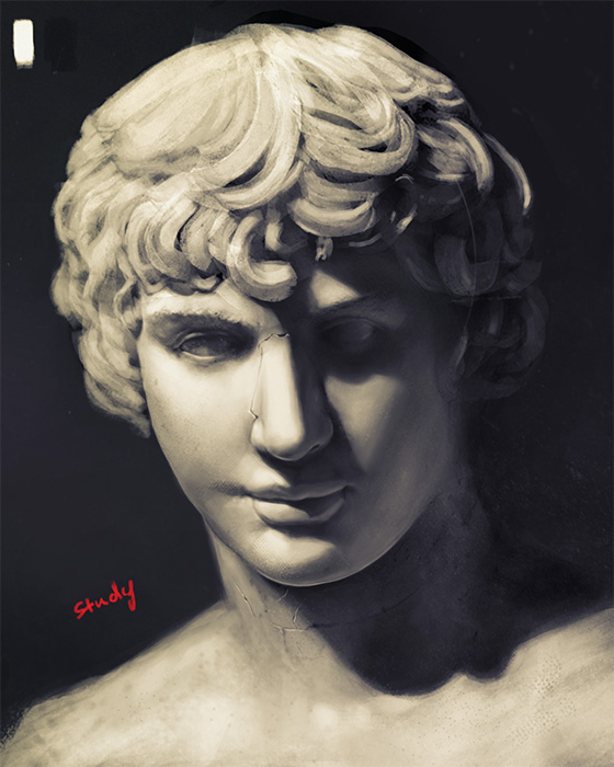


Another round of the same thing


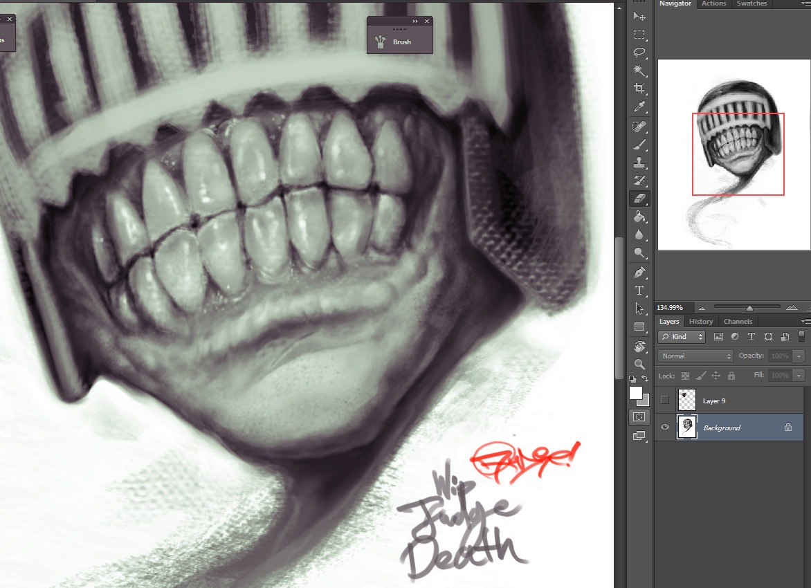
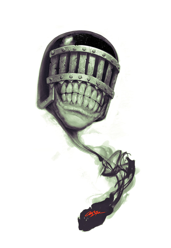
Judge Death. Used many dental photos for reference. Didn't think I'd need to look at teeth to draw teeth. hah.


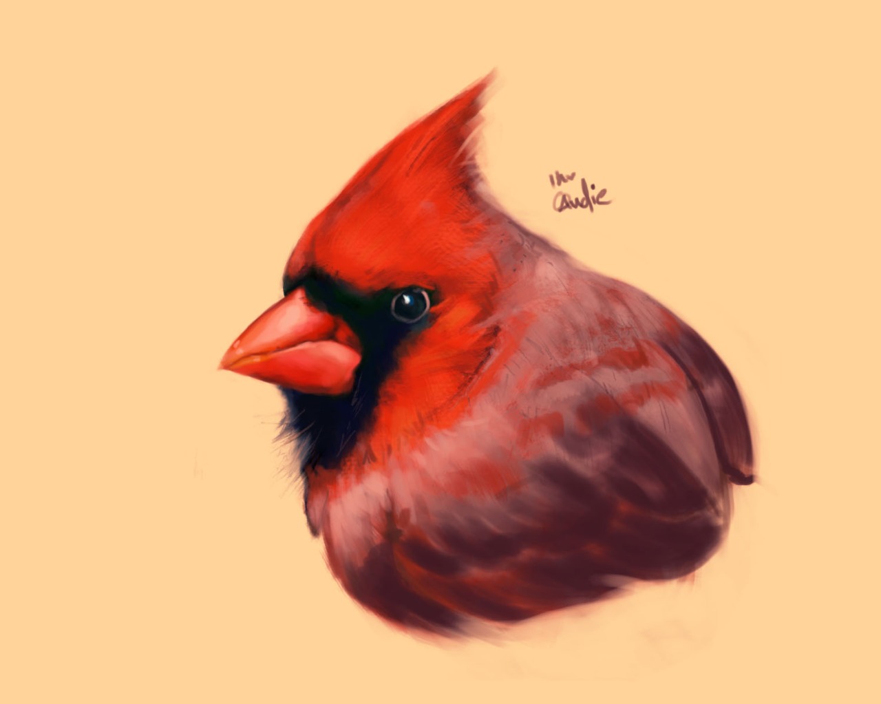
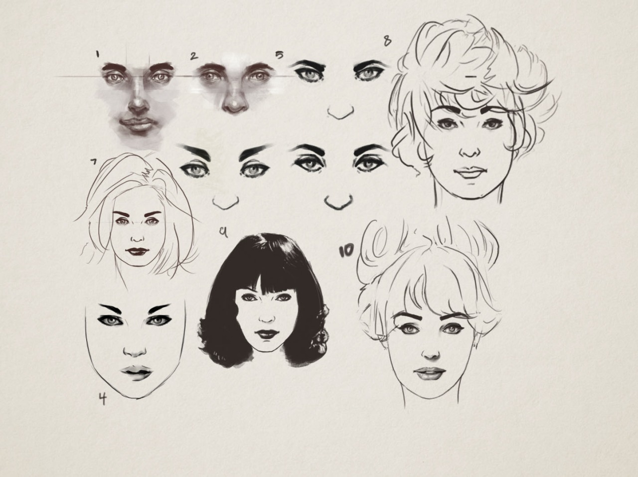
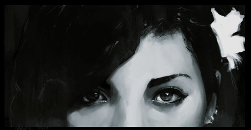
I love beautiful eyes.


Used an old sketch of Spider-man and utilized Rapoza's breakdown technique in part of his Bog Witch tutorial.
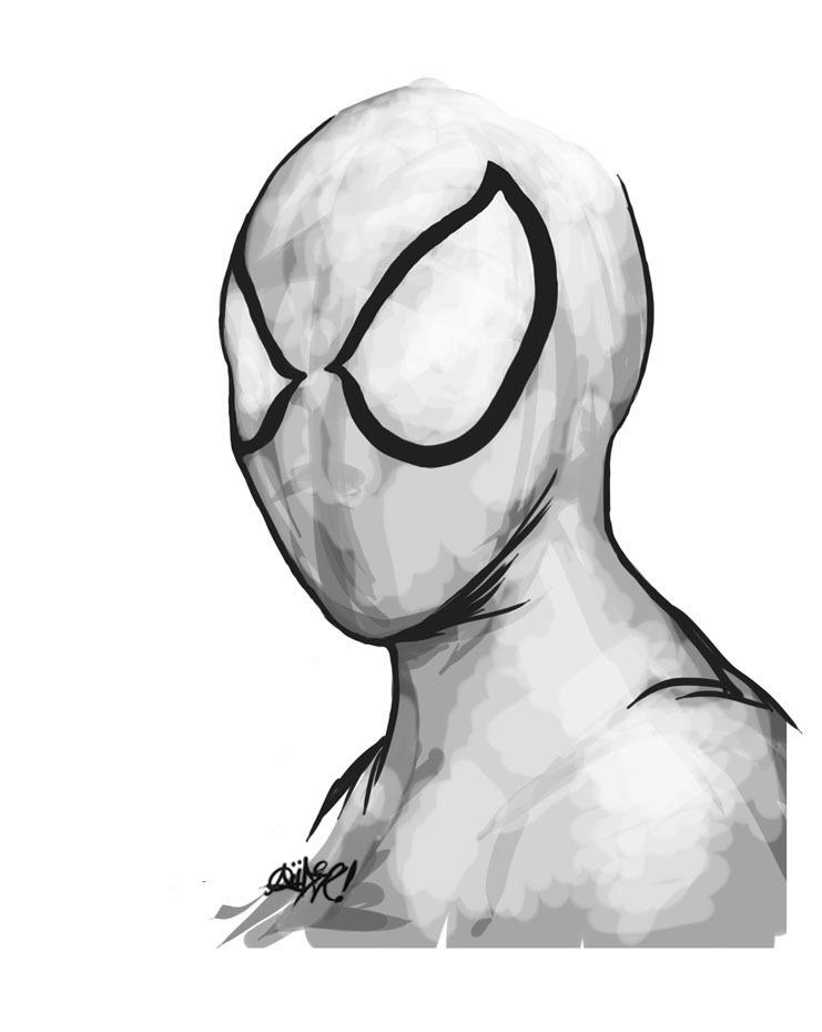
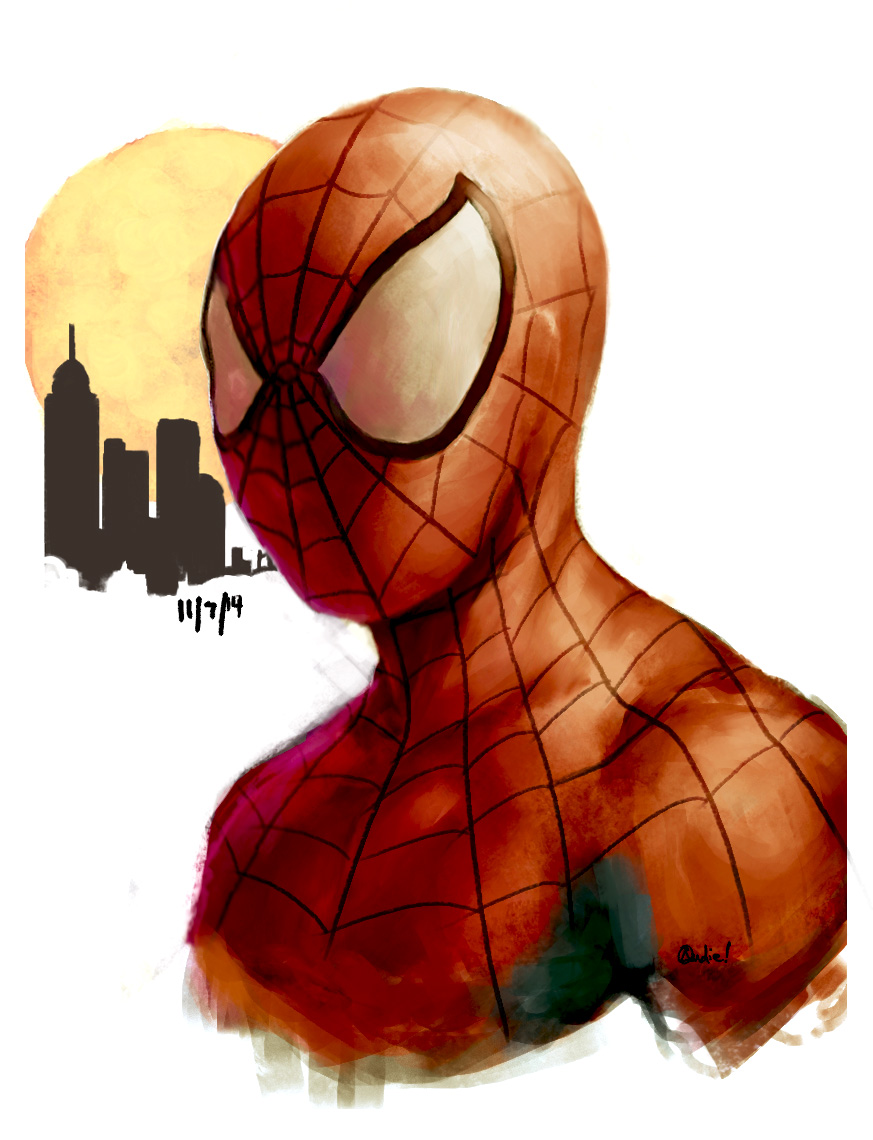


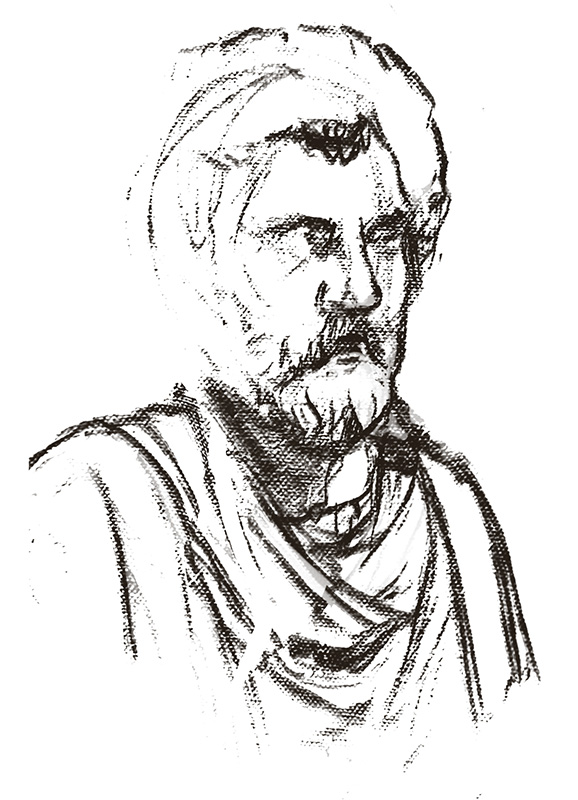
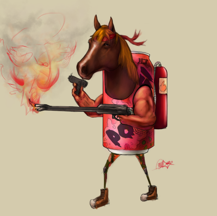
Looking back, I'd say my illustrations, sketches look exactly like... like generic photos. But I keep them that way because they're studies on basic fundamentals, which I have yet to really use effortlessly without the aid of references. I want to start incorporating some dynamism, get some tricky poses and all those features. But my mind, at this point, isn't really flexible to produce complex stuff; well, it can, but it'd take days or even months to get things rolling. So, I must study anatomy and analyze all that a heck of a lot more to get things speedy for the next stage.
Reply
#2

Reply
#3
Studies are looking good! And the imaginative work looks pretty good too; I definitely know what you mean about feeling like you can't make dynamic or complex stuff yet. I constantly fear making imaginative work myself because I want to be better at the figure and head first. But just forcing yourself to do it so you can really see what needs work and get feedback will really help get you there faster.

I look forward to seeing more stuff from you, and hopefully give you useful feedback too : )
When you're trying to come up with a complex image at first, just use simple gestures/mannequin figures to rough out the image, and don't be afraid to get composition ideas from master paintings. Even the old masters did that.

Once you have the basic gestures and shapes established, just collect a ton of reference that you think would help and start drawing in lines or silhouettes, however you work best, and then post that stage for feedback. I think that would probably be the best way to go about it. Just my two cents though!

: D

Reply
#4
Great Pinups, love it! But i looked at that Spider Man, and i guess you should think more about a construction of a head, think more whats behind the mask. because its terrifying.


Reply
#5
Yes, that's exactly what I'd imagine if my Spider-man was unmasked 'cause I genuinely did not -- I had no good understanding at how to draw a portrait in that angle very well, especially when the face is masked. So I used references, but they weren't that helpful; I winged it.

from February


to October


and just starting to get back in anatomy.


Shouldn't have stopped art all together. I have to relearn everything again.

Reply
#6
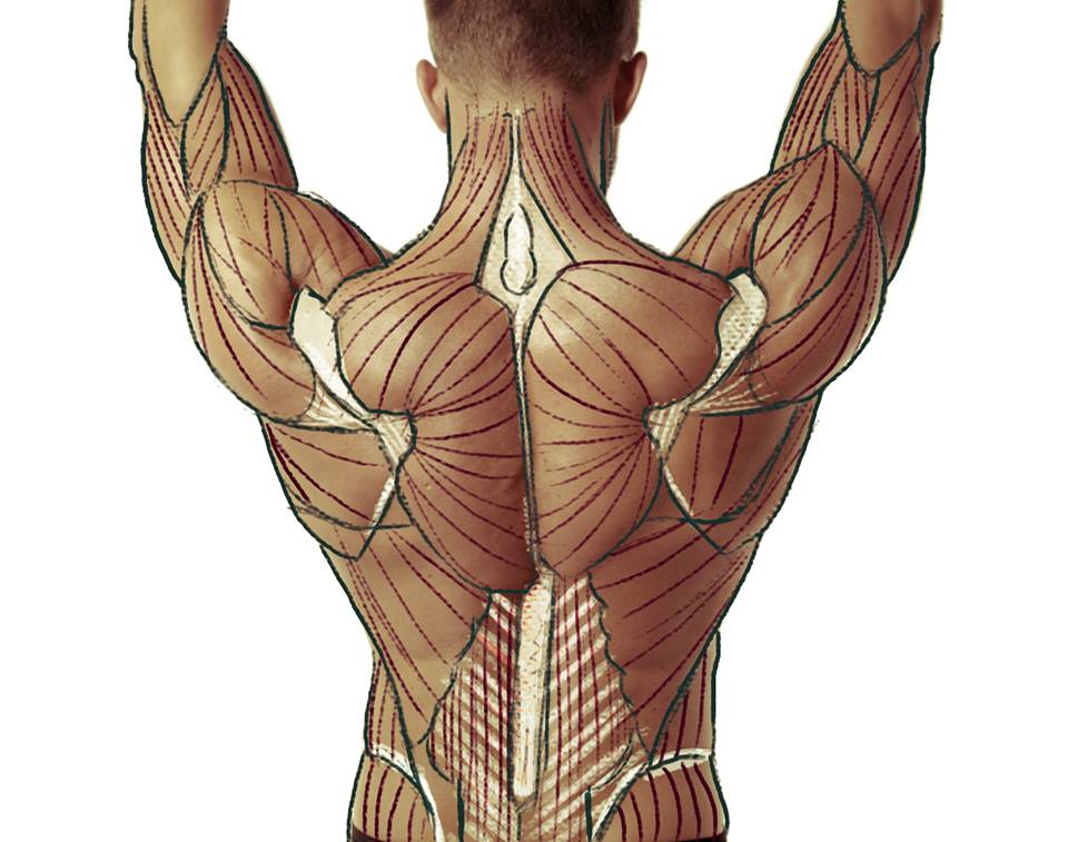
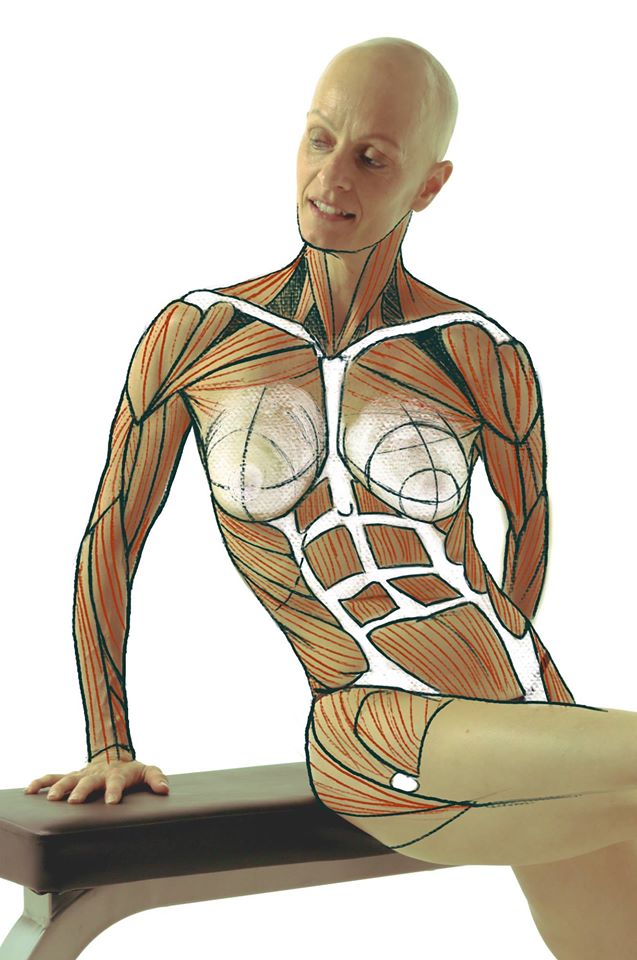
From Proko studies


I've followed this short tutorial by Reiq - I feel like I'm doing something cause mine look a little stiff.


Reply
#7
Some nice studies going on, Judge death image is pretty sweet. Make sure to try and apply the studies whenever possible so they stick!

Sketchbook ▲  Website ▲ TwitterArtStation ▲ Twitch ▲


Reply
#8


Reply
#9
Woah!!! Awesome stuff, lots of great stuff here!
I especially love the rendered cartoon stuff you're doing.

I really look forward to seeing more stuff, I'll drop a critique later on after the next batch of work or so. Keep on working!

Reply
#10
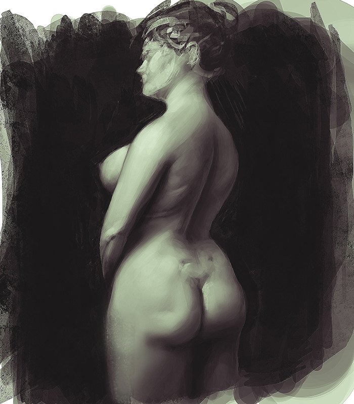
I should soften the textures on certain area. Sorry, I know the size is big but I'm at work and, so, I can't edit the size.

Anyways, light/shadow study.


Reply
#11
Really diggin the quality of light you captured in the last few studies you did. Great use of values.

Reply
#12
Testing out a new digital paint method


Reply
#13
kick ass studies indeed. i absolutely love the color study of finn, do you paint all that in from imagination? or did you use refs?

Reply
#14
Looking really solid and nice. You have definitely improved your color/painting technique by far. I noticed that by the heads from the start of the thread till the end with the color study on the body, it's like you understand where to smudge and where to not. Also it's very good if you are mixing both hard and soft brushes. Pretty cool sketchbook, will have my eye on! :)

Reply
#15
(04-19-2015, 05:00 PM)foxfire1345 Wrote: kick ass studies indeed. i absolutely love the color study of finn, do you paint all that in from imagination? or did you use refs?

I had the idea in my mind and proceeded to map out that thought onto a thumbnail strictly for colors ( i don't know the proper art term for it). I did end up using reference for light value, like ambient light, and foliage. That's it.

(04-19-2015, 09:55 PM)Tsirides Wrote: Looking really solid and nice. You have definitely improved your color/painting technique by far. I noticed that by the heads from the start of the thread till the end with the color study on the body, it's like you understand where to smudge and where to not. Also it's very good if you are mixing both hard and soft brushes. Pretty cool sketchbook, will have my eye on! :)

Honestly, it's all luck. Luck and many educated guesses. Maybe I'm beginning to be good at observing but not so well at understanding.

Reply
#16
I need help: Are there any notes on how to make cast shadows using perspective?

As you can see, I have the direction of them right (sorta), but the length and width on the shadows confuses me.


Reply
#17
First and second attempt to speed painting. I feel like I'm adding too much detail on the background for the first one.


Reply
#18


Reply


Forum Jump:


Users browsing this thread: 6 Guest(s)