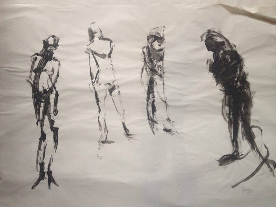
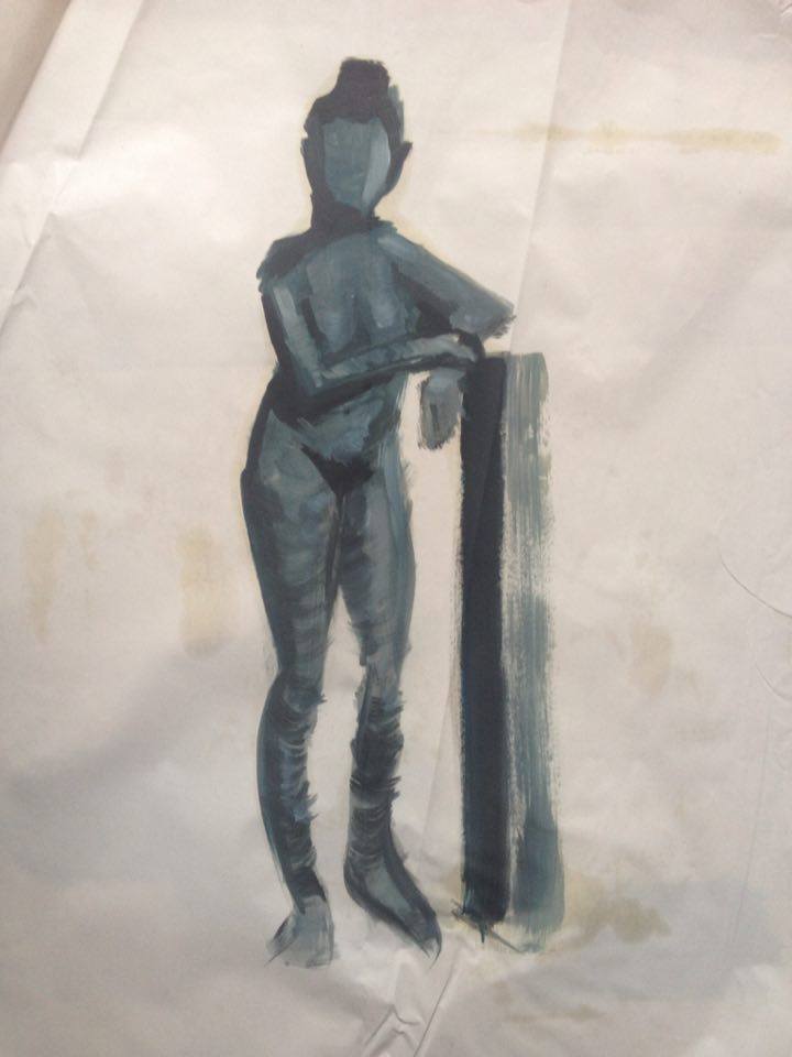
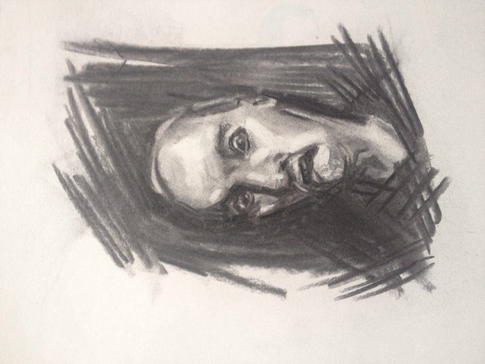
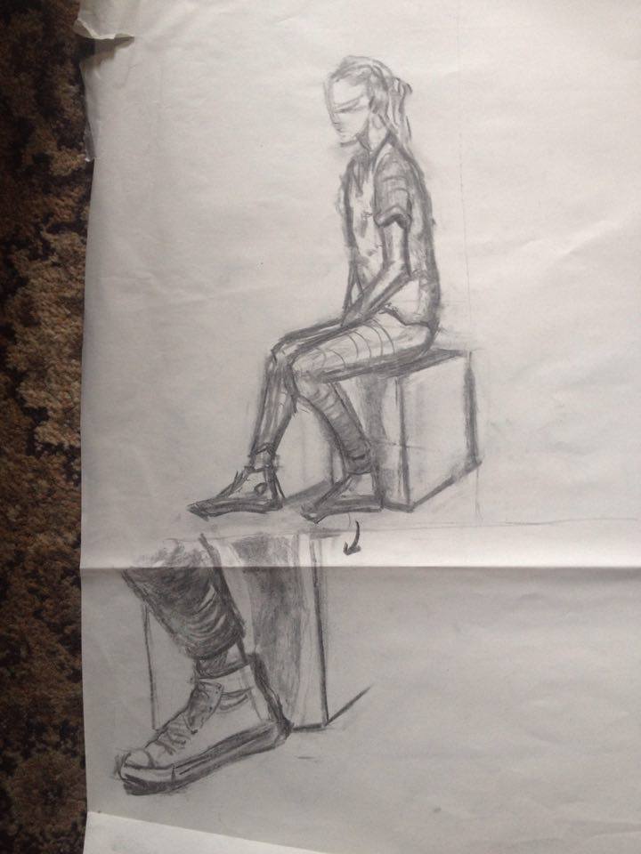
Posts: 191
Threads: 2
Joined: Oct 2014
Reputation:
3
@Fedodika, Thank you :3 I'll work on that!
@John, Hey John!! Thank you for taking the time out to do a paintover! 
Yeah I'm getting sick of the faces in pixelovely so ill try out drawing the same person rotated. I came across a channel on youtube that has heads rotating for this purpose exactly.
I'll see if that helps!
@Jonesoda, Cheers! I was thinking not enough variety 


Posts: 472
Threads: 7
Joined: Jun 2012
Reputation:
15
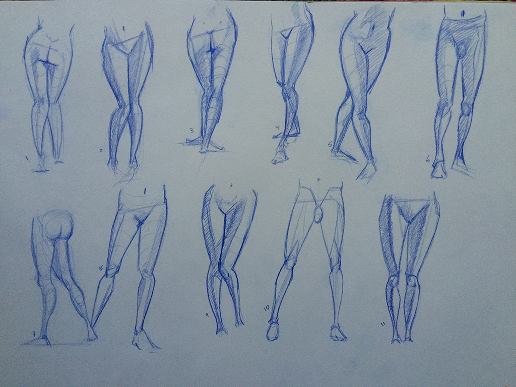
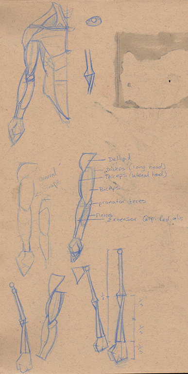
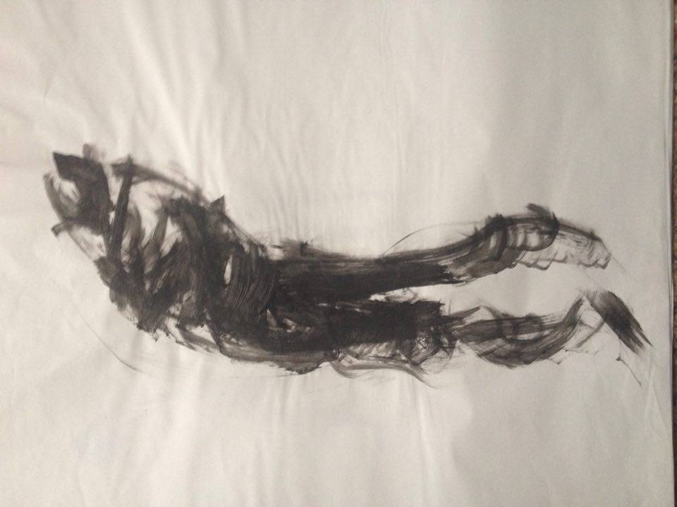
Heya I was just studying legs to other day. See we got that in common. haha
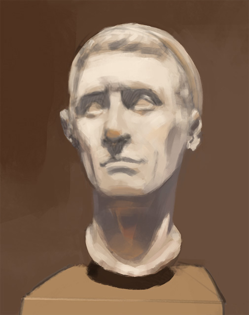
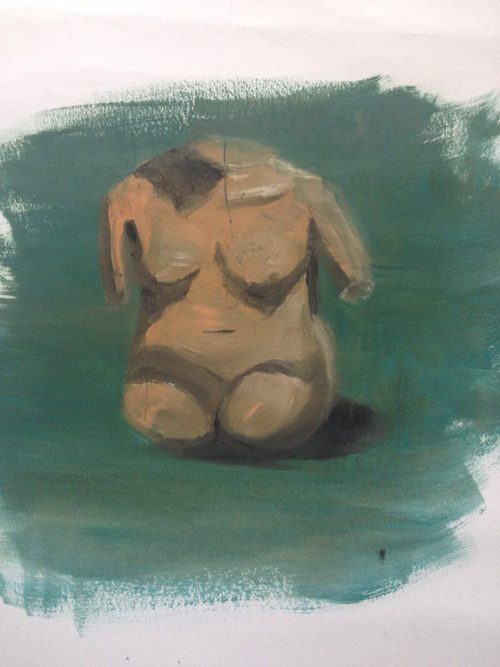
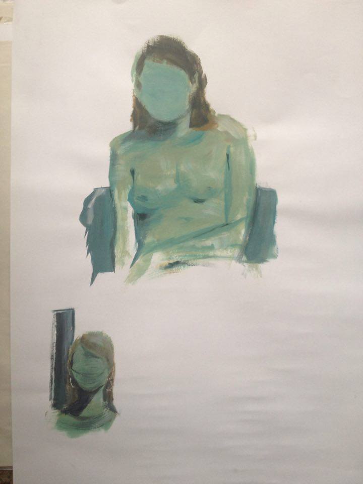
Anyway nice wokr on the latest studies, especially on the bust. It's just nice to see people actually take their time and really try to get the shapes correctly!
Posts: 2,817
Threads: 15
Joined: Jun 2013
Reputation:
109
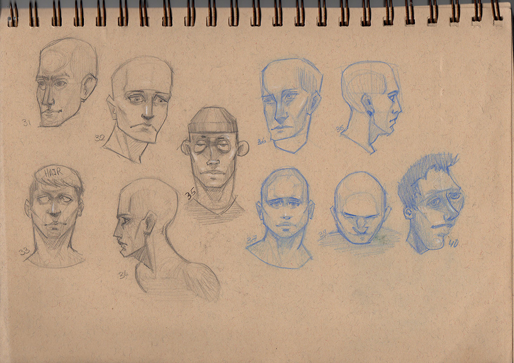
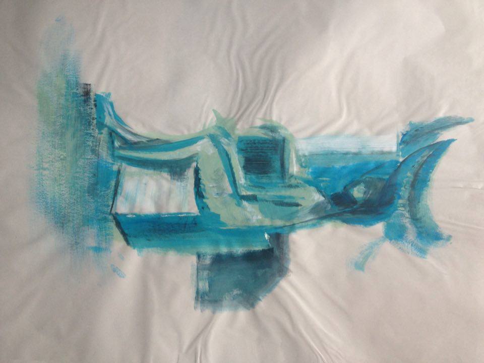
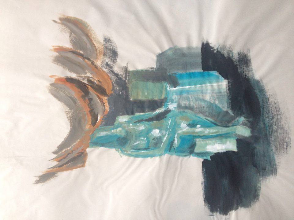
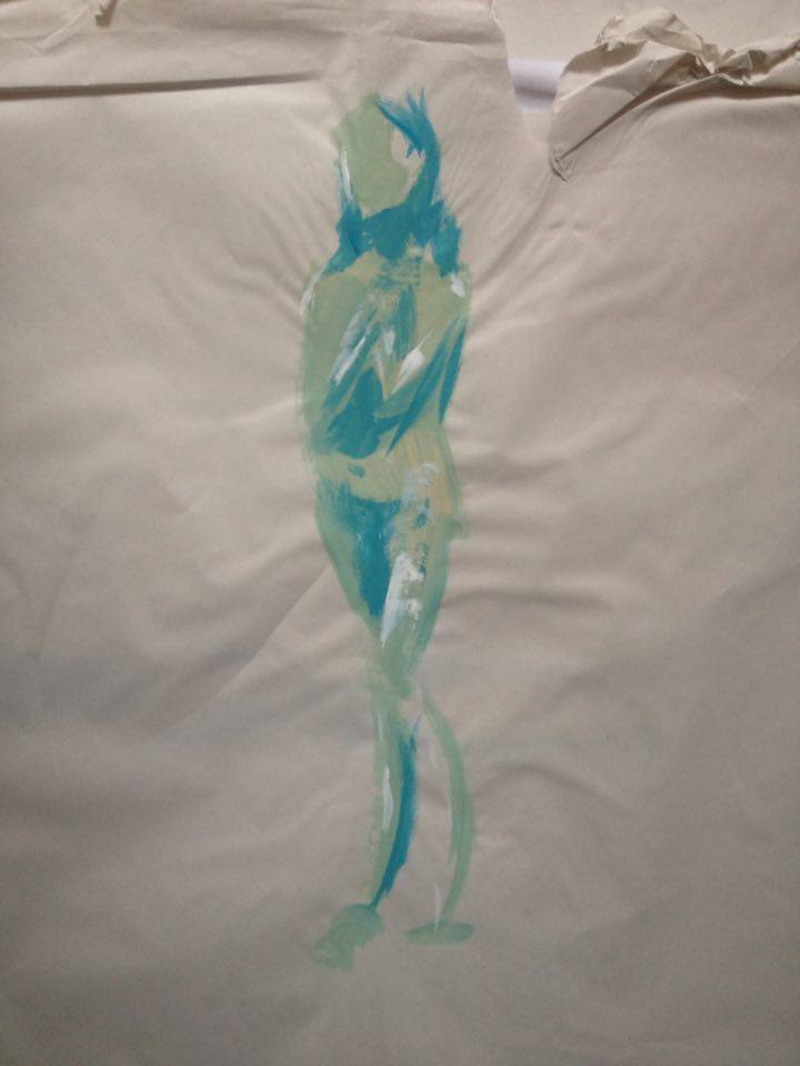
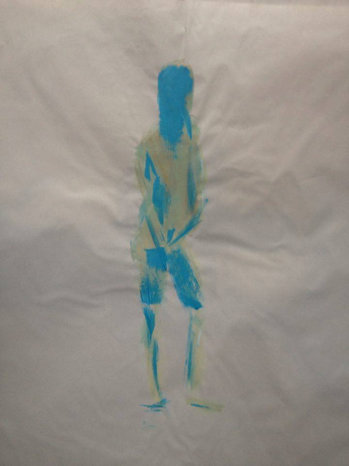
oooh that blue bust sketch is very good! watch the proportions around the chins, they are usually longer; try to get a system of measurements for a rule of thumb like hampton of loomis maybeh hehe <3
Posts: 191
Threads: 2
Joined: Oct 2014
Reputation:
3
@Zipfelzeus, Thanks alot! Can't skip leg day haha
@Fedodika, Cheers! yeah i'm trying to train myself to keep proportions in mind but i keep getting lost in a sketch and kinda daydreaming while i do it but i know what you mean and i will try change my crooked ways 
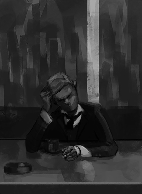
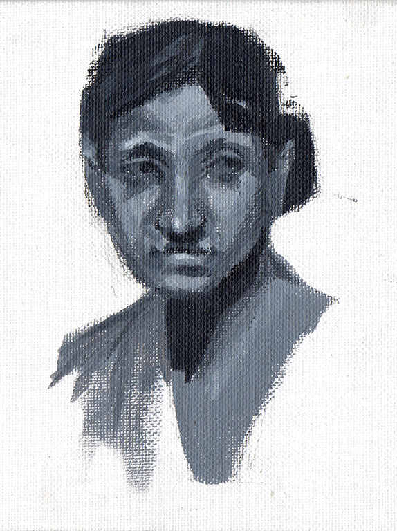
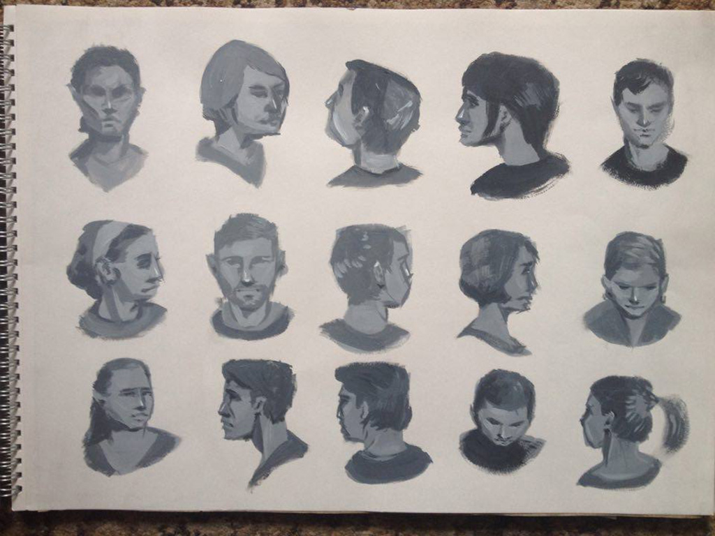
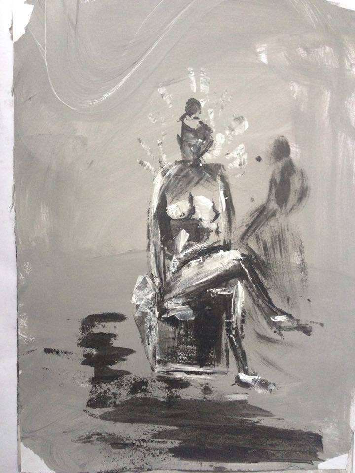
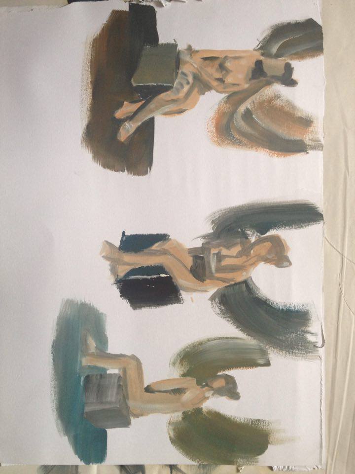
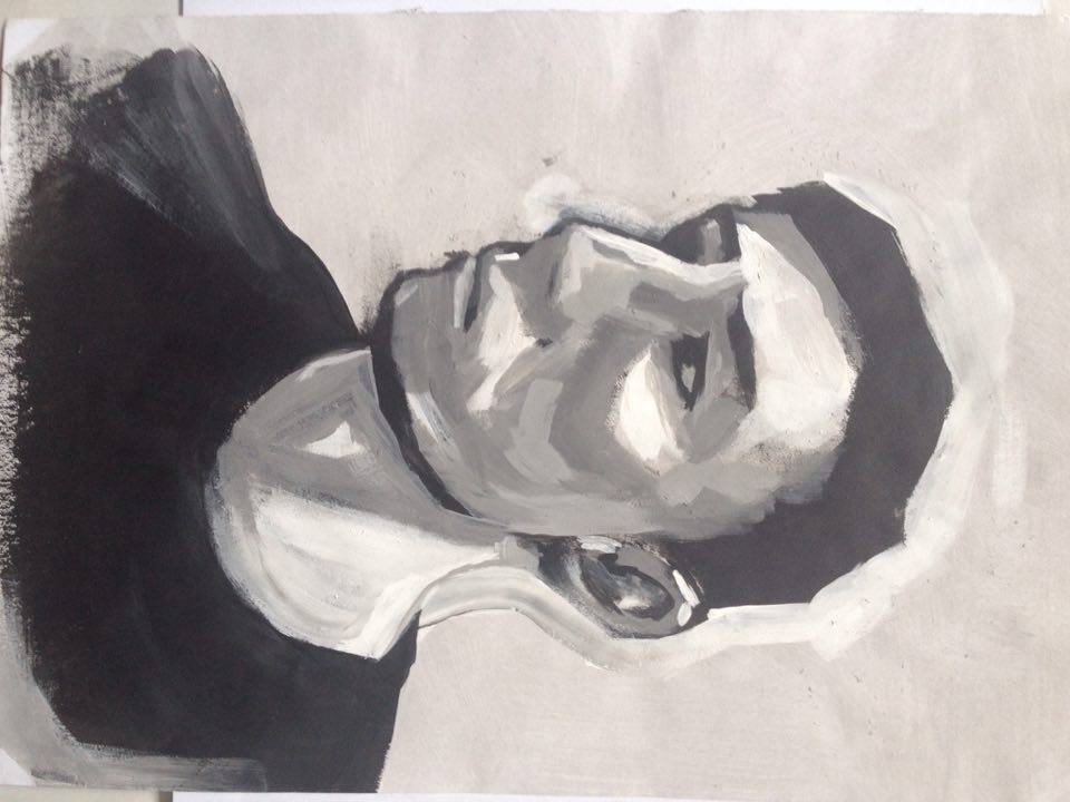
Color/portrait/value study thing.
#12/50

Posts: 71
Threads: 10
Joined: Mar 2012
Reputation:
0
you are on the rigth path! keep working as you have been working until now!
Posts: 191
Threads: 2
Joined: Oct 2014
Reputation:
3
Posts: 191
Threads: 2
Joined: Oct 2014
Reputation:
3
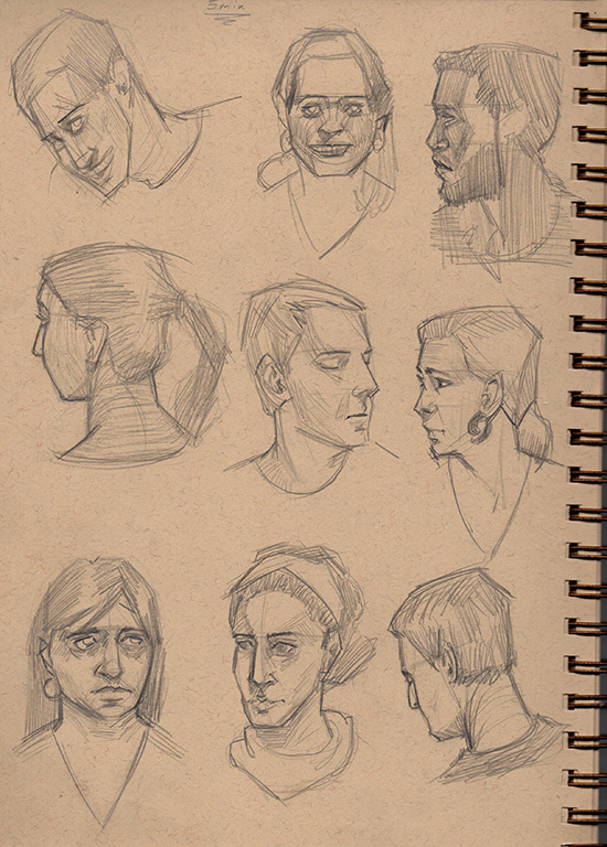
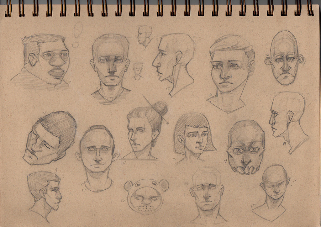
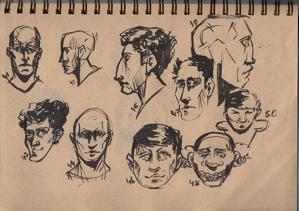
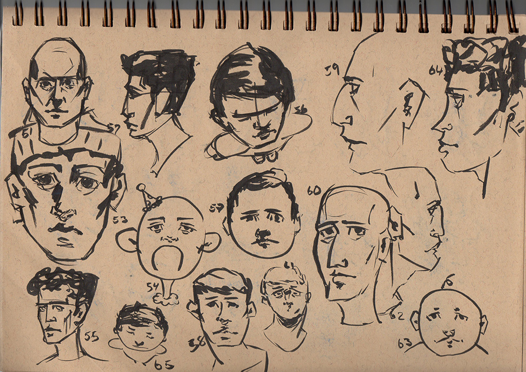
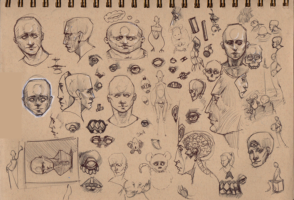
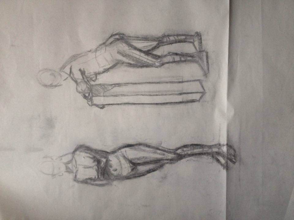
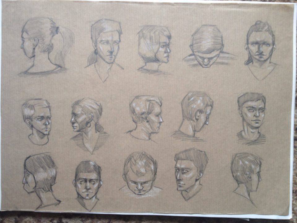
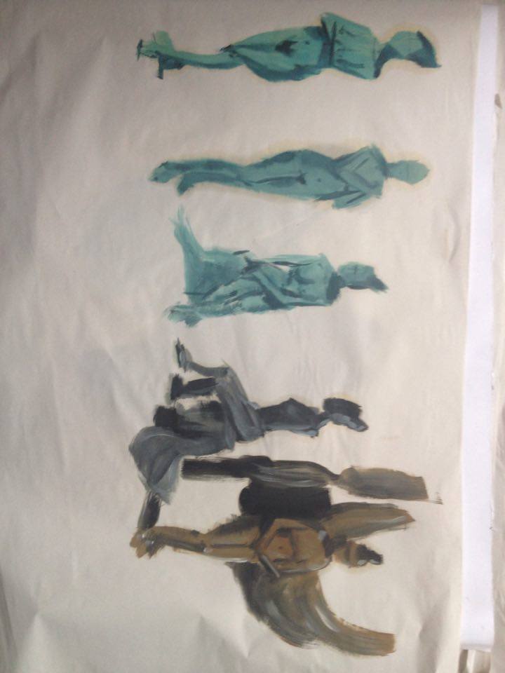
5 Minute heads

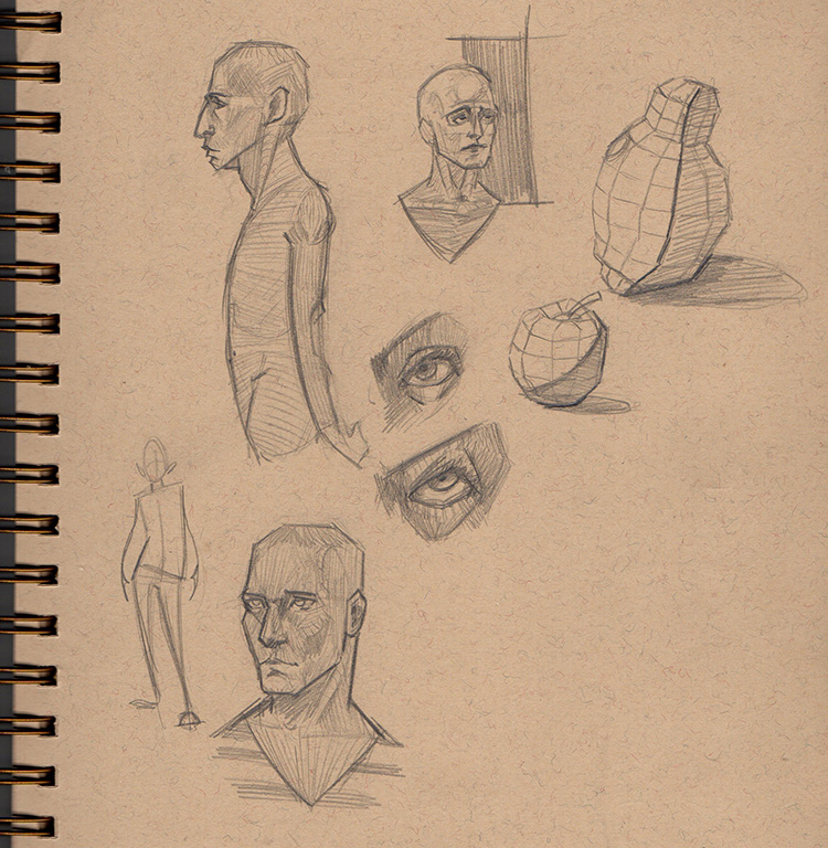
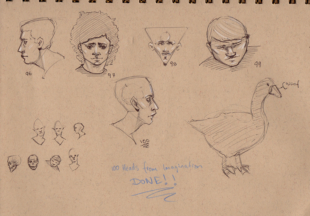
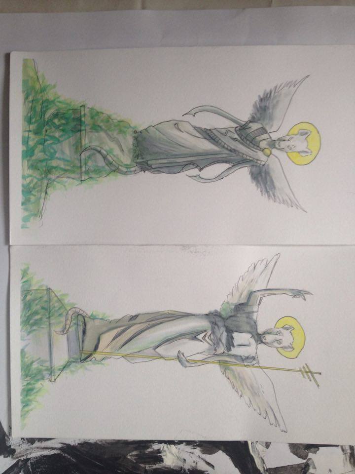
Still have no imagination :/

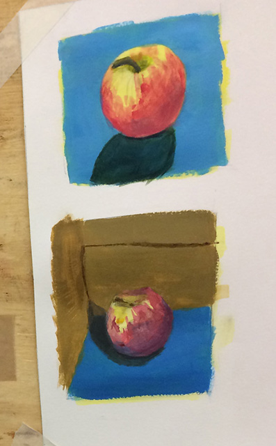
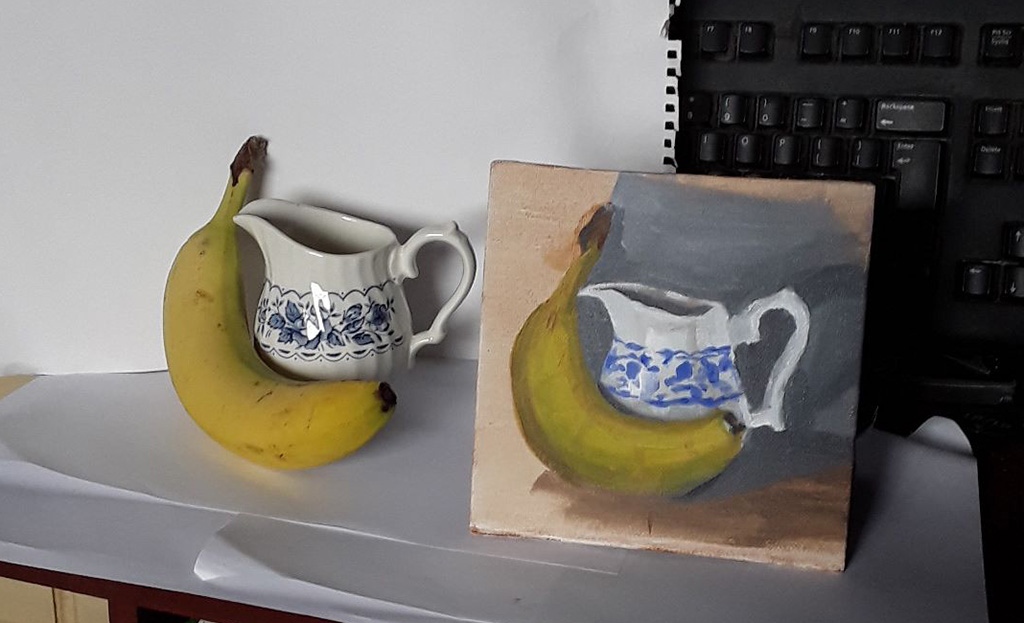
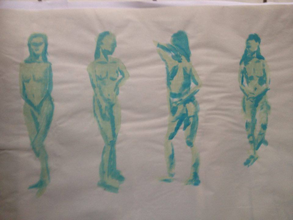
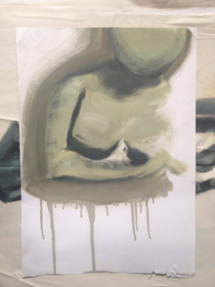
watercolor still life's

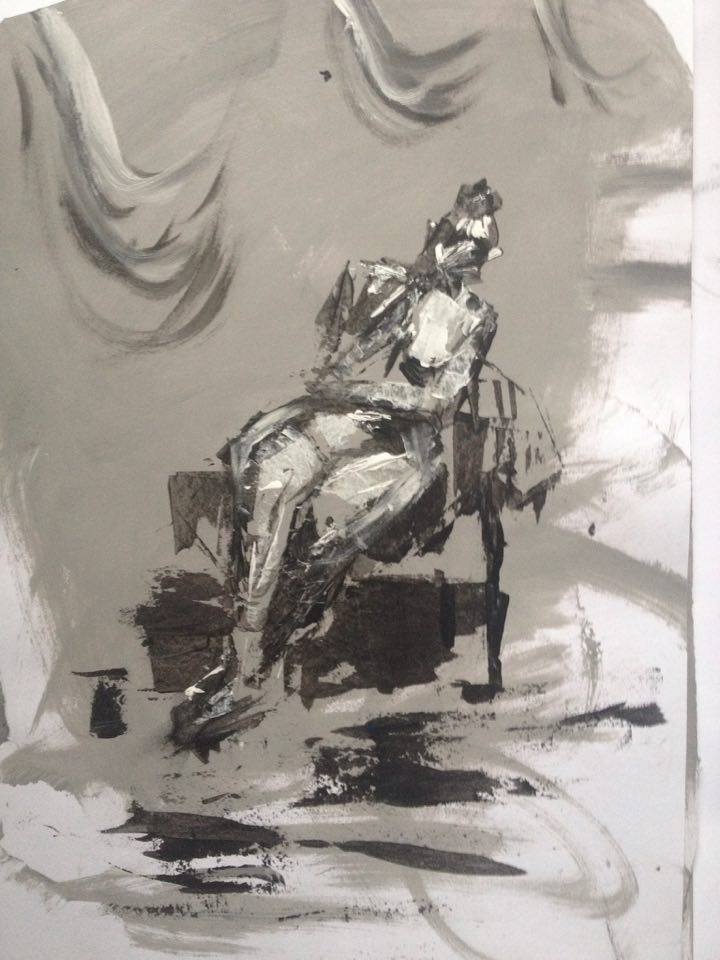
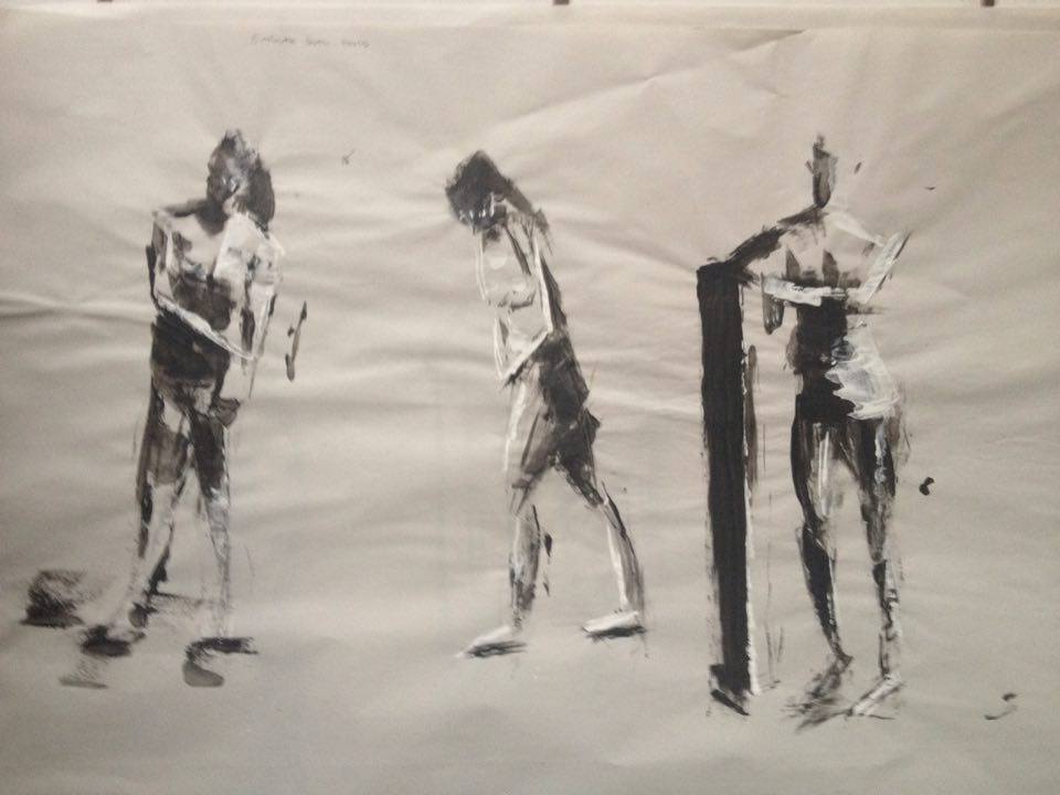
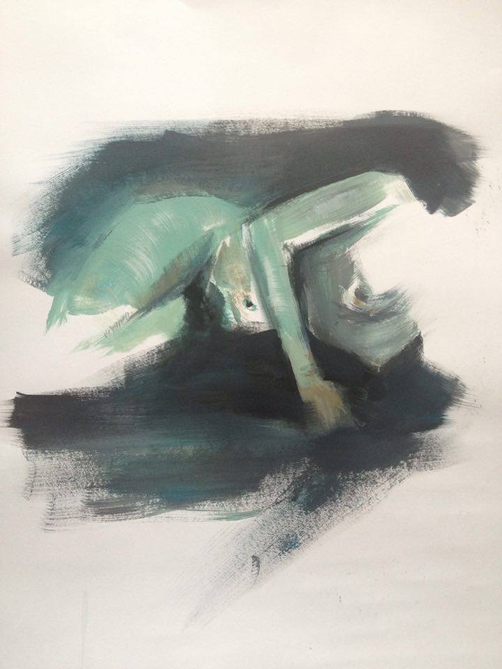
checking if these portrait studies transfer to acrylic traditional.
#14/50

Posts: 191
Threads: 2
Joined: Oct 2014
Reputation:
3
Posts: 1,109
Threads: 18
Joined: Apr 2014
Reputation:
68
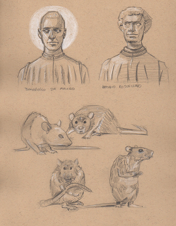
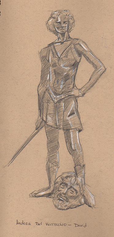
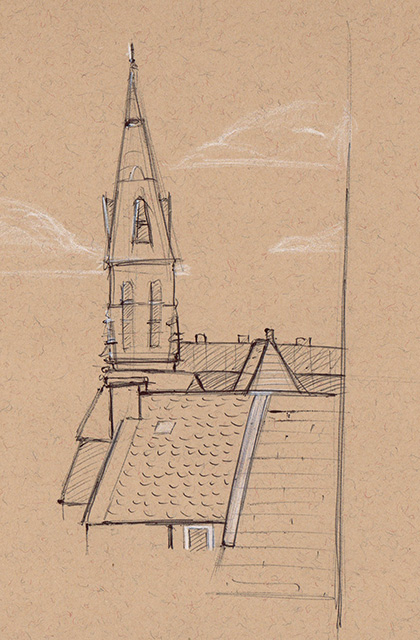
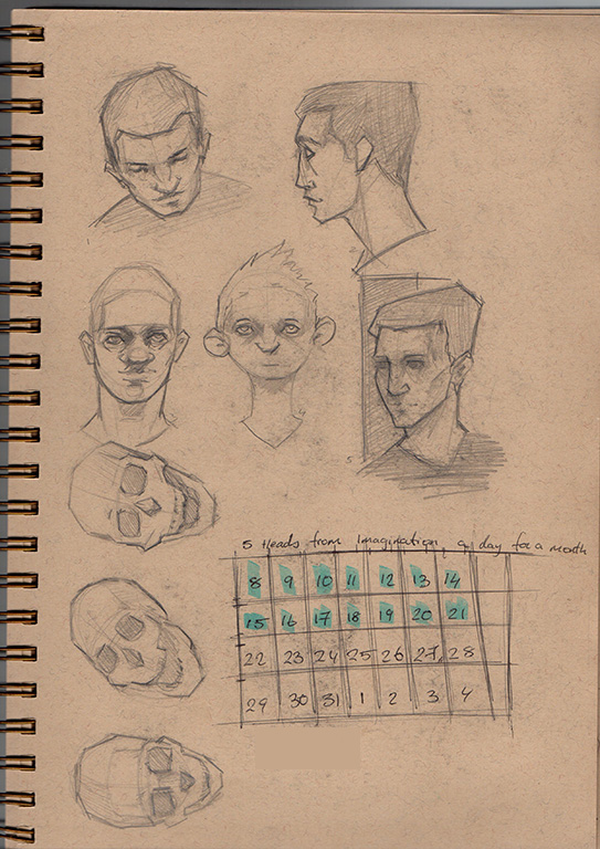
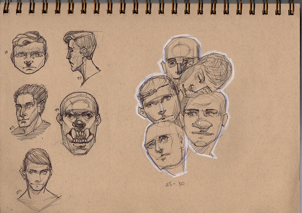
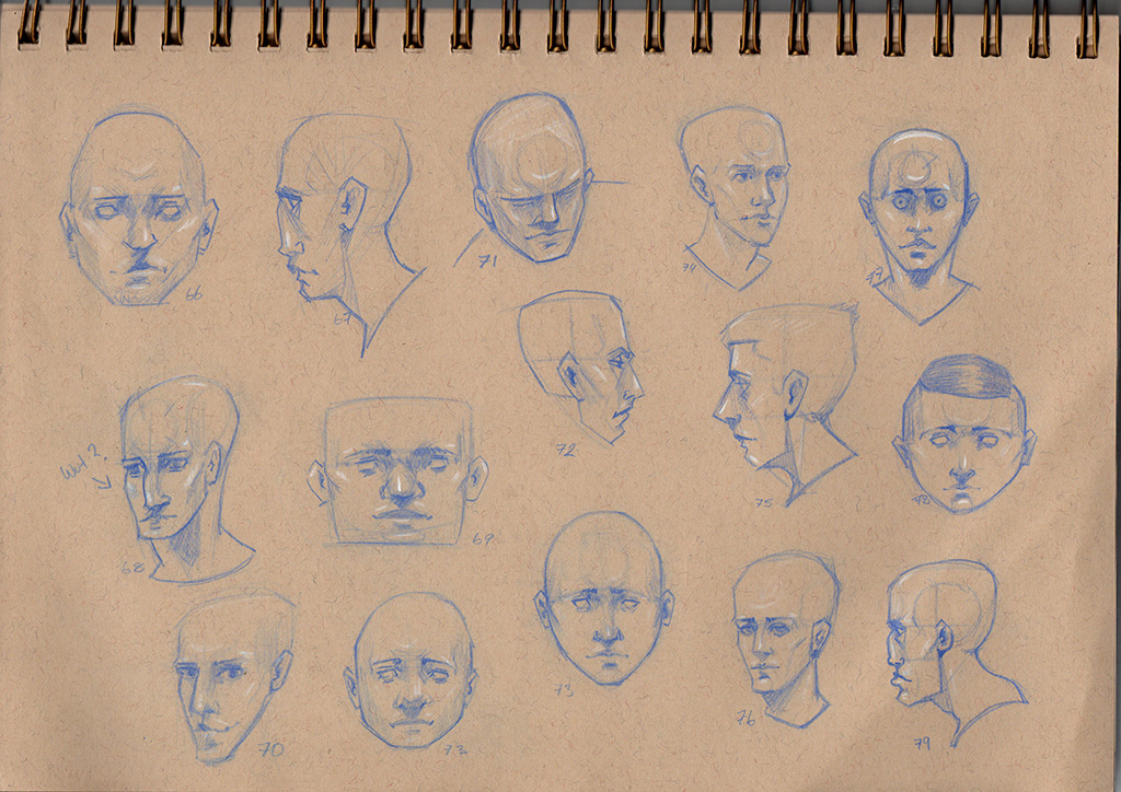
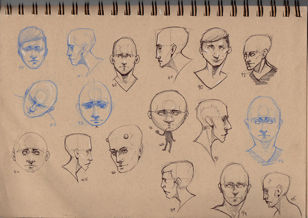
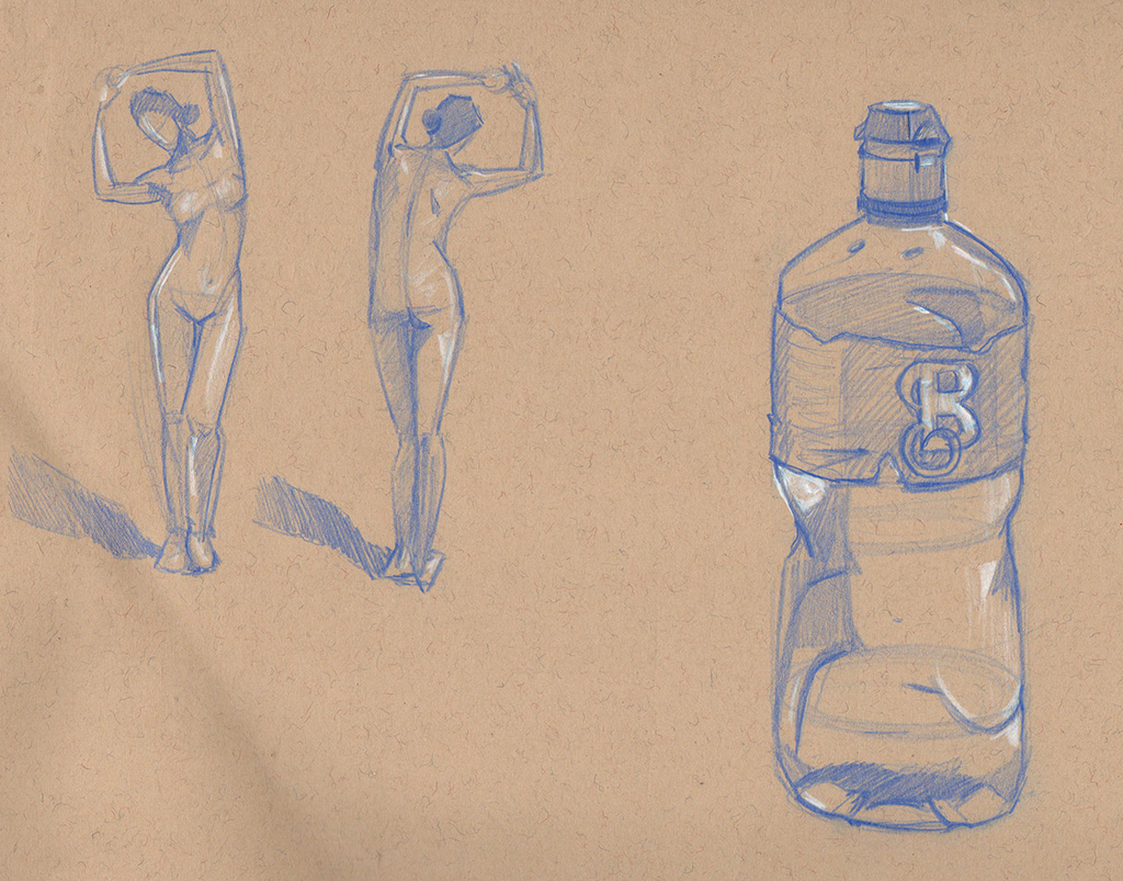
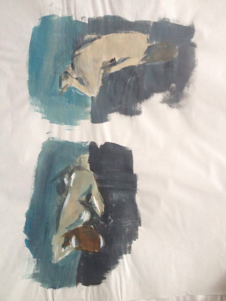
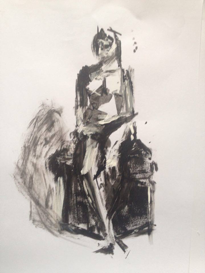
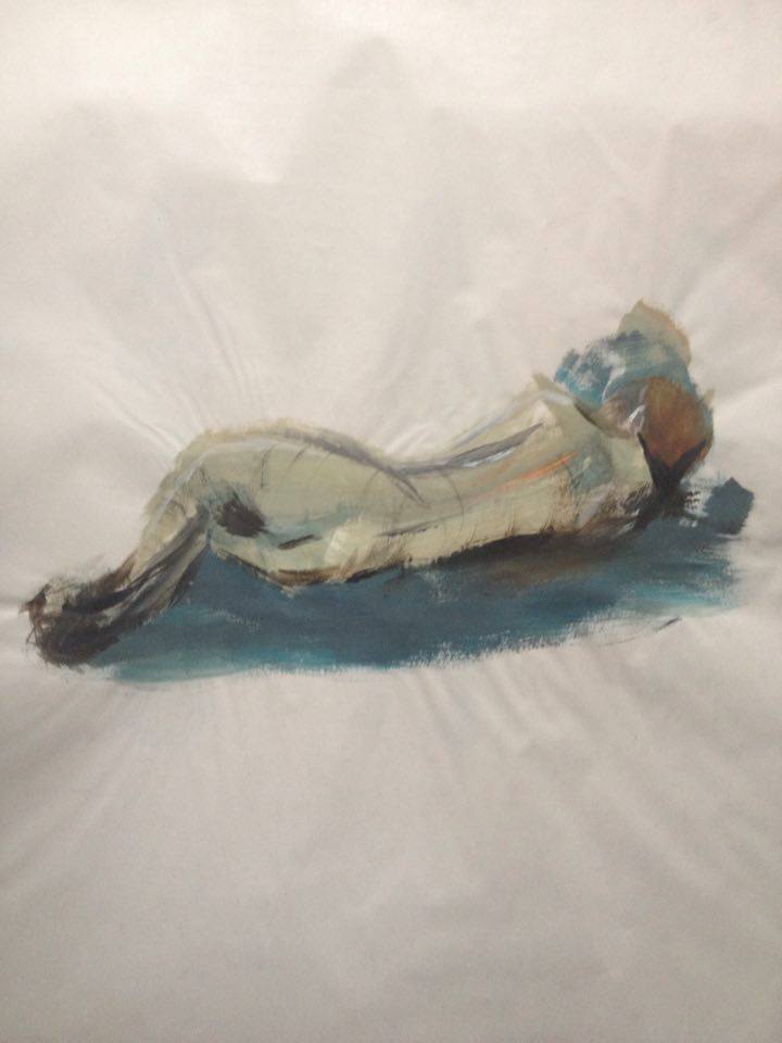
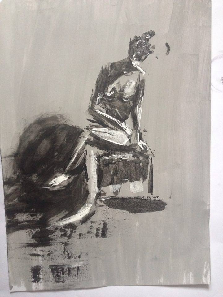
hey dude! great stuff man, love those blue sketches with the white highlights! and the pen stuff looks cool too! Not sure if you tried this exercise, where you just scribble a random shape and then make a face from it, it's really fun and useful to try and 'break out' of your visual library of faces and features - a lot of people's faces in reality do give a pretty cartoony impression after all!
Here's a few of what I mean. Sometimes they turn out crappy like these but I still loosened up from them and discovered a few nice things I can use in a more deliberate drawing. Also it's a great way to 'test' yourself on anatomy of the face by adding as much stuff as you can to make it all fit together 'correctly'.
http://i.imgur.com/pQy6vjh.jpg
Take it easy!
Posts: 733
Threads: 7
Joined: Dec 2014
Reputation:
32
Wow, lots of practice, looking better and better! Just keep going!
Posts: 97
Threads: 2
Joined: Apr 2014
Reputation:
1
I think the best feeling in the world is when you come to crimson daggers (after sleeping for half a year or more xD) and check out people you've been following and see how much they improved and how much they worked and practiced. Man you've come so far. I've been looking at your last 2 pages and just... looking... I can't even accept the fact that you improved so much. I can just congratulate you at this point and wish for even better future.
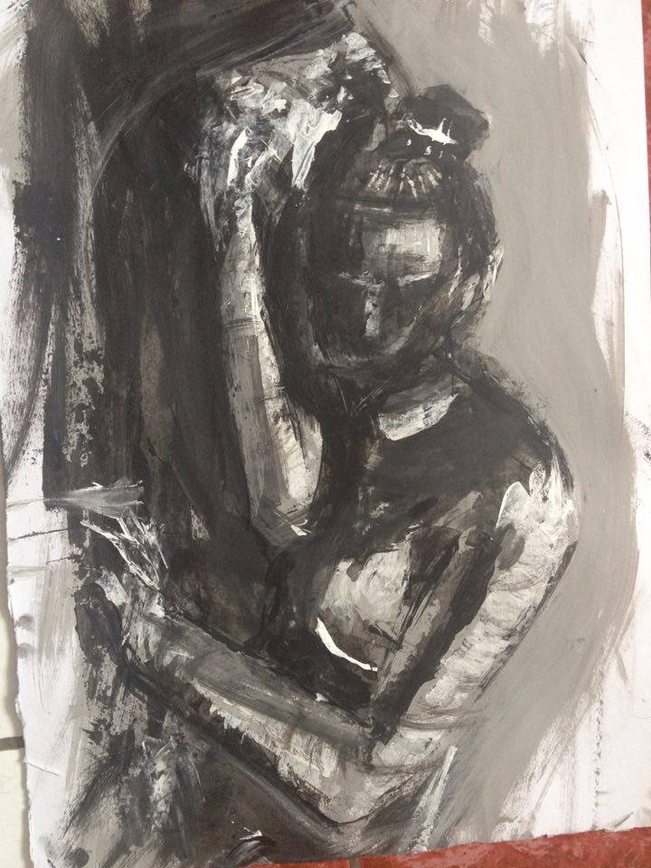
Btw, i really liked that study where you placed faces on top of skull. Also, black and white paintings look amazing too. :D
Posts: 191
Threads: 2
Joined: Oct 2014
Reputation:
3
Posts: 191
Threads: 2
Joined: Oct 2014
Reputation:
3
It has been too long 
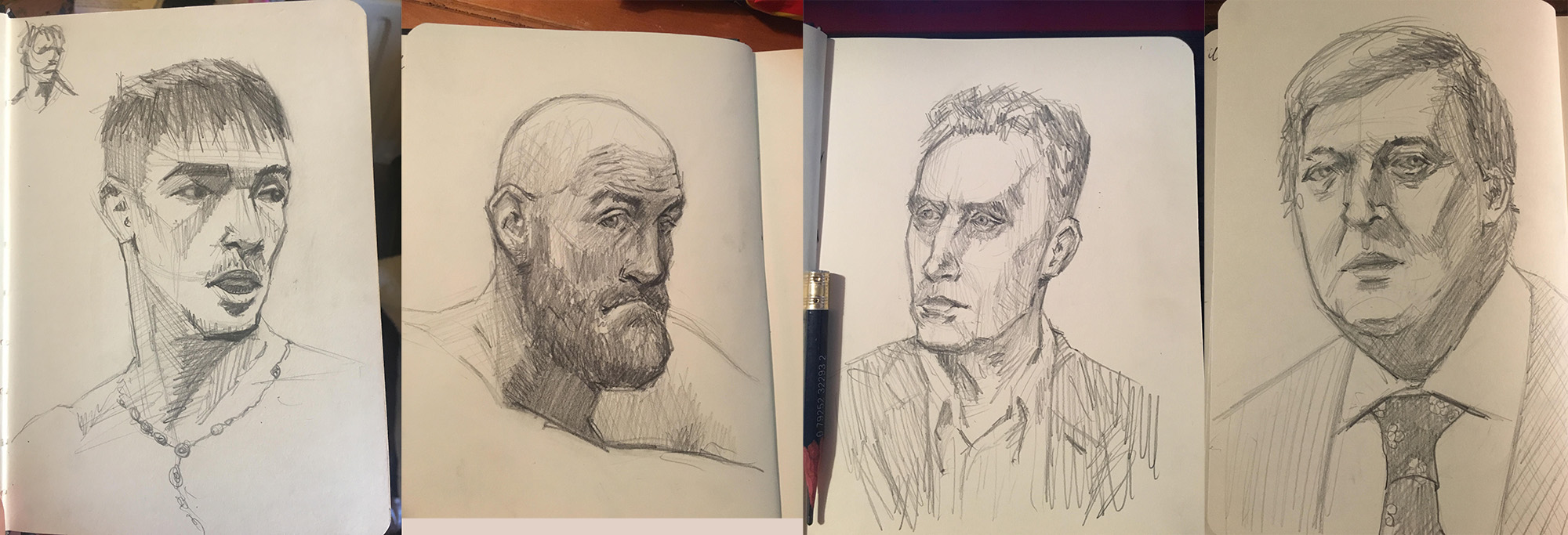
Back on the portrait hype train.....#15,16,17,18/50
likeness is hard but getting a little better every time.

Posts: 2,817
Threads: 15
Joined: Jun 2013
Reputation:
109
if you upload the reference i can give you critiques on likeness ;)
Posts: 191
Threads: 2
Joined: Oct 2014
Reputation:
3
Hey Fedodika!
That's so kind of you! took me awhile to find the pictures haha
Proportions are the obvious thing for me to work on.
Thank you! 

Posts: 2,817
Threads: 15
Joined: Jun 2013
Reputation:
109
Alrighty, for the far left one, the head is tilted way more to the right and upwards. Pay attention to how his eye on our left its tiny compared to the cheek bone, there should be way more space for that to exist and you indicated the eye on our right as it appears in the reference, but since the rest of the head in yours isnt tilting that way it looks out of place
For the second to the left youre getting a few things right, but notice how his head tilts more towards the right and the essence of that angle is in that tilt. His jaw underneath should go further back, which would push the rest of the cranial mass. You'll notice the way you drew his ear, and how much space there is of his head going behind the ear, but in the photo it nearly tangents the ear to show the full mass of the head. And his nose is slanted in yours, like its pulling to the left, but with that proper tilt of the head it'd be a better indication in perspective.
for JP most the problem is the spacing and size of the features. Like the eyes are slightly farther apart, and his lips are a bit wider, and his nose has more structure near the end. His jaw is also fuller, its goes down lower and the top of his head is higher in the reference to show that very egglike form of his forehead.
For (fry?) his eyebrows are higher up, almost ladylike. and the forms of his head like his nose are larger. I hate to say it but his face is less symmetrical than what youve indicated. His eyes are lopsided, his nose is crooked, his lip is off center. The guy you've indicated looks quite menacing and evil, closer to like anthony hopkins maybe, but in the photo he seems gregarious and charming in his fatness lol.
Hope that gives you some ideas ;) dont be shy from posting more!
Posts: 3,360
Threads: 37
Joined: Aug 2013
Reputation:
234
I been looking at the water color i think you need to either reduce the amount of water on the tool or change paper it not suppose to make the paper work so much and it distract from the artwork.
Posts: 191
Threads: 2
Joined: Oct 2014
Reputation:
3
@Fedodika, Thank you so much! Great Critiques as usual.
Yeah i have noticed that i don't get the angle right away and i just continue the drawing instead of just correcting it and rubbing it out and starting over. I really need to work on measurements more because i like eyeballing too much :P
Thank you again for the help! I will read this again before i do my next few drawings! 
@darkiste, Hi. Which watercolors? the one with the apple and the tomatoes in the cup?
When i use watercolor i always use too much water. I guess its easier to correct if i make a mistake. Ill try change that next time. Thank you!
Posts: 191
Threads: 2
Joined: Oct 2014
Reputation:
3
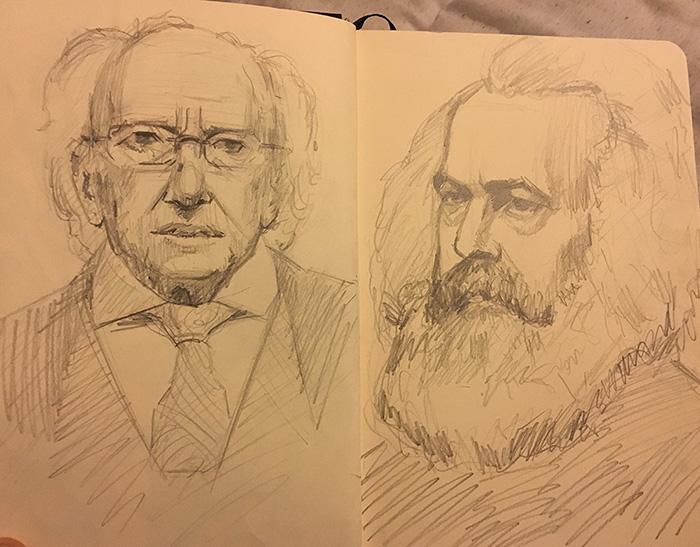
#19,20/50
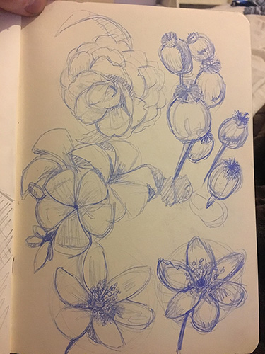
Michael D. higgins and Carl marx..... also some flowers.

Posts: 3,360
Threads: 37
Joined: Aug 2013
Reputation:
234
I love the way you seem to simplify and still got a likeness.Would be good to test yourself on smooth shading on the other hand.No hatching.
|


