Posts: 291
Threads: 13
Joined: Dec 2013
Reputation:
5
YO MAN been awhile !
cool studies indeed , im like where youre going.
also its cool that you share the steps in doing them. very helpful.
i recommend these books if you dont have them yet:
drawing lessons from the great masters- robert beverly hale
color and light by james gurney
also imaginative realism.
Posts: 60
Threads: 3
Joined: Feb 2015
Reputation:
14
Page 2 baby!
Feeling gooooood this week, still producing the worst trash known to man but I back in the swing of it. loving what I'm studying at the moment (gotta enjoy it while it lasts, gonna hate being back in limbo wasting all my time trying figure out what to study). hopefully it'll keep working for a few months and I can get some real progress out of it before it become irrelevant.
Warm Up
added a bit of rendering to my warm up, such a waste of time... i'll keep the shadow construction lines next week because that's still essentially guessing correct perspective lines, but assigning values was just pointless for what I'm trying to do with the warm up
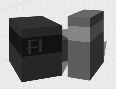
Form Building
Finished off what I was doing last week, had a quick go at colouring it up because I wanted my grandsport white stripe :)

it's the first thing I've done that feels like a legit design, bought John Liberto's https://gumroad.com/l/Lqknx loved watching him draw and design at the same time with minimal perspective construction. that's the dream.
Rendering
Don't laugh, i'm starting off all kinda basic
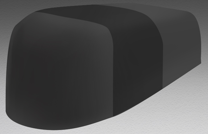
gonna slowly make my way through all the xyz constructions i've done. all matte for now... it's a start
Composition
it was a rush to get both the line work and lighting done in one week, thought it would be better to split it over two weeks
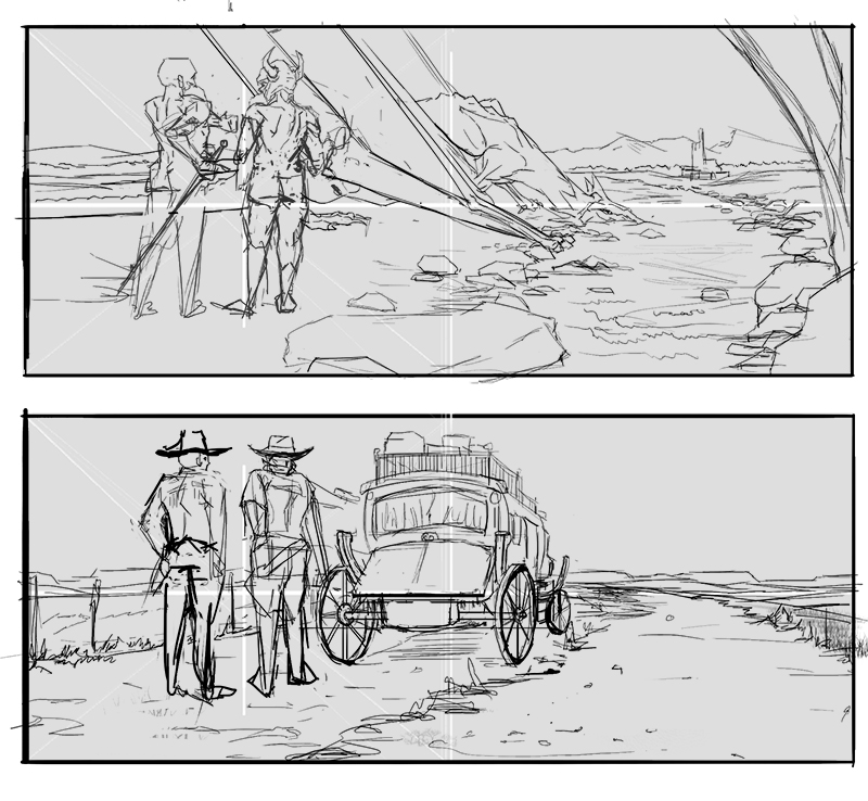
the basic layout was taken from a no country for old men scene. since that is basically all the graphic layout the main composition elements left were storytelling, so with the linework, establishing the relationship between the figures and their relationship to the main object in the centre on the comp. next week when i light it I'm gonna be tring to change the mood/ the relationships, might not work. There is also a graphic design element to choosing the light and shadow to think about
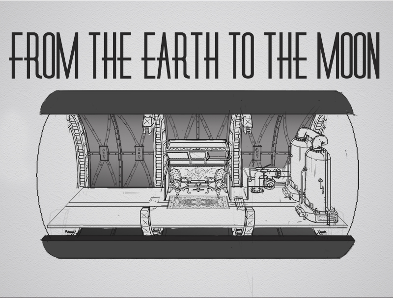
Design
As far as I got
Hey Kurt, how's it going man?
thank's for the recommendations, I know nothing about Hale or his books, so that will be a fun one same with imaginative realism, I have no idea what to expect from it. if it's anyway near as good as color and light i'll be happy, love that book.
thanks!
Posts: 1,342
Threads: 17
Joined: Jul 2013
Reputation:
45
That design thing looks pretty neat, looking forvard to the lighting versions on the composition pieces.
Posts: 60
Threads: 3
Joined: Feb 2015
Reputation:
14
WIP Week!
not had as much time as I'd normally have this week (i'd say I averaged about 3hrs a day, usually it'd be 6+) so I'm gonna carry this week over and hopefully finish everything over the next seven days. I'll post my WIPs though because it's sunday and I love me some routine.
Warm up
I was saying the other week about my freehand box drawing warmup, on top of that I do 30 mins of either:
industrial design perspective practice - basically combining basic forms in a set 2 point perspective. all freehand (except holding shift for verticals... because). I'm hoping it will improve my ability to draw straight lines, judge perspective convergence and reduce objects to basic shapes. Ultimately it hope it will make sketching designs in 3/4 view more natural, like playing with building blocks
scene perpective practice -
organic shape perspective practice - imagine robo bean style practice
i'll describe the other two more when I've got something to show, but this week it was the industrial design one.
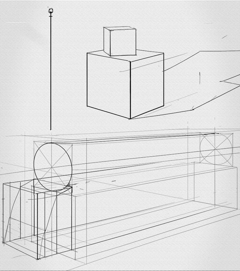
i'm trying to replicate what the term one people do at FZD school. should look like a train by next week if all goes well.
XYZ:
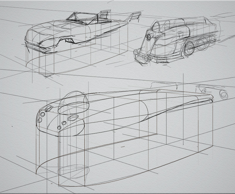
more with the form shiz, scribble a quick idea over a basic two curve combo and get the drawing it accurately using all the techniques from HOW TO DRAW. there will be a cadillac style thang, and shitty look train and a slim line submarine (the only one i've started correct construction on)
Composition:
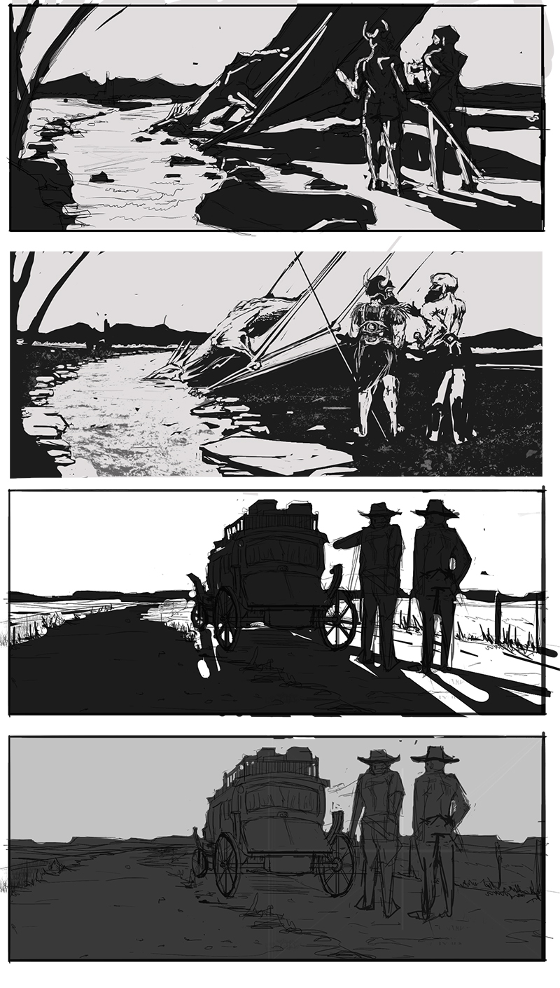
Lighting choices from last weeks line work, bit meh, did an ambient and a backlight for both should have tried more options but got caught up detailing-ish the second one down... the most boring of them all :)
design:
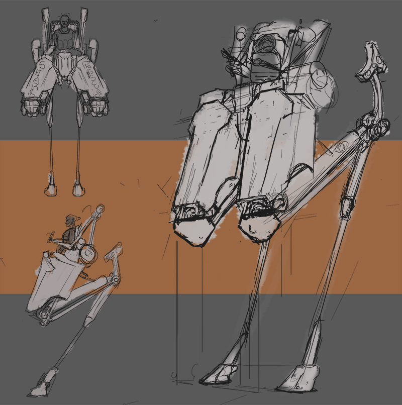
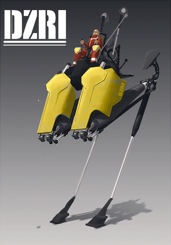
new IOW search and rescue mech. had to get over all terrain so i was thinking mountain goat... you's just have to imgaine them being very nimble. lead to the satyr looking chap. i'm gonna refine and maybe render though-out the week, i like it though so probably wont change it much
B.b.b.bonus.sssss:
since this is just a WIP week I'd thought I'd add a bunch of older stuff to spice it up.
this is what I was doing summah last year, bunch of EOW's and CHOW's, still life from photo ref, speed paints. this year has been about improving my underlying construction and line work mostly so i thought it would be cool to post something different from back when I wasn't so dry and boring :)

not crazy exciting, but hey.
Cracked: thanks! I kinda dropped the ball on the lighting them, might be able to pull it back :/
Posts: 179
Threads: 3
Joined: Mar 2015
Reputation:
5
Awesome Sketchbook joe, love the plane and environmental sketches that you did 
Posts: 60
Threads: 3
Joined: Feb 2015
Reputation:
14
quick update
entry for IDW
Posts: 1,342
Threads: 17
Joined: Jul 2013
Reputation:
45
Good to see the new stuff, Id ride that mech, looks fucking awesome. I also imagined it has some sort of powerjump ability. It compresses air to critical point and then releases in a burst causing the mech to leap 50-100 meters, wouldnt be very healthy for the pilot though :)
Posts: 60
Threads: 3
Joined: Feb 2015
Reputation:
14
CRacked: haha, I thought it was a death trap before, ain't no way anyone is walking away from it alive with it jumping abouts the place.
Yo Chris, if you've eva got a few mins I wanna pick your brain, find out what construction your throwing down for your perspective sketches, you made them look so effortless. mine look soooo laboured.
Hey people, it's been a while. moved house again, started new job, squeezed in very little drawing.
I kinda abandoned my study scheduled/topics and just tried to fit in anything. worked out I ended up doing more finished drawings which gave me a chance to see where the study has gotten me this year.
so, self assessment (tax doesn't have to be taxing)
I have a good handle on perspective construction techniques so at the very least I can draw something that looks solid and three dimensional. I need to throw some artistry and stylz at it to make them sexy.
my sketching needs a lot of work too, I'm can draw well enough with the crutches of construction, but i'm failing when it comes to do anything more free. it's a skill I really need, it'll make a huge difference when I come to sketch rough concepts.
Design is my biggest hurdle, as far as I can tell my proportion and placement are good but I'm always left stumbling when it comes to designing the details and mechanics. I know so little about how things work that even using reference isn't much help because I don't have a solid grasp on the ideas behind it.
for the most part I prefer drawing more realistic stuff, so we might have different things come to mind when I say design because I'm not really pushing for any far out concepts (not yet anyway), i'm looking for believability, some kind of mechanical accuracy and to nail the design aesthetic of an era. oh, and to hit the basic principles of design, like yo shape, and proportion such and such...
stuff like this https://www.youtube.com/watch?v=Ydu_2bUgG78
Rendering and painting are not even on my radar at the moment, same for drawing more organic shitz. i need to figure how to work them back in
so yeah, i need to make a new study system based on this, hopefully in a few weeks i'll have a path I can trot merrily down.
now for the work (sorry for the long ramble, it's been a while)
This sub is a good example of poor design, it started as an exercise of randomly applying XYZ techniques (like 2 curve combos, radii, projecting forms out, cutting into forms for the HowToDraw Book) so when it came time to detail it I was all kinds of lost. I think it'll always be better to start with a clear concept or design direction
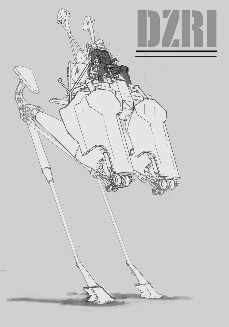
same again here, i thought I'd show the line drawing for the mech to show lack of good design detail. it could have been so much more interesting if the mechanisms and pneumatics were designed with any understanding of a real world equivalent.
the perspective construction on this was not the best too, if i were to do it again now the smaller details (ellipses mainly) would be drawn more accurately.
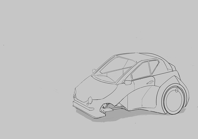
This is the first car I've ever drawn, it's trash, but I definitely think it's good first step. I don't have the same confidence drawing cars as I do with other things, it's a more specific set of drawing technique, more projecting on to curved surfaces and such. plus the design is whack, it was for a contest. a three wheeled car for 2016
meh, I'm happy enough with it and it sets me up nicely to for the next one
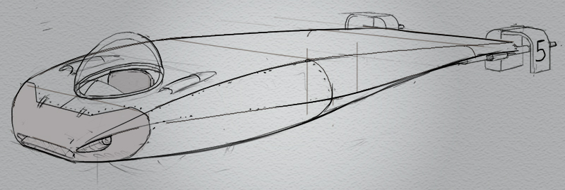
This plane is more recent, I tried to correct the problems I had with the last few draws. so before I started I researched a bunch of WW2 fighters, drew breakdowns for parts, looked a little into manufacture and the science (no way near enough mind) and designed options in orthographic views.
could used some lovin' but i don't think i can do any better than this ATM
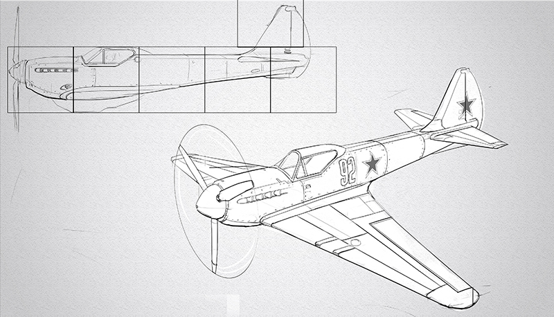
Last one. I tried my best to mimic the Foundation term 1 work they do at FZD. not much design work went into this as it's a very heavily based on The Cincinnatian. The construction is different for the plane drawing, here i started with some boxes (trying to get the basic proportions) and just chopped away at and added to (the plane was drawn by projecting orthographic views and constructing cross sections).
I didn't quite achieve the same look, the line work is a little to phat in places which makes it look a little more cartoony, an it's missing some details. pretty close though, at a glance it might look like it came from the school... a very quick glance.
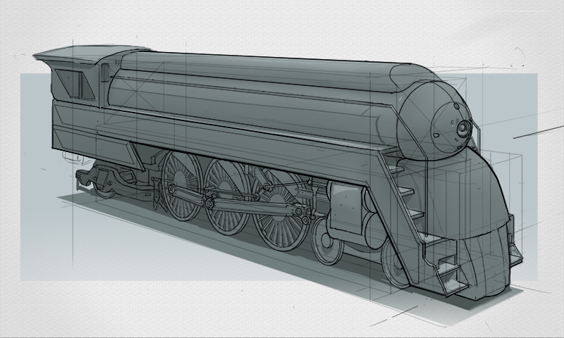
I posted it on deviantart, I got one reply and it was a request for it to be entered into the group "horseshitartofDA" felt like a punch to the old guts.
CYA
Posts: 60
Threads: 3
Joined: Feb 2015
Reputation:
14
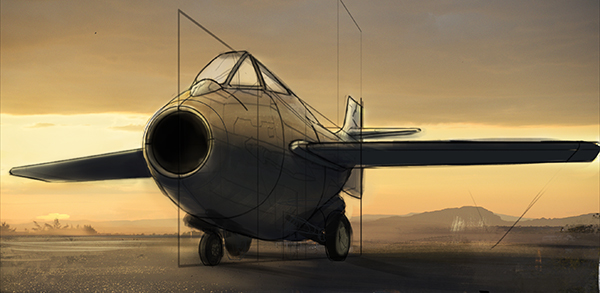
quick update
working on this
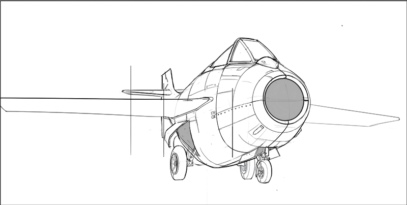
and a rough colour comp i did before i finished the line work
Posts: 60
Threads: 3
Joined: Feb 2015
Reputation:
14
yo Daggers, loooong time.
gonna do a bigger post soon showing what I decided to study but for now I'm just looking for a bit of advice on composition.
I'm working on this painting
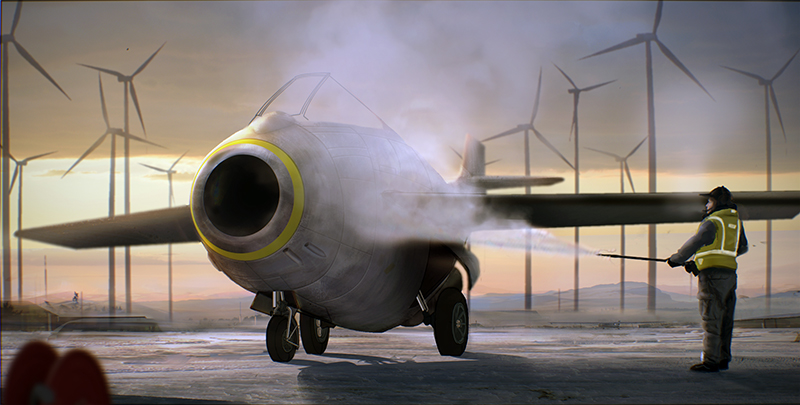
I was almost done with it but then I was hit with how boring it is. It was never meant to be action packed but I don't think there is enough going on for it to even be interesting
so the idea behind it is, it's early morning, it's cold, it's calm, a Plane is being de-iced before it's flown later that day.
initially I was gonna put more people and stuff in it (like the pilot waiting around, watching the work being done on the plane, drinking some coco, some more maintenance folks pottering around, tools and equipment) but I couldn't find a way to place them in the scene that I liked I hate adding things I think, like everything to be as sparse ans possible.
with the ground plane being so flat and boring and because I have soooo many horizontals and such a still comp I dont think I can get away with it being that empty. so now I need to add stuff in and I'm looking fo opinions on what to add and where to place 'em
so this is an early idea I had for the comp
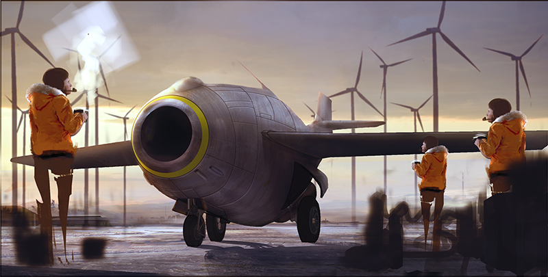
which I dont like too much
this is what I'm thinking now
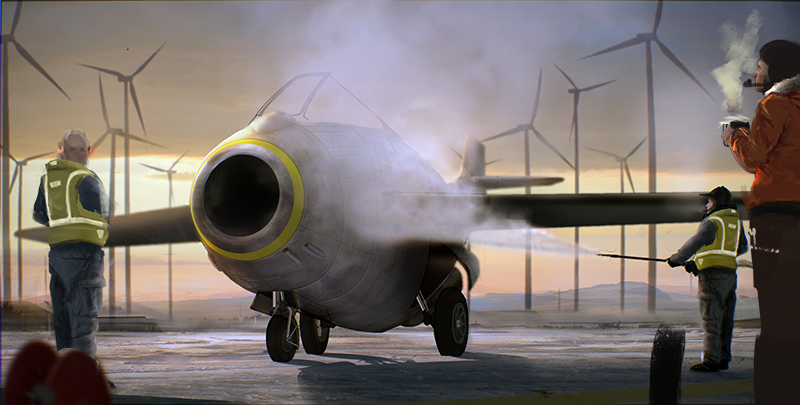
which I'm more happy with, but it's still not sexy. I think the dude on the left looking towards to pilot is something I'll keep, works to stop the your eyes falling off the left side of the picture, but other than that im not sure
any ideas?
Posts: 1,527
Threads: 24
Joined: Dec 2012
Reputation:
70
Hi, how's it goin'
Um, so. Uh--YOUR SKETCHBOOK NEEDS MORE LOVE, GODDAMMIT!
You can do the perspective, holy shit. Great stuff
Seriously
Don't stop, pls. such eye candy. yas.
can't talk
so good
sketchbook | pg 52
"Not a single thing in this world isn't in the process of becoming something else."
I'll be back - it's an odyssey, after all
Posts: 60
Threads: 3
Joined: Feb 2015
Reputation:
14
#heeyyyooo
long post time, hold on to ya butts.
I came to a dead-end a couple of months ago, getting a firm grasp on the basic (more mathematical side) of perspective had been my aim for so long (ergh, like a whole year jeeeeez I'm slow.... or time is fast, yeah! i'll just blame time. stupid time) that when I felt i had gone far enough down that road I was at a complete loss. it's hands down the worst part about trying to self teach, just so much time wasted just trying to decide what your next move should be.
I've still not decided but I've got a few ideas I'm gonna try out, focusing more on industrial design so if anyone has any ideas of stuff I should try out i'd really appreciate the input. Or if y'all are going through a similar phase of decision making feel free to add your story below, it's always helpful to see how other people tackle the same problem.
Design:
At this point I think there are two main problems I need to overcome.
the first one is getting comfortable with the various techniques of design sketching. without all the perspective construction (which is slow and laborious) my drawing sux, and it's hard to take. so I'll begin trying to experiment and come up with a happy medium. i think each class of vehicle will have it's own simplified construction I can use to sketch and keep the perspective roughly correct. For example correctly plotting the front and back wheel of a bike meant I could sketch the frames loosely and quickly without loosing the look of solid forms too much. I imagine for jeeps and tanks I could do simple box stacking to get the construction down then cut and detail. I can't think of how to simplify plane construction yet, might be best to 3D paper plane it? not sure, oo actually one big box might be enough, trying to get the ratio of wingspan to plane length is the trick bit in sketching because I wont be setting up measuring points, but with a big box it'll be easier to guess... hmmmm, gonna try it
the second problem is visual library, I have none, which really slows things down. the more i know about a subject the more I can experiment freely and make choices with less stress . this is the biggest thing I'm going to have to overcome over the next few months. I just want more building blocks to play with
so here is a little snippit of some of the stuff I've been trying
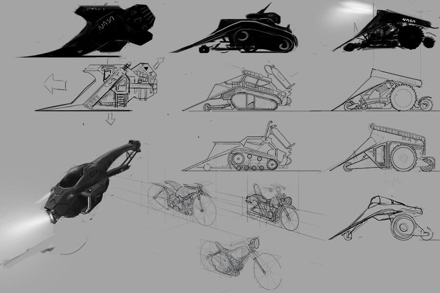
a lot of these are ploughs for this weeks IDW, I'm using what I learnt for John Parks Intro to Vehicle design. the bikes were me trying to draw loosely in perspective, and the hover Chopper was an attempt to come up with a silhouette and add value to it to define a 3D form (I really like that one :)
the plan now is to try incorporate everything a need to do into a self contained practice:
once I've chosen a vehicle I'm gonna do 30 mins of research, get a rough idea of how it works, the different parts, some basic proportions
Next up, put all that research to one side and find reference from other types of vehicle... or anything really. all i'm looking for here is different form languages.
so with the form language to hand I'm gonna sketch versions of the original vehicle trying my best to remember as much of the research I did while modifying the forms to emulate the new references.
after that I'll go over my research notes and make additions to the sketches
I think the incorporates everything I'm trying to learn.
Presentation:
I want to still churn out properly constructed drawings. I'm not putting any brain effort in here to improve, I just want to keep doing them so they evolve and refine themselves
once aspect I'll probably look into here is style. it's as basic as it gets at the moment, just black drawing on a white background. Wanna see what I can do to make it more interesting
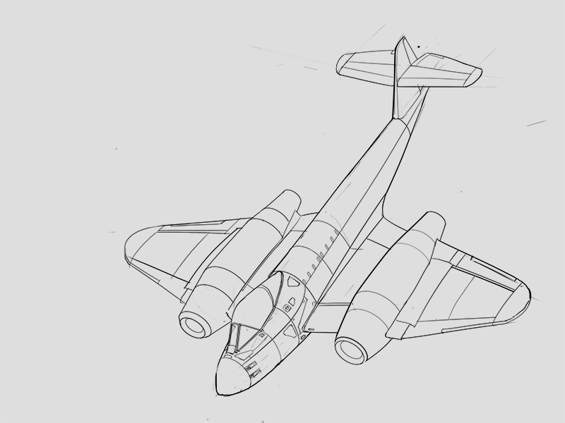
here are a couple of planes
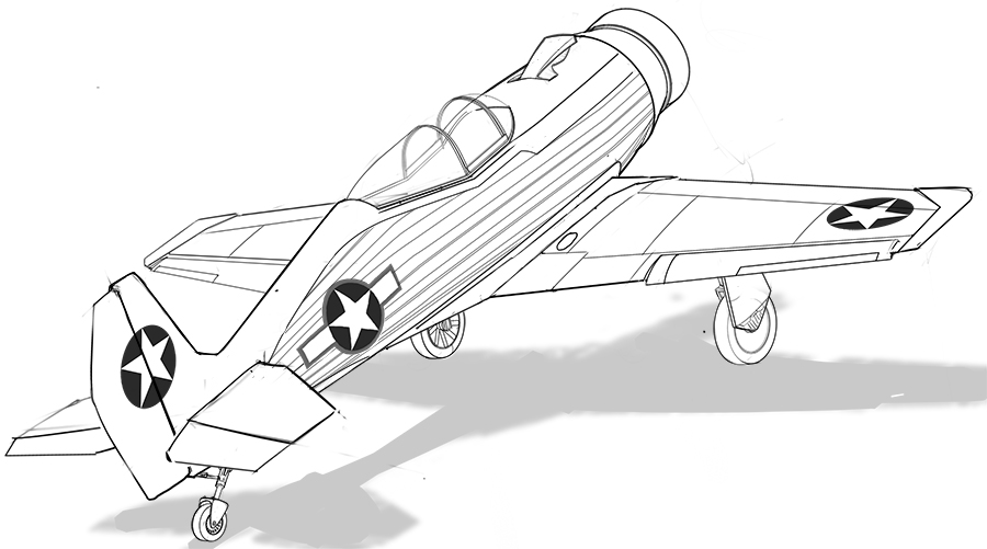
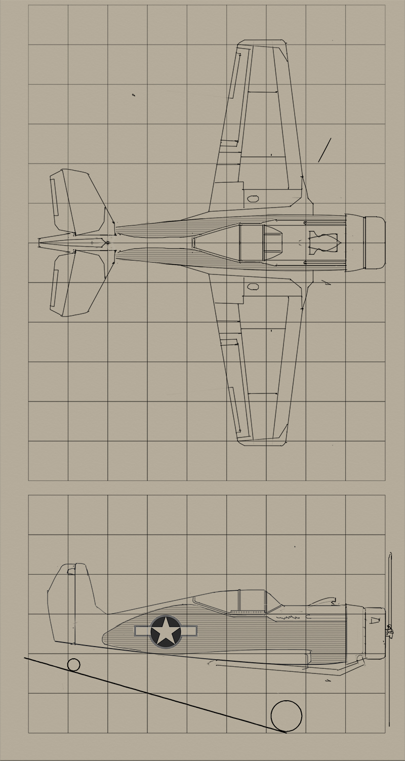
the second one is my design, here be the orthos
WorkShop:
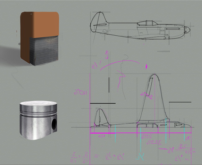
i'm going to have a PSD where I just try things out, little perspective experiments, look and parks and proportions of vehicles, just to get a handle on bits and bobs without the stress of doing a full drawing
People:
This bit is just for fun if I have time
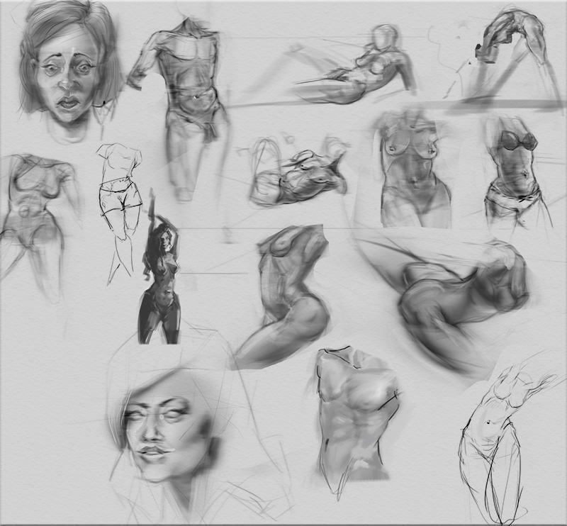
ANNNNNND done
I hope this'll workout for a while
Smrr: haha Thank you :) I come back to that comment whenever a need a pickmeup
Posts: 177
Threads: 2
Joined: Aug 2015
Reputation:
9
damn your perspective stuff is dope! I'm envious that you've managed to stick to such a technical approach.
I'm still working on the basics of perspective, just starting Scott Robertsons book, but I can already sympathise with the problems your having finding a happy medium between accuracy and speed. Everyone else seems to hve this lid back approach that still looks amazing and I'm drawing crosses in boxes and it still looks crap! haha.
I guess you already saw Rene Aigners perspective video, he goes through some PS stuff in it, in case you didn't already catch it;
https://www.youtube.com/watch?v=25x7MuSrQGU
As you were dicussing style, and trying to make those studies look more interesting, you could just throw in some simple single colour, like a grey overlay for the entire plane (or grey background), then a tiny bit of suggested ground, or a horizon with basic shapes to anchor it down - it's not a lot but it should break up the whiteness. I can see from your other peice that you have no problem rendering things fully, but that could be nice for drawings you don't want to fully develop. You could even throw in some real basic shadow and highlight so it's got that product design sketch kinda feel?
I'm havin trouble finding examples of what I mean but these are a start;
https://www.pinterest.com/pin/65513369555855224/
http://www.homebuiltairplanes.com/forums...zerosm.jpg
http://www.desig-nergy.com/images/portfo...il-13a.jpg
https://www.cadcrowd.com/slides/016.jpg
Visual library wise, it looks like you've come up with a good approach already - I was going to suggest you could also look at model kits like the maschinen krieger stuff for shapes and concept inspiration.
Sorry bout the giant post - I'm probably coming in well under your skill level but hopefully some of this is useful!
You're seriously smashing it here tho man, I'm looking forward to seeing more.
Posts: 60
Threads: 3
Joined: Feb 2015
Reputation:
14
 06-29-2016, 12:17 AM
Hey, I've come sculking back to the boards after months of inactivity again. here to recapture the glory days when I use to post up in this joint every week... almost every week. I've been busy but without much direction, that's mainly what i'm trying to get back.
so today, i'll catch y'all up on some of the bits and bobs I've been up to and organise a schedule of sorts
first up I've got my entry for the artstation transport challenge, which is also my first full illustration (I finally completed something, woop!) I spent countless hours on it, messed my eyes up and melted my laptop but bygum I
was happy when I finished it (I don't care about it any more now... brains are stupid)
mostly painted a bit of photobashing in the foreground
most of the other entries used a lot of 3D, I think it's about time I learnt. to do that though i'd need to invest in a desktop, my laptop struggles with just photoshop and slow down to a crawl if I spend longer than an hour of a painting... possibly down to my liberal layer usage, love me some layers. I'd have to get it on finance though, which is the scary part
so I did a rough collection of designs, drew up a neat version of the finished design in the perspective I wanted in the final image. blocked out a rough comp ontop of the new line drawing, first planning the layout of the other opjects/characters in the imaged then designing the shadow shapes and loosely drew a few details for the other elements. finally trying out a few different colour schemes (each object in the image, and their shadow shapes were on different layers so it was easy to change the colours)
chose one and made it neat before adding the details
ive been a bit lost since I finished it. a few things ive been trying to do are virtual plein air sketches. the facebook group
working on my traditional perspective drawing (posted on my Instagram, I'm a 'like' whore)
and trying to keep up with my digital perspective drawing
![[Image: safe_image.php?d=AQDvf0U0BilHviML&w=435&...3D.2&cfs=1]](https://external-lhr3-1.xx.fbcdn.net/safe_image.php?d=AQDvf0U0BilHviML&w=435&h=435&url=https%3A%2F%2Figcdn-photos-c-a.akamaihd.net%2Fhphotos-ak-xpf1%2Ft51.2885-15%2Fe35%2F12627933_809577459171122_1680075913_n.jpg%3Fig_cache_key%3DMTE4MTIwNDE5NDcyNDUwNjMzNQ%253D%253D.2&cfs=1)
it's all a bit sporadic atm, need to choose a direction and stick to it, just so I can work in volume again, you waste a lot of time doing nothing when you don't have a plan.
NEW SCHEDULE
virtual plein air
going to continue churning these out, but with one caveat, I can only spend 6hours per image.
PORTFOLIO PIECES
I've got a few ideas for portfolio illustrations and I need to start painting them up, i'm going to have one completed every 2 months, i'l share all process shots on the forum weekly as I go along (then you guys can crit the shit out of them  )
GOODGUYSBADGUYS
As Jake parker said, it's important to have a project, this one will be mine. it's a design challenge, visual library building, perspective drawing bonanza.
i'll be choosing a particular time era, or genera and create two opposing factions. it'll mostly be designing different vehicles for each side, but I might include uniforms and logos too.
the design goal would be to make sure that each team follows a specific design language and there is a clear good side and a clear bad side. without being super obvious though, so, like no skulls and sharp jaggy shit for the bad guys. I've set up a tumbr for the finished designs, but i'll pop all the WIPs and thumbnails up in this thread
HELPING OUT
anybody want any advice or crits? specific perspective problems? drop me a message, post it on this page, link me to the crit thread, friend me on facebook, anything you think I could help with just let me know. i'll keep trying to include as mush info as I update this sketchbook, hopfully there will be something useful hidden amongst the ramble
I know it's a bit of a loosey goosey schedule at the moment, but i'll tighten it up when I get an idea of how long things will take
cya
Posts: 60
Threads: 3
Joined: Feb 2015
Reputation:
14
I think at the moment I'm gonna go for daily update of the GOODGUYSBADGUYS project and then do weekly update for the other two.
It's gonna be really sketchy. Trying to focus mainly on the design for now
So for the first iteration of GGBG im setting it in a WW2 esque era. Im starting off by designing military motorbikes for each side even drawing a lot of bikes recently so I thought it would be an waiter place to start while I'm working out the design language for each side
Focuses more on the goodguys side today. Using early prop planes as shape inspiration for that team
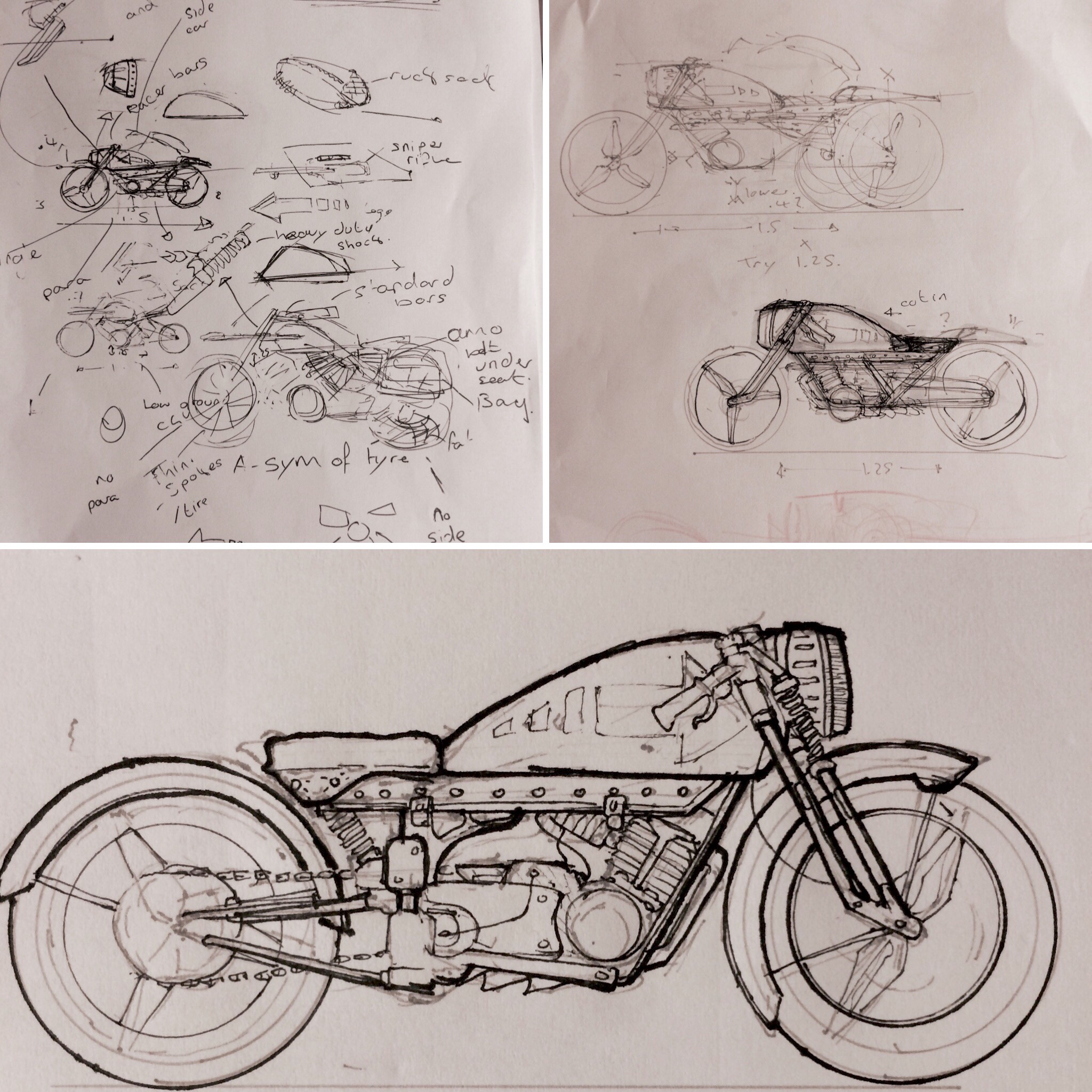
(Not much time to day but I'll go into more detail as we go along)
Posts: 1,118
Threads: 12
Joined: Nov 2013
Reputation:
63
Hey awesome sketchbook, man. Thanks for the PS tip. I love how you did a traditional mock up to explain it lol. One question, though. In your diagram, what is the "left measuring point" used for? You mean a left vanishing point?
Posts: 60
Threads: 3
Joined: Feb 2015
Reputation:
14
Hey man, I made a little video just going through the process a bit so you can see how the measuring points work is regards to this, hopefully it's clear enough (both my explanation and video quality (working off an old laptop, had to keep the settings pretty low)
might be an idea to watch this video first, it's a guy explaining measuring points using perfect cubes as an example
https://www.youtube.com/watch?v=OB3UEpxFlj8
measuring points are just a way of working out how far back into the distance an object in perspective is going
just watched it and the quality is pants, buuuut, i'll post it for now, i'll try again in the future
it might me a good idea to play at a faster speed :)
Posts: 144
Threads: 4
Joined: Dec 2015
Reputation:
5
Nice sb dude! Love the motorcycle design, keep up the good work!
Posts: 1,424
Threads: 12
Joined: Dec 2015
Reputation:
139
Fantastic sketchbook mate! I love all of the perspective stuff - I was giving myself a head-ache the other day trying to work out how deep to make an object in perspective but I think these Measuring Point thingamajigs are what I need! Thanks for sharing this stuff Joe - I will put it on my Deathline Task Bucket to study.
Also your rendering and design work is really inspirational - keep going - looking good!
“Today, give a stranger one of your smiles. It might be the only sunshine he sees all day.” -- H. Jackson Brown Jr.
CD Sketchbook
Posts: 60
Threads: 3
Joined: Feb 2015
Reputation:
14
Miracoly: thank man, looking forward to the draw through hangout! Your work has come along at since the last time a saw, looking forward to pillaging your techniques 
Hey artloader, thank you, thats really awesome to hear! I was struggling with the same think about a year ago, that and trying to find out how to tilt an object (turns out measuring points are the key to both). I'm thinking about starting a YouTube perspective series when I get back off my holiday, I remember when I was trying to find information there was no one place that had it all, just drips and drabs from various places. So if you have any questions about perspective, or anything you are struggling with let me know and I'll included (so long as I know how  ) it'll help me plug any holes in my understanding too
That's an open invitation to anyone btw, drop a list of perspective questions or topics and I'll try work it into the videos
|


![[Image: untitled_by_josephhoward-dareacq.jpg]](http://orig07.deviantart.net/0547/f/2016/346/e/5/untitled_by_josephhoward-dareacq.jpg)
![[Image: landscape_study_by_josephhoward-dardq4r.jpg]](http://orig14.deviantart.net/6172/f/2016/346/1/e/landscape_study_by_josephhoward-dardq4r.jpg)
![[Image: landscape_study__by_josephhoward-dardq9p.jpg]](http://orig10.deviantart.net/980c/f/2016/346/1/4/landscape_study__by_josephhoward-dardq9p.jpg)
![[Image: safe_image.php?d=AQCLVs_c4I5PsXKE&w=435&...53D%253D.2]](https://external-lhr3-1.xx.fbcdn.net/safe_image.php?d=AQCLVs_c4I5PsXKE&w=435&h=435&url=https%3A%2F%2Figcdn-photos-a-a.akamaihd.net%2Fhphotos-ak-xaf1%2Ft51.2885-15%2Fe35%2F13259658_1755275348092992_1701242405_n.jpg%3Fig_cache_key%3DMTI2MjQxNjIyMjc5MjgwNDUwMg%253D%253D.2)
![[Image: safe_image.php?d=AQDvf0U0BilHviML&w=435&...3D.2&cfs=1]](https://external-lhr3-1.xx.fbcdn.net/safe_image.php?d=AQDvf0U0BilHviML&w=435&h=435&url=https%3A%2F%2Figcdn-photos-c-a.akamaihd.net%2Fhphotos-ak-xpf1%2Ft51.2885-15%2Fe35%2F12627933_809577459171122_1680075913_n.jpg%3Fig_cache_key%3DMTE4MTIwNDE5NDcyNDUwNjMzNQ%253D%253D.2&cfs=1)
 )
)
 ) it'll help me plug any holes in my understanding too