^ this is true. can throw in my 2 cents tho on this one.
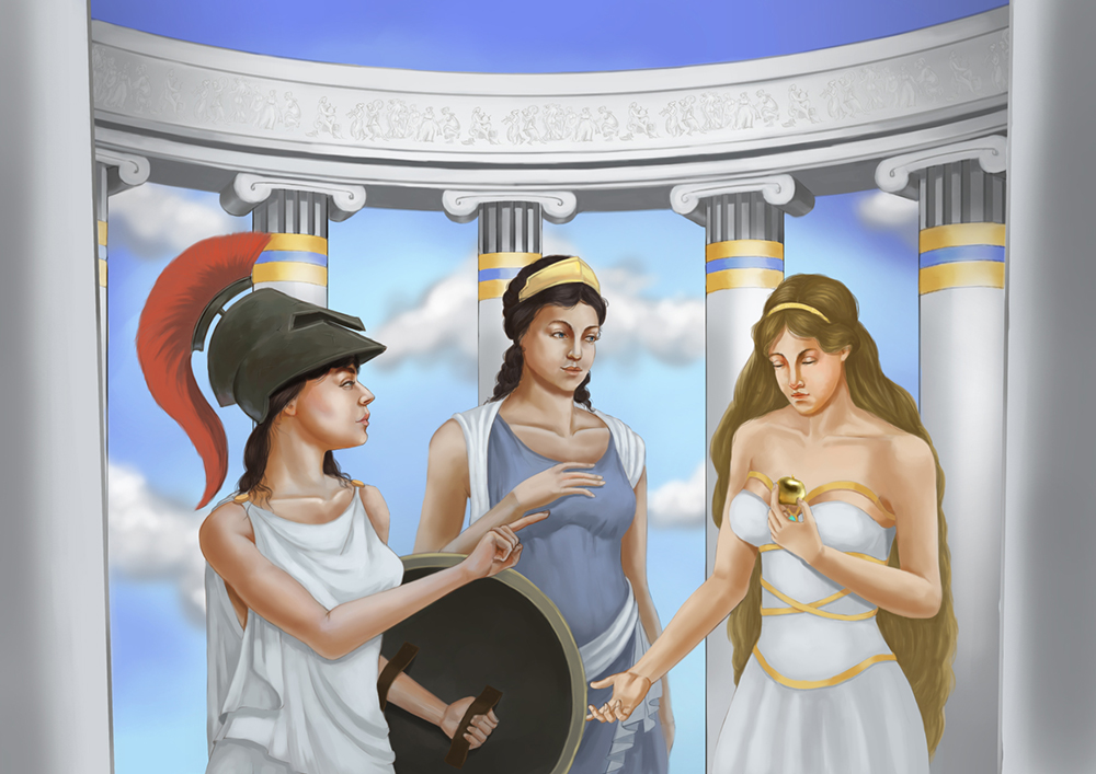
I'd say no.1 thing is lighting. obviously texture and the rest mentioned by darktiste are extremely important too, but i'd say if nothing else you can generate a lot more interest in this though using interesting lighting, at the moment it seems to just be skylight and an side lighting which doesnt quite work.
Try partial lighting. from my exprerience partial lighting is one of the best way to pull focus to something you want to show, whereas your eyes are going everywhere on this one, because the values are all very bland and similar. figure out where youre main light source is coming from, and really think about where it will fall. before this though, think more about what you want to show case in the scene- who is the main focal point, secondary and tertiary?
I'd also say you should look into a more dynamic composition- our eyes just go in a line really through the faces horizontally and doesnt get a very interesting arc of movement.
gonna say what people always say to me which funny enough always turns out to be true- do thumbnails, and play with directional lighting, spotlighting, different levels (like having the one in the most focus on a higher level to the others, maybe just catching light from between some pillars?). basically play with it and try to generate more interest through difference between the figures, as well as value changes between the figures and the backdrop.
gonna agree with darktiste on this, very hard to give crit without knowing more about what you are looking for advice one etc. more info would be great! good start though, you can certainly do faces better than me so good stuff.
check this out btw, artistic reference/studies always help. check out how the artist pulls focus and uses lighting to tell a story.
http://www.greek-gods-and-goddesses.com/...d-iris.jpg
Xavier


