11-09-2015, 01:59 AM
Studying values and rendering
Focusing on values and rendering, is down a little step by step method I used.
![[Image: 364fbd31055221.563f6923c7add.jpg]](https://mir-s3-cdn-cf.behance.net/project_modules/hd/364fbd31055221.563f6923c7add.jpg)
![[Image: e25c3131055221.563f6923c8c6b.png]](https://mir-s3-cdn-cf.behance.net/project_modules/hd/e25c3131055221.563f6923c8c6b.png)
|
Malini's Sketchbook
|
|
11-09-2015, 01:59 AM
Studying values and rendering
Focusing on values and rendering, is down a little step by step method I used. ![[Image: 364fbd31055221.563f6923c7add.jpg]](https://mir-s3-cdn-cf.behance.net/project_modules/hd/364fbd31055221.563f6923c7add.jpg) ![[Image: e25c3131055221.563f6923c8c6b.png]](https://mir-s3-cdn-cf.behance.net/project_modules/hd/e25c3131055221.563f6923c8c6b.png)
02-06-2016, 11:52 AM
After some time away due to some problems, with no opportunities to even connect to social networks and something like that ... good going straight to the point, a few of my studies of values of the day 10.11 and 12.11, 2015.
![[Image: d9392431055221.5649424e45ee7.png]](https://mir-s3-cdn-cf.behance.net/project_modules/hd/d9392431055221.5649424e45ee7.png)
02-06-2016, 12:03 PM
Study in which I emphasized to work in colors
![[Image: girl_lying_by_felipeokashi-d9qnit1.png]](http://img15.deviantart.net/4dcc/i/2016/036/7/d/girl_lying_by_felipeokashi-d9qnit1.png)
02-08-2016, 07:24 AM
Dude that 4 strep greyscale painting is great. Love step two, especially. Cheers for sharing. Looking forward to more!
Just over here trying to get better.
05-03-2016, 09:13 AM
Some portrait of drawings in which I have a great appreciation of doing.
05-03-2016, 10:59 AM
Wow those are some amazing portraits, you have really good control over your values.
I would suggest maybe trying to do more from imagination though.
05-04-2016, 01:20 AM
I would rather start direct play of my imagination, but the problem I have to do this is that I'm too perfectionist.
05-04-2016, 01:44 AM
Speed painting for about 40 min.
- References next to.
05-04-2016, 02:09 AM
you mean drawing something directly from your imagination with no ref?
eh, from what i've gathered outside of sketches and the like it's never usually a good idea to go fully without ref(Though I know there are some artists who've trained themselves not to I think they used to use ref), I think there's a balance it can't be too much ref so that you're copying but you need enough for your visual library, studying without application does'nt tend to build it up as fast. I'm just as guilty of this though haha, whenever I draw from imagination I notice everything going wrong and it demotivates me a lot so I think I go back to studying because it feels safer, i've been trying to get into the habit of doing some imaginitive sketching more often but I do tend to get back to focusing on studying a bit too much. Maybe just as an experiment try and see how far you can take a piece without ref, then gather all the ref you'd need for it and fix the piece with it?, i'd also suggest that for whatever you're studying to try to apply it even a little to something imaginary at the end of the day, for example that helmet study you did, try drawing an imaginary helmet and applying anything you learned about reflective surfaces.
05-04-2016, 04:04 AM
I agree most of his words, I also get very discouraged when I try to do any design without reference, I have a very high uncertainty in this regard, but I am studying structures and foundations to fund to get registered in my mind, the incredible that for more I try to draw without reference, even though I have a fixed idea in my mind it ends up blocking time I will step into the role.
But I will follow your suggestion, she encouraged me enough to continue trying to draw the imagination, when I draw anything using reference at the end of the day I will try to play the imagination and see what actually is recorded in my visual library.
06-06-2016, 09:17 AM
I was half gone, was not able to access the forum, I do not know if the forum was going through some kind of maintenance.
Finally, some studies through tutorials "JesusConde".
06-06-2016, 09:25 AM
For some time now, I expressed a huge interest in illustrations for "cardgame" as the "Legend of the Cryptids."
With that in mind, I drew a plan of studies, first studying dynamic poses of anatomy, as you can see this is essential. I also decided to begin deconstructing some works of other artist of that market, then I selected a few and decided to copy, but not just copy, but to understand how they got that impressive result. But I confess that I am still very lost about following studies for this type of illustration. If you have any tips or suggestions no matter how small, do not hesitate to leave here.
07-02-2016, 04:15 PM
Hey Felipe, this post is about the how to apply studies to finished pieces.
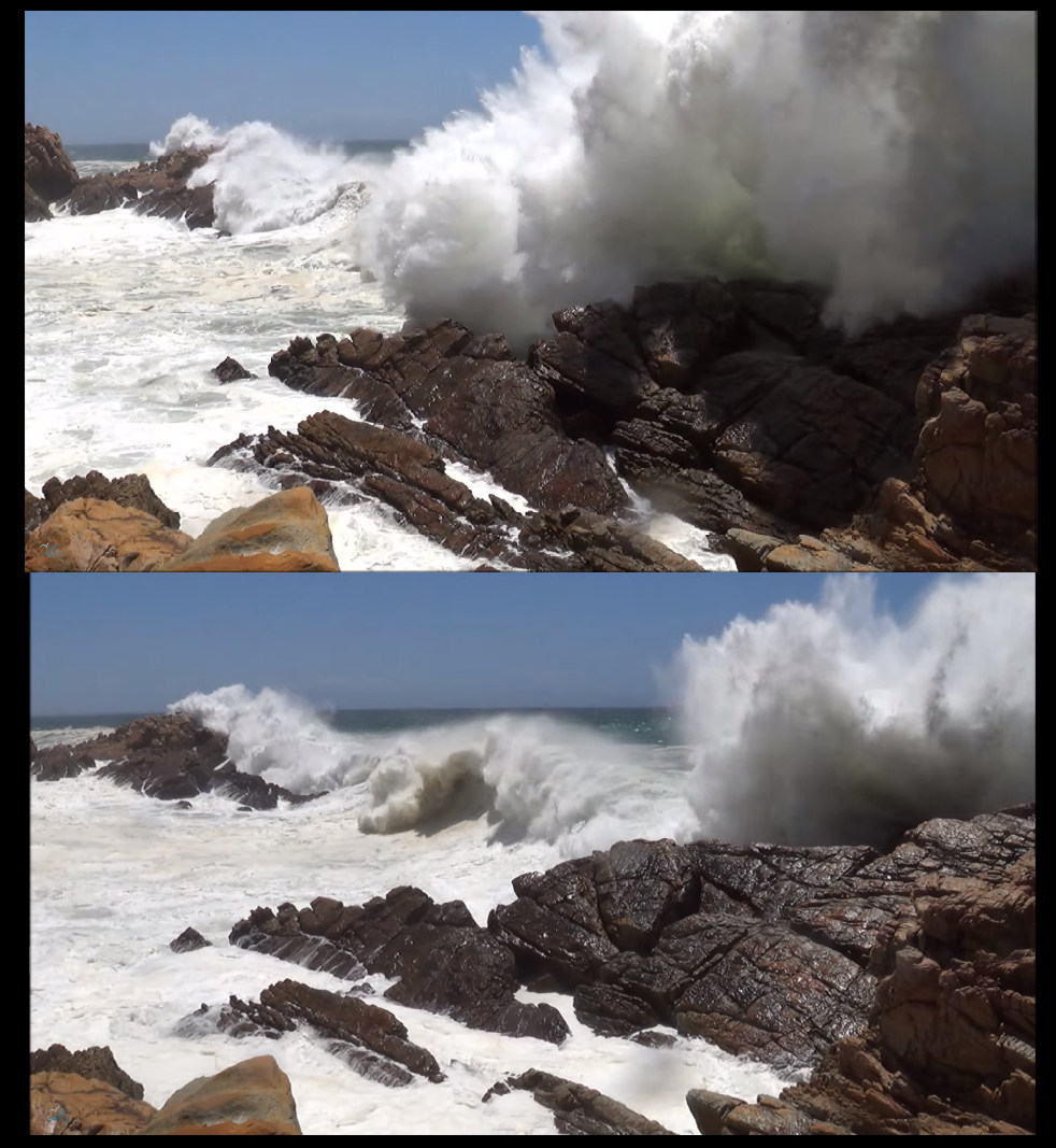
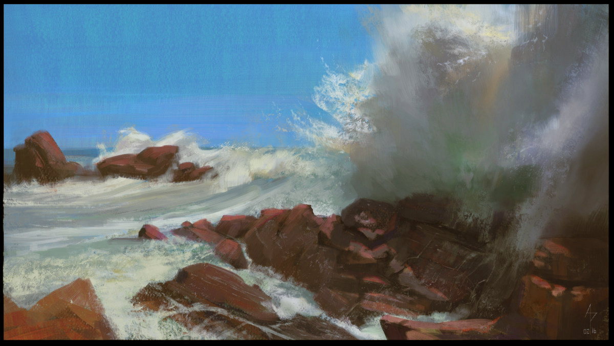
The main point I'd like to get across is that all studies you do towards a final, should be addressing a specific problem that you might have or are having trouble with in the final. Studies should be focused on analysis and not reproduction. I would say you are just reproducing, but doing little of the analysis part, which is why you aren't carrying the learnings from the study to your finals. We do need to see some finals or it's just taking your word for it ;). Here is an example of the process. I decided I wanted to learn how to take a specific style of painting, by master seascape painter Ruo Li. I wanted to do a seascape from reference but paint using what I learned from his work. Original on the left. As I was painting I tried to think about what it was that made his work great. Specific things like edge control, simplification, colour etc. I wasn't focused purely on reproduction, but I like to practice accuracy whenever I can, things didn't need to be as accurate to get the same learning. Observations I made during/after the study. Write them down somewhere, it solidifies things in your mind, and you can refer to them later. (02-24-2016, 04:13 PM)Amit Dutta Wrote: [*]Brushes: One hard texture brush for spray and wave crests worked well. Soft round with a light touch to get that soft wave volume and glow. I did one more like this, but I can't find it, unfortunately. Then I took a couple of screenshots from a video on youtube which showed waves crashing on a rocky coast.  This is the image I painted using my observations from the studies, applied to the reference images. Note it's not exactly the same. I took stuff from both images and combined them. Where the study helped are often in little things like the oranges at the top of the big wave crest. I would have had no idea that would have looked good amplified if I hadn't analysed the colours in the previous study. It wasn't obvious at all in the reference images alone. Photos are quite bad at showing nuances in value and colour / saturation that you might see in real life. Ruo Li paints from life as well as from photoreference, which is probably why he amplified those aspects. I kinda screwed up the final colour balance and values and the rocks are too red so I brought some cools into them especially in the darker values. I fixed it later but didn't update the image.  So, I had a specific study goal in mind, I analysed, I applied to a personal piece, using what I learned. With this one I did it for an entire overall image style, but you can break this down into much smaller chunks for an illustration. If you want to show armour in a certain way in your final, do armour studies, analyse and apply to your final. Then go on to the next thing that you are having trouble with. Every time you are faced with any problem (rendering, lighting, edges, design, colour, anatomy etc) just do the same process. Specific Goal > Study > Analysis > Application. If you break it down like this, you won't feel as discouraged by everything looking bad. The way to improve and apply study is to break things down into smaller manageable problems, and work towards fixing those individually. Obviously if you take the time to do it for EVERY problem you have, it may take quite some time to finish an illustration, so you decide where your study will be best used, but it will be worth it. I hope that helps.
07-05-2016, 01:47 AM
Awesome work. Adding up to the awesome post that amit has provided you; while producing reproducing artists you like, you have to be critical at what the artist was going for in the painting. In this case the LoC has a distinct style of having hard and crisp edges, tight linedrawing , and ton of adjusments layrers unique to the digital realm.
Taking notes like this would make the time you've spent on "studying" much more productive. I sometimed think the notes are as important as the study itself. On top of all that, try to go in and be fearless at making your own illustration. Finishing it even though you might take your work as horrible. But i found theres no other way to improve. Than just to make mistakes along the way , and moving on to the next.
07-12-2016, 08:37 AM
Following the counsel of Amit, before starting my illustration I did a study of scenarios with snow, because I want to portray that in my art as I had not trained before this type of scenario I decided to try.
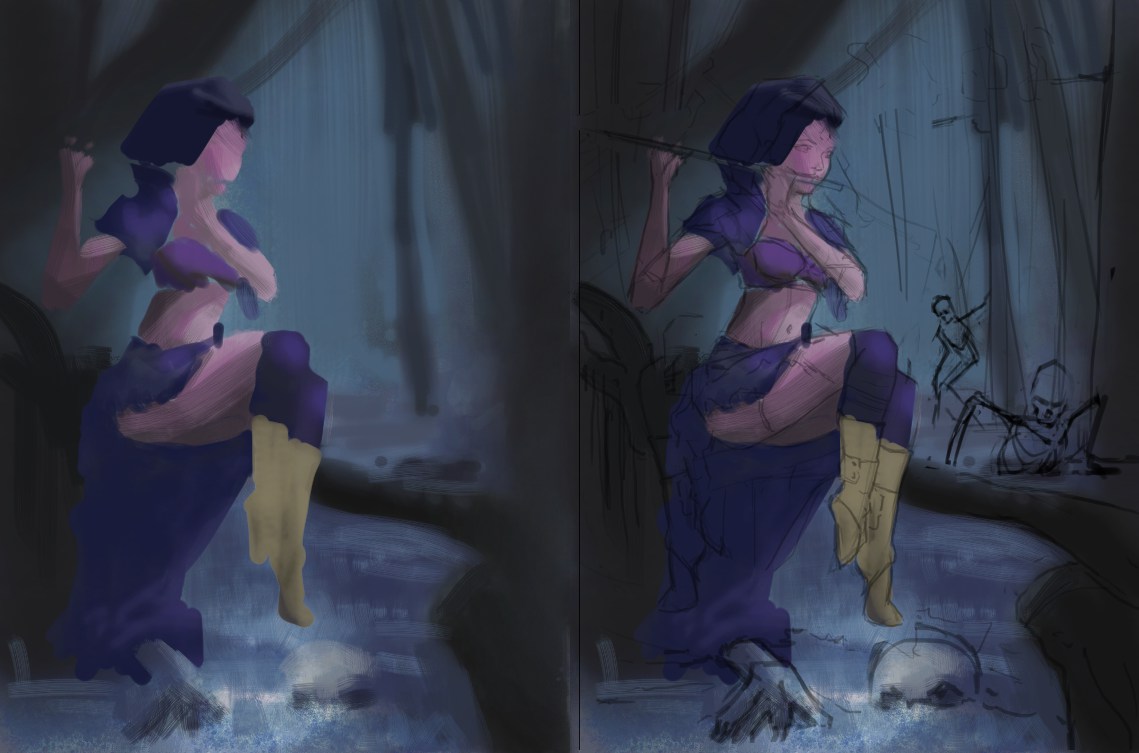
After I did at least 4 studies 40 minutes each, I decided to start my art, following what was said to me here I just created a theme for my art and googled a bit. But as always happens to me I give up on this stage of the work, because when I am not copying do not know how to solve problems that appear to me, after doing a quick sketch, I for color, but when I have to create my own color palette can not really define what I want, it seems that the colors in my art are dirty especially the skin, I like to have colors similar to the reference. I'm really lost, and more than spending hours in this process can not send the painting to a more advanced stage. About my idea, my intention is to create a sorceress to play the instrument in his hands, in case the flute she creates a spell bringing skeletons life, the soul of the creatures would leave the enchantment on the flute and would absorb the creature.
07-12-2016, 11:02 AM
Good start man. Did a paintover.
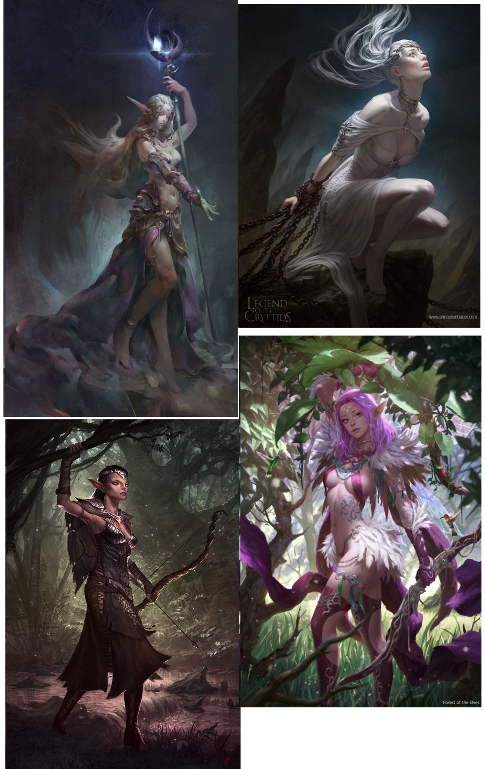
 First thing I did was adjust the comp. I had her face into the canvas, adjusted tree silhouettes that were tangents and added some other points of interest (skeletons coming out of ground and in the trees) to add more to flesh out your narrative. Her pose is pretty good, just watch the near foot, the arch of it is really not working. I used your lineart and blocked in some bold colours before thinking about any detail at all. I tend to think about broad temperature relationships when I do this. What will be cooler, what will be warmer? The cooler surroundings contrast with her slightly warmer tone. That was intentional contrast. You can also start to think about broad form lighting at this stage. You can also refine the overall colour pallette by trying different things at this stage quite quickly since it is easy to colour balance and adjust values, mood of the entire image before you even start detailing. For example I adjusted values of your piece to pop her out a bit more against a darker overall background for contrast. For basic palette and mood don't expect it to magically fart out of your head just because you gathered reference and did some studies. Look for other paintings or images that have the mood/palette you want to go for...analyze them and apply that consciously to your scene. Some potential refs I found that I might have used for the figure, general lighting.  Your image is overall pretty desaturated. This is what is making it look quite gray and dull overall. There is also less colour variation within the hues in there. Again the problem with relying on too many photo studies is it can often give you this kind of colour result unless you bring in your own colour theory and observation from life. The lighting is pretty ambient and not very dynamic which also flattens things. I tried to push that more in the paintover. Take your colour picker and analyze the LOTC pieces you posted earlier. They are way more saturated overall I would bet. Again this is analysis for a specific purpose. You don't always have to paint to learn. Start doing this with any reference you are using to understand value/hue relationships. When it comes to detailing that's when you can do more direct painted studies for the rendering. it's a good base for an image...just work the larger problems first, then slowly get to the smaller problems as you go. You can do it man, don't give up!
07-20-2016, 06:18 AM
Following the tips above I even step is. It was fun here, but I confess that it is extremely difficult ... I'm starting to be taken by the frustration, I'm lost, I do not know what kind of lighting I'm trying to apply the image is, like an interesting lighting ...
Tips and suggestions on what I can improve and change are welcome!
07-20-2016, 12:46 PM
Nice changes, I think it's better. Again, you have to make informed choices based on analysis. Look at the references I posted. In particular the top right image. I didn't pick them randomly. I picked them for mood and lighting. They all mostly use top lighting, which makes nice cast shadows for contrast. Almost all those references have lighting from the top with the face getting the most, except the last one.
Again you are doing this ambient painting style with no obvious light source. You need to pick a main light source and apply this to all your forms consistently. Do a quick study of say that top right ref image lighting scheme, analyse the values and saturation, hues etc, then apply to your piece. Look at how your figure has no consistent shadowing of form, the underside of legs is same value as all the other sides of her limbs. Where is that light coming from, it should be in shadow. Things likethat will only make sense if you have a specific light source so you can map shadows. You answer your own question each time you say, I don't know how to do "x". Just focus on that, go to reference and study if needed, make a decision then apply. Start to gather references to help you with fabric and material and design once you've picked a lighting scheme, time to start tightening up some of that sketchy stuff going on everywhere.
07-20-2016, 10:01 PM
I like where this illustration is going! Hope to see the finished version.
Amit gave you some good advice. I also think the front foot looks a bit unnaturally twisted.
08-02-2016, 09:28 AM
Using the advice of you, I'm detailing the piece at some points, I'm taking a beating and still catching enough in some point.
What could be improved from now on? Something that could add or change as well as better rendering of parts that are with brushstrokes? Circled a point that I am consuming a long time that I am not being satisfied, already I blacked out and redid the designer and still do not know what to do with her shoulder... in a matter of flute I'd like to leave a bluish energy and that light reflected on the character somehow more in practice I'm unable to apply it. |
|
« Next Oldest | Next Newest »
|