Posts: 140
Threads: 3
Joined: Aug 2015
Reputation:
7
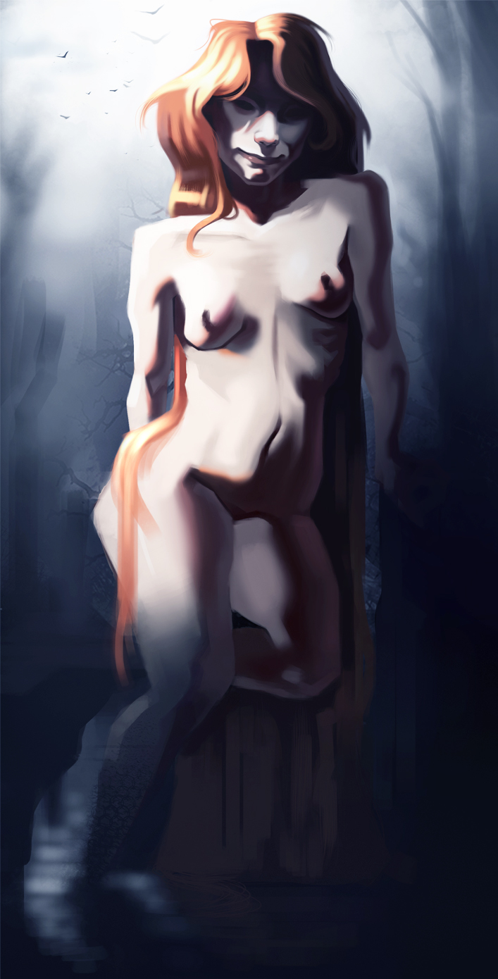
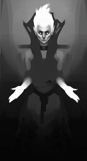
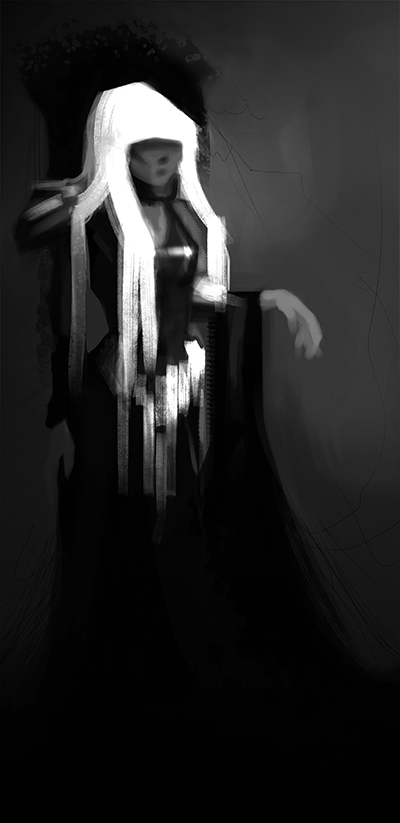
Slow progress...  Im having trouble with the brightness and contrast of this towards the bottom of the painting... oh well. I think im going to add some jewellery on her to make it a bit more interesting, tbh it feels very generic atm.

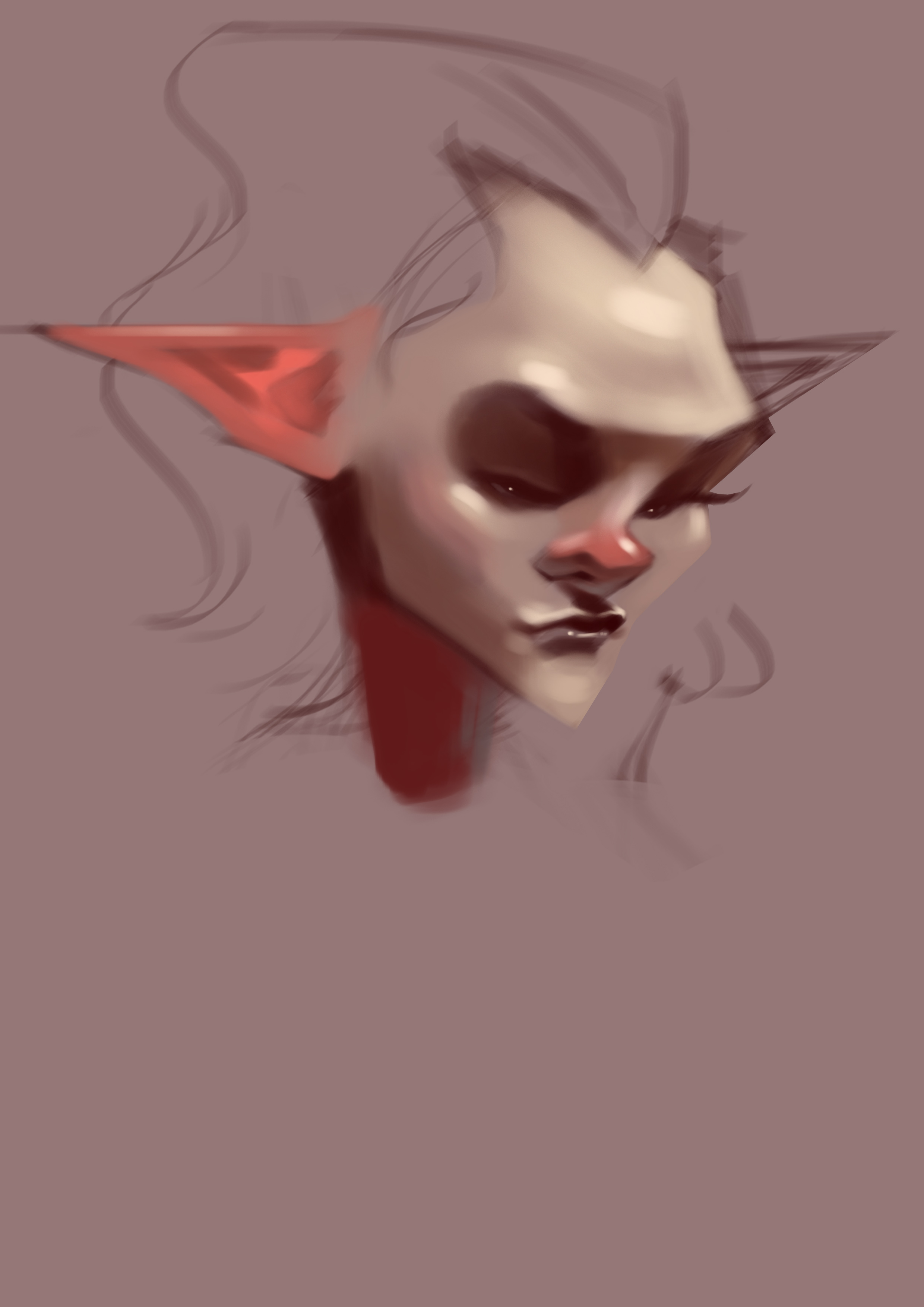
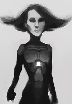
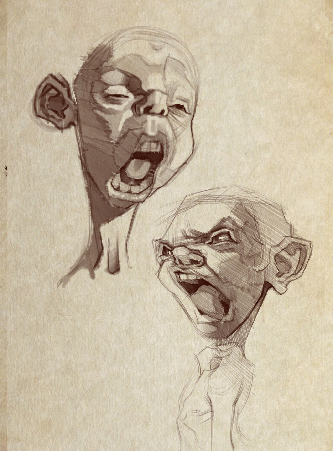
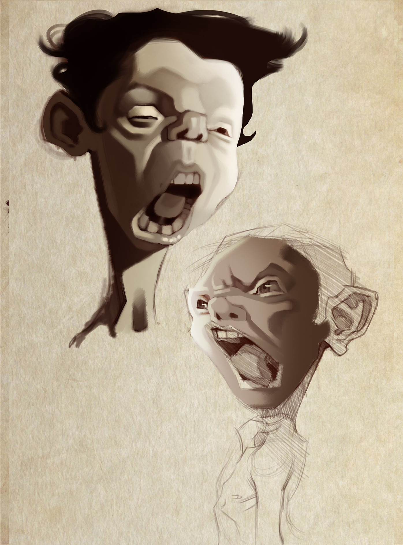
little 20 min painting from imagination 

Posts: 733
Threads: 7
Joined: Dec 2014
Reputation:
32
Fun stuff as usual! Looking forward to seeing your final render of the Rusalka. I love the mood you've conveyed through the colours you've used. Also, great imagination sketch, lovin' it! 
Posts: 177
Threads: 2
Joined: Aug 2015
Reputation:
9
her face is looking great, really sad n spooky.
the rest of it, i'm not really in a position to offer advice on stuff like that yet! maybe there would be some light bouncing back up at her in the lower part of the image, if there's water down there?
how come I can think about stuff like this when I see other peoples work and not my own?! lol.
anyways, cool stuff, the new character is looking good too, liking your rendering.
Posts: 140
Threads: 3
Joined: Aug 2015
Reputation:
7
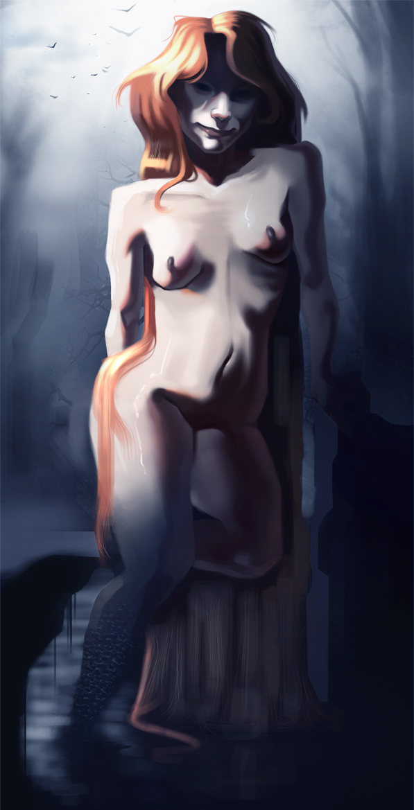
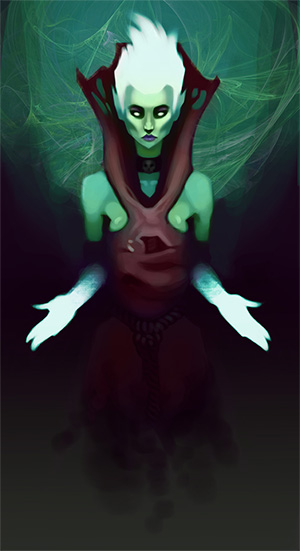
Bookend: thanks man! Finally finished it  I had some trouble with the values of it, hope it isn't too dark at the bottom of the painting.
lurch: thanks! yeh I did paint in some reflected light but I got the values too dark on them, so its hard to see but I have altered the values a bit and made them a bit lighter. thanks for the kind words! 
Here is the final of the Rusalka 

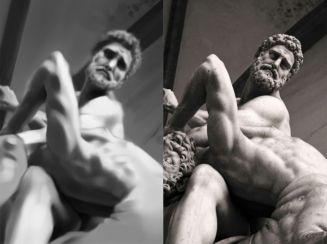
value study, I felt like I really learnt alot in this study, I tended to exaggerate subtle value changes and I realised this when doing this study so I forced myself to squint my eyes alot more to seperate the lights and darks

Posts: 140
Threads: 3
Joined: Aug 2015
Reputation:
7
Posts: 177
Threads: 2
Joined: Aug 2015
Reputation:
9
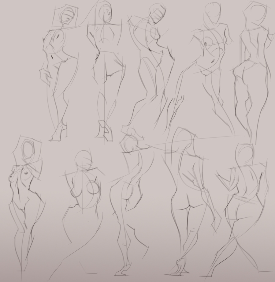
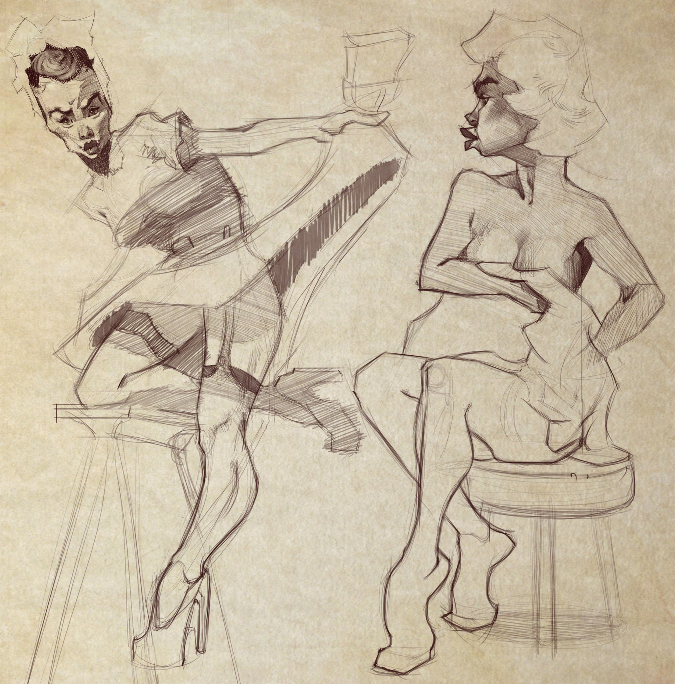
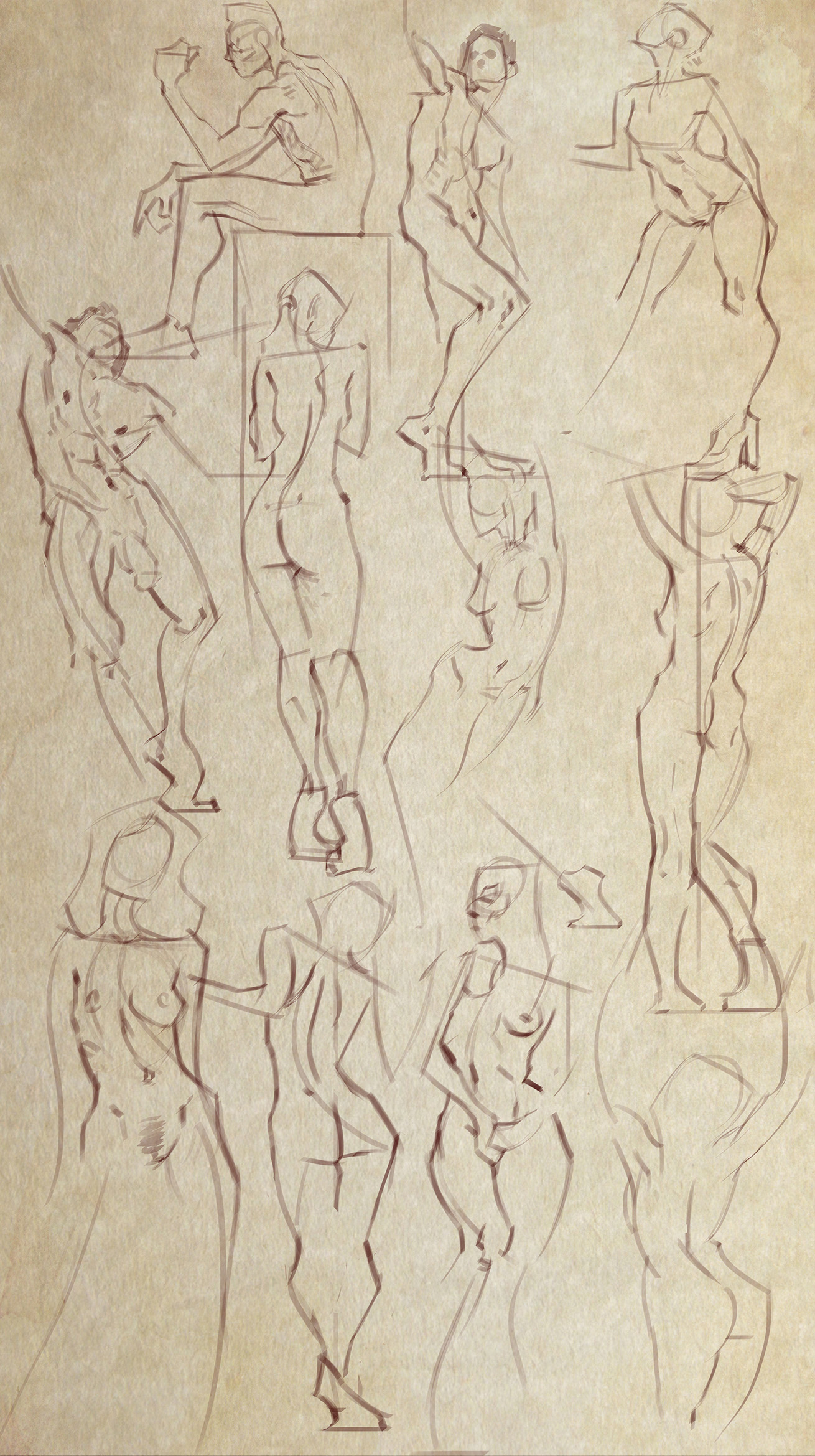
nice figures as always.
i'd love to see more of your personal work, like finished pieces and idea sketches.
i know, it's time though, every time i work on something personal, it's disappointing and i feel like i could have spent the time better studying!
Posts: 140
Threads: 3
Joined: Aug 2015
Reputation:
7
(09-14-2015, 10:17 PM)lurch Wrote: nice figures as always.
i'd love to see more of your personal work, like finished pieces and idea sketches.
i know, it's time though, every time i work on something personal, it's disappointing and i feel like i could have spent the time better studying! Thanks 
yeh sure I will upload some idea sketches etc later.
I feel the same way, when I am doing personal work. I always find faults in my personal work and end up just not finishing it. 
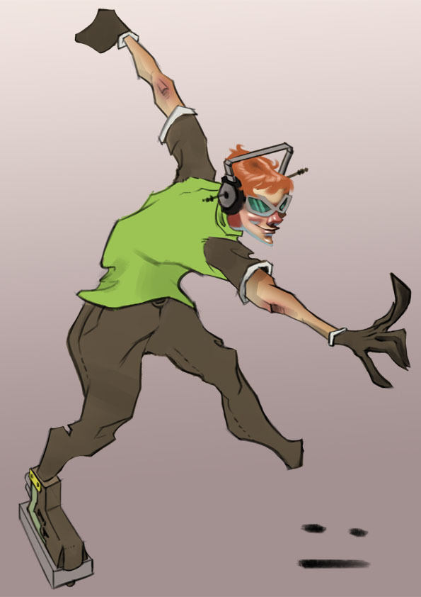
Beat from JSRF, I really dont like this. I was struggling alot with the placement of his left foot.... bleh 

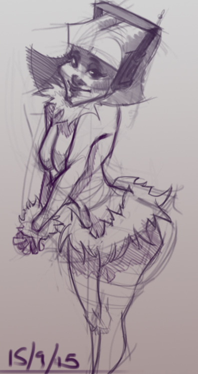
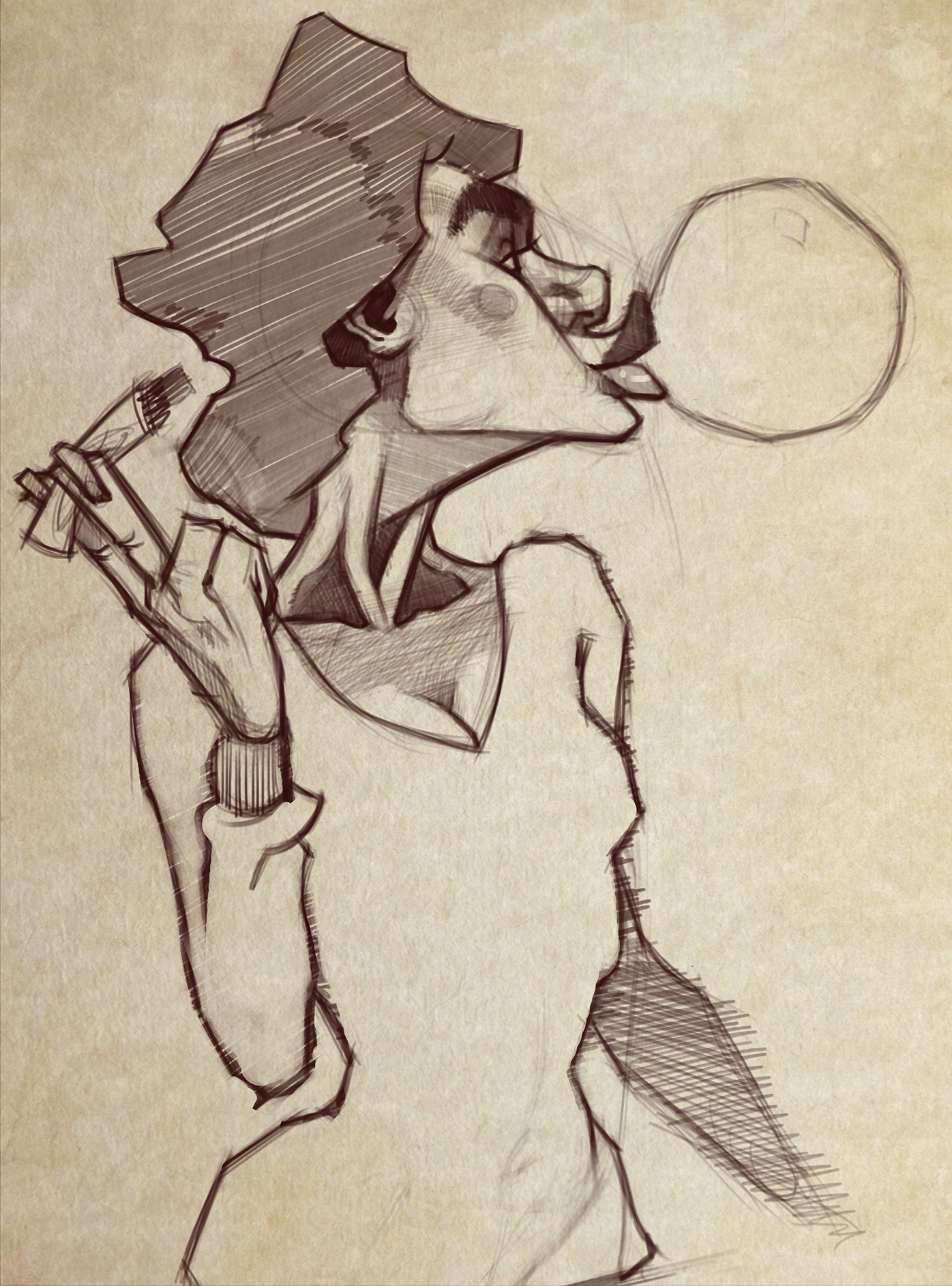
quick sketch from tonight

Posts: 140
Threads: 3
Joined: Aug 2015
Reputation:
7
Posts: 140
Threads: 3
Joined: Aug 2015
Reputation:
7
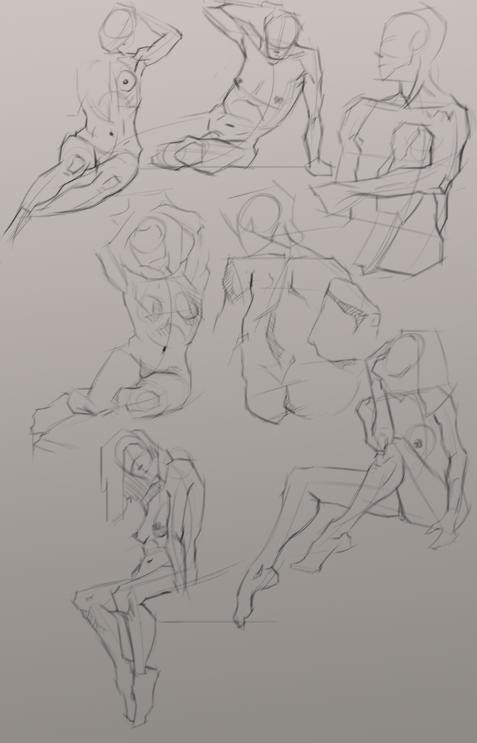
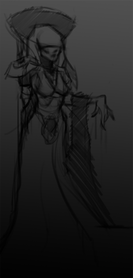
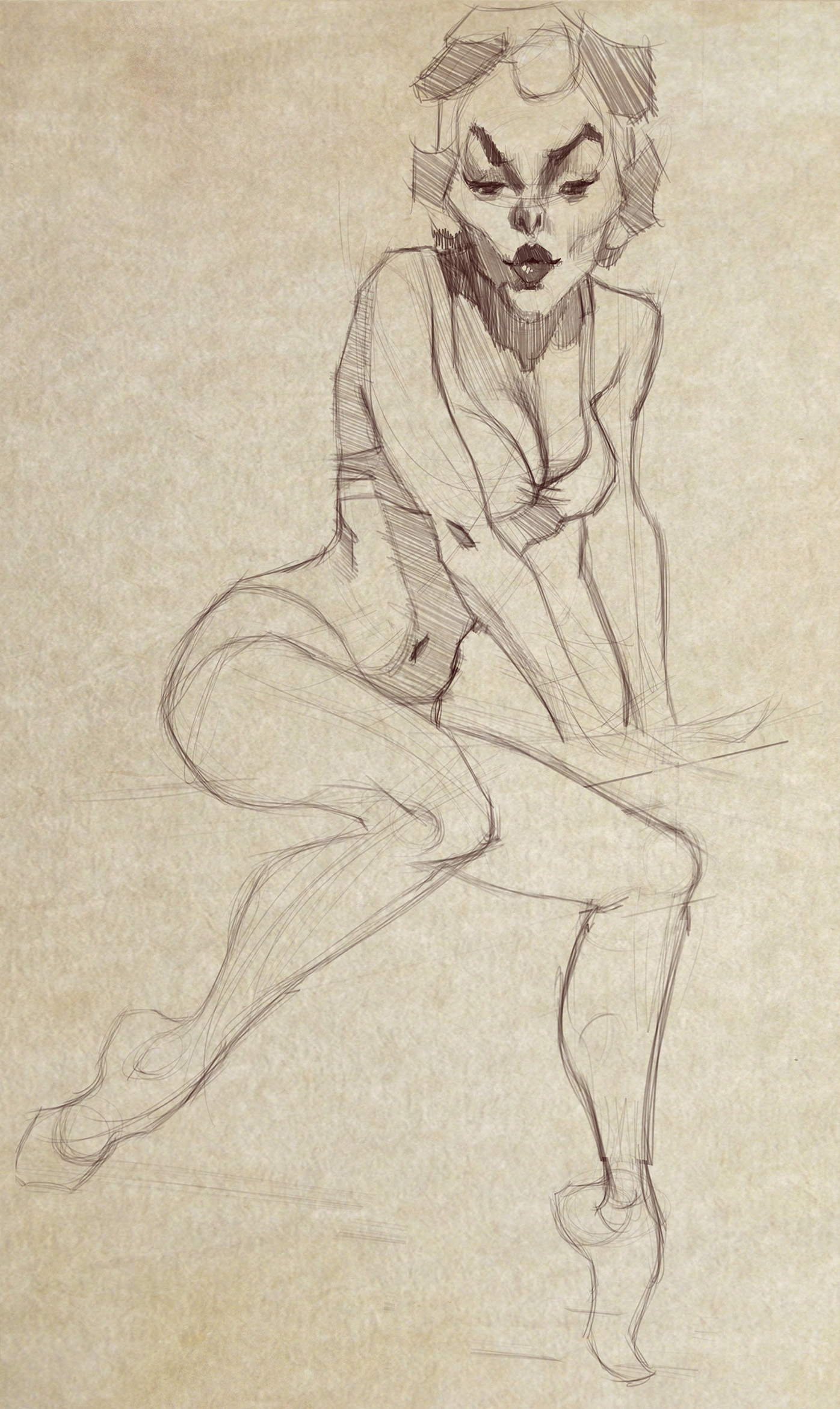
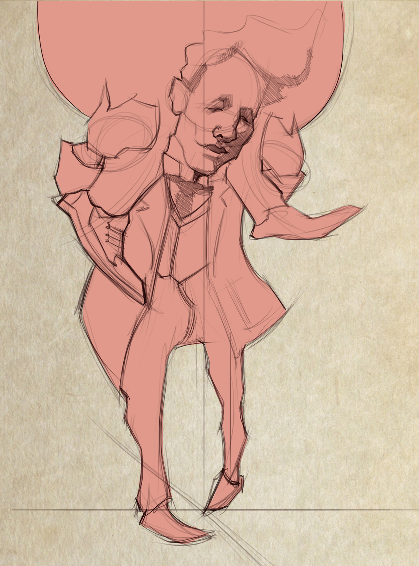
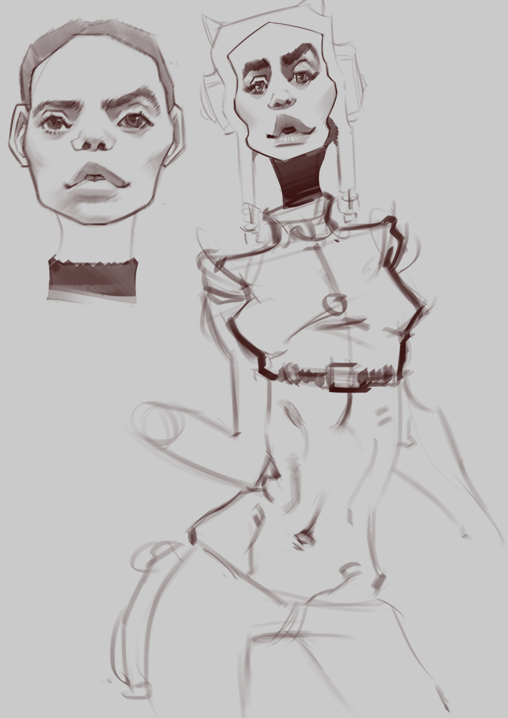
Been doing alot of figure studies today but, had time to fit in this sketch before I get some zzzzz, I think I will start painting it tomorrow.

Posts: 177
Threads: 2
Joined: Aug 2015
Reputation:
9
that last sketch is looking good man, did you start painting it?
Posts: 7
Threads: 0
Joined: Sep 2015
Reputation:
1
really, really nice use of contrast in both tone and colour, but sometimes i wish there was more sharpness to some of your pieces, i find them a bit blurry and it's hard to really find anything to focus on. i think that in your more painterly pieces you could really emphasize a focal point by sharpening areas beyond what you've done.
i really like what you're doing though, your characters are imaginative and your gestures are anything but stiff.
Posts: 161
Threads: 0
Joined: Aug 2013
Reputation:
9
Wow, your gestures are really nice. I think they are so well done that perhaps they take an unnecessary front seat in your work sometimes. For example, the Rusalka painting you did. The gesture is good but the rest of it is lacking in my opinion. Particularly when it comes to design. Just remember that while gesture and anatomy are key fundamentals, they shouldn't take the place of other things like design.
Keep working, have fun :)
Posts: 140
Threads: 3
Joined: Aug 2015
Reputation:
7
hey guys! thanks for the comments.  sorry ive been inactive recently... life stuff 
Lurch; Yeh I did start painting it. here it is! I will probs finish it at a leter date.

ari: thanks man! yeh I agree with the blury comment, I think it was because I was only using a soft brush. I will try a different approach and make things much sharper. thanks for the crit though.
JJ Aron: Thanks!  yeh, with the Rusulka painting I was sticking in my comfort zone. I have been exploring design much more recently and have been studying what makes a good design. Im still a massive noob at it, but power on!
Posts: 177
Threads: 2
Joined: Aug 2015
Reputation:
9
like the atmosphere of that, very dark and gothic, the hair is working well.
Posts: 140
Threads: 3
Joined: Aug 2015
Reputation:
7
Posts: 140
Threads: 3
Joined: Aug 2015
Reputation:
7
Posts: 113
Threads: 1
Joined: Feb 2016
Reputation:
1
Very interesting style man, I'd suggest some general practice on anatomy.
Btw do you know Normal Rockwell, i think you'd like him.
Posts: 140
Threads: 3
Joined: Aug 2015
Reputation:
7
(02-08-2016, 04:55 AM)tripna Wrote: Very interesting style man, I'd suggest some general practice on anatomy.
Btw do you know Normal Rockwell, i think you'd like him.
Thanks  yeh, still learning anatomy all the time. Yeh Rockwells work is great, Allways been a fan of his work.
Posts: 80
Threads: 3
Joined: Jan 2016
Reputation:
2
straight up admiring your bold forms on the figures!! Awesome stuff :)
Posts: 140
Threads: 3
Joined: Aug 2015
Reputation:
7
(02-08-2016, 08:28 PM)nutriman Wrote: straight up admiring your bold forms on the figures!! Awesome stuff :) Ahh, thanks man!
|
 Im having trouble with the brightness and contrast of this towards the bottom of the painting... oh well. I think im going to add some jewellery on her to make it a bit more interesting, tbh it feels very generic atm.


 Im having trouble with the brightness and contrast of this towards the bottom of the painting... oh well. I think im going to add some jewellery on her to make it a bit more interesting, tbh it feels very generic atm.