Environment Design Rocks!
@Artloader. DO IT! :)
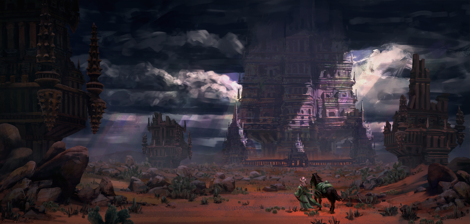
@Zdele. Nice. I like 1 a lot, but if your aim is to show actual village life it's probably not the best comp for that. It's almost ominous with the dark trees in front as well. It's cool though. You should do it up if you like it. Or maybe a combo of 1 and 6. We can chat about them later

@Klexvier. Nice update on the scene it's looking much livelier!
You're right about the saturation, definitely work on that. 

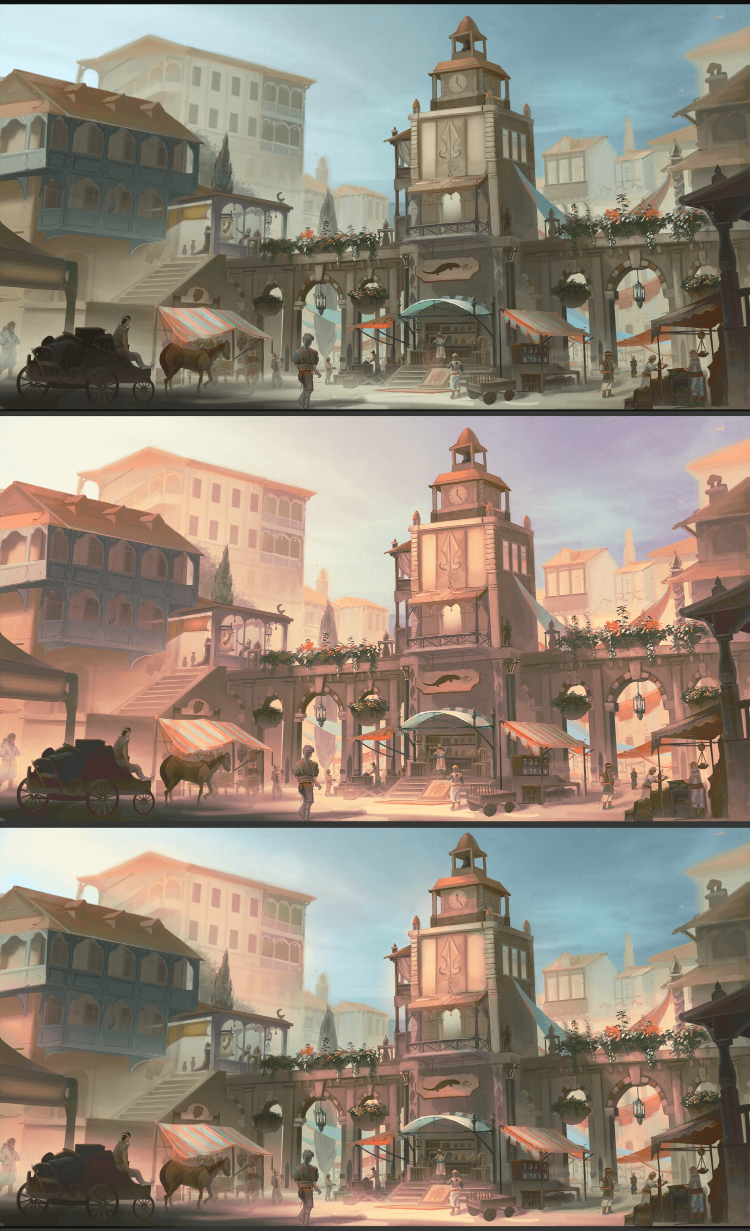
One way I sometimes test out lighting schemes quickly over a detailed scene is as below.
  • duplicate merged image. (or use adjustment layer with a mask)
  • Adjust brightness / contrast / colour balance and saturation of copy to get the right feel for "lit" areas.
  • Add a mask to the duplicate layer to hide it all, then paint in the mask to reveal areas that are lit.
This is a very quick way to test different lighting schemes, directions / shadows and it is very easy to change without worrying about all the already rendered stuff. Best done on a scene that is not going to change much, or use an adjustment layer with a mask instead so you don't have to redo it if things change.
As always you will probably have to refine areas with specific overpainting, but it's a great way to do quick broad tests done in only a few minutes. I overemphasised the effect here, to get the point across. You probably don't want to go that far :)


 YouTube free learnin! | DeviantArt | Old Folio | Insta
Reply
Update on progress, almost done. It was a struggle sometimes, and along the way i learned lots of important lessons, such as using layers  for different object depths, doing masks, and most importanlty, having clean edges


Reply
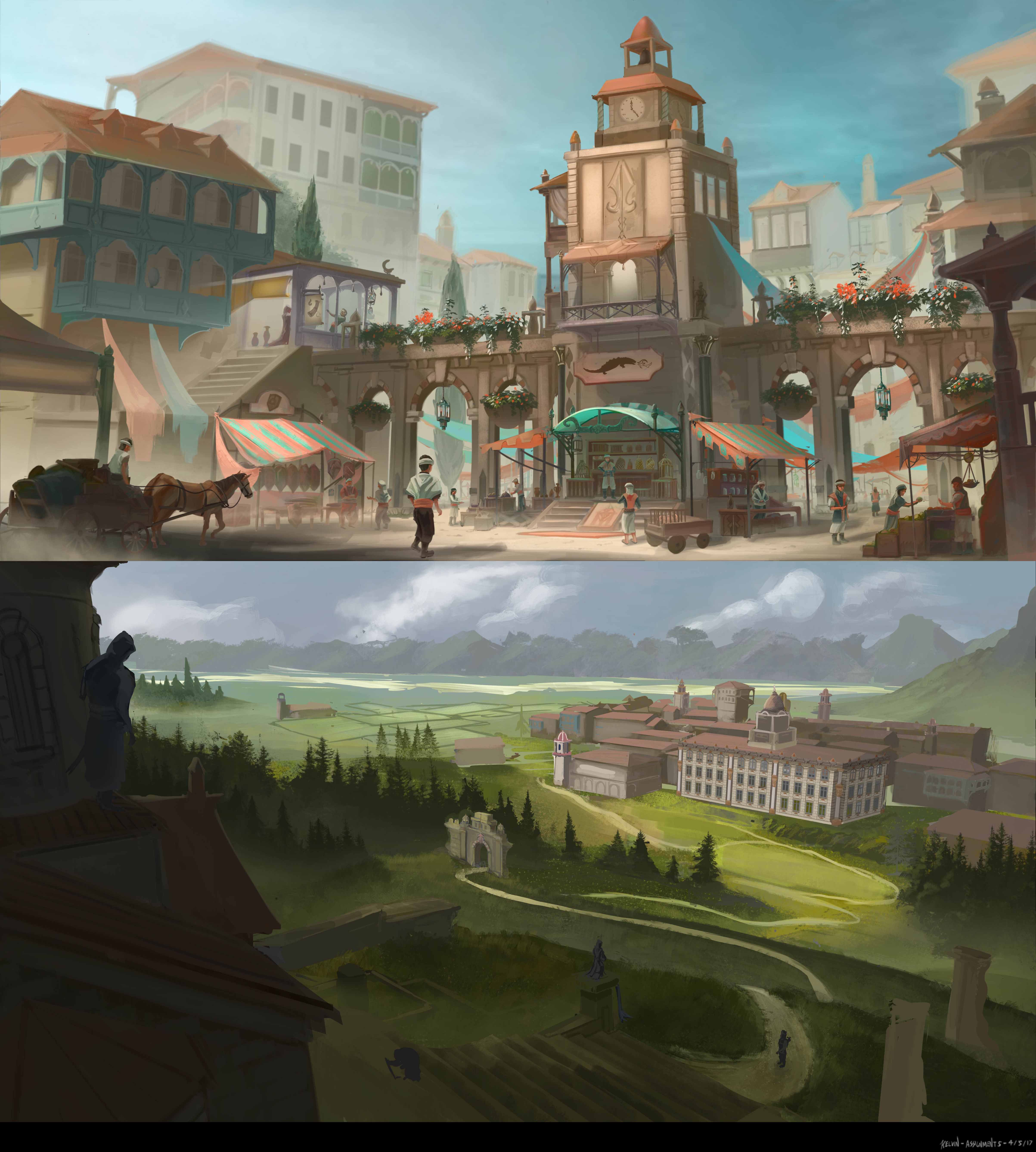
Hello, here is an update on week 5.
I used the lighting mask tip to tweak the sky and focal point's saturation. :D The saturation still seem to lower after saving to a jpeg from a psd.

The second piece is a disaster (the comp/edge/everything needs work). If the town is covering a vast land, how does one keep the color shift consistent with lighting? (The blue/less contrast effect in the distance effect and shadows)


Reply
Thanks for the comments in my thread!
I've watched all the vids and finished those assignments.Now I put'em here,hopefully someday when you see them you could generaously give some crit.
Thanks for the tutorials you made,helps a lot: )


Attached Files Image(s)


Reply
Alrighty bagenew. You did it! :)
And as I promised...I can't give you much crits....and the reason for that is, you did frikkin great!
Honestly, I couldn't expect any better in terms of applying the lessons I was trying to get across, to your work (which is really the main learning, not necessarily the critique on the individual pieces themselves)

All the notan studies are great. Really chose well in what to simplify and go to positive or negative.

The personal value sketches are solid! Love the interesting viewpoint of the canyon and truck. You have got some decent comps, and the general sense of depth down, but I think you could probably benefit from now going on to apply a more nuanced subtle control of value within each depth layer as you do these going forward. I saw some really cool examples in your sketchbook before you even started the assignments so I know you know what's up. I found that some of your contrast within each depth layer was a bit "blunt" and the layers more in the distance could probably do with a bit less contrast overall to really get that idea of realistic depth across. This will help you with quickly arriving at a more accurate shorthand for a piece. For example the giant skeleton and sword would benefit from much less contrast I feel to get scale and depth across. The control of value contrast is probably more important, than actual overall value shifts between layers. The contrast is what determines depth.

The best one I think, is the knight and the giant behind the tree in terms of balance of depth and contrast. It hit the sweet spot. But also the stylisation and sense of volume in the forms again from more nuanced control, is cool in that one :)

Your colour applications from ref are almost faultless. Seriously. Nailed it. For what the exercise was, don't think there is much "crit". I think you got exactly out of it what I hoped people would.  I will always call out a shitty stick salesmen so there's that but that aside I suppose one of the issues with sticking too close to photo ref is that it does end up looking like a photo, which tend to be more contrasty than looking at things with eyes. When I use photo ref I apply the ref, but it is always a starter. I tweak according to what the image needs rather than being uber faithful to the camera. So if you were to do this exercise again...there is an optional exercise in that week which might be useful for you, which is essentially a plein air study but with some photo ref taken so you can see the differences afterwards.  It can help you understand the difference between our eyes and a camera lens!

Alright block of text done. Hopefully doing the exercises was what actually taught you. My crit is like the half assed pat on the back afterwards.

And as an aside, I went through your sketchbook and I am sad that you get so few comments from the community.
http://crimsondaggers.com/forum/thread-7781.html
 But the good thing is, you don't need them at ALL! You're doing really well, doing the right kind of things, improving and self critiquing, no wonder you aced these assignments. Just carry on, good shit will come to you in the art arena! :)

Great job!!

 YouTube free learnin! | DeviantArt | Old Folio | Insta
Reply
Never too late  Tongue


Attached Files Image(s)


Reply
Hey, this is Amit, my old account is inaccessible. 
Even after all this time you get a lucky crit!

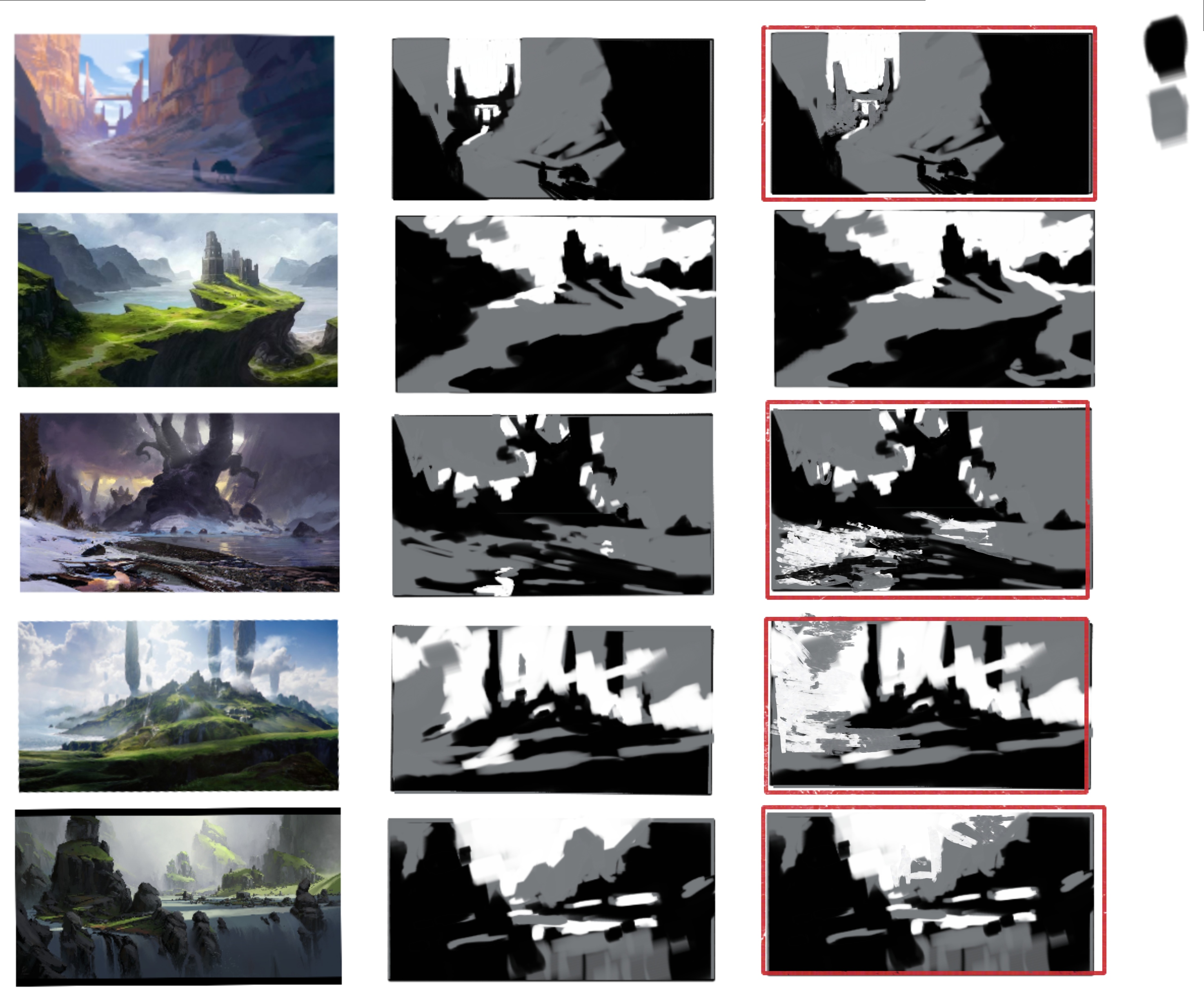
I outlined your 3 value studies that I thought could do with some small changes. Overall you did good, but in some areas you could have consolidated values to match the compositional shapes more accurately.

I outlined which ones I made changes to, next to your originals. Notice how in each one I'm aiming at getting a more accurate read compositionally. Squinting your eyes is invaluable to reduce the small changes and see these larger shapes better. Are you going to continue with the other excercises?


Reply


Forum Jump:


Users browsing this thread: 229 Guest(s)