03-10-2016, 05:06 PM
Good work with the consistent posting man!
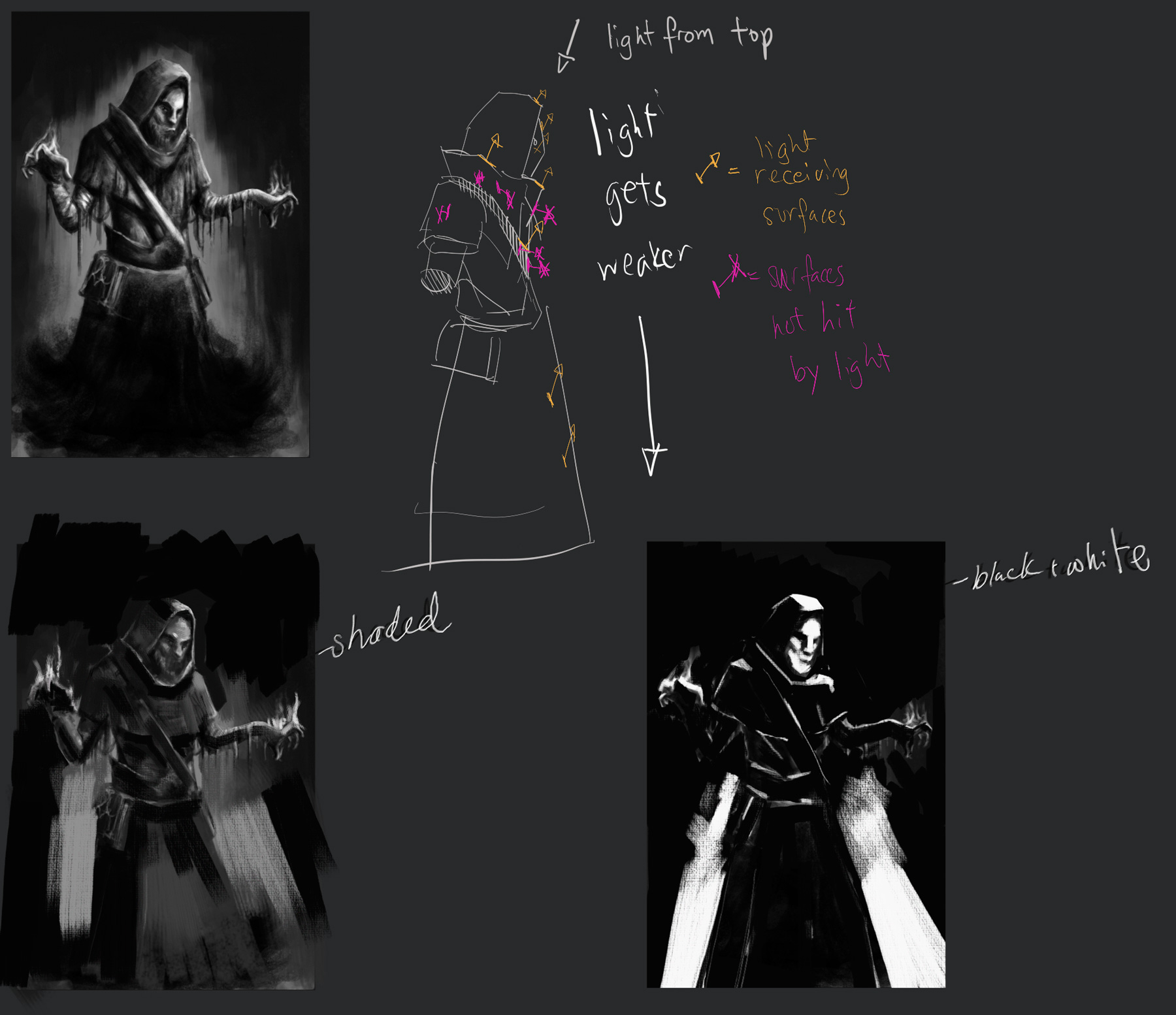
Feels like the light source is coming from quite a few areas right now.
The leather strap of his satchel is receivbing some intense front light,
there is also an ambient light brightening up the front of figure.
The intensities of the lighting is inconsistent, leather strap is light brightly from the front but the clothes dont seem to be as affected.
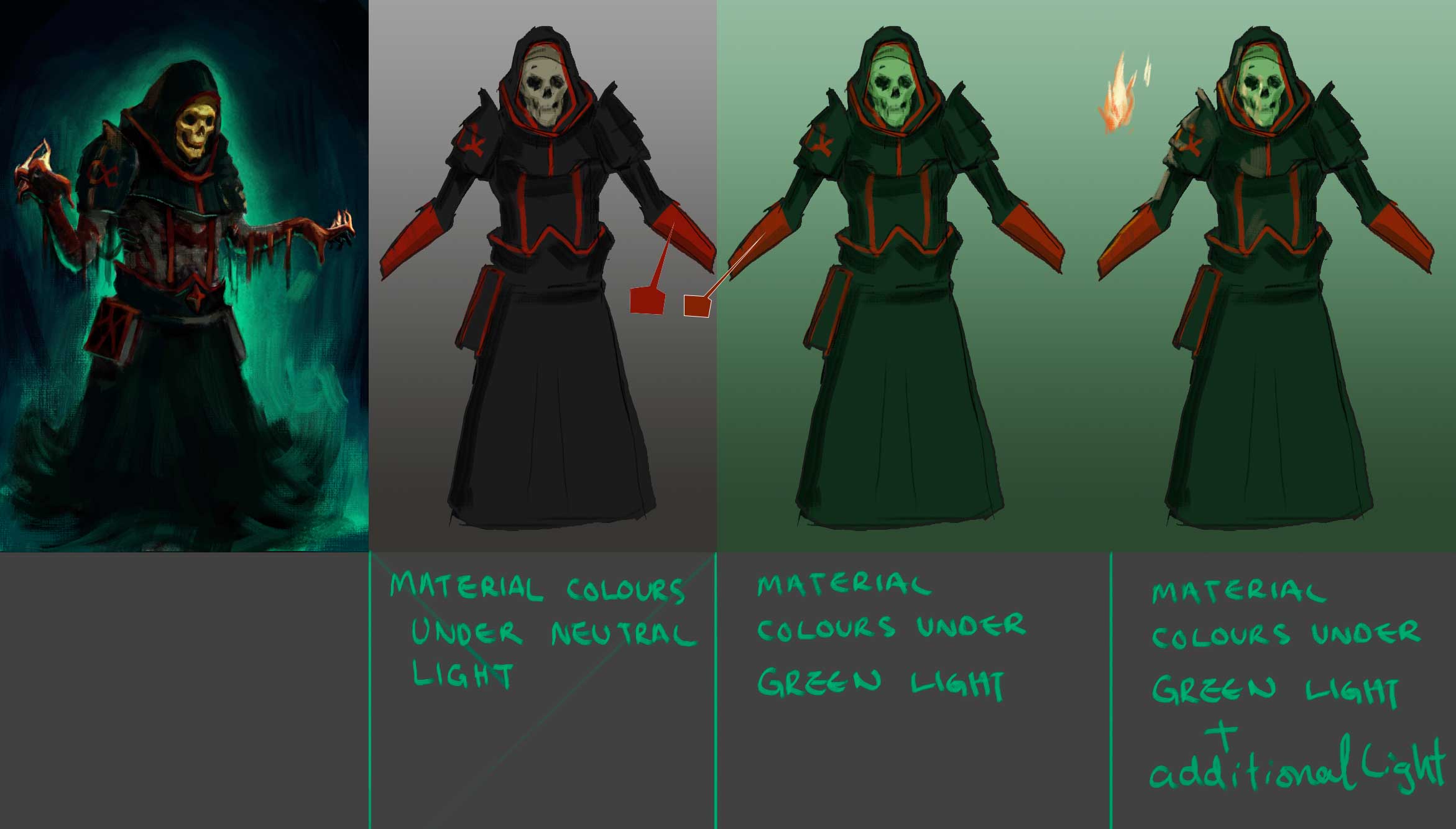
I did some notes that might be useful to you,

It is important to keep a greater vs lesser light source in most scenes, so that it doesn't end up flattening out the form. The correct drawing/shading of the form is also vital, especially when you are executing it in a painterly fashion, it is very easy to lose the sense of structure in shapes. Volumes must be expressed definitively, with no ambiguity.
Consider the material on your character, leather, clothing and skin all react pretty differently to light. This is show in the way the colours transition across their surfaces, reflective objects have large jumps between darks and lights and matte surfaces transition more gradually.
Also consider, the strength and shape of your light source. a single light bulb in a room vs a panel of flourescent lights will cast light differently.
Lastly, when it comes to colours, consider the colour of the object and how it reacts to the colour of the light. A blue tee shirt under a yellow/orange streetlamp ends up looking pretty gray.
Here is a good resource on light and colour http://www.itchy-animation.co.uk/light.htm
Between light, colour and form theres alot to learn, but its alot of fun :D
If theres bits that doesn't make sense to you, please dont hesitate to ask!
Keep truckin' and keep having a ball!
Feels like the light source is coming from quite a few areas right now.
The leather strap of his satchel is receivbing some intense front light,
there is also an ambient light brightening up the front of figure.
The intensities of the lighting is inconsistent, leather strap is light brightly from the front but the clothes dont seem to be as affected.
I did some notes that might be useful to you,

It is important to keep a greater vs lesser light source in most scenes, so that it doesn't end up flattening out the form. The correct drawing/shading of the form is also vital, especially when you are executing it in a painterly fashion, it is very easy to lose the sense of structure in shapes. Volumes must be expressed definitively, with no ambiguity.
Consider the material on your character, leather, clothing and skin all react pretty differently to light. This is show in the way the colours transition across their surfaces, reflective objects have large jumps between darks and lights and matte surfaces transition more gradually.
Also consider, the strength and shape of your light source. a single light bulb in a room vs a panel of flourescent lights will cast light differently.
Lastly, when it comes to colours, consider the colour of the object and how it reacts to the colour of the light. A blue tee shirt under a yellow/orange streetlamp ends up looking pretty gray.
Here is a good resource on light and colour http://www.itchy-animation.co.uk/light.htm
Between light, colour and form theres alot to learn, but its alot of fun :D
If theres bits that doesn't make sense to you, please dont hesitate to ask!
Keep truckin' and keep having a ball!


![[Image: Owsn8vl.png]](http://i.imgur.com/Owsn8vl.png)
![[Image: X79zWL5.png]](http://i.imgur.com/X79zWL5.png)
![[Image: y009W3X.png]](http://i.imgur.com/y009W3X.png)

![[Image: CGh1lUw.png]](http://i.imgur.com/CGh1lUw.png)
![[Image: kvMeQTq.png]](http://i.imgur.com/kvMeQTq.png)
![[Image: XHQ8opr.png]](http://i.imgur.com/XHQ8opr.png)
![[Image: urIQKOX.png]](http://i.imgur.com/urIQKOX.png)
![[Image: DVkrSRG.png]](http://i.imgur.com/DVkrSRG.png)
![[Image: mEkJnjK.png]](http://i.imgur.com/mEkJnjK.png)
![[Image: uLqfuEF.png]](http://i.imgur.com/uLqfuEF.png)
![[Image: 7TVA0YX.png]](http://i.imgur.com/7TVA0YX.png)
![[Image: tVRDL0I.png]](http://i.imgur.com/tVRDL0I.png)
![[Image: chT4SlM.png]](http://i.imgur.com/chT4SlM.png)
![[Image: 3psS3Cf.png]](http://i.imgur.com/3psS3Cf.png)
![[Image: rptZQY7.png]](http://i.imgur.com/rptZQY7.png)
![[Image: qkmrLGP.jpg]](http://i.imgur.com/qkmrLGP.jpg)
![[Image: qHOLKb7.jpg]](http://i.imgur.com/qHOLKb7.jpg)