austin's sketchbook
#1
Hi all, I'm a graphic designer looking to push my drawing and painting ability. I don't have any experience studying environments, so that's what I've been trying to do this year.
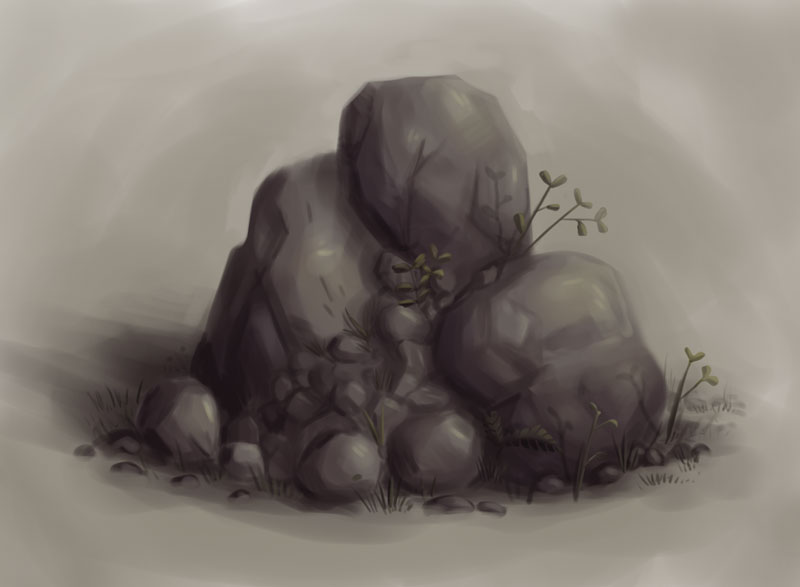


From multiple photo references.
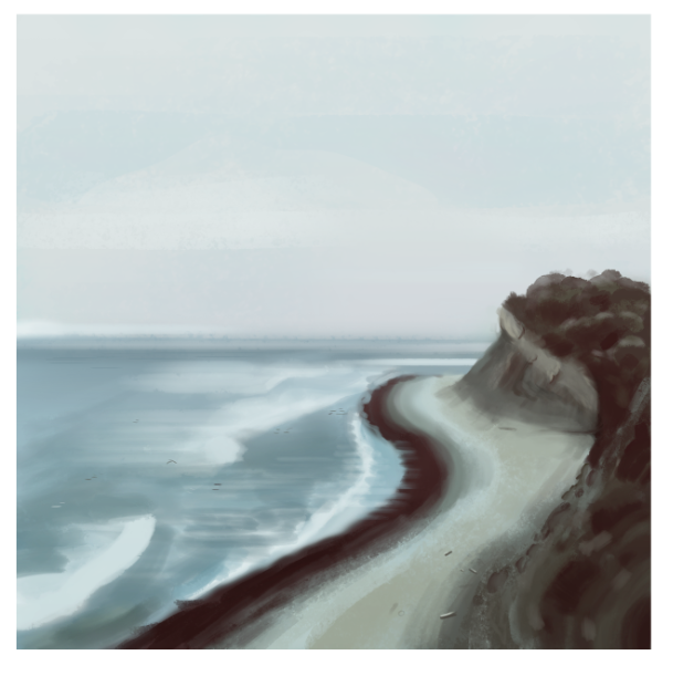


From a photo.
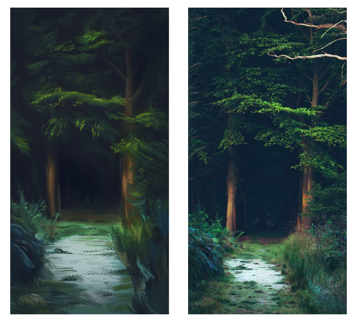

Reply
#2
From a photo.

Reply
#3
Nice colours, I really like the rocks from your first post.

About the forest picture in the references the path becomes narrower, because of the perspective and creates a sense of depth. In both your forest study and the beach, the perspective misses or could be more. Maybe try to study some perspective and analyse what you are seeing and try to understand how that works.

Good luck!

Reply
#4
(01-28-2016, 08:42 PM)Eyliana Wrote: Nice colours, I really like the rocks from your first post.

About the forest picture in the references the path becomes narrower, because of the perspective and creates a sense of depth. In both your forest study and the beach, the perspective misses or could be more. Maybe try to study some perspective and analyse what you are seeing and try to understand how that works.

Good luck!

Thank you for the feedback! This is really helpful, I'll focus on that.
Reply
#5

Reply


Forum Jump:


Users browsing this thread: 2 Guest(s)