05-28-2017, 10:28 PM
Nice work. I like all the studies you do.
Also... the hair in the last image has cool movement to it. :)
Also... the hair in the last image has cool movement to it. :)
|
John's Thread (Used to be super active! Still the longest thread name ever in CD)
|
|
05-28-2017, 10:28 PM
Nice work. I like all the studies you do.
Also... the hair in the last image has cool movement to it. :)
05-31-2017, 10:21 PM
Really nice studies as usual dude.
I like your super hero piece as well - delicious rendering. For super heroes, maybe you could have made the proportions more heroic though? I think Loomis recommends 9 heads tall for heroic type physiques. Your project sounds interesting, maybe check out GhostBlade by Wlop: https://tapas.io/series/GhostBlade Keep grinding dude.
“Today, give a stranger one of your smiles. It might be the only sunshine he sees all day.” -- H. Jackson Brown Jr.
CD Sketchbook
06-08-2017, 12:11 AM
Steeliebob - Thanks Steeliebob!
Artloader - Love the recommendation. I like Wlop's illustration. This is the first time I heard of his web comic. Thanks for this! And yeah, that comment about heroic proportions, you're probably the second one who commented on that. I will mull things over. Rest assured that will not be the final version. Unless my copy craps out that is! Knock on wood! --- I just recently found out that I don't know how to render a sphere. Apparently, the highlight isn't necessarily smacked down in the center of the lightest halftone.. I have to credit Hobitt again for the clarification. http://www.huevaluechroma.com/021.php was the reading he sent me. I have yet to read it since my dyslexia keeps me from wanting to do it. Here are two sphere studies: 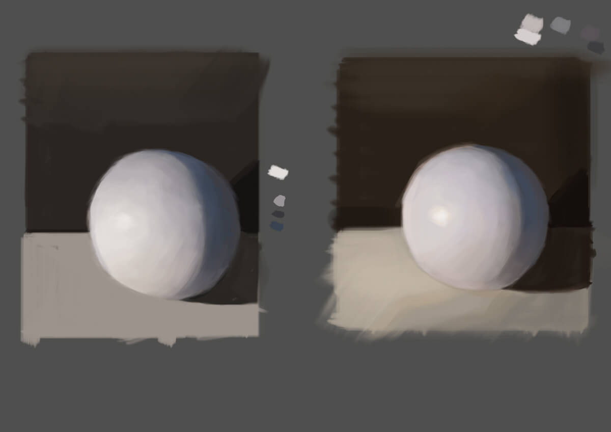.jpg) And a botched attempt at doing a portrait: 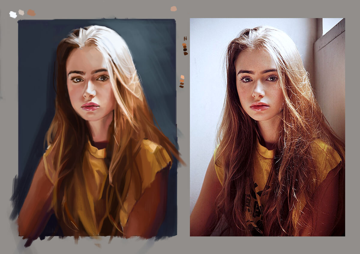.jpg) Hmm.. I have to read/study more about simplification. I think that was were I made a huge mistake.. And looking at it now, the colors don't look good together.. Chalk another one up for failure. Must do more studies and exercises.
If you are reading this, I most likely just gave you a crappy crit! What I'm basically trying to say is, don't give up!
---- IG: @thatpuddinhead
06-08-2017, 02:31 PM
I understand those dyslexia feels man. I browsed the pics on the link Hobb sent, and a lot of it seems to be stuff that Dorian Iten covers in his light series. If you find videos much easier to learn from (like I do otherwise I'm stuck reading over the same thing a million times lol) it's a good course to check out.
The hero piece turned out very nice, and I like the way you've done the hair in the girly above. In terms of the comic idea, it's a double edged sword. It's a great (and exciting) thing to do, but it's going to be one hell of a task. Visual storytelling is a whole other side to art. Wlop is a great example of how you need a good story, frames, pacing, to achieve it and not just have it be a bunch of pretty pics. Besides that, just start reading good ol' comic books ;) Another note - be careful with combining themes and ideas, such as swords and graffiti... they are things not traditionally portrayed together since their use is quite far apart in terms of our real world history. Although it may sound like I'm trying to deter you, I think doing a comic book project will turn out to be a great experience! It'll help you figure out what you like, dislike, and what part of the industry you are really interested in. Keep up the work man. I'm excited to see your upcoming project :)
06-10-2017, 03:59 AM
To be honest, if simplification was your goal, you kind of shot yourself in the foot when you chose that reference. The highlights are completely blown out, and everything else is under very diffused lighting with no clear shadow patterning except around the shirt collar.
All things considered I think you did a swell job on the drawing and matching values. A selective color layer(provided you use Photoshop) would have easily helped you fine tune those colors to harmonize a bit better, or if nothing else, help you to see what you could have done differently. Onward to the next one!
06-12-2017, 11:39 PM
chubbycat - What you said got me to thinking. That maybe what I was doing was forcing the issue on putting a lot of things in one basket, which in turn, the whole thing might lose its sense of focus.. Good thoughts, very well appreciated.
Ambiguity - Oh the selective color layer tip is awesome! I'm going to play around with it. Thanks for this! --- Portrait exercise: 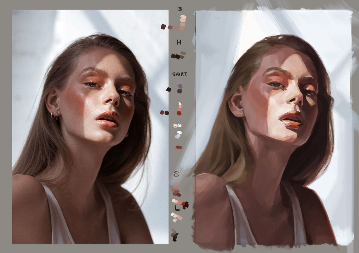.jpg) Changed a bunch on my workflow: 1. "Premixed" my colors so that I won't have overblown saturation like my last attempt. Plus it helped a bit with the accents. 2. Worked in halftones then built from that to the lightest light and darkest dark. Kind of in the middle Dorien Iten's (separate the sketch values between lightest and darkest first) and Sargent's (work from halftones) ideologies regarding their process in values. By mapping the lightest and darkest in halftones, work on the middle values while slowly bumping up/down the values at the extremities. 3. Always start with hard brushes and paint broadly. Then zoom in to focal points still with the hard brush. Finish with a soft brush and blend edges. Have to do more of this exercise. I think how I do things need more work and re-adjusting..
If you are reading this, I most likely just gave you a crappy crit! What I'm basically trying to say is, don't give up!
---- IG: @thatpuddinhead
06-15-2017, 11:05 AM
Hey John. Sorry I've not checked in for a while. :( Really enjoying the latest studies bro! I really like the portrait study of the girl with the lilac hair. The movement is really awesome. There is more depth in your painting than in the original photo also, and I really like that too.
The super hero piece really came out well too. You put an epic amount of energy into producing it - totally worth it! I'd totally have that on my wall. Are you considering doing anything for the background? For the future (if it's not something you do already), In terms of composition, it can help to put all the characters in silhouette. This way you can see the compositions negative space easily. That can really help with producing attractive and balanced shapes in the layout. Especially when dealing with so many characters. The yellow and blue portrait study is also cool. The contrast is really good - perhaps your being a bit too hard on yourself there. I think the colours work really well together. Perhaps the shadows could be a little softer on her shirt, the lighting is maybe a little on the harsh side making the material look somewhat rigid. Really nice work bro. Inspiring as always! PS: When you send your hero pic to print, don't forget to check which CMYK colour profile your print company is using, so you can make sure you are happy with all of the colours before it gets printed. (:
- EmEl
06-22-2017, 11:53 PM
EmEl - Hey Emel. Thanks for the words.
I did consider a background for the Batman piece. But I can't seem to come up with one that ties in with everything. I did the silhouette thingy. But you're probably right that I should move things a bit. But at this time, the last thing I want is to be near it to have a fresh set of eyes to do an update. I will take your comments into consideration. I got them all listed down in a file. The yellow and blue one's problem, besides the ones you pointed out, has something to do with two strong colors both vying for attention. I'm dabbling on Selective Color to do some color altering to figure out how to kill some of the colors I don't want post processing.. But granted. Some of its elements do need better rendering. And thanks for the CMYK tip. Yeah that part gets overlooked often. Which I almost did if it wasn't for your reply. --- Study turned piece: 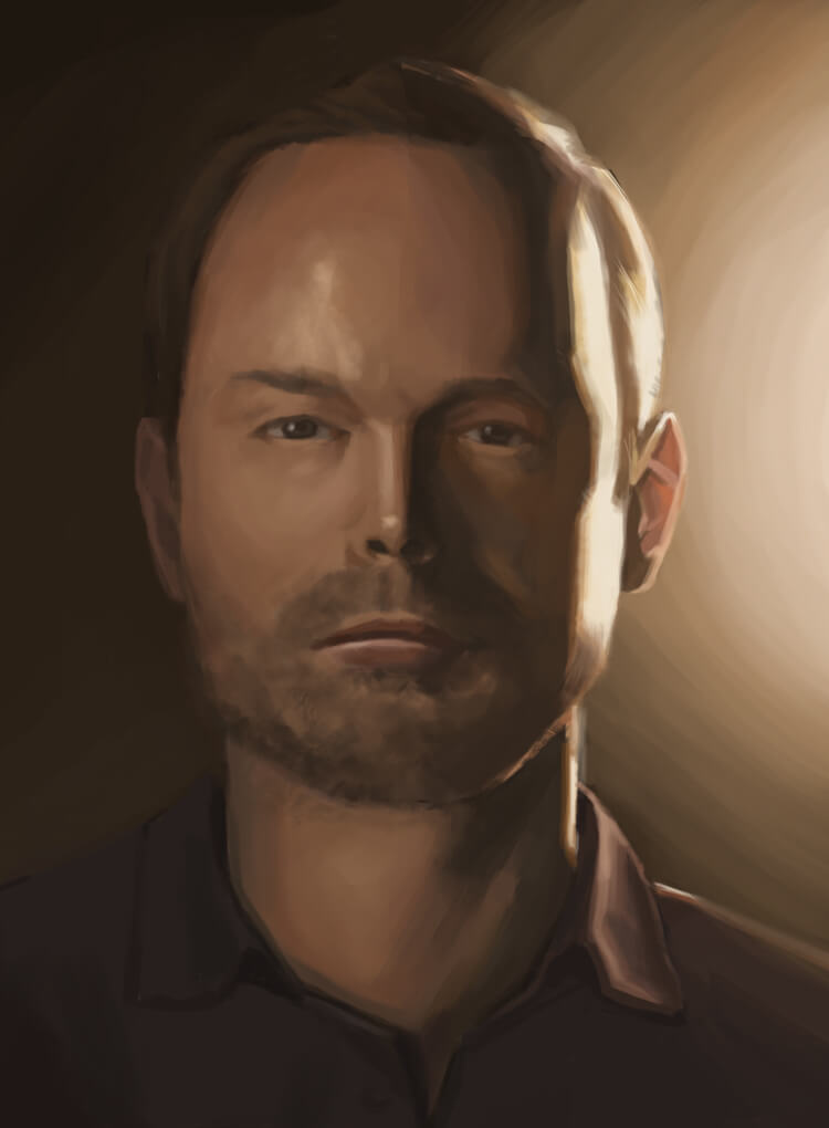.jpg) I'll sit on this for a day before I spread it. One of those pieces that's getting harder to solve.
If you are reading this, I most likely just gave you a crappy crit! What I'm basically trying to say is, don't give up!
---- IG: @thatpuddinhead
06-29-2017, 11:45 PM
I felt some sort of a relief now that I am realizing what people said about speed comes gradually through consistent work. I was caught up in a lot of moments of worrying that I'm a slow worker, panicking that I'll always be. Granted I still am, but I just realized I got a bit faster even though I do take my time.
Usually I take a week on a study. This took 3 days less? 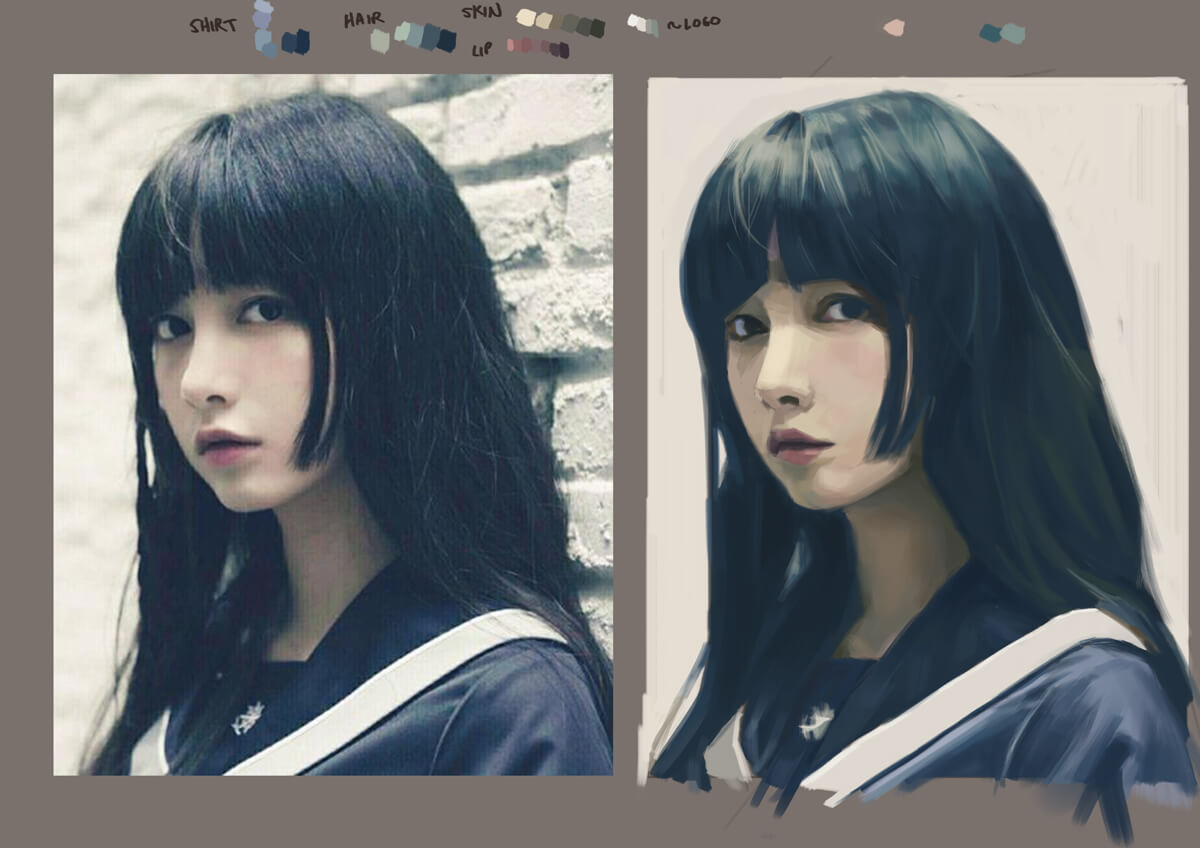.jpg) Of course, that was a fluke. I'm on the 2nd day of my current study and I've barely put the colors down.
If you are reading this, I most likely just gave you a crappy crit! What I'm basically trying to say is, don't give up!
---- IG: @thatpuddinhead
07-04-2017, 05:48 AM
Those are some lovely studies. I envy your balance of soft and hard edges. I'm always so tempted to sharpen too much. Keep up the good work, dude.
07-04-2017, 11:30 PM
jacksonb57 - Starting off with sharp edges (I'm assuming it's synonymous to hard edges) is a nice way to do paintings. I think I have that problem of making too many sharp edges too, especially that I started digital painting with really soft brushes. Now, I think I went the other way hard. Hey man, thanks for dropping by.
---- Working on a small personal project on top of doing studies. I'm worried that I might lose my painting skills since the project calls for line work, which can be tedious and boring. I''l be just posting exercises for now: 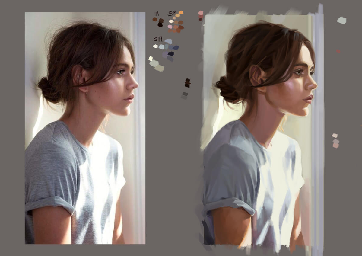.jpg)
If you are reading this, I most likely just gave you a crappy crit! What I'm basically trying to say is, don't give up!
---- IG: @thatpuddinhead
07-07-2017, 04:27 AM
Awesome job John. Love the way you lay down the base values. specially on post 241 and 245.
Do you have an online portfolio so i can take a sneak peek :P Cheers!
07-13-2017, 12:36 AM
RickRichards - I do. And it's atrocious. I keep saying I should clean and update it, but I keep putting it off! However, I do keep this fairly updated. In fact, this is place is more updated than my portfolio. It's probably counterproductive! But it's better for me to make a disaster here where it's not as public, than out there.
I should probably update it next year.. --- Portrait study: 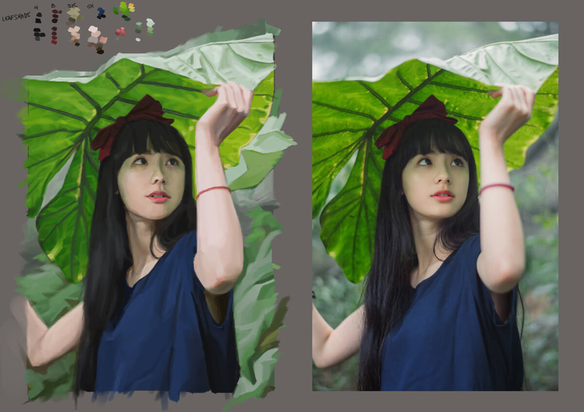.jpg) No color picking on the reference photos on this one. Kinda tricky to sneak in the green among the fleshy color. It's kinda difficult to move around the color green. This gives me an idea how to move around the color wheel. I don't know how to put them in words yet. Moving around the color wheel is something I'm trying to figure out for this piece and possibly the next. Hopefully I'd get a good grasp of it before I start working on book covers.
If you are reading this, I most likely just gave you a crappy crit! What I'm basically trying to say is, don't give up!
---- IG: @thatpuddinhead
07-13-2017, 01:00 AM
Dude, great studies both quality and quantity!
also batman piece is niiiiceee keep it up, all of it!
07-14-2017, 08:45 AM
Studies look awesome, would love to see your small personal project wips. Is it about portraiture?
07-15-2017, 09:36 AM
Great work on that girl under the leaf dude. I love how you're pre-mixing your colours with your colour palette at the top there - very organised. Also you did a good job on matching the colours and values without colour picking.
Keep pushing my friend!
“Today, give a stranger one of your smiles. It might be the only sunshine he sees all day.” -- H. Jackson Brown Jr.
CD Sketchbook
07-15-2017, 11:40 PM
xelfereht - Thanks!
Artloader - Honestly, I'm not sure how to translate that premixing I'm doing for studies into doing coloring for an original piece. It does help me to limit colors so that I don't overblow the saturation. I think I'm still a crapload full of exercises away from getting the coloring/painting down to a pat. It's easier for exercises like these because there's a reference photo I can always go back to if the colors get to stray. neopatogen - No. A lot of line art and toning. Comic books! I'm doing paint studies because I'm worried I lose that skill of how to paint! I'm still trying to figure out how to make things look good with halftones. This is a test panel: ![[Image: j57V0r3.jpg]](http://i.imgur.com/j57V0r3.jpg) I'll not use this exact panel for the final output. There are still a lot of things that look a bit messy (eg. shading of the shadow side of the jaw, maybe I will take the liberty to caricaturize some features, etc). The book is a mess. Right now, it can look as barebones as this: 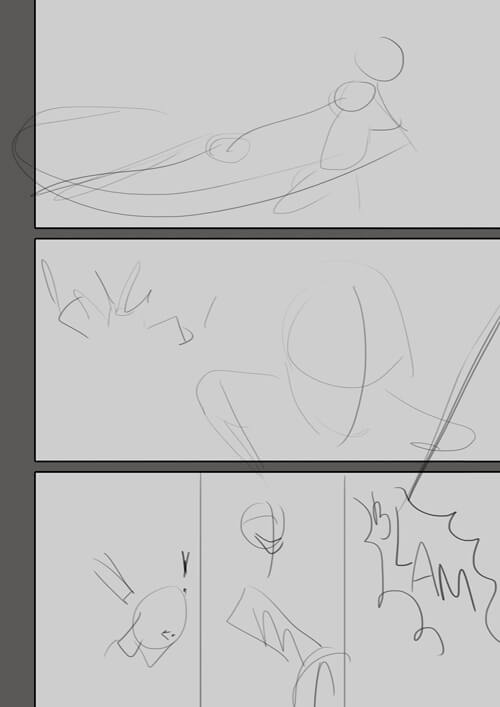.jpg) Or as finished as this: 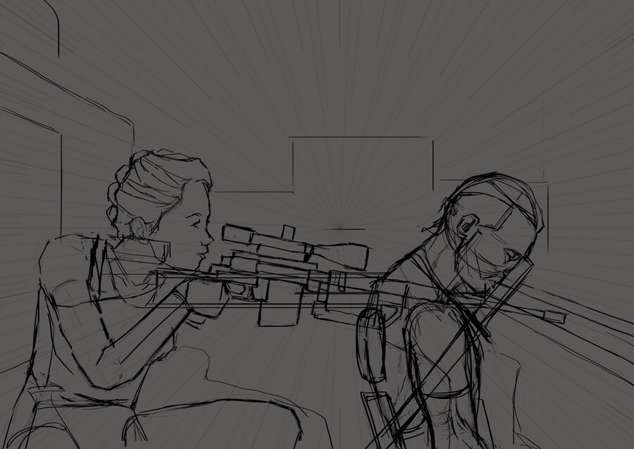.jpg) The reason why I'm not posting the comic book work, not that I don't want external feedback. It's because I listen to feedback so much, trouble is that the work might be pulled into different directions. I am wary of the impending scope creep. Especially when there's a hard deadline. All in all, I think it's manageable. It's just a 16 pager. --- No painting studies to show for now. It's currently shitting the bed.
If you are reading this, I most likely just gave you a crappy crit! What I'm basically trying to say is, don't give up!
---- IG: @thatpuddinhead
07-27-2017, 01:27 AM
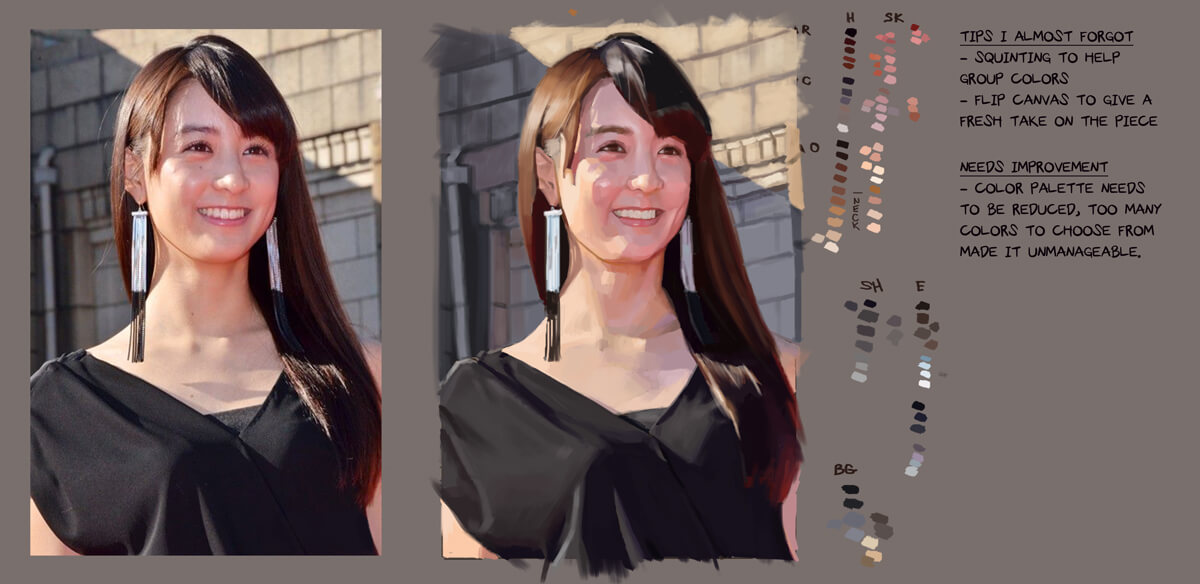.jpg) This particular study was proof that the "pre-mixing" stage was too much of a handful. There are 3 sources of light: sky, red carpet reflecting from the bottom, and the sun. The amount of colors chosen for this piece was too much. In fact, I had just a few colors where I often go back to, and the rest weren't used as much. I have to think of this on the next painting exercise. But, I won't be near a computer til Sunday. No painting. Boo hoo for me.
If you are reading this, I most likely just gave you a crappy crit! What I'm basically trying to say is, don't give up!
---- IG: @thatpuddinhead
08-03-2017, 10:04 PM
Churning out a fast one
Study: 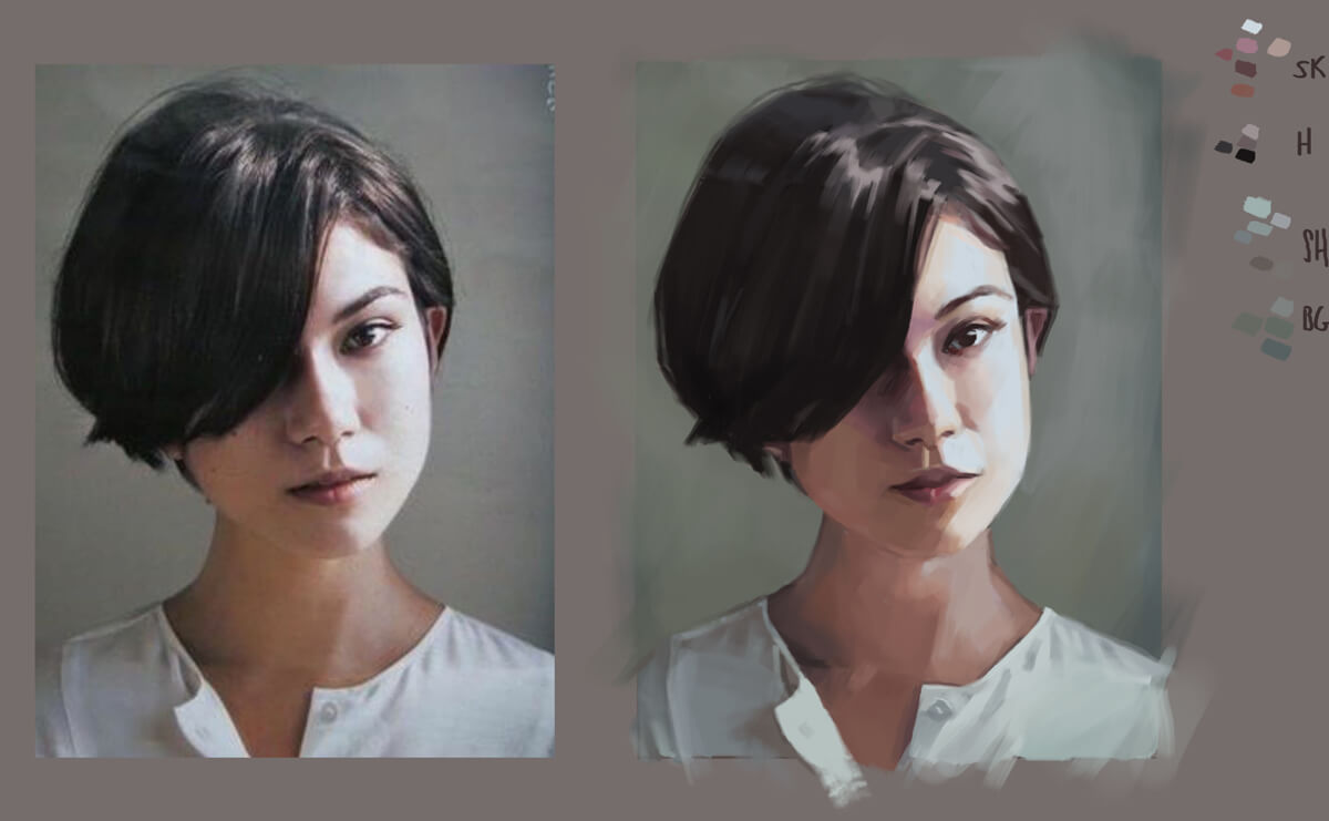.jpg) I've said it before that I should do another process gif. But preparing them just takes too much time. Maybe I'll do one if I can get a bit of down time around October to November.
If you are reading this, I most likely just gave you a crappy crit! What I'm basically trying to say is, don't give up!
---- IG: @thatpuddinhead
08-10-2017, 09:10 PM
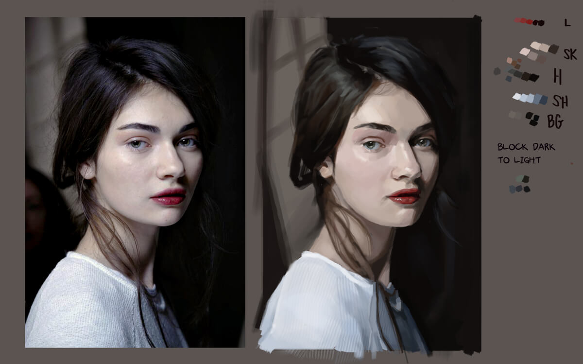
Portrait study:
.jpg)
If you are reading this, I most likely just gave you a crappy crit! What I'm basically trying to say is, don't give up!
---- IG: @thatpuddinhead |
|
« Next Oldest | Next Newest »
|