John's Thread (Used to be super active! Still the longest thread name ever in CD)
Portfolio stuff:


Still in polishing stage but it's probably 90% done!

If you are reading this, I most likely just gave you a crappy crit! What I'm basically trying to say is, don't give up!  
----
IG: @thatpuddinhead
Reply
Thanks for the advice on perspective drawing!

What's a good resource for learning how to render so things look solid? All your armor, and people look so well sculpted.

_________________________________________________________________________
The best time to plant a tree was 20 years ago.  The second best time is now.  
-Chinese proverb

Sketchbook

Reply
When I realised I could do studies that basically reproduced the thing studied pretty accurately with no stylisation and without much effort or attention, I stopped doing them, and started tailoring studies to specific pieces / goals. Yours are getting close to that, so I'm just making sure you are asking the "why you study what you do" question if you aren't doing it already. :)

Last piece could probably do with a bit of well chosen texture in the materials.

 YouTube free learnin! | DeviantArt | Old Folio | Insta
Reply
Tygerson - The 'too long didn't read' answer is to google for notes on how master painters paint things. And gather references.

For this specific piece, I remember somebody, probably by Amit, gave this link (http://surfacefragments.blogspot.co.nz/2...ld-in.html) to me a long time ago and just to go through the painting with those thoughts in mind. I observed a lot of Rembrandt before tackling the gold stuff.

With regards to rendering people, I dived in hard on how Sargent does his paintings and copied some of his tendencies. Case in point: that solid brown stroke on the cheek shadow side is one of his tricks I stole from. It's pretty hacky, especially now that you know where I take my cues from. But that has always been my safety net: pick a painter's, preferably dead, body of work I really love and try to shadow him/her til I find my own voice.

Amit - I honestly don't have a good answer for that question, especially now that I took a good considerable amount of time thinking about it since you posted. All I can think of at the moment is a very cop out answer of wanting to be accurate on how I observe things and render them as perfect as possible. Another layer of 'why' or 'what for' question, I don't have a particularly good reason or even a solid thing that I'm aiming for. My body of work shows that I love doing fan art, but I think you know me well enough that I don't want to do other people's gigs my whole life.

I should be asking myself that question more often. I am coasting on that department.

And stupid, material studies. That's always been my problem. Looking back at my latest now, I should be more more aware of which brush to use on which.

----

I don't have anything new to show for since I'm still doing comic book work. But here's a filler image of something I've done 3 or so years before side by side with the new one.


I remember I made that thing and I was so proud of myself. Looking back at it now, made me realize how obnoxiously conceited I've been. I think I coasted with that kind of rendering style for a long time before somebody pointed out to me that I wasn't the hot shit I thought I was. And boy, was that a miserable awakening!

I do feel proud of the latest one, but in the back of my mind, there are still a lot of issues of this painting I'll try to tackle on the next. Like what Amit pointed out, how I render different materials is still a mess to look at.

Well on to the next!
If you are reading this, I most likely just gave you a crappy crit! What I'm basically trying to say is, don't give up!  
----
IG: @thatpuddinhead
Reply
Your abilities have taken a quantum leap in those three years dude!

“Today, give a stranger one of your smiles. It might be the only sunshine he sees all day.” -- H. Jackson Brown Jr.

CD Sketchbook


Reply
great improvment bro, wish we could see more stuff but you seem busy !

Reply
Artloader - Thanks. I didn't use reference on the old one. And I went reference heavy for the newer version. Yanked an existing working color palette. Plus, it's probably one of those moments where I things lined up. Honestly, I don't think it has anything to do with a skill upgrade. I flip through my sketchbook (a real one) with all those small pencil sketches I do when I'm bored? Not that good! 

I try my best to hide how much of a fraud I am. But thanks!

kikindaface - Thanks! Yeah. There's a deadline looming and I am not even close to finishing half of it!

---

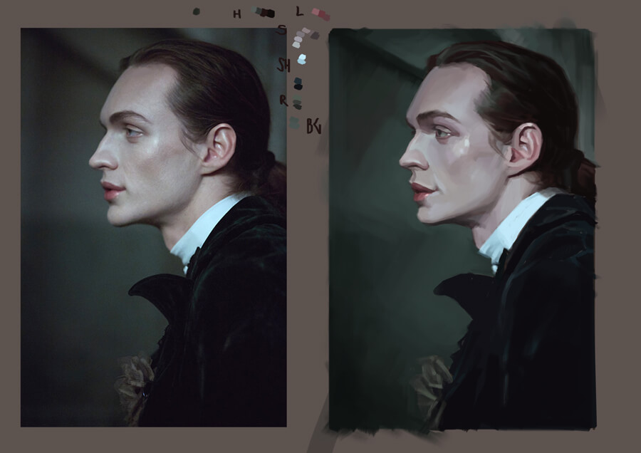
I'll be taking a long break from digital painting. The comic book work I'm doing is not looking good! Quick drop:

Portrait study:


If you are reading this, I most likely just gave you a crappy crit! What I'm basically trying to say is, don't give up!  
----
IG: @thatpuddinhead
Reply
Thanks for the response. I liked the link explaining rendering, and the clues to your process.

Looking at your side by side paintings, that's some great progress. Current you beats old you hands down!

_________________________________________________________________________
The best time to plant a tree was 20 years ago.  The second best time is now.  
-Chinese proverb

Sketchbook

Reply
Great job on those portrait studies :) Like Tygerson said that side by side comparison shows how much you've improved over the last couple of years. Keep it up!

Reply
Interesting Sketchbook.
I like the Skull studies of (i guess) famous people you did on page 12 the most. Their skulls had interesting shapes.


(08-20-2017, 02:36 AM)John Wrote: Portfolio stuff:

On the first and last page I couldnt really find your goals for your artwork, so what are the goals and how did you decide that this one is a portfolio piece? Of course good improvement since 3 years ago!

Rational Thought never helped anybody.

btw. Youtube: https://www.youtube.com/channel/UCIYkXrw.../playlists
Reply
Tygerson - If there's anything I wasn't clear about, drop me a message! I can be vague at times, especially when it comes to explaining art process.

Peter - Thanks!

LK Crown - I had to round up 5 pieces to submit for a comic publisher that month. I didn't have any finished piece for one of the big 2's IP, so I had to sneak that one in quickly.

---

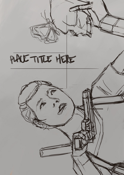
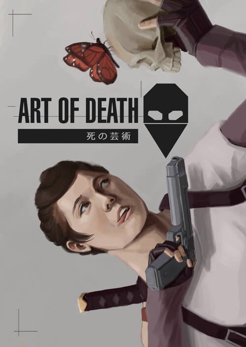
Comic cover:


The space above is for the title and some cover layout stuff!

---

Edit:


If you are reading this, I most likely just gave you a crappy crit! What I'm basically trying to say is, don't give up!  
----
IG: @thatpuddinhead
Reply
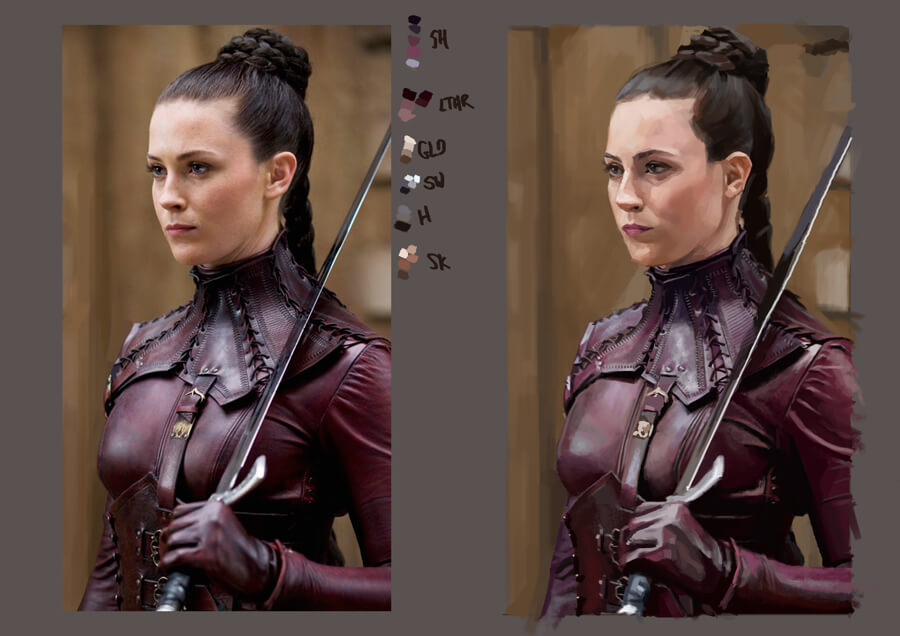
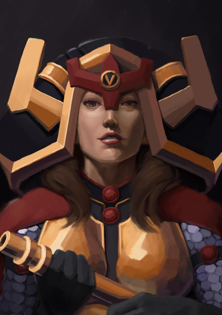
Portrait/material study:


I think I should explore with more brushes. The problem with playing and experimenting with something for too long is nothing gets finished. I think I stretched this one for too long so I'll stop here and move on to the next.

New cover in progress (which I hope I can finish given the amount of time dwindling fast).


If you are reading this, I most likely just gave you a crappy crit! What I'm basically trying to say is, don't give up!  
----
IG: @thatpuddinhead
Reply
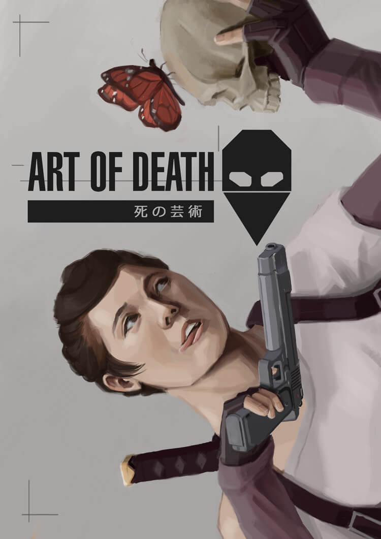
Cover work:


Shout out to Amit helping me workshop the piece.

If you are reading this, I most likely just gave you a crappy crit! What I'm basically trying to say is, don't give up!  
----
IG: @thatpuddinhead
Reply
Nice piece John :).

I love the angle of view, makes it seem more dramatic and the butterfly looks cool!

“Today, give a stranger one of your smiles. It might be the only sunshine he sees all day.” -- H. Jackson Brown Jr.

CD Sketchbook


Reply
nice piece bro
i have to go out but wanted to make a few small suggestions
the butterfly looks a little large to the point its distracting as an element of the piece
popped a tad more light on the skull
altered her angle a little bit to satisfy my eye a bit more
her shirt area was creating too much or a stiff rectangle area i thought
gave her a thumb cos the way she was holding the gun felt a lil off to me
not sure who the character is so not sure what the expression was supposed to show so just altered it a bit.
the tongue was a bit miley cyris and the teeth didnt look like they were making contact with it so much so i tried to make it a lil more natural but this was done real quick so dont have to take it so serious.
made the shadows contrast a bit more and thinned her face a tad
also just added some butterfly dust for people to read meaning into.. blood spray or what have you.
anyway, good stuff!
[Image: po_by_andrew_gibbons-dbqewqq.jpg]

GUMROAD | ARTSTATIONINSTAGRAM | YOUTUBETWITCH | SKETCHBOOK
Discord tag: AndrewGibbons#3357
Reply
Artloader - I can't take credit. In essence, it's Amit's direction. He saw the first cover and we argued about the character being cross-eyed for about half an hour! That and the composition and the story behind it. And wow, he knows my bullshit better than I do.

xelfereht -  No offense. I don't think there was anything to add or change. Except for the thumb suggestion. Now that find was brutal. It was either fixing the gun or fixing the hand down to the arm. 

Great catch. And I did tweek the contrast abit! Not the best rush job, but thankfully, because of you, she won't be running around thumbless! 

As much as I would like to make more changes, it is final. Can't unbake a cake just to fix it!


Thanks Andrew.

----
Final print version:


If you are reading this, I most likely just gave you a crappy crit! What I'm basically trying to say is, don't give up!  
----
IG: @thatpuddinhead
Reply
Haha you fixed the wrist! Totally feels like she can actually support the gun now ;) The prints look tantalizingly good! And yes, you should take credit. It's easy to be the ass who points out mistakes, harder to listen to those asses and apply the good stuff. Pat on the back man. do it.
Do we get to see a small teaser of the comic too? ?

 YouTube free learnin! | DeviantArt | Old Folio | Insta
Reply
No offence taken, great job on this one John

GUMROAD | ARTSTATIONINSTAGRAM | YOUTUBETWITCH | SKETCHBOOK
Discord tag: AndrewGibbons#3357
Reply
Good work John!I like this 2nd version of the cover much more.
I can see a pack of paper in that pocket, have you finished the comic already? How soon is the con?
Would love to see a teaser as well :)

Reply
Amit Dutta - No!
neopatogen - The con is done. I peddled tons more of the old stuff I made with a team than the new one I made myself. I sold 3 of the books. 

I just remembered: Technically sold two. And traded one.. and boy did I disappoint that person.. It was rough! But a good learning experience no doubt. One of those things where it's not fun having that memory still fresh and lingering. But given a significant amount of time and distance from that moment, I think I can look at it fondly and laugh about it in the future!

----
Portrait study:


If you are reading this, I most likely just gave you a crappy crit! What I'm basically trying to say is, don't give up!  
----
IG: @thatpuddinhead
Reply


Forum Jump:


Users browsing this thread: 165 Guest(s)