Posts: 124
Threads: 2
Joined: Nov 2020
Reputation:
13
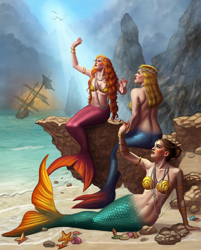
mermay painting is looking great. I don't have much feedback - only thing is that as you mentioned using less saturated colours, I think the blonde mermaid has hair that's too yellow to be natural. Most blondes (even warmed toned ones) arent brassy unless a dye job has been botched, however your mermaids hair has a very saturated orange toned shadow, despite it being an overcast day. Redhead mermaids hair ( for the areas in the light) also seems a smidge too light in value for that level of saturation, but it might work out once all the lighting and stuff is finished.
Having said that, i think the higher saturation across your paintings works really well for this fantasy type of art so if this is a personal style thing, keep it as is.
Posts: 1,076
Threads: 4
Joined: Jan 2016
Reputation:
43
one_two: Thanks! I tend to use a hard edged brush during the early stages, and then blend them with a soft edged brush for a smoother result. I hope I'm not overdoing this, but I do prefer a soft look to my images.
Skeffin: Great input regarding the hair! I should know this myself since I have blonde hair as well, haha. Glad you enjoy the saturated style as well!
Continued to work on the image, made a ton of progress and it seems to finally be coming together. Any input is appreciated, here is the current preview:

Posts: 316
Threads: 3
Joined: Sep 2019
Reputation:
23
Hiya, Thanks for stopping over my way and for the comment about value. I tried to put that to work in my latest.
Anyway - looked over the last two pages and thought you made excellent improvements as you went along on the knight.
Loving the composition on the mermaid image! Their figures / faces are well done and the background is awesome.
As Skeffin said they're a bit over-saturated at least on my screen and to my eye. Suggest using some atmospheric perspective to give them some depth like you did with the background. For example the tails are all about the same values.
Love that ship in the background and the way you highlighted it with the sky but suggest widening the body quite a bit. I've noticed that even old vessels like this one are actually quite wide when seen from the front or back.
Anyway — love what you're doing - keep it up!!
Posts: 3,357
Threads: 37
Joined: Aug 2013
Reputation:
234
A really theatrical lighting here.I would probably have reduce some of the atmospheric perspective on the rock in the midground just to avoid the flatning effect it pretty much on any object past the sirene.Would be interesting to add a bit of transparency in your sirene fins since it pretty much like that on animal just something to try not sure if the result is as interesting i imagine.
Posts: 181
Threads: 0
Joined: Oct 2017
Reputation:
41
Hey cg, thanks for stopping by my sketchbook. I'm really digging the mermaid piece, it's looking good! The main thing that sticks out for me is the lighting source not matching the story? As in, there is a 'spotlight' beam coming above from the middle of the sky (where the birds are) but the mermaids are shielding their eyes from (what we presume to be) a light source on the left. I don't think that means you have to veto the 'spotlight' altogether, but toning it down might help with the story
Posts: 1,076
Threads: 4
Joined: Jan 2016
Reputation:
43
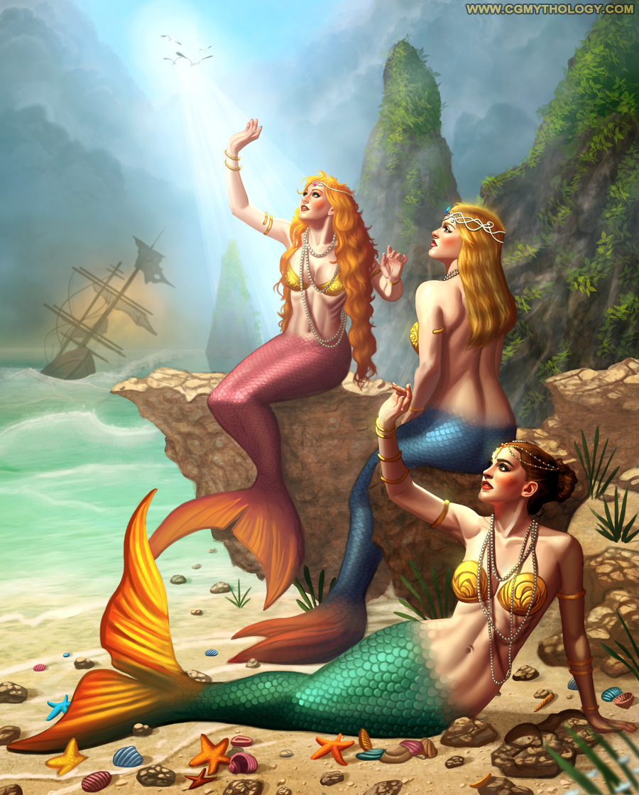
Jephyr: Thank you! Great point regarding the atmospheric perspective, just incorporated and it looks much more natural now!
darktiste: Sure thing, just made those changes mentioned, hopefully it looks better now!
chubby_cat: Great point regarding the 'spotlight', I tried toning it down a bit, hopefully it works better now!
................
I reworked the image quite a bit, focused a ton of values and detail work here and tried to make it look more natural and realistic. I'm calling it done for now as I worked so much on the image that I'm quite exhausted! With that said, I'm fairly happy with how this one turned out, and thanks again for everyone with their input and suggestions, really made a big difference here so I'm very grateful! Here is the final image:

Posts: 3,357
Threads: 37
Joined: Aug 2013
Reputation:
234
A nice difference in depth specially in the character.A solid result.Maybe the only thing and it really nitpicky is to observe how scale transition in fish and liizard to better find solution instead of applying a fading effect would probably be more believable in term of skin to scale transtion.
Posts: 1,076
Threads: 4
Joined: Jan 2016
Reputation:
43
darktiste: Thank you, great input on the scale transition as well, will try a different approach when I draw a mermaid again... probably next year :D
..............
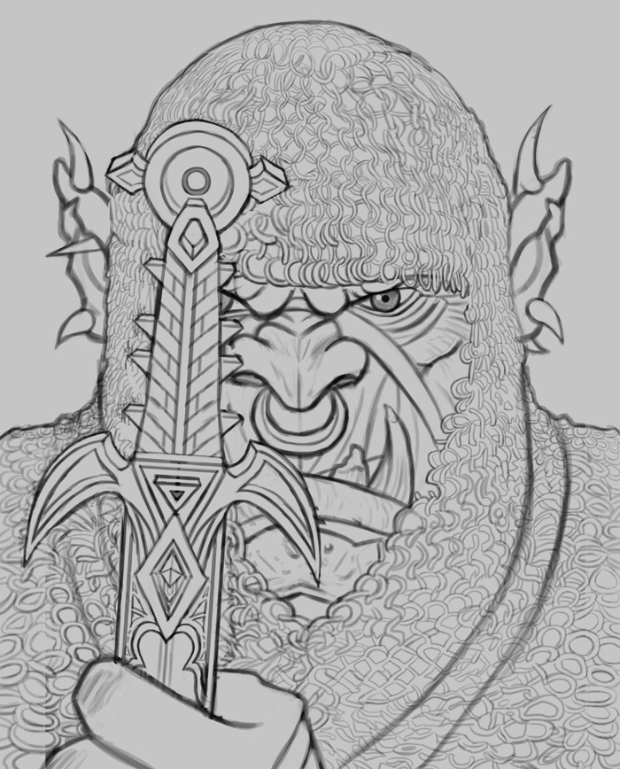
I'm ready to begin working on a new illustration! I wanted to do something simpler this time so I opted for a portrait, this time depicting an Warcraft-inspired Orc which should make for some fun subject matter. I worked on the sketch a great deal, very pleased with how it turned out although I would very much appreciate some feedback before the painting process, just to make sure I get everything right. Here is the sketch:

Posts: 3,357
Threads: 37
Joined: Aug 2013
Reputation:
234
The sword isn't really doing it for me it doesn't look functional and it look way to small and if your going for the warcraft orcish weapon look it not there yet.I recommend more study unless you want to put your own spin to it which still would probably require you study some of those work.
Why make your life simple when you can make your life harder with chain mail all over the place xD.I suggest you remove the chainmail head cover atleast thank me later.Than why not add some scar and tattoo.Why not try a small horned orc for a change perhaps?
Posts: 73
Threads: 4
Joined: Jul 2020
Reputation:
2
Your sketchbook looks great! I love your anatomy and rending, especially in the faces.
Posts: 306
Threads: 1
Joined: Aug 2020
Reputation:
16
Mermaid piece turned out nice! Really dig the seashells!
Posts: 1,076
Threads: 4
Joined: Jan 2016
Reputation:
43
darktiste: Excellent input as always! I agree with a lot of what you said and made some changes to the image; Primarily, I made the sword much larger and reworked the design quite a bit, hope it works better now!
Tank Rat: Appreciate it! :)
one_two: Thanks, glad to hear you enjoy those details!
............
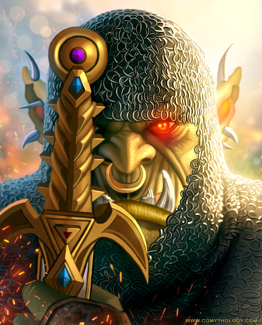
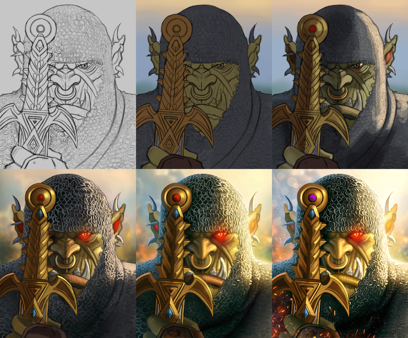
I worked on the Orc a great deal, put a lot of effort into this one and it came out much more realistic than I thought it would, but I feel it works well. Here is the final image followed by a step by step animation, hope you enjoy!


Posts: 3,357
Threads: 37
Joined: Aug 2013
Reputation:
234
Looking good but the illusion of the chainmail get lost around the jaw because the inside of the ring should have a color to reflect the face under it.Like the forehead section.It would add more depth and realism to the chain main which add more overlap but i think it alot of work but as they say love is in the detail.
Good job
Posts: 1,076
Threads: 4
Joined: Jan 2016
Reputation:
43
darktiste: That's a great point! I probably should have put some skin tones blending in with the shadows for the chainmail, might have made the image even more convincing. Might rework the image in the future with that in mind, we'll see!
...............
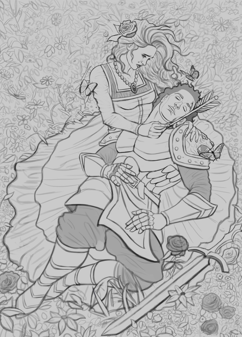
I started on a new sketch, the goal for this one is to create something that looks like it came from the 'Victorian' era which I'm a huge of. I spent a lot of time on this sketch to bring the details to life, and I'm overall satisfied with it. The figures' poses were referenced from FantasyStock as well - tried to be as faithful as possible to the poses while taking a lot of artistic liberties such as the character designs and costuming. Please feel free to let me know any input, as I'd like the sketch to be as good as possible before I begin painting this one!

Posts: 852
Threads: 6
Joined: May 2018
Reputation:
116
Nice composition! I always think your drawings look really good, although we have rather different styles of painting. On this one the only thing I really see that I would change is to pretty much get rid of the line showing her boobs, since her dress and undergarments would kind of smooth that out. A line indicates a crease, like the dress is being pulled under her breast, instead of laying over it.
The other thing is that there's a twist in the guy's body where his pelvis is facing a different direction than the torso. You follow the reference pretty close, but since the armor is rigid, it creates a bit of a weird effect where the two halves of his body seem disconnected. If that makes any sense. I think what I would do is have his breast plate and ab armor face front a little more, that seems easiest, but maybe it's just me.
Posts: 3,357
Threads: 37
Joined: Aug 2013
Reputation:
234
My comment would be focus on the armor leg piece instead of making the silhouette of the shape take the exact shape of a leg try to think about the armor wrapping around i would assume if it made of metal it should be more cylindrical and thigh fit unless it a very thigh leather with some kind of flat ridge or painted strip i doubt you would get this silhouette.
Posts: 1,076
Threads: 4
Joined: Jan 2016
Reputation:
43
JosephCow: Thank you! Excellent feedback as well, I updated the sketch with your input implemented. Great point about the torso as well, I changed the angle as suggested and it does indeed look much more natural now!
darktiste: Thanks! I kind of like the silhouette to be honest, hopefully it looks more natural when I paint it in!
..........
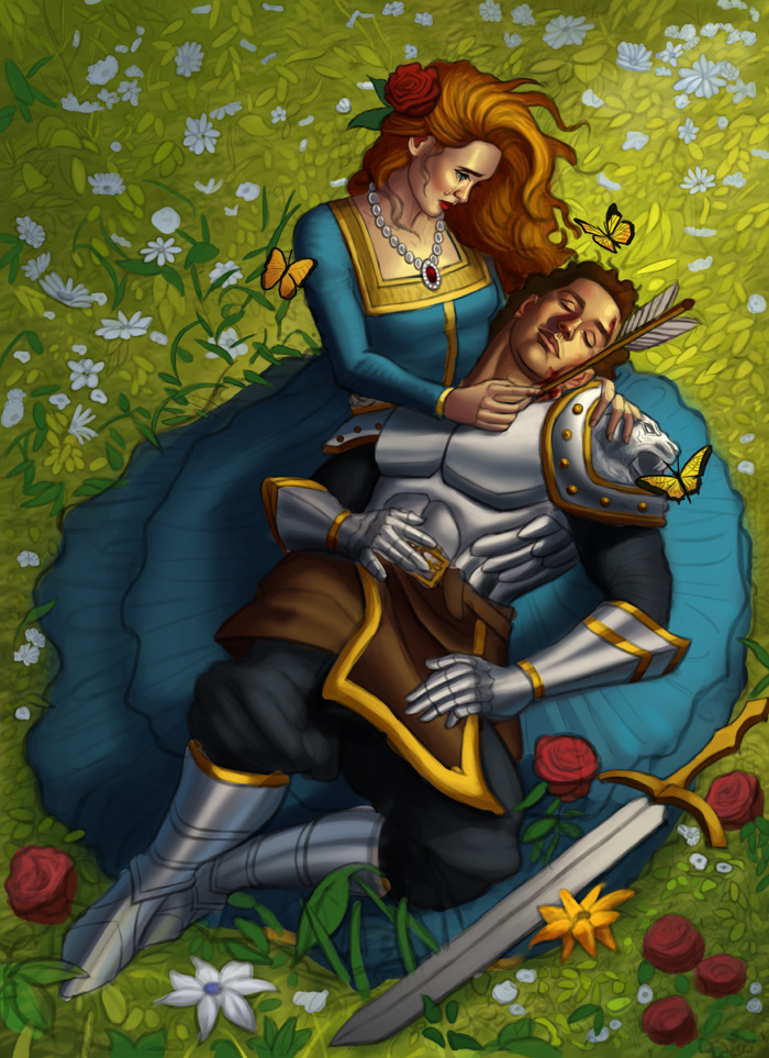
I began the painting process and worked on the image a great deal, although it has some ways to go as I want to play up the details as much as I can with this one. Attached the current preview here, any input is appreciated as always!

Posts: 852
Threads: 6
Joined: May 2018
Reputation:
116
Cool! I think that change to the armor makes it look more natural.
Posts: 76
Threads: 3
Joined: Feb 2021
Reputation:
6
Its beautifull, I like the victorian look a lot. Especially how you painted the guys face. One thing that came to my mind is, that the necklace looks like it does not cast enough shadows on the skin and maybe isn´t shiny enough for facing the light.
Posts: 316
Threads: 3
Joined: Sep 2019
Reputation:
23
Hi again,
That mermaid piece turned out great!
Love this new one too. It's cool to see how you used the reference — and worked it into your fantasy style.
You have an amazing ability to render figures and faces that feel natural. With that said the armor around both calves doesn't seem — at least to my eye — to fit the form of the legs and feet.
When I'm confronted with those kinds of things I go strait to human anatomy images or look for references and poses that are similar to what I'm going for.
Anyway — The background and lighting on this one are looking fantastic! Look forward to seeing the final piece!
|


