10-10-2021, 03:54 AM
The last painting is really nice. Dig the hair.
|
CGMythology's Sketchbook
|
|
10-22-2021, 05:08 PM
darktiste: Thanks! I freelance every day full time with some tight deadlines so I'm used to painting fast, glad to see you noticed an improvement in that regard! Are you referring to the Wonder Woman logo? I added it to give it more of a comic book feel, hopefully it's not too distracting!
one_two: Thanks! The hair was a lot of fun to paint so I'm glad you enjoy it! ............... Time for a new painting! I finished up a sketch, was in the mood to sketch an angelic figure. I'm planning on doing something really dynamic with the lighting on this one, but I would love to hear any input before I begin painting just to make sure everything is just right, so any input would be appreciated! Below is the sketch: 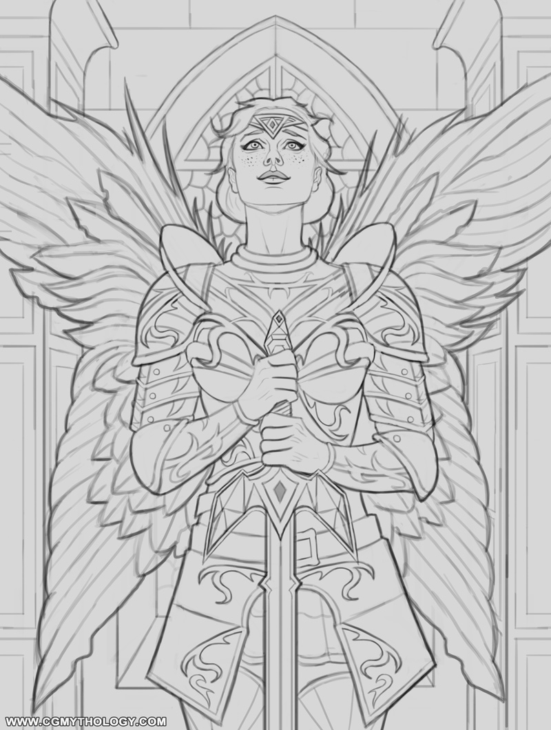
10-27-2021, 04:02 PM
I like her. The wings are almost like a butterfly and frames the image really nicely. There's a little bit of asymmetry in the headpiece that I'm not sure was intentional, with the rest of the armor being very balanced. I think maybe the fauld and tasset need to curve or angle outwards a bit more - not to accents the hips but to act like they would over hips and be more functional - they're just a little too straight at this stage.
10-27-2021, 05:07 PM
Remember to charge extra if it not front a facing figure
Charge less if it portrait size portrait size. Also if it color vs just line art affect the prizing.Color being more time consuming obviously. Do you deliever as is or do you also give people opportunity to modify? If yes remember to limit the amount as not to fall in the trap of over demanding client and save your time which is your money unit you cannot afford to give away indefinitely. Just some tips you never know if no body tell you.
11-02-2021, 03:45 PM
Hi,
Ok — so what ever you're eating — keep it up! You did a serious level-up since my last visit. Sith, Captain America, The Batman, and Wonder Woman are all outstanding. Looking forward to seeing what you do with the angel. I don't have any suggestions other than continue to pursue what is obviously working for you!
11-14-2021, 03:31 PM
RottenPocket: Thank you! Great point regarding the headpiece, I reworked it significantly so hopefully it works better now!
darktiste: Thanks for the advice! I usually work within the budget of the client; basically the higher the budget the more time I spent on refining and detailing. Some clients have a very high budget, others not so much but I try my best to price fairly. I hope I'm getting better at it! Jephyr: I'm glad to hear that! Always happy to hear I'm improving! I try to do better with each piece so your comment made my day, thank you! ............... Finally finished the painting process for the image. Lots of fun tackling the lighting here. The wings were very, very time consuming however, had to do several passes on them to get it just right but I hope the image is stronger as a result. Here is the final image followed by a step by step animation, hope you find it useful. Feedback is always appreciated, so if something looks off please feel free to let me know! 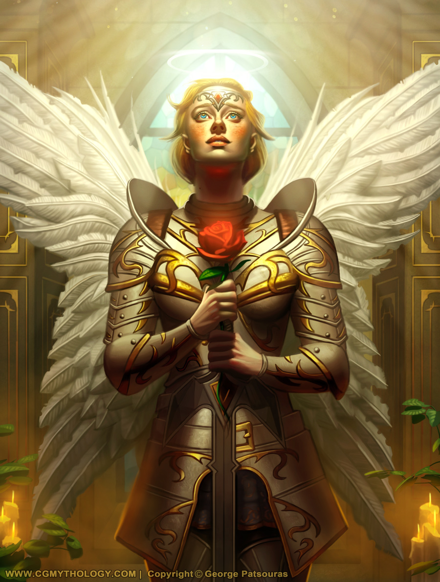 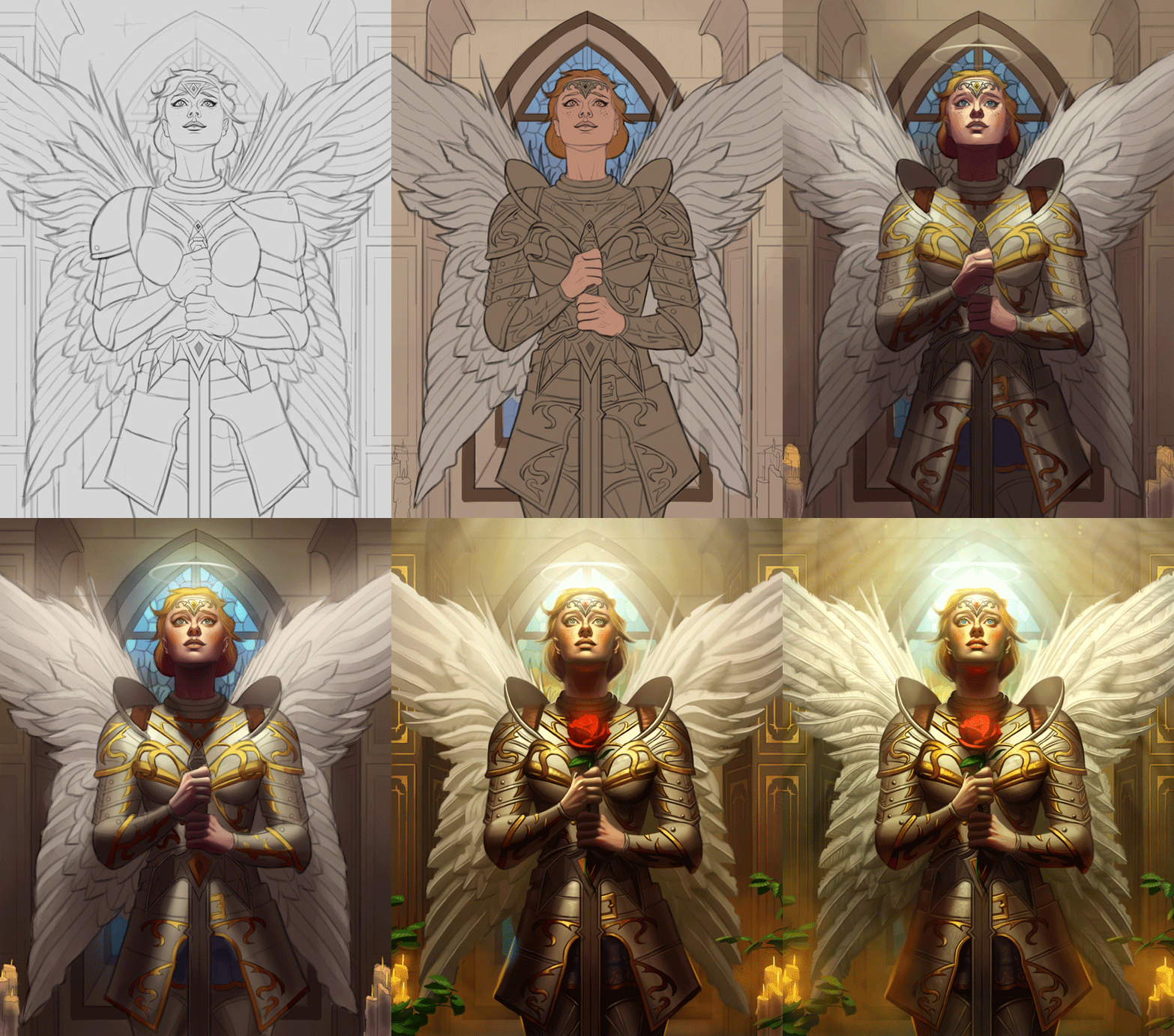
11-14-2021, 09:42 PM
The rose is a bit to saturated and it even as a glow instead of being bit translucide i don't think it would behave that way but i could be wrong.For the lightning i kinda prefer the not over the top lighting which mean that in the time lapse which would be the before end picture.It still as a nice over head.I find that adding the light ray really make it look more comic''ish'' when you exaggerate thing also you lost alot of the halo presence into the light.
The sword handle shape seem unresolve and doesn't seem to harmonize with the armor in term of the shape language.Now for the belt buckle i think it just unessary and it as the same texture as the armor instead of being leather it doesn't seem to sit over ther armor but it seem to be part of the armor but the pose of the arm make it really hard to be clear. What is kinda wierd i never seen a iron belt exept maybe those made of chain link which would have been strange here. One rule to keep in mind is you don't need to add detail that take you extra time which doesn't necessarly have to be there to make the whole picture cohesive.As you can see the armor doesn't need a belt to hold in place there strap on the side.Take a good amount in researching reference make for better decision making phase when it come to design just don't lose to much time there obviously and by that i mean don't get sidetrack in your research or collect to much but more is better than less when we talk about reference.Also don't forget to study how armor and how they are build so that it believable. It really depend what was ask of you of course the client is king.
11-15-2021, 04:32 AM
The angel piece looks fantastic!
I do have one suggestion, not that you should change it or anything. It looks good as it is. But I feel like there is a different way you could have framed things so that it really reads as you intended. And I'm saying this just assuming your intentions based on the progress shots but y'know i could be wrong. It seems like her face is supposed to read as really bright, like it's bathed in this divine light, and the halo also is supposed to be glowing really hot. If you want something to seem to be bright, you need a darker mass behind it. A few shots ago, you had the window darker, but you added a ton of effects and now it's reading the dark shadows of the face against a light window, and then the lit part of the face is kinda tepid against it. Personally I would reverse that, and make the window darker again, because it also frames the wings you spent time on better. The wings and the halo also end up being about the same value as the window behind them. Not a bad thing to have things be the same value, but not if it's an extremely important element. Another thing I might do is to 'cut' the value range of the face. It's sort of like when a camera gets over exposed and the light parts end up flattening to white. This tends to communicate that something is extremely clear and bright, without using a ton of value. It's just an alternative to having so much shading in the face. By the same token the rose is hard to miss because it's bright red. However, the value of it is actually quite dark in B&W. It's kind of lost in the shadow from the neck, and the bottom part gets lost in it's own shadow. Just not ideal framing imo. The rose can't really be lighter than the shadow without losing the color, so therefore it's surroundings would have to be lighter if that's going to stand out. It's clearly an important symbolic element, so it should be given as much prominence as is feasible. I do like what you ended up with, don't get me wrong. There's probably a hundred different ways the piece could be composed. But just some thoughts. Because i could also see the idea being that the whole top of the picture is bathed in light, and her face and wings are meant to emerge out of that as opposed to stand out from what is behind, which is more what you have. But I like strong masses against each other.
11-16-2021, 07:35 PM
darktiste: Thanks for your input. I wanted the rose fairly saturated, wanted it to pop but hopefully it's not too distracting. I lost the belt buckle as you mentioned, great call. Regarding detail, I prefer a highly detailed look for my illustrations, but hopefully I can control this a bit better as I progress. This image wasn't created for a client btw, I rarely post client work here due to NDA. Thanks again for your suggestions!
JoshephCow: Thank you! I love what you did with the paintover and I agree with your suggestions. I tried to update it a bit to reflect what you painted to a degree, but it's a bit tricky due to so many layers and changes, but I do think it's an improvement over the previous version. I made note of your suggestions so I can remember them for future works, however. Thanks again for your input and taking the time to do the paintover, very much appreciate it! ............ I did some minor updates on the image based on the feedback I received. It's a bit difficult o take it a step further as the detail work is pretty much done and I don't want to repaint everything, but hopefully it works better now. In the future I'll post steps more often so I can implement the feedback I receive earlier during the painting process, starting with my next illustration. Here's the update: 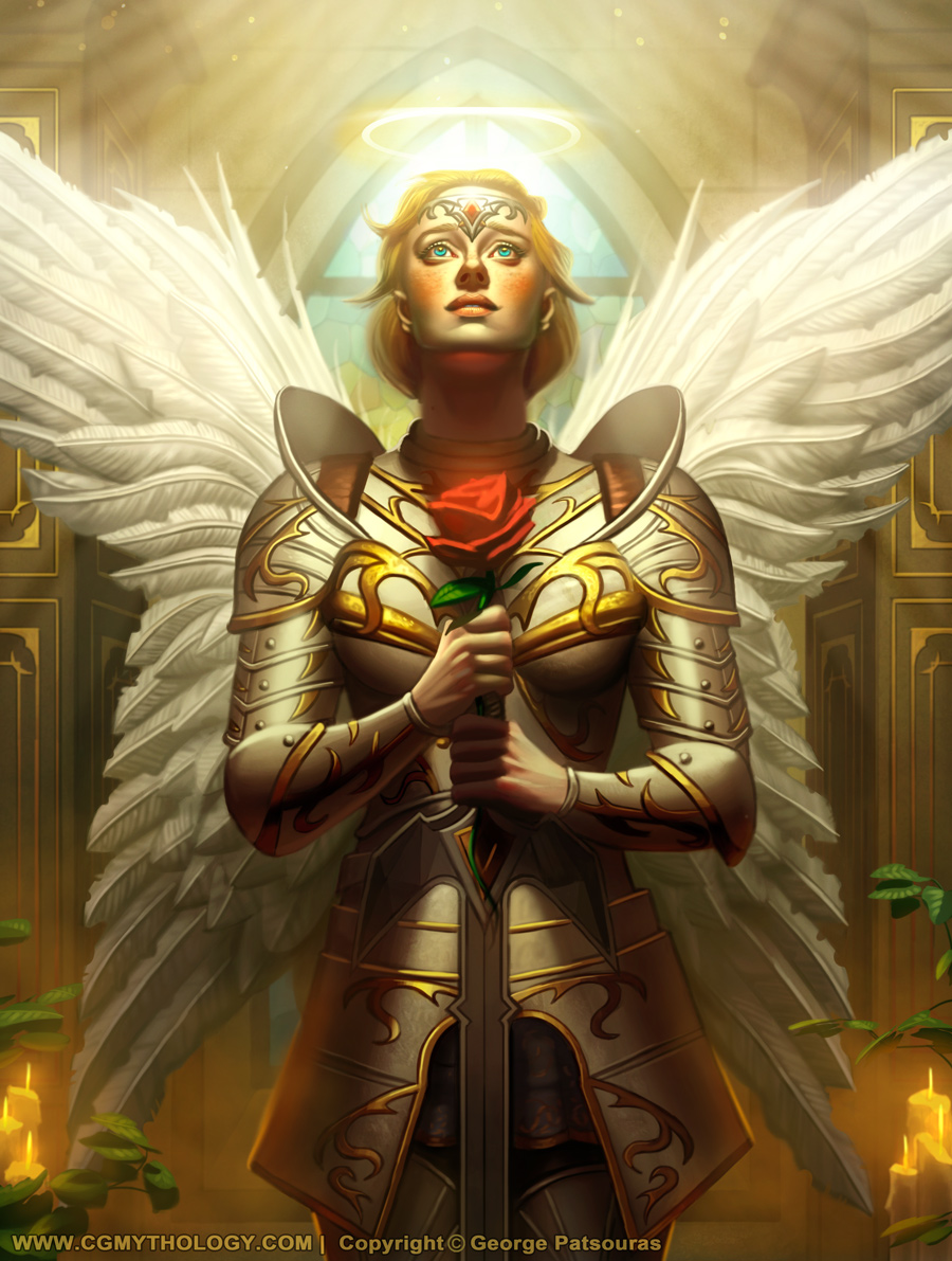
11-17-2021, 12:00 PM
You welcome! I was hoping you wouldn't be put off by it. I really didn't expect you to repaint anything at this point lol. I do like the new rose better though.
11-17-2021, 08:06 PM
JosephCow: Not at all, I'm always extremely grateful for anyone taking the time to do a paintover/critique my work, it's incredibly helpful so I wasn't put off by it at all! Glad you dig the updates rose!
............. And time for another illustration! This is for a friend, I previously illustrated her as 'Lady Justice' and will keep the same concept, but a totally different execution. Going for a classical feel with this one, really excited to begin painting it in soon. Please feel free to let me know any feedback on the linework, however! Here's the current sketch: 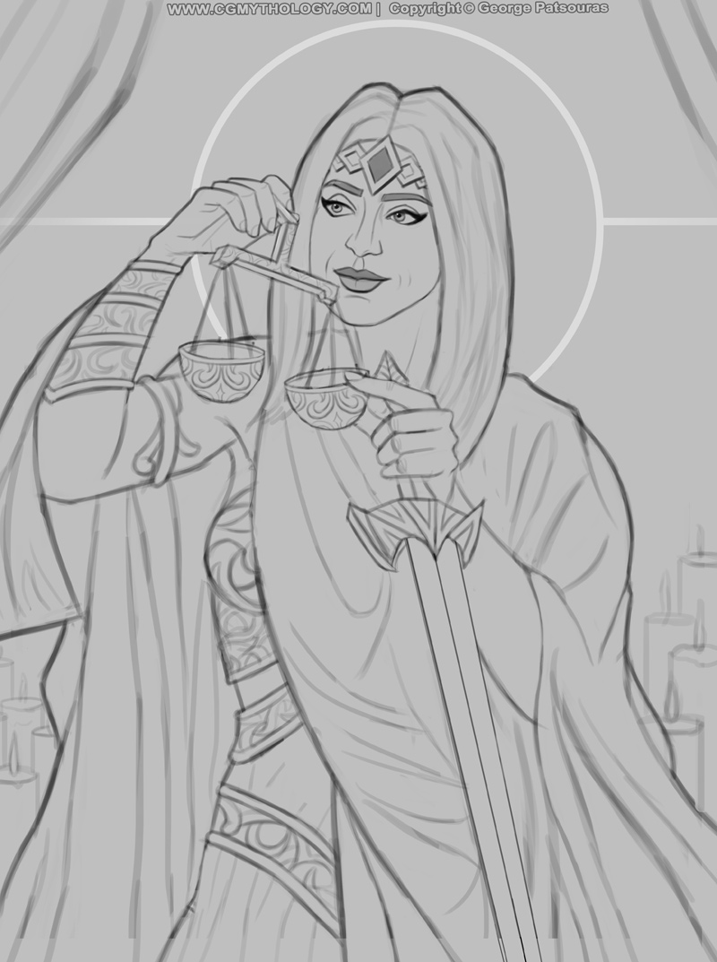
11-18-2021, 03:36 AM
Hey CGMythology just had a go at practicing by doing quick paint over see what i can pick up on.I started tweaking the face and age her abit to reflect the idea of knowledge and good judgement.I mainly soften the jawline and down size the nose.I also ajusted the right shoulder a little bit. Played with the hand but end up with a tangente there so i see why you have the hand that way.I also play with liquify on the bottom of the left arm because it was to angular i really didn't spend much time there.I wasn't fan of the hand guard so i said why not experiment with a hand guardless sword or maybe see if you can just get ride of the sword unless it really for symbolism.I also made sure the armor wrap correctly according to body.To finish i try a color palette a bit away from the palette i seem to see you use.
I think it would be nice to consider an art nouveaux style instead of a classical look since it as a nice symbolism attach to it.She remind me a bit to much of the wonder women piece for some reason such as the crown and the corset type armor with the bracer. I hope you find something useless in that. Edit* The finger pointing seem kinda big.In term of symbolism lady justice is normally found with a cloth over her eye it would be sad because the eye are pretty amazing here.
11-18-2021, 06:13 PM
darktiste: Thank you for that! Great input in general, I will implement some of them by the next update - although I don't think I'll make her older since this is a portrait for a friend, and I don't think that'll be particular appealing her to her.
.............. I began the painting process, it's at a very early stage but I'm quite happy with how the lighting in particular is shaping up. Still have a long way to go but I'm having fun bringing this image to life. Here is the current update: 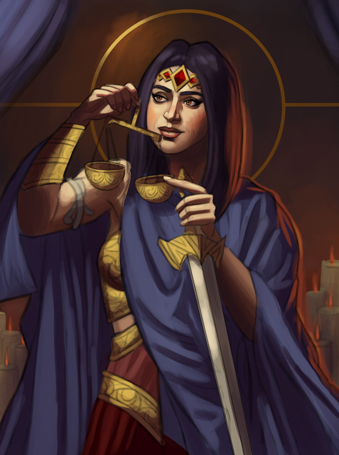
11-19-2021, 09:06 AM
Coming in a bit late most likely but -- I think her eyes/gaze should be looking down lower at the scales themselves. Right now she's looking at or past her hand which makes the closeness of the scales to her face kind of confusing. Just a gentle downward cast gaze would make more sense to me but I get that for a portrait you want to show those eyes off. 2 cents left, it's all yours.
11-19-2021, 12:30 PM
I think Rotten makes a good point, because she is holding the scales up close to her eye level, as if balancing them, so for that action to completely make sense she would have to be looking down a bit more.
On this one i also feel like there's a similar thing happening with the values, where with the addition of effects and extra light sources, the values of different things end up getting closer together. In this case the cloak with the candlelight on it. adding another colored light source usually looks cool, but in this case the light on there brings what would have been a dark shadows of the cloak, up to basically the same general value area as the background. And I would think if a rimlight is added, it's to make something read stronger not weaker. If going for a classical look, consider doing some notan studies for the painting. Old paintings are almost composed with a simple value scheme, and it is very planned out to get maximum read. The paintings might be extremely complex, but the value scheme is typically simple, with three main values which can be grouped together. Modern paintings tend to have more complicated lighting scenarios, but they still operate on the same basic prinicple of dark mass against light mass, or vice versa. So for example, if posterizing your painting so far, what you have would be on the left, and a more classic way to approach the same thing would be on the right (simplified).
11-21-2021, 06:35 PM
RottenPocket: That's a great point, I'll definitely experiment a bit with the eyes to make it more natural looking, thanks!
JosephCow: Great feedback as always! Initially I wanted the background to be as dark as possible to help the figure pop out, but what you have works much better! I revised the painting to reflect the new values and it works much better now I believe! ............ Here's the latest update, revised the values significantly to make it more coherent and refined the image as a whole. I think it's at a point where I can now begin some serious detail work which should help bring it to life. Feedback welcome as always! 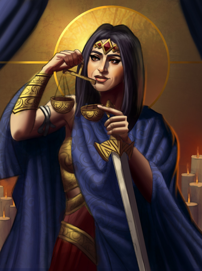
11-22-2021, 09:51 AM
Yay that looks stronger to me. I was thinking a black background would be good for this theme because it makes it mysterious. Losing the shadow part of the cloak into the background wouldn't necessarily be a bad thing, but losing the shape of the hair would. So I think what you have now is a stronger statement.
11-22-2021, 03:39 PM
That angel turned out great! Having just done a character with wings I'm impressed with the detail you put in yours.
Looking forward to seeing the 'Justice' pic finalized.
11-24-2021, 03:28 PM
JosephCow: Thank you, glad to hear it!
Jephyr: Thank you, I'm very happy with the 'angel' image so I'm glad you enjoy it. Glad you dig the wings as well, those were so much more time consuming than I anticipated! .................... I resumed working on the image, refined it heavily and did some detail work. We are getting there! 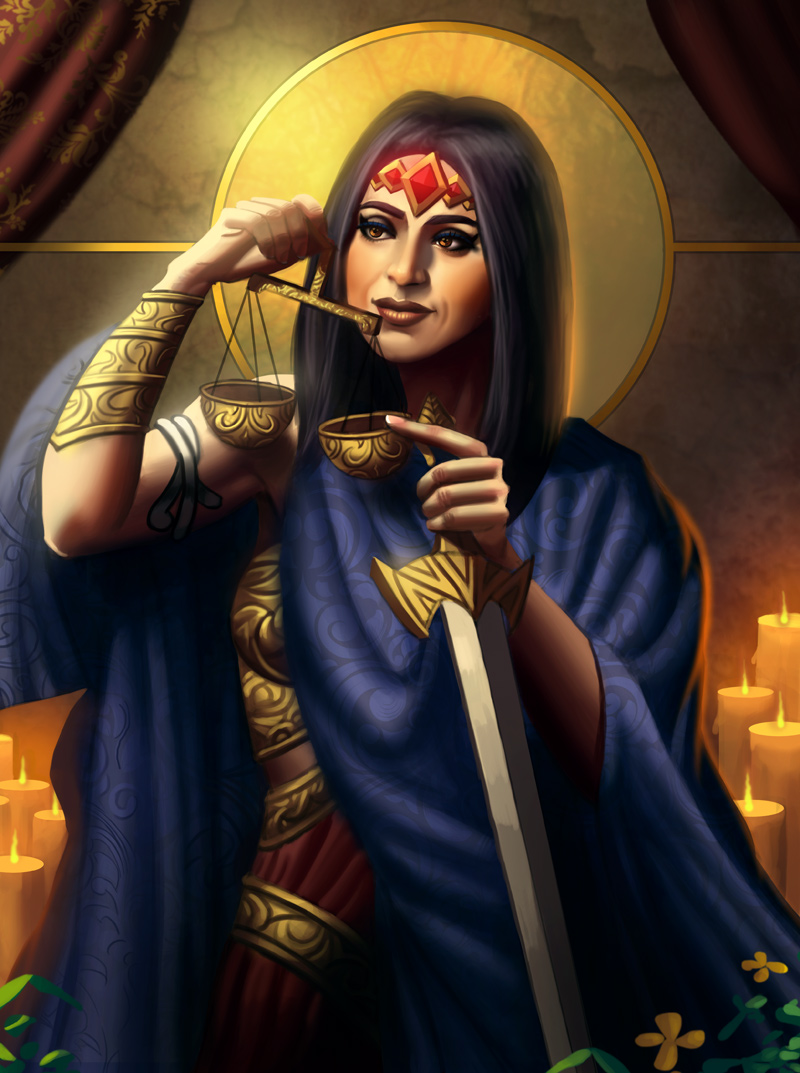
11-24-2021, 09:13 PM
The drappery in the back why is it being overlap by the circle and line of the background?
|
|
« Next Oldest | Next Newest »
|