Posts: 1,076
Threads: 4
Joined: Jan 2016
Reputation:
43
darktiste: Great work, thanks for taking the time to do that! Just updated the image based on your paintover, hopefully it works much better now!

...............
And time for a new illustration! Wanted to do something a bit different than the usual fantasy work so I went with a sci fi theme, this time featuring a friendly space alien smoking a cigar because... why not? Here is the finished sketch, any input before I begin the painting process would be greatly appreciated!

Posts: 1,076
Threads: 4
Joined: Jan 2016
Reputation:
43
I finished up the painting process! This is definitely my most successful alien image I feel so I'm quite satisfied with how it turned out. I'm calling this finalized unless there's anything major off, so any final input is welcome! Below is the final image followed by some steps!


Posts: 261
Threads: 9
Joined: Dec 2021
Reputation:
43
Dude it looks awesome nice work. There is only two things that stand out to me. first i would have like to see the cigar tip lite more realistically with some dark ash clung to glowing bits a little more. (see ref) buts that's being picky.
second is the orange reflection/ specular reflection in his eyes. is this a unseen sunset possibly coming from the FG? if so I have no issues. if it was supposed to be the cigar reflection then his right eye (our left) is off. I think its the similarities in the color that confused me a little, and the there is the orange back/under lighting on the bottom of his cranium that insinuating that a similar light source is behind him also.
But in all I like this one a lot

Posts: 3,357
Threads: 37
Joined: Aug 2013
Reputation:
234
The city building in the back i think you could and i think you made 2 building on the right like both on different height yet they both behave like there flush at the horizon line.They are also to similar in shape which make for a weird look.
Posts: 1,076
Threads: 4
Joined: Jan 2016
Reputation:
43
CBinnsIllustration: Thank you! Great point about the ciigar, just reworked it for a more realistic feel. As for the eyes, it's a combo of both the environment as well as the light from the cigar, took some artistic liberties in that regard to make it look good as opposed to it being 100% practical. Glad you enjoy the image and thanks for the tips!
darktiste: Good point, didn't pay too much attention to the perspective of them to be honest as this was mostly a portrait piece. I made some corrections based on your input as well, hopefully it works better now!
................
Did some final adjustments on the alien image based on the feedback, here is an update:

Next up I started on a new sketch, back to my usual fantasy theme. I'm actually working on a big project featuring dragons and knights, so I thought I would practice those themes a bit more and came up with this. Figure was referenced from Satine Zillah's 'Knight' reference pack from ArtStation as well, the lightning in it is very dynamic which I hope to recreate when I begin painting it in... but before I do that any input would be appreciated! Here is the current sketch:

Posts: 261
Threads: 9
Joined: Dec 2021
Reputation:
43
The cigar looks much more realistic now! and i'm no one to call out taking artistic liberties as i take a lot my own work but i do feel flipping that orange reflection in the eye would read better (quick edit below) , but and I totally get sticking with your vision dude, after all this is sci-fi, we can do what we want!

the new piece looks good so far, will wait for your update!
Posts: 20
Threads: 2
Joined: Dec 2021
Reputation:
0
(01-15-2022, 11:30 PM)cgmythology Wrote: darktiste: Great work, thanks for taking the time to do that! Just updated the image based on your paintover, hopefully it works much better now!
Wow, love how cleanly rendered this is. Nice work
Posts: 1,076
Threads: 4
Joined: Jan 2016
Reputation:
43
CBinnsIllustration: Thank you! Love the fix with the eyes you did and incorporated it to the final image, thanks for that!
spectralpainter: Thank you, much appreciated!
................
Finished up the new painting, took a lot of work as I played up the details quite significantly. Of course there's still time to revise if needed, so any final input would be most appreciated. Below is the final followed by some steps if you're interested!


Posts: 852
Threads: 6
Joined: May 2018
Reputation:
116
Nice! This one would make a really good book cover for a fantasy book. Nice work on the armour on this one.
This is probably more of a personal taste, but I kind of liked how it looked before all the lighting effects at the end. The second to last, or even third to last image. Because it actually has very cohesive lighting and atmosphere where it feels calm, and cool, like moonlight. And then with all the effects added it kind of changes it to extremely warm and saturated and everything's glowing. It is kind of a ton of effects. The fireflies look cool, though.
You're definitely good at painting those kinds of effects, but a little goes a long way.
Posts: 20
Threads: 2
Joined: Dec 2021
Reputation:
0
Nice work, was all that texture on the dragon painted by hand? My two cents for critique: I think that the values on the breastplate could be darkened somewhat since I think it's currently brighter than the face.
Posts: 3,357
Threads: 37
Joined: Aug 2013
Reputation:
234
A really strong piece you did there. Overall you really are going far and beyond my exeptation now.But i am going to have to second JosephCow don't get to lost with the cool effect.Applying restraint and figuring out when to end a piece is an art in itself.
Posts: 1,076
Threads: 4
Joined: Jan 2016
Reputation:
43
JosephCow: Thank you! Very good point about the glows, I tend to do that step last and sometimes I can overdo it a bit, I admit. I'll definitely keep this in mind for future pieces and try to show some restraint in that regard!
spectralpainter: Thank you! The dragon texture was mostly painted by hand, although I did overlay a rock photo texture early on to speed up the process. Good point regarding the breastplate, it's probably too bright, might rework it in the future!
darktiste: Glad to hear it! Agreed about the glow effects, will try to tone it down in the future as I kind overdid it here a bit, I admit. I couldn't help myself 
...................
And time for a new illustration! Back in 'fan art' mode, decided to sketch 'Catwoman' with the likeness of the actress that's playing her in the new Batman movie, Zoe Kravitz. The general pose was referenced from one of Grafit's excellent reference packs as well. Overall I'm fairly pleased with the linework but I wanted to her any feedback before I begin the painting process. Here is the current sketch:

Posts: 3,357
Threads: 37
Joined: Aug 2013
Reputation:
234
I am not to convince by the belt area it doesn't seem to be twisting around the hips as if it as the proper volume i feel like we would see more of the pelvis and less from the leg actually it just how perspective and thing goes since the left leg is in foreground the pelvis in midground and the right leg in background.A hard pose i could not pull off even if i would try to draw it.Personally i am not the best at anatomy so it a bit out of my league to give tips on that.
Posts: 261
Threads: 9
Joined: Dec 2021
Reputation:
43
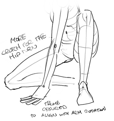
Looking good and with your paint skills it will be a strong piece, i would have to echo Darktiste sentiment that this pose is am ambitious one (the hip does need a little attention, letting her right leg to extend more and show more crotch would help sorry for the rough doodle of how i might approach this tricky hip and leg area, just for a second opinion only.) The good part of comic art is you can take more stylized liberties, which I'm totally cool with. That being said there are few small thing that caught my eye that might help.
first is she holding her whip? if so we should taper it a bit nore, right now it looks like she is emphatically mooring up her super yacht :)
Then the foreground hand bothers me a little. Right now it looks like a right hand on a left arm. I would suggest either dropping the thumb and moving to the back of the hand. OR rotate the hand a little more clockwise to compensate for the arm rotation
but in all great start I love her face, looking forward to your progress
.jpeg "Filename: image0 (1).jpeg
Size: 57.4 KB02-01-2022, 05:17 AM")
Posts: 316
Threads: 3
Joined: Sep 2019
Reputation:
23
Love the space alien — and the dragon and knight turned out really well. The lighting is especially tasty on that one.
Looking forward to seeing Catwoman finished up
Think CBinns gave some good advice as well
Posts: 1,076
Threads: 4
Joined: Jan 2016
Reputation:
43
darktiste: good point! I think it wraps around the waist fairly well, but perhaps it works better once proper shading is applied. I will hide most of it with shadow so it's not too distracting or noticeable.
CBinnsIllustration: Thanks for your input. I readjusted the whip to make it a bit more dynamic. Great point regarding the foreground hand, it does indeed look like a thumb which wasn't intentional, so I just readjusted it. Great work with your sketch as well, very much appreciate you taking the time to do that. I ended up not incorporating it however as it's at a bit of a different angle and the sketch would require far too much reworking to be honest, but I appreciate your effort!
Jephyr: Thank you! Space Alien was a lot of fun, really want to tackle another one soon!
................
I finished up the Catwoman image, very pleased with how it turned out. Of course there's still time for tweaks and minor changes if necessary, so any final feedback would be more than welcome. Below is the illustration followed by some steps for those interested!


Posts: 1,076
Threads: 4
Joined: Jan 2016
Reputation:
43
Time for a new illustration! I wanted to draw something a bit more dynamic in terms of perspective while maintaining an iconic look to the image, and this is the result. The 'Gladiator' theme was something I wanted to do for a while as well, and I feel it works quite well here. The figure was referenced from 'Grafit' with some artistic liberty taken in terms of character design. Any input before I begin the painting process would be greatly appreciated! Below is the sketch:

Posts: 3,357
Threads: 37
Joined: Aug 2013
Reputation:
234
Where the sole of the sandal?I am not very sold on the leg shape the negative shape make it very hard to read for me i would say but that might be fix with value i don't know for sure.The cylope head don't seem to have the proper volume and the eye is slightly force toward the viewer instead of being centered it the reverse for the nose.Try to consider different lenght for the column aswell as breaking them down aging them with vegetation maybe also.Same thing with your podium step try to break up the perfectly straight edge to give it a more rock like quality.To me is seem there also issue with your column ellipse.You make pointy ellipse that a common mistake it not just on the top one you are doing this problem.I recommend reviewing your cylinder skill.Maybe also do a few study of skull form with wireframe if you have a 3d modelling sofware where you can set one up in a lightbox.Maybe just buy a good quality skull replica to study from which will never be a waste of money for any artist.
Posts: 76
Threads: 1
Joined: Feb 2020
Reputation:
4
hey great sketchbook
your art is improving a lot
you seem to have a good understanding of facial anatomy you've got some good rendering skills. one thing i would suggest is you use hard edges a bit more because your shading tends to look too soft/muddy at times which is a problem my art has as well
take a look at leyendeckers work to study the edges/shape design on his figure.
your darks are also too dark which make the painting look flatter so i would suggest thinking about that as well
overall admiring your improvement and decication
Posts: 1,076
Threads: 4
Joined: Jan 2016
Reputation:
43
Darktiste: Thank you, great suggestions. Added some vegetation and fixed the issues with the columns.
HandsomeKorean: Thank you! Great point about the edges, using softer one comes more naturally for me so I'll try to be more conscious of this in the future. Great point about the darks as well, that was useful critique for this painting in particular as I lightened up the shadows a bit at the late part of the process which helped make the image.
.................
I finished up the painting process! Had a lot of fun with this one. Of course there's still time to revise it if needed, so please feel free to let me know any final input. Below is the final image followed by the steps for those interested.


|


