10-27-2022, 12:26 AM
I think you got something solid i don't have anything to add maybe start the next one
|
CGMythology's Sketchbook
|
|
10-27-2022, 12:26 AM
I think you got something solid i don't have anything to add maybe start the next one
10-27-2022, 01:23 AM
darktiste: Thanks! I went ahead and added the final touches!
............. I resumed work on the image and it's pretty much finalized. I'm open to any final feedback as well, so if anything is off please feel free to let me know. Thanks again to everyone for the feedback, very much appreciate it as always! 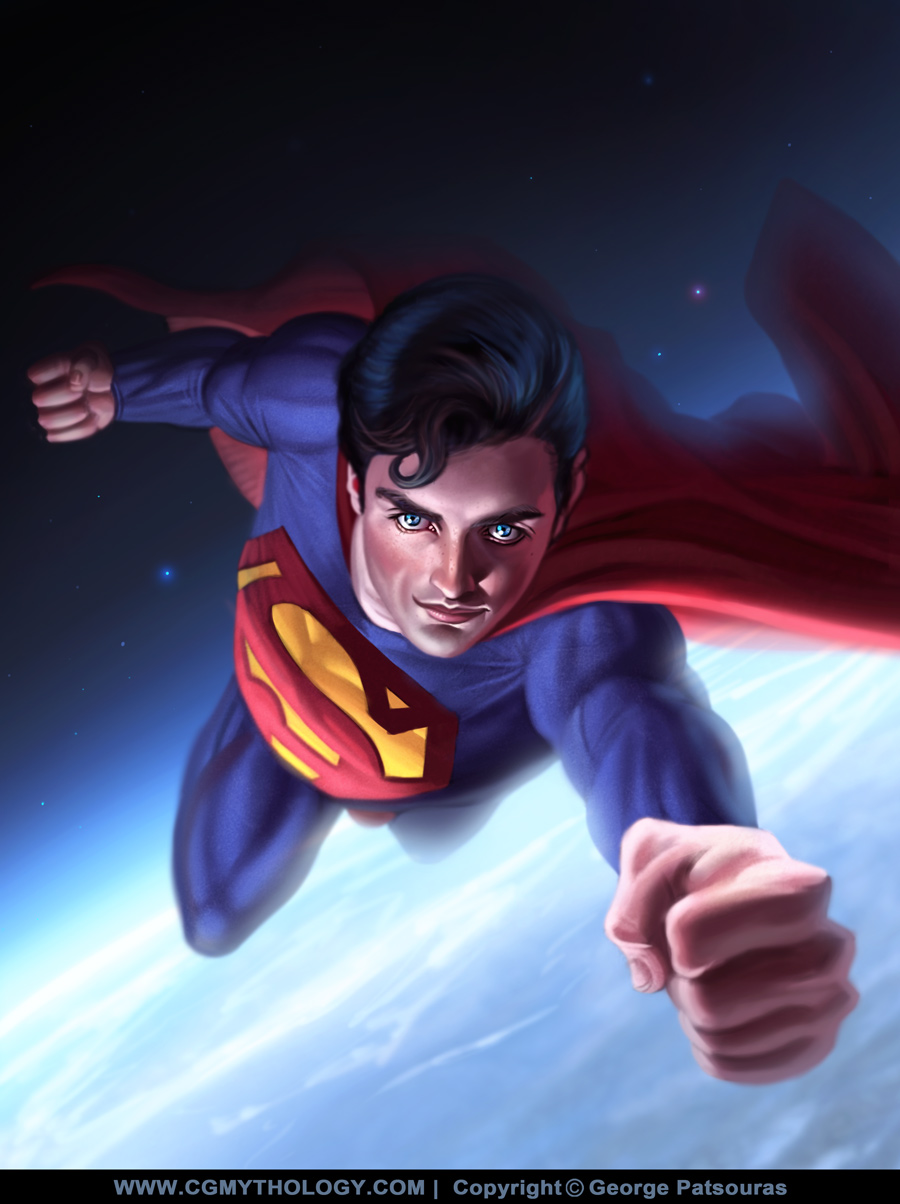
10-27-2022, 07:52 AM
(10-26-2022, 06:09 PM)cgmythology Wrote: Jephyr: Thank you! Love the changes you did to the sketch so incorporated it, feels much more natural now so I very much appreciate it. Thanks again for your support and kind words! YW George. Congrats on another fine image
10-27-2022, 11:05 AM
Jephyr: Thank you! :)
........................ On to the next image! I chose to depict a Lion Warrior for this one, which was something I wanted to do for a while now. The general pose was referenced from an image I found on Pinterest here which I feel is quite dynamic and appropriate for such a character. Below is the sketch, I'm quite happy with it but I'm always open to feedback, so please feel free to offer any input as always! 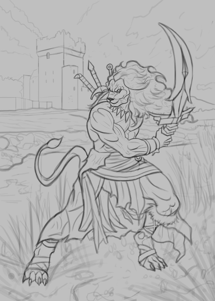
10-27-2022, 05:03 PM
Superman looks really cool! Good job. Love the atmosphere on the background! Looking forward to seeing what you do with this next one!
10-28-2022, 05:03 AM
About your final drawing, the anatomy of the body is very good, it is appealing, but the head seems a little small compared to the body
10-28-2022, 10:09 AM
How are those blade hanging behind is back? That sword is very strange that a very unpractical sword guard it big thick.The pommel of the sweord doesn't seem to allign with the rest of the blade.
10-28-2022, 01:56 PM
the link to the ref doesn't seem to work. :( is that just me?
cool drawing though! I don't really see any big problems with it, other than like Darktiste I kinda find the curve of the sword confusing. One thing that I feel like would be nice to see in this drawing is more of a twist to the body, and a sense that one shoulder is really going behind him. I actually think the diagonal gesture of the pose works really well, but I think it would be enhanced by the right side of his abs and pectoral disappearing more since that part is stretching back away from us. But I feel like I see a lot of his right side as if there weren't much movement. Also the anatomy of the left shoulder could be more convincing, just how his arm connects to his collar bone and scapula. Idk what the ref looks like though. Just stuff to think about. Being able to show that kind of thing can really take a painting from decent to amazing in my opinion. You seem to produce these fairly quickly, so it might be worth it to see how far you can really push it since it's not something you've already sunk like a month into or something.
11-05-2022, 01:00 AM
DamienLevs: Thank you, appreciate it!
serdar: Thank you, and great point regarding the head. I fixed the issue hopefully it works better now! darktiste: I added him a shoulder strap so hopefully it's more practical now. I'm going something more fantastical based for the shape of the sword, please let me know if it works better now as I've updated it since the original sketch! JosephCow: Yeah it doesn't seem to be working, just uploaded it again hopefully there are no issues. Here is the link. As for the anatomy, I refined it slightly but I feel it works fairly well as is, please let me know! ................. I worked on the image until I completed it, it was fairly challenging as I couldn't get the look I was going for until the final stages of the painting process, but I'm finally pleased with it. Of course there is still time to refine if needed, so please feel free to let me know any input! Below is the final followed by the steps for those interested. 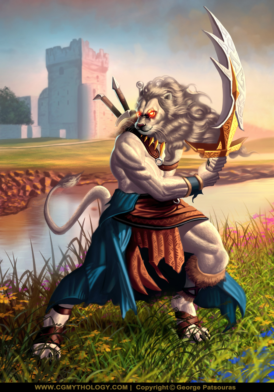 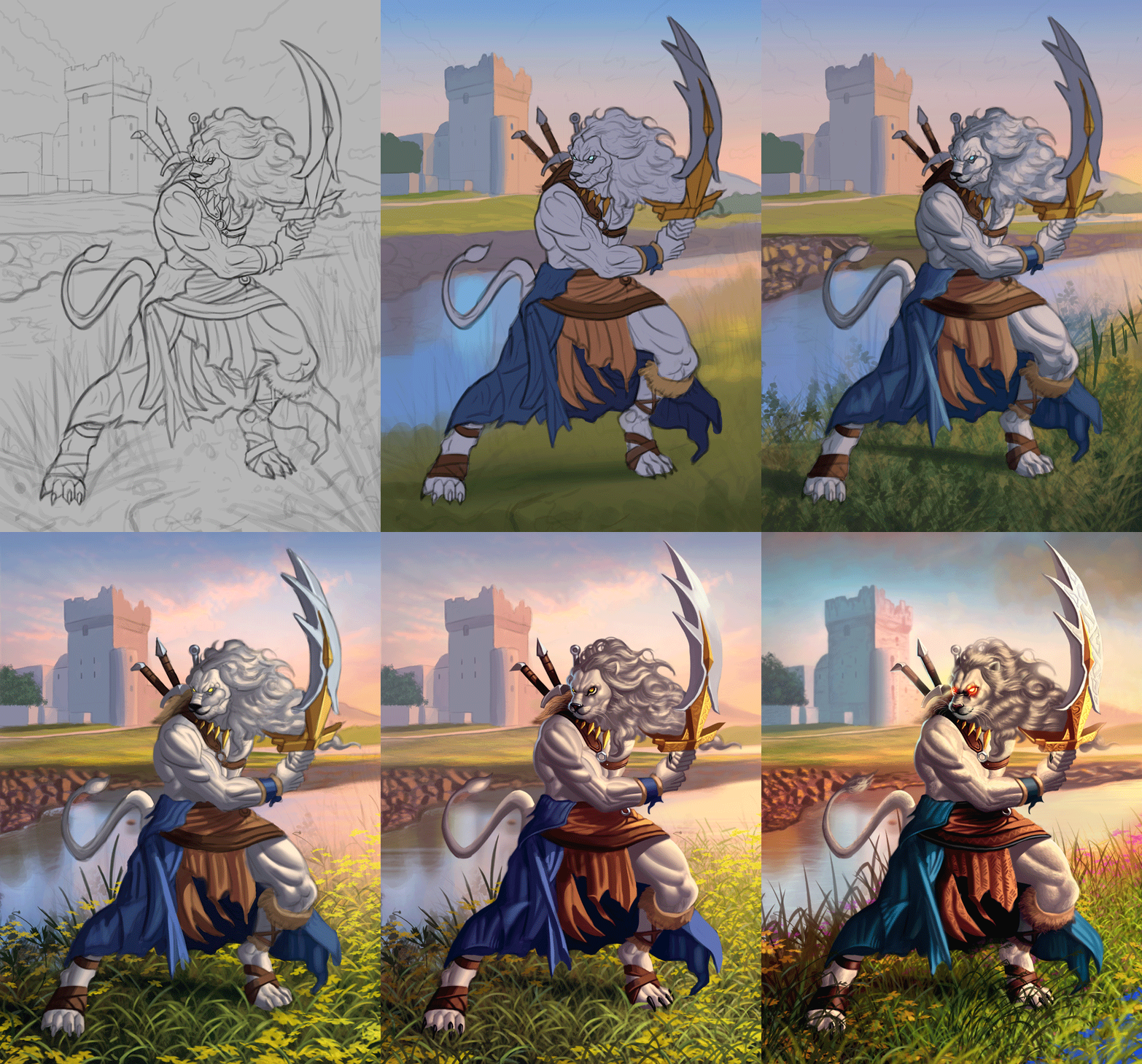
11-05-2022, 02:58 AM
Here a few additional point that seem to repeat in my critic.
The grass is to high detail it should become a bit suggestive as it move back in space in my opinion.Studying Vegetation are a great way to learn how to simplify detail.Just look at Ai work and you will see how little it necessary to suggest and for the brain to fill the rest of a picture.Also there some transparent grass on the left near the river bank. You don't properly indicate value change for example where is the light coming from for us to see so much of is right under thigh.One other thing you ignore or often forget to create is occulusion shadow. I circled the under arm because to me this space should be simplified to be fully in shadow.There is nothing to look at there so no need to create contrast over there i would say. For the hand just adding the occulusion shadow between the finger would also go a long way. For the last point i would say the costume look nice but it kinda hard to understand what i am looking at for the cloth in between the leg the shape of the fabric is torn it seem but i think i would just redefine the silhouette to make it less torn it not working on the first look i would say.
11-07-2022, 11:39 PM
darktiste: Excellent feedback as always. I agree with everything, including the occlusion shadows. In general I reserve those for late during the painting process and sometimes I do indeed forget to apply them everywhere, such was the case here as well. I'll try to be more conscious of this for future paintings! Great points regarding the grass as well, I heavily reworked it and am hoping it looks much better now!
.............. I took a look at this piece after a few days and wasn't entirely satisfied with it, so I reworked it significantly. I tried to make the values more pleasing and natural and enhanced the colors a bit, and also heavily reworked the grass. I'm pleased with it now, but any final feedback would be welcome so please let me know! 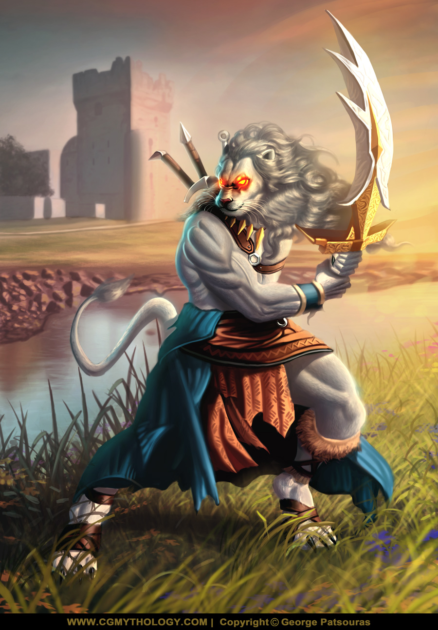
11-08-2022, 03:37 PM
Sorry if I'm kinda late to the party on this. That guy in the ref is like the most muscular person I've ever seen holy cow. He has muscles I didn't even know existed.
Anyway, I'm certainly no anatomy expert, but I do think there's a couple little issues with the arm, and the leg on the right. I would check some anatomy diagrams and just make sure the major muscles groups make sense. even if you're copying the ref you still need to understand to some level to interpret it. The leg especially I just don't feel like that represents the muscles that are there. But more than that, I think it would help to shade the body with more attention to the whole form rather than separate muscles that are shaded individually. The anatomy should be there, but it should also make sense just as a tube in space. Right now, feels a bit flat because the muscles aren't really part of a bigger structure. The structure, and flow of the major muscles can make someone look stronger just as much as increasing the size of each muscle, or the definition, because it feels believable. Other things that I just kind of notice that would really help imo is that there's a lot of places in the garments he's wearing where they are really flat across his body, without showing much overlap or wrapping around at all. Like the bracer for example. Just giving it more thickness and showing it wrapping around makes it a stronger drawing. Same with the belt thing, and the cloth. The sword still doesn't make much sense to me. It seems like it would be sooooo thick, and kind of looks to be curving backward, instead of just the blade being curved? Not sure if that's what is meant, but I found a 3D model of a scimitar, and traced the shape of the blade, and it seems like that's more what would make sense for that kind of sword. And obviously it could have spikes and stuff on it as well, but the basic structure should read first of all. And small nitpick, his tail seems like it would be super long, because it isn't foreshortened in space much at all. Idk might be just me but a lion's tail isn't all that long, and it's coming out of his tail-bone so there's more of it that we can't see adding to it as well. I mean, it's fantasy so it can be whatever you want it to be, but it's just something I noticed. So yeah sorry to unload critique on an almost finished picture, I know that can be annoying, but maybe these are areas you could improve in your next one.
11-20-2022, 03:09 AM
JosephCow: Thanks for commenting! Great points regarding the arm and leg anatomy, great insight! I agree about the sword, the values were also a bit too light as well giving it too much attention. Your paintover is excellent, really makes your point very clear and fixes the problem areas you mentioned. I just implemented it, your feedback is ridiculously helpful as always, thank you for that!
........................... I did some final changes to the image, updated heavily based on the recent input I received. I tried to improve it as a whole especially in regards to the values as they weren't coming across as strongly as I would have liked. Hopefully this is a good improvement as I'm calling the image done for now! 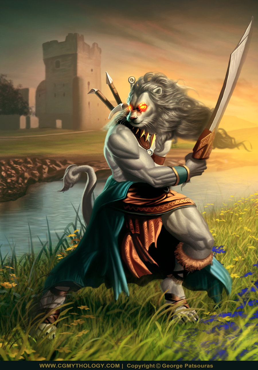 Next up I started a new illustration. I had a strong reference for this one from Jessica Truscott that I recently bought from ArtStation, so I tried my best to recreate the general pose as well as the structure she's standing on. The hardest part was getting the balcony shapes right surprisingly. Below is the sketch, any feedback would be welcome before I begin work on some quick color tests! 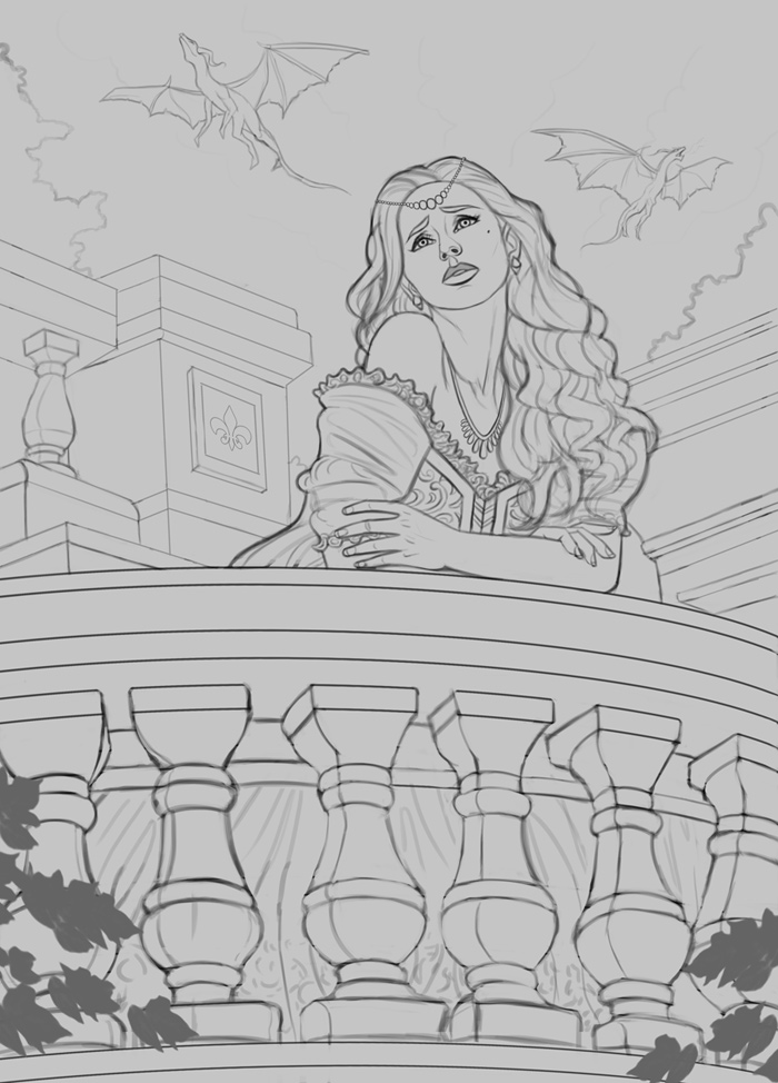
11-20-2022, 05:00 AM
Something doesn't seem right about the perspective in the top left corner not all line seem to be converging to the same vanishing point.
One other thing is how her elbow look.That doesn't make sense to have it with such a straight angle when the arm is going back in space.The straighter something is the more support it mean there is... but since the head is shifted to the left the weight isn't so much on the right arm. One last thing i would say and recommend is to study more archtecture what you draw seem to end up very blocky but i suppose it as to do with how much you love castle.It up to you to see if that resonate with what you see and feel. For the balcony shapes i thing there a few issue on the upper part of the repeating column the volume is hard to read so throwing in some value will probably help solve the volume that might have not been to sucessfully render during the lineart stage.I don't think you necessarly want that line going down the midsection and the bottom of those collumn but i see why they would be helpful ''to feel the volume'' Other then that keep up the great work.
11-20-2022, 02:50 PM
That's working way better to me! Nice job! Also love the blue light from the left in the new version it looks a lot more refined, and his shoulder's feeling really 3D.
New image looks pretty strong, I like the balcony with the pillars a lot
11-20-2022, 03:41 PM
darktiste: Great feedback, thanks! I made some changes to the linework based on your input, hopefully it works a bit better now.
JosephCow: Glad to hear it! Your paintover was crazy helpful so I'm very grateful. Glad you're digging the new sketch as well! ................. I updated the linework a bit and did some quick color tests. My personal favorites are the last two, E and F. I'd love to hear any input on which color palette works best so please feel free to let me know which one you dig the most! Below are the color tests: 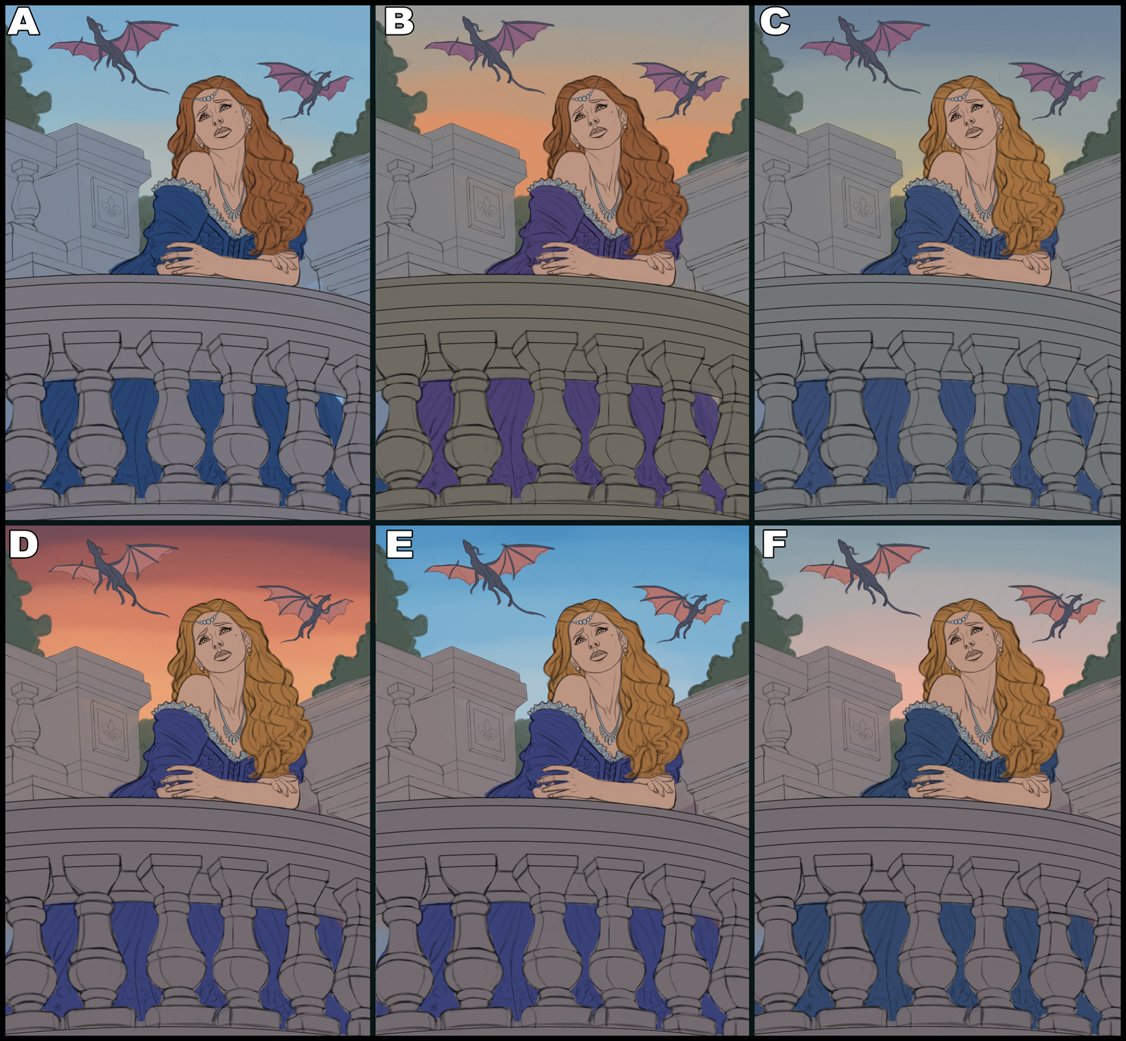
11-21-2022, 01:26 PM
I think either A or E . The blue sky heavily contrasting with her orange hair will make her pop out more.
as for perspective, try out PErspective tools made by this russian guy on youtube helps me a ton of time with solving the perspective problem with every piece.
11-29-2022, 11:38 PM
handsomekorean: Thanks! I ended up going with F although I made sure to introduce some cooler tones at the top to make the image pop. I have some useful perspective grids and such which are a great help, but specifically for the balcony I found the oval shapes a bit tricky to apply.
.................. I ended up developing version 'F' and it evolved naturally to a more vibrant color palette. Made some changes to the composition as well which hopefully improved the image. The illustration is pretty much done I think, quite pleased with this one. Of course any final input is welcome, so if something feels off please feel free to let me know! Below is the final image followed by the steps for those interested. 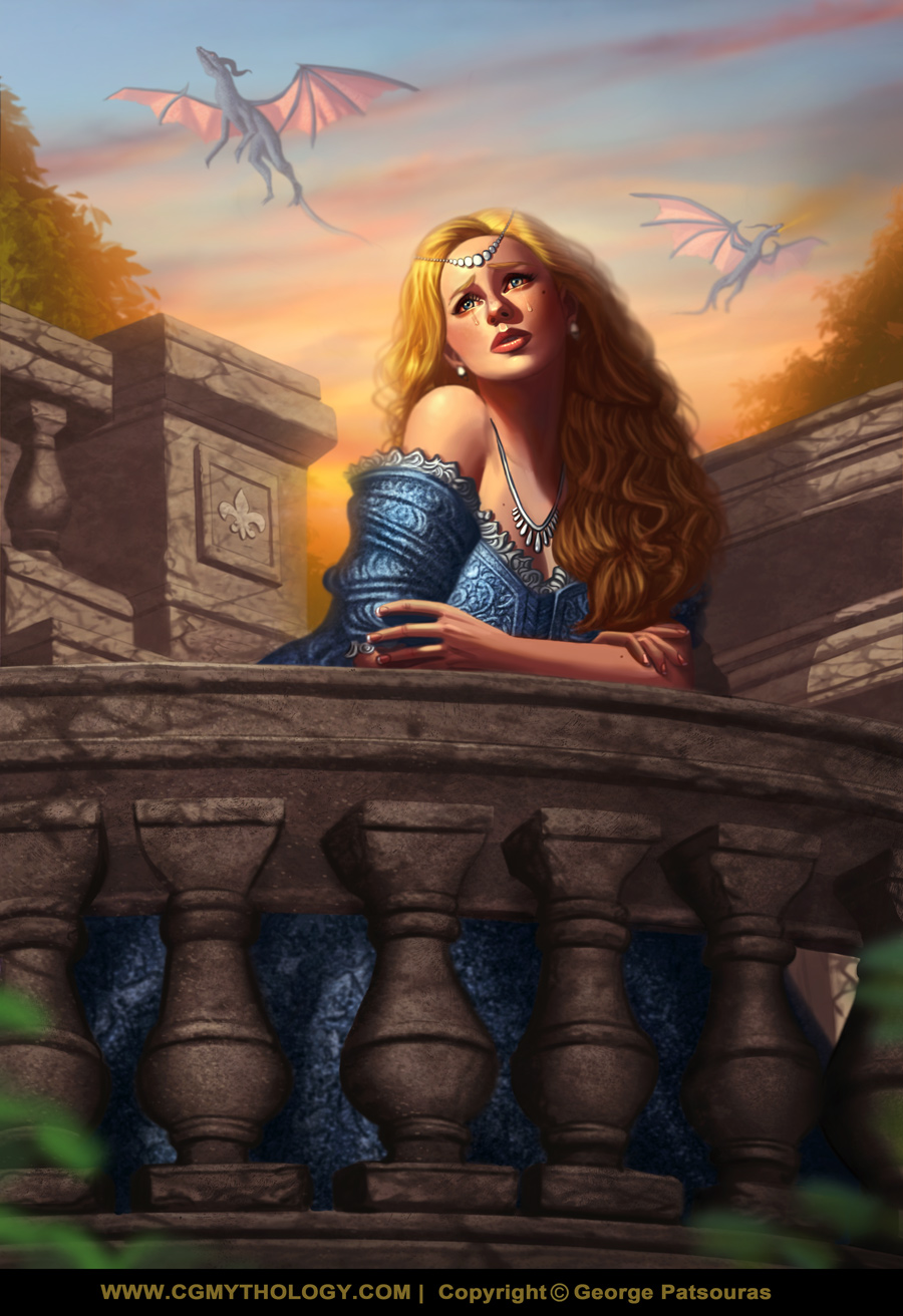 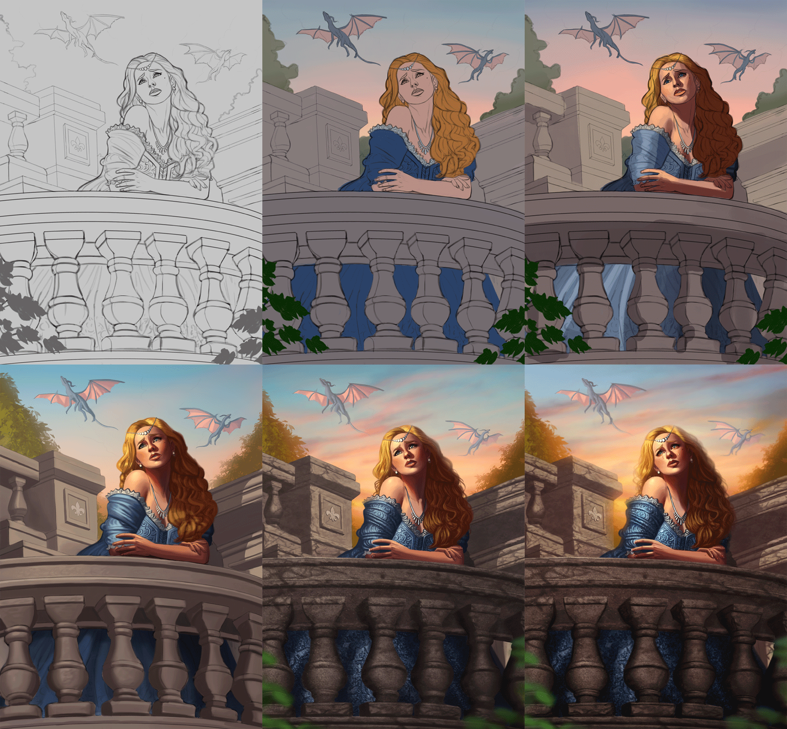
11-30-2022, 10:59 AM
Hi! That last piece turned out great. Love the colors, her expression and pose, and depth and perspective.
I'm not very attracted to those dragons though. They seem to be just hanging in the sky and their limbs seem over-long and over-all they're not very 'traditional' dragon-ish. I feel like it you spent a bit more time on their design this piece would be a complete home-run! Either way, it remains exceptional — and the detail you put into her dress, jewelry, and the stonework is amazing!
12-02-2022, 07:47 PM
Jephyr: Thank you kindly! I agree that the dragons could be better. I didn't want to overwork them as to not take attention away from the figure, but I just scaled them down a bit further, you can see the update on my official website if you're interested. I'm glad you enjoy the details as well, I spent a lot of time on the detail and texture work so I'm glad it's appreciated!
............... Time for a new illustration! I was browsing Pinterest and stumbled across this photo which I loved, so I wanted to do my own take on it... something a bit more darker in theme. Below is the sketch, any input before I begin painting would be appreciated! 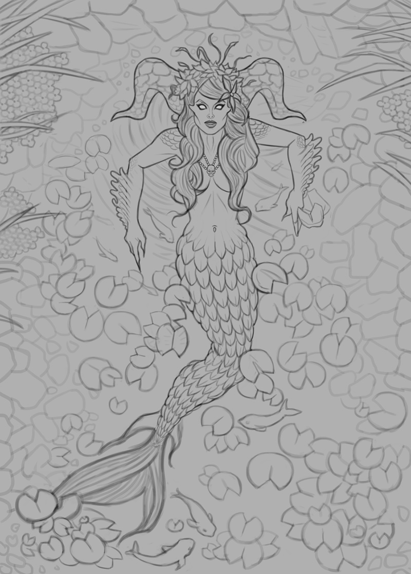 |
|
« Next Oldest | Next Newest »
|