11-04-2025, 02:34 PM
oooooooo love this wee comp!! The wolfs are done hella nice
|
CGMythology's Sketchbook
|
|
11-04-2025, 02:34 PM
oooooooo love this wee comp!! The wolfs are done hella nice
11-06-2025, 03:43 AM
Seeing your recent work, all I can say is it's powerful, and clean.
Strong linework, with compositions that really draw your eyes to the subject matter. Excellent lighting and paintings in a process that really works for you. The sense of light and color on the illustration of the woman on the horse is breathtaking, and somehow all the detail doesn't really distract from the focal points. Personally, I'd add a bit more areas of rest, like some foliage could be a bit more loose with focus on the larger shapes with the edges of them showing more details of the leaves instead of every individual one, but I'm really not qualified to give you advice. Very beautiful stuff, with storytelling and a level of drawing skill that's inspiring, to say the least.
11-06-2025, 10:22 AM
Can i see the wolf reference i feel like you squash the right one in the foreground so as to fit him in the frame. Also there spacial problem related to the left wolf and the throne which i suspect would use the same space which is not possible and will result in a flattening of the spacial distance. What ever she sitting is not necessary stable due it weight distribution and the shape the base that carry it weight on the ground... it as somewhat of an egg shape wish is not a stable form .Also depending on the type of ground (soft/hard) i would probably try to have the ground plane interact with the shape of the throne so that the weight of that thing feel more anchored and sitting ''in the ground''
Hopefully this message find you and you don't skip over it. Such attention to detail really do add up to elevate the realism.
11-11-2025, 12:49 AM
Crowbit: Thank you! I don't have much experience drawing wolves so I'm really glad to hear that!
calebartist: Thank you, really appreciate your kind words and support. I agree about adding more areas of rest, I'll try to be more conscious of this in the future. I'm also trying to keep my brushwork a bit looser now, as I feel that can be a bit more interesting then refining everything in the painting. Still experimenting with technique but I really like your suggestions, so thank sagain! darktiste: I had a bunch of different references for the poses, muscle groups, and different types of wolves so what you're seeing is a combination of my interpretation of all the material. Great input as always, hopefully the image works better now that it's painted with the lighting implemented, I feel it looks a bit more natural now with the planes established than flat lines, but please feel free to let me know! ................ I went ahead and finished the painting process. I got the colors and values pretty much how I wanted them fairly early, so everything went quite smooth. I'm pretty satisfied with how the image turned out, but there's still time to implement any feedback if necessary, so if something looks off please let me know. Below is the current preview followed by the steps for those interested:  
11-15-2025, 01:06 AM
Started work on a new illustration. This is Thor from Norse Mythology. For the general pose I referenced one of Satine Zillah's reference pack while coming up with a unique character design with the look of a viking. I worked on the sketch for a while so I might have become immune to some of it's mistakes, so I would be very grateful for any feedback on it! Below is the current sketch:
 Edit: Fixed some issues I noticed, mainly in regards to the angle of the axe.
11-15-2025, 03:53 AM
It looks cool! I feel like the chest on the right where it's turning away from us feels a bit flat in space. I also imagine the left pec would be more raised up with the arm as well? I guess if you share the reference I could see what's going on there but that's my impression just from the drawing. I think you could push a little more flow and depth into this pose!
I think the costume looks pretty good, is the ring or circle motif that's repeated something you took from something Norse related or is it just an element you came up with? I'm not that familiar with Viking/Norse stuff so I'm just curious if it's significant.
11-15-2025, 01:16 PM
Most of the ellipse have issue for example some being off them off center some other not changing degree to fit the roundness of an object .Most of the ellipse have the problem where you are showing more of the ellipse than necessary it a common mistake. The common mistake is to either have pointy ellipse or have to much of the ellipse showing.Think of your axis and the horizon line and the surface the ellipse is intersecting. Taking about intersection i think you need to practice more of that and ellipse also you can never practice ellipse enough in my opinion should at least be 5min a day until you get consistent result.
I don't think you need the ellipse on the hammer there is no reason to have the ring there if there is no strap to keep the hammer from slip out of is hand it what the ring is there normally it because the strap wrap around the arm because hammer will have alot of weight and slip from hand but it can also be use on smaller hammer as to spin it .For the leather wrap you would normally want to put it where he would be holding the weapon it to prevent wood shard from piercing the skin when the weapon suffer damage or aging it also offer some shock absorption.
11-19-2025, 07:04 PM
JosephCow: Thank you! I went ahead and did some minor changes to the anatomy based on your feedback, hopefully it looks more natural now. The reference is from a paid stock photo from Satine Zeillah so I'm not sure I'm allowed to post it freely anywhere, but the model was a bit stiff looking so I tried to make it more dynamic when I drew it.
Regarding the circle motif in the costume, I feel repeated elements make the design more uniform so I decided to incorporate it throughout, although I did just update it as I felt the design could be improved. Thanks for your input, appreciate the kind words and feedback! darktiste: Great point about the ellipses, went ahead and updated them to fix the issues mentioned and removed some of them as I felt i could improve the design a bit. Please feel free to let me know if it's better now! .............. I went ahead and updated the sketch to improve the general design, and finished up the painting process. I'm fairly satisfied with how it turned out, and I'm open to make some minor changes and fixes and such if necessary, so please let me know if something feels 'off'. Below is the current preview followed by the steps for those interested: 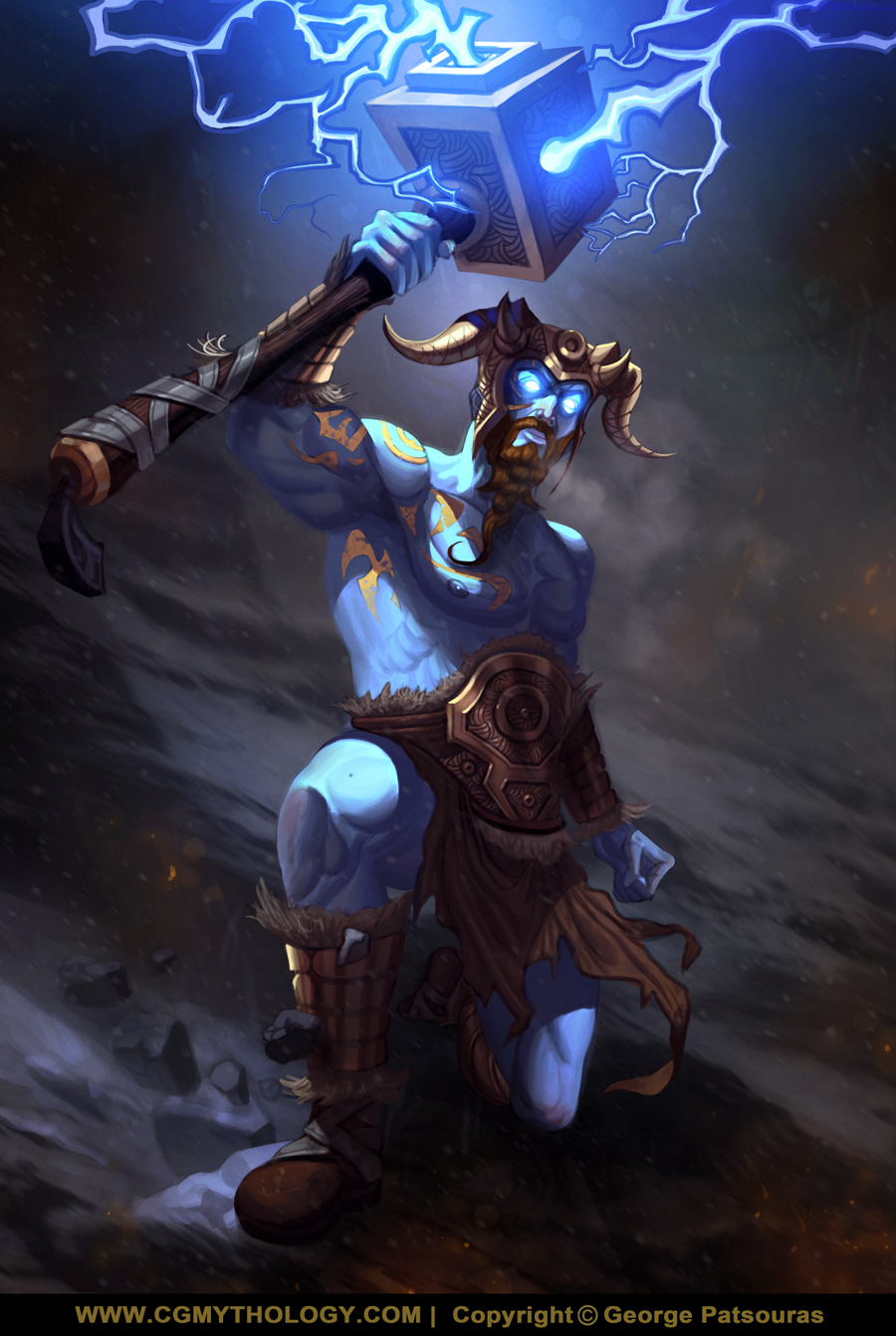 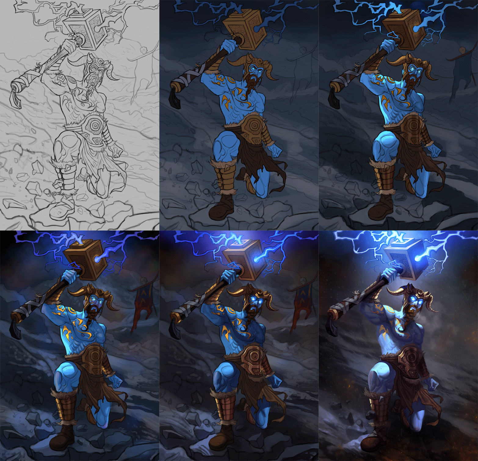
11-19-2025, 10:45 PM
The lightening effect doesn't need outline specially since you gone with a painterly style i would say Use a soft brush it light not a solid this for me create a break in the stylization choose do you have outline elsewhere?
You did a pretty good damn job on the metal but i am less convince by the fabric i feel it to ''flat'' in the gradient you have harsh transition. The lateral muscle on the side of the torso they sit on the ribcage there is no need for a ''line'' running along but i suppose you made it so as a guide or ''rhythm'' just be careful not to carry it to the final .Those lateral muscle they also extend longer than that .For additional information A line is often the result of a compression that only occur either due to excess fat or extreme bending.Where there is chance for line to show with more definition it due to muscle group and muscle definition. But for such line to appear we are talking about compression not extension. Also now the ''handle'' is way off center in it insertion into the hammer head the sketch was better on this topic. So yeah i really wanna encourage you to do some insertion exercise basically you make tWo geometric form ''fuse'' into one an other. Specially ball and cylinder are tricky to do but also mix some cube and box and some pyramid in the mix. Some of those exercise are also about finding the center of your object or ellipse. One of those is about cutting and adding to shape.
11-19-2025, 11:41 PM
darktiste: Thank you for your input, some excellent feedback as always. I liked the stylization of the thunder but to find a better balance I ran it through a motion blur filter to smoothen out a bit and quite like the effect. Regarding the cylinder shape on the axe, excellent point it was waaaaay off! Can't believe I didn't notice that.... When I work on an image for too long I get 'immune' to some of the mistakes so I'm glad you pointed it out. I updated it and fixed the issue. Excellent suggestions regarding the exercises on the forms, I think I'll do more of those traditionally for practice.
............. Fixed the issues mentioned and posted an update below. I think I'm gonna call it done now unless there is something majorly off, so if so please let me know! 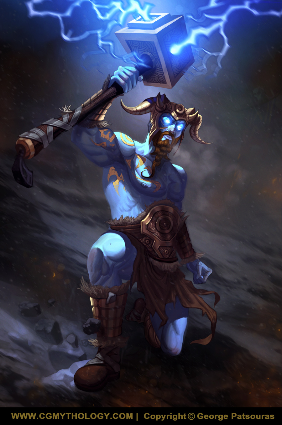 Edit: Did some minor adjustments.
11-21-2025, 02:53 PM
Time for a new illustration! With this one I'm going for a more 'Lord of the Rings' vibe, featuring an elegant elf. The figure was referenced from this awesome stock photo I found which you can view here, did my best to draw the pose accurately and I felt I was quite successful in that regard. I took some artistic liberties in the character design as well for a more fantasy type vibe.
Any feedback would be most appreciated before I begin work on the color tests! Below is the current sketch: 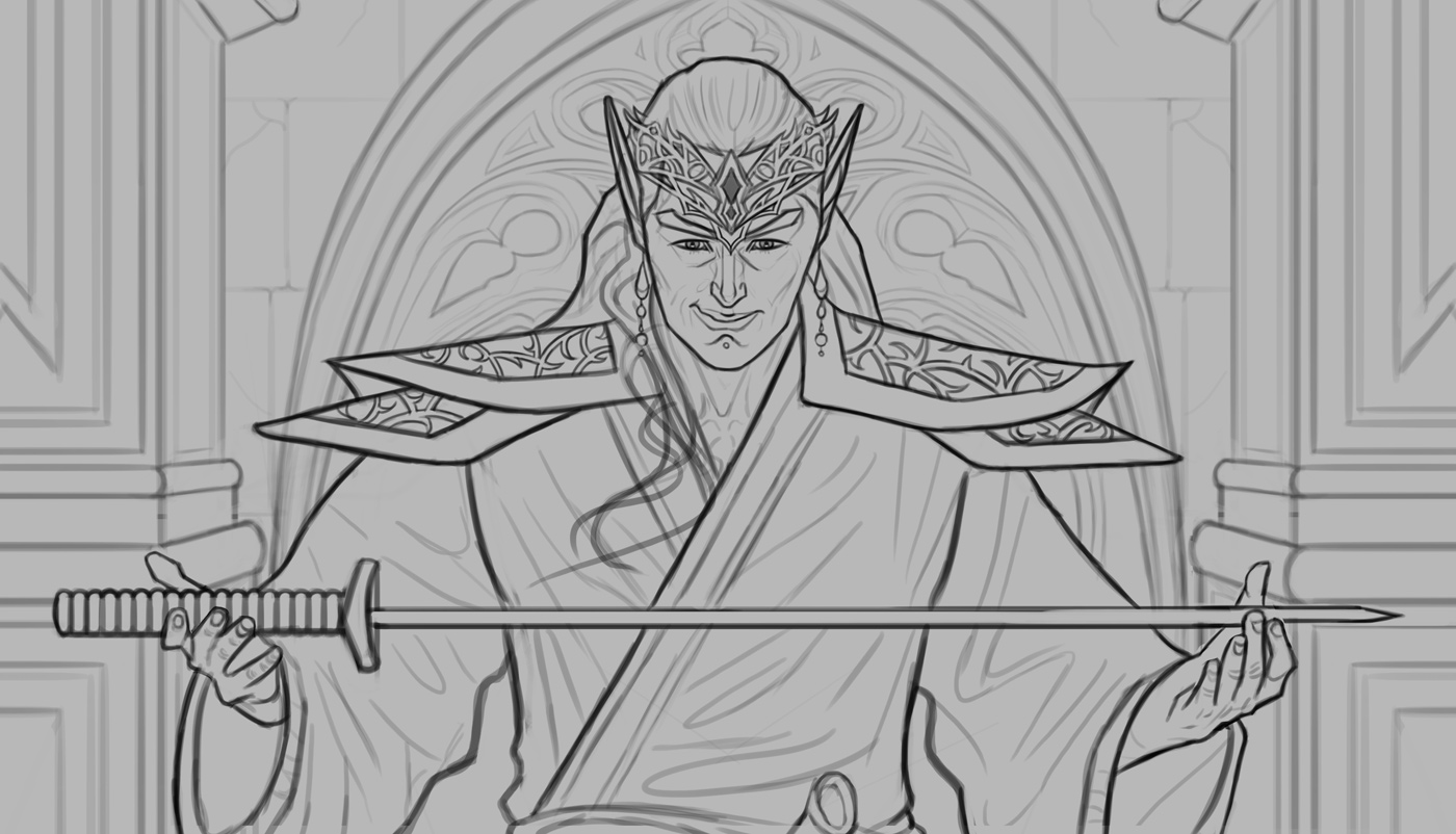 Edit: Fixed the link issue
11-21-2025, 04:41 PM
I think drawing the actual full arm would help there something strange about them i feel like the wrist is to thic and the cloth doesn't conform to the point of contact. The sword could be more original and ornated after all i also feel like it the ''center piece here''. The background element is it a door or a window? Is this scene inside or outside this will change the mood alot .
This also feel like one of your recent artwork is this meant to be like a LOTR series around ''gifting'' weapon?
11-21-2025, 10:43 PM
darktiste: Great feedback as always! I agree about pretty much everything and made the changes based on your input. Also the setting is inside not outside, and the back design will be part of the 'wall' with the outside showing through in only a few minor spots (should make sense when I apply colors!).
................. I updated the sketch, tried to make the folds more natural looking and also went for a more ornate design for the sword as suggested. I feel it looks fairly solid now but if something is off please let me know! Below is the update: 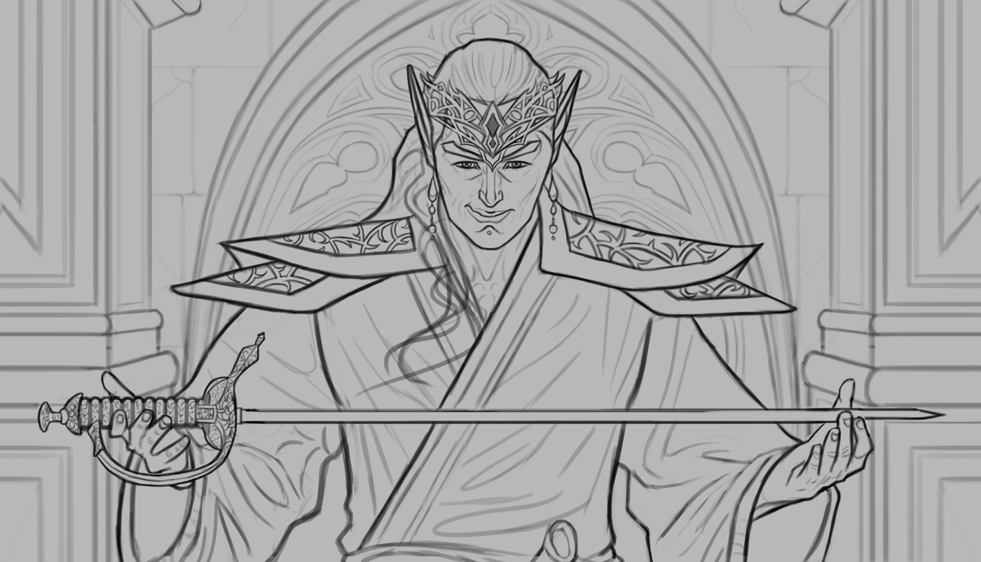
11-22-2025, 04:14 AM
The way is cloth flow is not correct .The fabric doesn't behave how a cape would against the back... the sleeve is like a tube that find it tension point at the shoulder in the case here it then fall a similar angle to the upper arm but then it meet and other tension point at the middle of the arm.
Please excuse my poor POV. In green i added a cape drapping down is shoulder piece (which is a suggestion) Note that the green part toward is hips would actually be is sleeve coming down not the cape(Mistake on my part) If we see is elbow poking at the bottom that mean the fabric is thight at the elbow if it sag it mean the fabric as weight and it probably doesn't squeeze around the upper arm like let say a wet suit would. To support my point i added a picture with a almost identical pose with similar cloth which is very fortunate to further my point. Here a few source for some reference(The preview was resize to be to small on CD) i provided the additional resource to show what happen to the fabric when the arm are aim outward instead straight at us please look at both: Resource 1: https://www.halloweencostumes.ca/mens-cl...stume.html Resource 2: https://www.thehorrordome.com/products/d...p84P1TddbI
11-23-2025, 02:30 AM
darktiste: Great point, didn't think too much about the structure of it all. Your suggestion and the reference material you posted are a great help, so thank you for that. Please let me know if it's an improvement!
........... Went ahead and updated the folds a bit based on darktiste's excellent feedback, hopefully it looks more natural now. Please let me know! 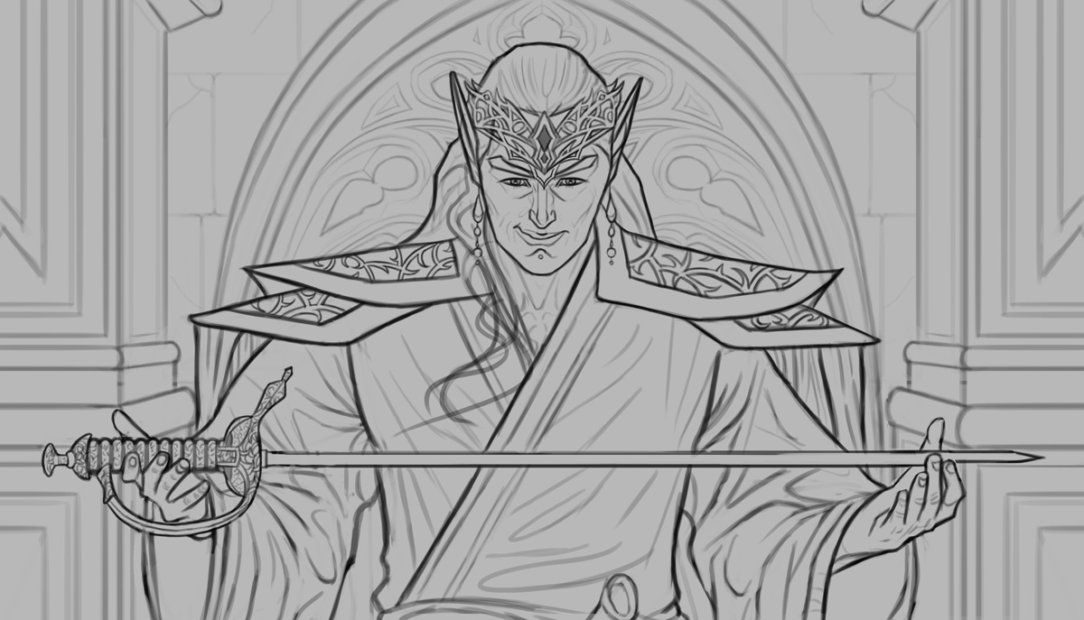
11-23-2025, 04:48 AM
The cylinder representation not a accurate portrait of the upper arm.
The Red line represent the tension you think would happen(note i didn't bother doing both side the same principle apply due to the mirror of the arm pose). A fabric that sit on top of one cylinder vertically and one horizontally might in a specific scenario i won't illustration for time sake. The fabric in the case that is in front of us will not create this diagonal tension point it will simply conform first to the vertical nature of the cylinder and it will reach the middle of the arm since it a sleeve it will then create a ''new tension point'' the rest of the fabric will then sit on the horizontal portion of the forearm. The green line is a much more approximative representation of how the fabric outline would look for the side that working against the force of gravity The thing with cloth is that you need to study it to understand how it behave... i can give you reference after reference if you don't understand thing like gravity, tension point ,weight, balance or if i do paint over it not sure to fix your problem you need the principle of why cloth behave like it does. This the point in imaginative work where reference will not save you this the point where you would be better setting your own scene in real life and understand the real life propriety in a personal manner.
11-24-2025, 03:53 AM
In the reference he posted though it looks like how he drew it. Maybe it's different if it's really stiff cloth?
11-24-2025, 09:08 AM
-JosephCow- I see it a much thicker material then i imagined i feel in that case what he translated isn't correctly copied and carried into is own interpretation there is to many fold to express the thickness and by changing where the fold appear it also change how the outline would look.A ridge fabric can hold some of it own weight alot better than a thin a light fabric that explain why the outline is so linear. I was thinking of reference like lord of the ring the mistake is on me. Ultimately a lot of the value will answers if he capture the nature of the fabric. Line can be easily ignored when they are not outline.
11-26-2025, 04:43 AM
I do agree that the structure of the cloth could be more clear. It makes more sense currently with the way it's drawn, the way darktiste suggested. But if the cloth was drawn a different way, I could definitely see the sleeves having those angles and it being correct.
Also on a different note I think the hands could have more gesture and structure. Especially left hand
12-05-2025, 05:47 PM
I don't think the above Green-lined placement of the edge of the fabric is a solution - it flattens the pose, making the arm appear to bend aside, rather than in front of the character. But, it does look unbalanced as there is some noise created by the folds in the fabric - they all swoop downwards indicating they are handing from a point, rather than curving around the form of the arms. It confuses the form of the arms beneath.
|
|
« Next Oldest | Next Newest »
|