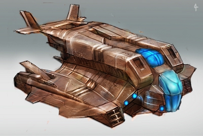
09-23-2012, 04:43 AM
Kick ass Isra :D
|
Isra's sketchbook
|
|
09-23-2012, 07:44 AM
Oh man, great work on that blue mech Isra! Very solid, very powerful design, great texture, great rendering. Man, you are improving hell fast as always! Awesome!
Just one thing... the mech has a funny subliminal gun haha. Great job man, hope to see more of your work soon. Muchas felicidades dude! :) También se habla español!
10-08-2012, 11:33 AM
Thanks a long for the comments! It took a long but here's my vehicle design. It took me so long because I had to do tons of sketches, redraw it many times, change the design etc, you know, lack of experience that practice solve with time ^^; Hope you like it
![[Image: remoteexplorer.jpg]](http://isrartistic.files.wordpress.com/2012/10/remoteexplorer.jpg)
10-08-2012, 04:07 PM
This is nice, I like vehicles/mechs a lot, but it's harder then it looks :)
Also the colors are great of the vehicle.
10-09-2012, 01:15 AM
Damn dude! You're an ID genius. Have you ever done toy design, or thought about it? My only crit is that everything is kind of given equal importance as far as rendering, so the overall finish can be a bit severe.
10-09-2012, 01:59 AM
i just realized i never commented here xD
just keep updating this with more inspirational works!
"Stand tall, and shake the Heavens!"
Tumblr for my comic!: http://rainfallcomic.tumblr.com/ Sketchbook: http://crimsondaggers.com/forum/thread-1227.html Facebook: http://www.facebook.com/eduardogarayart Deviantart: http://eduardogaray.deviantart.com/
10-15-2012, 08:21 PM
Thanks a lot for all the comments!
Yeah "hard stuff" (vehicles, robots, etc.) are harder to design then it seem, at least to me, that's why the last few days I did some line drawing and a character design (last one was 2 months and a half back!!) I just started with ID, it the vehicle looks ok, is for the insane amount of hours I spent, someone with experience could do that in some hours and looking better XD I never imagined the toy design option till I saw the assignments from FZD. But my priority is concept art and second illustration. But, I will never say never hehe. Good point about not rendering everything equal, I'll keep in mind. ![[Image: asakusa.jpg]](http://isrartistic.files.wordpress.com/2012/10/asakusa.jpg) ![[Image: greg.jpg?w=900&h=630]](http://isrartistic.files.wordpress.com/2012/10/greg.jpg?w=900&h=630)
10-15-2012, 08:56 PM
I like the last one. You are really geting better, Isra.
Consider adding some speculars, especially to armour, so it wouldn't look like a dry, scrabrous(not sure if it's the correct word) material. Sketchbook | Gallery | Twitch
10-15-2012, 11:41 PM
godly work dude!
10-16-2012, 12:33 AM
this superb sketchbook has a shit name. nothing embarassing here.
10-16-2012, 04:37 PM
Haha! Thank you guys, name of the sketchbook fixed :)
10-23-2012, 10:29 AM
Some stuff from the last few days
![[Image: payaso.jpg?w=900]](http://isrartistic.files.wordpress.com/2012/10/payaso.jpg?w=900) ![[Image: brentclass01.jpg?w=900]](http://isrartistic.files.wordpress.com/2012/10/brentclass01.jpg?w=900) ![[Image: carsketches2.jpg?w=900&h=359]](http://isrartistic.files.wordpress.com/2012/10/carsketches2.jpg?w=900&h=359) ![[Image: memedrawthisagain31.jpg?w=900&h=680]](http://isrartistic.files.wordpress.com/2012/10/memedrawthisagain31.jpg?w=900&h=680) ![[Image: scificharscolorfinal3.jpg?w=900&h=507]](http://isrartistic.files.wordpress.com/2012/10/scificharscolorfinal3.jpg?w=900&h=507)
10-23-2012, 12:17 PM
WOW! You're sketches are beyond cool! Maaaaan.. So much tallent! cant wait to see some of those Characters finished! Love your works mate!
10-25-2012, 01:19 AM
Isra the recent leap in your skills is awesome! lLove the sketches, Keep up all your hard work, it's really paying off!
10-25-2012, 11:12 AM
You've improved a lot in one year.
10-25-2012, 05:27 PM
Really nice designs. If I may give a little critique: In some of them there is too much going on and it gets a bit confusing and hard to understand. I think it would be benefitial if you thought more about the weight balance - the visual one - like in 8th one very thin body ends with a large element on the front. It doesn't feel right to me. Another thing that could put your work on another level would be cast shadows, it would look more like a 3d model. Some speculars could be nice as well.
Anyway, that's a really good job here. If you keep the pace you may end up designing stuff for movies in no time, so keep this up! Sketchbook | Gallery | Twitch
10-25-2012, 09:05 PM
I'm obviously no expert in spaceship design, but as a fellow student I can share some thoughts. I made a little paintover, I hope you will find something useful you could incorporate in your workshop. I won't be surprised if you don't, since because of my lack of skill I can't offer anything better...
Anyway doing paintovers is a good prectise for me and I find it to be a waste to just keep the result for myself as sometimes even someone better than me can find something usefull in my crap.  I also noticed the second wing behind the ship is a little too close to the main body. Sketchbook | Gallery | Twitch
10-26-2012, 07:01 PM
Thanks for the feedback but no need to do paintovers If I dont ask for them :) All my works could be better, but you miss some decisions I take deliberately or due to deadlines I put myself :p
10-26-2012, 07:31 PM
I do paintovers mostly because it's a good pracice for me. Otherwise I wouldn't do them if someone didn't ask me for that. I find it, however, reasonable to show them to original artist since there is a chance he or she will see something useful in them. Sorry if it caused inconvenience, I'll restrain myself from doing that :]
Sketchbook | Gallery | Twitch
|
|
« Next Oldest | Next Newest »
|