Posts: 331
Threads: 8
Joined: Jan 2012
Reputation:
14
Hi Daggers!
I finally decided to create my own sketchbook thread here. I've been doing studies for over 50 dies since I joined CD, but I've been posting them on the my livestream/deathline's threads. And I don't draw many sketches worth to show, because they're usually related to the illustration I'm working on and very loosy. But I want to change that!! :D
I'm super excited for the new Bloodsports challenge, and I will keep posting here all the sketches, wips, studies and whatever related to it because the next 10 days will be mostly dedicated to it (I have other stuff to do but it won't take too long I guess).
I drew my fisr sketches this morning, and I'll draw more variations, but for now I'd appreciate if you can give me some feedback and pick your 1,2 favs.
Thanks guys!
![[Image: character2.jpg]](http://isrartistic.files.wordpress.com/2012/03/character2.jpg)
Posts: 112
Threads: 0
Joined: Jan 2012
Reputation:
13
i know you work hard because i watch your streams, man. keep posting here too so others can see your progress and give you feedback!
Posts: 535
Threads: 9
Joined: Jan 2012
Reputation:
7
I like #3 and #9 of those sketches Israel, and nice job finally makin a sketchbook :)
Posts: 331
Threads: 8
Joined: Jan 2012
Reputation:
14
Thanks a lot for the first 2 comments! I will try to check other Dagger's sketchbooks as much as possible too :)
Brent, the other day I was looking at your work on deviantart from 1 year ago and I can see how you improved, I'd like to look at this sketchbook after some months and see if I improved my sketches as well :)
Forrest, I take note of your votes, but I guess you mean #8 when you said #9?
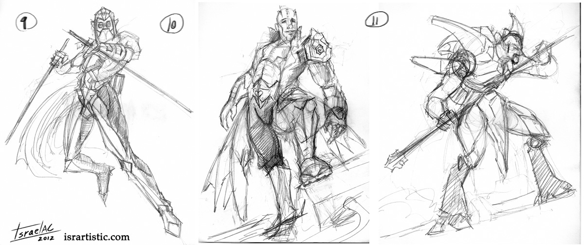
Here are another 3 quick sketches I drew today in the train. #9 is similar to #5, #10 has anatomy problems XD and #11 is.....idk lol These are drawn on paper with just a pencil.
Posts: 13
Threads: 4
Joined: Feb 2012
Reputation:
0
I really dig #10 and #11, they feel the most dynamic and least stereotypical. Although I think any of them would look good with some color on them. How much realism are you going to push into them?
Posts: 331
Threads: 8
Joined: Jan 2012
Reputation:
14
(03-27-2012, 05:08 AM)Knights End Wrote: I really dig #10 and #11, they feel the most dynamic and least stereotypical. Although I think any of them would look good with some color on them. How much realism are you going to push into them?
I take note of your votes too, thank you! I'd like to go as far as I can with realism, if my sketches or paintings still look a bit cartoonish it's because of the lack of practice hehe
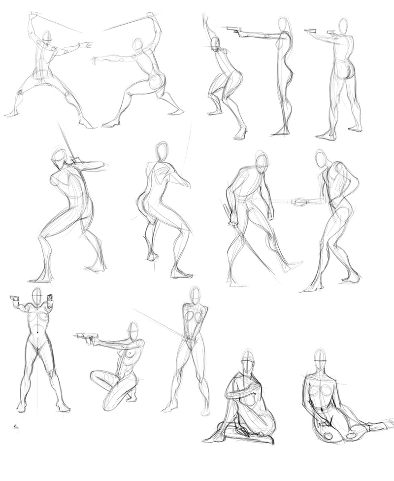
This is a 2 hour session I just did drawing some gestures.....I think it's the first time I do one of these so I felt super slow.
Posts: 116
Threads: 2
Joined: Jan 2012
Reputation:
1
Great sketches man!
So you spent 2 hours in the last one. I think that's ok! Don't worry too much about time. As long as you understand and learn from what you are doing, you are ok! You will get faster :)
(De casualidad hablas español? veo que eres de Barcelona, y si es asi, tal vez ahora me sienta tonto contestandote en ingles jaja :P )
También se habla español!
Posts: 331
Threads: 8
Joined: Jan 2012
Reputation:
14
(03-27-2012, 09:18 AM)malan Wrote: Great sketches man!
So you spent 2 hours in the last one. I think that's ok! Don't worry too much about time. As long as you understand and learn from what you are doing, you are ok! You will get faster :)
(De casualidad hablas español? veo que eres de Barcelona, y si es asi, tal vez ahora me sienta tonto contestandote en ingles jaja :P )
Gracias! Si que hablo español, pero si hablamos en inglés la ventaja es que el resto también se podrá enterar ^^ Yo tengo la costumbre de contestar en lo que me hablen, si se el idioma claro.....xDD
Posts: 331
Threads: 8
Joined: Jan 2012
Reputation:
14
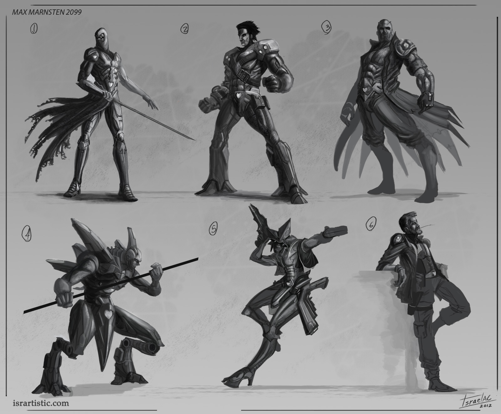
Well, having in mind the votes I got on my first sketches I drew yesterday these 6. I wanted them to look more finished but after hours and hours working on them (I worked in sow motion and trying to get better results than my previous works) I got a crit by Trevor and Kekai and I thought I'm going to apply all the advices for the next sketches and not fix these.
So please, pick your 1,2 favs, then I'll paint new sketches. Depending on the votes I will go with the final design or offer again 2 or 3 variations this time with color :)
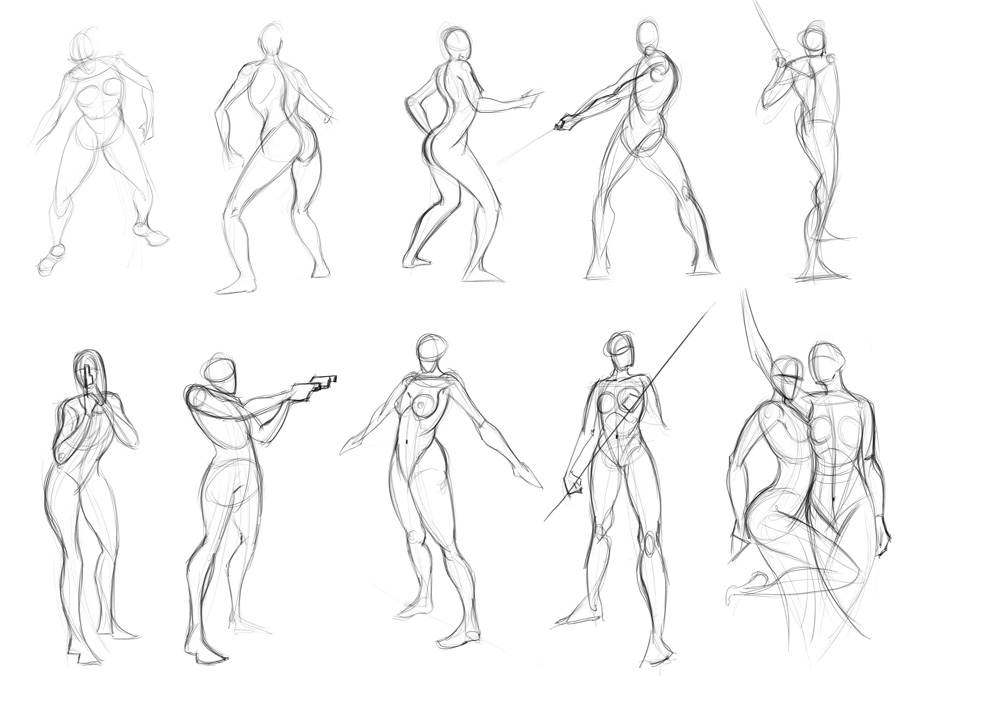
Also, here is another session of gesture drawing I just did this morning :)
Posts: 160
Threads: 3
Joined: Jan 2012
Reputation:
10
Fantastic gesture drawings! I love the ease and fluidity of the poses!
Posts: 116
Threads: 2
Joined: Jan 2012
Reputation:
1
(03-27-2012, 09:55 AM)isra-ac Wrote: Gracias! Si que hablo español, pero si hablamos en inglés la ventaja es que el resto también se podrá enterar ^^ Yo tengo la costumbre de contestar en lo que me hablen, si se el idioma claro.....xDD
Jaja, ya estás, hablemos en ingles pues! por mi tampoco hay problema en lo que me hablen! jaja, pero para no hacer a un lado a la comunidad de aqui hablemos igual que ellos! (solo que puede que algunas veces mi inglés se lea un poco bestia jaja)
Mucho gusto! :)
Cheers man!
By the way, I really like your gesture drawings! Very dynamic and natural at the same time!
También se habla español!
Posts: 331
Threads: 8
Joined: Jan 2012
Reputation:
14
Thanks for the comments on the gesture drawings, here I have more I drew the other day but this time in a different way. I used the page Alex Negrea gave me:
http://lovecastle.org/draw/
I set the timer to 3 minutes, the references were random (the previous sessions were selected by me) and I used the graphire instead of the cintiq, that's why they look a bit worse now, it was more challenging lol
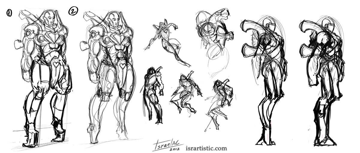
This is a very rough sketch of my final concept of Max, considering the feedback I got from the previous sketches. I like 2, but I'm wondering if it's well balanced (center of gravity), that's why I drew 1. The bust won't change that much, but I'm working on the legs.....
Feedback will be welcome!
Posts: 331
Threads: 8
Joined: Jan 2012
Reputation:
14
More sketches of my Max. This kind of space suit is pretty complex that's why I'm playing with the possibilities in terms of pose variations etc before going with the final design. I want to know very well my character.
Once I have the final design for the outfit I'm gonna draw some facial expressions sketches as well.
There's a lot of stuff around this IP on my head and I know I won't be able to finish everything, but I like thinking about it as a big project :D
![[Image: maxposes2.jpg]](http://isrartistic.files.wordpress.com/2012/04/maxposes2.jpg)
Posts: 331
Threads: 8
Joined: Jan 2012
Reputation:
14
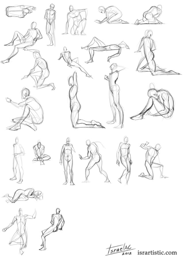
I've been doing studies everyday for 8 weeks now (almost all of them recorded in my daily livestream sessions) but I was posting them on my Livestream thread on these forums. I guess it's the wrong place because I don't see anybody else doing, so I'll try to keep using that thread only to notify the lives and post the studies here in my sketchbook.
Sorry for the repeated content, but my usual "format" showing the studies is once a week in an image compiling all of them.
![[Image: week8studies.jpg]](http://isrartistic.files.wordpress.com/2012/04/week8studies.jpg)
Posts: 112
Threads: 0
Joined: Jan 2012
Reputation:
13
Awesome SB.
Gestures look good and are really useful and all the anatomy is paying off nicely in your work.
The Max spacedude is looking cool. Design seems good, though I don't know much about sci-fi, seems to make sense to me anyway and looks cool :)
Look forward to more!
Posts: 331
Threads: 8
Joined: Jan 2012
Reputation:
14
Thanks again for the comments and your support.
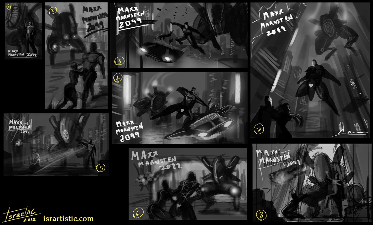
Before posting a new image I want to talk a bit more about my work on this bloodsports. At the beginning I had in mind painting a couple of pages of a comic/graphic novel, that's why I wanted to know very well my character (to draw him from different angles) and I was thinking on other stuff around this IP: the futuristic city where the action takes place, the Maxx's company, a mech with a program installed by his dead wife that try to kill any girl who goes close to Maxx, a hot chick Maxx was going to save from a villain, etc.
Even being at the end a comic work, I wanted the development to be like concept art for a game, that's why I wanted to paint the design sheet for Maxx, for the Mech, a shot of the city environment, etc.
Too much stuff to do in only two weeks with my lack of experience and two non productive days in between for some reason.
I noticed another problem in my work flow, I usually get stuck just thinking, thinking for hours on ideas, recreating the world I'm going to create in my mind, but not in a canvas, and I need to fix that, I shoup have less fear to just put my ideas on a canvas.
ANYWAY, there are only 4 days till the deadline so I changed a bit the presentation of my entry, but the concept of the world is still there. So I'm going to paint an illustration, with most of the elements I had in mind, so you can see in these composition studies how I'm going to include Maxx, the Mech, the girl, the villain and the city.
My favs are 3, 4, 7 and 8. I like 8 because I can show the Mech design better, but it has lack of background, and they like the other 3 as well but they're similar and I can't pick only one yet.
I'm gonna take some sleep now, and hopefully tomorrow with fresh eyes and some feedback here I can pick one :D

Posts: 331
Threads: 8
Joined: Jan 2012
Reputation:
14
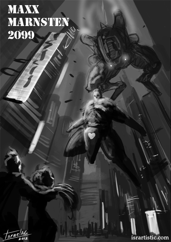
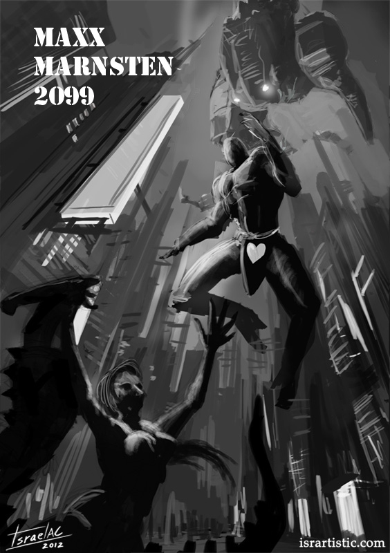
I got some feedback from people on my livestream this morning and I'm going to work on this composition

Looking good mate, wicked comp!
Posts: 331
Threads: 8
Joined: Jan 2012
Reputation:
14
I've been stuck with the comp, I liked it but when I tried to put it in the right perpective and anatomy I had some problems. I even tried to change the same action shot into a widescreen format and it was cool for the environment but not for the action in the scene. My neighbor using a super noisy electric drill didn't help also.
The thing with this comp is I lose a bit of design of the mech/robot in the background, it was important in the story for me, but considering is an illustration with info enough in it........I guess it's fine.
Anyway, only 2 days to go, so no more time to get stuck with comp, perspective or anatomy, I'm going to start painting till the end :)
PD: Thanks again Alex

|
![[Image: character2.jpg]](http://isrartistic.files.wordpress.com/2012/03/character2.jpg)
![[Image: character2.jpg]](http://isrartistic.files.wordpress.com/2012/03/character2.jpg)


![[Image: maxposes2.jpg]](http://isrartistic.files.wordpress.com/2012/04/maxposes2.jpg)
![[Image: week8studies.jpg]](http://isrartistic.files.wordpress.com/2012/04/week8studies.jpg)
