TLC = Tender loving care
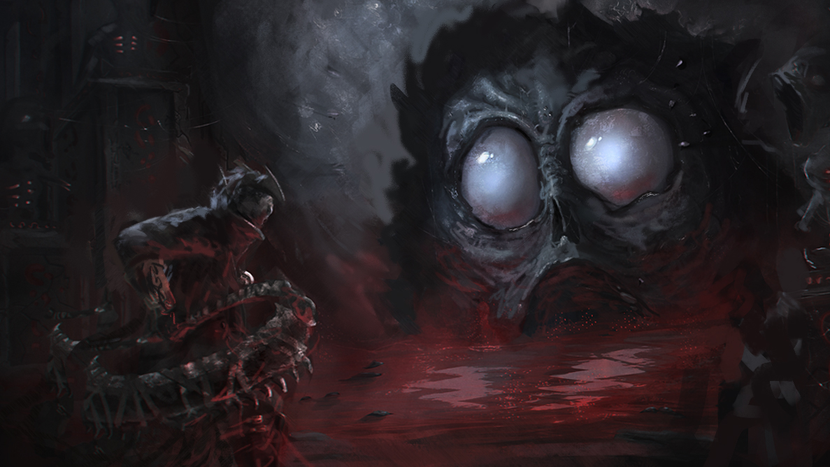
Heres a crit and paintover!
The hunter's lighting really flattens him out a lot, It's also little hard to tell the direction of the light source, it seems several things within the image have different sources, and no indication of being affected by the others. Like the crit I gave Hobitt, I think you could move the hunter a bit closer to the foreground.
The composition also doesn't conform to any of the composition overlays in PS, you don't have to do that exactly, but it's a good starting place for composition.
I do want to add, I really like the idea, the blood and the eyes of the creature look good!
So anyway here's what I did.
I cropped the image and brought the guy closer to the foreground, it now adheres a lot closer to the rule of thirds which I feel works well for this. unified the light source, pulled red from the blood pool as a secondary/reflected light source, It makes things feel more part of the image - that creature and hunter are actually there in that environment. softened edges all around the non focal's, Also softened the creatures skin to make him look more fleshy.


