Posts: 101
Threads: 6
Joined: May 2016
Reputation:
10
Hey guys,
I've just signed up here, but I used the site briefly a few years ago. I need to create a convincing illustration and character concept portfolio, at a professional (but probably entry level!) standard. I've spent the last few years mostly drawing portraits, so it's going to take some work. But I've just finished my (non-art related) degree, so art is 100% my focus now. I need crits and accountability to help keep me studying effectively! So here I am :)
Posts: 101
Threads: 6
Joined: May 2016
Reputation:
10
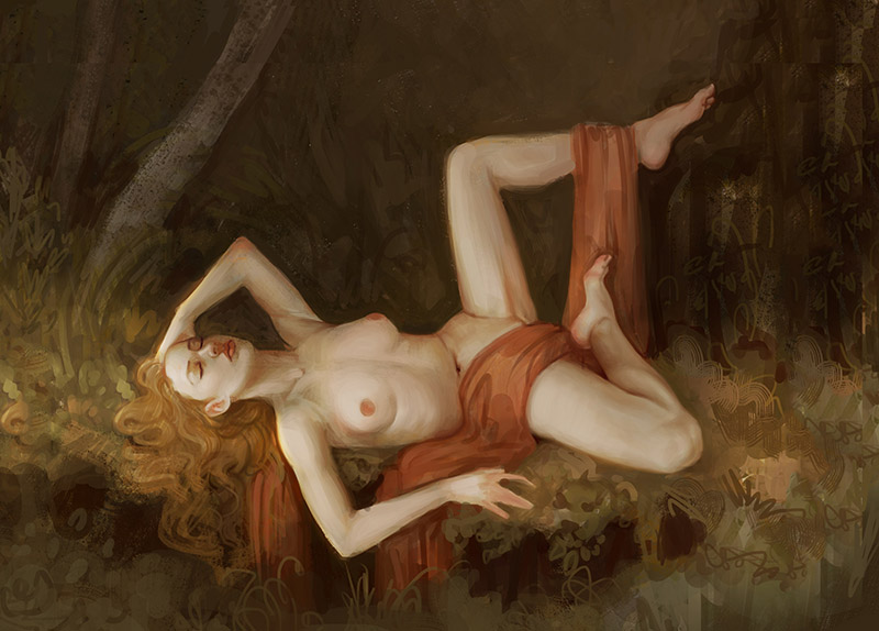
Currently working on this master study of Hugues Merle's 'Mary Magdalene in the Cave'.

It's been helping to figure out colours and such on my current WIP:
Posts: 101
Threads: 6
Joined: May 2016
Reputation:
10
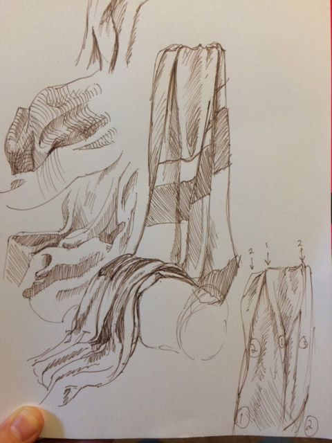
I set up some drapery and did some sketching. Should help with my WIP.
.jpg)
Posts: 101
Threads: 6
Joined: May 2016
Reputation:
10
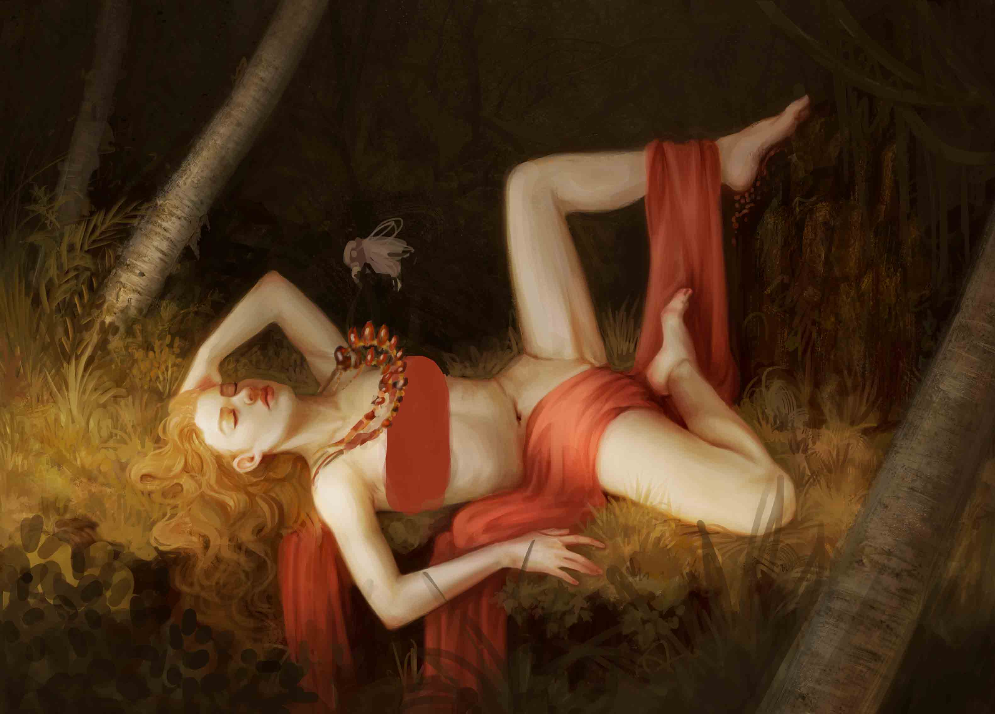
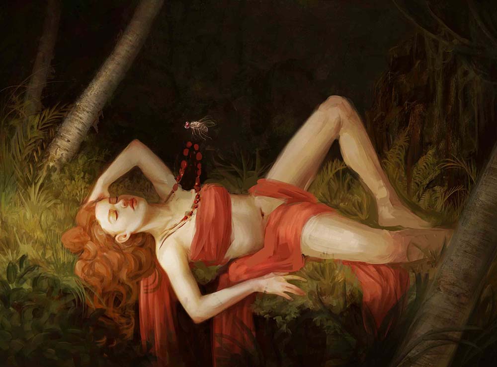
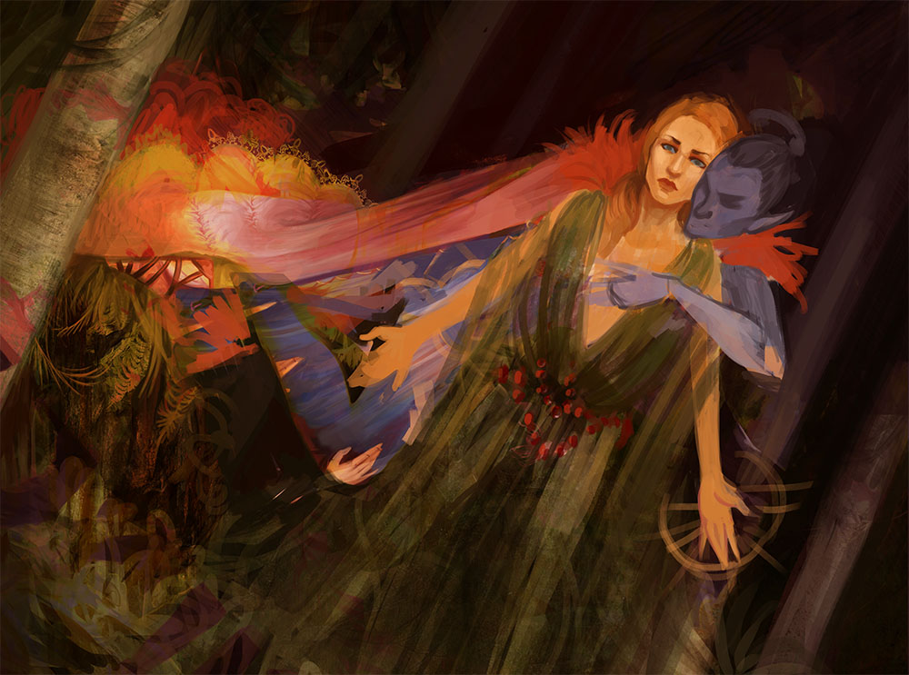
New WIP of that illustration:

Gonna hop on over to the crit forum to see if I can get any tips. I'm having trouble with the story telling aspect (which is about a fly stealing a necklace...), but any advice on execution is welcome. Will need to do some fly, jewellery and foliage studies.
Posts: 37
Threads: 1
Joined: Jun 2015
Reputation:
3
Welcome to crimson daggers!
Your studies look great so far.
One critique I have is that her pose is really weird. her legs make her not look like she is not lying down. I will admit I am not the best at color theory but I would suggest adding some green and purple to balance out the dominant yellow and red. Her hair is blending into the grass because of the dominant yellow. I also prefer the one where you see the dirt or the cliff. I have no idea what to call it. I feel it gives the image more depth.
If your focal point is the necklace I would highly suggest making it the only thing that is red in order to draw the eye to it. The fly is a little big and her necklace looks like it is levitating. I would have the insect near the necklace. I would suggest doing studies of flies or even create your own creature to steal the necklace . Overall the rendering is good and you effectively apply your studies. Have you done any lighting or color studies? They are tedious but it helps with figuring the hard stuff early on.
I hope that helps. Keep up the good work I can't wait to see more
Posts: 101
Threads: 6
Joined: May 2016
Reputation:
10
(05-27-2016, 02:32 PM)ZandraDragon Wrote: Welcome to crimson daggers!
Your studies look great so far.
One critique I have is that her pose is really weird. her legs make her not look like she is not lying down. I will admit I am not the best at color theory but I would suggest adding some green and purple to balance out the dominant yellow and red. Her hair is blending into the grass because of the dominant yellow. I also prefer the one where you see the dirt or the cliff. I have no idea what to call it. I feel it gives the image more depth.
If your focal point is the necklace I would highly suggest making it the only thing that is red in order to draw the eye to it. The fly is a little big and her necklace looks like it is levitating. I would have the insect near the necklace. I would suggest doing studies of flies or even create your own creature to steal the necklace . Overall the rendering is good and you effectively apply your studies. Have you done any lighting or color studies? They are tedious but it helps with figuring the hard stuff early on.
I hope that helps. Keep up the good work I can't wait to see more
Thanks for the suggestions! Based on the feedback I've had here and on the crit forum, I'll be reworking her leg pose. I'll also try to bring a greater hue variety in.
Not sure I can bring back the cliff thing...the reason I moved it was to bring her closer to the bottom of the canvas, because the comp was looking rubbish when I added the necklace. The focal point ended up dead on the centre horizontally, so I was trying to bring that necklace focal point closer to the 2/3 sweet spot. I 'ummed' and 'ahhed' over it for a while, so... I don't know. We'll see!
Will definitely be doing fly studies. Will keep the fly big though because its a supernatural fly (a god in disguise) and I want it to have enough focal weight. The necklace *is* levitating - I'll hopefully make the intentionality of that clearer when I properly paint it in.
As for lighting and colour studies...depends really, do you mean for this painting or in general? I do them in general, but I didn't do any with this piece in mind.
Posts: 101
Threads: 6
Joined: May 2016
Reputation:
10
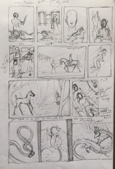
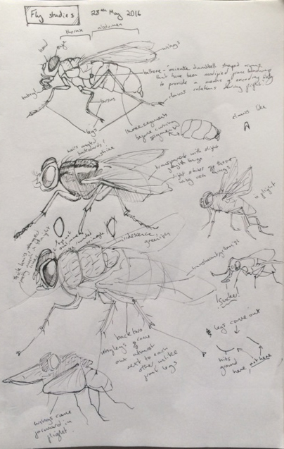
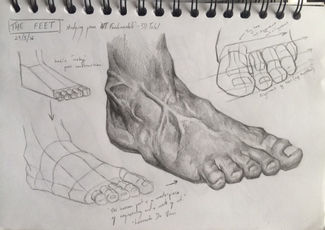
Stuff from the last 3 or 4 days:
Misc thumbs:

Fly studies:

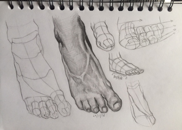
Foot studies:


Current state of my WIP (so bored of painting this right now!):

[attachment=86455]
Posts: 101
Threads: 6
Joined: May 2016
Reputation:
10
Really trying to do better planning for my next painting, since that's where I went most wrong on the Freyja thing.
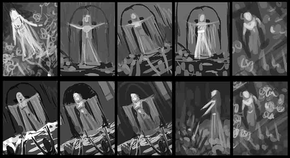
Ugly thumbs are ugly!

I'll refine a few of these and see what comes out.
Posts: 101
Threads: 6
Joined: May 2016
Reputation:
10

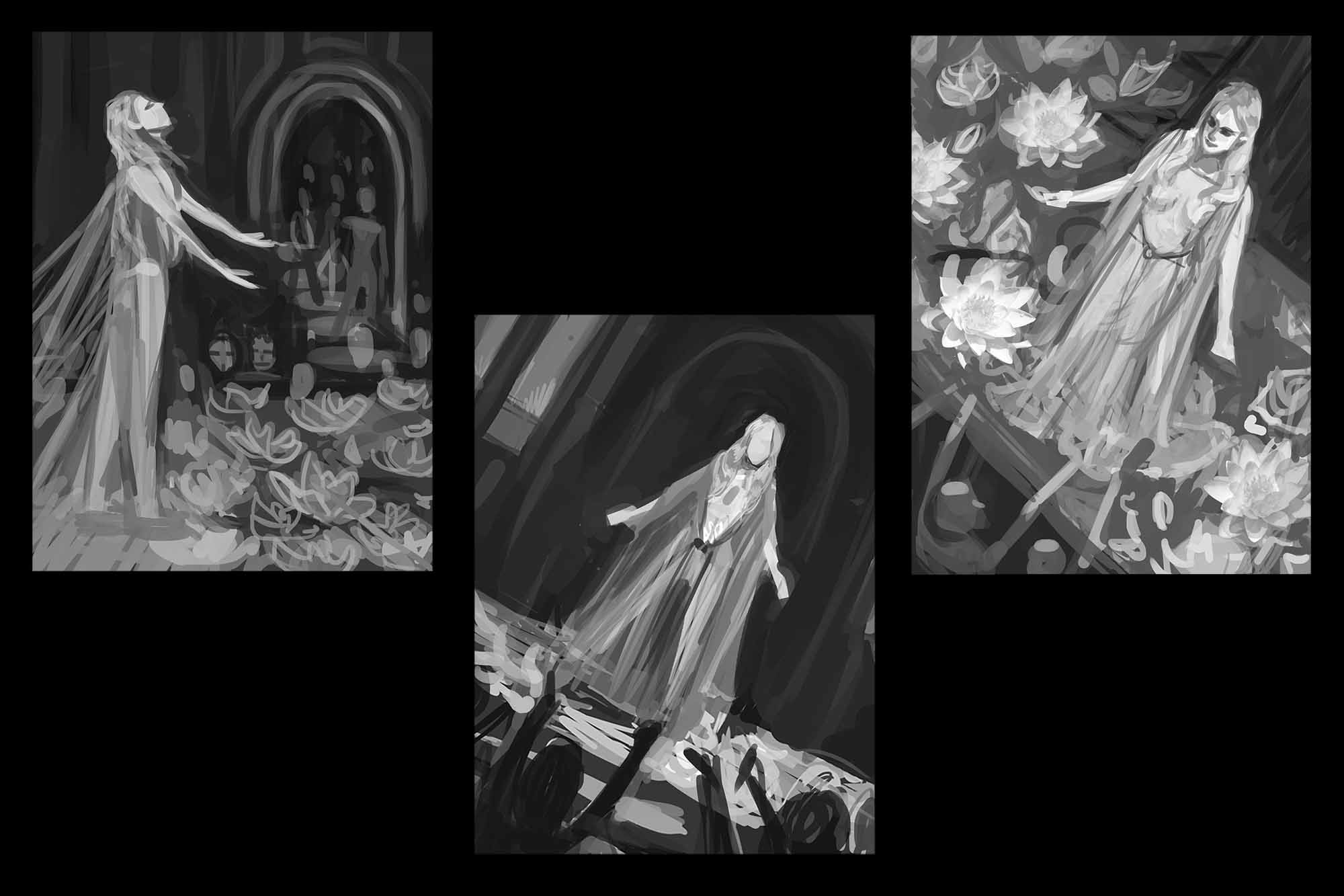
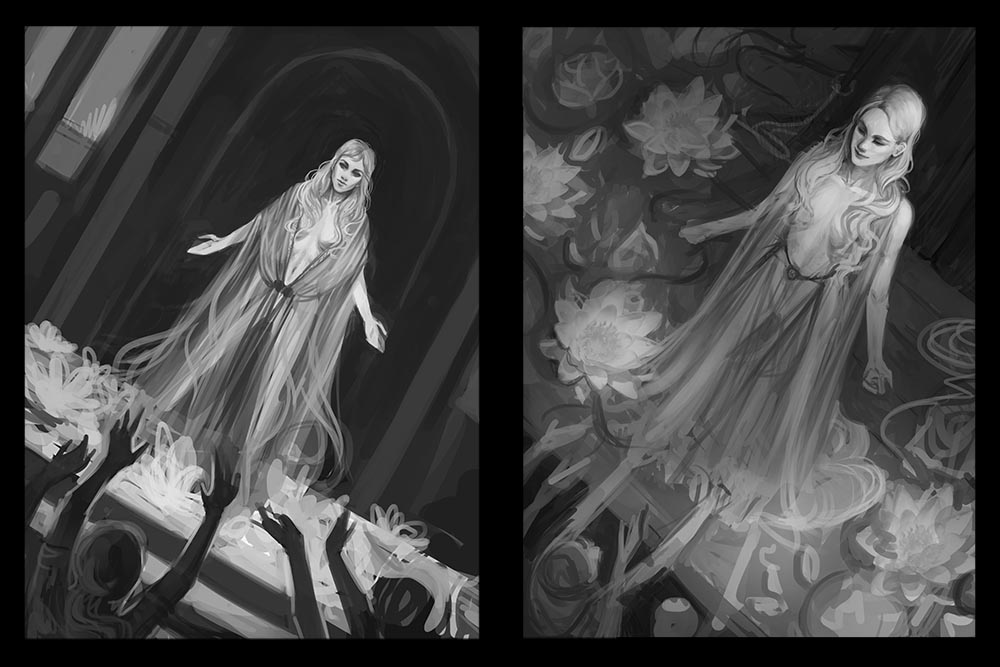
This is where I got to with those thumbs today. I'm instinctively drawn to the one on the right. I think it brings out the compassion of the character. But I like the simplicity of the middle comp, which brings out her strength - another important trait of hers. The one on the left feels compositionally weak to me at the moment, BUT would allow me to add another narrative feature (secondary character watching from the stairwell). This thumb also has her looking up towards heaven, which emphasises her faith (she's a kind of preacher and matyr in training...long story). So...all of the thumbs kind of capture the character in a different way and I can't choose.
Feel free to comment and help me decide :)
Posts: 101
Threads: 6
Joined: May 2016
Reputation:
10
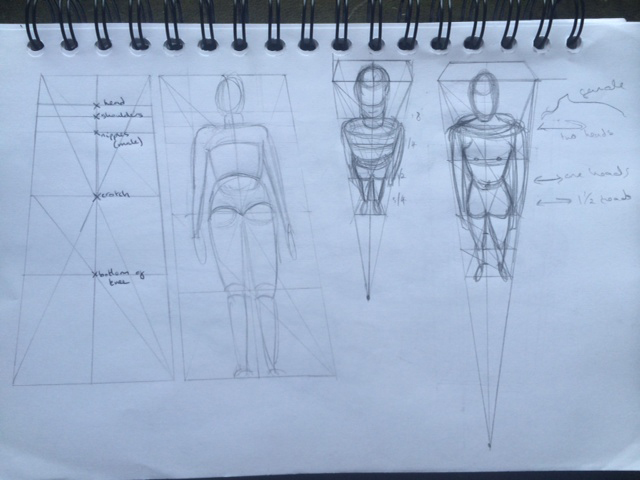
Trying to do figures in perspective with Loomis, shoddy stuff:

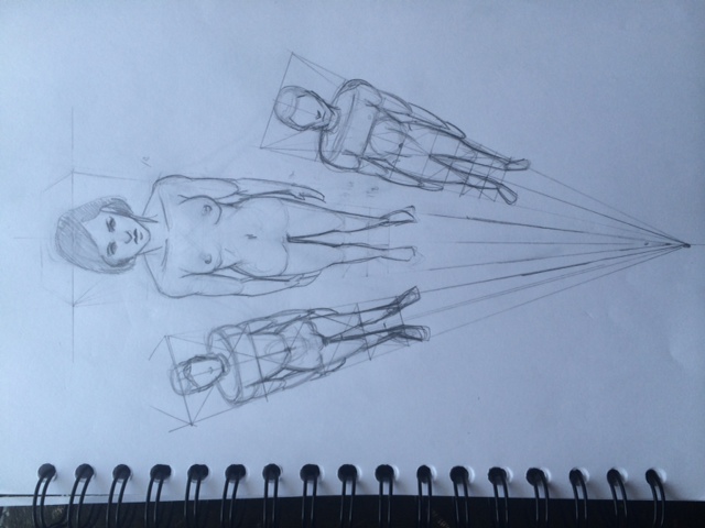
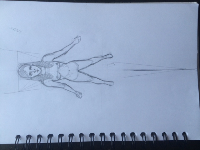
To learn this properly, I'm going to have to find some photos and try to apply the construction principles and figure it all out that way I think.
Posts: 101
Threads: 6
Joined: May 2016
Reputation:
10
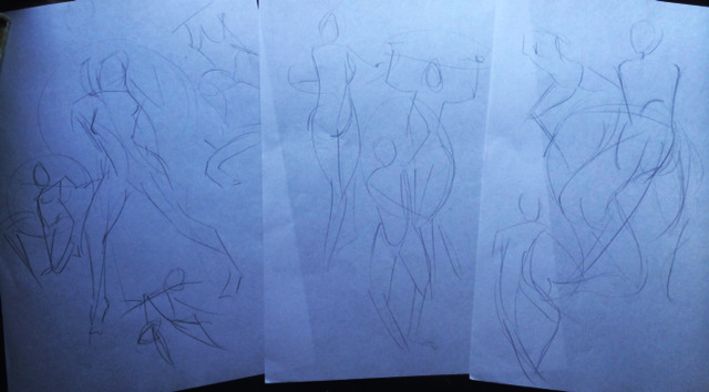
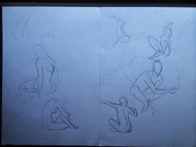
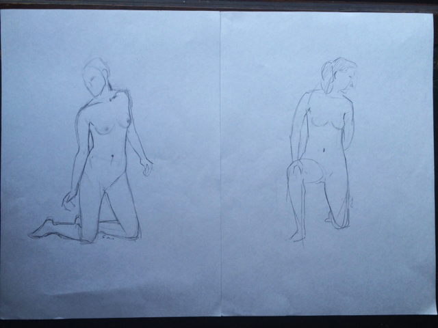
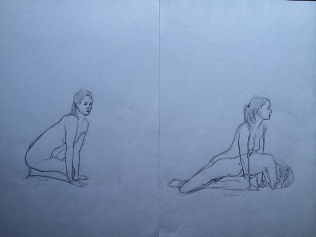
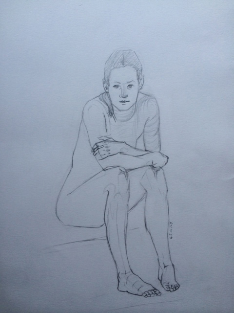
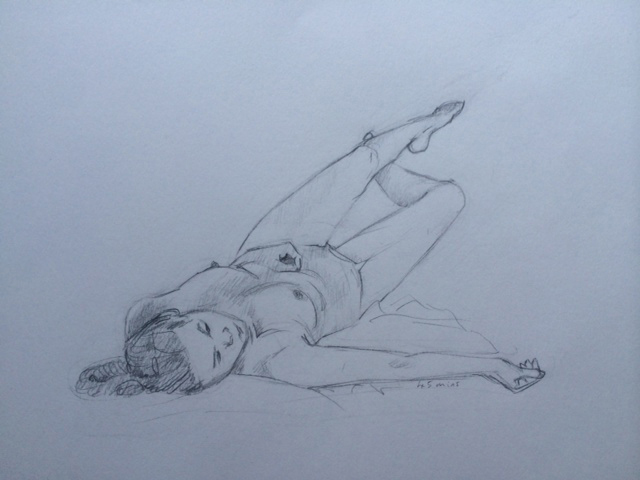
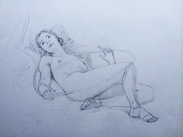
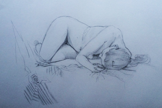
Had a life drawing session yesterday :)
Warm up (15 mins of moving model):

1 minute sketches:

5 minute sketches (last two overlapping):


45 minutes each:


1 hour each:


Posts: 101
Threads: 6
Joined: May 2016
Reputation:
10

I'll probably go for the one on the right, purely because so far I've found it more fun to paint, and it's an angle that I've not done before. I'll keep the other sketch though as I like the simplicity and readability of it. Maybe I can adapt it for something else later down the line.
Posts: 101
Threads: 6
Joined: May 2016
Reputation:
10
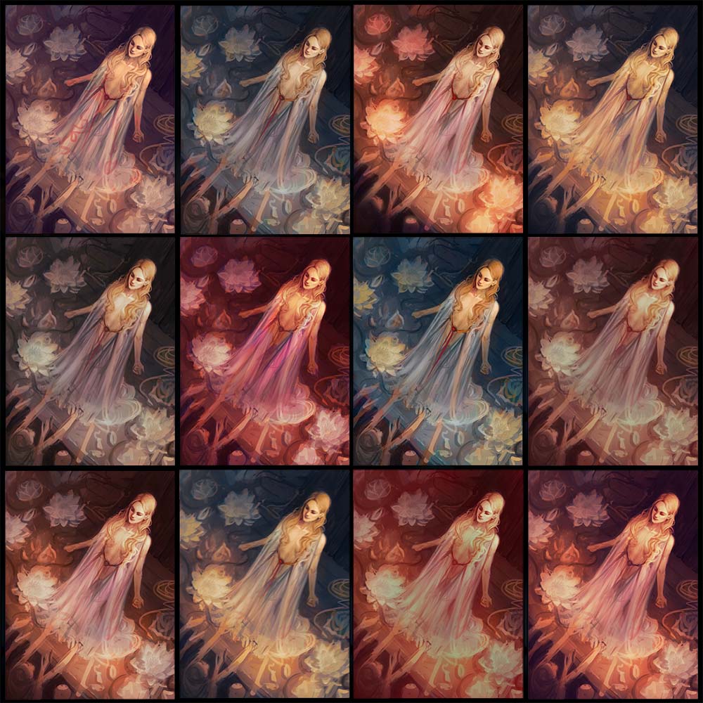
testing out some colouuuuuurrrsss

Posts: 101
Threads: 6
Joined: May 2016
Reputation:
10
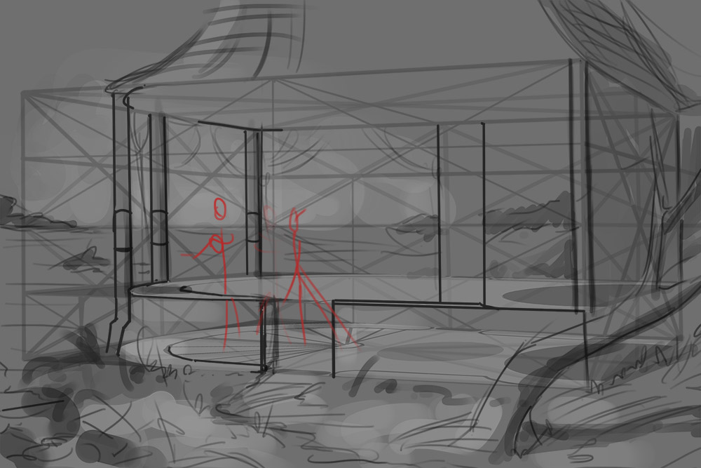
I was mucking about with constructing stuff in perspective:

And I got this idea out of it that I might develop for my portfolio:

Posts: 1,970
Threads: 22
Joined: Apr 2012
Reputation:
243
Nice work man, and a belated welcome. Keep pushing your stuff. Definitely work on folio pieces that mean something personally to you rather than trying too hard to hit some mark. (not saying you are doing that btw) Also link some pieces together into a mini-project or sorts. AD's love to see that stuff.
Once you've got a couple of good pieces together and a clean site, start sending that stuff out already, and do it religiously. Better to have a couple of Awesome pieces only, than a dozen mediocre ones. Eventually it will fill up. Good luck!
Posts: 429
Threads: 0
Joined: May 2012
Reputation:
7
Hey, welcome here! Solid work off the bat. I think your drawing and rendering is very good. As Amit said, slowly put a portfolio together as it will force you to get better.
Looking forward to seeing where you take that last illustration, keep it coming.
Posts: 101
Threads: 6
Joined: May 2016
Reputation:
10
Thanks so much for the advice and encouragement, Amit and Ben.
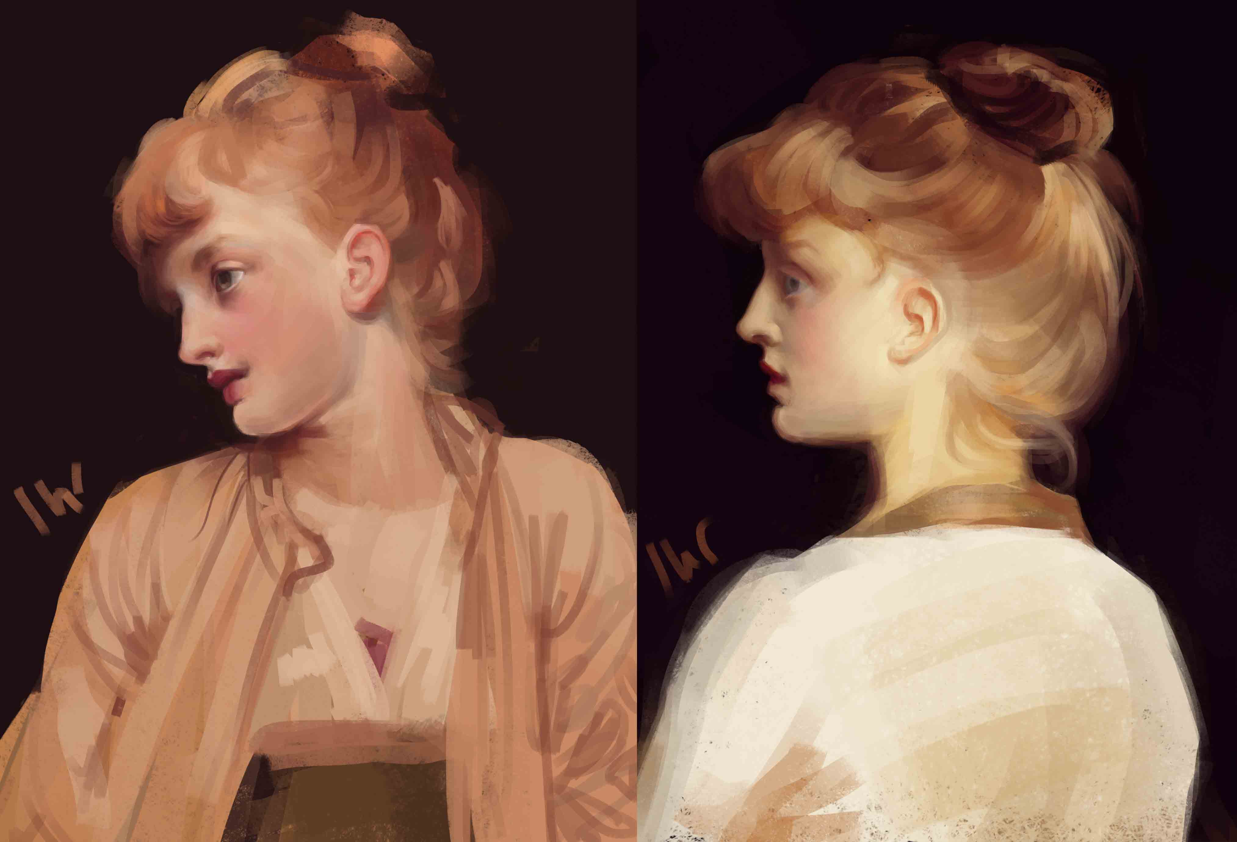
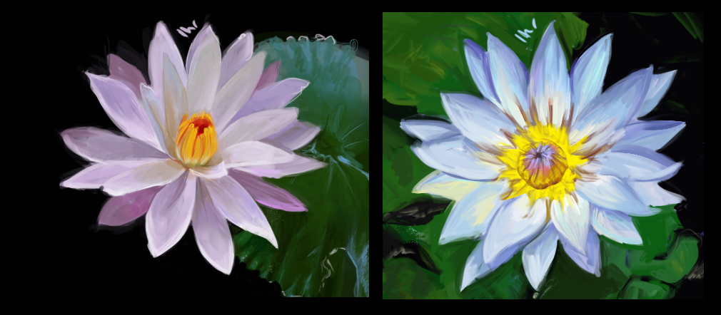
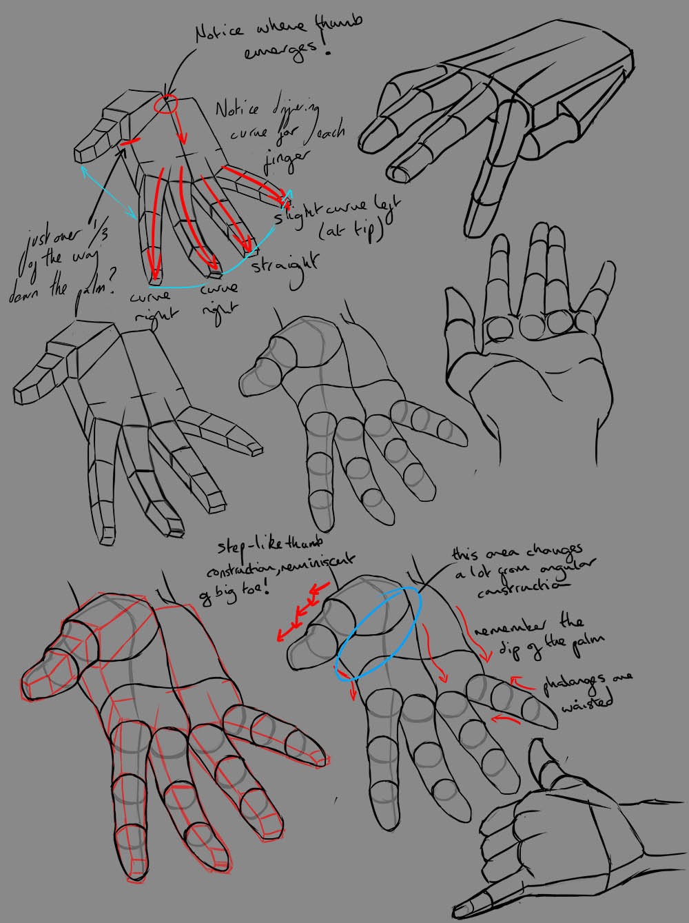
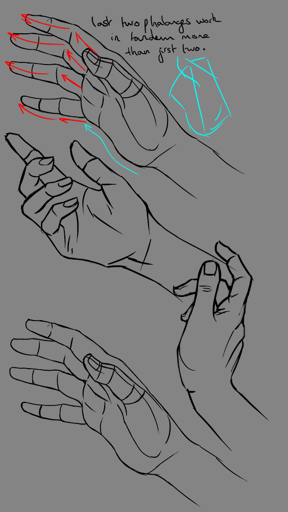
Studies from the last three days:
Lord Frederick Leighton Master Studies:

Water Lily Studies:

Hand Studies:

I've been applying these to one of the portfolio pieces I'm working on, so hopefully be will be able to finish and show that soon.
Posts: 101
Threads: 6
Joined: May 2016
Reputation:
10

These are the only studies from today, but I had a good six hours working my portfolio piece :)
Posts: 414
Threads: 27
Joined: Jul 2013
Reputation:
8
Wow, really nice work! I'm excited to see your full painting of your next illustration. I especially like the blue and yellow ones, particularly the upper right one and the bottom one, second from the left. The mood of those make her look very compassionate and caring. Lovely studies, keep it up!
Posts: 101
Threads: 6
Joined: May 2016
Reputation:
10
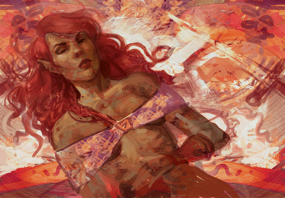
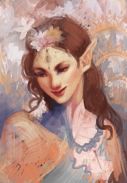
So... what do I have to show from the last few days? I've *still* not finished either of the portfolio pieces I was working on. They're both at about 90% done, and I find the last 10% of painting soul-achingly boring, so... it may be a couple of days yet.
But here's some sketches that I did for distraction when I was bored of rendering:


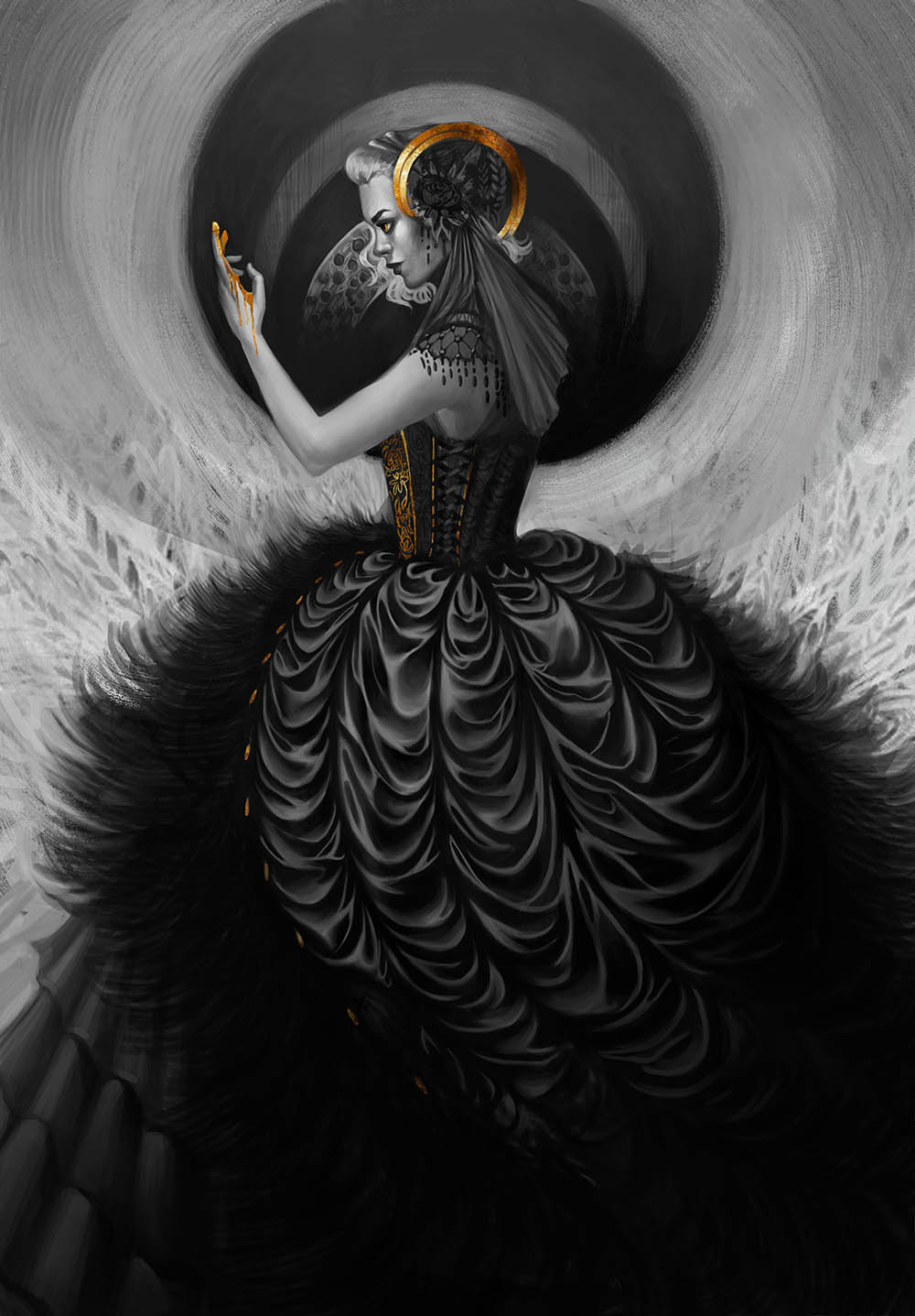
And here's a kind of gothic character that I sketched and rendered out: (totally reminds me of Lily from Penny Dreadful, and I'm a fan of Billie Piper so 100% ok with that)

|


.jpg)
