07-07-2016, 02:06 PM
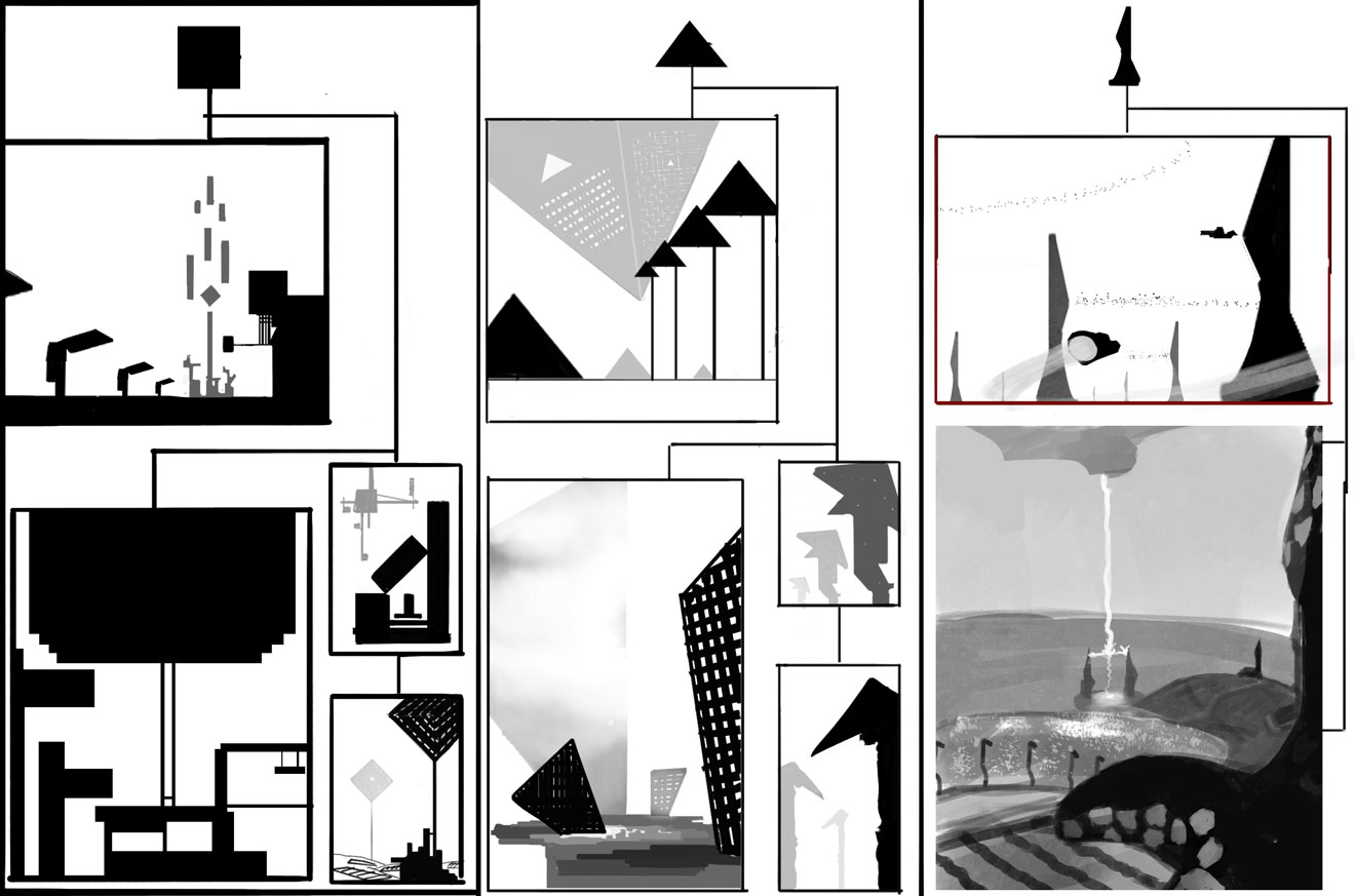
Out of my comfort zone, but I just jumped in and saw what came up.

|
CC5: Pokakaktotalocotrubowanilee stellar union
|
|
07-07-2016, 02:06 PM
Out of my comfort zone, but I just jumped in and saw what came up.

07-07-2016, 10:10 PM
Some cool comps! I quite like the top left one, it might be worth checking out Bastion it has some really nice cubic shape language.
07-07-2016, 11:06 PM
Cool start. Now go further. Geometry can be simple or intricate. it can combine patterns or use single repetitive ones. It can be infinitely recurring like fractals or finitely bounded. My suggestion is come up with some interesting geometric designs in ortho, and see what you can make out of them in a scene!
07-08-2016, 01:00 PM
Jack: I've played it and loved it. I also really liked Hyper light drifter, some comps were inspired by it.
Amit: Thats solid advice! Shrooms & Dicks. 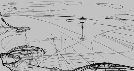 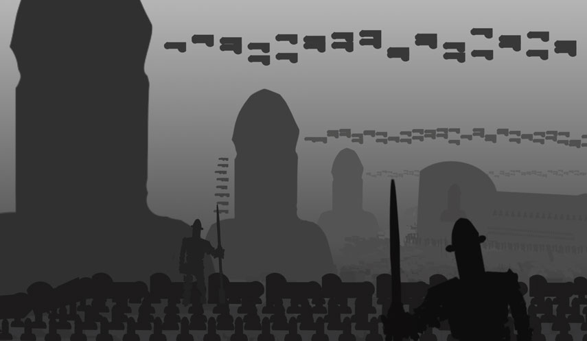
07-08-2016, 04:02 PM
that shroom one is cool. It looks like you almost have a giant S in perspective starting at the bottom left corner and curving up into that background shroom. You could build on that to drive the eye to the focal top right quadrant.
07-08-2016, 07:51 PM
Yaaaay for dick city. Really cool start! I really liked all the thumbnails in the first post! This is going to be awesome.
07-12-2016, 06:44 PM
Good idea Adam :)
Zipfelzeus- Thank you Designing is pretty fun. I've also tried to follow the brief as best as I can, all the patterns and structures are the mushroom geometric shape, which, depending on what angle you look at it, can be , circle, shroom, or circle with a smaller one inside it, even the city will follow this pattern, with the addition of the ridge textures on the top of many shrooms. Hope you liked the comma riddled sentence.  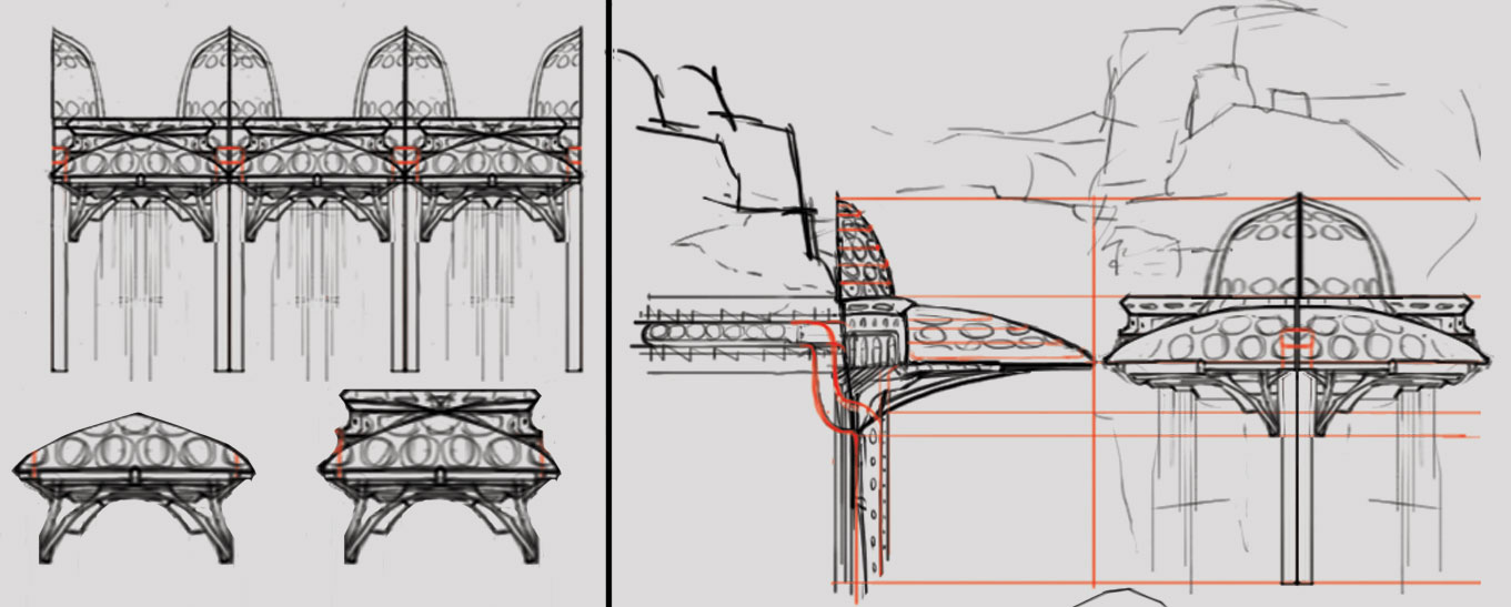 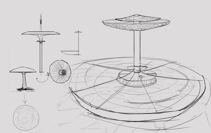
07-12-2016, 11:08 PM
Cool stuff, mein freund
07-16-2016, 03:49 AM
Good start, I like that you're trying something different and out of your comfort zone.
07-17-2016, 06:49 AM
thanks guys
The designs were fun, but I liked the original sketch more so I just went with it. I will probably make some pattern later and wrap it around the structures. 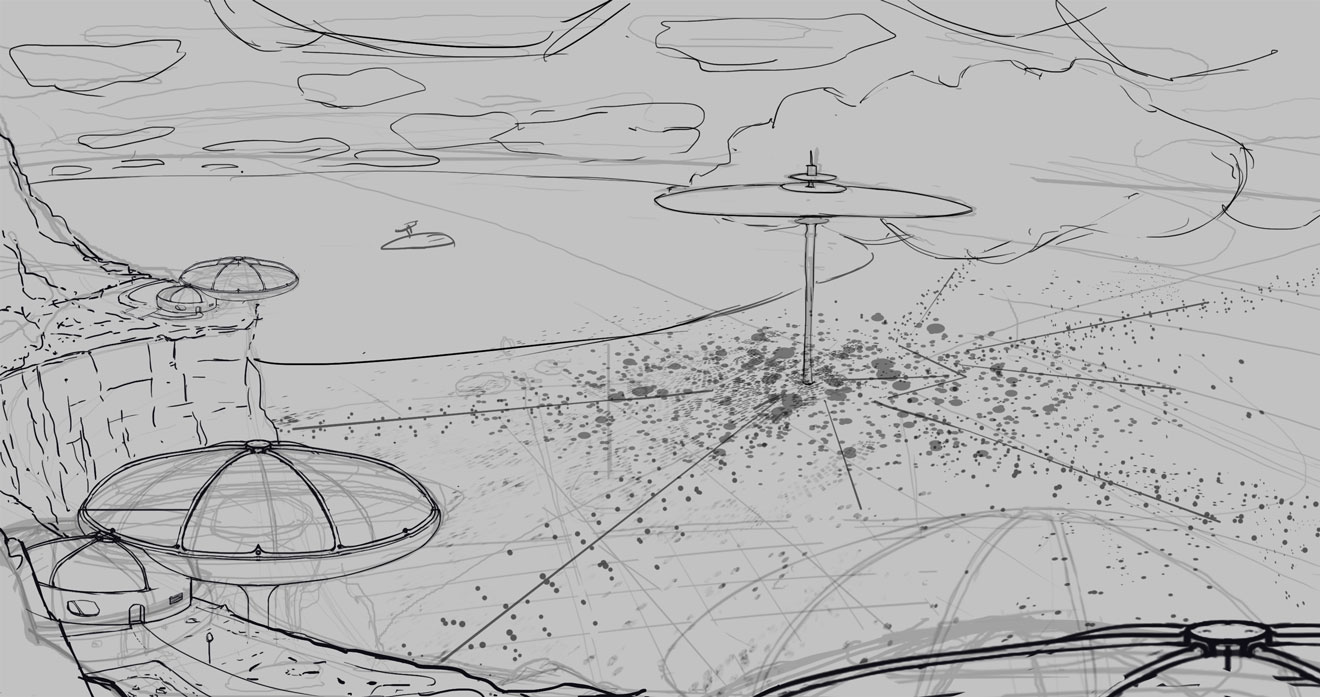
07-18-2016, 07:48 AM
That's some pretty amazing looking linework cracked. Imo you'll want to leave the colors of the rocks much lighter. A pastel colorscheme would work amazingly well.
07-19-2016, 12:45 AM
Thanks, but I wanna depict a night scene, so light rocks wont works so well.
Think I'm getting somwhere with this. 
07-19-2016, 08:27 AM
Cool, just remember to include the 3 different areas/structures so they are clear in the scene since you are pulled out quite far.
07-21-2016, 05:16 AM
They are already included, I tried to make it more obvious that they are special structures(hazy plants in farm structure and lights on the giant mushroom.

07-22-2016, 05:43 AM
Good stuff man, can't wait to see it finished!
07-24-2016, 09:37 PM
You've made the biggest progress with this CC so far, thumbs up! I actually like the line drawing more than the color wip, but let's see the final!
07-25-2016, 01:37 AM
It's beautiful.
line light reminds me of constellation pattern & for some reason Akira intro night bike scene. Very vibrant night scene.
07-26-2016, 11:38 AM
Thanks AArscott
Neopatogen - I kinda skimmed over some parts  . Anyways I really liked the linedrawing a lot aswell which is why I decided to go with it instead of the more designed stuff, but I quess I lost the energy when I started fixing things and laying in values. . Anyways I really liked the linedrawing a lot aswell which is why I decided to go with it instead of the more designed stuff, but I quess I lost the energy when I started fixing things and laying in values.Prabu - Thanks, really love Akira so thats good to know. The intro scenes were my favorite visually, would have loved if the entire movie just went off like that. Fiddled around with the hue slider and turned the colors to "alien" looks more awesome now so gonna render this version. Blood ocean! 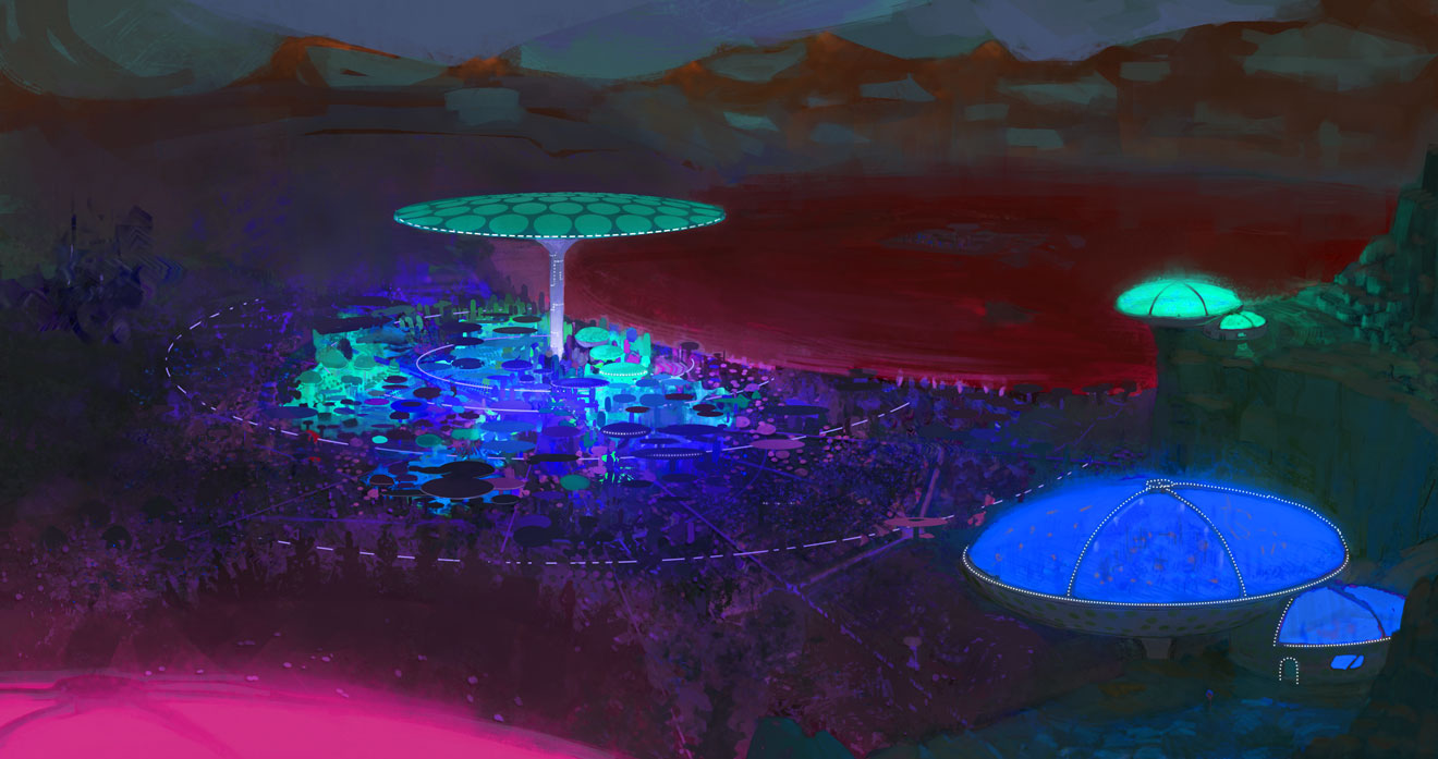 |
|
« Next Oldest | Next Newest »
|