Posts: 22
Threads: 2
Joined: Mar 2017
Reputation:
3
Hello guys, I've been a lurker here for months, I decided it's time to get shit done and start a sketchbook, but I'll be streaming the progress and then posting it here. Been into art for almost 2 years now, and I procrastinate a shit ton, I really want to stop that so this is a commitment I want to keep.
I'll start posting my studies tomorrow.
The streams will be every day at: https://www.twitch.tv/pinshivic
Starting at 12:00pm (UTC-6:00)
Posts: 671
Threads: 8
Joined: Feb 2016
Reputation:
113
Looking forward to those studies. Hey man, good to see you involved fresh off your lurker state. I'll try to catch you on your streams when I get to.
Welcome to the Crimson Daggers.
If you are reading this, I most likely just gave you a crappy crit! What I'm basically trying to say is, don't give up!
----
IG: @thatpuddinhead
Posts: 22
Threads: 2
Joined: Mar 2017
Reputation:
3
(03-15-2017, 02:07 AM)John Wrote: Looking forward to those studies. Hey man, good to see you involved fresh off your lurker state. I'll try to catch you on your streams when I get to.
Welcome to the Crimson Daggers.
Thanks dude, hope to see you there! :)
Posts: 22
Threads: 2
Joined: Mar 2017
Reputation:
3
DAY #1
First stream was a little short, just 1 hour, but I want to make them at least 4-5 hours, the problem is that I failed to realize I need to plan ahead what I'm going to do and not wing it randomly.
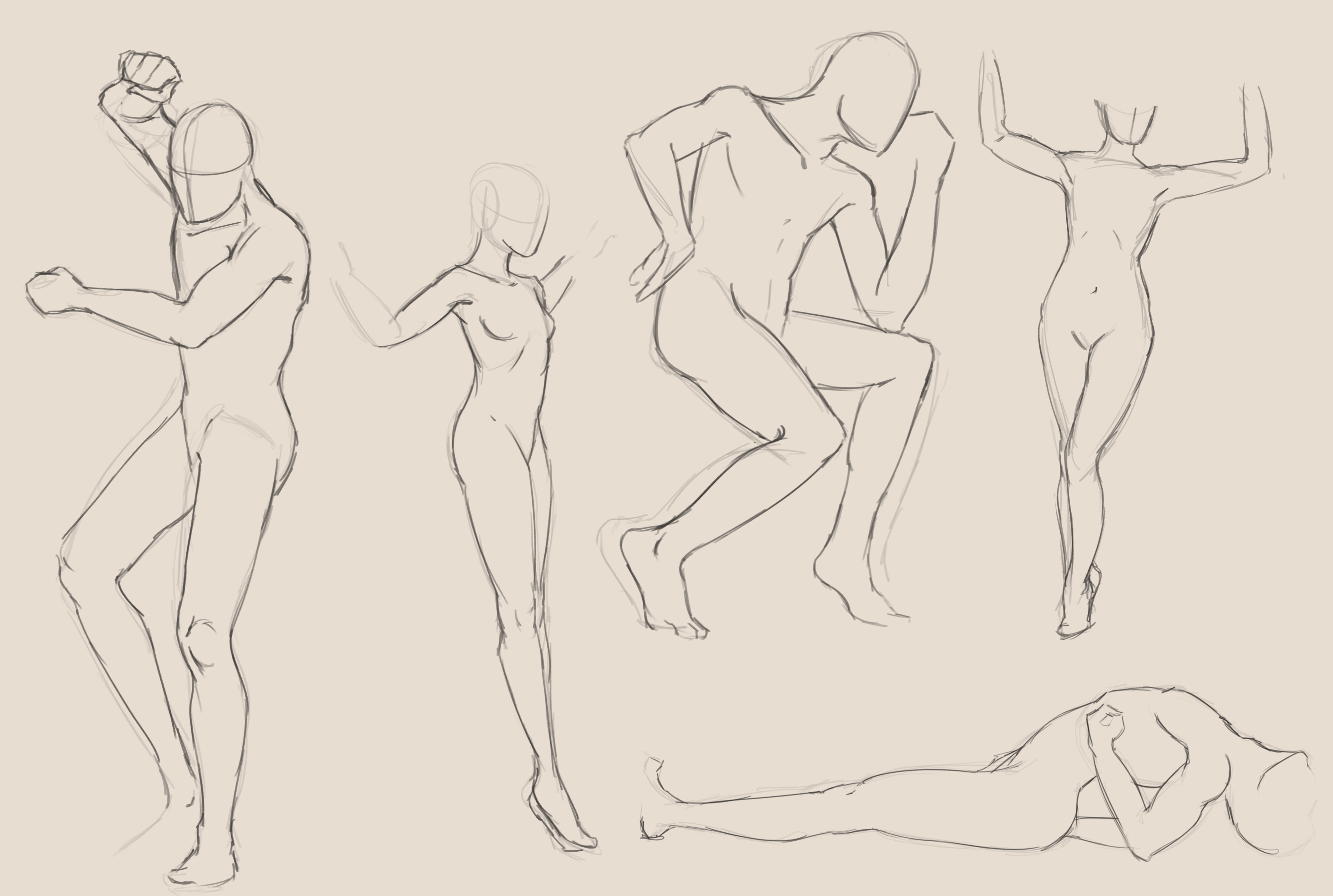
Here is what I did, some 10 minute poses from Quickposes.com.

Posts: 1,424
Threads: 12
Joined: Dec 2015
Reputation:
139
Welcome out of the shadows Pinshivic :).
Nice start here - have you ever tried using wrapping lines on your figures? They can really help communicate foreshortening in a pose.
Good to see you chipping in on the other sketchbooks already - kudos to you dude!
Looking forward to more.
“Today, give a stranger one of your smiles. It might be the only sunshine he sees all day.” -- H. Jackson Brown Jr.
CD Sketchbook
Posts: 22
Threads: 2
Joined: Mar 2017
Reputation:
3
(03-15-2017, 08:58 AM)Artloader Wrote: Welcome out of the shadows Pinshivic :).
Nice start here - have you ever tried using wrapping lines on your figures? They can really help communicate foreshortening in a pose.
Good to see you chipping in on the other sketchbooks already - kudos to you dude!
Looking forward to more.
Sup, yeah I usually use wrapping lines when doing foreshortening from imagination but when working from reference I'm way too lazy and just copy overall shapes, it ends up looking really ugly but I really want to practice doing wrapping lines to explain the form more, I'm just terrible at it, so I avoid doing it, I should practice them more so I don't avoid them, stupid of me being lazy on my first day and not practicing them lol.
Posts: 2,817
Threads: 15
Joined: Jun 2013
Reputation:
109
Posts: 22
Threads: 2
Joined: Mar 2017
Reputation:
3
#DAY 2
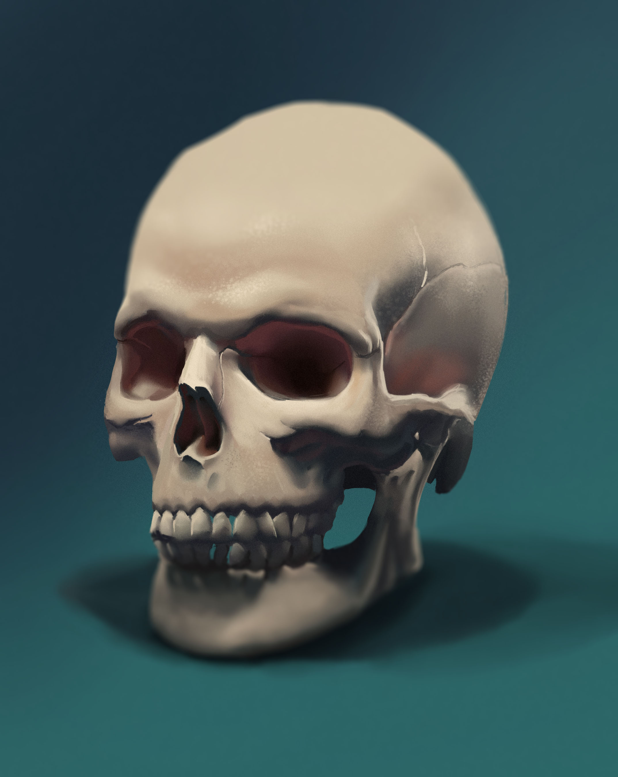
Sometimes I suck at face structure and I really want to improve in brushstrokes and markmaking but I almost never paint, 90% of what I do is drawing so here's a skull painting, took me around 2:30 hours and got very bored so I didn't take it further, still good practice.
No one has showed up to the streams so the pressure is off, I don't know how good I'll paint/draw if someone's watching lol.

Posts: 2,817
Threads: 15
Joined: Jun 2013
Reputation:
109
people might watch if you draw animu or BOOBZ XX <3
Posts: 22
Threads: 2
Joined: Mar 2017
Reputation:
3
(03-16-2017, 07:44 AM)Fedodika Wrote: people might watch if you draw animu or BOOBZ XX <3
LOL, yeah the problem is I don't have interest in drawing anime, and twitch isn't yet letting people draw nudes :/!
Posts: 22
Threads: 2
Joined: Mar 2017
Reputation:
3
DAY #3 Had the worst day in a long time, just as I got to do the study my dogs couldn't stop barking, I got like 4 phonecalls and I was drawing the worst I have done in a while, didn't even finish the study out of frustration, It's like today I unlearned everything, at least I realized I need to work a lot on my portraits.

Posts: 2,817
Threads: 15
Joined: Jun 2013
Reputation:
109
hey not bad! I think his lips are a little crooked tho :p
Posts: 22
Threads: 2
Joined: Mar 2017
Reputation:
3
(03-17-2017, 07:08 AM)Fedodika Wrote: hey not bad! I think his lips are a little crooked tho :p
I think a lot of his face features are crooked LMAO.
Posts: 22
Threads: 2
Joined: Mar 2017
Reputation:
3
Relieving frustrations with my sketchbook, thought that I should post it aswell.

Posts: 22
Threads: 2
Joined: Mar 2017
Reputation:
3
DAY #4
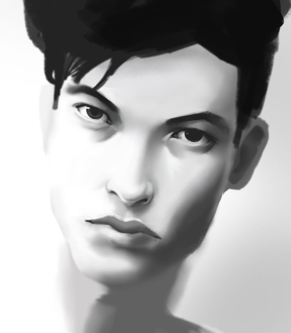
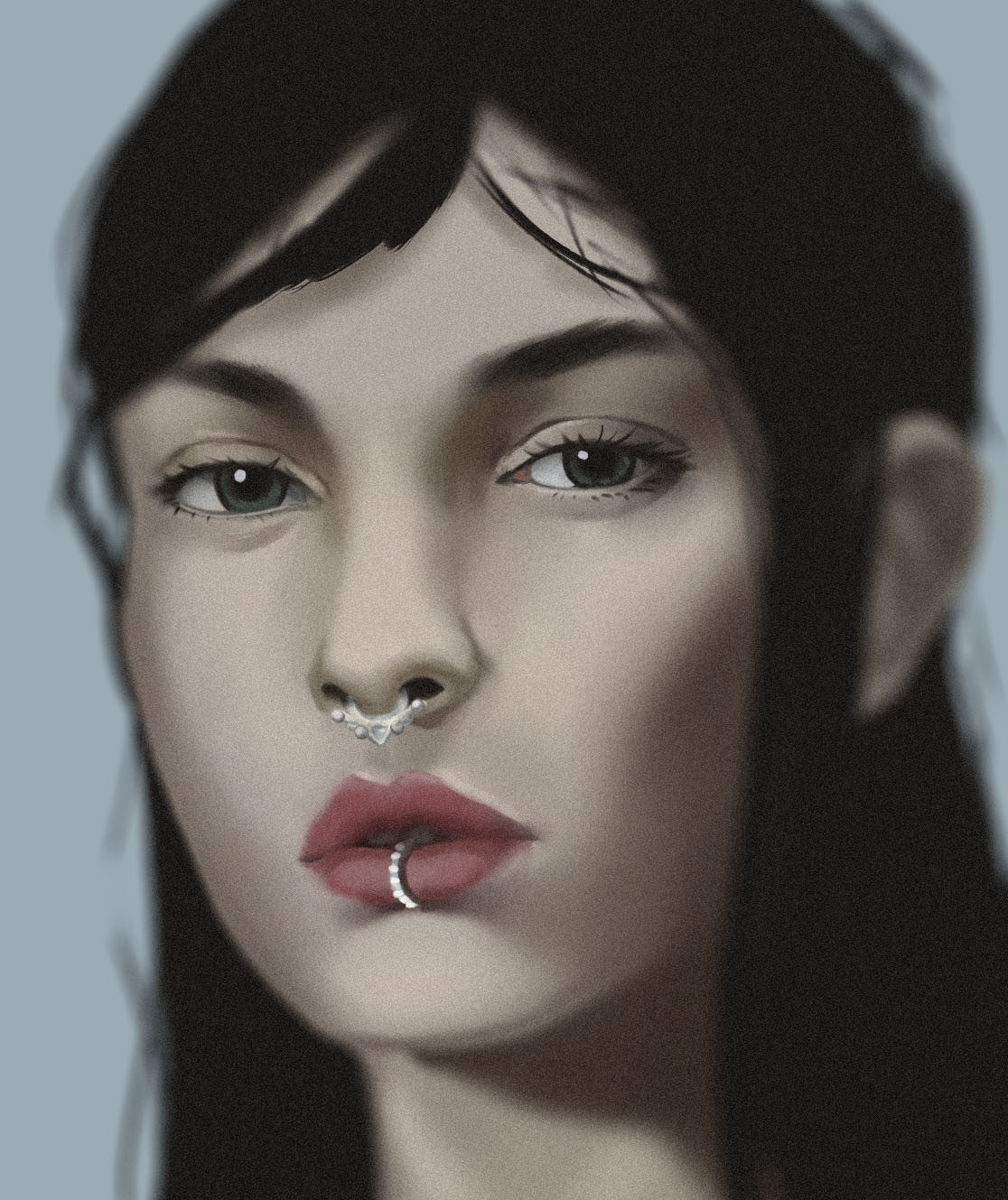
Well, today was a better day than yesterday, did another portrait to compensate for the lack of work yesterday.
Obviously still sucking at portraits.

Posts: 2,817
Threads: 15
Joined: Jun 2013
Reputation:
109
hmm, I think you could try some softer edges on those eyes, they look like a doll's face, quite plastic. I like the depth of field you have around the hair and +1 for the grain filter ;). The structure seems good, you just need to delve more into details and edges, and that may be tough since you draw mostly, so i'd reccomend trying some texture brushes instead of just the basic ones you seem to be using and try adding and removing texture and noise manually.
Like the lips, I doubt they look like that, maybe have some creases and folds in them or moisture. The skin looks plastic because the lack of texture and hue variation. try spending more time on stuff, or try texturing something simple like a ball of granite or something, see how far you can push the realism of texture alone with just a ball, it's an exercise a lotta ppl do
Posts: 22
Threads: 2
Joined: Mar 2017
Reputation:
3
(03-18-2017, 08:13 AM)Fedodika Wrote: hmm, I think you could try some softer edges on those eyes, they look like a doll's face, quite plastic. I like the depth of field you have around the hair and +1 for the grain filter ;). The structure seems good, you just need to delve more into details and edges, and that may be tough since you draw mostly, so i'd reccomend trying some texture brushes instead of just the basic ones you seem to be using and try adding and removing texture and noise manually.
Like the lips, I doubt they look like that, maybe have some creases and folds in them or moisture. The skin looks plastic because the lack of texture and hue variation. try spending more time on stuff, or try texturing something simple like a ball of granite or something, see how far you can push the realism of texture alone with just a ball, it's an exercise a lotta ppl do
Yeah I agree with you, the thing is that I paint in massive resolutions but I'm actually kinda zoomed out when seeing the painting, so this issues are waaay less aparent, maybe I'll have to stop painting in 300DPI, or re-scaling the painting. Also I have problems with wanting to get the thing done and not going over a lot of this issues and when it's at a certain point just calling it done, I skipped rendering the lips, hair, the thing that was really hard was the hues of the skin I failed super hard at that, but since I'm focusing mainly on getting the likeness down (which I didn't manage to do) I oversee a lot of issues.
Posts: 2,817
Threads: 15
Joined: Jun 2013
Reputation:
109
DPI has nothing to do with how your image is painted it only affects how it is printed (Dots Per Inch on paper has nothing to do with image files appearance on screen.) One thing you can try is doing an underpainting where you just randomly slap different colors down before adding the base colors, there's a good example in this. I learned a lot about painting just watching this guys vids. By adding those random splatters of color, they will bleed into your main colors subtely.
https://www.youtube.com/watch?v=omry014wZVk
Try slapping down even photo textures and lowering opacity, it can really get you some "teeth" on the painting to work with, and can give interesting results. I mean all of this is helpful for painting and "rendering" but remember you don't have to paint if you don't want to, you can always just cell shade or not even shade at all.
And they don't have to be random colors, in traditional most people just lay in a warm layer then add other colors based off that. I like adding crazy rainbow splatters, that's how I get the big amount of color variation I usually get, I learned that studying Bouguereau because he has so much color variation.
Posts: 22
Threads: 2
Joined: Mar 2017
Reputation:
3
(03-18-2017, 08:35 AM)Fedodika Wrote: DPI has nothing to do with how your image is painted it only affects how it is printed (Dots Per Inch on paper has nothing to do with image files appearance on screen.) One thing you can try is doing an underpainting where you just randomly slap different colors down before adding the base colors, there's a good example in this. I learned a lot about painting just watching this guys vids. By adding those random splatters of color, they will bleed into your main colors subtely.
https://www.youtube.com/watch?v=omry014wZVk
Try slapping down even photo textures and lowering opacity, it can really get you some "teeth" on the painting to work with, and can give interesting results. I mean all of this is helpful for painting and "rendering" but remember you don't have to paint if you don't want to, you can always just cell shade or not even shade at all.
And they don't have to be random colors, in traditional most people just lay in a warm layer then add other colors based off that. I like adding crazy rainbow splatters, that's how I get the big amount of color variation I usually get, I learned that studying Bouguereau because he has so much color variation.
I messed up with the DPI I mean PPI (Pixels Per Inch) it's not the same painting at 10000 pixels than 1000 pixels and it shows really different, it's not the same watching a painting 10 feet away than with a magnifying glass, that's what I meant. Also I know those methods but I really don't want to use photo textures specially on a study the point it's not making it look great but learning, if this was a piece, I would spend much more time on it and go in and fix these errors, the point of the study was to get the likeness down, went for the big shapes. I think if I went into a portrait to get the likeness and ended up focusing on color, or my brushtrokes it would defeat the purpose of the study. But I'll take the critiscism into account.
Posts: 22
Threads: 2
Joined: Mar 2017
Reputation:
3
DAY #5
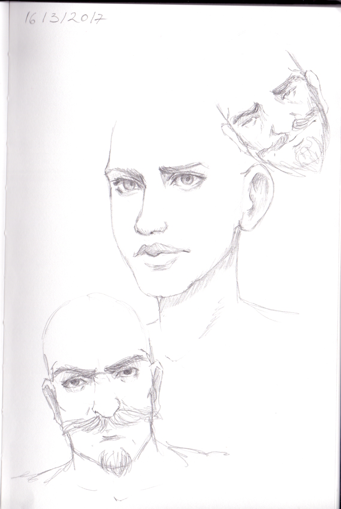
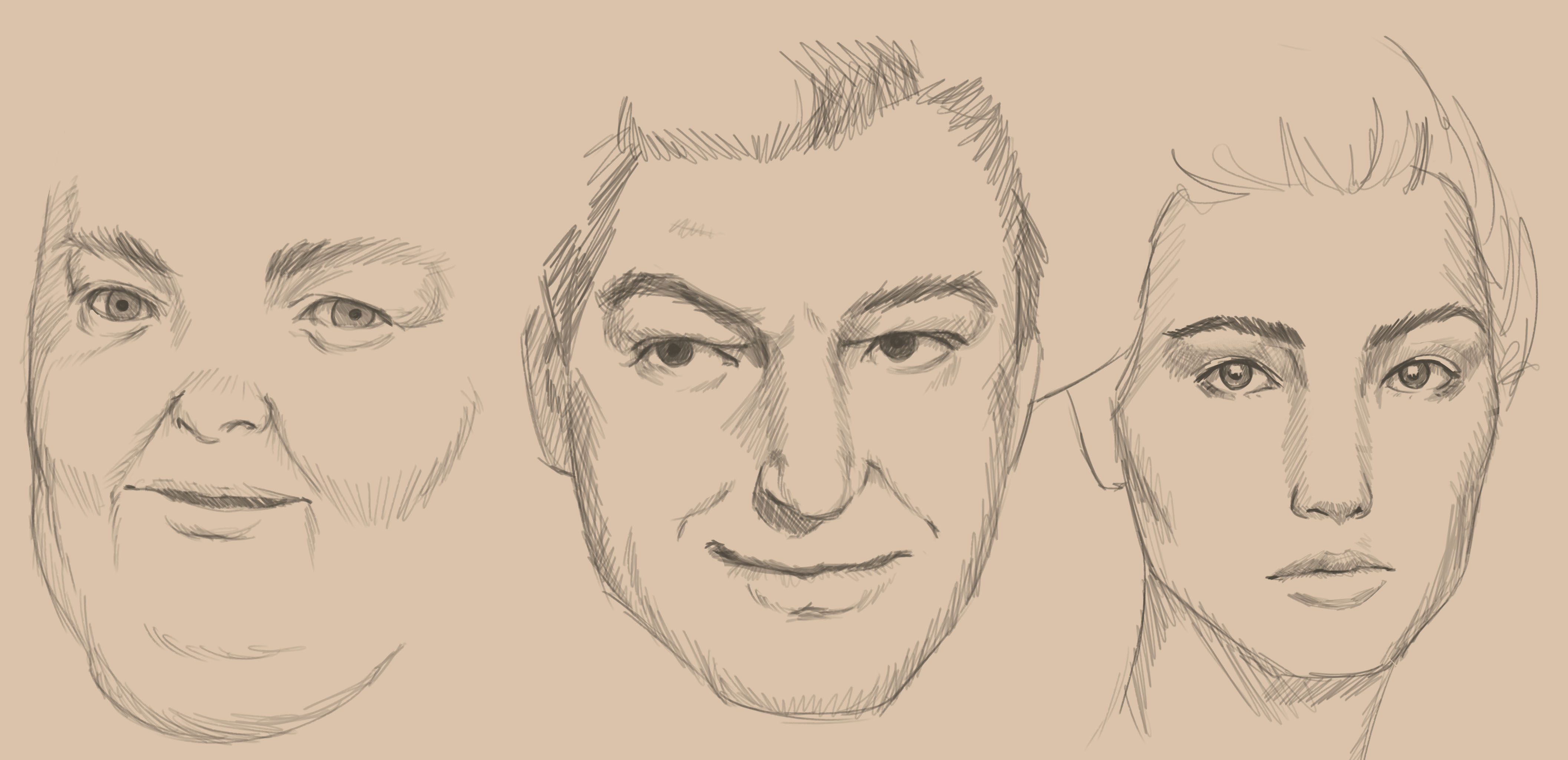
Getting more confident with portraits, but not happy with the likeness, tried to get the likeness as close as possible using only line, was a good excercise, will be doing it more and more.

|


