03-12-2018, 05:04 AM
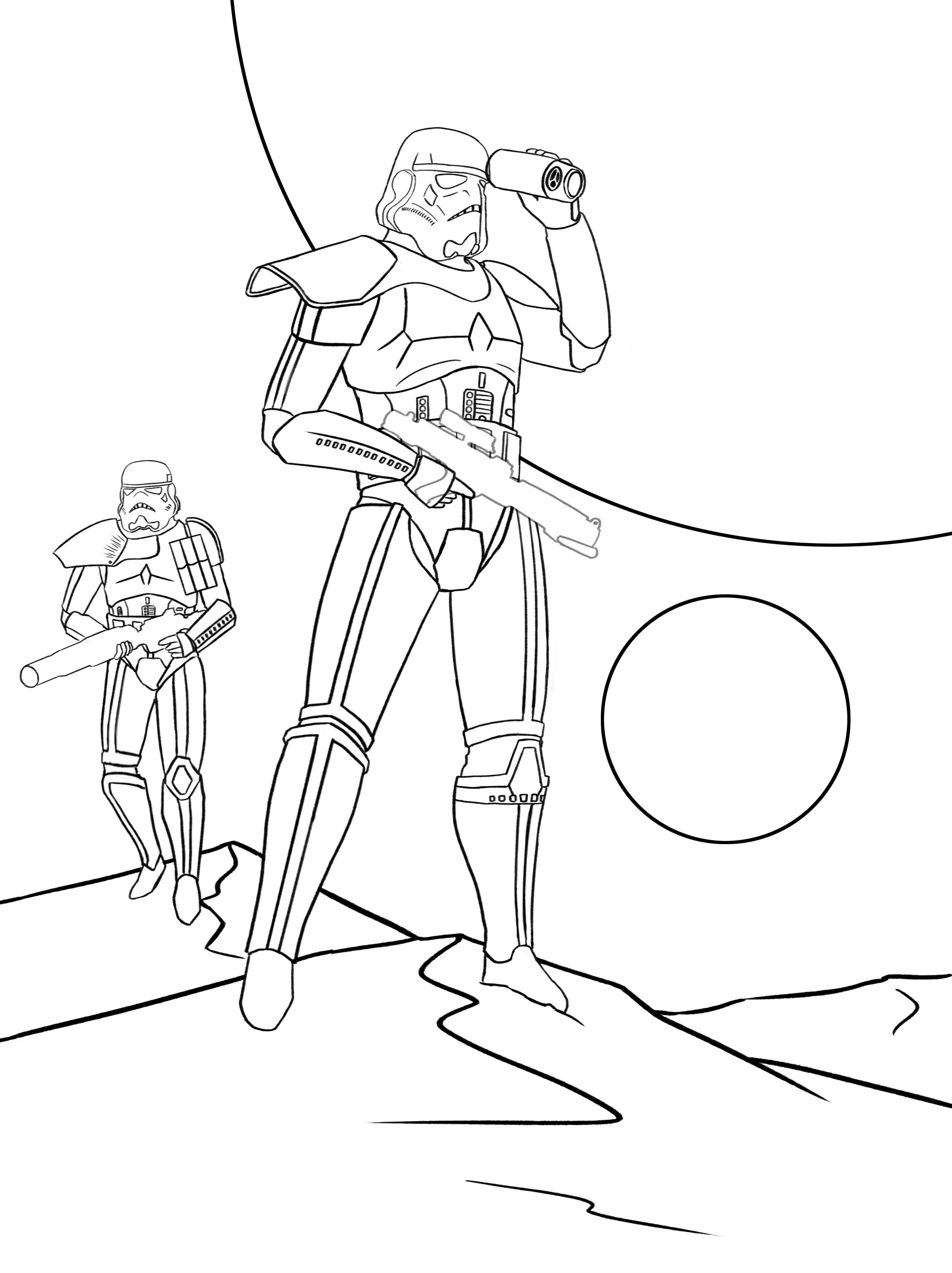
Hi guys! I finished line but I am not sure about the proportions. Can somebody please help me? Thanks in advance!


|
Not sure about legs(and everything else)
|
|
03-12-2018, 05:04 AM
Hi guys! I finished line but I am not sure about the proportions. Can somebody please help me? Thanks in advance!

03-12-2018, 03:07 PM
Uncertain about something it sometime more important to experiment than ask for a critique.
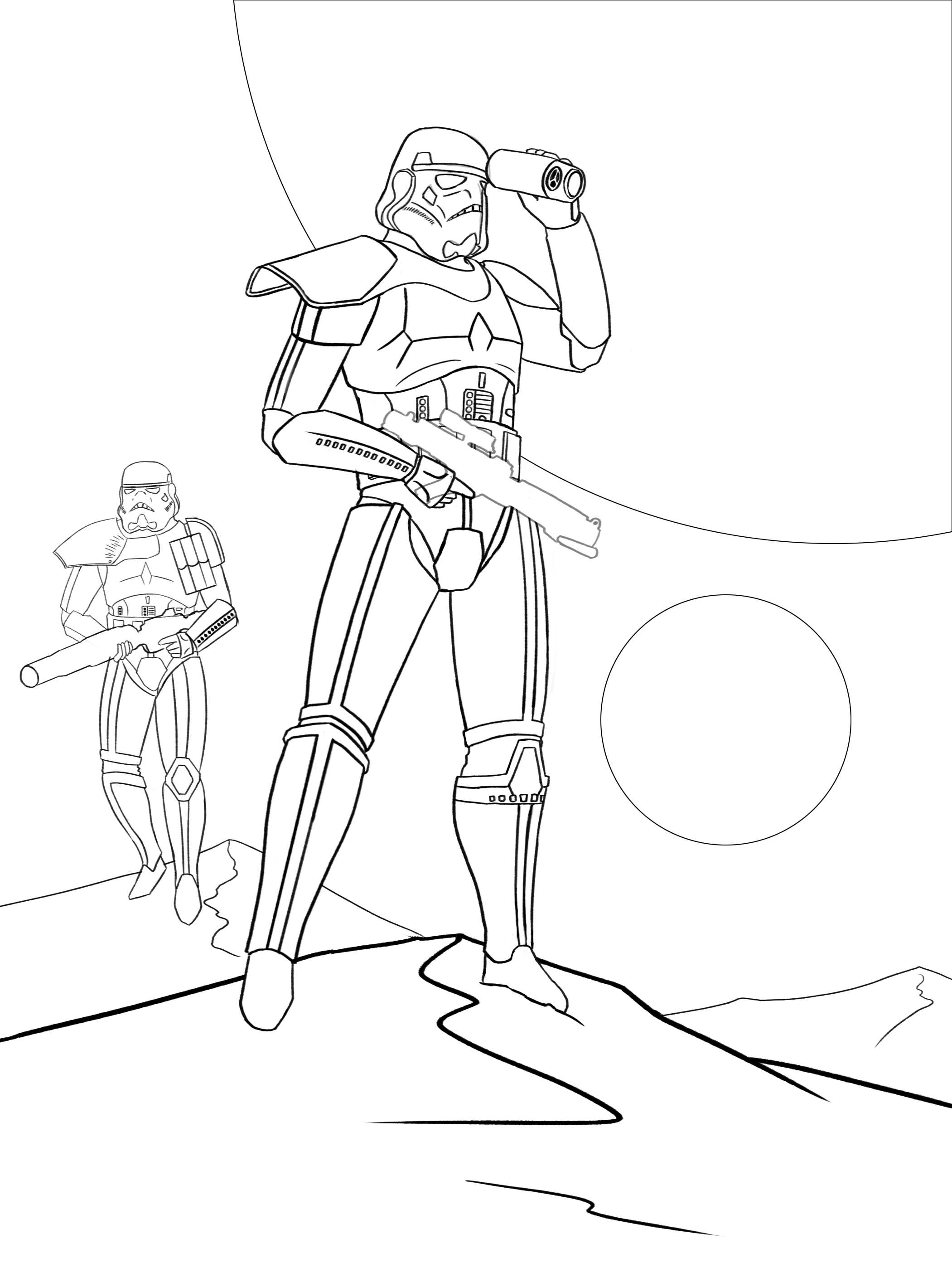
One thing i have to say is there a strange line weight going on here the face as tinner line and the rest of the body as bolder line. The goal is to use line to describe what element is in front and what in the back. Bold line for close element and tinner line for distant element. Bold line over overlapping element and it recommend to also outline the silhouette Use tinner line for the inside detail of an element Try use the line weight to describe element that float in the air to describe there distance. It easier to describe land mass you just reduce use bolder line for the front and tinner for the landmass in the distance. Sorry for the sloppy paint over i don't have my tablet install.
03-13-2018, 05:22 AM
(03-12-2018, 03:07 PM)darktiste Wrote: The goal is to use line to describe what element is in front and what in the back. Bold line for close element and tinner line for distant element. Thanks for reply! I then paint over with color in my artworks, but that is a valuable knowledge. I`ll fix it. What do you think about proportions?
03-13-2018, 06:31 AM
(03-13-2018, 05:22 AM)Blackskull27 Wrote:(03-12-2018, 03:07 PM)darktiste Wrote: The goal is to use line to describe what element is in front and what in the back. Bold line for close element and tinner line for distant element. I personally see them as small but it might be due to the foreshorting and low camera angle and the angled surface he is standing on.The feet attract to much attention because there the least detail element of the whole figure but it can be fixed but i believe it not a bad thing because the eye go from the bottom to the top of the figure.Also be aware that line inside an element can be use to direct the eye across the figure.For example i don't know if you see it but there an arrow in the design of you leg section.I added and image of the foot of a clone tropper i think drawing in the detail can help you check the proportion. I also took the liberty to try to flip an element i believe didn't helped to direct the eye across the image.
03-13-2018, 06:58 AM
Another great suggestion. Thanks. I fixed the line now it looks better
 |
|
« Next Oldest | Next Newest »
|