@Prabu Thanks ;A;!!
@Darktiste Thanks for the input/paint over! Because of your advice, I could really see that the main focus of the piece isn't so clear in my original take, and how the stronger lighting really helps with that problem. ;w;b
@Chubby_Cat Thanks for your advice!! I think I have a habit to be a bit heavy handed with saturation, and I definitely see how the darks in the study could be pushed. Ahh... when put like that, I think for the future I need to focus on my intention for the feeling of the piece, and carry it with me as I render. Also, omg... I couldn't un-see the youtube play button after I read your comment. I have no idea how I didn't see how distractingly prominent it was in the first place. @_@; LOL.
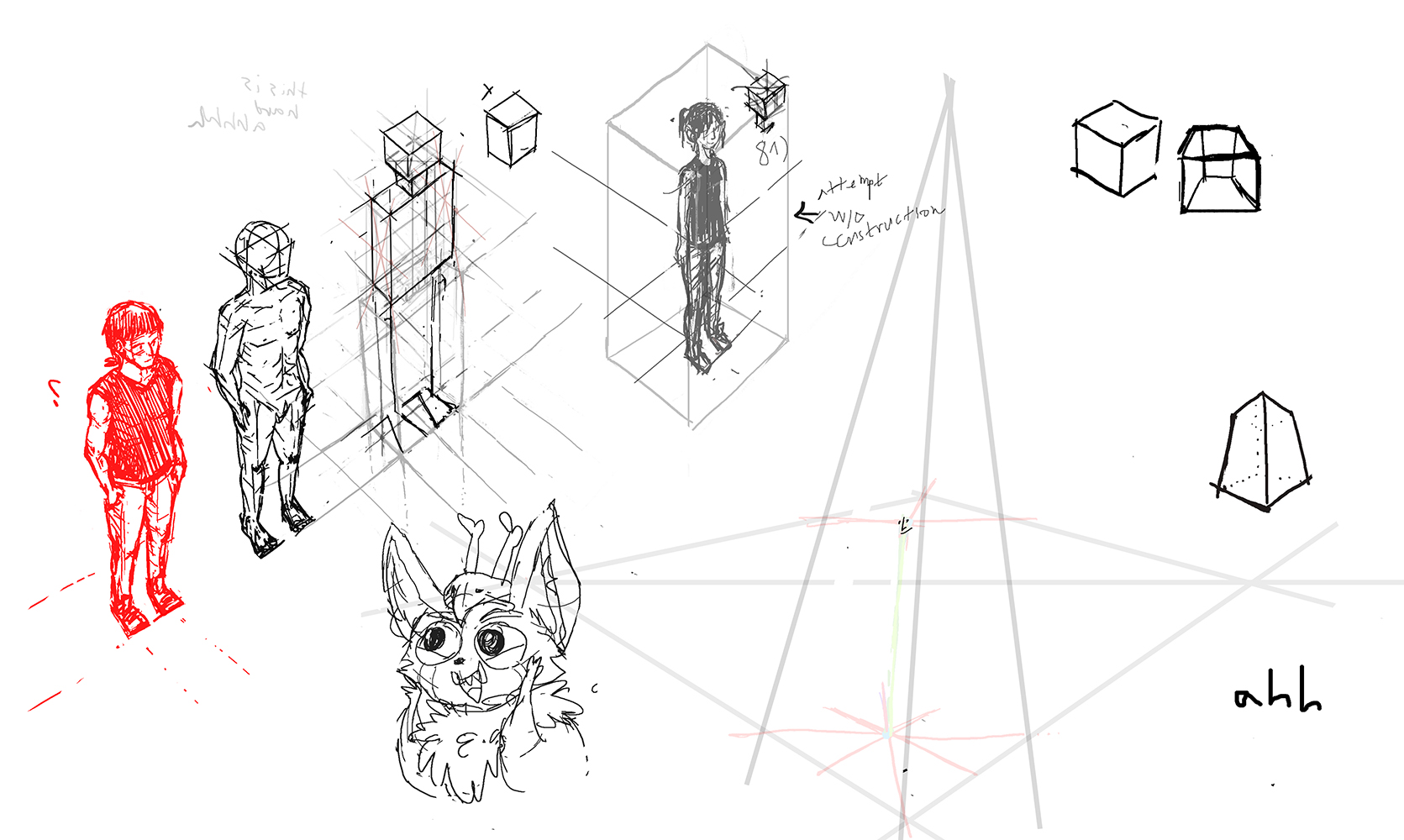
^ attempting to use a construction method that desquolor has been showing me. i need to keep practicing this a lot more with simpler shapes to really get a good grasp of it.
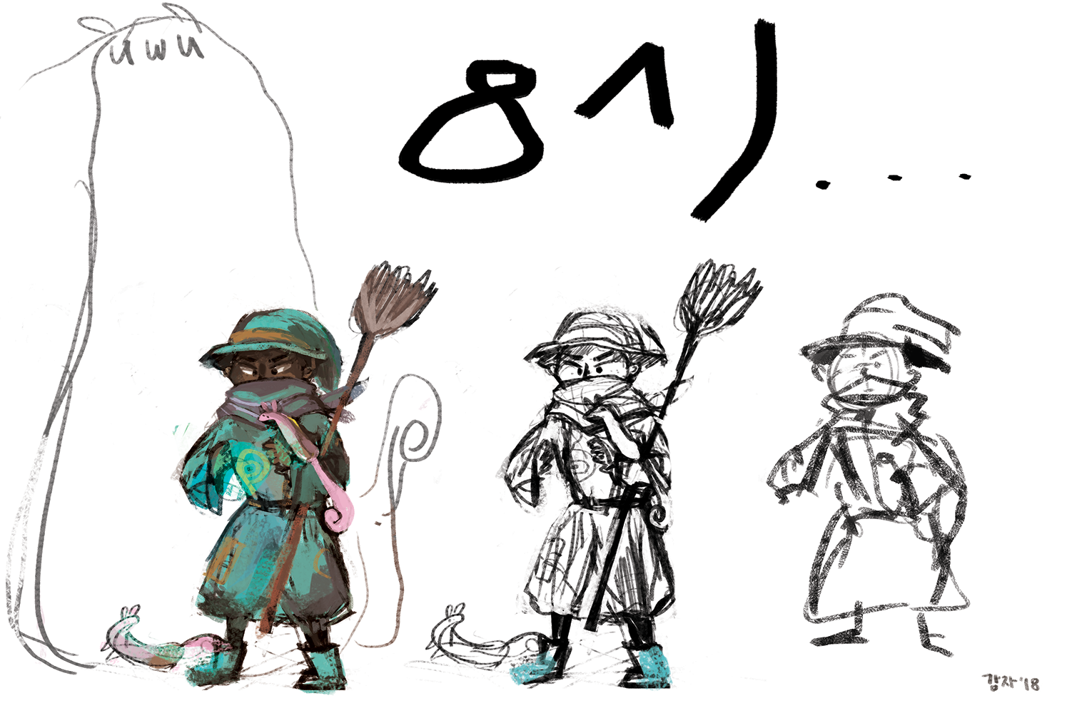
^ mage boy that i kinda forgot about. might finish this later
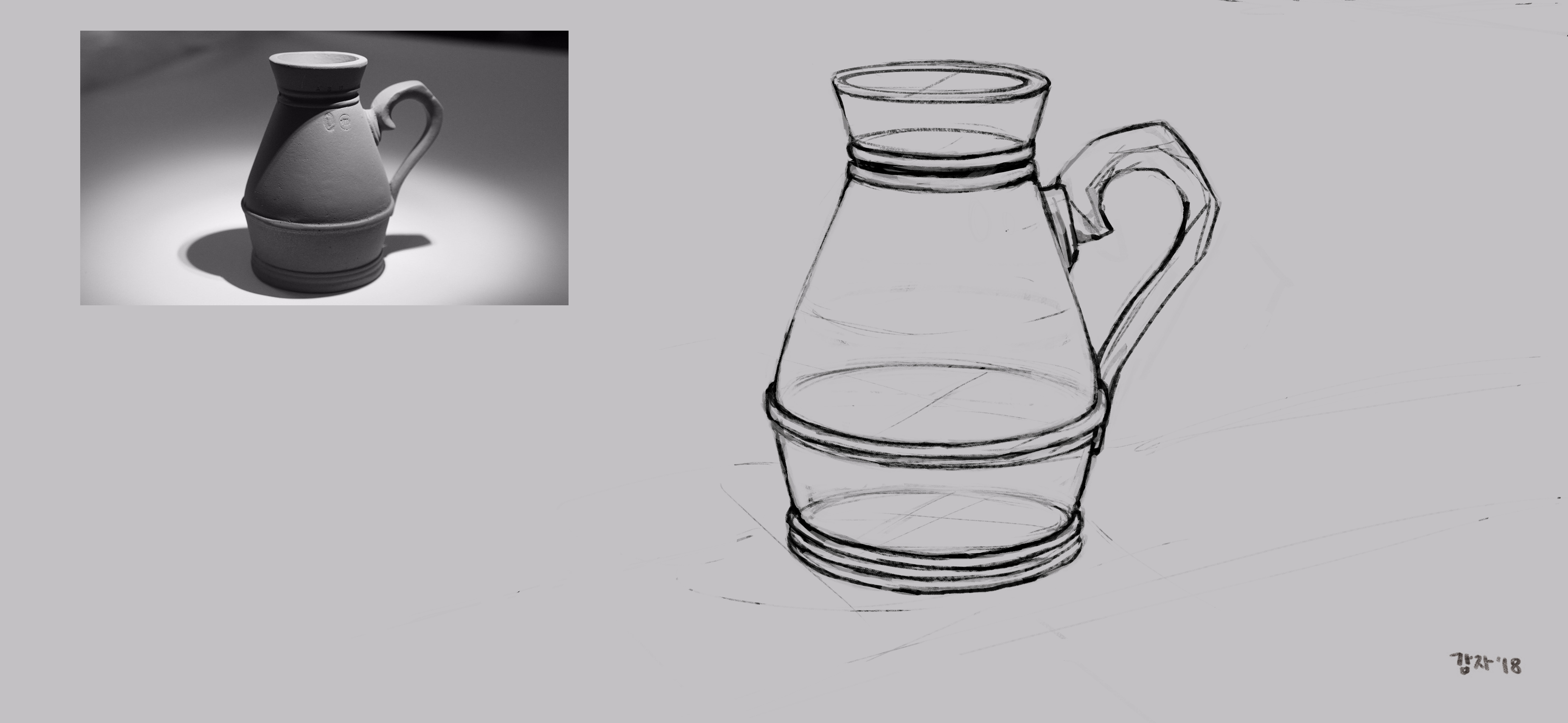
^ going to attempt to paint this tomorrow. looking at it, now there are things that look a bit off here and there at the handle and the base of the object... going to try fix that before actually painting it
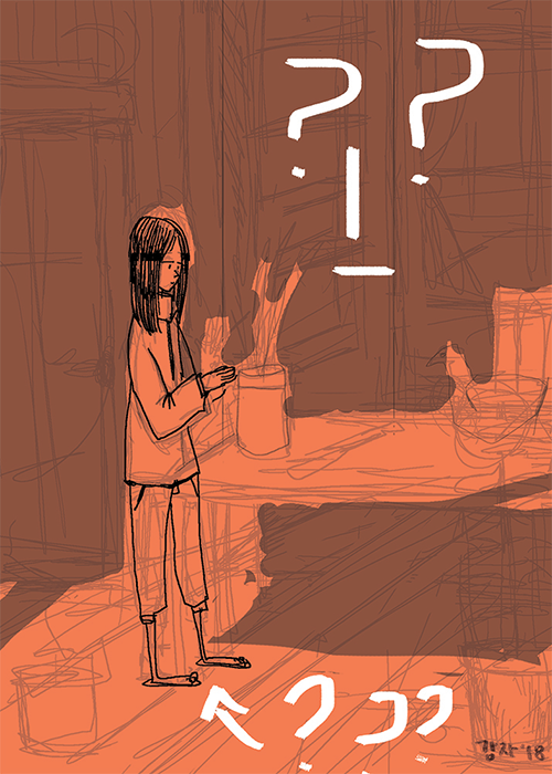
^ i want to re-visit/work on this some time. not sure why, but there's something i kinda like about it
![[Image: s2tf84.jpg]](http://oi63.tinypic.com/s2tf84.jpg)
^ i tried to take some of the advice that was given to me and took a quick second pass on this. even though i'm not completely happy with it, i think at least the compositional focus is more clear, and i'm happy that the cape doesn't resemble the Youtube Play Button anymore (^8 LOL... Thank you darktiste/ chubby_cat for the advice!
on another note, i broke my upload everyday/ every other day promise... i'm going to try my best to make sure that doesn't happen again.
![[Image: t06ng1.jpg]](http://oi67.tinypic.com/t06ng1.jpg)
![[Image: t06ng1.jpg]](http://oi67.tinypic.com/t06ng1.jpg)


![[Image: 25u0d38.jpg]](http://oi64.tinypic.com/25u0d38.jpg)
![[Image: 2jfc2u1.jpg]](http://oi65.tinypic.com/2jfc2u1.jpg)
![[Image: 2h7nol3.jpg]](http://oi64.tinypic.com/2h7nol3.jpg)

![[Image: 2v0jtjq.jpg]](http://oi67.tinypic.com/2v0jtjq.jpg)
![[Image: vijjgg.jpg]](http://oi64.tinypic.com/vijjgg.jpg)


![[Image: s2tf84.jpg]](http://oi63.tinypic.com/s2tf84.jpg)