Posts: 369
Threads: 6
Joined: Sep 2019
Reputation:
23
@darktiste - The large text is for it to be readable on a 320 pixel phone screen. Below is an example of a vertical comic, scroll down past the messaging parts to where the actual (big) speech bubbles appear:
https://www.webtoons.com/en/super-hero/o...isode_no=1
The problem might be rather that the panels are too small - I wanted to avoid using the full width all the time but it may be a bad decision.
@Rotohail - I was really going to stop at the line, but you know, after a decade away, some old reflexes took over. I'll be more cautious from now on ;)
@both - I actually drew the inverse shifting in the unpublished second scene before I started the first scene over, it's a progressive change in shape and features - cartoony way, not horror. But I believe that my reluctance to show it in the first scene is because it can be overwhelming information at start. I think that I will get back to starting the story at a different point in time, as I did long ago. Also, I need to find the format I really want, I tried so many in the past but now that I'm back into it I need to pick a trail.
Posts: 76
Threads: 1
Joined: Oct 2019
Reputation:
5
Nice colors on the back of the painted horse! You got me drawing some horses as well (but I didn't post them), so thanks for the inspiration.
For the comic, I also have some suggestions:
I was confused in the 1st panel, I thought the boy was tired, so I like the close up of the second panel in the 1st version.
Then the 2 panels next to each other could be "Again?" and "Please?" but maybe a bit bigger. Or if you keep the 1st version of that 3rd/4th panel, I think it would be more clear if you flipped it, so "Again?" is in the top left.
For the 5th and 6th panel, I like the flow of the text of the 2nd version. The boy (5th panel) could be in a more interesting pose/silhouette. I like the idea that the transformation gets confirmed in the second scene, but I agree it might get confusing.
I think it's coming along quite nicely, just some more exploration to get that flow. 
Posts: 369
Threads: 6
Joined: Sep 2019
Reputation:
23
Thank you Ash! Horses are creatures of fascinating weirdness, eh? :P
The comic draft was visually not clear enough indeed, I think I should post the scripts in addition to the drafts, as well as some background information. It crossed my mind to swap the diagonal panels until I realized this would be a brutal 180 degree angle turn at the very start of the story when we are still wondering who is who. Difficult decision. Also, I wasn't happy with the pre-shapeshifting panel indeed, too bland, botched, you're totally right.
I didn't find the time to work on this last weekend except exploring a bit the alternate beginning that I alluded to the other time. This is a tentative vertical mode long-scrolling first "panel" which I abandoned midway because of how narrow and suffocating it looked. I would really prefer the landscape slide show format. I am posting it just as an testimony of the trials and errors:

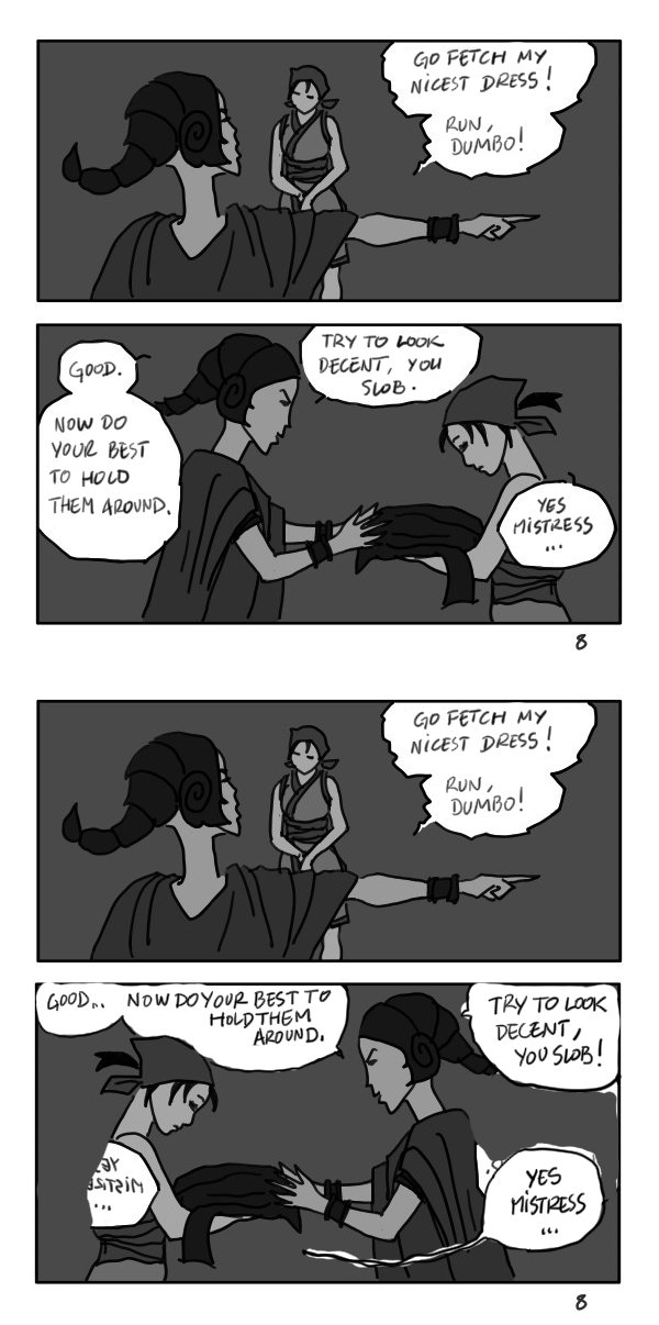
To provide a guideline, below is an old draft of this beginning, in a square page format. It was made some time after I gave up on comics, some kind of a last breath, not very appealing but it tells the story. I spent an insane amount of time translating it into English (and yet the texts probably look awkward) and the speech balloons were not always fit:

Posts: 151
Threads: 2
Joined: Oct 2019
Reputation:
20
Why did you give up? Honestly this looks good to me! It reads well, and you can get the gist. So your art might not be what you would like it to be, but you can always hire someone if you story is good enough to pursue. For story boarding this works really well. Characters, setting and emotions are all identifiable. If I had to say something is that, you do less panels and move everything faster so you have a bigger picture earlier, then if you want to you can expand points, or change them. Basically iterate over it, as you go.
You shouldn't wait for your art to be really good to write stories, if that is what you like. You can keep a pile of storyboards and later on if you get where you want to reach with your technique then just redraw them. Hire a team.
As a comment on page 8, flip the last panel, mainly because the action comes from the right but I'm guessing is read left to right, so it makes you bounce from the bubble to the action opposite, try to keep elements that belong together, close by. So keep the bubbles but flip the picture.
Posts: 369
Threads: 6
Joined: Sep 2019
Reputation:
23
Thank you Rotohail. I used to make some drafts a bit more polished in order for others to understand them; I'm glad it's working :) I think I'm going to follow your advice and go on with just drafts. And maybe condense the story - although I hate skipping minor details that turn out to be important for the overall mood and meaning of the story.
I did try to team up with artists for various projects of mine but, you know, it's hard to find like-minded people to match the particular mood of one story.
I tried flipping the panel as you suggest, is this what you are describing?

I started an illustrated background roll of this story to help understand the setting - I didn't include the all-text background dossier, that would be overwhelming:

And a condensed version of scene 6 (roll format) - that picks up where the old draft (square page format) left:

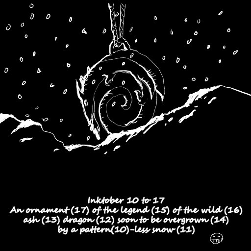
Inktober:

Posts: 151
Threads: 2
Joined: Oct 2019
Reputation:
20
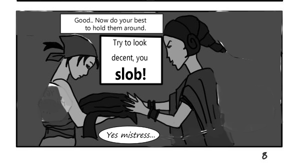
Heya! So I saw the panel change, I feel with the reorganizing is a bit kind of messy, so I tried to do an idea. I like your bubbles shapes and handwriting a lot more so disregard those. I wanted to make it flow a bit more clear, keep the view inside the interaction between them. Also suggest you can vary the lettering shape, size and all that to go along with the emotion, mood, you have. Like when she says slob! Make it bolder, bigger, because I imagine it as a scream or higher in tone, meanwhile her reply is smaller, because it's more coy, softer, she's lowering her head so that's the attitude I get from her. Obedience.

Horchata! Oh well I can maybe tell where you are from, from this. Ha! I think we share a language. Her looks remind me of Tsuomu nihei, Cibo, from Blame! I'm a big fan of that manga. Is due to the color scheme, eye type and expression mostly, I feel. Your drawings feel a lot more cheerful!
I personally like a lot more this kind of vertical strip with open places and floating close panels, dunno why but it appeals to me quite a bit. Everything flows quite well also! I like it. Your inktober idea is pretty good, like I imagine both the item and and actual dragon/lizard monster being lifted up into the sky or to sit on someones neck, it's a nice thing to see. Both the small and large scale at play, together.
Now I want to see when you are gonna hit any action your your stories! See how you fend with that. Or maybe they are slow burners? Lots of exposition? Anyhow, keep it up!
Posts: 369
Threads: 6
Joined: Sep 2019
Reputation:
23
Thank you so much Rotohail for all these comments! :)
You're damn right, one big problem with this version of the story is that it is excruciatingly slow to get into action. Some previous versions were much more hectic, for instance the two immortals died crossing the empire's border (and revived) in the first chapter. Also the drawings and situations were much funnier, and the speech bubbles were more varied too. This one is like a psychological novel where everybody stays calm, and the truth about the immortals is discovered bit by bit by Blitz the inn's slave. I'm getting old or something...
I haven't read Blame but I looked up the Cibo character; yes, there is something. I called Horchata that because of her being as pale as the beverage and cold-hearted: "sangre de horchata" - I speak a bit of Spanish indeed but my native language is French, yours is Spanish, right?
If you like the scroll comic format you should read some online if you don't already know webtoons.com or other sites. Many are designed to be read on a phone screen, which explains the vertical layout and big text.
I hadn't expected the last inktober to have any effect. It was more of a joke on my laziness to make a drawing a day :D Thanks!
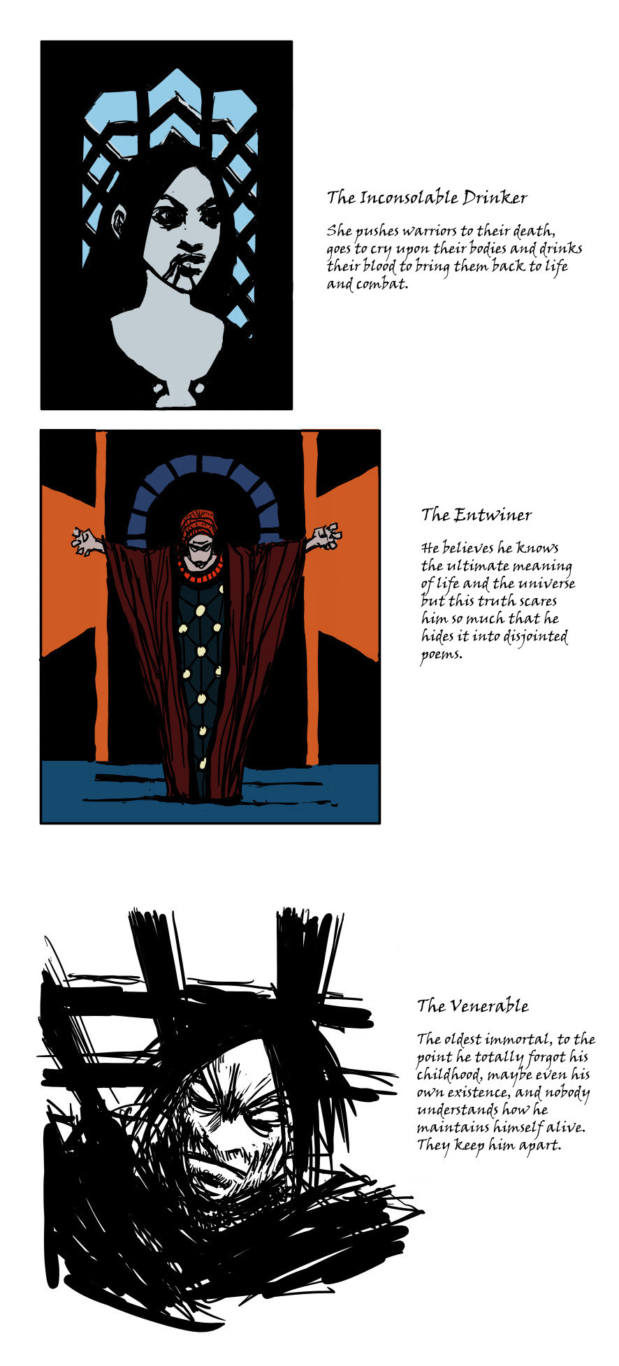
I dug up a few very old background data on this comic project. Some more immortals:

This is scene 7, insanely condensed. Normally one would follow Zaitun from the garden to inside the inn and his thoughts on the situation, to get to know him and the place better:

Posts: 3,361
Threads: 37
Joined: Aug 2013
Reputation:
234
Did you though about mixing narration with still image.This is specially a great idea if you have a good voice but yea you would still probably need to write down your text so it not that great of a time saver when i double think about it.It just an option to generate interest toward your comic using website like youtube to gain traffic.
Here and example of what i mean.
Skip to 0:30 to see an example of what i mean.
https://www.youtube.com/watch?v=Y2785k2xXWM
Posts: 76
Threads: 1
Joined: Oct 2019
Reputation:
5
This reads really well, both words and drawings.
I agree that a lower angle on the inn could work better, but for the room, I love the birds eye view (dunno if that's what you meant with 'eye is way too high'?). "This better do", instead of 'For the dinner' might work for the condensed version to show the relationship these 2 have going?
The inktober, well, you did them all, right, pretty funny, lol. 
Posts: 316
Threads: 3
Joined: Sep 2019
Reputation:
23
Hi Leo Ki,
Thanks for your comments in my sketchbook.
I only had a a little time to scroll through some of your work on this page but really like the world/story you are creating.
I'll come back soon when I have more time and will give everything a better look.
Thanks again
Posts: 151
Threads: 2
Joined: Oct 2019
Reputation:
20
Yup! You got it right! Spanish. French huh!? I know a bit of french! Very little. I guess we could swap languages! ha. Joking.
Yeah I started to realize this kind of format was the new digital format for phones? Like you say. I haven't seen webtoons or read anything using it yet! I'll be on the lookout.
So is it about vampires? Because of the Inconsolable Drinker. Or does every immortal have their own quirk, needs? More like folklore gods then?\
I think I like it more with that shade of brown rather than plain gray or monotone.
Well it's alright to make a slow paced story, I just think first is best to focus on moving everything fast so you can get a better picture of the whole. But maybe you already have maybe written all the keypoints of your story? Don't show them to anyone! Ha. Just trying to give the advice, don't get caught on the details too early.
Posts: 369
Threads: 6
Joined: Sep 2019
Reputation:
23
@darktiste
I'm not sure I would be able to create such a video. I would actually love to make a full animation for one of my projects but this is even more time consuming than a comic...
@Ash
I would keep the high angle but put the eye/camera closer to the ground with more foreshortening on the characters because the ceiling is not that high, although I'm afraid this change would lose a good part of the room and showing what a box it is.
In the condensed version I'm not sure "This better do." is clear enough to show they are about to prepare the dinner, unless I make the image more clear. But in a more detailed version and dialog this is spot on! Thanks!
@Jephyr
This thread is here to stay so you are welcome back when you get a chance.
@Rotohail
Se puede intentar! (We can try!)
Have a look at webtoons.com or tapas.io - you may have to search beyond the featured series to find something of your taste. I can recommend you a few if you wish.
No vampires indeed in this story, the Drinker rather creates disposable zombies of sorts, she's addicted to mourning because of her personal story. The immortals are a bit like the heroes or half-gods of the old mythologies but with a much more realistic life and mindset.
Yes, I have all the milestones of the story written but contrarily to my older projects, this one started as a careless improvisation meant to change my mind. It ended up as a giant world and story like all the rest. Ha...
Now for something totally different...
My apologies for abruptly derailing but I'm reconnecting to all my old projects, and one of them suddenly took precedence. It is a science-fiction story that takes place after a nanotechnology world war left the planet, its space stations and the moon in a worse state than a nuclear and biological war would. The nanobots accidentally created a vigorous neobiotic form of life that is threatening the biosphere, and rogue AIs are starting to wake up. This started as a novel before I switched to comic.
I am trying to reproduce the graphic style I was striving for, and failing at it with this first series of sketches:

I can't find all my archived files but I made a compilation of the "least worse" ones that I could find, as a reminder to myself and a project context to you all. The more "recent" ones are first - although they look centuries old to me. The very last few are from in-between.

Posts: 51
Threads: 2
Joined: Nov 2018
Reputation:
1
Hey! Nice drawings!! Iwould like to give you some advices:
Study the drawing fundamentals, colour theory and composition. You will find easier to imagine those scenes. Here you can find 2 websites with good quality content https://www.ctrlpaint.com/library and here about drawing fundamentals: https://drawabox.com/
You need to start somewhere, hehehehe.
Keep it up!!
Posts: 151
Threads: 2
Joined: Oct 2019
Reputation:
20
Cross-pollinated reply from Fedodika's SB lol! Yeah! It was CLIP studio rulers. I started doing the perspective exercises last year on Photoshop before swapping to CLIP, and while I managed it was a chore lol. Photoshop's snapping to forms was rather useful though, also measuring angles and distances tooltips. Studio perspective rulers are mindblowingly useful, but at the same time I lost that mechanical functionality of measuring and snapping Photoshop had! A trade off.
I found a way to make it work though! Mostly using the page rotation ha to keep track of angles. But if you just want to lay down some VPs quickly for a reference shot. Clip is stupidly good! Also the other rulers, I'm starting to use them more often, like the symmetry one? Great for design.
Pues lo intentamos! (So we try!)
Actually I caught a translation you made on someone else's SB and it was pretty damn good! A little Spanish, you got me fooled. That's pretty much native! I can't even do the above sentence on French... lol. Hopeless!
Please do, I haven't used the sites yet!
I actually talk with someone that has the same issue, they write stories and it always blows out onto a whole new world, or dimension or multiverse lol. Madness. I can't even manage to write a weeks worth of time inside a story!
So from the description I would had though the story would be more dramatic or dark on this one but you have quite a bunch of vibrantly colored shots. So it's a more uplifted story? Or are you thinking the palette might not be suitable and that's one of the reasons it might not be working for you? I gotta say some shots are pretty good like the orange suit character floating in space, with part of earth, the purple and blue character with their backs towards the viewer, looking at the sky, talking.
The first shot I would advice framing it further away, so you can show the wasteland better and have the character become smaller (more dramatic). Or do initial shot like that then zoom in on a smaller panel closer if the emotions at play matter.
I'm having a bit of trouble following what goes on from after the spacecraft crashes and they peek out, then go back in, forward, so I guess those are snipets of the rest of the story. The character dynamics are a bit unclear to me, like who are the heroes, who the villains, or their roles on the story? If that makes sense.
The shot of the machine climbing, could use more punch, and change the angle I feel, sideways feels a bit like comedy to me? Or a gag. The shots with the 3 characters with backs against one another is also pretty damn good. Oh the green one with the character naked ghost in the shell vibes lol! Having influences there?
Anyhow! Keep it up!
Posts: 369
Threads: 6
Joined: Sep 2019
Reputation:
23
@Matheus:
Thanks! Yes I need to get back to the fundamentals since I'm trying to draw again.
@Rotohail:
Thanks for the tips! I use only Clip Studio nowadays and I should explore its features more. Previously I used openCanvas and the GIMP.
Here's the trick: I can build a Spanish sentence that doesn't look too alien but I need the dictionary at my side - I lack a lot of vocabulary and forgot what I had. Pues lo intentamos! = Alors on essaye! (alorõnesei)
Here's a few titles to get you started on vertical comics:
https://www.webtoons.com/en/super-hero/o...le_no=1450
https://www.webtoons.com/en/sf/aphrodite...le_no=1451
https://www.webtoons.com/en/romance/lore...le_no=1320
https://tapas.io/series/fisheye
There's also classic-paged comics that I like there.
Good catch on the mood conflict in Shunran. The initial novel project was extremely dark, but it turned highly satirical in its comic form. How many versions did I try... One hell of a project, which is why it may never be born. Thank you a ton for the comments on the old and new sketches. I will get back to this later next week and explain a bit more. They are random pages and sketches indeed.
For now I just wanted to drop archives from another project that I think would really work only as an animation. This one also started as a novel. As a series of novels more precisely. Stories set in a world that is not a planet, some stories in a tiny place of it that looks somewhat Earth-like.
Below are sketches of one of the stories, Keis the Mapmapker. The first sketch is my first digital drawing, on Windows Paint with the mouse, lol.

And while digging through my archives I also fetched a few random pieces, chronologically ordered from 2005 to 2010 or so, as a brief summary of my journey:

Posts: 369
Threads: 6
Joined: Sep 2019
Reputation:
23
@Rotohail
Here is the additional info on Shunran that I promised you; I was too exhausted the other day to write more. The samples I posted are very haphazard, hence the confusion. The main character, Squirrel, is a biologically enhanced soldier sent in a disciplinary section on the only remaining space station, cleaning orbital junk and dreaming of going back to Earth. She is the girl in the orange combat suit - a nanotech suit that is very alive. I wasn't aware of Ghost in the Shell at the time but this kind of ideas goes back to the beginnings of science fiction. However, I had a character called the Puppeteer, and I discovered Ghost in the Shell had a very similar one with the same nickname, which spurred me to change things a bit.
The other main character, Harlequin, is an artibiotic being, an extremely smart, rogue AI that starts out socially inept and ends up teaming up with Squirrel for an evasion to Earth where life is even harder than in space. There are many characters in this story and they are not fully bad or good guys, they just try to survive in a harsh environment. Plus everybody was traumatized by the war which wiped out most of the humankind. Some, such as Squirrel, are also traumatized by their life before the war.
The main difficulty of this comic is that technology is nanotech and not bare metal, which requires an enormous concept research and difficult visual work. Also, society is nothing like what we usually see in science fiction and it makes for a hard to grasp atmosphere. I hope that helps explain a bit.
---
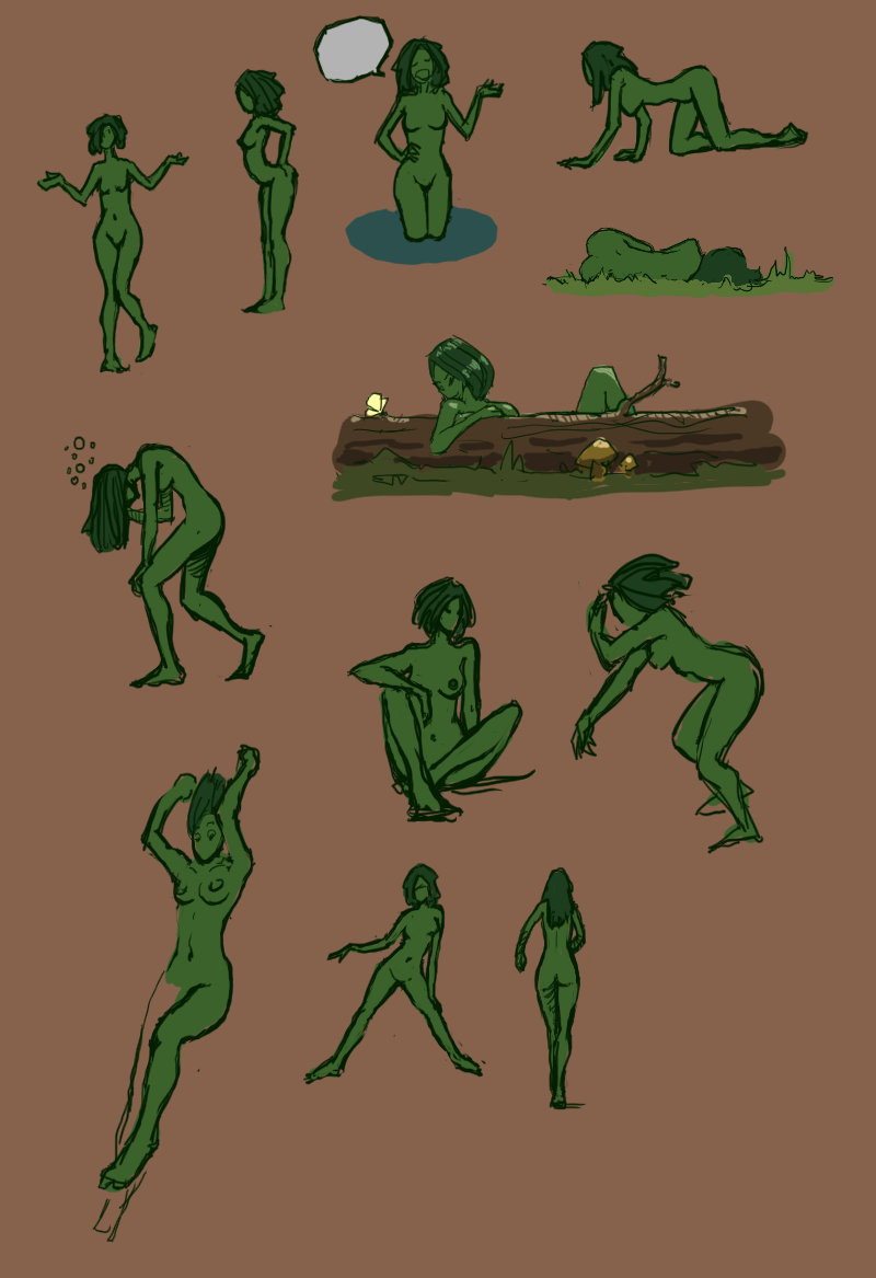
Going back to the basics, exploring attitudes for a character of an old side project, Chloe the dryad:

And the obligatory dump of archives as I reconnect to my past. Below are sketches and layouts from around 2008. This project, just like Burung and Horchata's project, was initially a side project to work on something small, but when I began to imagine the lore of all the region and several episodes, I abandoned it to prevent my head from exploding.

Posts: 316
Threads: 3
Joined: Sep 2019
Reputation:
23
Hi, Finally had a moment and decided to give your thread a better look.
I kinda do a form of “automatic” drawing you refer to—when I lightly scribble randomly in my sketchbook and look for ideas from them (although I then spend a fair amount of time then refining those concepts).
I like to see when you add more volume to your forms with hatching and contour shadows etc—but understand your disclaimer about feeling burned/burned-out and just enjoying sketching.
Your artistic ability is evident in your studies—ie the horse face/eye on page one—and your “archive” work gives a big hint at what you can do when you put a little more polish and color on your panels (ie the Mapmaker).
It’s good to see you experiment with over-head views, character placements too (foreground/background mix) and love the bold spontaneous looking “Venerable.”
Anyway—no critz for now from me—just encouragement to keep doing what you enjoy.
Ciao fer now
Posts: 369
Threads: 6
Joined: Sep 2019
Reputation:
23
@Jephyr:
My automatic drawing period only lasted a week or two unfortunately, it was an experiment to bypass any planning after a decade without drawing. Old habits took over quickly and I have a more and more clear idea of what I am going to draw now. When I trained in the 2000's I observed that the more accurate I grew, the less spontaneous I became - the Venerable's wild strokes being an exception as you noted. I would really like to reconcile wild spontaneity with precision, not sure if this is possible.
There is an urban legend running in this thread that I was burned out but it was not the case. When I realized that making a comic is a full time job that generally does not pay the bills, I lost interest in telling my stories - and drawing - ten years ago. Now I'm obeying an urge to express something, not quite sure what yet.
Thank you so much for your comments and encouragements. I am now trying to get back to painting, which I used to love, and abandoned because a painted comic takes even more time.
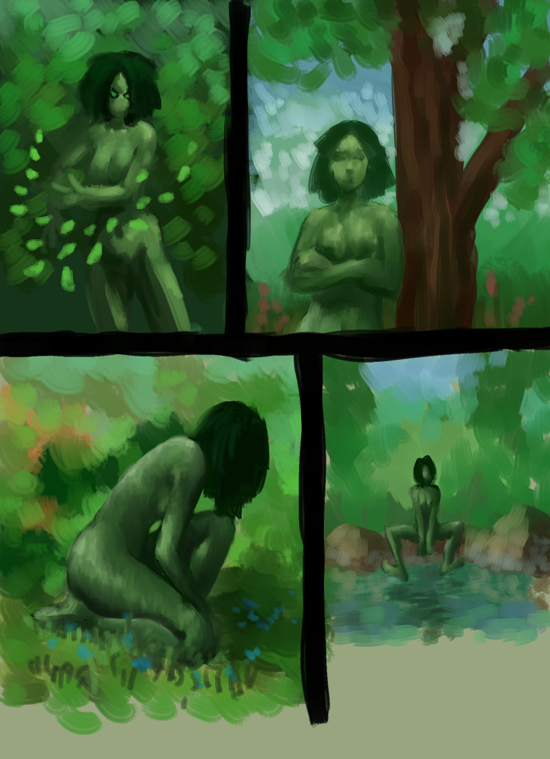
More attitude research for Chloe the dryad. How much am I struggling with the paint thing... You can pick up riding a bike in a few hours after a decade without riding, but painting is another matter... I am aware of many shortcomings in all these half-done images and will try to return to them later.

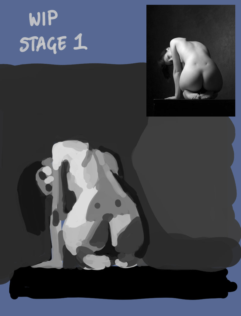
And here I am trying to do studies again. I never pick artistic poses for study but this one is natural enough that it could be in a comic panel. Author unknown, I found the photo on quickposes.com when doing speed sketching. Does anybody know?

Posts: 151
Threads: 2
Joined: Oct 2019
Reputation:
20
I checked the links and damn! Outrage and Fisheye are probably right up my alley. Fisheye the visuals! Holy cow, loved the datacube head split. I gotta say the mask is Darker than Black rip-off lol. Outrage! I'm gonna read!
The first page with the non-planet world you mention reminded me of what happens in the 100th! Ha, gotta love those. I would say designing the flora and fauna would be a challenge, to make it both interesting and alien-like, but still fitting inside an ecosystem. Maybe I overthink things!
Oh noes! Bird stole my heart, damn! The emotion, love it. 2005!? So long ago... when did we get to 2020!? I want my time back.
About Shunran ha ha! Happens all the time! People get similar ideas even when they don't know of each other, there's a term for that but I can't recall. Honestly you shouldn't feel the need to change it but yeah, some people might judge it because of it, whatever comes after. But there's no truly original idea so just put a nice spin to it, or make it fun! And that's all.
Well making something all that complex can be a challenge to keep readers on point, tough call. Complex morals, character dynamics and goals, world that is not easy to grasp, enemies that work in a never seen before way, focus could be split too much. I dunno though! Until you see it at work, only you can imagine it. Ha.
Chloe I would say, make her design a bit more plant like, like if a character focus is to be something, just giving it a green color and making it a normal shaped person, is a bit boring to my eyes. Have some nodes or growths or plants or just change the silhouette. Once you have that then, go into making gestures, because it will affect the way she acts. Like if she can't do an action or an action affects something about her, like if she had a growth of some plant, it could change shape with her emotions or add to the action, or i she doesn't actually have feet or hands, can't do certain actions and you must act them out differently. Designing a character is always tough to me though.
Interesting point, I actually relate with what you mention with studying. On the one hand when I started doing studies and painting back in 2013 it was a terrible time and got burned out, lost all my drive to draw alongside my arm lol. Doing personal work is more engaging and fulfilling, to me at least, but also having been a while since I have done serious studies I feel I need to find a balance once again. Depends on your goals and what you want to improve at, other things will drop a bit. But so long you can tell there's stuff you can improve/work at, then is good, because you have goals and targets to hit. Is actually not knowing what's wrong what is scary, because if something doesn't work you don't even know or understand why, man, that is hell.
Okay! Picking studies! I would say try to make shapes a bit more clear than just blobs, but not too detailed, if you want to go for analysis, just make them a bit more characteristic? If that makes sense, or geometric. Anyhow, keep it up! Let's find the way to make this work!
I also apologize, I feel I should be giving you encouragement and some more positive comments on what you have! I would say the dryad with the creature near the fire pit and the 3 panels following are the ones I like the most, for composition and color choice!
Posts: 316
Threads: 3
Joined: Sep 2019
Reputation:
23
Man I gotta say I agree with Rotohail—Fisheye is awseome!
Sorry to contribute to the urban legend about you. Glad you're hearing the call again. Similar things have happened to me creatively—but in spite of it all I can't help myself. :)
The somewhat mono-chromatic images above are cool. The form of the woman in the lower left is very good.
Keep 'em coming
|


