06-28-2023, 01:05 AM
The shortest way to improvement is targeted study repetition and revision and a dose of dedication.
|
Nirenia's Sketchbook
|
|
06-28-2023, 01:05 AM
The shortest way to improvement is targeted study repetition and revision and a dose of dedication.
06-28-2023, 02:11 AM
ognjiša, thank you for pointing that out.
ThereIsNoJustice, thank you for pointing the hips out. I'm going to see if I can fix the porportions in the hips. darktiste, I completely agree with you; I need to do more studies.
06-28-2023, 03:32 AM
Nice work! I would say don't neglect painting. Also take some of your pencil drawings and get yourself a lightbox from art store on scan in and make some confident black strokes to really solidify your concept. Make sure to draw completely a full character and then whatever part you struggled on set time aside to do isolated studies on those areas. Example draw nothing but hands build that muscle memory and do the anatomy studies in general will only make your work stronger.
Front End Developer by day but an Artist by Night
"Artists help artists" My Sketchbook | Artstation | Instagram | Youtube Lets Learn 3D
06-28-2023, 03:50 AM
nufftalon, thank you, I definitely agree regarding the isolated studies and the light box; I could vary the line weights and tones to give more depth and make the lines more crisp and calligraphic with one.
I tried rendering a bit. It isn't polished; I just wanted to get a rough preliminary render in, and see what I'm doing alright and what I need to work on. 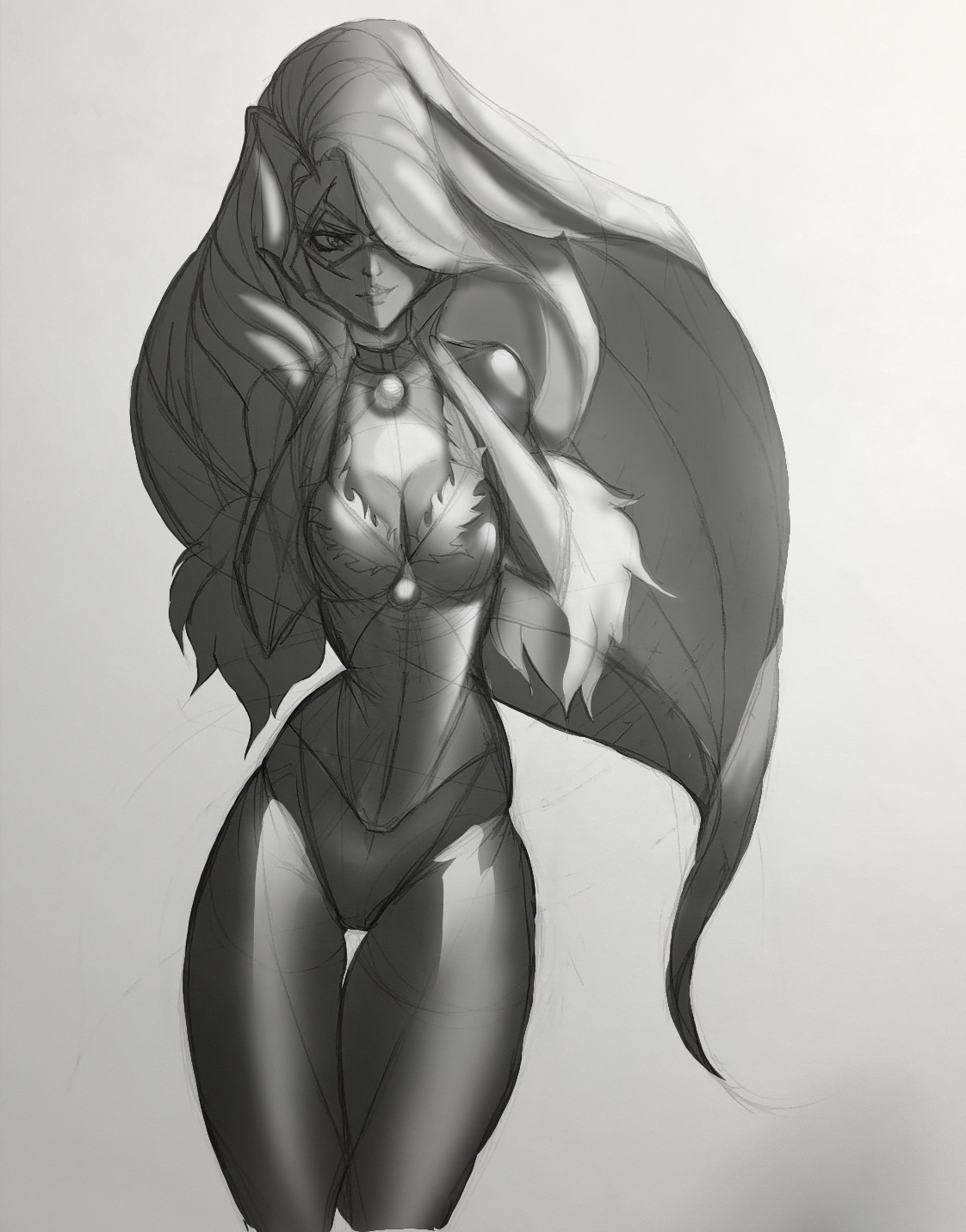
06-28-2023, 04:35 AM
(06-28-2023, 03:50 AM)Nirenia Wrote: nufftalon, thank you, I definitely agree regarding the isolated studies and the light box; I could vary the line weights and tones to give more depth and make the lines more crisp and calligraphic with one. Looks good so far...you just want to be mindful of your darkest darks and lights lights and mid values and make those shapes pop define and refine. We start mid like 50 percent so we don't get too dark or too light too fast. I think you could benefit from some value studies from old masters just take a photo with good composition and anatomy and make it greyscale in photoshop and use just a square or round hard brush and do a thumbnail value study quick 20 minute studies, and if you want maybe one at higher res where you really go in but challenge yourself one hard brush to rule them all:) (Lord of Rings reference) Also just doing this with simple primitive shapes is great practice as well.
Front End Developer by day but an Artist by Night
"Artists help artists" My Sketchbook | Artstation | Instagram | Youtube Lets Learn 3D
06-28-2023, 05:19 AM
Welcome back. I don't see why you should feel embarrassed, unless you feel like you haven't made as much time for drawing as you "should" have, maybe? Which is an understandable feeling, but no need to feel embarrassed; it's rarely something that can be helped.
Your latest drawing certainly looks more fluid and relaxed than the ones in your original post. You did a good job of blocking out the lights and shadows, and the stylization is really nice. It's a very pleasing-looking drawing overall; I particularly like how you drew the shoulders and arms. I think the contour of the hips and waist could be more realistic, so I did a paintover to try and explain. Also, feel free to take this with a grain of salt, since my paintovers tend to be more like "this is how I'd draw this" rather than "this is a better version of what you were trying to draw", but I tried to minimize arbitrary changes. 1. I thought the ribcage looked a little out of alignment below the breasts, so I added more fullness to the right side (our right) to try and make the tilt of it more clear. 2. I made the transitions from the ribcage to the waist and the flank to the hips little more gradual because I thought that might look nicer, but it's your call. 3. There's a strong tilt to the hips in this pose, but I thought the shading and contours needed to be adjusted to make that tilt more obvious. Minimal changes, but I thought it made a difference. 4. I made the contour of the right thigh (our right) more symmetrical with the left one because they're both in basically the same position. Let me know if this was helpful or totally useless. 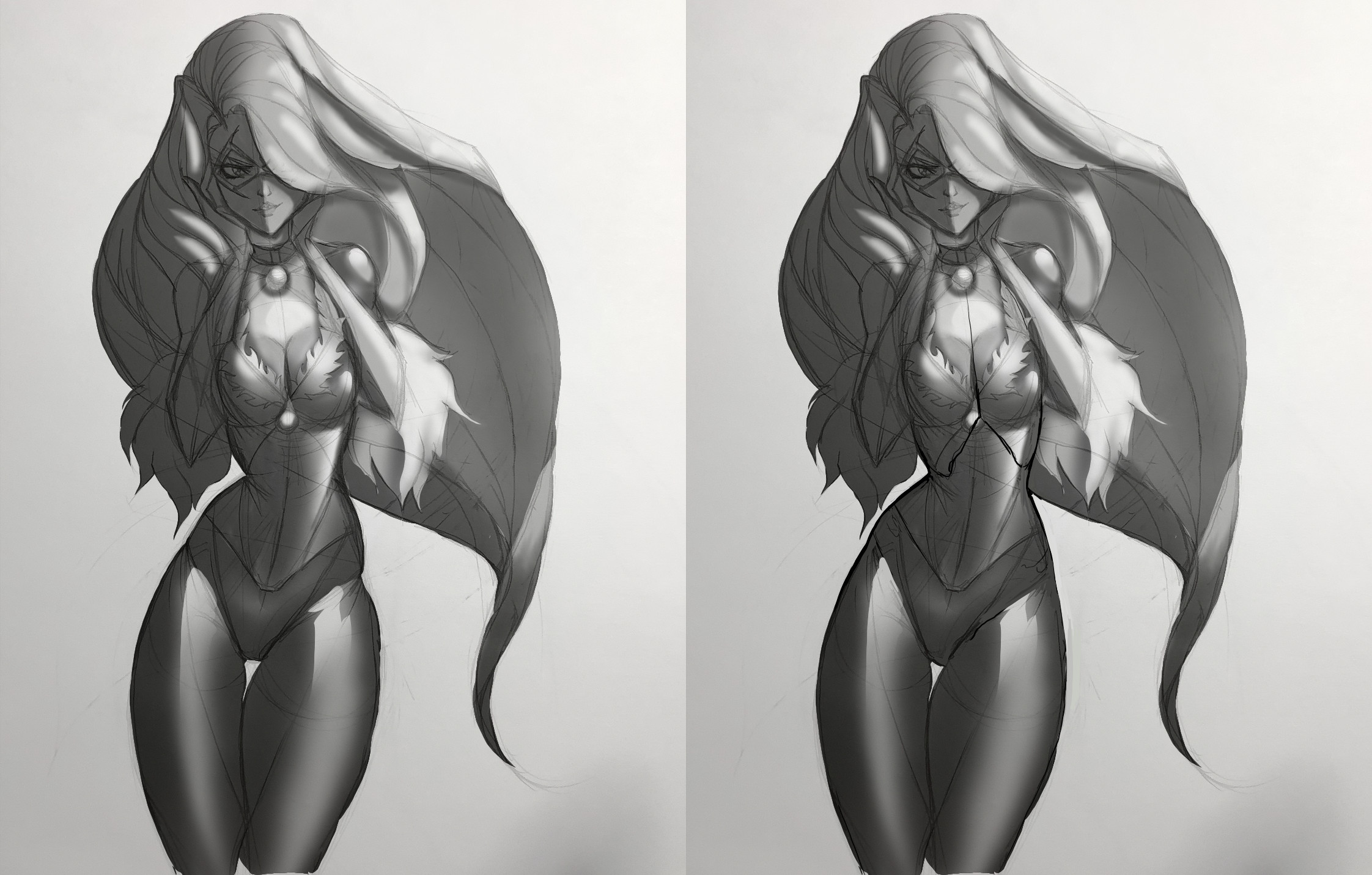
06-28-2023, 05:57 AM
If you do targeted study you gotta remember that it not enough because of proportion it as to be expanded into being intergrated with the rest of the anatomy.
As for how to pick a good reference well you gotta understand image exposure and image quality for example it would be a bad idea to take an over expose image to try to learn about texture unless it a case specific composition texture is one of those subject where you gotta study the texture under different lighting scenario. Just because you draw something doesn't mean it behave the same way everytime that the problem with color and reflection and as i said texture.For anantomy it also about learn to draw the different part with twisting and with bending and also to learn to imply weight by how much the muscle flex or contract etc. Nothing said here is related to anything you have done so far it more a reflection on some of the thing being said previous in the sketchbook.
06-28-2023, 06:50 AM
nufftalon, thank you for the advice. I did try the value studies from the old masters a while ago for a Noah Bradley art camp course, they're below. I think I used 3 for each? I do find them helpful. This piece I just posted (I think) looks saturated because it's below a scanned layer that isn't transparent. Without the pencil layer, it looks like this:
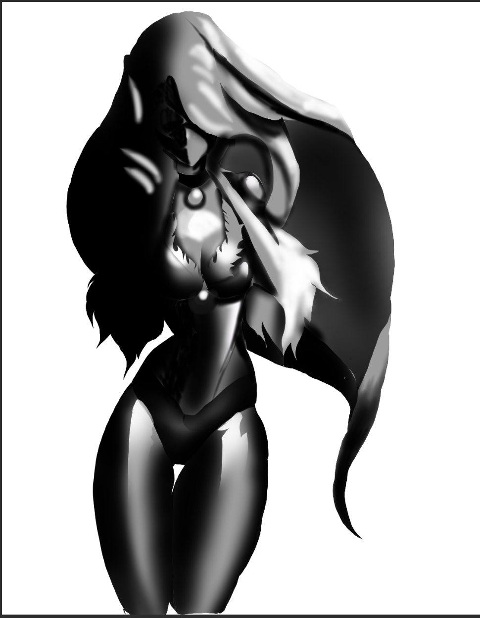 When I look at it, it could use more tonal variation. Here's the value studies: 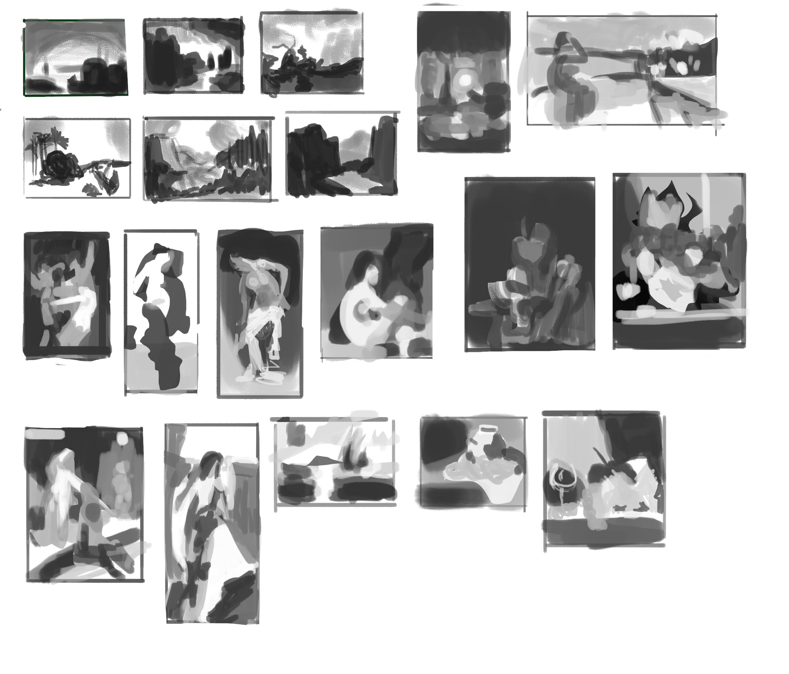 Pubic Enemy, its good to hear from you again :) I think the paint over version looks a lot more pleasing to the eye than the original. The torso looks more believable than the original too, it also made me realize that it looks better without the hip dips. Don't worry, I found this very helpful. darktiste, thank you, that's very good to know, I'll keep that in mind.
06-28-2023, 07:06 AM
I tried reworking it a bit (using the paint over [thank you Pubic Enemy]), by playing with the contrast and brightness sliders. Hopefully the variation looks somewhat better.
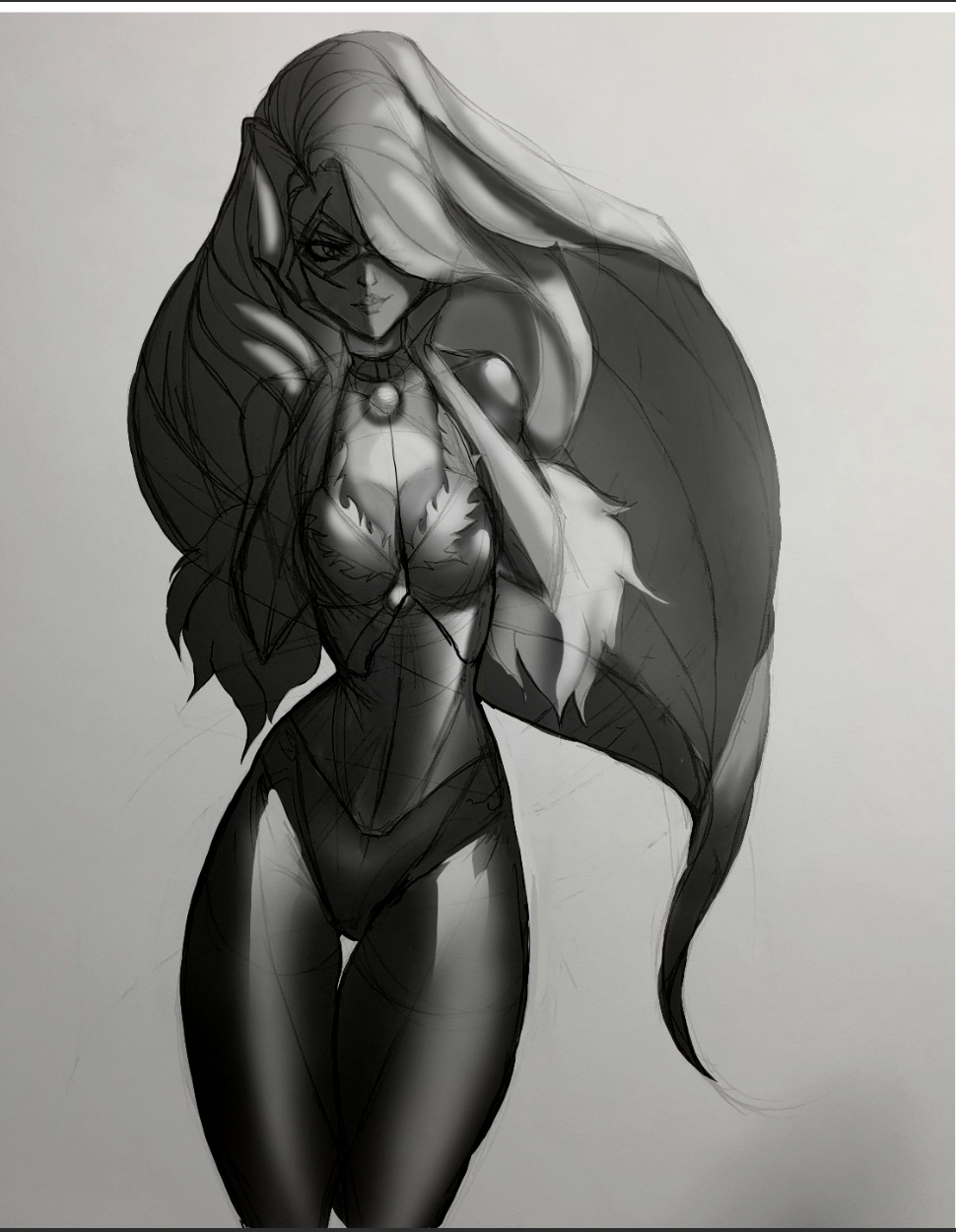
06-28-2023, 08:20 AM
I flipped the canvas and
 . I'm going to do that more often... . I'm going to do that more often...
06-29-2023, 02:04 AM
Haha. Try not to be too discouraged by the flip. Some of that "OH MY GOD IT'S HORRIBLE" feeling simply comes from the fact that you were looking at in the original orientation for so long. When I flip drawings or paintings by other people that have noticeable wonky bits and misalignments, they never look as bad as my own do when I flip them.
One thing you can try is flipping with some frequency from the beginning. Also, in that piece, I suggest keeping the tonal variation in areas like the white hair more restricted, since the shadow on a light object will always be lighter than the shadow on a dark object. Unless you're going for a kind of lighting where there's no noticeable ambient light.
06-29-2023, 08:27 AM
You are doing great keep going maybe a little softer on shadow under certain areas and you don't have to go completely black to simulate a shadow, shadows are not as dark as we really think they are. Overall treat objects like shapes with light hitting them isolate them in a sense spherical objects such as breasts would be slightly dark underneath but it wouldn't be too high up either on how much of an area would be affected. Just keep going though love the progress.
A good study is the moon the terminator line the light and shadow things in light tend to be blown out where the line hits is where you see texture etc. A lot to think about it but when you do small practices you will build your subconscious when you attack bigger projects and know how to solve.
Front End Developer by day but an Artist by Night
"Artists help artists" My Sketchbook | Artstation | Instagram | Youtube Lets Learn 3D
06-30-2023, 08:23 AM
Pubic Enemy, I agree that looking at a piece for too long makes one a little oblivious to flaws. At first, I could vaguely noticed the asymmetry in the hips that ThereIsNoJustice pointed out. When I flipped it, I REALLY noticed it. It's good for self critique.
I tried less variation in the tones and rendered the hair a bit below. I hope it looks okay: 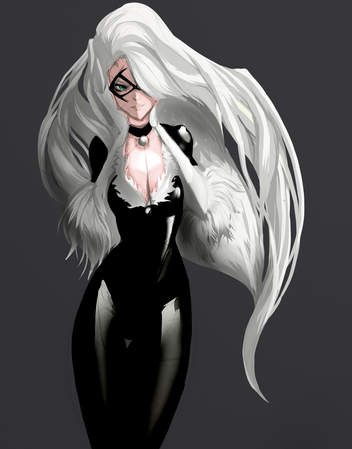 I used this hair as a reference for rendering: 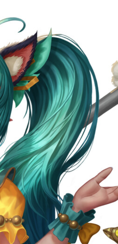 The artist is Lee Leon on Artstation. nufftalon, thank you. I'm going to try some more shadow occlusive shading when I polish it up. I'm just in the process of getting in details.
06-30-2023, 10:26 AM
Hi just one advise avoid 100% black unless you are in a close room with no window or door.Reflection is why i am saying this there is always light bouncing outside of the scenario in mentioned above.
Also if you can try to add a gradiant to any color if you want to go toward something that as more realism.As light bounce around it get absorb and you get a shift between the lit and shadow side of object.
07-01-2023, 12:21 AM
(06-30-2023, 08:23 AM)Nirenia Wrote: Pubic Enemy, I agree that looking at a piece for too long makes one a little oblivious to flaws. At first, I could vaguely noticed the asymmetry in the hips that ThereIsNoJustice pointed out. When I flipped it, I REALLY noticed it. It's good for self critique. There's one thing to keep in mind about flipping when you've been staring at a piece for a long time though, which is that it will make you notice flaws to an exaggerated degree. The flaws are there, and the flip helps you notice them, but they're not AS bad as they appear to you when you flip. That's why I wrote that you shouldn't feel too discouraged by it, if you are. The piece looks like it's turning out well to me. Hair is convincingly white and the highlights on her catsuit read really nicely.
07-01-2023, 05:55 AM
darktiste, I was looking at references of vinyl catsuits for the catsuit, when they're black they're pretty black. As seen below:
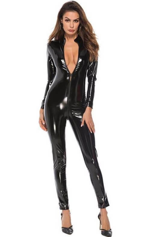 I do think that I could use a bit more tonal variation though, when I look at them again. I added a bit of rim light to it. Pubic Enemy, thank you, don't worry I'm not discouraged, it was more of an epiphany moment for me. I tried rendering the skin a bit, it's not perfect, but on the bright side, I don't have the lineart layers showing. I tried to make the face more readable with rendering and tonal variation. 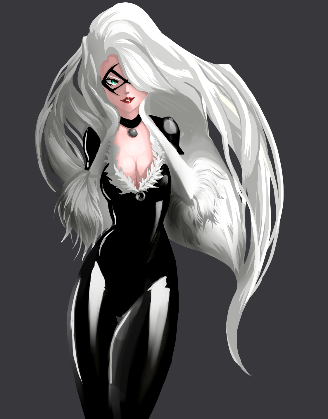 I think what I need to do at this point, to really refine the piece, is add more contrasting lines around some areas to really clean and sharpen them up.
07-01-2023, 04:39 PM
Getting there...

07-14-2023, 10:09 PM
It's the Black Cat! Love the character and love your work based on it. The way you handled the latex material is brilliant, extremely convincing and well thought out, bravo!
07-15-2023, 05:32 AM
It getting there but i think you need to work on your shadow to separate those white glove also for the arm you don't want that much contrast between the shadow and the light side because to a viewer it look like you are imply an edge so try to add more gradiant to reflect the idea of a curve surface.With only 2 tone thing can get really confusing that something that require a good deal of compositional skill and planning to achieve.The problem is when white portion overlap white portion without an outline it can become confusing.
|
|
« Next Oldest | Next Newest »
|