Posts: 88
Threads: 1
Joined: Sep 2020
Reputation:
7
Zorrentos : thanks buddy ! the lack of perspective is really strong on this one ! i am thinking about each body parts's perspective but i have a hard time making the whole figure fitting the same horizon line ! let's go practice that !
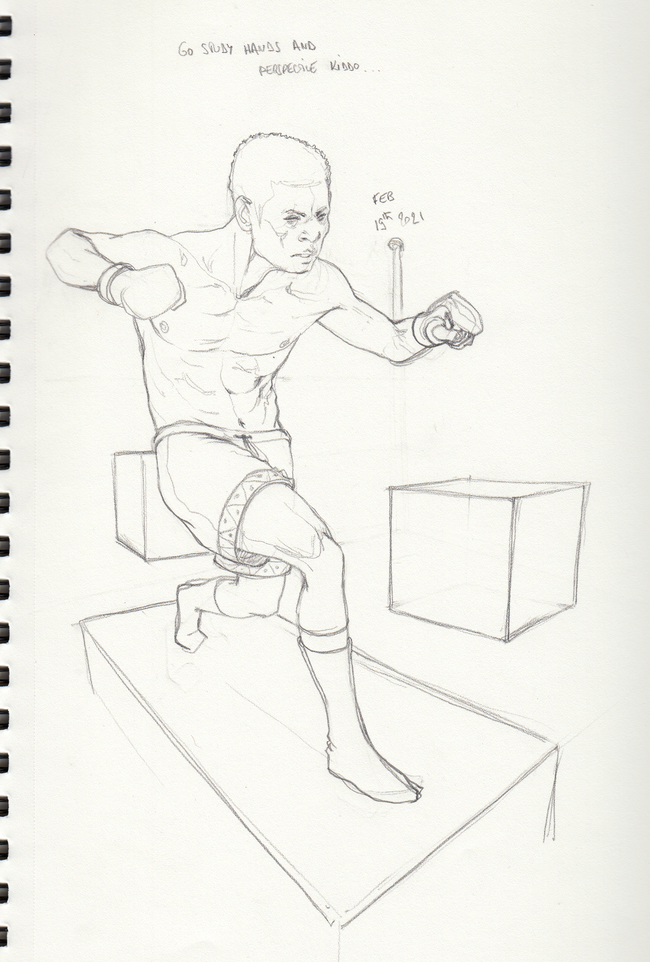
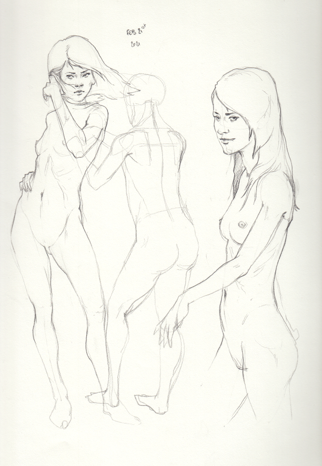
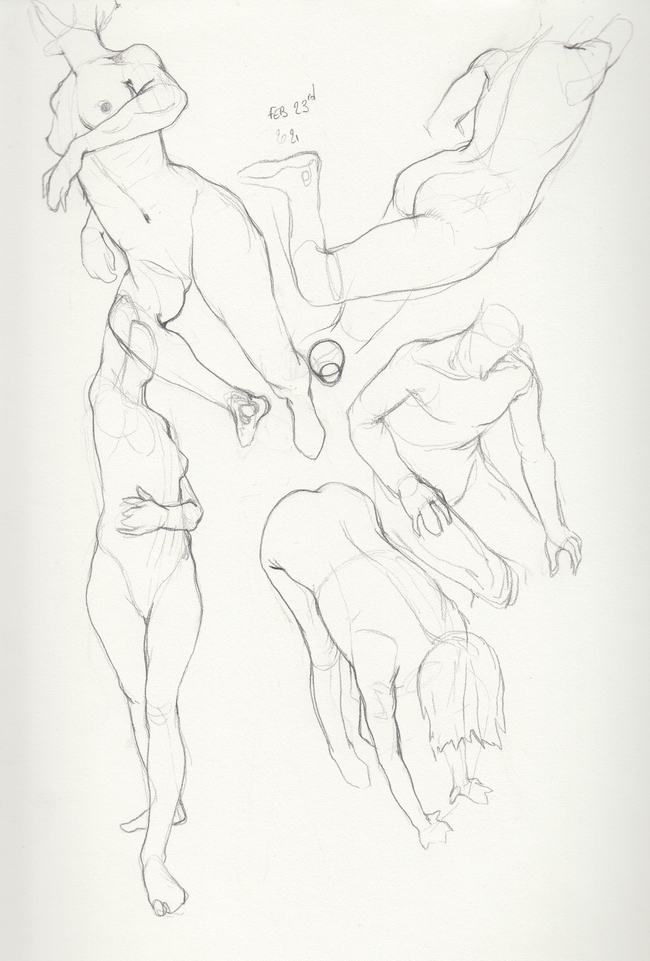
today's stuff, don't have much time, sticking to my routine exept for the sketchbook page that i did in about 20 minutes since i'm a bit in a rush today, didn't have time to fix the baby legs and pother proportions mistakes, and the pers is still mostly off, something i'll study this week end !! i really need to learn to take a step back from the paper and see the picture as a whole, something hard to do when i got my nose 3 inches away from the paper ...


Posts: 3,357
Threads: 37
Joined: Aug 2013
Reputation:
234
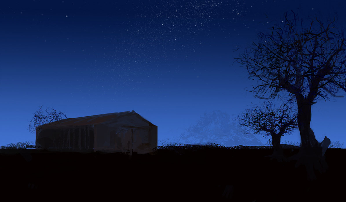
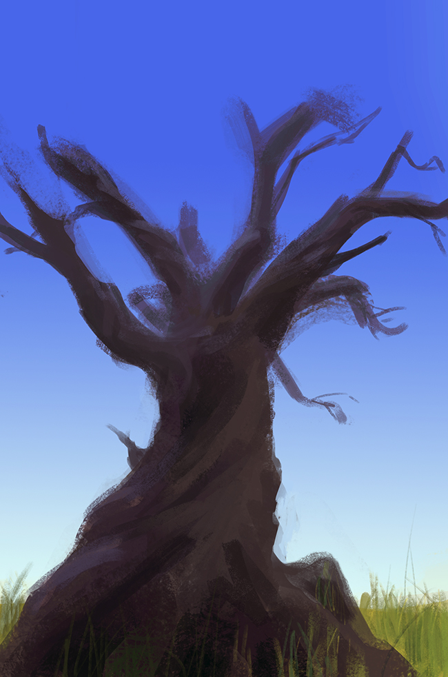
Hey i figure i would return the ball and come have a look.I will comment on the brush use .I can tell your using some kind of special brush and in your work they are apparent and clash with what is painted if not properly blended. I recommend studying tree the result will be much more pleasing to the viewer once you know how to do quick tree because you will be in control of every branch you put and you won't have to deal with unwanted placement and the result will be better.If you want to use tree brush i recommend you make your own tree brush pack and instead of a bunch branch isolate one branch.A good exercise in brush control is to be able to go from big(trunk) to thin(Branch).
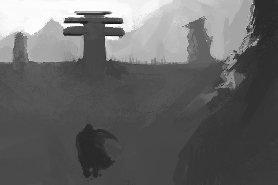
One an an other note in find the environnement piece to be quiet unbalanced specially in the left top corner i think the building could have took more space in height or maybe you could have place some of those mountain range closer for more visual weight in that space.I did a good deal of environnement study back in my sketchbook i recommend you go check. Are you aware of the principle of design?
Posts: 460
Threads: 10
Joined: Mar 2016
Reputation:
64
Your figure is looking way better on this sketch page!
I had some notes on your landscape sketch. I hope they can be of some use! : )

Posts: 88
Threads: 1
Joined: Sep 2020
Reputation:
7
darktiste : thanks man, Yep so much things to study , i kinda feel overwhelmed by the amount of things i'm far from knowing but will tackle one thing at a time ^^
Zorrentos : thanks man, still giving golden critics ! So good you should make people pay for that !
today's one of those shitty days when you feel everything you do is shit and your mind is running at 100 mph but you keep doing shit for nothing ... needed to vent ^^


Posts: 460
Threads: 10
Joined: Mar 2016
Reputation:
64
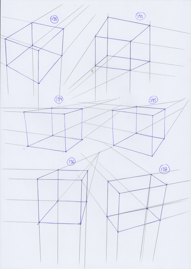
Hey man, your latest figure sketches are looking quite good! Same for the boxes.
As for your landscape, I feel it's hard to know what is supposed to be the focus/Story of the image? The guy? The towers? Nothing really stands out. Probably it's a good idea to start from the basics of composition and storytelling here and work yourself up from there.
Keep up the good work! I look forward to seeing how much progress you will make! :)
Posts: 50
Threads: 2
Joined: Feb 2021
Reputation:
5
Man! you have amazing figure drawings in here! Nice paintings also (are these from imagination?), keep it up !
Glad to see you're doing this crazy 250 boxes challenge, rotating these boxes in perspective is not easy. I'm starting Box number one today 
Posts: 88
Threads: 1
Joined: Sep 2020
Reputation:
7
Zorrentos : thanks, been starting to study the fundamentals of composition, hope to see some improvment soon !
Kassatay : thanks ! the most recent are from imagination but previous posts from last year have some studies from life too ! Good luck with the boxes challenge, it's really tiring and takes way more time than what i expected but it's really worth the effort, i've seen good progress since i started !
Mariyan-Hristov : thanks buddy, yeah my understand of anatomy sucks pretty well, it's just guesswork, i really have to put more thoughts into the construction and planes ! will check those courses out but i already have so much to watch already :D !
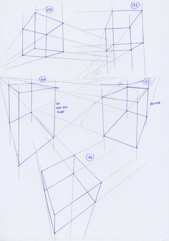
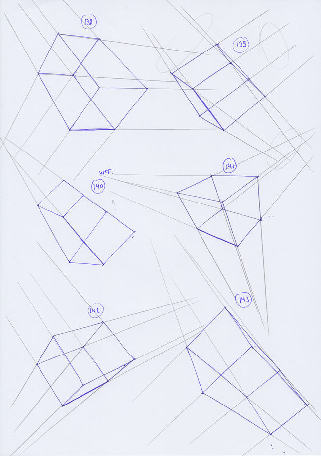
today's stuff, did something i should have done way earlier : take a photo and look out the vanishing points ! well i knew they were far but not this far, really eye opening to how i'm always putting then too close even if they're out of the page , i better understand why everything i draw is quite distorted !
for the painting sketch instead of focusing on tons of different things i just wanted to paint a tree. i really feel the need to go hiking when weather will warm up a bit ...


Posts: 3,357
Threads: 37
Joined: Aug 2013
Reputation:
234
Good to see your pick up the advise on drawing tree .I don't know exactly what brush your using but it leaving some ''artefact'' unecessary brush information outside your actual form.So be careful with the texture brush either use a mask or lock your shape it not necessarly wrong but it doesn't really work here in my opinion it look almost like spider web maybe you could try to utilize that would make for a interesting tree.Did you saw the place where spider have literally put there web all over the place it real stuff you can draw from.It always cool to include usual combination to create something truely unique.
Posts: 460
Threads: 10
Joined: Mar 2016
Reputation:
64
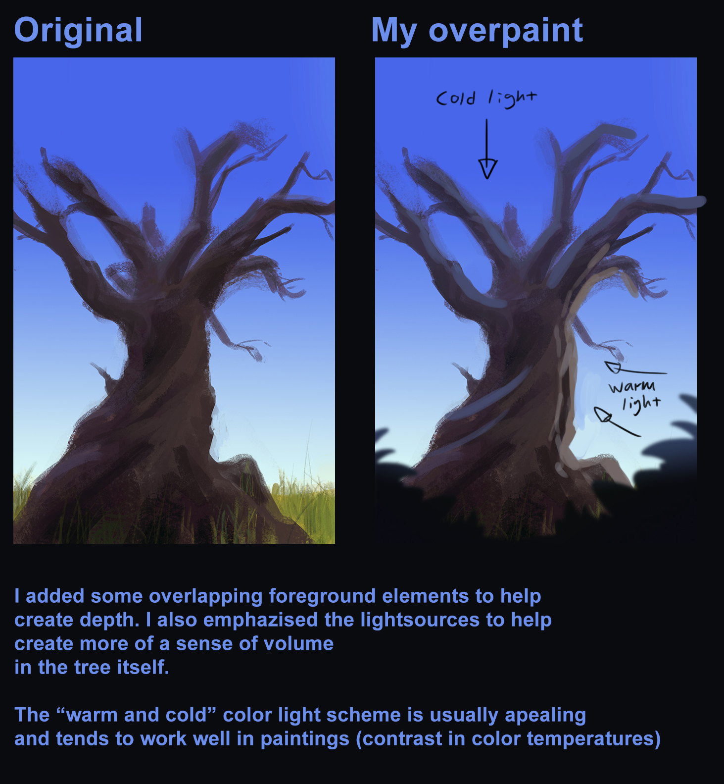
The last color sketch is looking quite good. I had some ideas that came to mind when I first saw it, so I made a quick overpaint. I hope it can be of some use! 

Posts: 88
Threads: 1
Joined: Sep 2020
Reputation:
7
Darktiste : thanks man ! yep i'm still experimenting with brushes and stuff, seeing what works and what fails ^^ i think the trunk isn't too horrible to see but the branches suck hard !
Zorrentos : thanks for the paintover my friend ! I think i really wanted to be subtle with the sky light falling on the tree but after checking some refs, yeah, you're closer to what it should look like !
today's stuff, been able to do a bit more than usual !
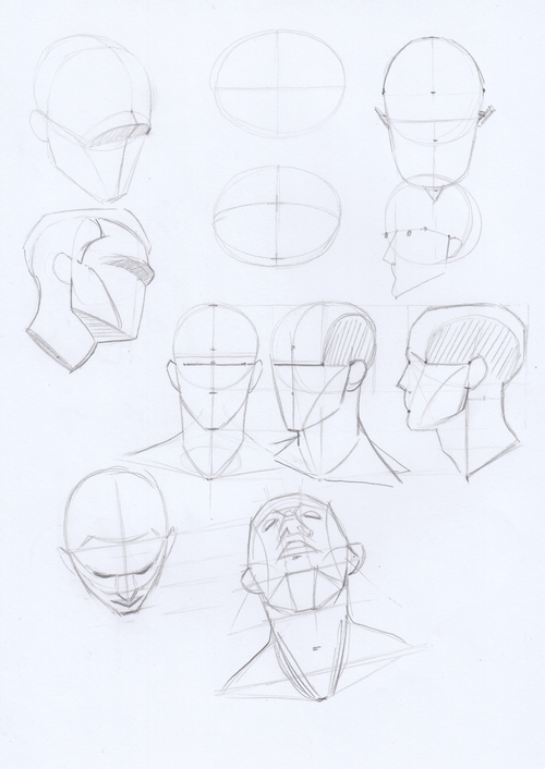
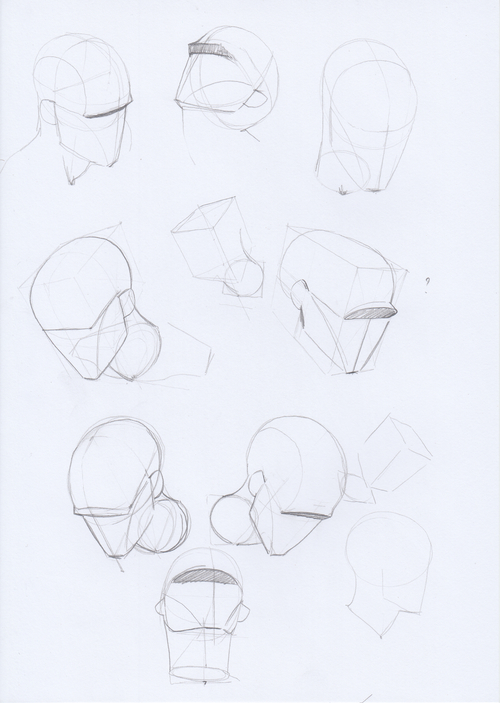
been doing a few head studies since i feel like i'm putting features quite randomly without thinking much about the construction, and noticed that i often draw the head too big compared to the rest of the body, need to fix that asap ...


Posts: 1,424
Threads: 12
Joined: Dec 2015
Reputation:
139
Hey wld.89 - nice going in here - I like how you're working on both drawing and painting in parallel - I feel like this will boost you into being a better all round artist.
Those boxes are looking awesome as well :) - one slight thing might be for you to use heavier line weight on the edges that are nearest the viewer - this should help with readability.
Keep it going dude - you're doing great!
“Today, give a stranger one of your smiles. It might be the only sunshine he sees all day.” -- H. Jackson Brown Jr.
CD Sketchbook
Posts: 76
Threads: 3
Joined: Feb 2021
Reputation:
6
Hey wld.98, looks like you are also doing the 250 Boxes challenge. I wish I already did as many boxes as you did though :D Keep it up! Your stuff looks nice.
Posts: 30
Threads: 0
Joined: Jan 2017
Reputation:
4
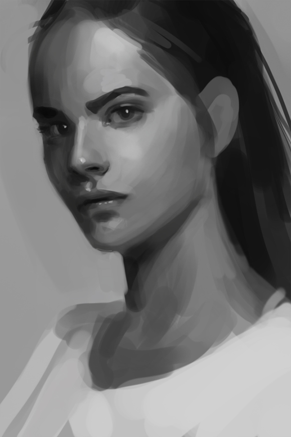
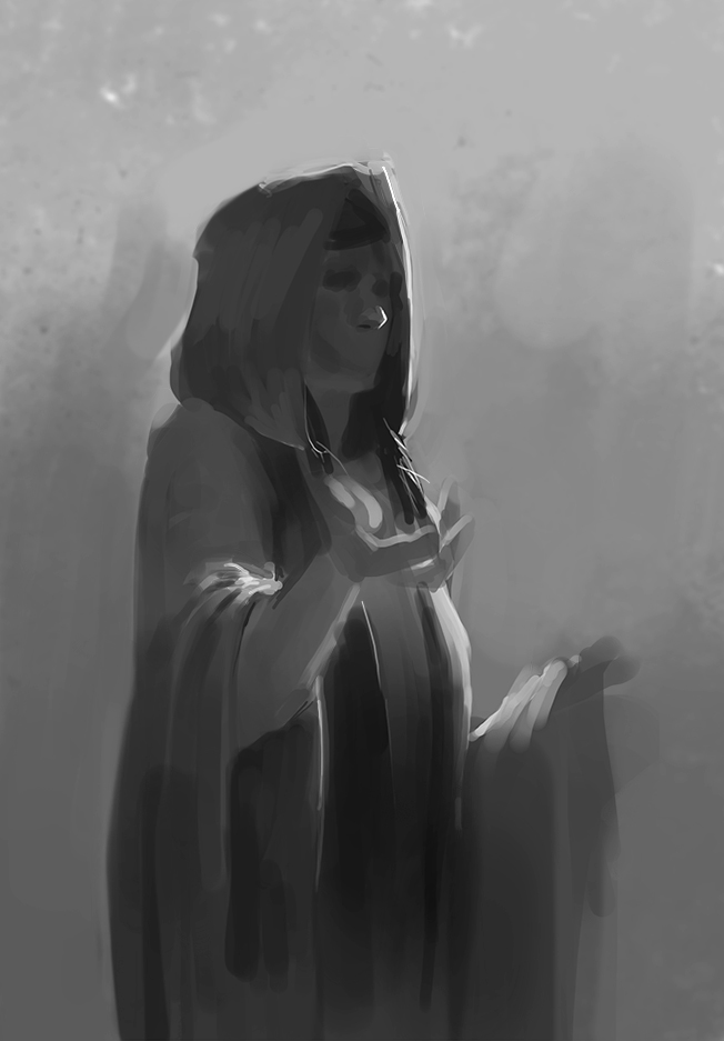
I really enjoy your recent studies! Especially the two digital b/w paintings. The lighting is really nice in both and adds a lot of weight to them already!
Keep it up! :)
Posts: 88
Threads: 1
Joined: Sep 2020
Reputation:
7
Artloader : thanks man ! Started to add more weight to the closer lines ! it reminds me that i need to work on my lineweight , they are too evenly throughout my drawings ...
Jana : Thanks ! Go for it, you'll see preatty nice results !
Kaiko : thanks man :D
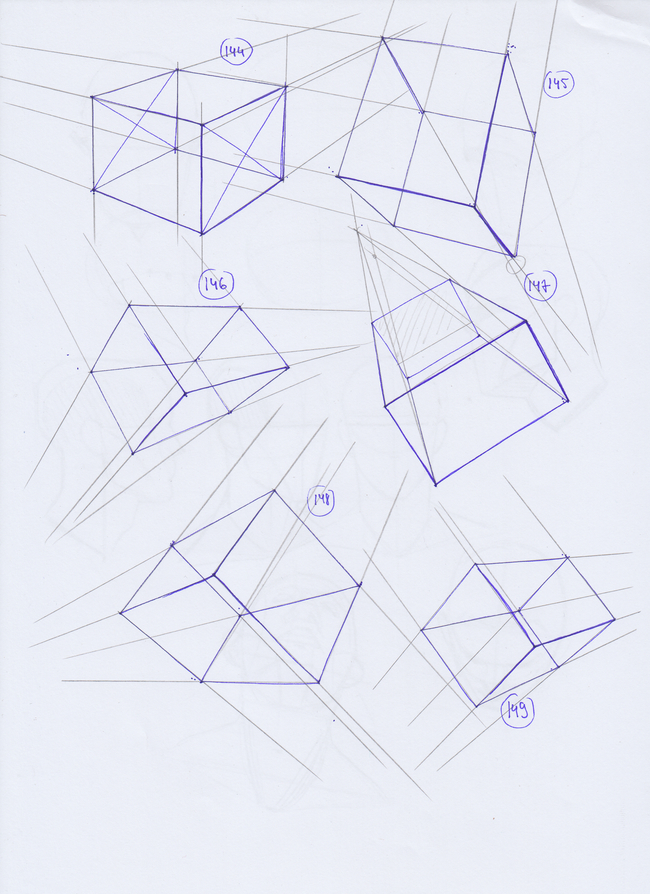
today's stuff, sticking to my daily schedule of some boxes ( still 100 to go ) one digital painting and one sketchbook page !
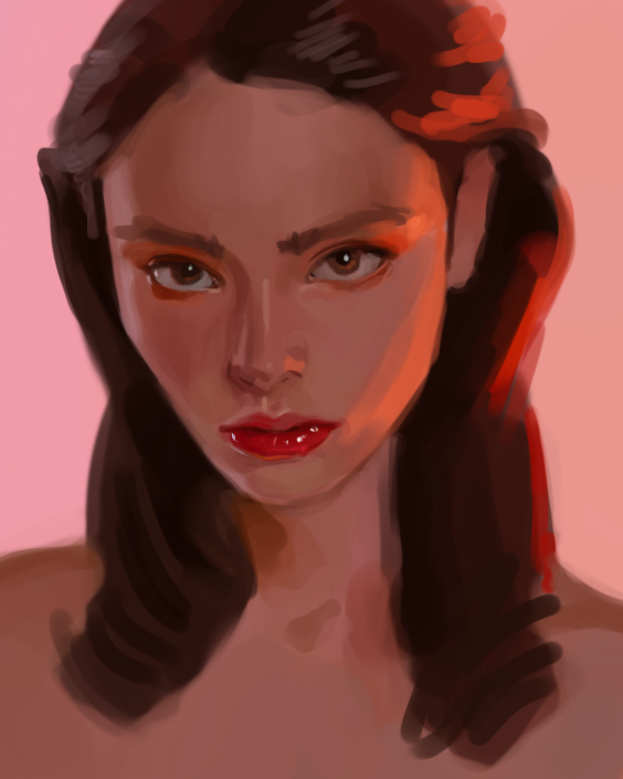
Feeling some microscopic improvments but better than nothing ^^i'm starting to visualize a bit more in term of space, and wanted to paint colors i don't usually use so here's a quick study ( around 30 minutes ) still looks flat to me, need to better understand how light falls on form ...


Posts: 88
Threads: 1
Joined: Sep 2020
Reputation:
7
today's stuff
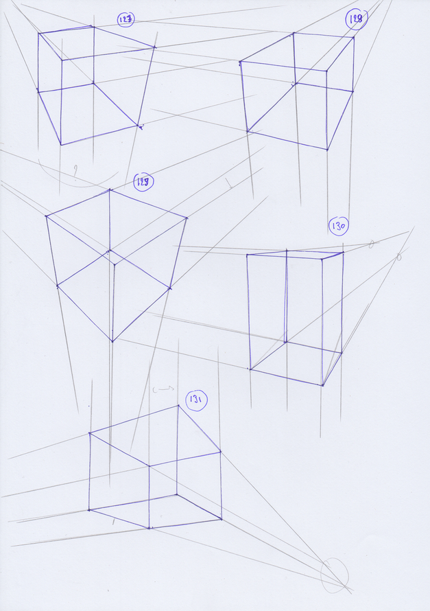
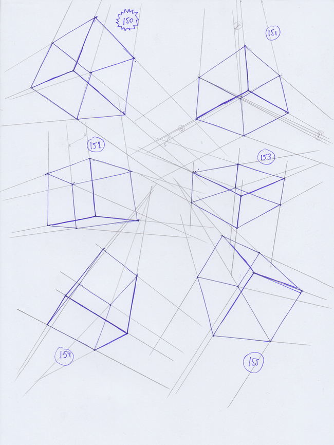
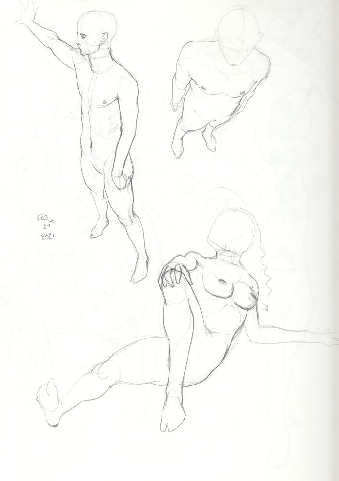
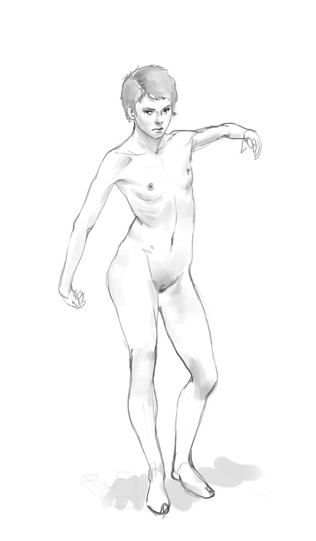
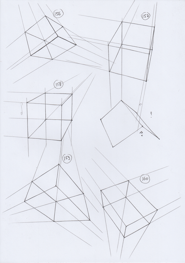
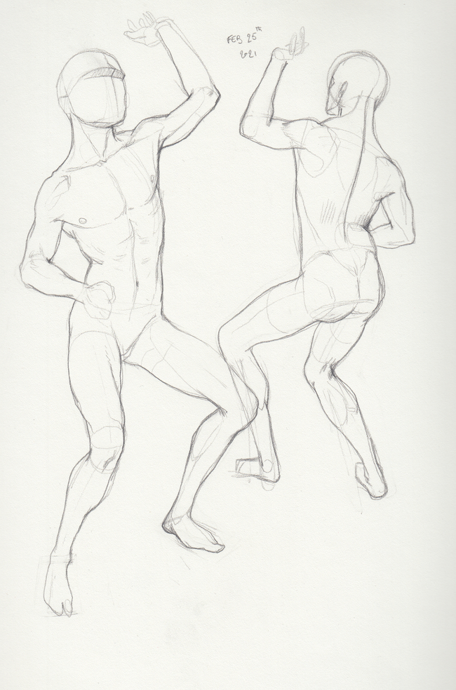
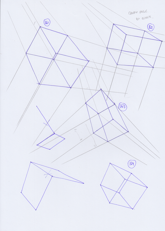
Wanted to experiment a bit more with boxes rotation in all kind of directions, that's why i'm making more mistakes, but learning too . Kept doing figures in my sketchbook, trying for more extreme perspectives ! and a quick drawing in photoshop, been ages i didn't draw with my tablet, might take a bit further and do some painting above !


Posts: 50
Threads: 2
Joined: Feb 2021
Reputation:
5
Man you're making quick progress here!
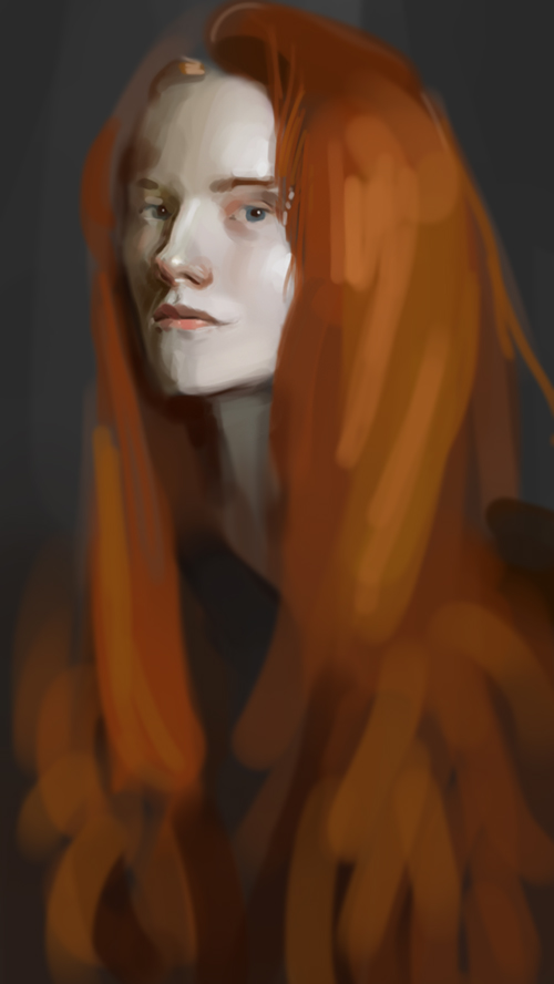
I love the last portrait, it's so realistic! Are you using the round brush for these?
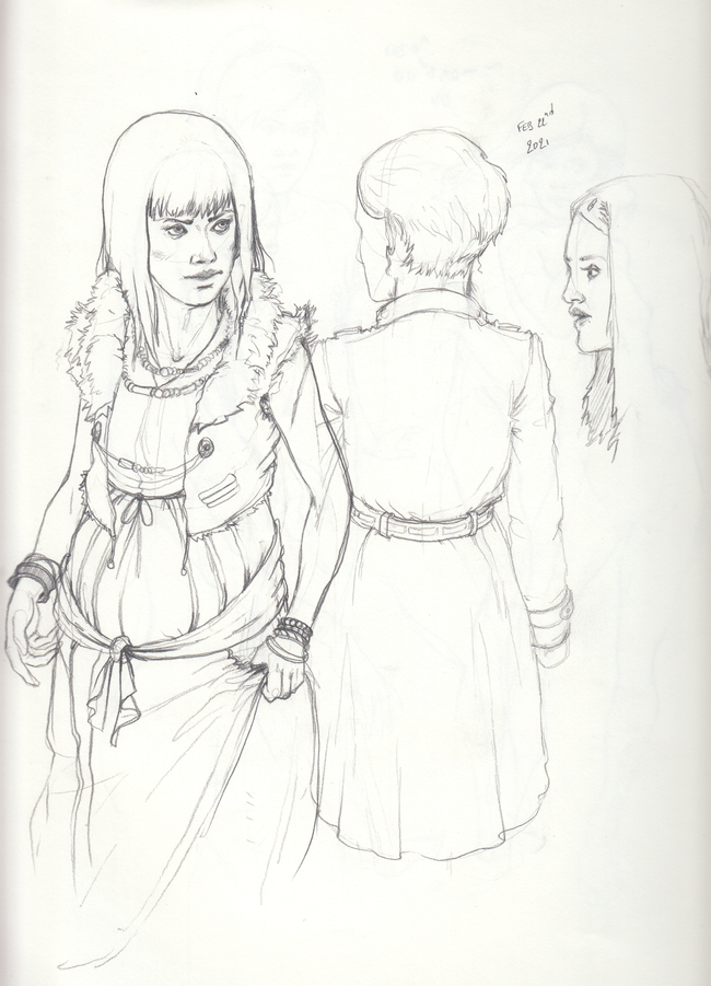
You're improving on your figure drawings keep it up. I like how dynamic and in perspective they are!
Posts: 88
Threads: 1
Joined: Sep 2020
Reputation:
7
Kassatay : thanks, not improving as fast as i would but baby steps ^^ Yep I'm mostly using one round brush in my portraits :D let's keep the work and improve together !
damn this forum is getting more active recently ^^ looking forward to the next CHOW ! wanna participate ^^
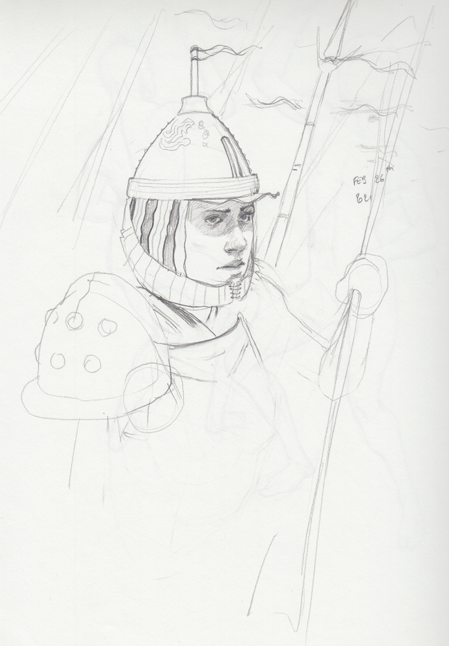
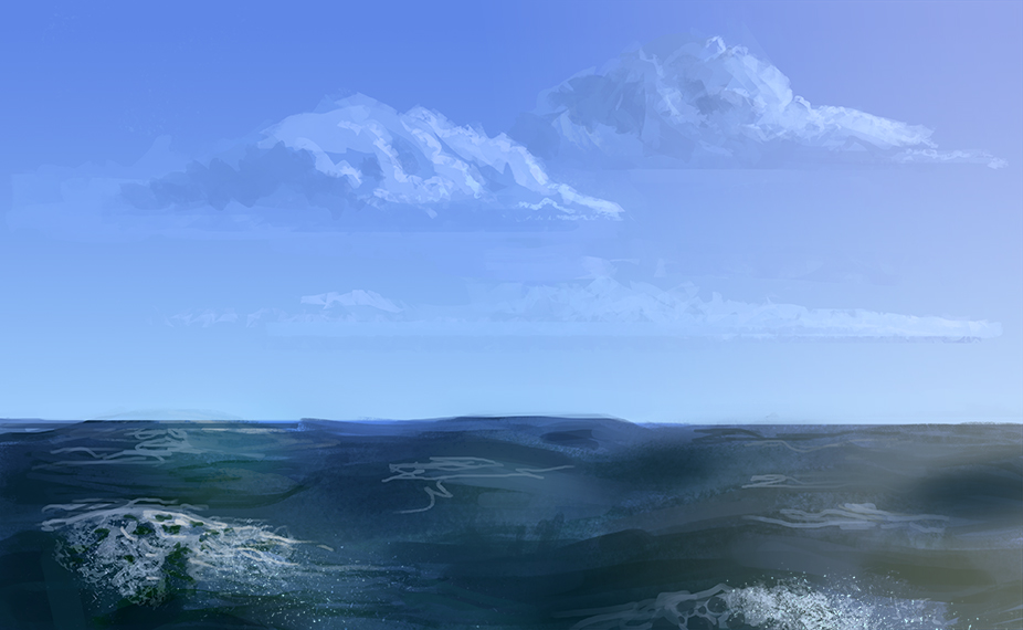
tried to mess up with different ways to build my boxes today, tried to draw same pose from 2 different angles in my sketchbook ( pretty bad at that but interesting exercise to visualize, and did a 30 min painting study !
Hope everything is good for you guys ! cheers and see you tomorrow !


Posts: 50
Threads: 2
Joined: Feb 2021
Reputation:
5
Your boxes are getting better, 90 more and you're done! I wish I can tell the same about myself  .
Nice figure studies. Have you tried working on separate body parts? I think it will help also.
The portrait is amazing, I like how you rendered the nose. I wish you gave more work to the hair also.
Keep it up, you're on the right track.
Posts: 460
Threads: 10
Joined: Mar 2016
Reputation:
64
Nice work! The studies are paying off for sure! 
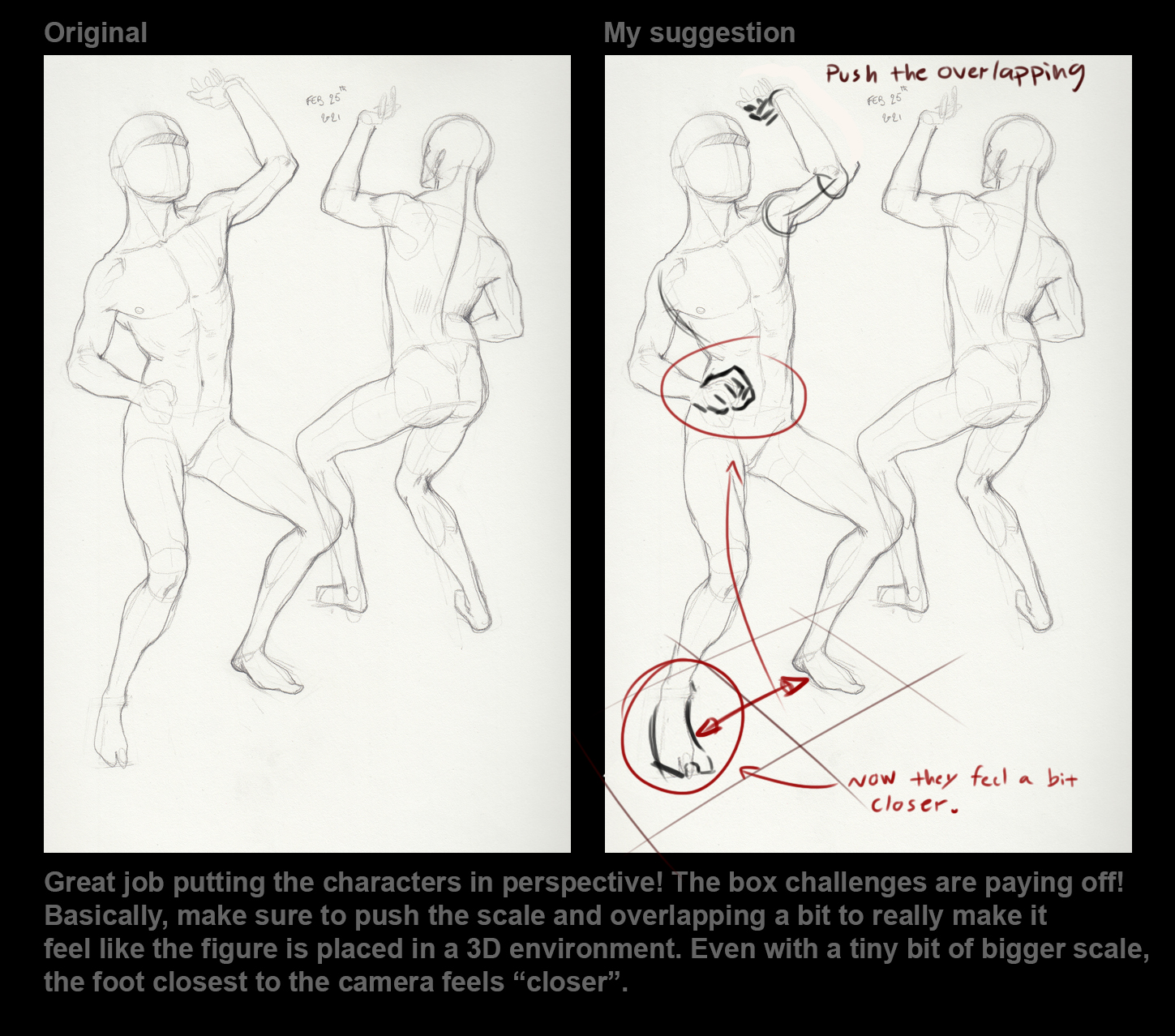
I had a few nitpicks about the latest figure drawing. Nothing major, but I hope it can help a bit.
Basically, make sure to push the shapes closest to the "camera" a bit to ensure that they are not smaller than the shapes in the backgrounds (aka the hand closest to the camera should not feel smaller than the hand in the distance and so on).

Posts: 88
Threads: 1
Joined: Sep 2020
Reputation:
7
Kassatay : thanks, i'll try to spend more and more time on my paintings but right now i'm more in the process of doing rather short ( 30 minutes) paintings while trying to really focus and visualize ! overtime will do full illustrations ^^ will study anatomy way more in march, i'll have more free time, right now super busy !
Zorrentos : thanks bro, always reminding me the good stuff ! really need to get that law of diminution in my lazy brain ...
Today has been a really stressful day, cumulating too much sleep deprivation, tried to chill while drawing but was frustrated by silly mistakes i was doing, i think it's time to go to sleep, will do better tomorrow ...


|
