01-20-2021, 09:01 AM

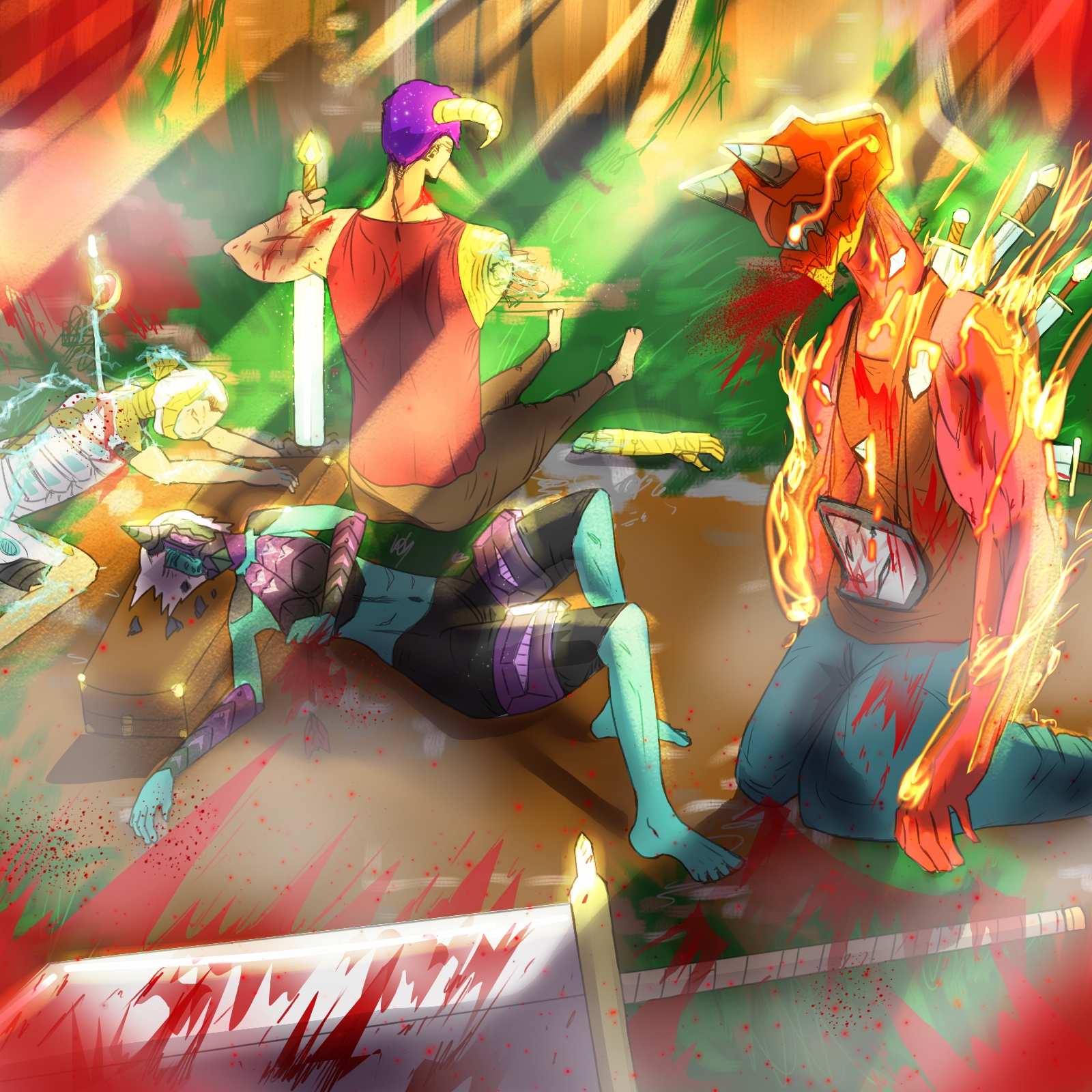
2-3h finished piece
|
Comrade
|
|
01-20-2021, 09:01 AM
 2-3h finished piece
01-20-2021, 10:33 AM
My honest opinion is i have no idea what going on.My first impression is are you aware of the message your sending to the people who might want to hire you?Do you understand that by adding blood you put yourself in a certain genre and a certain age audience?No chance to get hire at disney with a piece like this just to give an example.
When i look at this i feel like there still alot of perspective issue. I think you have potential for story telling if you learn to utilize the principle of design.For me right now i feel like there conflicting vibe going on first you got people dying and you have bright ray of light shining which generally have the symbolism of hope.So i am not sure if i am suppose to cry or to be relief. I am not sure but it feel like you might be better going toward story boarding or maybe animation or comic book.Nothing stop you if that not what really interest you that just my personal advise i would not personnaly buy this as an illustration and hang it on the wall if you see what i mean. It hard for me to give you advise on direction since i believe right now you should be exploring if you intend of doing this more seriously down the road. Good luck and remember it better to be lost and know it than to stay lost.Being able to give direction to your art journey is a essential step to create a direction to grow.Being focus give you a better fighting chance than never learning to focus on a specific art path.
01-20-2021, 11:43 AM
Hey, StudioZ, I honestly enjoyed it! I found it very dynamic, I do feel there is something missing in the story you are trying to tell.
I liked how you used the colors. Boldly I say. Loved the guy in the right... Well... he is having a hell of a day!!!! There is, of course, problems with the anatomy and perspective, so focus on these guys! Looking forward to see your next piece!
01-20-2021, 03:52 PM
You have already received some good criticism, so I will just add my own opinion and not repeat what has been said. Feel free to use it as you will.
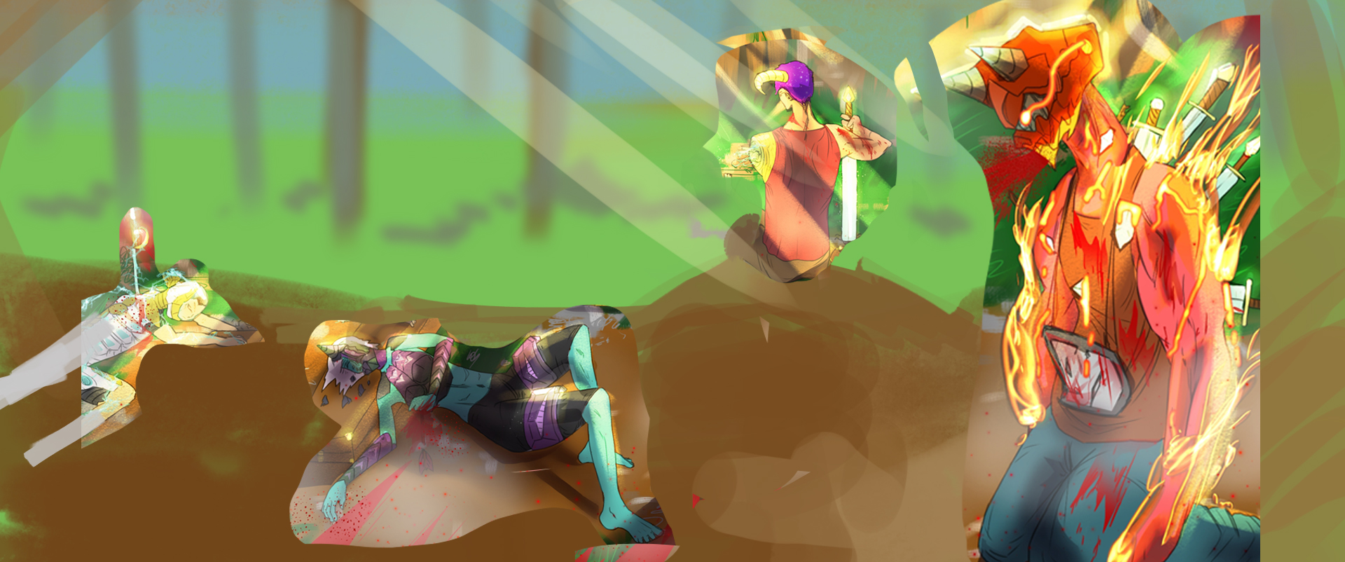
First, the format is not very good. A square is rarely used in illustrations because of compositional issues (not saying it has never been used ever, but it's very rare). I would enlarge the illustration to a widescreen format or an A4 format. A widescreen format can help "sell" the illustration as a movie still, while an A4 format can give the feeling of seeing the illustration in a book. Second, the values are a bit confusing. When I turn the image B/W and zoom out, I can't really tell what's going on. You should carefully place your values and maintain the highest contrast in your focal points. Third. Be conscious of all your design and compositional decisions. The god rays should be used sparingly as a compositional element. You also need to place every element carefully and maintain balance in your composition. Read up on the "principles of design" to get a nice checklist to use. I did an extremely quick overpaint on your image and changed the format. It's very quick and rushed and it's not perfect, but I think it does a better job with the balance and composition. Keep up the good work! And keep posting! 
01-21-2021, 10:11 AM
Thanks for all the advices!
|
|
« Next Oldest | Next Newest »
|