Posts: 57
Threads: 3
Joined: Jan 2021
Reputation:
9
Hi, thought I'd start off with a quick work recap of where I started (old CA.org, Polycount stuff), and then post the new stuff asap. Self-taught concept artist, started to take art as a career serious back in 2011, studied game design, now working as an AD & concept designer for a game studio in the Netherlands. Feel incredibly lucky and grateful to be in this line of work.
Feeling a bit of a slump in work and engagement on the socials and discord communities, but then I found CD through some defunct CA.org posts! Looking forward to being a part of the community here.
2011/12 - Finding concept art
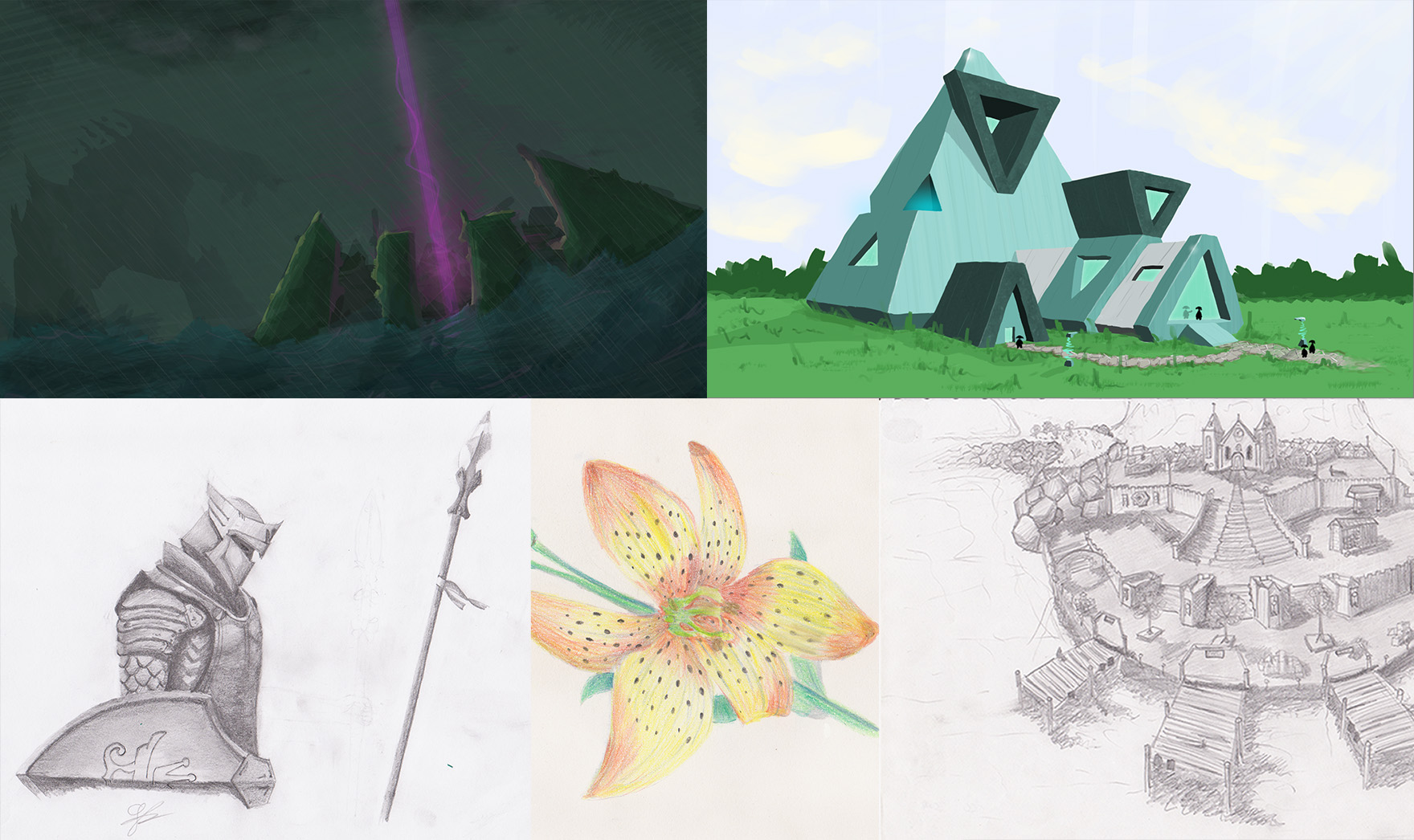 2013 - Messing around, learning perspective
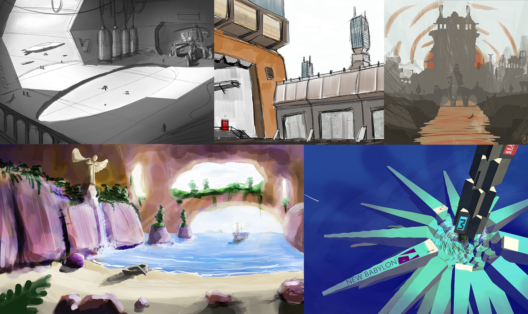 2014 - Discovered Feng Zhu's youtube channel (thank god for that man)
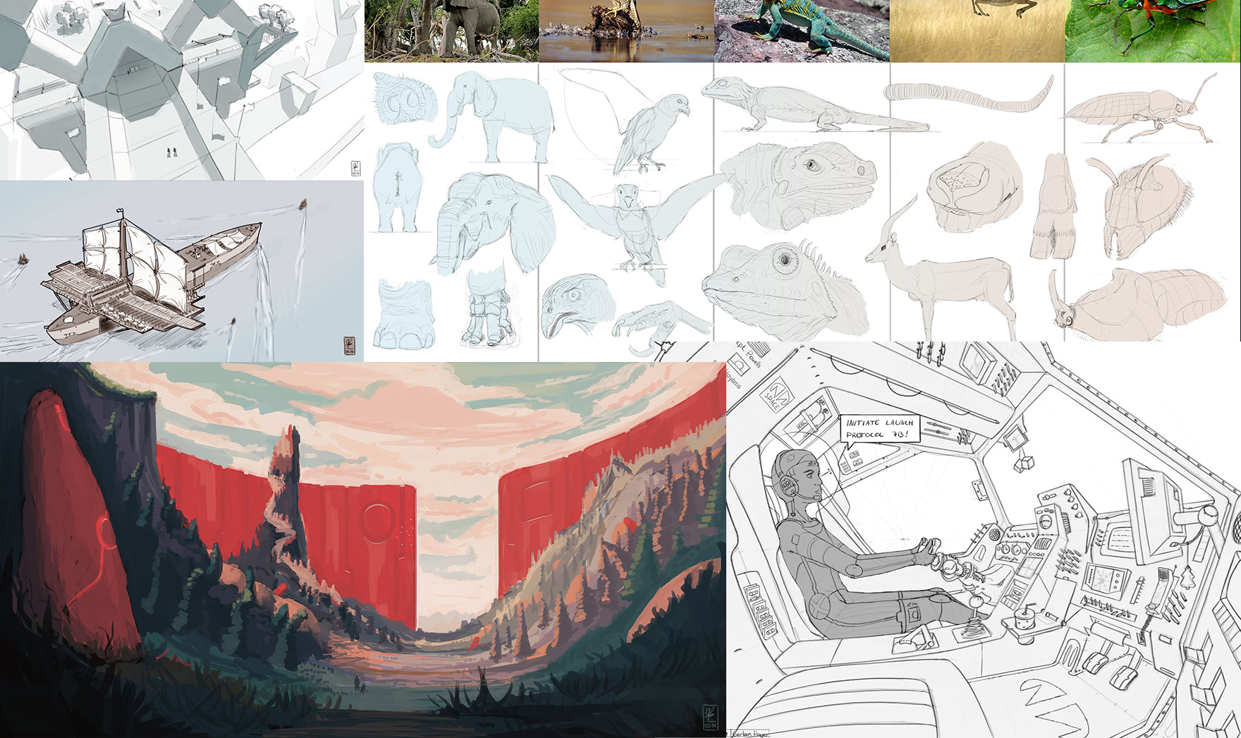
 2015 - first internship at a game company
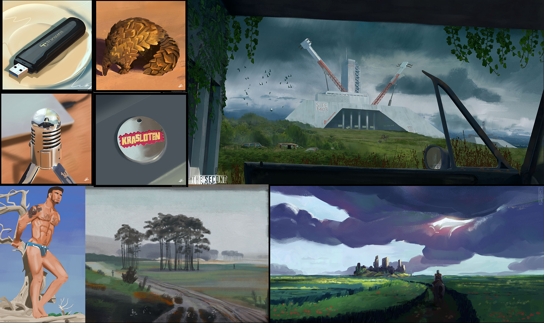 2016 - getting my feet wet with 3D underlays
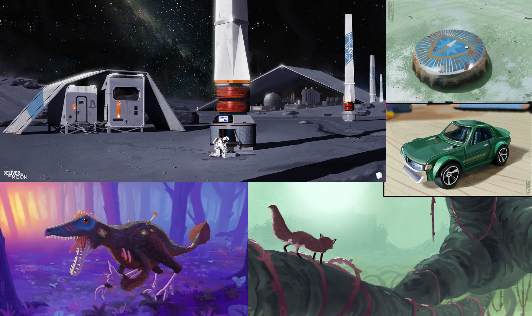 2017 - graduated, first job
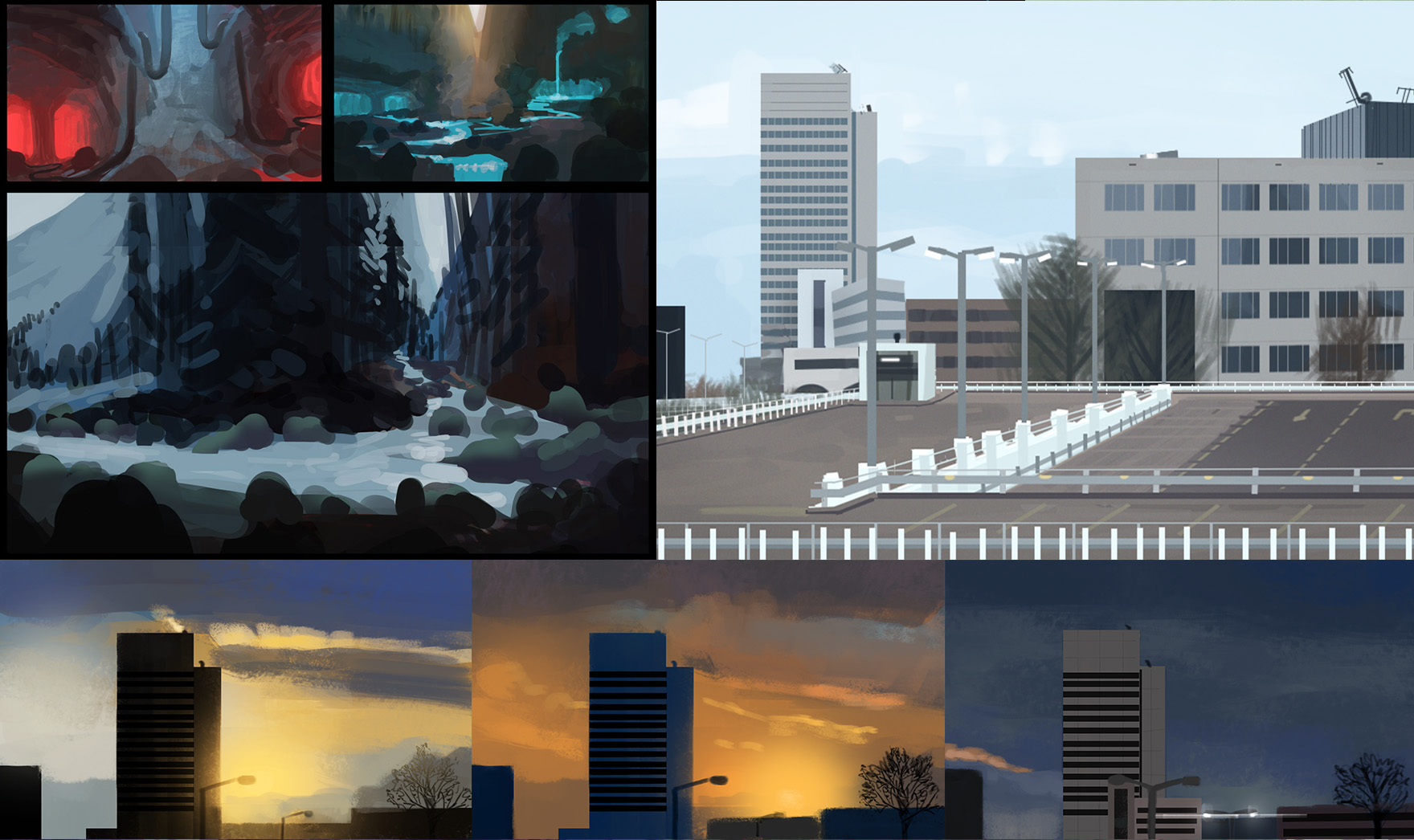
After that I started working professionally so I won't bore you all with that work. The main purpose of my posting here will be to rediscover the joy of making art and feel connected to more artists. I've felt for a long time that I haven't truly enjoyed making the little things anymore; everything's become a chore (also in the bigger life picture). Getting back to the roots, rediscovering the joy in the process. that's what I aim to find (again).
C&C is most welcome and appreciated. The harsher the better!
"No man is more unhappy than he who never faces adversity. For he is not permitted to prove himself." - Seneca
Posts: 60
Threads: 2
Joined: Nov 2020
Reputation:
4
Nice to see how you much you were able to grow in all those years.
Some really nice stuff here, I'm really digging that cloudy piece from 2015.
Keep it up :)
-------------------------------------------------------
SKETCHBOOK // INSTAGRAM // WEBSITE
-------------------------------------------------------
"Losing all hope was freedom."
Posts: 30
Threads: 3
Joined: Jan 2021
Reputation:
0
I love your studies with small objects, so neat material and form!
Posts: 460
Threads: 10
Joined: Mar 2016
Reputation:
64
You took a big leap in quality from 13 to 14! Welcome to the forums! Hope you will enjoy your stay!
Posts: 57
Threads: 3
Joined: Jan 2021
Reputation:
9
(01-25-2021, 05:47 AM)Zorrentos Wrote: You took a big leap in quality from 13 to 14! Welcome to the forums! Hope you will enjoy your stay! Thanks Zorrentos & Max & Ronya! It was in fact compiling this overview that I considered my growth had slowed down too much too my liking, so here we are! It is motivated from a positive angle though, I don't believe guilt and shame are good motivators in the long term (for me anyway).
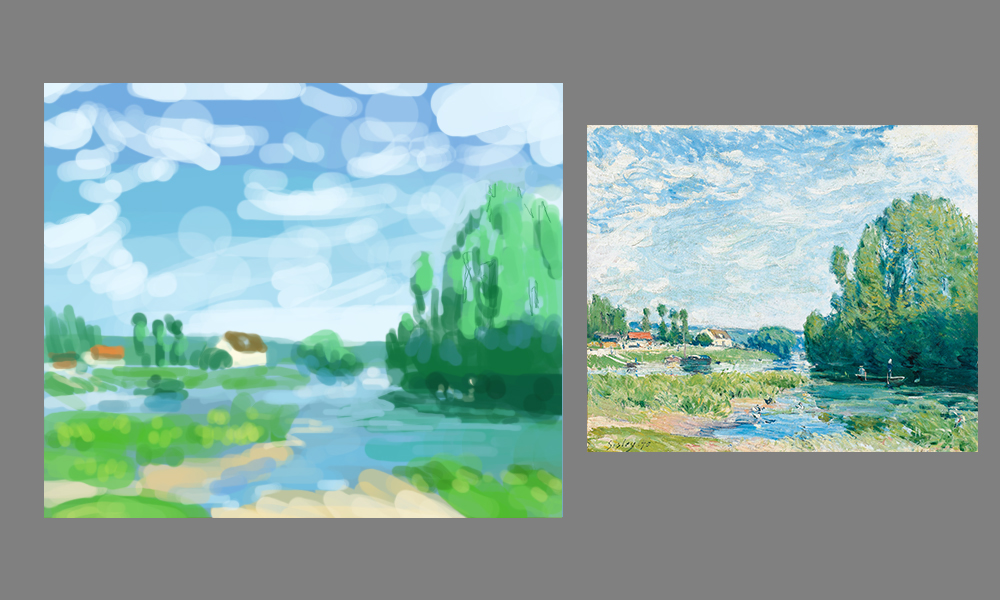
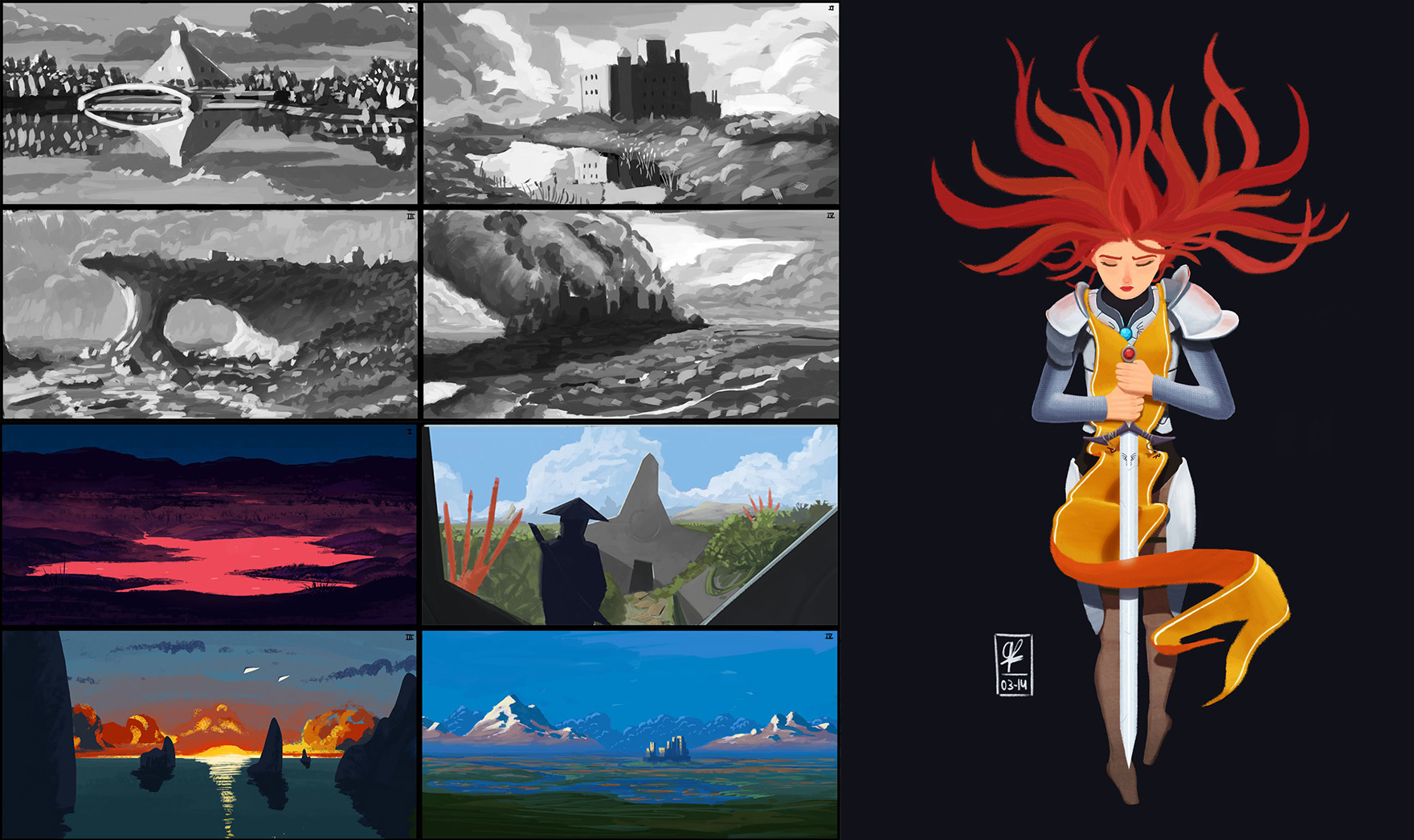
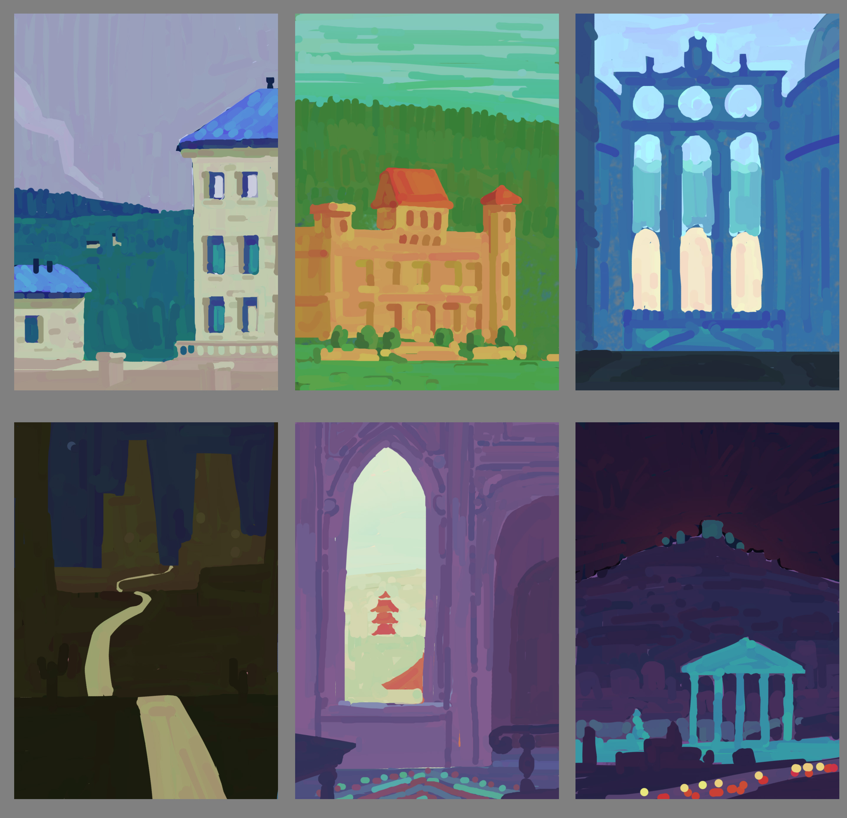
Anyway here's some half-study half imaginary paintings I did from Mary Blair's work. Her color combinations are fantastic and I wanted to figure out what she's doing. I still have a lot of trouble figuring out the local value of the sky vs the landscape, would like to do some virtual plein airs to remedy that!
"No man is more unhappy than he who never faces adversity. For he is not permitted to prove himself." - Seneca
Posts: 201
Threads: 3
Joined: Jan 2021
Reputation:
3
Hi, and welcome to the forums! I really like the landscapes in your portfolio, it's full of such scope! I went looking to see if CA was back up because of your post, heh. 'Discovering the joy in the process'. ABSOLUTELY. I want that too, if you manage to find that it doesn't feel like work. As a professional, I can't wait to see what you bring to the forums.
Posts: 1,429
Threads: 12
Joined: Dec 2015
Reputation:
139
Hey gerbenpasjes - welcome to the forum :).
Really awesome to see your progress shots from over the years - thanks for sharing.
Looking forward to seeing you rediscover that joy!
“Today, give a stranger one of your smiles. It might be the only sunshine he sees all day.” -- H. Jackson Brown Jr.
CD Sketchbook
Posts: 57
Threads: 3
Joined: Jan 2021
Reputation:
9
Thanks for the kind words everyone :)
I've been getting my hands dirty in VR (finally) after Gravity Sketch released for free yesterday! I quite enjoyed it even though I don't know the tool yet.
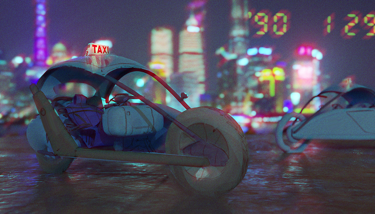
Did a 30 mins "overpaint" this morning to push it further than a few blue blobs. The composition and readability are quite bad, and the whole rgb offset is disgusting. But that's why we're here!
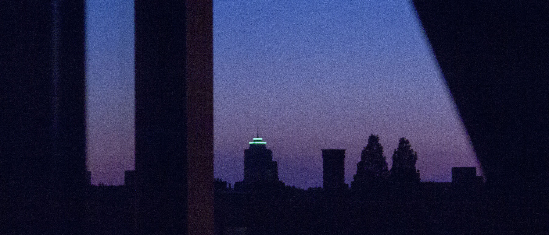
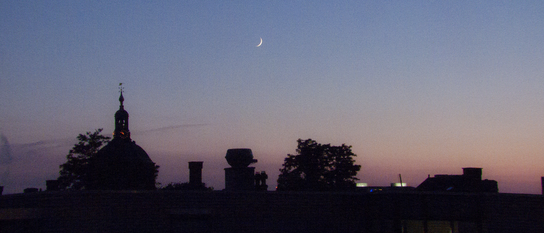
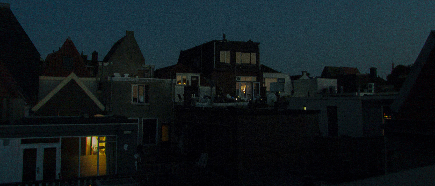
I've also been doing some photography (from my window) to practice color grading and composition.
.jpg)
.jpg)
.jpg)
I don't quite "get" color the way other artists seem to do, so I studied some more film-lighting; it's a little easier to get into because there's no brush dynamics and other crazy photoshop filters.
"No man is more unhappy than he who never faces adversity. For he is not permitted to prove himself." - Seneca
Posts: 57
Threads: 3
Joined: Jan 2021
Reputation:
9
Back again with painting studies. Following Craig Mullin's simple advice now.
"I learned to paint (still am) by doing hundreds, if not thousands, of little sketches. Don't spend more than 1/2 hour on them. Try to get the main information down as quickly as possible... ...The media, whether photoshop or real paint is unimportant."
So here we are. In the past I'd make a schedule, put it in my calendar, plan everything, sort the reference, make complicated photoshop files... I've gone through that process countless times already. But as I've stated in my original post, I'm here because I want to enjoy the process again. So instead of rigorous planning, I'm sticking to a simple principle from Marcus Aurelius:
"Concentrate every minute like a Roman— like a man— on doing what’s in front of you with precise and genuine seriousness, tenderly, willingly, with justice. And on freeing yourself from all other distractions. Yes, you can— if you do everything as if it were the last thing you were doing in your life, and stop being aimless, stop letting your emotions override what your mind tells you, stop being hypocritical, self-centered , irritable. You see how few things you have to do to live a satisfying and reverent life? If you can manage this, that’s all even the gods can ask of you.”
With that kind of advice you can't go wrong haha. Painting on a 1000px wide file, that's it. No zoom, no fancy brushes, just the canvas and myself. So far I'm enjoying it very much.

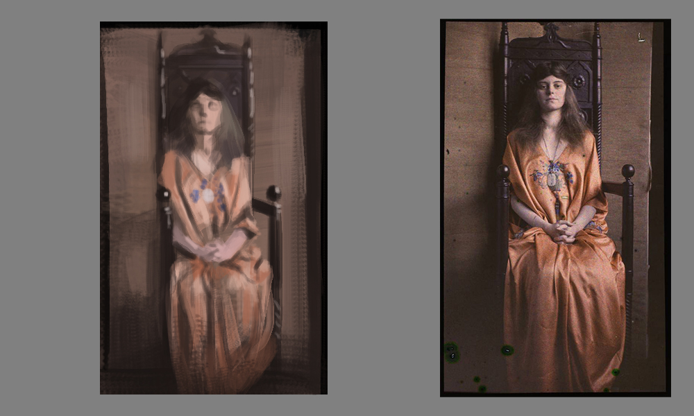
Happened to be first one in my folder of random pictures; an original Craig Mullins. Happy about the result, though the construction is a bit wonky. The figures need to be much improved.

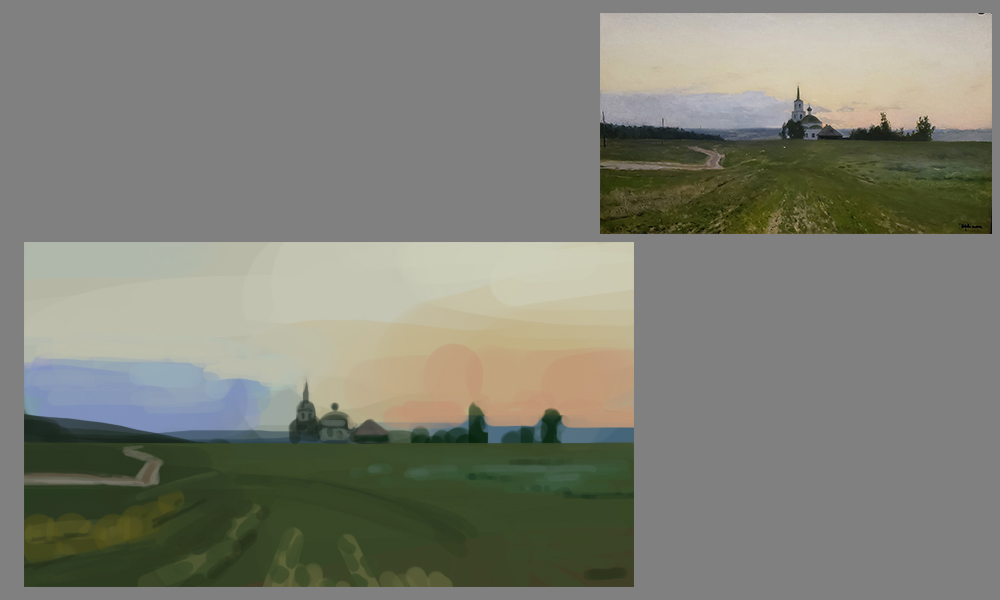
Russian painter, don't know who. I know Nick Gindraux studies him a lot. Getting sky values right is still difficult for me.

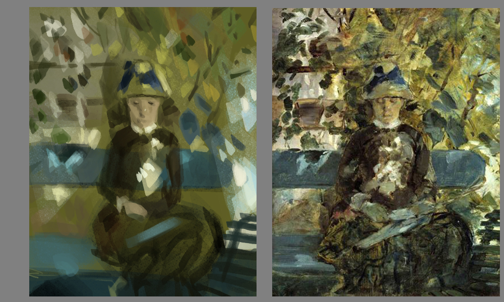
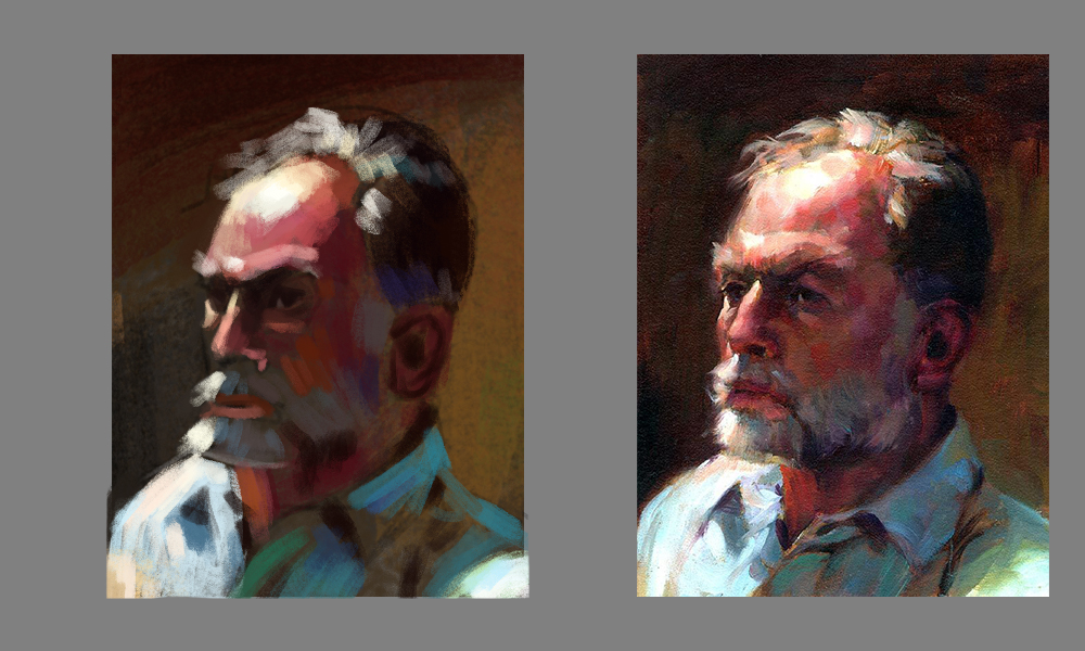
An impressionist. Getting the face right on 50 px is very challenging.
"No man is more unhappy than he who never faces adversity. For he is not permitted to prove himself." - Seneca
Posts: 57
Threads: 3
Joined: Jan 2021
Reputation:
9
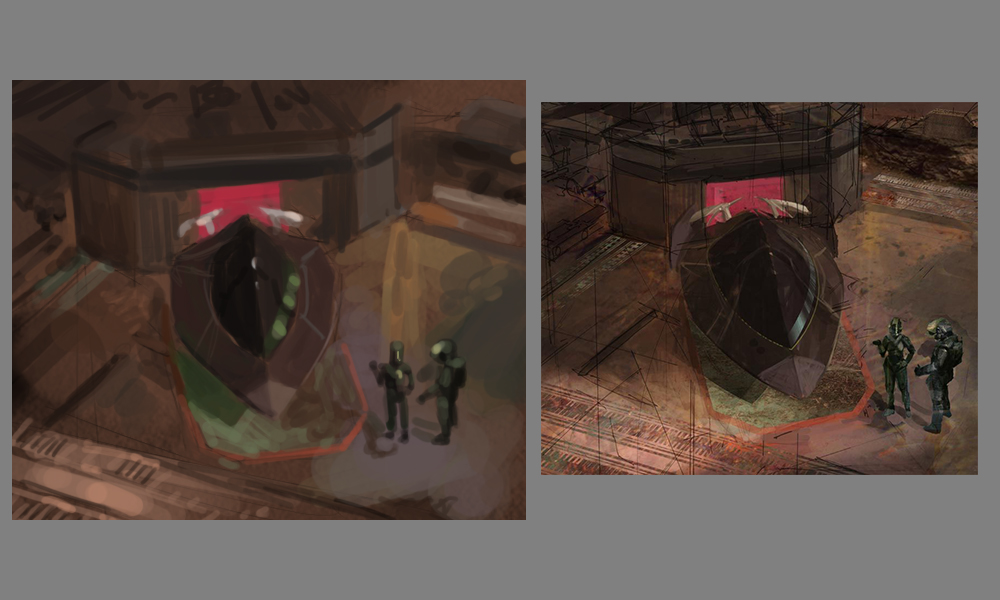
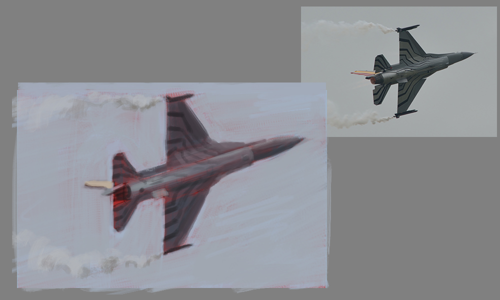
Attempting to use as few strokes as possible to express the forms and textures from my ref. Getting to the point in as little work as possible, to keep it clean, pure, simple.

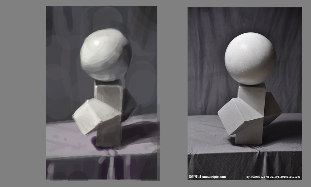
I love hard-surface but without any 3D or lasso tool, getting sharp edges is a trip! Pushed the colors here a little bit cuz the ref was boring.

Compared to the previous face I did get it better this time. Trying to express the key features of the form without too much noodling. I did not get the cloth material to look right though.

So. Much. Saturation. I'm really not used to work with this much saturation and it's throwing me off a little bit. Love that I'm learning it though. The color dynamic of the bright blue and the purple reds oranges is spectacular.
I keep being surprised at the amount of saturation in the lower values. It's the biggest thing I've learned so far.
"No man is more unhappy than he who never faces adversity. For he is not permitted to prove himself." - Seneca
Posts: 288
Threads: 8
Joined: Nov 2012
Reputation:
9
Great work. Do you feel those studies focusing on less brush strokes helped? I have a terrible habit of noodling that I need to kick.
Posts: 57
Threads: 3
Joined: Jan 2021
Reputation:
9
(01-29-2021, 09:25 PM)CoreyH Wrote: Great work. Do you feel those studies focusing on less brush strokes helped? I have a terrible habit of noodling that I need to kick.
Thanks Corey! I do yes. The tiny canvas and no zooming helps too; there's really only so much you can do, and using small brushes is almost made impossible because your hand would move to fast, thus stopping you from noodling!
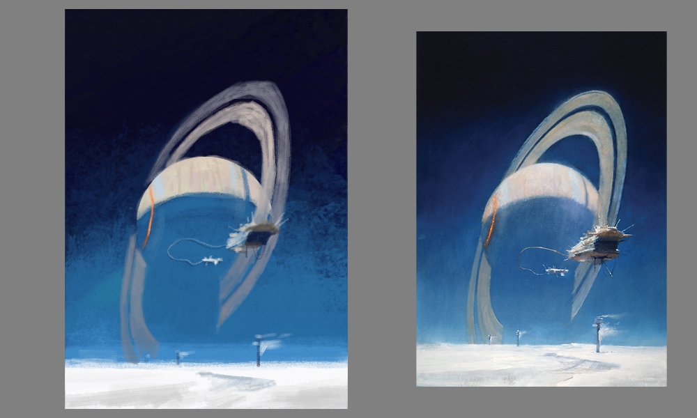
John Harris piece, incredible. I know he paints these really big, doing it justice on a tiny canvas was very challenging. That green glow he's got going on around the rings, I couldn't get that right yet.
A beautiful, delicate balance of local values is happening where the rings go into the lower atmosphere of the ice landscape. Happy about my version of that, although its still ever so slightly off.

An Edgar Payne (I believe); was very challenging to get the correct blues, oranges, and purples. Craig Mullins says all colors are relative, so it doesn't really matter what you do in terms of brightness, as long as the hue is correct in relation to each other. Nevertheless I tried to get the local values correct too.

I'm not doing much in terms of studies this weekend cuz I'm participating in the global game jam. Looking forward to next week already haha.
"No man is more unhappy than he who never faces adversity. For he is not permitted to prove himself." - Seneca
Posts: 57
Threads: 3
Joined: Jan 2021
Reputation:
9
Phew Global Game Jam successfully finished. Here's the game we made in 48 hours.
On to studies.

Unknown artist. Clouds and blue skies are very challenging for me. Almost anything with high chroma I noticed, I feel much more comfortable in low saturation. Scale, color balance, everything is a bit off. Quite sloppy.

Saw this picture somewhere in a CD sketchbook and thought, neat! I painted it without using construction or 3D underlay (which is what I would do usually). I'm always fascinated by the amount of bounce light at the bottom of things. They seem much less pronounced when just walking around the real world.
"No man is more unhappy than he who never faces adversity. For he is not permitted to prove himself." - Seneca
Posts: 57
Threads: 3
Joined: Jan 2021
Reputation:
9
Been working on some 3D stuff and Unity, but did some studies in between. No pressure, no stress, just... doing the work, as mindfully and focussed as possible. Feels good.

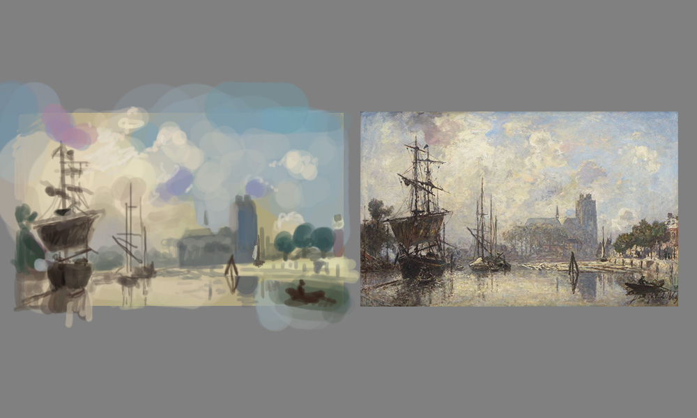
Had a lot of trouble with this one. These very advanced scenes are challenging me to capture most of the shapes in big forms, but I notice that I tend to literally forget to paint in a ship or house. It's like my mind blanks over and I only see what the artists intended for me to see, so dramatically that I omit other parts haha.

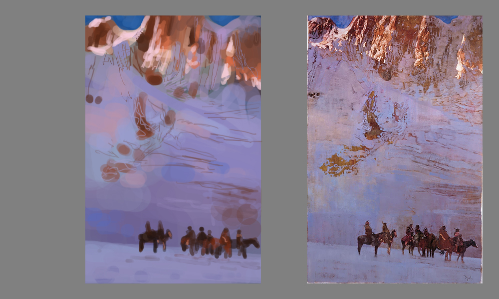
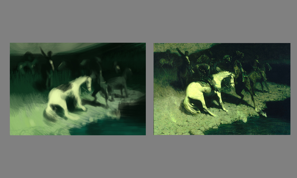
Frederic Remington, the one and only. What a palette! I can hardly imagine how he painted these. Is it from vivid memory/imagination, or the result of extensive construction and logical thought? Regardless, the same problem is above, I actually omitted the main character on the main horse and I didn't even realize it before I posted it here.
"No man is more unhappy than he who never faces adversity. For he is not permitted to prove himself." - Seneca
Posts: 181
Threads: 0
Joined: Oct 2017
Reputation:
41
Hey gerbenpasjes. Great sketchbook you have! I really love seeing your art journey in your first post - there's just so much growth. Digging your latest studies; the John Harris piece is pulled off specially well. Since the Frederic palette is quite intense, you could play around with upping the saturation in your version? That is if colour is something you are trying to focus on too.
Forgetting to paint in things is also something I have a problem with too hahaha so don't feel like you're alone with that issue lmao
Posts: 852
Threads: 6
Joined: May 2018
Reputation:
116
I actually saw a similar Frederick Remmington painting in a museum. If it wasn't that one it was very very similar, with the bright green. Maybe it was a different one, I think there were dogs. Anyway the color really struck me, it was so bright, like it was glowing. Had a really terrifying effect.
I can assume it's painted with solid colors underneath and the rubbed over with a transparent green pigment. In some of his other paintings you can see the color underneath poking through. I think Remmington used models, and photography as well, but I wish i knew how it all gets put together.
Posts: 460
Threads: 10
Joined: Mar 2016
Reputation:
64
I dig the latest bunch of studies you made! It seems like you put a lot of thought into them as you are making them!
Posts: 57
Threads: 3
Joined: Jan 2021
Reputation:
9
@chubby_cat Thanks! Yeah I guess I could up the sat afterwards but I want to touch them as little as possible. Do it "alla prima" right! I feel like right now "getting better at color" is already too diffuse. There are so many complex interactions in the field of color. I am struggling especially with getting the right saturation. I've always drawn more to the grey side of things and keep saturation for lighter shapes or light-sources, never for shadows.
@JosephCow Whoa thanks for explaining! I would argue getting his lighting and shadow play you need to have models yeah, it's so complex!
@Zorrentos Cheers! I try to stay as mindful as possible when doing them as opposed to "just noodling about". I've flipped the switch on how I want to do personal work and improve, the gist of it being "less planning, more focus".
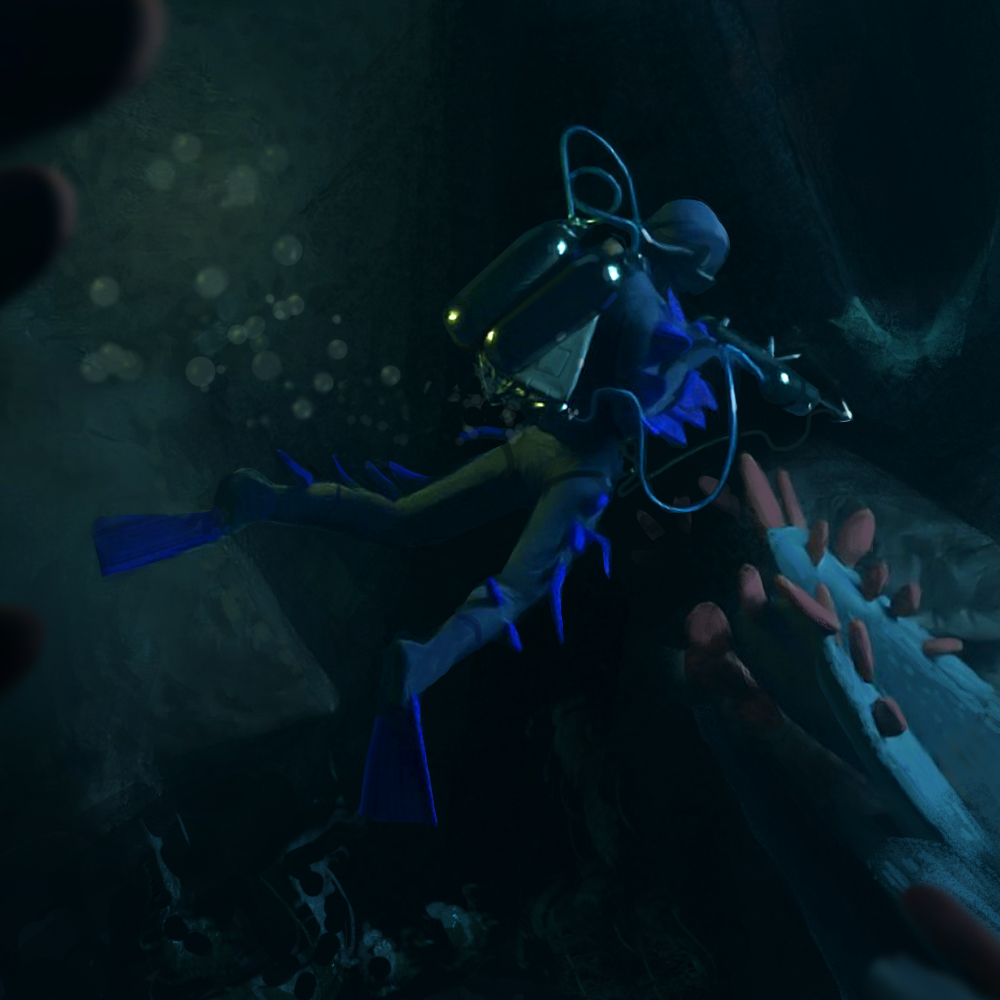
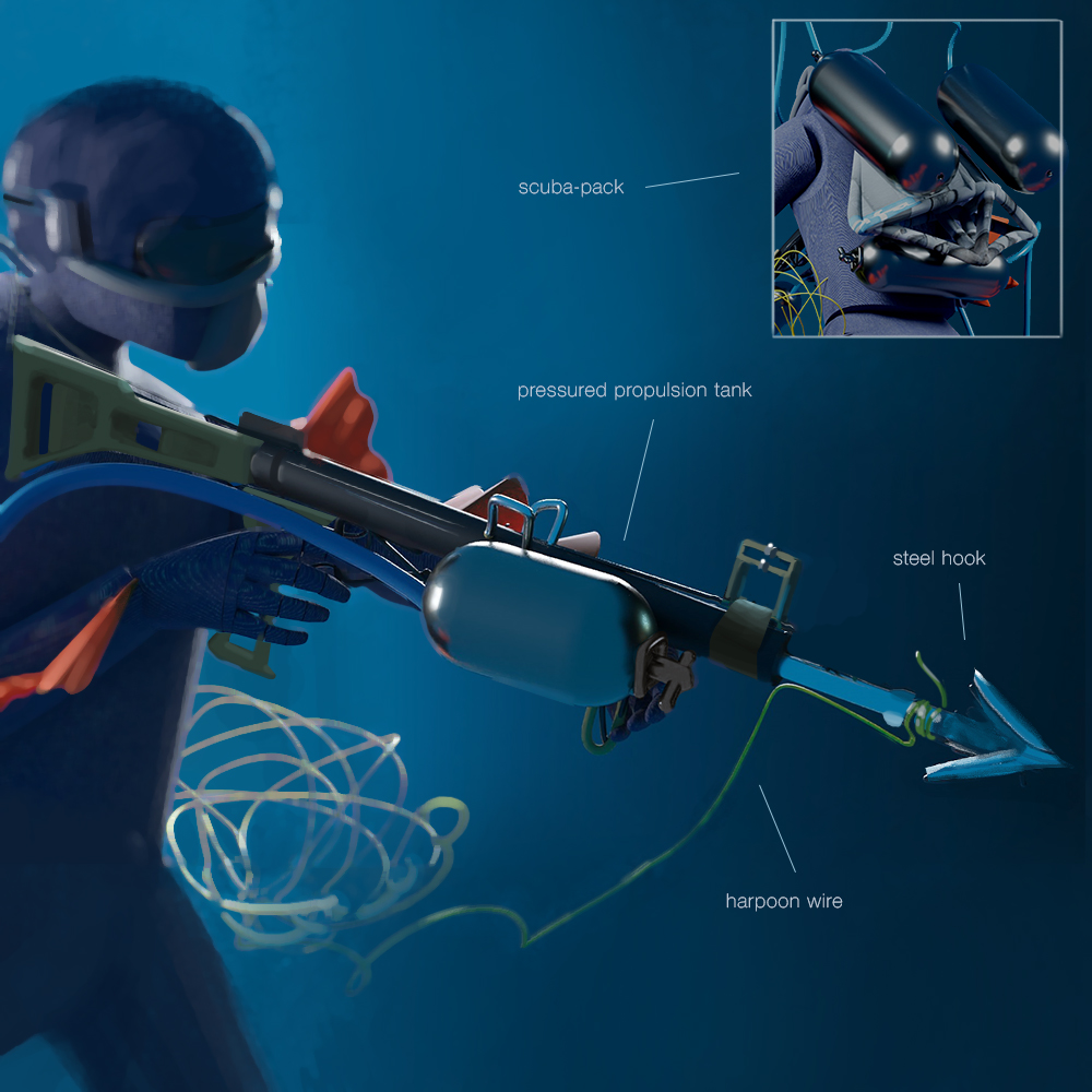
My pieces for the CHOW this week;


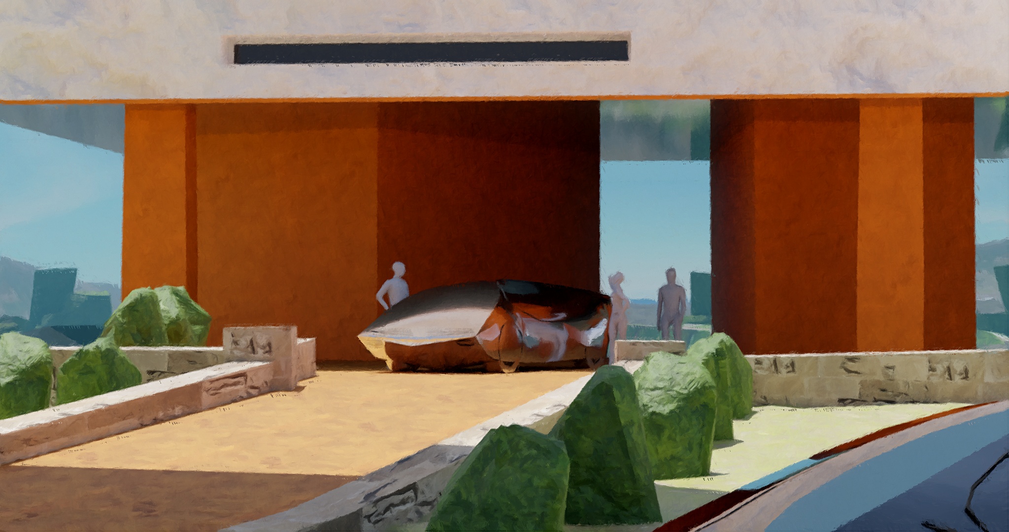
A Syd Mead inspired VR sketch I did last night to get more familiar with the tools. Still need to do the overpainting!

"No man is more unhappy than he who never faces adversity. For he is not permitted to prove himself." - Seneca
Posts: 460
Threads: 10
Joined: Mar 2016
Reputation:
64
Your CHOW is looking quite good! As an illustration, it certainly works well! However, I'm a bit curious about some of the functions of the scuba diving suit. Like, what are those "fins" on his legs supposed to do? This is one of those times where I would really like a breakdown with some explanation of the design.
The Syd Mead inspired study is looking amazing! Really dig the color palette and shape language of that one! Hope you push it a bit further! :)
Posts: 485
Threads: 2
Joined: Feb 2017
Reputation:
5
Hey man great work so far :) Really digging that scuba diver painting in particular.
In reagrds to omitting information from studies. As long as you have set your intention for your study and felt like you have achieved that then I guess it doesn't rally matter haha. I've been doing some landscape studies recently and didn't bother with the figures since I was just focusing on studying his colour choices. :)
|


.jpg)
.jpg)
.jpg)
