Character Design
#1
Hello again,

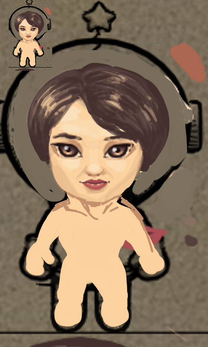
I'm trying to paint a character for my project. The proportions should fit the astronaut as shown below while taking into account the size of the head.

I've numbered my attempts from 1 to 4. I feel that I'm going down the right path as there's an improvement from the first attempt and the fourth one.

What I find the hardest is depicting the hair. I've looked up tutorials on google but none that help me so far.

Question 1:
I want to be transparent (no pun intended) and say that in 4 I used a semi-transparent brush at 5% which might be considered "cheating". I try to challenge myself in using as few tools as possible so that I can transfer my skills in traditional arts as well. Is this the best way to get nuances?

I don't know of any other ways to have nuances necessary for the skin and hair... I imagine that if I were doing traditional painting, I'd mix colors together to get the right result for the nuances in the skin and hair but I'm not sure how to do that besides using the smudge tool to mix the colors together.

Again, I strongly encourage paintovers (if you can be so enclined) over written texts although I realize they are more time consuming as I find they're the best way for me to learn. 

Thank you for reading and potential input.

[Image: wffdH20.png]
Reply
#2
I did a quick paintover, hope it helps.

I did a quick idea for a body, just to make sure the head would fit the body style & proportionwise.
Also lowered the eyes, and made the nose and mouth smaller, simplified the rendering, added lights in the eyes, and basically copied the hairstyle from your photo, but bigger. As a tip: I think you need to break your overal hairshape into several shapes (with a slightly different orientation).

I think every medium and style have their pro and contra, so I think low opacity brushes are fine whenever you feel they do the job. :-)


Reply
#3
I feel like you're trying to do way too much. It's not a portrait. You're taking stuff from the reference that shouldn't go on a tiny character head. Like the laugh lines, small details, and the lighting in the pic on the right which leaves a little dark spot on the center of the nose. Idk if you are using cel shading only, or if you can use soft edges, but either way, simpler is better. 

4 is definitely your best option, but even that is way too literal from the ref in my opinion. 
Hair isn't too hard, just paint a dark mass, and then a highlight on top which describes the shape of the head. You can cut into the highlight and that makes it look like locks of hair.

So yeah I hope that helps, again i'm kinda tentative to critique because I don't really see the exact context. Like idk how big this will appear on screen in the game, whether it's a portrait icon, or the sprite itself, or just figuring out the general design. y'know what I mean.

I'm not really sure what you mean about using the opacity tool to get colors. If that's cheating then I guess I've been cheating a lot.  Dead


Attached Files Image(s)


Reply
#4
Great edits! Thanks to both of you.

Regarding the details, I figured it would be a good opportunity to learn but considering the size you probably have a point that I'm splitting hairs... After resizing almost all of the details are lost...

The version I have now:
[Image: WSYCDOU.png]


To give you an idea:
[Image: K7zhRpC.png]

So as it stands the head is too big still and the nose is barely visible.

I'm wondering which approach I should go about this. Should I just get rid of the nose and give more room to the eyes? See below for example:

[Image: z1nbfNh.png]
I realize this is more of a design question than a purely artistic enquiry but I'm a bit stumped...
Reply
#5
Oh I see. Yeah in context that doesn't really make a lot of sense. Wouldn't it have to look something more like this? Obviously drawn properly, but proportion-wise. The first thing I would do is get rid of the neck in any case, since the other character doesn't have one.

What you've been working on makes more sense as like the profile icon in a dialogue box when she is talking.


Attached Files Image(s)


Reply
#6
Lightbulb 
Alright so long message incoming. I wanted to be transparent in my approach in order to get feedback and critique not only on what I'm attempting to paint, but also on my workflow. I hope you find this interesting.

1. Working in 100% vs 200%
So following the realization that I was losing a lot of details when I transitioned from 200% to 100%, I thought I should just paint at 100% but in the end I thought it was more difficult for some reason. Maybe it's a bad habit but I prefer to work at a higher resolution and scale down afterwards. 

Still, I went straight to 100%.  I put the astronaut as a the reference as a back layer to make sure my proportions will end up being right:
[Image: iIRI4G0.png]

2. Work process: outline
So the first thing I try to do is draw an outline for the face using the references I have and the paintovers. I usually draw half the face and then copy paste it and rotate it 180 degrees so that it ends up being symmetrical.
[Image: IExDz6K.png]
I then paint the interior of the outline with the same color. I'll then merge the three layers and call that layer "face".

[Image: cxCfGwq.png]

3. Proportions:
Then, I'll look up the proportions for a female face:
[Image: UuGYJh7.png]
Source

Of course I need just my judgment here as my game doesn't have characters will realistic proportions. Also, the constrained proportions and small characters means I need to sacrifice some details.

My first attempt here at this new resolution is definitely not right for reasons I'll get in the next point:
 [Image: C0U7M8K.png]
The main issue I can spot at a glance is that the head is too big and too large as well as being in a full front perspective as opposed to being 3/4 cavalier perspective. 

On the bright side, I do like the hair a lot.

4. Attempt 7:
I decided to keep the hair as I thought it looked good and fix the rest. What I have in mind to fix the perspective is to move the hair line down so to speak.

 The eyes looked pretty bad, glassy and expressionless.

This is my next take. Notice I tried to do the whole character that time. 

* I used the same color as the hair for the clothes of the character.
* Changed the eyes. I think this is a step forward. I think I manage to convey almond shaped eyes here.
[Image: fn51LJM.png]
5. Moving forward:
The way I see it, the face is likely still too big. 

So that's it for now. Thanks for reading and any potential feedback.

Another attempt:
[Image: MGU1vVj.png](it looks worse but I want to keep all traces of my progress). and then another: [Image: CRPxqHl.png]
And another take:
[Image: ztdo1fx.png]
Reply
#7
Ok, I feel like I'm getting somewhere with the character.

Went from: [Image: MGU1vVj.png] to [Image: TAsFNqv.png] to [Image: ztdo1fx.png] to [Image: dVyQ2tj.png]

Full disclosure, I looked up some concept art for Link's Awakening for the shape of the eyes.
[Image: SviBrNl.jpg]
Reply
#8
Not related to skin and hair.

Personally i find that the character highlight in it eye isn't necessary.I would say you need the eye to be visible they are important to establish a connection with the viewer.It really also a question of scale of your asset inside the game itself.Just look at the link example the finish one and you barely see any highly and is eye.

I would say you have to learn to know where to simplify and where put detail you don't need to add ton of detail to describe what you want your viewer to understand sometime simple is best.

My Sketchbook

Perfection is unmeasurable therefor it impossible to reach it.
Reply
#9
Yeah, I should probably change the title of the thread somewhat.

So I'm trying to simplify as much as I can. I've dropped a color for the hair to make it less busy, stylized the hair a bit more, etc...

Quote:Personally i find that the character highlight in it eye isn't necessary.
I was ambivalent about this but makes the eyes a bit dull I find:

[Image: dVyQ2tj.png][Image: 2aH9zMV.png]
I think the mouth is better, so is the dress. The arms are better too. One thing I'm having trouble with is the perspective, it still looks like she's looking straight on!
Reply
#10
[Image: ZKGhzZm.png]
Some more attempts. I'm still struggling with perspective.
Reply
#11
You should keep the proportion of the head bigger for clarity in my opinion it also as to do with the concept of visual hierachy(where you want the attention of the player to go first) number 16, 12, 13 have better proportion than 14 15 in term of this concept.The problem for me right now is you have for all your character what i refer to a split proportion meaning half half proportion meaning if we split character head is 1/2 is of the total height and is body would 1/2 of the total height.This mean that you get less interesting proportion resulting from that .By using of the concept of small medium and big shape.Now look at the image i provided and look at the square example you want strong difference between your small, medium and big shape.Of course that not an absolute rule specially if we talk about proportion but it a tool to create more interesting proportion for stylize project such as this one.

I hope that was useful.


Attached Files Image(s)


My Sketchbook

Perfection is unmeasurable therefor it impossible to reach it.
Reply
#12
I like the 16, 12 and 13 more too but the problem is that the perspective is off. It's not a top-down perspective, it's a front view perspective which doesn't integrate well with the game environment. Unfortunately, trying to fix this issue (14, 15 and 16) screws up the art quality.

Thanks for the images, I'll study them in greater details. I really need to figure out that perspective issue though!
Reply
#13
The thing here is i think you have to ''cheat'' how her head should normally look if she was looking forward. If you choose this in that case you would only see the top of there head maybe that fine for you. But when you want the player to recognize who is who you got to make sure there other detail than there face in that case to identify them apart form the other character.Since your camera or viewer perspective is above the character the only reason why we would see so much of her face is if she would look up i mean that fine but not really realistic if your trying to walk but sometime you don't have to make everything make sense if it doesn't become game breaking.

What you need i think is the face to be front facing but in this case it natural for your brain to make also everything else look front facing but you have to remember the body is seen from a top down view so you need to show object as if they are seen from the top down there no way to fake it you need to learn how to draw human from that perspective and that might be something you never learn to do yet so you need to go study other game and photo reference you can find on ther internet that show this.What i really advise you is to learn to use overlap it a great tool to indicate a different view point.What also important is that you understand foreshorthing something that require to be good at estimating that mean being good a finding proportion.

My Sketchbook

Perfection is unmeasurable therefor it impossible to reach it.
Reply
#14
I will try to sum up your points best I can:
* I shouldn't try to fix the perspective perfectly as it would be detrimental in terms of character recognition.
* I think you're saying I should "cheat" for the face (tweak the perspective) but attempt to display correctly for the body by checking how other games do it and studying anatomy/foreshortening.

Am I understanding you correctly?

Here's an example of reference from Link's Awakening:
[Image: F8ts8NS.png]
Everything looks right to me. I'll try to reproduce it.
Reply
#15
Yes something like this.I also want to add that if you have problem with perspective you can always learn to draw your shape inside a box it always help if you need to find the right perspective and it pretty quick fix.

My Sketchbook

Perfection is unmeasurable therefor it impossible to reach it.
Reply
#16
I've never heard of the box technique but I was getting stuck and a bit discouraged so I used a 3D wood mannequin instead to get the pose I was looking for (or something similar).

[Image: wStLq8E.png]
I think I'm getting there with the face. The angle looks just about right to me at the moment (talkinga bout 18 here). The arms still look wrong but with enough practice I should manage. The way I see it arms are about waist long so that's what I'm trying to do here.
Reply
#17
I've tried again with v.19. Reworked proportions, hair, eyes and other details.
[Image: GAYmzQQ.png]

In-game:
[Image: nKS9OAe.png]

Still feel like I'm making progress although the changes are getting more subtle. The woman seem like she's looking up however but it might be because of the way I positioned the highlight.
Reply
#18
I feel like the issue with it is that it doesn't follow the canon of proportions already established. The astronaut character has a head that is a circle and body that is a slightly smaller circle. There's no waist. And not really any shoulders or legs either. So logically the woman should follow that and deviate only slightly in proportion.

Reply
#19
Again, thank you for your input as you might be on to something here. I've tried new proportions and changed the eyes too.

For the arms, I used this reference:
[Image: y3wdFIp.jpg]
Source

So I've tried two more versions, v.20 and 21 to cater to the astronaut's proportion.
[Image: 64duU7v.png]
Reply
#20
What Joseph said is spot on. Astronaut's head (was, now better), hands and feet are larger than the character's still. Also the astronaut is completely out of perspective of that of the scene's "perspective" . The astronaut is drawn pretty much front on to screen. This isn't necessarily bad especially given the scene perspective, but the inconsistency between characters is an issue. Either pick the astronaut as your standard for perspective and proportion and apply to all characters or make all characters including the astronaut "fit" the same perspective and relative scale of the scene
Reply


Forum Jump:


Users browsing this thread: 6 Guest(s)