12-10-2013, 09:49 AM
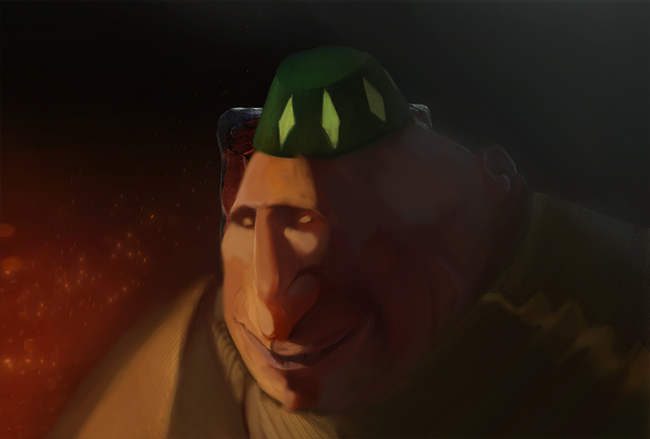
Think i got the nose pretty good, this is the size ive been jumping in and out of. Im in an awkard state of blurring and sharpening stuff and its so weird.
crits always welcome
crits always welcome

|
Mr. Toodles sketch book
|
|
12-10-2013, 09:49 AM
Think i got the nose pretty good, this is the size ive been jumping in and out of. Im in an awkard state of blurring and sharpening stuff and its so weird.
crits always welcome 
12-11-2013, 08:09 AM
Indeed! Very nice nose. Really liking the structure in this portrait, great work :D
And so, about edges. Yeah, I am deeply in trouble about that. I have been trying to figure it out - the logic, and how to render it, for a while now. Two things greatly influenced it: 1) Master studies. They have really nice designed edges. Edges that are truly designed for a painting. Here is what I have concluded so far about it: You're painting something that exists in three dimensions, making it project into a two-dimensional surface. The concept with have of edges only happens, really, on the 2D projection. They are entirely a graphical concept; We can't really look at the object and try to see edges - because the more you look, the more detail your eyes will dig. So even soft fabric becomes, actually, a collection of sharp loose threads, that you can actually see if you look at them. But you know that if you paint that, it will look terrible. So you kinda start looking for photos for that. They merge those loose threads and hair into a softer edge; And the biggest edge transition you see is usually with depth of field. And there lied the problem: the camera is actually designing the edges for us, and after doing a million photo studies, we try to apply lens/optical/camera logic to our paintings. But that is not how we see, that is how the CAMERA sees. Makes sense? So doing master studies was the first time I saw edges being used to convey information about the surface, and not some arbitrary lens captured phenomena. And you can go much softer on your edges then expected doing only photo studies, and it will still hold and look sharp if you use your hard edges right. The high contrast areas are usually pretty sharp - areas that are being directly by light. Areas in shadow are this much more softer, less detailed, less rendered. Edges also talks a lot about plane transitions - think a cube versus a sphere. So this need to translate well when you're painting too. 2) The first lesson on Chris Oatley's Magic Box talks about ambient/diffuse light setup. It's actually quite hard when you have all this diffuse light and not direct cast shadow. So he explains how to convey the softness of the light with a mix of gradient tool and soft brushing. He talks a lot about designing your shapes. And the exact act of designing shapes with a softer light made me think a great deal about how the shift in planes made a great deal about edges we are painting. It's confusing, really. I hope I can actually explain it once I am more sure of what I am doing. Back on conceptart.org we had a great thread that organized edges in 4 stages - 1 hard, 2 soft, 3 softer, 4 lost. And much like value, your painting would exists in the middle values, and the extremes ones were used as accents. So yeah, this has been a sort of guideline too. Please keep posting your experiments, I'd love to see the progress! (And feel free to drop me a line to talk about it anytime ;)
12-16-2013, 09:26 AM
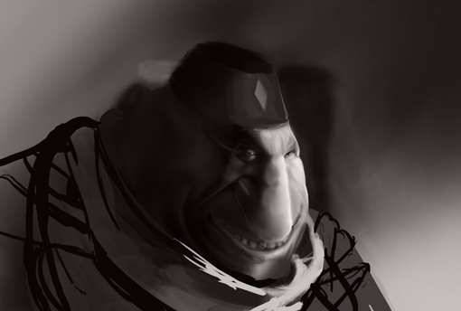
did some studies of le' corche model, my own face, and a self portrait going back to my values this time round, i have no idea how to bring it to color from here haha so im taking a break and im gonna look into it
01-05-2014, 09:27 AM
Nie sketchbook, you have been working on that piece for a long time. You seem to just be going backwards and forwards. Maybe its time to let it sit for a while, do some studies, take a photo and just copy the shit out of it. Then go back to it and see what you can do. Just a suggestion though :) Keep up the good work!
01-12-2014, 06:03 AM
Ya man i think im gonna take a break for a while, ive been working on some other things, currently the rough low res version of a model im working on

02-11-2014, 12:31 PM
So over the weekend i decided to make this axe, then i sculpted it, and in between i made a skin for CS:GO
you can be kind and upvote my go skin if youd like, it works on all items and is a randomly generated pattern, it was really fun using the workbench for CS:GO very easy to get into http://steamcommunity.com/sharedfiles/fi...=226784999 My axe, oh my axe, I created that small detail you see that ISN'T in the concept art, then spent my entire sunday making it only to find out that when imported he puts his hand right over that area, so its back to the drawing board I enjoyed sculpting it so I decided to share  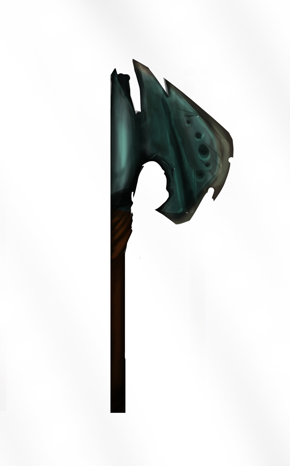 
02-17-2014, 01:45 PM
you look near this half mans lower half and you appreciate it damn it, I made that glorious belt buckle you see before your burning eyes
    
02-19-2014, 12:32 PM
here's a fun composition sketch i blew the hell up with filters

02-23-2014, 02:18 PM
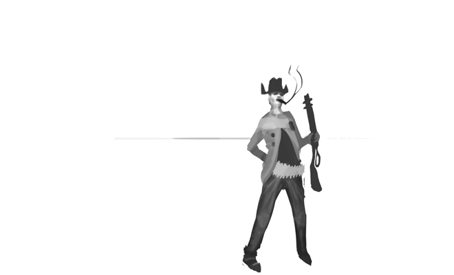
this is my thumbnail for a sculpture i'm preparing to do, It's the bandit from risk of rain, i love that game.
03-02-2014, 08:46 AM
I had a lot of fun with this
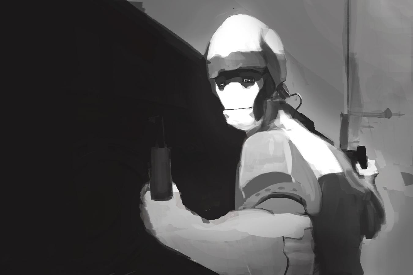
03-13-2014, 08:21 AM
Ballpoint pen, trying ti imitate Enrique Fernandez
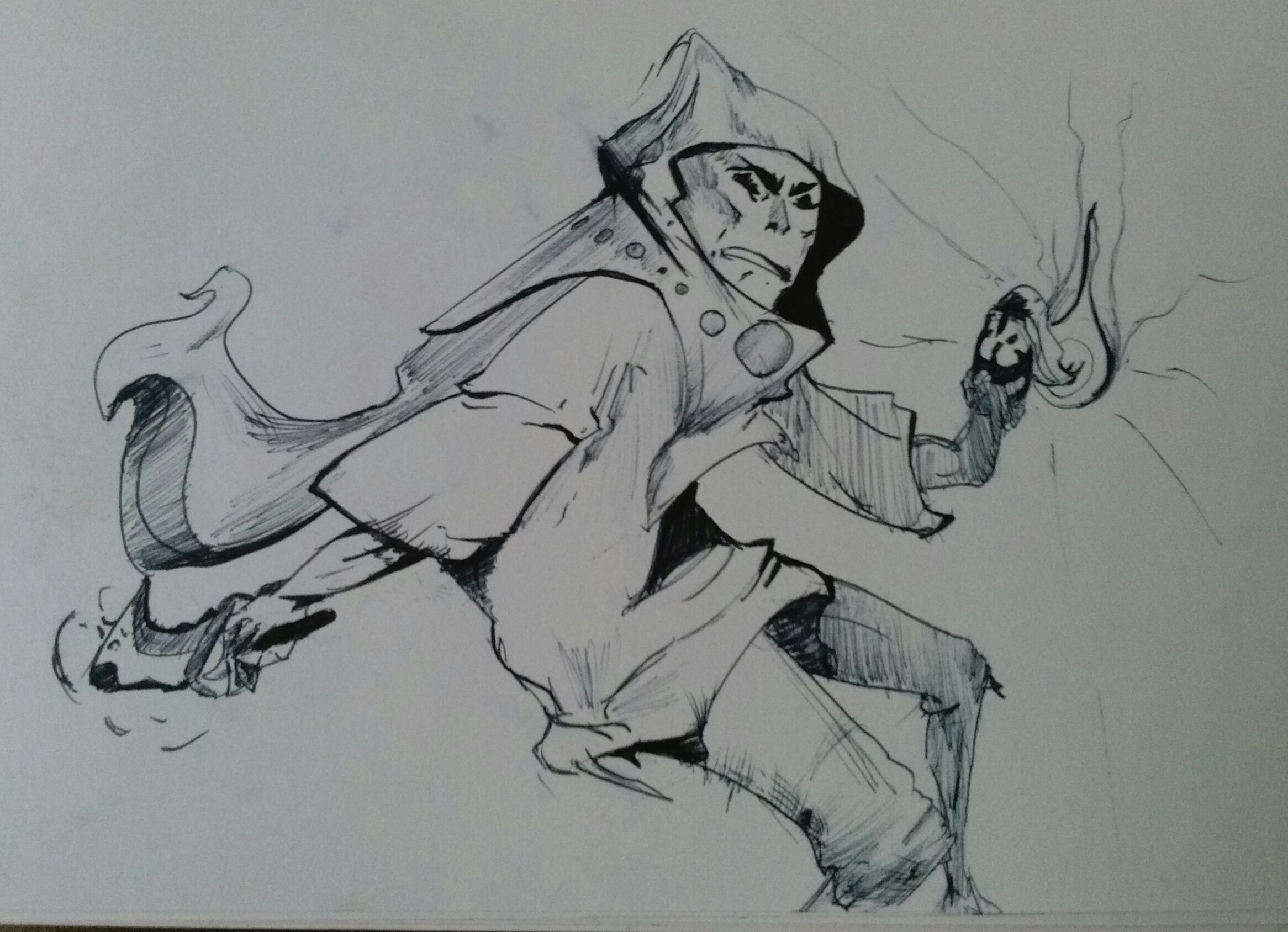
03-14-2014, 11:42 AM
Mother trucking DOTA concept art y'all
Vengeful spirit weapon 
03-16-2014, 12:36 PM
so painfully I have to tell everyone that I cant even finish that item, it is suppose to be transparent and their are no guidelines on how to make this effect for the weapon, so basically that means I can't even get a relation to the character
moving on i'm currently painting this, I wanted to take a break and show you all what i'm up to 
03-17-2014, 01:26 PM
lets get to page 10 already

03-18-2014, 02:02 AM
Page 10 gooooo!!11111 Awesome sketch book man. That last painting reminds me of Stephen Gammell's style some what.
03-23-2014, 08:14 AM
Thanks Hypnagogic_Haze! I gotta check that dude out then haha!
did i say i wasn't gonna finish that item? cause fuck that I'm finishing that item.  |
|
« Next Oldest | Next Newest »
|