Posts: 20
Threads: 2
Joined: Dec 2021
Reputation:
0
Posts: 3,343
Threads: 37
Joined: Aug 2013
Reputation:
234
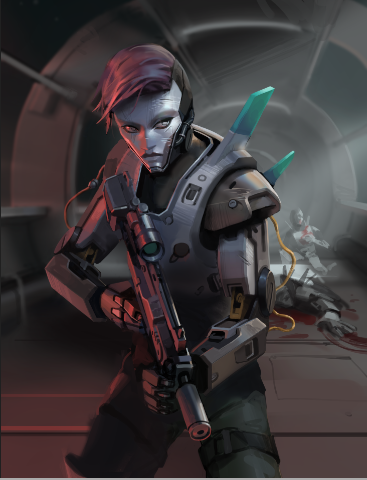
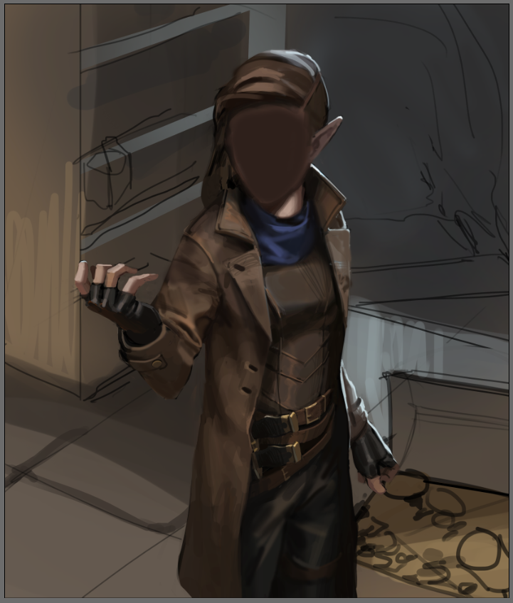
It strike me as odd to see you didn't develop the face and yet i see rendering.
Is it just that you turn up the opacity and have the face already figure below?
Good point
Good thing is you shown a few camera angle which show you have a good understand of perspective and anatomy and simplifcation.You shown different lightning scenario which also show you understand lightining.
Thing to improve
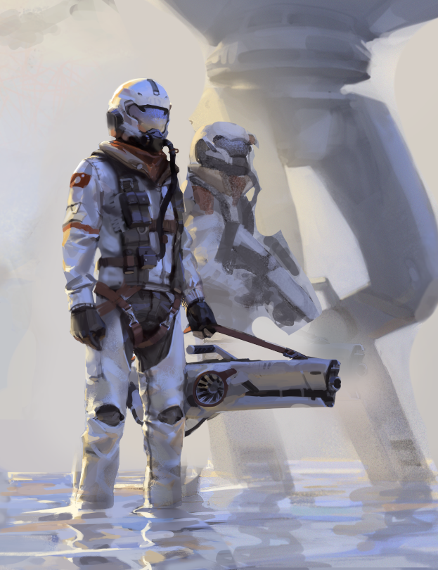
There a leak of dynamism in most of those you want to show more range of movement than this.Think, running, sitting or even jumping. Standing pose aren't going to make you stand out from the competition. Where are the leg of the men behind the other men in the last piece? How are you going to tell if there a nice overlap... and if thing read properly...
I can't really say with alot of assurance since i am not seeing the file of those artpiece but it seem that there a leak of planning in the thumbnailling phase which make it hard to figure out if thing are going in the right direction for those who critic.Maybe you have alot of confidence and do thing in reverse(the body first and the face last) it strike me as odd and risky.But nothing tell me you are setting yourself for failure it just me who doesn't know if you are going to be able to pull it off since you got nothing to show exept those 3 piece so it extra job to acess your skill level. Anyways what count is the result.
One additional thing would be to mention what position you want to apply with this portfolio and perhaps who you are targeting with this portfolio.
For example i see two sci-fi piece and 1 more fantasy which might be less useful if you target some studio that let say only does sci-fi game.
So i am going to stop here because i can critic the hell out of stuff but it better to let you do the talking since your new here and that not me who will give direction to what should define the identity of this portfolio.
Just one more thing there a portfolio section this isn't necessarly the right place to post this but no body is going to come ban you for that i say that to encourage you to look around the forum there even section about resource which could be a nice thing to dig up for reference and inspiration.
Posts: 261
Threads: 9
Joined: Dec 2021
Reputation:
43
Really nice star to your sketch book. I see some great things you are doing that show a good foundation and understanding. The lighting on your android piece is well planned out and the treatment to the uniforms in your third piece are great and i can feel the weight of the fabric which is a hard to convey so nicely done.
I would echo a few of the tips that Darktiste brought as up he gave some very good feedback. small tips like thinking through your backgrounds earlier in your planning stage helps a lot later on. the missing legs on the 2nd character on the your third piece is unsettling now that i noticed it. Its not that you need better backgrounds because i like them, just need to clean up some of the tangent lines and missing elements that people will spot easily and might ruin all the great work you are doing in the focal image.
a small thing i do will do with some images i might not be sure about is show it to a non-artist and just ask them to describe what they see. if you are drawing a flying character and they a say i see something swimming under water then you can adjust. It can help at time but then again you might be asking the wrong person :)
Posts: 83
Threads: 2
Joined: Apr 2020
Reputation:
4
Welcome Luka :) Lovely work so far! You have a great sense of painting and lighting. Keep em coming!
Posts: 50
Threads: 2
Joined: Apr 2021
Reputation:
1
(01-18-2022, 07:12 PM)spectralpainter Wrote: Big post to start. I'm trying to finish up these three images which will make up my new portfolio. I really want to make these images good so I hopefully can start illustrating for smaller board game / ttrpg companies. So all feedback would be appreciated :)
You really captured that the sunlight was hitting the back of the figure in the last one. It's beautiful.
Posts: 20
Threads: 2
Joined: Dec 2021
Reputation:
0
(01-18-2022, 07:42 PM)darktiste Wrote: There a leak of dynamism in most of those you want to show more range of movement than this.Think, running, sitting or even jumping. Standing pose aren't going to make you stand out from the competition. Where are the leg of the men behind the other men in the last piece? How are you going to tell if there a nice overlap... and if thing read properly...
I can't really say with alot of assurance since i am not seeing the file of those artpiece but it seem that there a leak of planning in the thumbnailling phase which make it hard to figure out if thing are going in the right direction for those who critic. Yeah, definitely going to try to work on not doing static poses for everything. Like you mentioned I think one of the main issues I have is not thinking too much about composition, mood, what a picture is trying to say. I'm one of those artists that tends to focus on technical stuff. I have some ideas for a new painting that I guess I'll put up in the critique thread maybe.
(01-19-2022, 04:15 AM)CBinnsIllustration Wrote: Really nice star to your sketch book. I see some great things you are doing that show a good foundation and understanding. The lighting on your android piece is well planned out and the treatment to the uniforms in your third piece are great and i can feel the weight of the fabric which is a hard to convey so nicely done.
I would echo a few of the tips that Darktiste brought as up he gave some very good feedback. small tips like thinking through your backgrounds earlier in your planning stage helps a lot later on. the missing legs on the 2nd character on the your third piece is unsettling now that i noticed it. Its not that you need better backgrounds because i like them, just need to clean up some of the tangent lines and missing elements that people will spot easily and might ruin all the great work you are doing in the focal image.
Thanks, and yes I agree going to try to spend more time planning the next image.
(01-20-2022, 01:22 AM)_spec Wrote: Welcome Luka :) Lovely work so far! You have a great sense of painting and lighting. Keep em coming!
(01-20-2022, 04:14 PM)Anomily Wrote: You really captured that the sunlight was hitting the back of the figure in the last one. It's beautiful. Thanks guys!
Posts: 20
Threads: 2
Joined: Dec 2021
Reputation:
0
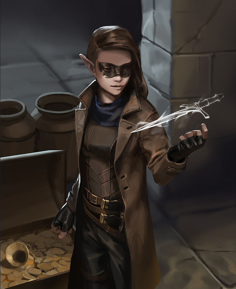
Hacked away at this one some more. I think I'm going to just finish these pieces out so I can just have something to show people and the next images I start I'll try to incorporate the critiques I've gotten here and other places.

Posts: 261
Threads: 9
Joined: Dec 2021
Reputation:
43
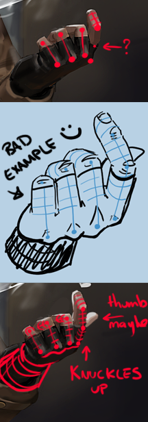
Really like the update to that piece the face is looking great even though adding after the fact, which is hard to do. Not sure if you were still working on her left hand structure some more, if so, please ignore my next sentence.
i would think about that hand structure a little more. I feel the index finger would be raised slightly and the first knuckle more obvious. and perhaps a thumb would help show a little more expression to the hand. forgive my crude doodle below but maybe it helps, maybe not.
keep posting!

Posts: 20
Threads: 2
Joined: Dec 2021
Reputation:
0
Thanks for the breakdown CBinns, appreciate it a lot. Yeah hand got sloppy.. will try to fix
Posts: 1,076
Threads: 4
Joined: Jan 2016
Reputation:
43
Great update, loving the brushwork and color choices here, just the perfect amount of saturation. Great angle too, very dynamic. Keep it going, looking forward to more progress!
Posts: 20
Threads: 2
Joined: Dec 2021
Reputation:
0
(01-21-2022, 06:55 PM)cgmythology Wrote: Great update, loving the brushwork and color choices here, just the perfect amount of saturation. Great angle too, very dynamic. Keep it going, looking forward to more progress!
Thank you!
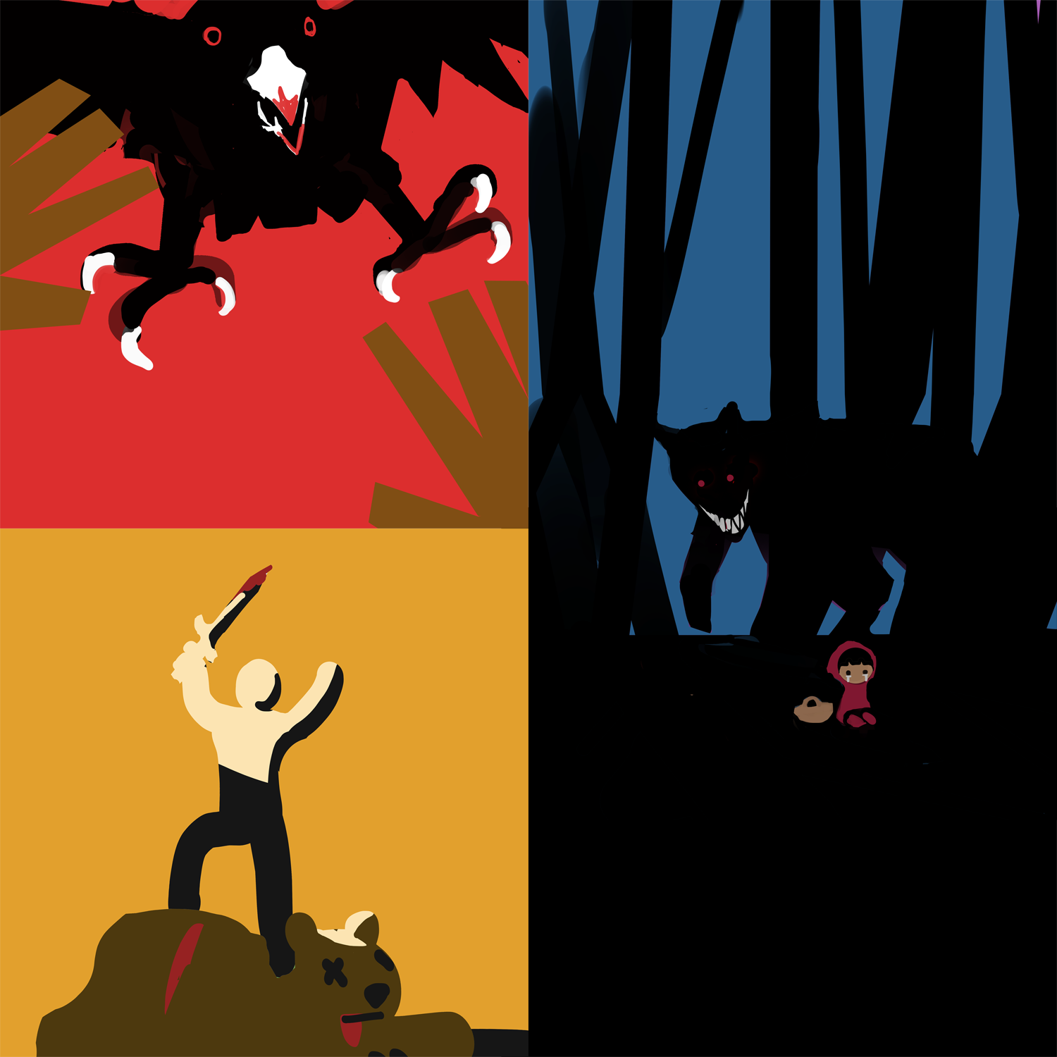
Something a bit more theoretical today, exercises from Molly Bang's How Pictures Work. The idea is to communicate a clear mood and a bit of story as simply as possible, definitely one of the aspects of illustration I give the least attention. I'm pretty okay with how these turned out though.

Posts: 27
Threads: 1
Joined: Dec 2015
Reputation:
7
That's a great exercise actually there in the latest post. Communicating an idea and a concept not through rendering but through simple shapes and composition basically, very good.
Posts: 20
Threads: 2
Joined: Dec 2021
Reputation:
0
(01-23-2022, 08:57 AM)Uiriamu Wrote: That's a great exercise actually there in the latest post. Communicating an idea and a concept not through rendering but through simple shapes and composition basically, very good.
Yeah, I think I was able to learn a lot. Plan to do more of those exercises some time.
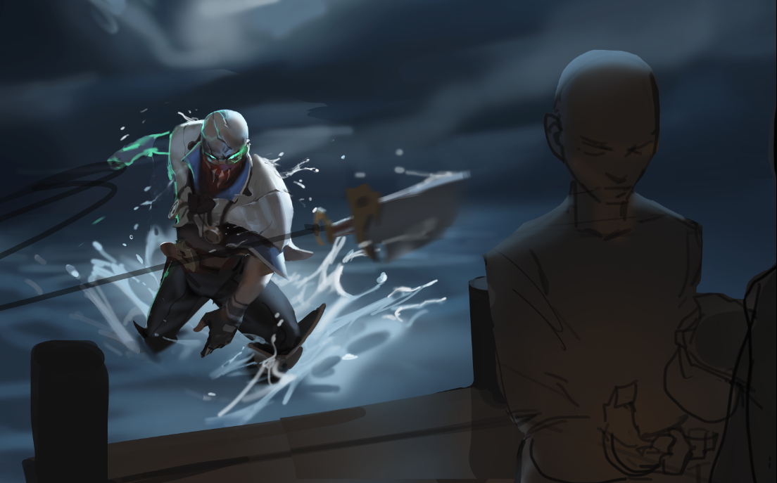
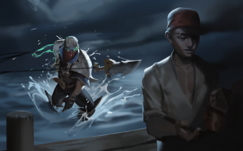
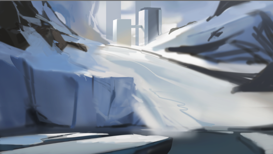
Started a new image today.. I seem to have something of a tendency to not render all parts of the image at once. This time it's because I'm struggling with the composition. I thought I was going to take out the figures in the foreground for a while. Still might end up doing that..

Posts: 20
Threads: 2
Joined: Dec 2021
Reputation:
0
Some more progress. Also started a landscape since I figured I should have at least one environment in my portfolio. This is somewhere around the fifth lanscape I've ever done but I like where it's going generally.


Posts: 3,343
Threads: 37
Joined: Aug 2013
Reputation:
234
Hey i just re-read the intro part where it say ''I really want to make these images good so I hopefully can start illustrating for smaller board game / ttrpg companies'' i think your not necessarly putting piece that would appeal to those kinda of game studio.I think you need to collect example of what aspect of those board game you are interested to design and create a visual board that will help you better understand what will be ask from you. Here some example of categorie of object you can find generally in a board game Counter,Card,Character sheet(being able to show you can design beyond drawing(infographie),Game board(where the action take place),Tile(object,power),Figurine(3d or concept)
So far you are more into the territory of TGC(trading game card) i would argue than board game in my opinion.If you want to make it clear what interest you it important that you understand what you will be designing.
Posts: 20
Threads: 2
Joined: Dec 2021
Reputation:
0
[attachment=124650 Wrote:darktiste pid='133664' dateline='1643306800']Hey i just re-read the intro part where it say ''I really want to make these images good so I hopefully can start illustrating for smaller board game / ttrpg companies'' i think your not necessarly putting piece that would appeal to those kinda of game studio.I think you need to collect example of what aspect of those board game you are interested to design and create a visual board that will help you better understand what will be ask from you. Here some example of categorie of object you can find generally in a board game Counter,Card,Character sheet(being able to show you can design beyond drawing(infographie),Game board(where the action take place),Tile(object,power),Figurine(3d or concept)
So far you are more into the territory of TGC(trading game card) i would argue than board game in my opinion.If you want to make it clear what interest you it important that you understand what you will be designing.
Yeah, I'm only really interested in illustration and maybe some concept art for the moment. I know a lot of board games have little images on their cards so I guess I was thinking of stuff more like that.
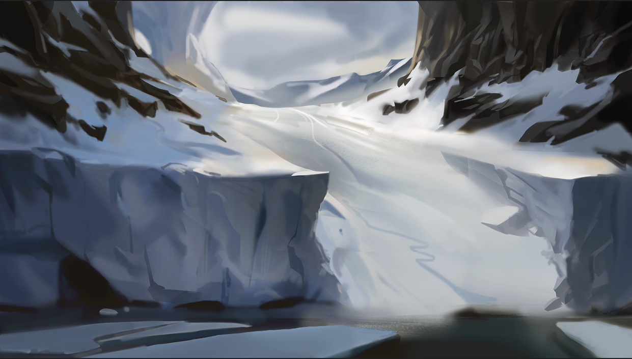
Did some more work on this. Not very satisfied with where it is at the moment. Currently studying up on rocks because I really don't know how to make them feel natural. Compositionally I think it's weak as well. It's pretty repetitive on both sides and I feel like the general outlines of things don't really flow together too well. I'm going to add some sort of focal point in the center but aside from that I think I would have to do the image over..

Posts: 3,343
Threads: 37
Joined: Aug 2013
Reputation:
234
I am not really concern by your rock.The only thing i would say for the rock is think about small medium big rock and you should be ok as long as you think of either round or angular depending on the type of rock.
For the image i think the problem is you have a big line at the middle which create a very predictable scene not only that the line finish at the middle out. But then you top it off with shape language (square heavy) shape which are often associated with a static feeling.Also you pretty much replicate in a mirror most of the element inside the scene.For example in the foreground there ice on the right and ice on the left rock on the left rock on the right.It a bit worst than that when you reallly take the time to check how much thing repeat.But it kinda predictable result for a ramp+ravine combo.
But what is worst is not trying anything new so it not a lost drawing so don't get bug down by that but avoid to much balance and repetition if you don't want a scene to be to predictiable.
One last thing that could add interest and detail would be to add more element to this scene.Ice falling of the cliff wind picking up snow water splash from the ice falling in the water,rock debris failling of the side of the cliff,bird flying in the sky and why not peinguin on the ice etc...
Posts: 20
Threads: 2
Joined: Dec 2021
Reputation:
0
[attachment=124657 Wrote:darktiste pid='133673' dateline='1643417105']I am not really concern by your rock.The only thing i would say for the rock is think about small medium big rock and you should be ok as long as you think of either round or angular depending on the type of rock.
For the image i think the problem is you have a big line at the middle which create a very predictable scene not only that the line finish at the middle of piece and to.But then you top it off with shape language (square heavy) shape which are often associated with a static feeling.Also you pretty much replicate in a mirror most of the element inside the scene.For example in theforeground there ice on the right and ice on the left rock on the left rock on the right.It a bit worst than that when you reallly take the time to check how much thing repeat.But it kinda predictable result for a ramp+ravine combo.
But what is worst is not trying anything new so it not a lost drawing so don't get bug down by that but avoid to much balance and repetition if you don't want a scene to be to predictiable.
One last thing that could add interest and detail would be to add more element to this scene.Ice falling of the cliff wind picking up snow water splash from the ice falling in the water,rock debris failling of the side of the cliff,bird flying in the sky and why not peinguin on the ice etc...
Definitely agree with the repetition bit. Think I'm going to add some people at the top of the hill and a boat and some more people walking up to give it a bit more interest as you said.
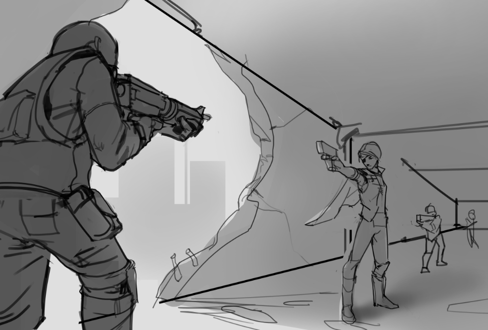
For now, I started the sketch for the last image I'm going to make for my portfolio before I send it off.

Posts: 73
Threads: 4
Joined: Jul 2020
Reputation:
2
You're really good with composition, the 3rd image with the soldiers in flight suites is my favorite.
Posts: 851
Threads: 6
Joined: May 2018
Reputation:
116
I really like this composition, it's going to look really cool. The poses you have for the two main actors already look pretty solid.
|
