Imogen's Sketchbook of '22
#21
What you want me to demonstrate exactly... ???

You got one of the following problem i suspect

1.Your brush sensitivity a bit to high making laying down small amount of value a problem ( it a setting i can't show you this by doing a self portrait there probably quicker way to make my point anyways)

2. other problem might be that you take value that are to dark (you need to observe more and take in account what around the value in term of value to see it correctly(yes value and color around a value change were perception of that value or color)

(This probably what you have in mind when you want to see this being demonstrate)(I included an example)


3.You push to hard on your tablet pen.
(I can demonstrate that but you won't see since you aren't sensing it yourself.)


Attached Files Image(s)


My Sketchbook

Perfection is unmeasurable therefor it impossible to reach it.
Reply
#22
Hello!
Great paintings! Especially the last one!
Reply
#23
(06-24-2022, 05:18 PM)Kilillan Wrote: Hello!
Great paintings! Especially the last one!

Hello and aw thank you so much Kilillan!!  I hope to keep on improving xoxo


🦇 33 / F / BPL UK
🖤 Imogen's Sketchbook of '22
🖤 ART Instagram
🖤 (NEW) DeviantART
🖤 Social Media Links

Reply
#24
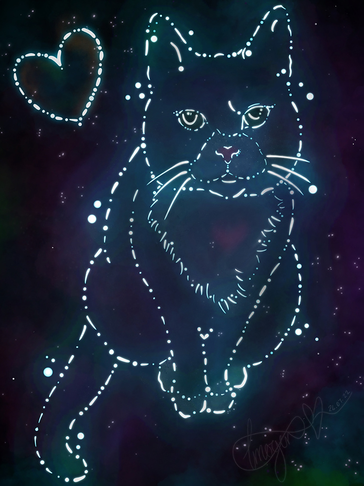
I understand my Crimson Daggers SB isn't really meant for finished pieces.  However this piece is very important to me (it simply is what it is - and comes from a place of great sadness and distress, an emotional piece if you will) - I'm sharing it here, because I feel I NEED to not because I'd like feedback purr-say!!

This piece is important to me because I lost my beloved Mr Ash on May 2nd 2022 - At the age of 8 and a half due to heart murmur and blood clot caused loss of his back end.  It was / is devastating; as a disabled person most days I spent the good majority of it with him (with the exception of maybe 10 days since day 1 of getting him and his sister).  It's very difficult but my spiritual beliefs are we are all energy and when our physical bodies die our energy returns to the universe to be reborn, recreated or simply belong to a bigger picture.  This is my attempt to capture that.  

Spirit of Ash
24th June 2022
Apx 5 hours total (inc a lot of learning).
iPad Pro 12.9" - Apple Pencil 2 - ProCreate.


🦇 33 / F / BPL UK
🖤 Imogen's Sketchbook of '22
🖤 ART Instagram
🖤 (NEW) DeviantART
🖤 Social Media Links

Reply
#25
aww that's so sad :( I'm sorry. The piece looks beautiful

Reply
#26
Thumbs Up 
Thank you oh so much JosephCow for your kind words <3


...............................................................................................................................


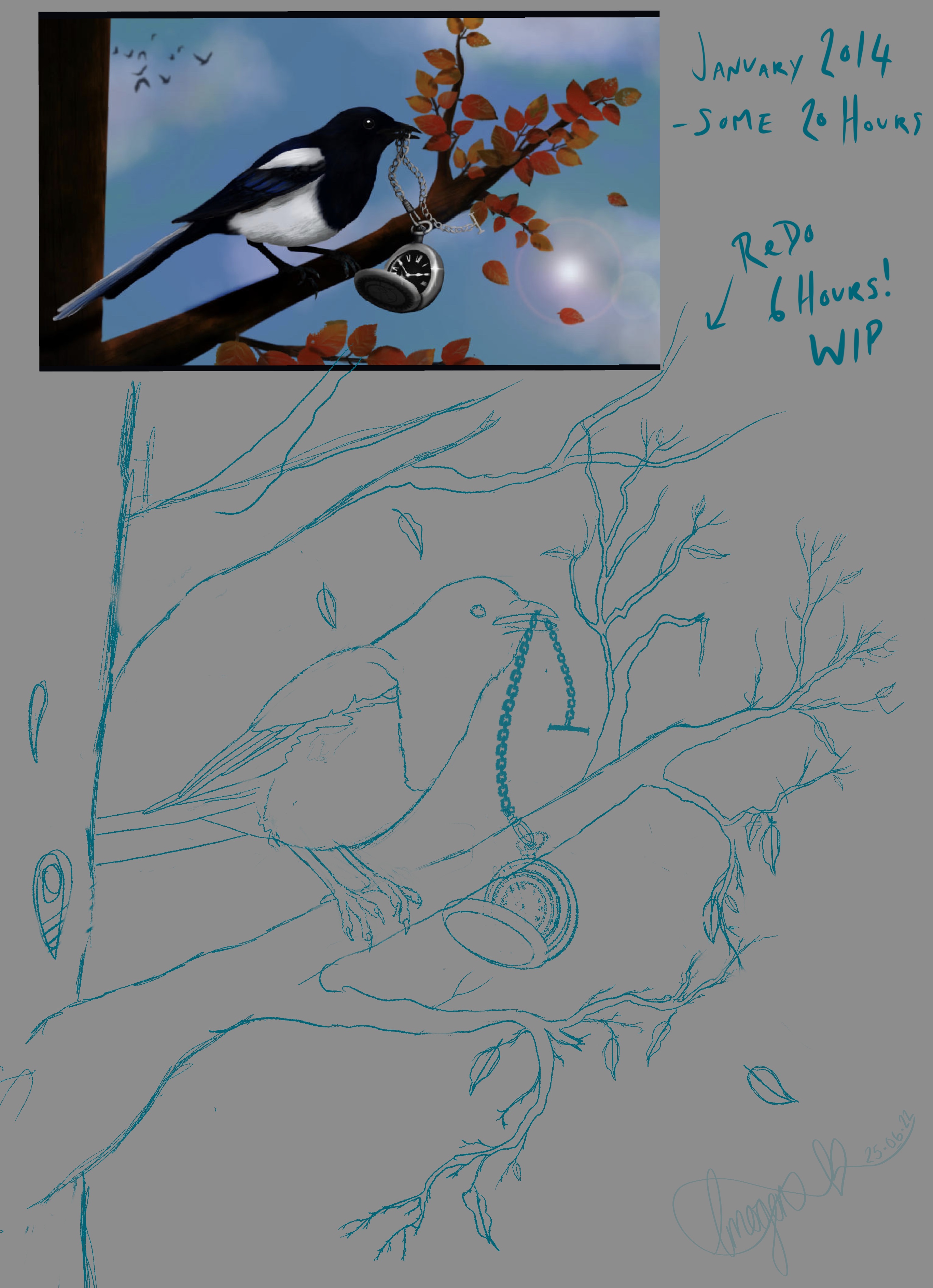
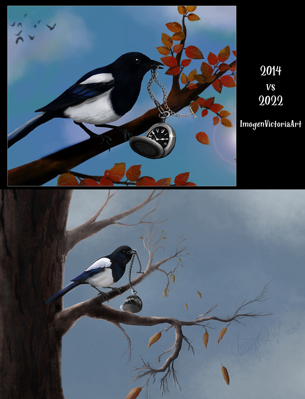
WIP.  Little Thief .2

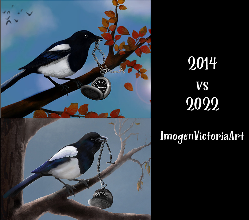
In other news I decided to redo one of my old art pieces (which I LOVE) but truly wish I'd put the time and energy into painting the tree, leaves. sky, birds etc.. as I did in doing the Magpie (and pocket watch sort of).  By the time I'd done that much I grew tired and just 'cheated' and used premade brushes / stamp brushes to add the rest of the image - even though they clearly don't fit in perspective, value, style etc..  Perhaps a naked winter / dead tree would have been better in this LAZY situation.  {Not saying there's anything wrong with using those kind of brushes / stamp brushes.. - but when it's done well!!}

Which may I add this art was done in an old version of Adobe Photoshop and with my laptop track pad as at that time I didn't own a graphics tablet.

However.  Here we are in 2022 (some 8 years or so later) and I've decided to do a ainting based on this previous work (Magpie - Autumnal Tree - Pocket Watch).  Here we are 6 hours or so later and I think I'm FINALLY happy enough with the 'line art' that I can start to paint (over) it.

I really did STRUGGLE with the feet, but found a Magpie very similar in posted compared to my original work.  And I tried my best..  All images were googled; for help in reference for drawing only.

Here is how it's going..  WIP:
iPad Pro 19.5" - Apple Pencil 2 - ProCreate
New art 25.06.22  apx  6 hours sketching / drawing / refining.


Ps. Yes I copy pasted a bunch of leaves BUT they won't look the same once painted.


🦇 33 / F / BPL UK
🖤 Imogen's Sketchbook of '22
🖤 ART Instagram
🖤 (NEW) DeviantART
🖤 Social Media Links

Reply
#27
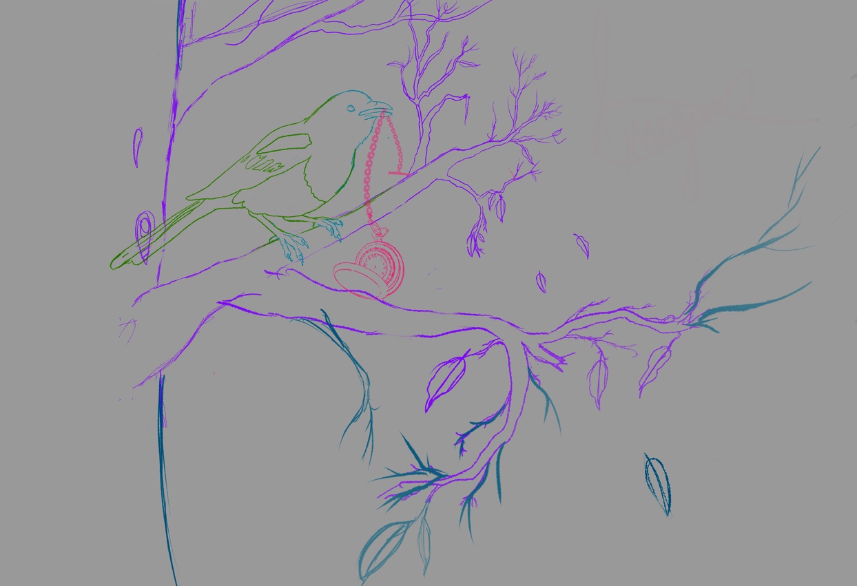
An extra hour revising that magpie..

Also I liked the way the pocket watch sat behind that front branch.  Which made me realise if that front branch is actually in the foreground it wojld be an awful lot bigger..  Especially the leaves in ratio to the magpie.. 

Totally open to optionions and suggestions on this..!!  TIA


🦇 33 / F / BPL UK
🖤 Imogen's Sketchbook of '22
🖤 ART Instagram
🖤 (NEW) DeviantART
🖤 Social Media Links

Reply
#28
(06-26-2022, 04:41 PM)miimogenation Wrote: An extra hour revising that magpie..

Also I liked the way the pocket watch sat behind that front branch.  Which made me realise if that front branch is actually in the foreground it wojld be an awful lot bigger..  Especially the leaves in ratio to the magpie.. 

Totally open to optionions and suggestions on this..!!  TIA

great line work and proportions on the bird.

I don't know much about drawing animals or birds but I know Jens Claessens, an artist i follow is rlly good at it
perhaps you can add some cross hatching to generate more interest in the image?
Examples: https://www.artstation.com/artwork/zOg1Qw


I also looked up images of magpies on google and noticed how reflective their feathers are

for example the top of the head and feathers that are most pependicular to the sky is most refelective of light. the top of the body is also reflecting some light as well at its beak , legs, and tail. Bounce lighting also hits the chin and belly of the bird. the belly of the bird looks more brown compared to the rest of the body because it's hitting lighting from the ground. I think adding these elements to your painting will make it look more 3D
 [Image: 1800]
rimlight from the sunlight could also enhance the painting.
Reply
#29
Hey handsomekorean, thanks for the reply and your kind words.  The drawing is just a basic lines so my painting over the top has somewhere to go.  - I find it easier to paint from lineart / over so I know a placement.. And then I can worry about values and less about perspective..  The painting itself is actually going really quiet well, for me.  Just taking a small break as I didn't realise its nearly 2pm and we haven't eaten..  So resolving that before continuing working.  May need to look up trees.. Never really painted those properly before..!!  But over all.. So far I'm happy..


Attached Files Image(s)


🦇 33 / F / BPL UK
🖤 Imogen's Sketchbook of '22
🖤 ART Instagram
🖤 (NEW) DeviantART
🖤 Social Media Links

Reply
#30
looks very nice, especially the colors
Huge improvement from the last piece. Seems like you already have good technical skills for rendering. 
Keep up with the studies from good high resolution references where lighting is obvious and clear, be very observant with what you see and recognize how interacts with the subject, and I think you'll be very happy with your progress and learning as an artist.
Reply
#31
(06-27-2022, 01:13 AM)handsomekorean Wrote: looks very nice, especially the colors
Huge improvement from the last piece. Seems like you already have good technical skills for rendering...

Thank you handsomekorean.


I now feel like I'm finished.  Simply because I am at the point where if I start doing more the worse it gets.  So for now I'm quite pleased with how this turned out...!!


🦇 33 / F / BPL UK
🖤 Imogen's Sketchbook of '22
🖤 ART Instagram
🖤 (NEW) DeviantART
🖤 Social Media Links

Reply
#32
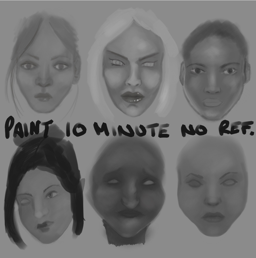
I did 6x 10 minute paintings.  Just to see what I'm like without lineart.  Without colour.  Without reference.  Just painting on one layer each.  Not zoomed in.   - Definitely something I need to practice. But for an hours er work? I don't think I did too awful.. Lol.

I'm actually loving middle bottom I might do a witch painting from her.


🦇 33 / F / BPL UK
🖤 Imogen's Sketchbook of '22
🖤 ART Instagram
🖤 (NEW) DeviantART
🖤 Social Media Links

Reply
#33
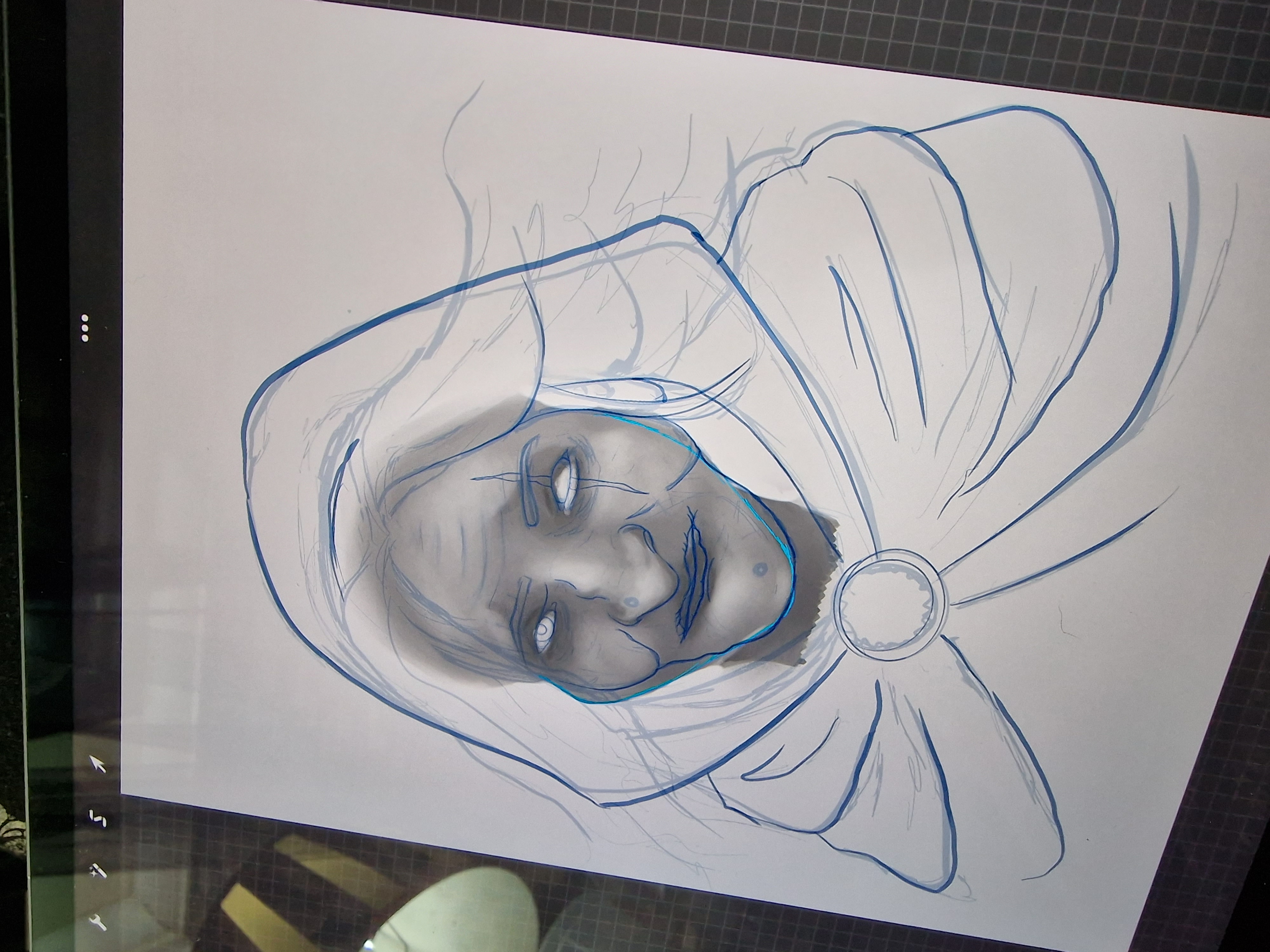
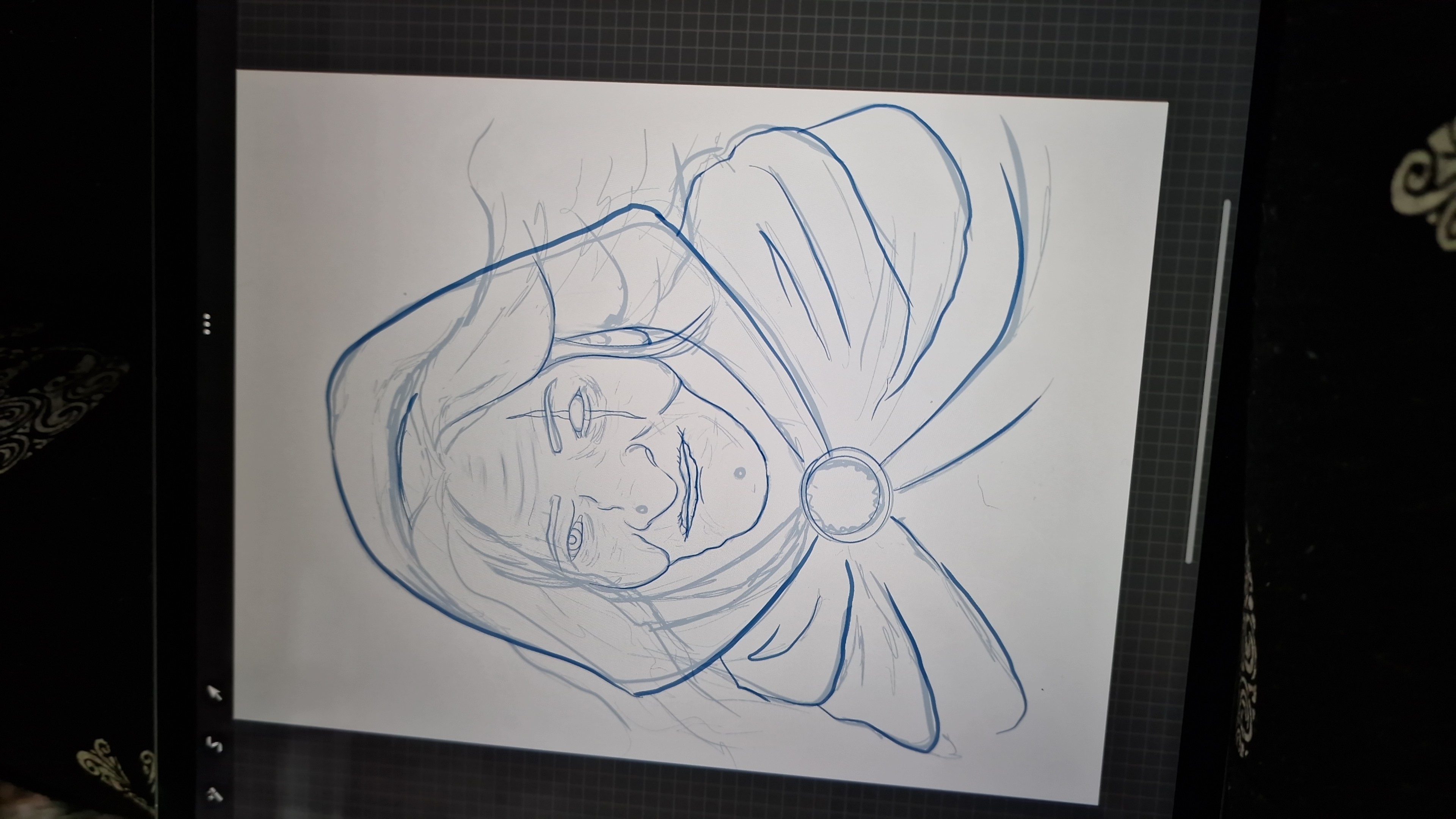
2 hour later..  Drawing over and adding to.   Going to totally repaint.  Drawing was from earlier imagination 10min paintings.......  


🦇 33 / F / BPL UK
🖤 Imogen's Sketchbook of '22
🖤 ART Instagram
🖤 (NEW) DeviantART
🖤 Social Media Links

Reply
#34
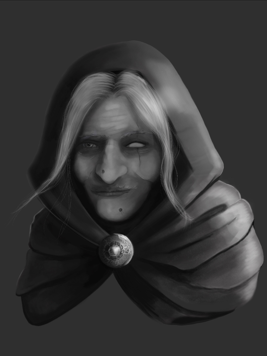
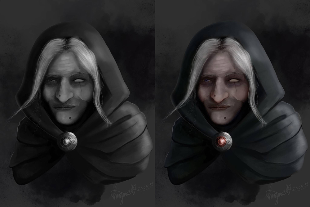
So some 11 hours and so far I've done this..  From imagination..  Going to attempt to colour over, which I've never done before (successfully at least).  But watched some videos by Dave Rapoza and Dave Greco so hoping it won't turn out too badly..


🦇 33 / F / BPL UK
🖤 Imogen's Sketchbook of '22
🖤 ART Instagram
🖤 (NEW) DeviantART
🖤 Social Media Links

Reply
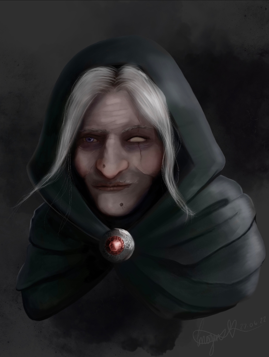
#35
Well never coloured ontop of black and white painting.  I've tried some stuff in the past and it never worked out.  Maybe I didn't do the values well enough.. Anyways this is how it's turned out.  And I think for a practice piece I'm going to leave it here.......  Maybe revisit at some point.  Especially if anyone has any suggestions..  Xx


Starting at 2am and its just gone 3pm so 13 hours of figuring stuff out.. Drawing.. Value painting.. Colour layer over painting..  Not sure how to take it further.

27th June 2022
Apx 13 hours
ProCreate - iPad Pro 2020 - Apple Pencil 2


🦇 33 / F / BPL UK
🖤 Imogen's Sketchbook of '22
🖤 ART Instagram
🖤 (NEW) DeviantART
🖤 Social Media Links

Reply
#36
Took a day out from art, to game.  Today I'm back at it.  

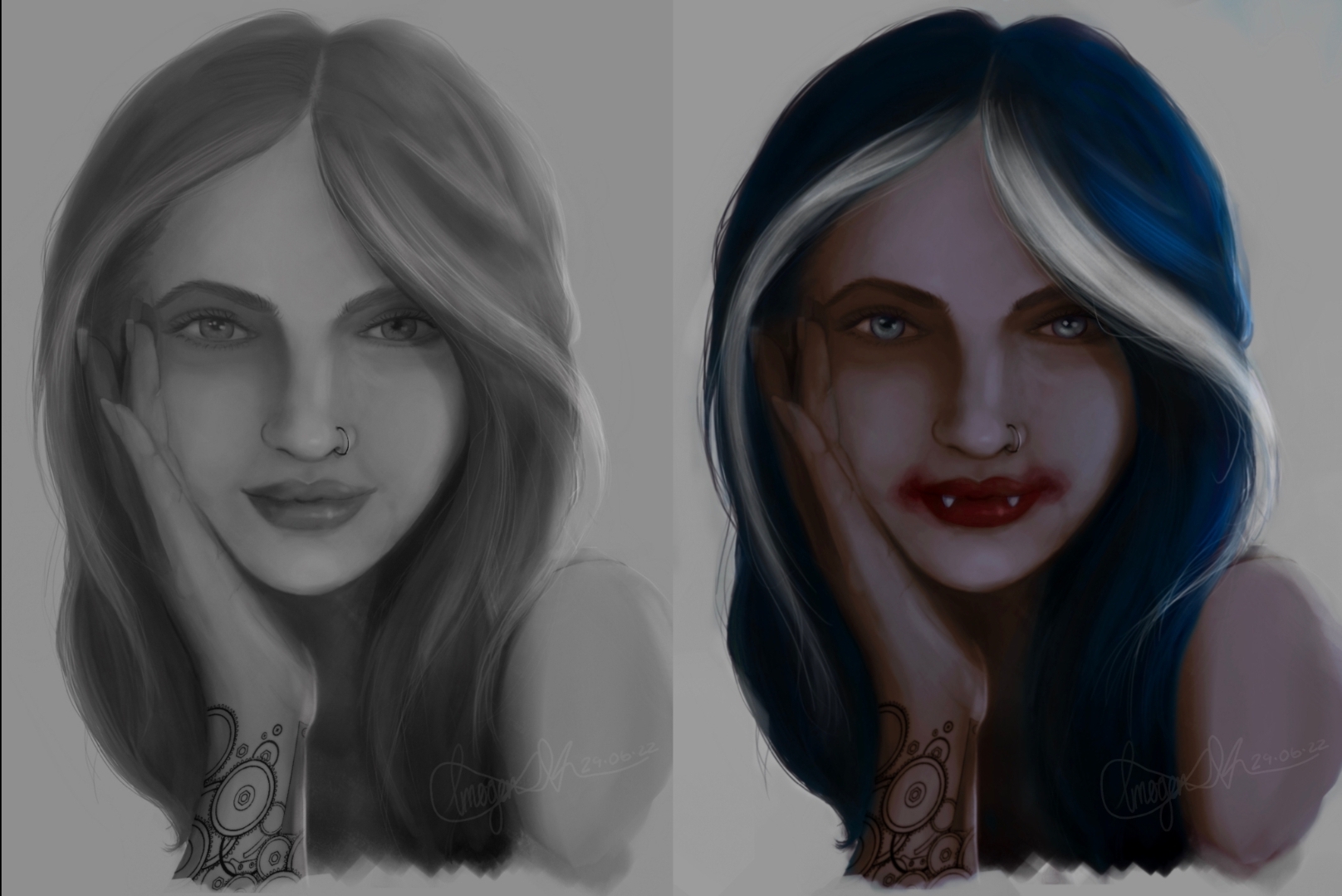
Inspired by today's sketchadayapp prompt challenge 'GEAR' and well this is the digital painting I did in monochrome values with no reference, all from imagination.  I impressed myself with this one.

I then coloured over if and turned her into this vampire girl. Don't know why I was just feeling it at the time. 

USING ONLY ONE BRUSH in different sizes and opacities. TO DRAW, PAINT AND COLOUR.

29th June 2022
Apx 7 hours
ProCreate - iPad Pro 2020 - Apple Pencil 2

Ps. I names her Jessika. I don't know why. 


🦇 33 / F / BPL UK
🖤 Imogen's Sketchbook of '22
🖤 ART Instagram
🖤 (NEW) DeviantART
🖤 Social Media Links

Reply
#37
Nice updates here, really enjoy your skin tones of your recent 'vampire' piece, very well chosen. The painting of Mr. Ash is excellent as well, really great concept there and nice colors as well. Keep it going, very much looking forward to seeing you progress further!

Reply
#38
Hi Imogen! Cool stuff you have going on, keep it up!

For the old woman / witch painting I think what could benefit you, not just for that picture but it's especially prevalent. If you were my student I would give you the assignment of study light and form on a simple sphere exercise. Dorian Iten is a great teacher and he's got some really great references to this here:


https://www.dorian-iten.com/light/

https://www.dorian-iten.com/wp-content/u...40x529.jpg
This is the goldmine right here. Personally I don't think you need to memories all the names but all these things are important ingredients in how we look at form and how we understand it in nature.


What I'm feeling is lacking in that painting is a more clearly defined direction of the light. It reads quite well on the pendant thingy and so I made a little paintover trying to keep the light you have on the pendant in mind when I painted. I think the painting "suffered" a little bit of "half-toneitis" and didn't quite have any intense lights, or rich darks (essentially contrast) and I tried to push that a little bit more. I also tried to have each value have its own purpose, like is it a cast shadow, or a core shadow, or a half tone? I hope this makes sense :)


This is how I would go forward with this kind of study. I would do a simple sphere, or two, or three, or four, basically until I feel like these names (Core shadow, half tone, and so on) are starting to click a bit more. I would copy the one Dorian Iten has published on his website, and then I would try to apply that knowledge and understanding to an old master painting portrait, perhaps an earlier Rembrandt when he was a bit tighter and not as loose, or a Caravaggio who used very intense lights in his work. Do it grayscale for now to keep it more simple just for this study. If the values work, color will almost automatically work (within reason) on top of it.

Keep up the good work, keep practicing and I'm excited to see where you go from here. And of course if you have any questions do let me know.


Attached Files Image(s)


Reply


Forum Jump:


Users browsing this thread: 3 Guest(s)