Environment Challenge #4 WIP - (Un)natural Power Extraction!
#1
Hello All, I wanted to bring back Environment challenges after the last CHOW, it looks like there have been 3 so far, long ago. Just thought this would be a fun way to shake things up, especially because I don't know about you all, but I've been more interested in environment design lately and thought this would be a fun portfolio building exercise. My intention for this is to kind of simulate the type of concept you might be asked to come up with for a level of a game or other visual media, but leave it more open ended to allow for individual creative freedom. Here is the brief:
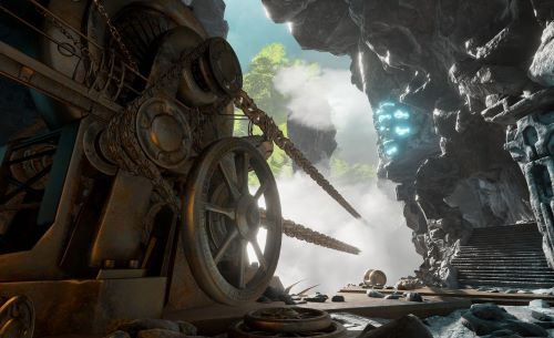


Image by Eric Anderson, from 2016 game Obduction to serve as vague inspiration.


(Un)natural Power Extraction


Design an environment concept which is a natural environment that stands in aesthetic contrast to man-made machines designed to harness and/or transport power from it. Imagine what type of constructions could be sensible AND visually interesting. Turbines? Boilers? Pipes? Cords? Particle beams? etc. Are the constructions new, or abandoned long ago? Is the power extraction in harmony with the environment, or is it destructive? These are questions that are up to you to consider.


Have fun, and be creative! The possibilities are fairly open ended, and there is not any requirement to entirely consider every aspect of how the machines may function in reality as long as it is convincing enough, and fulfills the prompt in terms of mood and aesthetic. Keep in mind though, that the challenge is about design. So as a guideline, try to go beyond something overly generic that could be easily generated by AI.


Contest Rules:


  • You must post at least one WIP in the WIP thread to be accepted into the final poll.
  • Finals must be posted in the finals thread before the deadline.
  • Only ONE submission per person in the finals thread.
  • Must be original work created for the challenge.
  • Work may be 2D or 3D*
  • Voting will be held for 5 days after the deadline.
  • In an event of a tiebreaker, a winner will be chosen through a randomized name picker.


*Rules for CHOW forbade the use of purchased or downloaded assets not created by you. However, since using them for environment concepts is so commonplace and expected nowadays, particularly for trees, rocks, vegetation and so on, I think this is permissible for 'generic' elements.


Deadline is Monday, April 15th @ UTC: 23:59
 -+|| WIP THREAD ||+-


Joking

Reply
#2
[Image: giphy.gif]

Sketcherinos

Link Tree

Discord: emnida
Reply
#3
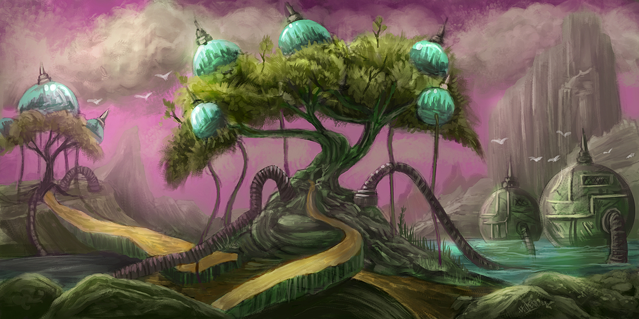
Here are some ideas of have for this topic...


LEGEND'S SKETCHBOOK_001
To all artists struggling to create and are intimidated by A.I. (anti-imagination)
Sun "Everything has been done, but not by you" Sun
Reply
#4
Ooh nice thumbnails! I'm interested in the trees with balls on em (2)? that seems unique. I'll be postin my own ideas in a bit!

Reply
#5
Here's some thumbnails of mine. I think the first one makes the most sense. I was thinking it's like a enormous shaft in the earth that naturally creates a draft, harnessed by a huge turbine.

2nd idea is a boiler in gorge like where a river used to be but has now dried up. So it would be using the power of the current when it was once underwater.

THe third one was supposed to be like steam generators on little islands in the water, some how it just visually looks confused so idk about that one.


Attached Files Image(s)


Reply
#6
Josephcow: Really nice concepts! I really like 1 a lot because of the odd shapes and propeller, I also like the camera angle in this piece. Number 2 has a lot of potential too. 

Here's what I have after some hours of noodling around....Basically an oxygen creation operation in a toxic environment using trees and machined processing to achieve the finished product. 


LEGEND'S SKETCHBOOK_001
To all artists struggling to create and are intimidated by A.I. (anti-imagination)
Sun "Everything has been done, but not by you" Sun
Reply
#7
(03-23-2024, 09:49 AM)JosephCow Wrote: Here's some thumbnails of mine. I think the first one makes the most sense. I was thinking it's like a enormous shaft in the earth that naturally creates a draft, harnessed by a huge turbine.

2nd idea is a boiler in gorge like where a river used to be but has now dried up. So it would be using the power of the current when it was once underwater.

THe third one was supposed to be like steam generators on little islands in the water, some how it just visually looks confused so idk about that one.

When i am doing concept i am always asking myself should i describe what my intent were it never seem to make sense to me to explain a design i think good art is ''leaving space to interpretation'' the only reason why i explain what i was trying to do i think is when i feel the design doesn't stand on it own yet it like nervous habit of mine i don't know for you.

I think if perfectly fine in the thumbnail stage to describe because it still open to change.What i don't like is when i explain what i was trying to do after finishing a piece it bother me because it make me question if i put enough though into the design if i need to explain what someone is looking at. But then i remember that even if we were to read the same word we have different perspective and intention can be sometime hard to graps.Also just describing what something is doesn't necessarily always include giving a context to why those design decision were made.

Design choose are more than mere aesthetical choose they fit inside a setting which define those aesthetical choose.

Here some note i took a while back that can serve as some kind of design checklist.If you feel like you are trying to justify what you are doing.
Atleast if you justify those thing to yourself perhaps the design will do the job on it own.

Here a few idea and key concept i have in mind in those note.


Readibly(Visually dominant in constrast to other object in the scene)Example the protagonist silhouette is more complex vs Minion have less complex silhouette

Strong Silhouette(use shape to contrast from other silouette not just in complexity but in curve and angle aswell as a more dominant use of shape language)

Color are carefully chosen if required and don't clash against one an other(No eye sore)(Can be look at for a long period)(Reforce the mood)(Color that say something not random)(Color that help establish dominiant vs none dominant)

Relatable(To the viewer)

Crafted for a specific audience

Give the viewer the illusion of 3 dimension to character, creature, object or space(The design must take something that is familiar to the targeted audience and put a twist on it)

It is relatable to human(Borrow from the real world)

Include pop culture references in a tasteful manner.

Utilize history & culture

Cool factor(Don't be boring)
Mood(Immersion and storytelling bonus point)
Color(Don't be an eye sore)
Dynamic gesture(Imply gravity and movement)

Creativity

Mix familiar surrounding

Introduce or Remove Technology(Create limitation this force you to narrow down your option)(This also add implied storytelling element)
Different life altering setting(Create a new flavor to a world

Play with scale to create interest or surprise the viewer(Caricaturist make a living doing this)

Mixing Opposite to create story and constrast.

Apply Reskin(Deconstruction what make something cool and apply it to something new)

Using pre existing design language whenever possible(Not only is it add a familiarity element it might be a requirement to be able to match that design language)

Entertainment before functionality

Use already existing design language to create new one(Borrowing)

My Sketchbook

Perfection is unmeasurable therefor it impossible to reach it.
Reply
#8
(03-23-2024, 03:09 PM)darktiste Wrote: When i am doing concept i am always asking myself should i describe what my intent were it never seem to make sense to me to explain a design i think good art is ''leaving space to interpretation'' the only reason why i explain what i was trying to do i think is when i feel the design doesn't stand on it own yet it like nervous habit of mine i don't know for you.

Yeah this definitely came to mind. If you need to explain an image, it might not be very strong. But I think for such an early work in progress it is helpful to provide like a sentence describing the intention of each idea. That way if someone wants to offer suggestions as to how my ideas could read clearer, they don't have to guess at what I'm trying to do. For example with Lege's oxygen farm all I really needed was a couple words to understand the concept.

I think with the finished product it depends also, because if it's part of a larger work, then it might not make sense on it's own without the broader context, yet that doesn't make it automatically bad. So maybe you feel like you need to justify your designs a lot more with words because you're afraid the viewer will misunderstand it otherwise.

Are you interested in giving the challenge a go? Could be fun :)

Reply
#9
(03-24-2024, 10:37 AM)JosephCow Wrote: Are you interested in giving the challenge a go? Could be fun :)

Not presently and i can't say for the future .Taste and interest mature. I think i am more into the natural beauty when it come to environment like landscape but don't feel a pull to express that beauty.

My Sketchbook

Perfection is unmeasurable therefor it impossible to reach it.
Reply
#10
New WIP on the challenge. I decided to go with the turbine idea, and then made a rough mock up in blender to help with lighting. I'm glad I did because the cast shadow of the propellers is not how I thought it would look but it makes sense when I think about it.

And here I've started painting over it doing the rocks which is already making a huge difference, but I definitely still have work to do.


Attached Files Image(s)


Reply
#11
Joseph Cow really cool work and coming along well. That is really neat that you worked up some 3D elements to calculate things like the shadow from the propellers better; kudos to you for doing that. Seems working working with the 3D is the absolute way to go when creating custom references for 2D illustration. Daarken recently put out a post on Instagram talking about how he has been working with 3D in his illustration for for the past 6 years now.

LEGEND'S SKETCHBOOK_001
To all artists struggling to create and are intimidated by A.I. (anti-imagination)
Sun "Everything has been done, but not by you" Sun
Reply


Forum Jump:


Users browsing this thread: 1 Guest(s)