10-08-2016, 04:21 AM
Heyo. Never really got into a community before (not for long anyways). Let's see how this goes!
From photographs
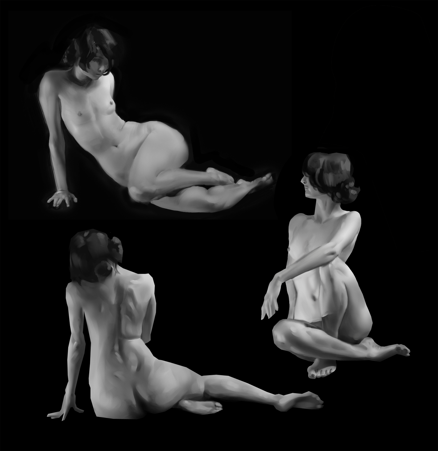
Applied
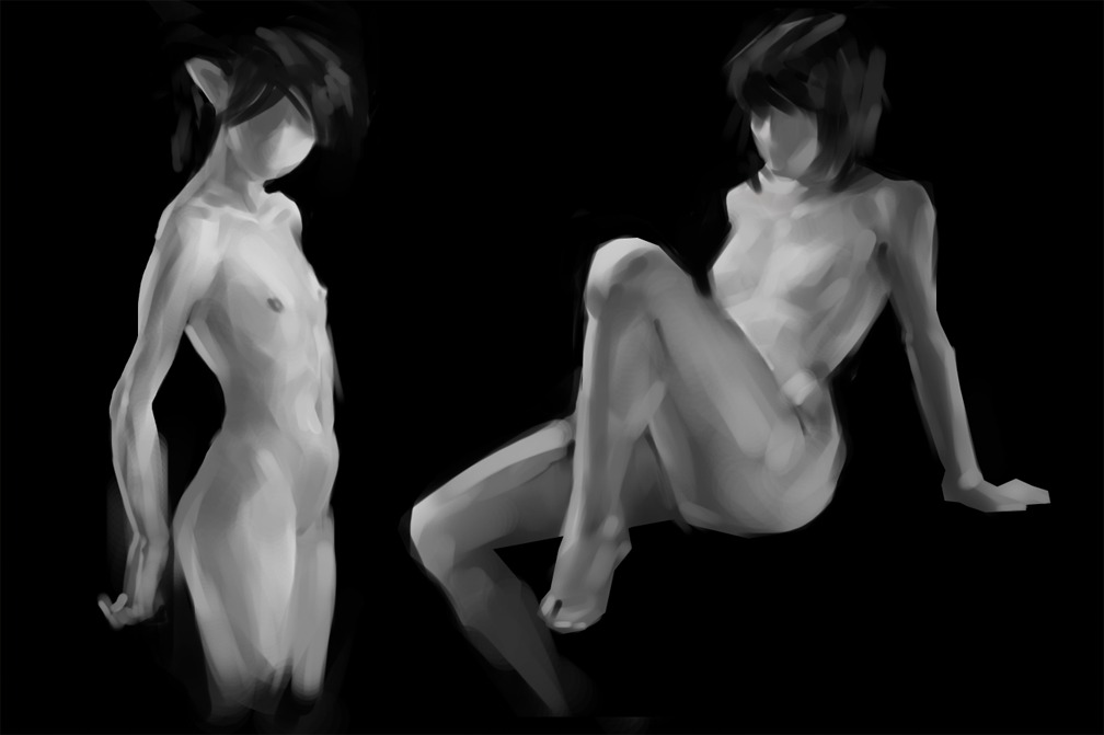
From photographs

Applied

|
Them sketchies
|
|
10-08-2016, 04:21 AM
Heyo. Never really got into a community before (not for long anyways). Let's see how this goes!
From photographs  Applied 
10-09-2016, 05:09 PM
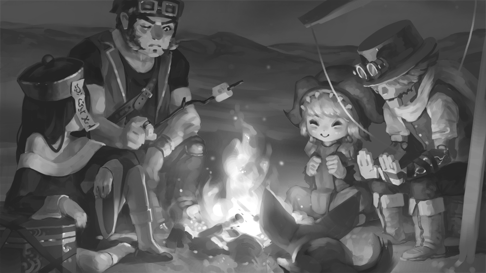
Trying to get in some more gray scale stuff.
 Transit isn't so bad... just have to try super hard to brush off the influence of other people staring at you. 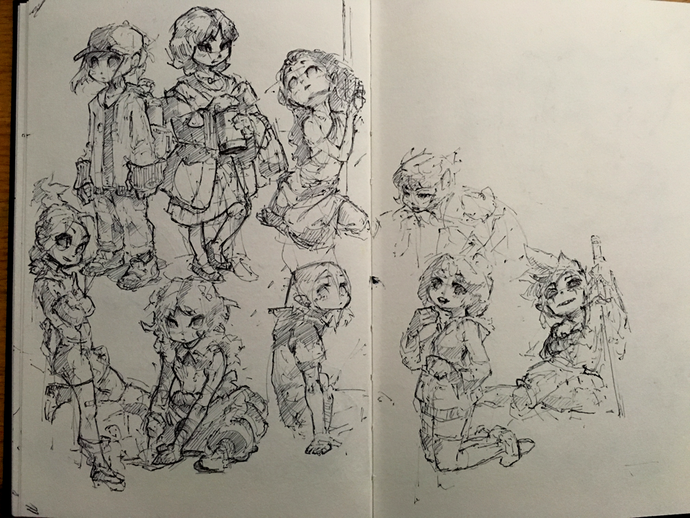 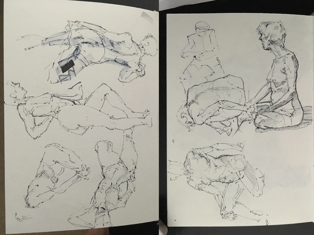
10-09-2016, 07:53 PM
Hey, welcome! :)
Looks awesome, you have good control of values and great anderstanding of figures. My critique would be that your egdes tend to be unrefined, some of them are smugdy where the should be sharp and some are sharp where the should be soft. That's nitpicking though. I hope to see more from you soon. Keep this up! :) Sketchbook | Gallery | Twitch
10-09-2016, 08:15 PM
Hey welcome to Crimson Daggers Hozure :).
Those are some awesome value figure sketches! Looking forward to more :).
“Today, give a stranger one of your smiles. It might be the only sunshine he sees all day.” -- H. Jackson Brown Jr.
CD Sketchbook
10-09-2016, 09:25 PM
i like your take on form, especially with the transit sketch. cool stuff.
10-09-2016, 10:57 PM
such subtle values and strokes! lovely sb more more!
10-09-2016, 11:25 PM
awesome <3
10-10-2016, 09:58 PM
Thank you guys for the warm welcome!
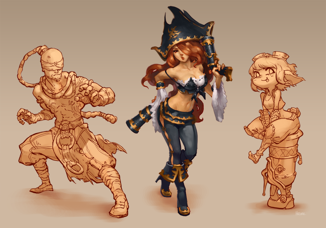
@Piotr: That's definitely something I need to work on. Appreciate it. Leyendecker studies. Trying to understand how he layered his strokes made me respect his work on a new level. 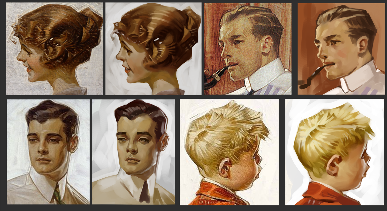 Applied. 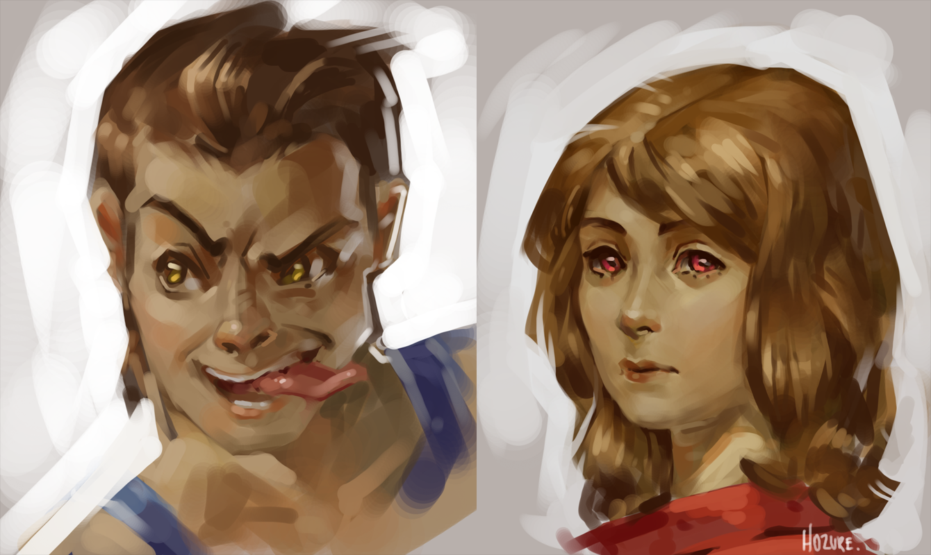 Turned the earlier sketches into line art (I've absolutely hated lineart for years until I figured to use a larger sized brush this time around) 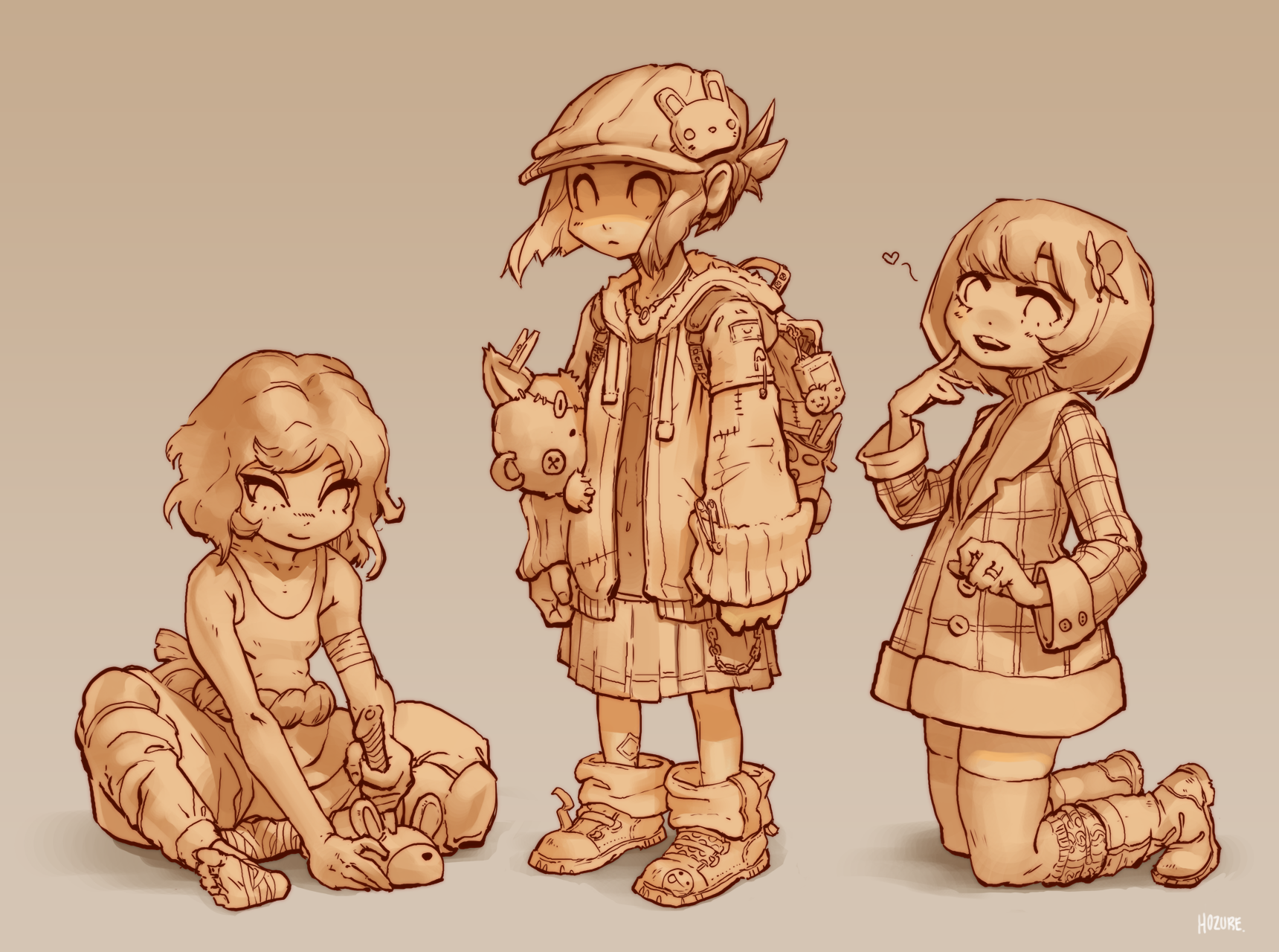
10-10-2016, 10:00 PM
wooooooooooow!! :-O
10-11-2016, 03:19 PM
Testing how painting with lines goes.
 Update. 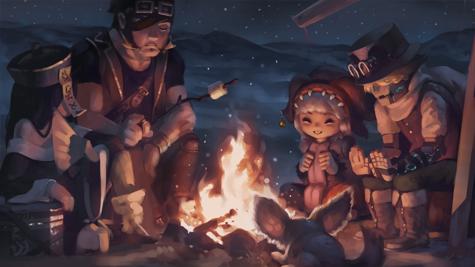
10-11-2016, 05:31 PM
You definitely know what you're doing, so I just urge you to do more of it, much more! Leyendecker studies are top notch, it's great you're studying both realism and cartoon(ism), which is apparently paying off to you. Comparing b&w and color thingy of the adorable campfire, how did you color your picture? I can see a lot fixed and rendered anew. Also, just to pretend I can help you (xD), the biggest guy's right (like, his right) leg, if it's a leg' is undefined and pretty messy, so you can render there a little bit, and between the most left and most right characters and most center ones you can add a little bit of fog or some evaporating snow just to create distance and the illusion of depth, because in opposition to left side characters, the right ones are sort of merging together.
But here's something about internet critique that I think a lot of us sometimes forget - critique is easy to get, but to get good critique is hard, which is the other way of saying - don't believe too much in anything I (or others) say about your work, unless they're really pro - but even then, have faith in yourself. :D Gosh, that was a rant. My first one here, I think. I'm looking forward to seeing more of your work!
Why do you complain of your fate when you could so easily change it?
https://www.instagram.com/dev4res/ https://www.artstation.com/artist/devares http://dev4res.deviantart.com/
10-11-2016, 10:31 PM
UR SAOO GOOD! HWOWOWOWOAHAHAHA!! <3
70+Page Koala Sketchbook: http://crimsondaggers.com/forum/thread-3465.html SB
Paintover thread, submit for crits! http://crimsondaggers.com/forum/thread-7879.html [color=rgba(255, 255, 255, 0.882)]e owl sat on an oak. The more he saw, the less he spoke.[/color]
10-12-2016, 08:42 PM
Really good stuff, great that you do a lot from imagination to apply your studies!
10-13-2016, 07:07 AM
Beautiful Leyendecker studies and I love your value studies. Keep up your great work!
10-15-2016, 04:58 AM
@devares: I used a color layer and tinkered with additional layers of overlay/multiply. 99% of the time I go straight into color and adjust my values later with a saturation layer, so I'm seriously not used to starting in black and white. Thanks for the feedback, although I'm not sure what you mean by the right side merging together (seems like the left side would be merging more currently, no?). Cheers!
Dimmed down the saturation a bit since every photo seemed overly intense, unless that's how flame light works in reality. Not too sure on that. 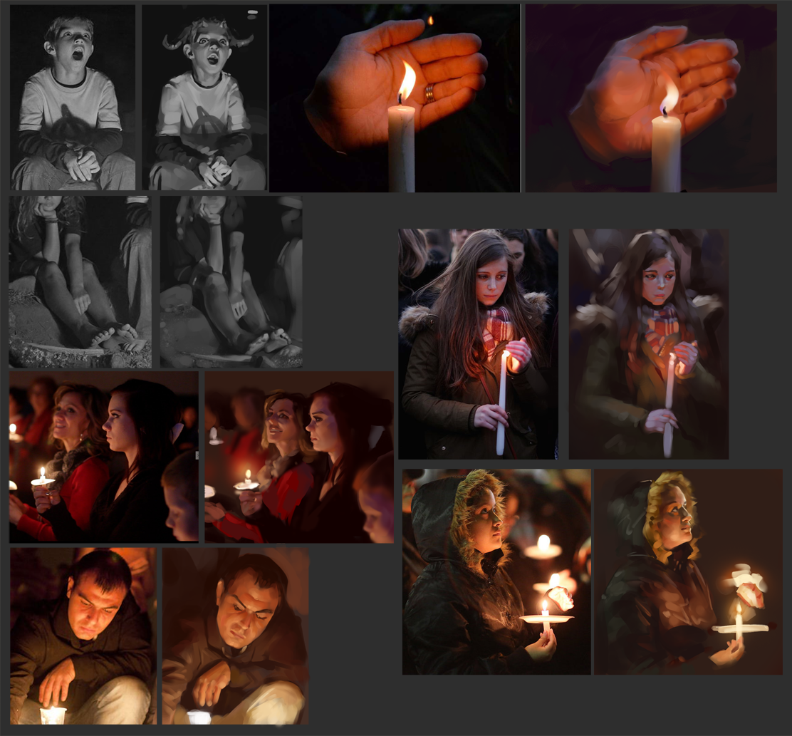 Studies on League splashes and ovopack. 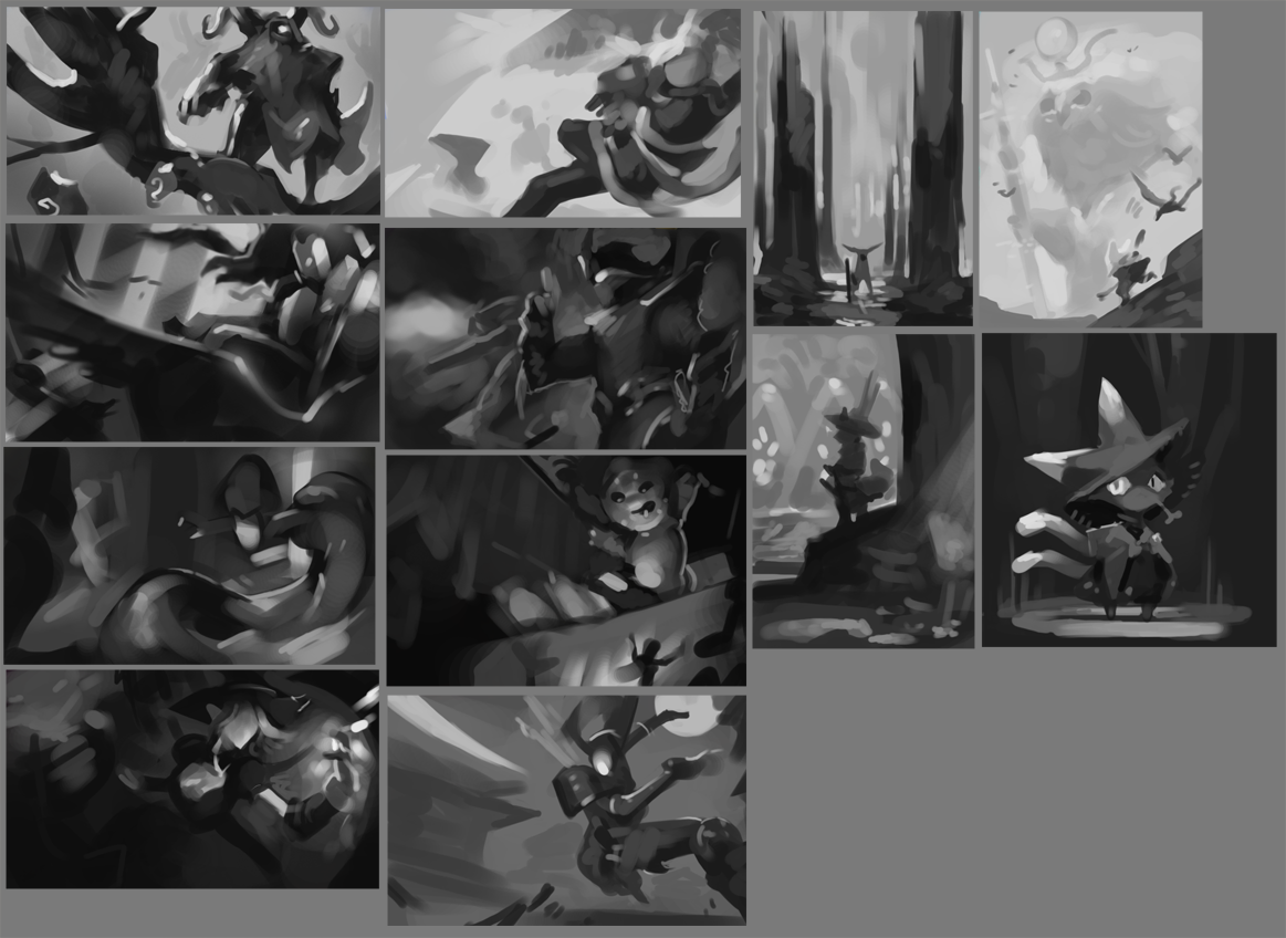
10-15-2016, 06:22 AM
Cool stuff, everything looks really nice, hope to see more
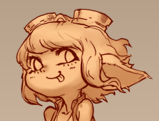
10-15-2016, 09:49 AM
You have a really good balance of realistic and stylized work as well as studies and original drawings. Good on ya! I'd love to have you along as a participant in the current CC (though it would certainly make things more difficult for the rest of us, but hey, that's what competitions are about).
10-16-2016, 10:18 PM
^ I second that! I'd really like to see your entry for CC6.
Sketchbook | Gallery | Twitch
10-17-2016, 10:51 AM
@Piotr and Lodratio : Sounds interesting. I'll check it out!
Slow day. 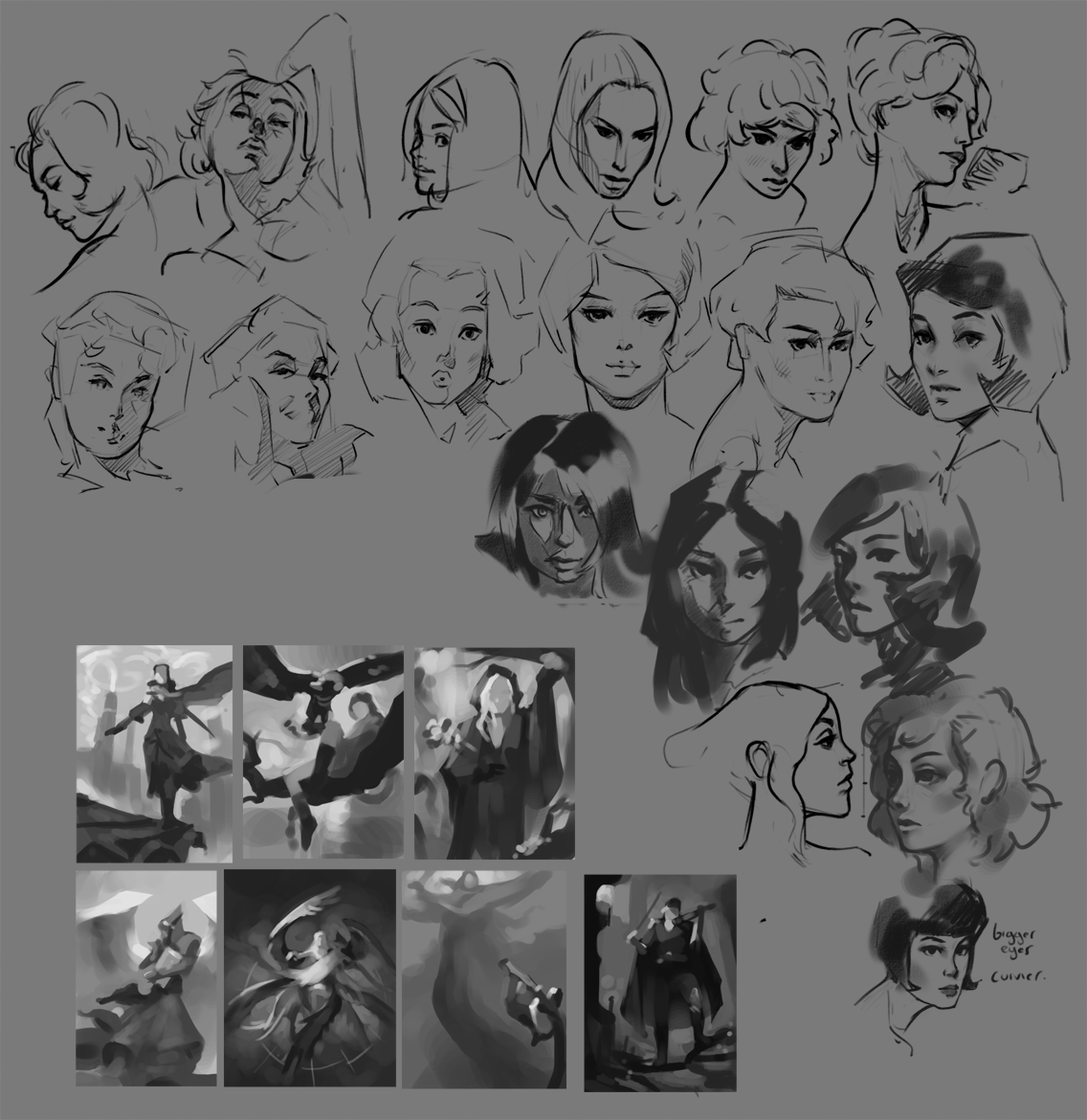 Enlarged thumbnail rough paintings(?). Applying the earlier comp studies since I always add too much later and forget the intention of the initial composition. 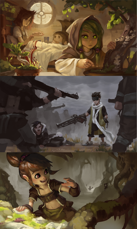
10-17-2016, 11:09 PM
I really enjoy youre studies, Hozure. Keep it coming! And I have a question - do you do anything traditionally apart from those digital studies? ;)
Why do you complain of your fate when you could so easily change it?
https://www.instagram.com/dev4res/ https://www.artstation.com/artist/devares http://dev4res.deviantart.com/ |
|
« Next Oldest | Next Newest »
|